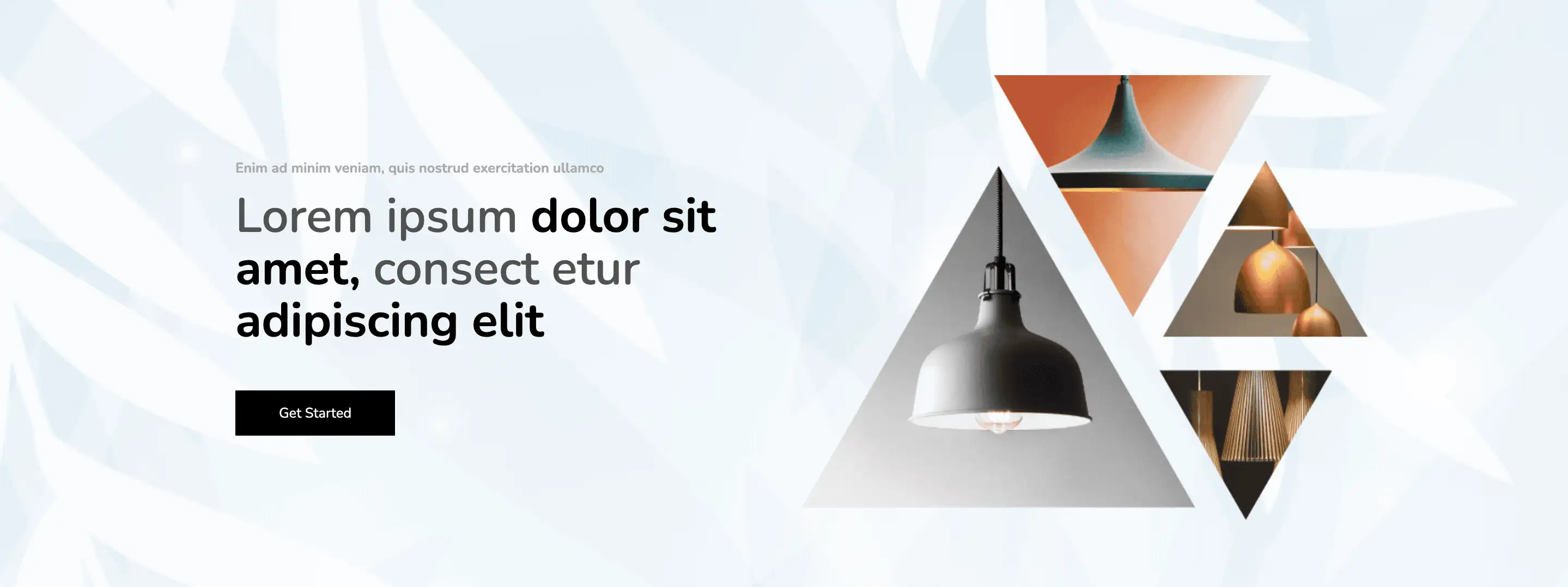
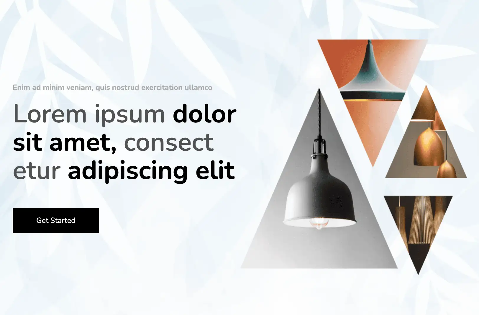
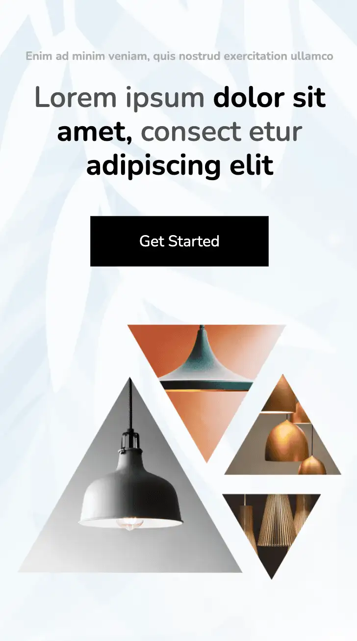
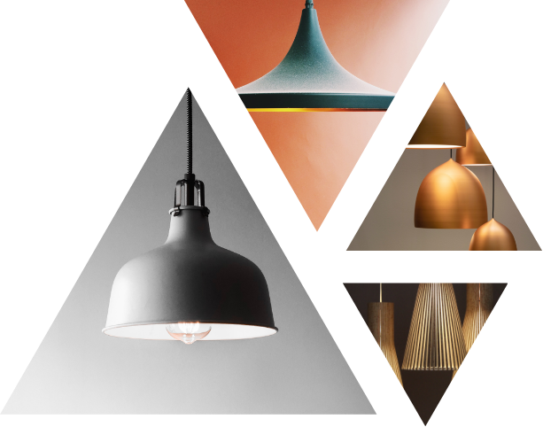
The above design showcases images of the products on a triangular frame. It incorporates span elements to create a title with dual colour schemes and weights. The light, yet attractive blue background enhances the visibility of the content.
View Code
HTML
CSS
JS
Responsive CSS
Output
              Enim ad minim veniam, quis nostrud exercitation ullamco


              Lorem ipsum

               dolor sit amet,

              consect etur

               adipiscing elit


              Get Started
         .new_top_home_web * {
    font-family: Nunito, sans-serif;
}

.new_top_home_web a {
    text-decoration-line: none;
    text-decoration-thickness: initial;
    text-decoration-style: initial;
    text-decoration-color: initial;
}

.new_top_home_web .text-blk {
    margin-top: 0px;
    margin-right: 0px;
    margin-bottom: 0px;
    margin-left: 0px;
    padding-top: 0px;
    padding-right: 0px;
    padding-bottom: 0px;
    padding-left: 0px;
    line-height: 25px;
}

.new_top_home_web .responsive-container-block {
    min-height: 75px;
    height: fit-content;
    width: 100%;
    padding-top: 10px;
    padding-right: 10px;
    padding-bottom: 10px;
    padding-left: 10px;
    display: flex;
    flex-wrap: wrap;
    margin-top: 0px;
    margin-right: auto;
    margin-bottom: 0px;
    margin-left: auto;
    justify-content: flex-start;
}

.new_top_home_web .responsive-container-block.bigContainer {
    padding-top: 10px;
    padding-right: 30px;
    padding-bottom: 10px;
    padding-left: 30px;
    margin-top: 0px;
    margin-right: 0px;
    margin-bottom: 0px;
    margin-left: 0px;
    background-image: url("https://workik-widget-assets.s3.amazonaws.com/widget-assets/images/aw64.png");
    background-position-x: initial;
    background-position-y: initial;
    background-size: cover;
    background-repeat-x: initial;
    background-repeat-y: initial;
    background-attachment: initial;
    background-origin: initial;
    background-clip: initial;
    background-color: initial;
    background-repeat: no-repeat;
}

.new_top_home_web .responsive-container-block.Container {
    max-width: 1320px;
    flex-direction: row;
    align-items: center;
    justify-content: flex-start;
    margin-top: 50px;
    margin-right: auto;
    margin-bottom: 50px;
    margin-left: auto;
    margin: 100px auto 100px auto;
}

.new_top_home_web .text-blk.heading {
    font-size: 16px;
    line-height: 20px;
    font-weight: 700;
    max-width: 435px;
    color: #acacac;
    margin-top: 0px;
    margin-right: 0px;
    margin-bottom: 15px;
    margin-left: 0px;
}

.new_top_home_web .text-blk.subHeading {
    font-size: 55px;
    line-height: 60px;
    max-width: 600px;
    color: #515151;
    font-weight: 600;
    margin-top: 0px;
    margin-right: 0px;
    margin-bottom: 50px;
    margin-left: 0px;
}

.new_top_home_web .text-blk.btn {
    padding-top: 20px;
    padding-right: 45px;
    padding-bottom: 20px;
    padding-left: 45px;
    background-color: #fff7df;
    border-top-left-radius: 100px;
    border-top-right-radius: 100px;
    border-bottom-right-radius: 100px;
    border-bottom-left-radius: 100px;
    font-size: 14px;
    line-height: 20px;
    color: #00b2eb;
    font-weight: 700;
    cursor: pointer;
}

.new_top_home_web .leftSide {
    display: flex;
    flex-direction: column;
    align-items: flex-start;
    width: 50%;
}

.new_top_home_web .rightSide {
    width: 50%;
    position: relative;
    display: flex;
    margin-top: 0px;
    margin-right: 0px;
    margin-bottom: 0px;
    margin-left: 0px;
}

.new_top_home_web .girl {
    position: static;
    width: 100%;
    height: 100%;
}

.new_top_home_web .darkText {
    font-weight: 700;
    color: black;
}

.new_top_home_web .getStarted {
    padding-top: 15px;
    padding-right: 50px;
    padding-bottom: 15px;
    padding-left: 50px;
    color: white;
    background-color: black;
}

.new_top_home_web .getStarted:hover {
    background-image: initial;
    background-position-x: initial;
    background-position-y: initial;
    background-size: initial;
    background-repeat-x: initial;
    background-repeat-y: initial;
    background-attachment: initial;
    background-origin: initial;
    background-clip: initial;
    background-color: white;
    color: black;
    border-top-width: 1px;
    border-right-width: 1px;
    border-bottom-width: 1px;
    border-left-width: 1px;
    border-top-style: solid;
    border-right-style: solid;
    border-bottom-style: solid;
    border-left-style: solid;
    border-top-color: black;
    border-right-color: black;
    border-bottom-color: black;
    border-left-color: black;
    border-image-source: initial;
    border-image-slice: initial;
    border-image-width: initial;
    border-image-outset: initial;
    border-image-repeat: initial;
}

@media (max-width: 1024px) {
    .new_top_home_web .responsive-container-block.Container {
        padding-top: 0px;
        padding-right: 0px;
        padding-bottom: 0px;
        padding-left: 0px;
    }

    .new_top_home_web .girl {
        height: auto;
    }

    .new_top_home_web .text-blk.heading {
        font-size: 40px;
        line-height: 60px;
    }

    .new_top_home_web .rightSide {
        flex-direction: column;
    }

    .new_top_home_web .girl {
        margin-top: -80px;
        margin-right: 0px;
        margin-bottom: -30px;
        margin-left: 0px;
    }

    .new_top_home_web .girl {
        margin-top: -80px;
        margin-right: 0px;
        margin-bottom: -50px;
        margin-left: 0px;
        width: 120%;
    }

    .new_top_home_web .rightSide {
        margin-top: 0px;
        margin-right: 0px;
        margin-bottom: -80px;
        margin-left: 0px;
    }

    .new_top_home_web .girl {
        width: 100%;
        height: 100%;
        margin-top: 0px;
        margin-right: 0px;
        margin-bottom: 0px;
        margin-left: 0px;
    }

    .new_top_home_web .rightSide {
        height: 500px;
        margin-top: 0px;
        margin-right: 0px;
        margin-bottom: 0px;
        margin-left: 0px;
    }

    .new_top_home_web .text-blk.heading {
        font-size: 16px;
        line-height: 22px;
    }
}

@media (max-width: 768px) {
    .new_top_home_web .girl {
        margin-top: -360px;
        margin-right: 0px;
        margin-bottom: -80px;
        margin-left: auto;
        width: 80%;
    }

    .new_top_home_web .rightSide {
        width: 100%;
        height: auto;
        margin-top: 0px;
        margin-right: 0px;
        margin-bottom: 0px;
        margin-left: 0px;
        position: static;
    }

    .new_top_home_web .responsive-container-block.Container {
        flex-direction: column;
        align-items: center;
        justify-content: center;
    }

    .new_top_home_web .leftSide {
        width: 100%;
        margin-top: 0px;
        margin-right: 0px;
        margin-bottom: 0px;
        margin-left: 0px;
    }

    .new_top_home_web .responsive-container-block.bigContainer {
        margin-top: 50px;
        margin-right: 0px;
        margin-bottom: 100px;
        margin-left: 0px;
    }

    .new_top_home_web .girl {
        margin-top: 0px;
        margin-right: 0px;
        margin-bottom: 0px;
        margin-left: 0px;
    }

    .new_top_home_web .rightSide {
        align-items: center;
        justify-content: center;
    }

    .new_top_home_web .responsive-container-block.bigContainer {
        margin-top: 0px;
        margin-right: 0px;
        margin-bottom: 100px;
        margin-left: 0px;
    }

    .new_top_home_web .text-blk.subHeading {
        text-align: center;
        font-size: 40px;
        line-height: 50px;
    }

    .new_top_home_web .leftSide {
        margin-top: 0px;
        margin-right: 0px;
        margin-bottom: 60px;
        margin-left: 0px;
        justify-content: center;
        align-items: center;
    }

    .new_top_home_web .text-blk.heading {
        text-align: center;
        font-size: 14px;
        line-height: 19px;
    }

    .new_top_home_web .responsive-container-block.bigContainer {
        margin: 0 0 0 0;
    }
}

@media (max-width: 500px) {
    .new_top_home_web .text-blk.heading {
        font-size: 25px;
        line-height: 40px;
    }

    .new_top_home_web .text-blk.subHeading {
        margin-top: 0px;
        margin-right: 0px;
        margin-bottom: 50px;
        margin-left: 0px;
    }

    .new_top_home_web .leftSide {
        margin-top: 0px;
        margin-right: 0px;
        margin-bottom: 0px;
        margin-left: 0px;
    }

    .new_top_home_web .responsive-container-block.Container {
        margin-top: 50px;
        margin-right: 0px;
        margin-bottom: 60px;
        margin-left: 0px;
    }

    .new_top_home_web .girl {
        margin-top: -200px;
        margin-right: 0px;
        margin-bottom: 0px;
        margin-left: 0px;
        width: 100%;
    }

    .new_top_home_web .leftSide {
        margin-top: 0px;
        margin-right: 0px;
        margin-bottom: 20px;
        margin-left: 0px;
        z-index: 10;
    }

    .new_top_home_web .girl {
        margin-top: 0px;
        margin-right: 0px;
        margin-bottom: 0px;
        margin-left: 0px;
    }

    .new_top_home_web .text-blk.heading {
        font-size: 12px;
        line-height: 18px;
        text-align: center;
    }

    .new_top_home_web .text-blk.subHeading {
        font-size: 30px;
        line-height: 35px;
        margin-top: 0px;
        margin-right: 0px;
        margin-bottom: 35px;
        margin-left: 0px;
        text-align: center;
    }

    .new_top_home_web .leftSide {
        margin-top: 0px;
        margin-right: 0px;
        margin-bottom: 60px;
        margin-left: 0px;
        align-items: center;
        justify-content: center;
    }

    .new_top_home_web .responsive-container-block.bigContainer {
        padding-top: 10px;
        padding-right: 20px;
        padding-bottom: 10px;
        padding-left: 20px;
    }
}
         @import url('https://fonts.googleapis.com/css2?family=Nunito:wght@200;300;400;600;700;800&display=swap');
                            *, *:before, *:after {
                            -moz-box-sizing: border-box;
                            -webkit-box-sizing: border-box;
                            box-sizing: border-box;
                            }
                            body {
                            margin: 0;
                            }
                            .wk-desk-1{
                            width: 8.333333%;
                            }
                            .wk-desk-2{
                            width: 16.666667%;
                            }
                            .wk-desk-3{
                            width: 25%;
                            }
                            .wk-desk-4{
                            width: 33.333333%;
                            }
                            .wk-desk-5{
                            width: 41.666667%;
                            }
                            .wk-desk-6{
                            width: 50%;
                            }
                            .wk-desk-7{
                            width: 58.333333%;
                            }
                            .wk-desk-8{
                            width: 66.666667%;
                            }
                            .wk-desk-9{
                            width: 75%;
                            }
                            .wk-desk-10{
                            width: 83.333333%;
                            }
                            .wk-desk-11{
                            width: 91.666667%;
                            }
                            .wk-desk-12{
                            width: 100%;
                            }
                            @media (max-width: 1024px) {
                            .wk-ipadp-1{
                            width: 8.333333%;
                            }
                            .wk-ipadp-2{
                            width: 16.666667%;
                            }
                            .wk-ipadp-3{
                            width: 25%;
                            }
                            .wk-ipadp-4{
                            width: 33.333333%;
                            }
                            .wk-ipadp-5{
                            width: 41.666667%;
                            }
                            .wk-ipadp-6{
                            width: 50%;
                            }
                            .wk-ipadp-7{
                            width: 58.333333%;
                            }
                            .wk-ipadp-8{
                            width: 66.666667%;
                            }
                            .wk-ipadp-9{
                            width: 75%;
                            }
                            .wk-ipadp-10{
                            width: 83.333333%;
                            }
                            .wk-ipadp-11{
                            width: 91.666667%;
                            }
                            .wk-ipadp-12{
                            width: 100%;
                            }
                            }
                            @media (max-width: 768px) {
                            .wk-tab-1{
                            width: 8.333333%;
                            }
                            .wk-tab-2{
                            width: 16.666667%;
                            }
                            .wk-tab-3{
                            width: 25%;
                            }
                            .wk-tab-4{
                            width: 33.333333%;
                            }
                            .wk-tab-5{
                            width: 41.666667%;
                            }
                            .wk-tab-6{
                            width: 50%;
                            }
                            .wk-tab-7{
                            width: 58.333333%;
                            }
                            .wk-tab-8{
                            width: 66.666667%;
                            }
                            .wk-tab-9{
                            width: 75%;
                            }
                            .wk-tab-10{
                            width: 83.333333%;
                            }
                            .wk-tab-11{
                            width: 91.666667%;
                            }
                            .wk-tab-12{
                            width: 100%;
                            }
                            }
                            @media (max-width: 500px) {
                            .wk-mobile-1{
                            width: 8.333333%;
                            }
                            .wk-mobile-2{
                            width: 16.666667%;
                            }
                            .wk-mobile-3{
                            width: 25%;
                            }
                            .wk-mobile-4{
                            width: 33.333333%;
                            }
                            .wk-mobile-5{
                            width: 41.666667%;
                            }
                            .wk-mobile-6{
                            width: 50%;
                            }
                            .wk-mobile-7{
                            width: 58.333333%;
                            }
                            .wk-mobile-8{
                            width: 66.666667%;
                            }
                            .wk-mobile-9{
                            width: 75%;
                            }
                            .wk-mobile-10{
                            width: 83.333333%;
                            }
                            .wk-mobile-11{
                            width: 91.666667%;
                            }
                            .wk-mobile-12{
                            width: 100%;
                            }
                            }
Reset
Join our community to see how developers are using Workik AI everyday.
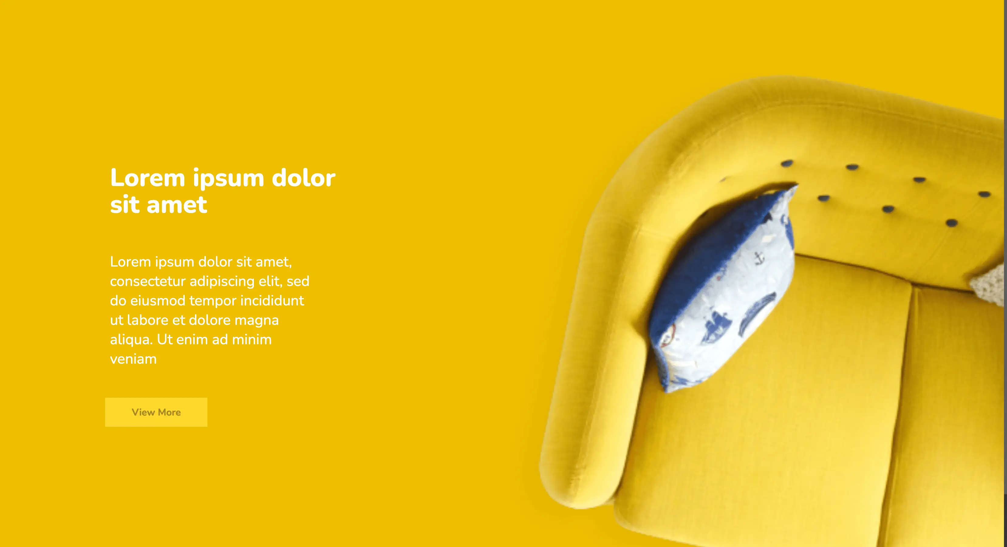
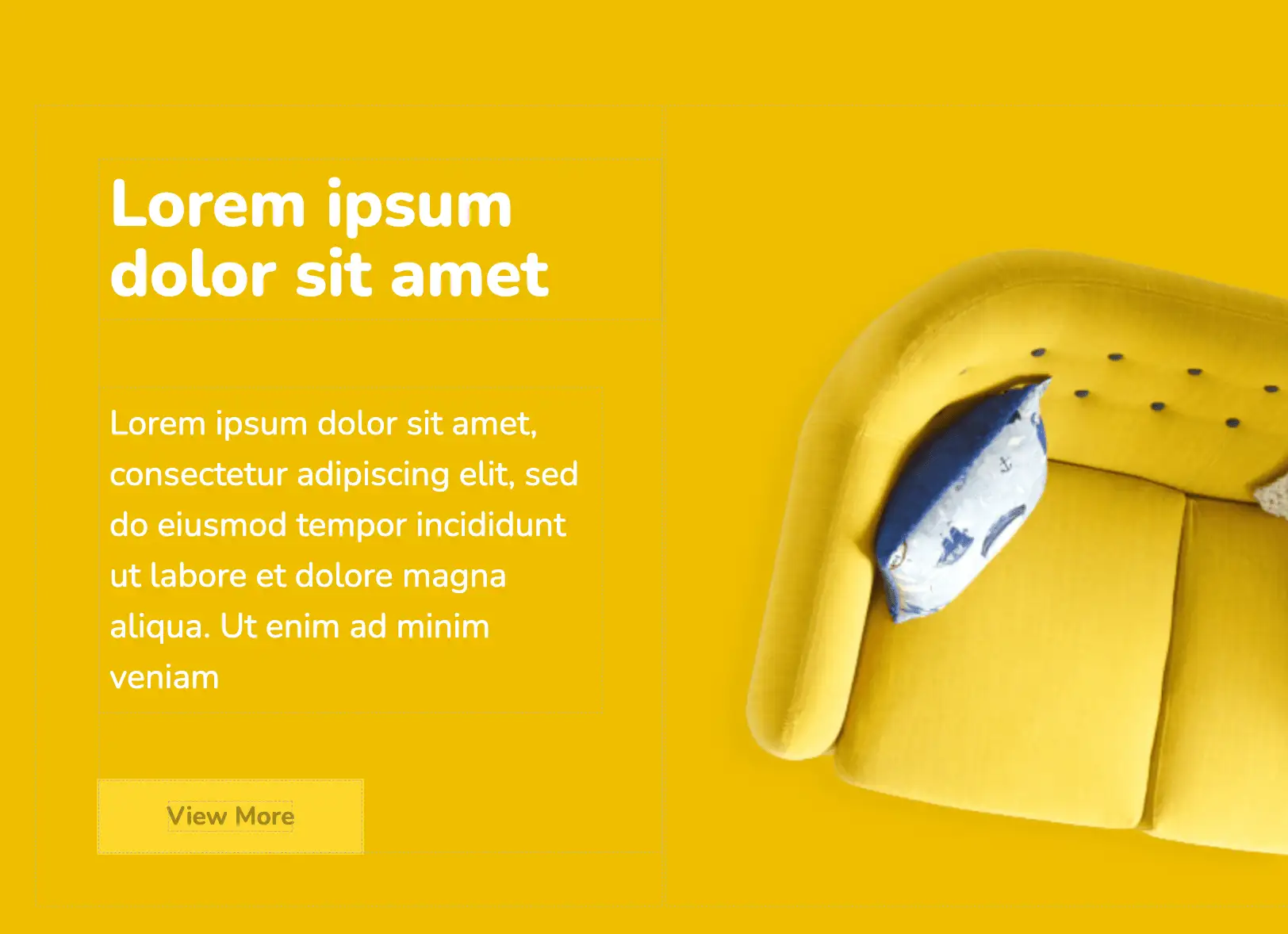
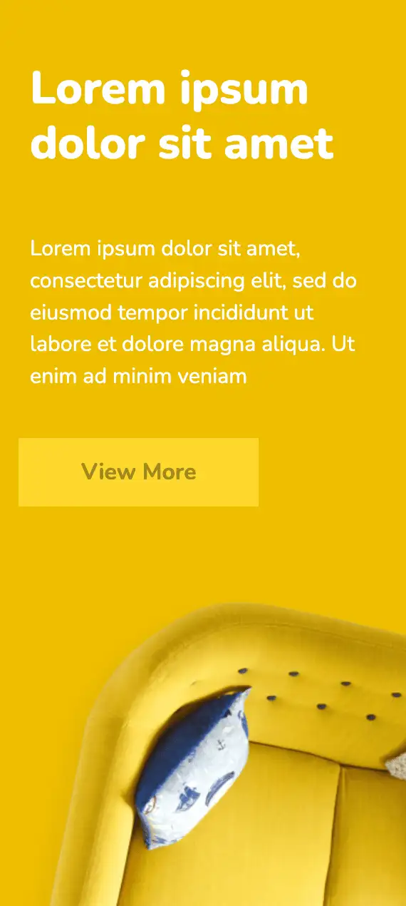
This landing page top section effectively grabs the visitors' attention. The yellow colour scheme of the design leaves a vibrant, catchy, and leaves a strong brand effect on the users. The widget also includes a call to action, inviting users to view more of your products/services.
View Code
HTML
CSS
JS
Responsive CSS
Output
Lorem ipsum dolor sit amet
Lorem ipsum dolor sit amet, consectetur adipiscing elit, sed do eiusmod tempor incididunt ut labore et dolore magna aliqua. Ut enim ad minim veniam
         .interior_1 * {
    font-family: Nunito, sans-serif;
}

.interior_1 .responsive-cell-block {
    min-height: 75px;
}

.interior_1 .text-blk {
    line-height: 40px;
    font-size: 30px;
    max-width: 450px;
    margin-top: 0px;
    margin-right: 0px;
    margin-bottom: 50px;
    margin-left: 0px;
}

.interior_1 a {
    text-decoration-line: none;
    text-decoration-thickness: initial;
    text-decoration-style: initial;
    text-decoration-color: initial;
    color: inherit;
}

.interior_1 .responsive-container-block {
    min-height: 75px;
    height: fit-content;
    width: 100%;
    display: flex;
    flex-wrap: wrap;
    margin-top: 0px;
    margin-right: auto;
    margin-bottom: 0px;
    margin-left: auto;
    justify-content: flex-start;
}

.interior_1 .responsive-container-block.big-container {
    background-color: #efbe00;
    position: relative;
    padding: 50px 0 0 30px;
}

.interior_1 .responsive-container-block.container {
    max-width: 1200px;
    height: 700px;
    margin-top: 50px;
    margin-right: auto;
    margin-bottom: 50px;
    margin-left: auto;
    flex-direction: column;
    align-items: flex-start;
    justify-content: center;
    color: white;
    padding-top: 10px;
    padding-right: 10px;
    padding-bottom: 10px;
    padding-left: 50px;
    position: static;
}

.interior_1 .text-blk.section-head {
    font-size: 52px;
    line-height: 55px;
    max-width: 500px;
    font-weight: 900;
    margin-top: 0px;
    margin-right: 0px;
    margin-bottom: 50px;
    margin-left: 0px;
}

.interior_1 #i7w9 {
    background-color: #ffd62b;
    height: 60px;
    padding-top: 15px;
    padding-right: 55px;
    padding-bottom: 15px;
    padding-left: 55px;
    font-size: 20px;
    font-weight: 700;
    color: #9e891e;
    border-top-width: 2px;
    border-right-width: 2px;
    border-bottom-width: 2px;
    border-left-width: 2px;
    border-top-style: none;
    border-right-style: none;
    border-bottom-style: none;
    border-left-style: none;
    border-top-color: #767676;
    border-right-color: #767676;
    border-bottom-color: #767676;
    border-left-color: #767676;
    border-image-source: initial;
    border-image-slice: initial;
    border-image-width: initial;
    border-image-outset: initial;
    border-image-repeat: initial;
}

.interior_1 .responsive-cell-block.wk-desk-6.wk-ipadp-6.wk-tab-12.wk-mobile-12.img-one {
    display: flex;
    justify-content: flex-end;
}

.interior_1 .responsive-cell-block.wk-desk-6.wk-ipadp-6.wk-tab-12.wk-mobile-12.right-one {
    display: flex;
    flex-direction: column;
    justify-content: center;
    align-items: center;
    color: #fff;
}

.interior_1 .big-sofa {
    width: 100%;
}

.interior_1 .content-box {
    margin: 0 0 0 100px;
}

@media (max-width: 1024px) {
    .interior_1 .responsive-container-block.container {
        justify-content: flex-start;
        padding-top: 60px;
        padding-right: 10px;
        padding-bottom: 10px;
        padding-left: 50px;
        position: relative;
    }

    .interior_1 .responsive-container-block.big-container {
        position: relative;
    }

    .interior_1 .text-blk {
        font-size: 27px;
        max-width: 400px;
    }

    .interior_1 .responsive-container-block.big-container {
        padding: 100px 0 50px 30px;
    }

    .interior_1 .content-box {
        margin: 0 0 0 50px;
    }
}

@media (max-width: 768px) {
    .interior_1 .text-blk {
        font-size: 25px;
        line-height: 34px;
        max-width: 350px;
    }

    .interior_1 .responsive-cell-block.wk-desk-6.wk-ipadp-6.wk-tab-12.wk-mobile-12.right-one {
        justify-content: flex-start;
        align-items: flex-start;
    }

    .interior_1 .big-sofa {
        height: 600px;
        width: 600px;
    }

    .interior_1 .text-blk.section-head {
        max-width: 600px;
    }

    .interior_1 .text-blk {
        max-width: 450px;
    }

    .interior_1 .content-box {
        margin: 0 0 0 0;
    }

    .interior_1 .responsive-container-block.big-container {
        padding: 120px 0 50px 30px;
    }
}

@media (max-width: 500px) {
    .interior_1 .text-blk.section-head {
        font-size: 40px;
        line-height: 48px;
        margin-top: 0px;
        margin-right: 0px;
        margin-bottom: 34px;
        margin-left: 0px;
    }

    .interior_1 .responsive-container-block.container {
        padding-top: 30px;
        padding-right: 20px;
        padding-bottom: 10px;
        padding-left: 20px;
    }

    .interior_1 .text-blk {
        font-size: 19px;
        line-height: 28px;
        margin-top: 0px;
        margin-right: 0px;
        margin-bottom: 30px;
        margin-left: 0px;
    }

    .interior_1 .responsive-cell-block.wk-desk-6.wk-ipadp-6.wk-tab-12.wk-mobile-12.right-one {
        padding: 0 20px 0 20px;
    }

    .interior_1 .responsive-container-block.big-container {
        padding: 120px 0 50px 0;
    }

    .interior_1 .big-sofa {
        width: 100%;
        height: auto;
    }
}
         @import url('https://fonts.googleapis.com/css2?family=Nunito:wght@200;300;400;600;700;800&display=swap');
                            *, *:before, *:after {
                            -moz-box-sizing: border-box;
                            -webkit-box-sizing: border-box;
                            box-sizing: border-box;
                            }
                            body {
                            margin: 0;
                            }
                            .wk-desk-1{
                            width: 8.333333%;
                            }
                            .wk-desk-2{
                            width: 16.666667%;
                            }
                            .wk-desk-3{
                            width: 25%;
                            }
                            .wk-desk-4{
                            width: 33.333333%;
                            }
                            .wk-desk-5{
                            width: 41.666667%;
                            }
                            .wk-desk-6{
                            width: 50%;
                            }
                            .wk-desk-7{
                            width: 58.333333%;
                            }
                            .wk-desk-8{
                            width: 66.666667%;
                            }
                            .wk-desk-9{
                            width: 75%;
                            }
                            .wk-desk-10{
                            width: 83.333333%;
                            }
                            .wk-desk-11{
                            width: 91.666667%;
                            }
                            .wk-desk-12{
                            width: 100%;
                            }
                            @media (max-width: 1024px) {
                            .wk-ipadp-1{
                            width: 8.333333%;
                            }
                            .wk-ipadp-2{
                            width: 16.666667%;
                            }
                            .wk-ipadp-3{
                            width: 25%;
                            }
                            .wk-ipadp-4{
                            width: 33.333333%;
                            }
                            .wk-ipadp-5{
                            width: 41.666667%;
                            }
                            .wk-ipadp-6{
                            width: 50%;
                            }
                            .wk-ipadp-7{
                            width: 58.333333%;
                            }
                            .wk-ipadp-8{
                            width: 66.666667%;
                            }
                            .wk-ipadp-9{
                            width: 75%;
                            }
                            .wk-ipadp-10{
                            width: 83.333333%;
                            }
                            .wk-ipadp-11{
                            width: 91.666667%;
                            }
                            .wk-ipadp-12{
                            width: 100%;
                            }
                            }
                            @media (max-width: 768px) {
                            .wk-tab-1{
                            width: 8.333333%;
                            }
                            .wk-tab-2{
                            width: 16.666667%;
                            }
                            .wk-tab-3{
                            width: 25%;
                            }
                            .wk-tab-4{
                            width: 33.333333%;
                            }
                            .wk-tab-5{
                            width: 41.666667%;
                            }
                            .wk-tab-6{
                            width: 50%;
                            }
                            .wk-tab-7{
                            width: 58.333333%;
                            }
                            .wk-tab-8{
                            width: 66.666667%;
                            }
                            .wk-tab-9{
                            width: 75%;
                            }
                            .wk-tab-10{
                            width: 83.333333%;
                            }
                            .wk-tab-11{
                            width: 91.666667%;
                            }
                            .wk-tab-12{
                            width: 100%;
                            }
                            }
                            @media (max-width: 500px) {
                            .wk-mobile-1{
                            width: 8.333333%;
                            }
                            .wk-mobile-2{
                            width: 16.666667%;
                            }
                            .wk-mobile-3{
                            width: 25%;
                            }
                            .wk-mobile-4{
                            width: 33.333333%;
                            }
                            .wk-mobile-5{
                            width: 41.666667%;
                            }
                            .wk-mobile-6{
                            width: 50%;
                            }
                            .wk-mobile-7{
                            width: 58.333333%;
                            }
                            .wk-mobile-8{
                            width: 66.666667%;
                            }
                            .wk-mobile-9{
                            width: 75%;
                            }
                            .wk-mobile-10{
                            width: 83.333333%;
                            }
                            .wk-mobile-11{
                            width: 91.666667%;
                            }
                            .wk-mobile-12{
                            width: 100%;
                            }
                            }
Reset
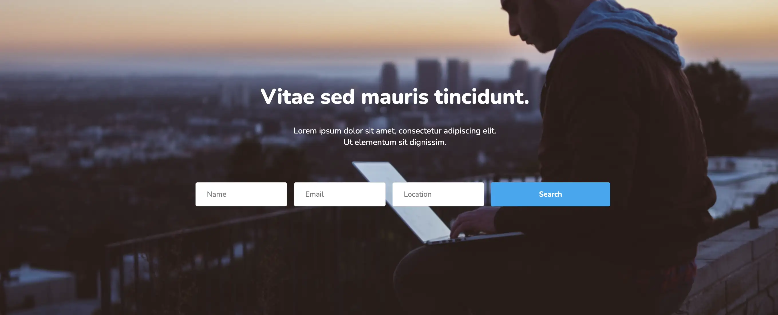
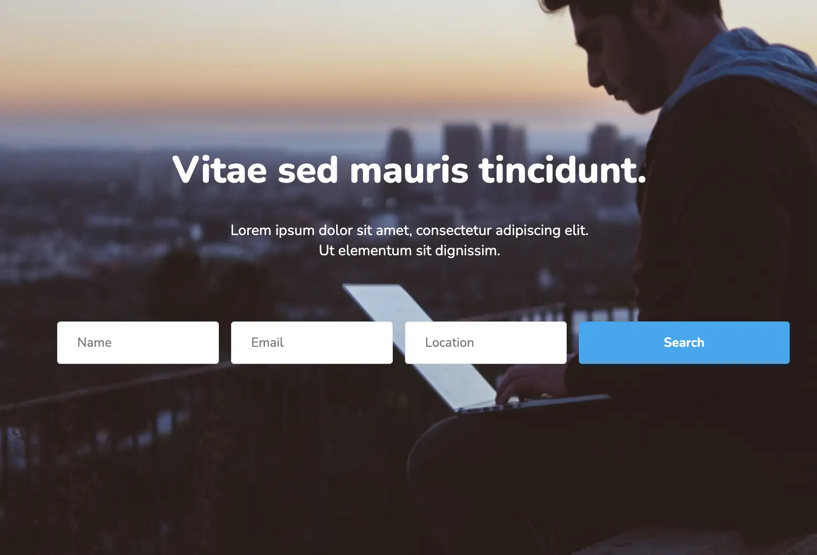
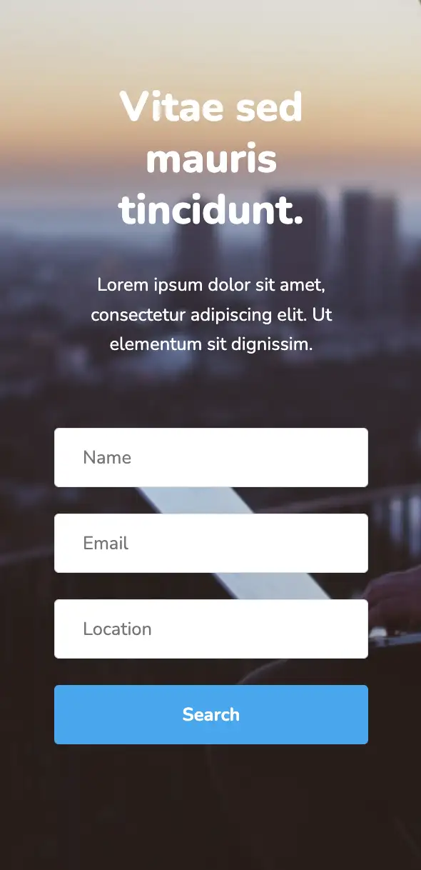
This widget has two parts: the contact form and additional company information. The layout is completely responsive and provides the best experience across different devices and screen sizes. This widget also allows you to showcase your exact location on a map and contains social media links.
View Code
HTML
CSS
JS
Responsive CSS
Output

Vitae sed mauris tincidunt.
Lorem ipsum dolor sit amet, consectetur adipiscing elit. Ut elementum sit dignissim.
         .atf_17 .responsive-cell-block {
    min-height: 75px;
}

.atf_17 * {
    font-family: Nunito, sans-serif;
}

.atf_17 .text-blk {
    margin-top: 0px;
    margin-right: 0px;
    margin-bottom: 0px;
    margin-left: 0px;
    line-height: 25px;
}

.atf_17 img {
    object-fit: cover;
}

.atf_17 .responsive-container-block {
    min-height: 75px;
    height: fit-content;
    width: 100%;
    display: flex;
    flex-wrap: wrap;
    margin-top: 0px;
    margin-right: auto;
    margin-bottom: 0px;
    margin-left: auto;
    justify-content: flex-start;
}

.atf_17 .responsive-container-block.big-continer {
    padding-top: 10px;
    padding-right: 30px;
    padding-bottom: 10px;
    padding-left: 30px;
    min-height: 700px;
    align-items: center;
    position: relative;
}

.atf_17 .responsive-container-block.container {
    max-width: 1320px;
    color: white;
    flex-direction: column;
    text-align: center;
    justify-content: center;
    align-items: center;
    margin-top: 130px;
    margin-right: auto;
    margin-bottom: 150px;
    margin-left: auto;
    position: relative;
}

.atf_17 .text-blk.landing19-head {
    font-size: 46px;
    font-weight: 900;
    line-height: 64px;
    text-align: center;
    margin-top: 0px;
    margin-right: 0px;
    margin-bottom: 10px;
    margin-left: 0px;
}

.atf_17 .text-blk.landing19-subhead {
    font-size: 18px;
    max-width: 470px;
    margin-top: 0px;
    margin-right: 0px;
    margin-bottom: 55px;
    margin-left: 0px;
}

.atf_17 .input {
    height: 52px;
    width: 200px;
    border-top-width: 1px;
    border-right-width: 1px;
    border-bottom-width: 1px;
    border-left-width: 1px;
    border-top-style: solid;
    border-right-style: solid;
    border-bottom-style: solid;
    border-left-style: solid;
    border-top-color: #dbdee7;
    border-right-color: #dbdee7;
    border-bottom-color: #dbdee7;
    border-left-color: #dbdee7;
    border-image-source: initial;
    border-image-slice: initial;
    border-image-width: initial;
    border-image-outset: initial;
    border-image-repeat: initial;
    border-top-left-radius: 4px;
    border-top-right-radius: 4px;
    border-bottom-right-radius: 4px;
    border-bottom-left-radius: 4px;
    padding-top: 1px;
    padding-right: 24px;
    padding-bottom: 1px;
    padding-left: 24px;
    font-size: 16px;
}

.atf_17 .button {
    height: 52px;
    padding-top: 1px;
    padding-right: 105px;
    padding-bottom: 1px;
    padding-left: 105px;
    border-top-width: 0px;
    border-right-width: 0px;
    border-bottom-width: 0px;
    border-left-width: 0px;
    border-top-style: outset;
    border-right-style: outset;
    border-bottom-style: outset;
    border-left-style: outset;
    border-top-color: #767676;
    border-right-color: #767676;
    border-bottom-color: #767676;
    border-left-color: #767676;
    border-image-source: initial;
    border-image-slice: initial;
    border-image-width: initial;
    border-image-outset: initial;
    border-image-repeat: initial;
    border-top-left-radius: 4px;
    border-top-right-radius: 4px;
    border-bottom-right-radius: 4px;
    border-bottom-left-radius: 4px;
    background-color: #03a9f4;
    font-size: 16px;
    font-weight: 700;
    color: white;
}

.atf_17 .responsive-container-block.input-box {
    justify-content: center;
}

.atf_17 .responsive-cell-block.wk-desk-2.wk-ipadp-2.wk-tab-6.wk-mobile-12 {
    width: 200px;
    margin-top: 0px;
    margin-right: 15px;
    margin-bottom: 0px;
    margin-left: 0px;
}

.atf_17 .responsive-cell-block.wk-desk-2.wk-ipadp-2.wk-mobile-12.wk-tab-7 {
    width: 200px;
    margin-top: 0px;
    margin-right: 15px;
    margin-bottom: 0px;
    margin-left: 0px;
}

.atf_17 .bg-img {
    position: absolute;
    width: 100%;
    height: 100%;
    top: 0px;
    right: 0px;
    left: 0px;
    bottom: 0px;
}

@media (max-width: 1024px) {
    .atf_17 .responsive-container-block.big-continer {
        background-position-x: 50%;
        background-position-y: 50%;
    }
}

@media (max-width: 768px) {
    .atf_17 .input {
        width: 100%;
    }

    .atf_17 .responsive-cell-block.wk-desk-2.wk-ipadp-2.wk-mobile-12.wk-tab-7 {
        width: 58%;
        margin-top: 0px;
        margin-right: 0px;
        margin-bottom: 0px;
        margin-left: 0px;
    }

    .atf_17 #i901w {
        width: 100%;
    }

    .atf_17 .text-blk.landing19-head {
        font-size: 36px;
        line-height: 45px;
    }

    .atf_17 .responsive-container-block.big-continer {
        background-position-x: 50%;
        background-position-y: 50%;
    }
}

@media (max-width: 500px) {
    .atf_17 .responsive-cell-block.wk-desk-2.wk-ipadp-2.wk-tab-6.wk-mobile-12 {
        width: 100%;
        margin-top: 0px;
        margin-right: 0px;
        margin-bottom: 0px;
        margin-left: 0px;
    }

    .atf_17 .input {
        width: 100%;
    }

    .atf_17 #i901w {
        width: 100%;
    }

    .atf_17 .responsive-container-block.big-continer {
        background-size: cover;
        background-position-x: 50%;
        background-position-y: 50%;
    }

    .atf_17 .responsive-cell-block.wk-desk-2.wk-ipadp-2.wk-mobile-12.wk-tab-7 {
        width: 100%;
    }

    .atf_17 .responsive-container-block.container {
        margin-top: 55px;
        margin-right: 0px;
        margin-bottom: 60px;
        margin-left: 0px;
    }

    .atf_17 .text-blk.landing19-subhead {
        font-size: 16px;
        line-height: 26px;
        margin-top: 0px;
        margin-right: 0px;
        margin-bottom: 40px;
        margin-left: 0px;
    }
}
         @import url('https://fonts.googleapis.com/css2?family=Nunito:wght@200;300;400;600;700;800&display=swap');
                            *, *:before, *:after {
                            -moz-box-sizing: border-box;
                            -webkit-box-sizing: border-box;
                            box-sizing: border-box;
                            }
                            body {
                            margin: 0;
                            }
                            .wk-desk-1{
                            width: 8.333333%;
                            }
                            .wk-desk-2{
                            width: 16.666667%;
                            }
                            .wk-desk-3{
                            width: 25%;
                            }
                            .wk-desk-4{
                            width: 33.333333%;
                            }
                            .wk-desk-5{
                            width: 41.666667%;
                            }
                            .wk-desk-6{
                            width: 50%;
                            }
                            .wk-desk-7{
                            width: 58.333333%;
                            }
                            .wk-desk-8{
                            width: 66.666667%;
                            }
                            .wk-desk-9{
                            width: 75%;
                            }
                            .wk-desk-10{
                            width: 83.333333%;
                            }
                            .wk-desk-11{
                            width: 91.666667%;
                            }
                            .wk-desk-12{
                            width: 100%;
                            }
                            @media (max-width: 1024px) {
                            .wk-ipadp-1{
                            width: 8.333333%;
                            }
                            .wk-ipadp-2{
                            width: 16.666667%;
                            }
                            .wk-ipadp-3{
                            width: 25%;
                            }
                            .wk-ipadp-4{
                            width: 33.333333%;
                            }
                            .wk-ipadp-5{
                            width: 41.666667%;
                            }
                            .wk-ipadp-6{
                            width: 50%;
                            }
                            .wk-ipadp-7{
                            width: 58.333333%;
                            }
                            .wk-ipadp-8{
                            width: 66.666667%;
                            }
                            .wk-ipadp-9{
                            width: 75%;
                            }
                            .wk-ipadp-10{
                            width: 83.333333%;
                            }
                            .wk-ipadp-11{
                            width: 91.666667%;
                            }
                            .wk-ipadp-12{
                            width: 100%;
                            }
                            }
                            @media (max-width: 768px) {
                            .wk-tab-1{
                            width: 8.333333%;
                            }
                            .wk-tab-2{
                            width: 16.666667%;
                            }
                            .wk-tab-3{
                            width: 25%;
                            }
                            .wk-tab-4{
                            width: 33.333333%;
                            }
                            .wk-tab-5{
                            width: 41.666667%;
                            }
                            .wk-tab-6{
                            width: 50%;
                            }
                            .wk-tab-7{
                            width: 58.333333%;
                            }
                            .wk-tab-8{
                            width: 66.666667%;
                            }
                            .wk-tab-9{
                            width: 75%;
                            }
                            .wk-tab-10{
                            width: 83.333333%;
                            }
                            .wk-tab-11{
                            width: 91.666667%;
                            }
                            .wk-tab-12{
                            width: 100%;
                            }
                            }
                            @media (max-width: 500px) {
                            .wk-mobile-1{
                            width: 8.333333%;
                            }
                            .wk-mobile-2{
                            width: 16.666667%;
                            }
                            .wk-mobile-3{
                            width: 25%;
                            }
                            .wk-mobile-4{
                            width: 33.333333%;
                            }
                            .wk-mobile-5{
                            width: 41.666667%;
                            }
                            .wk-mobile-6{
                            width: 50%;
                            }
                            .wk-mobile-7{
                            width: 58.333333%;
                            }
                            .wk-mobile-8{
                            width: 66.666667%;
                            }
                            .wk-mobile-9{
                            width: 75%;
                            }
                            .wk-mobile-10{
                            width: 83.333333%;
                            }
                            .wk-mobile-11{
                            width: 91.666667%;
                            }
                            .wk-mobile-12{
                            width: 100%;
                            }
                            }
Reset
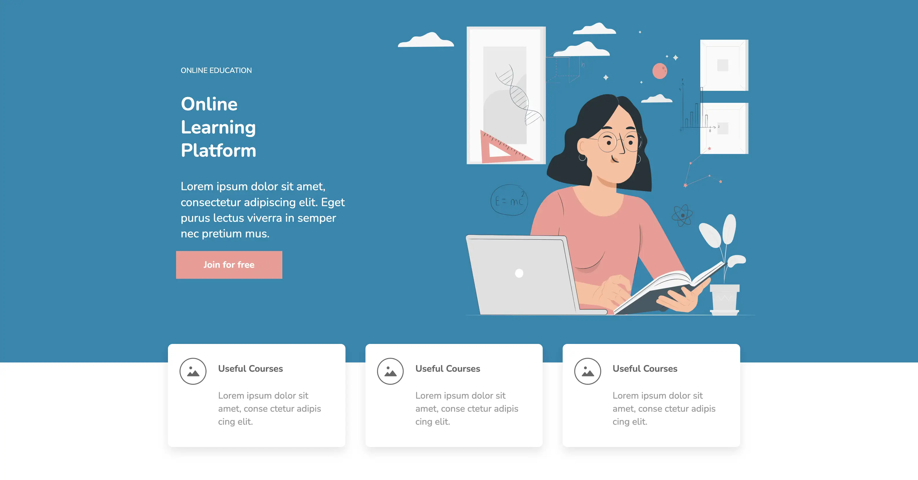
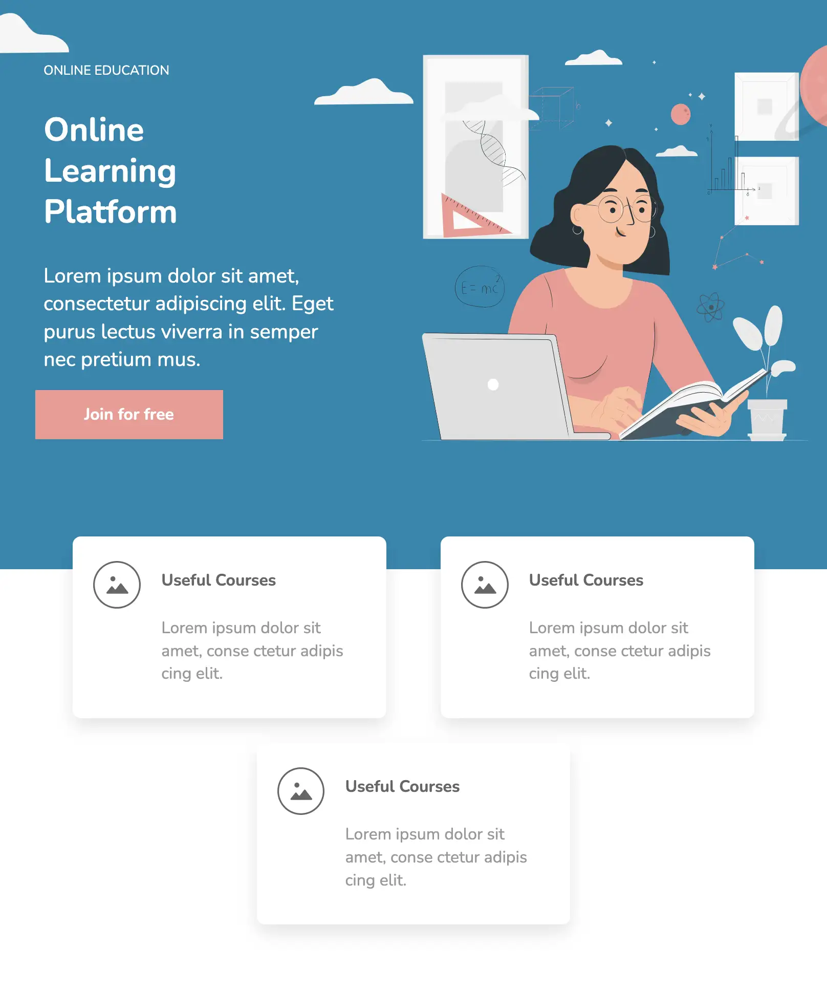

This design creates an informative user experience using a headline, subtext, an explainer image or an infographic, feature cards, and a catchy call-to-action. Services provided by the company are displayed on flex-based cards. They have rounded corners and a box shadow is applied to them, causing them to ‘pop out’. The cards are completely responsive and position themselves vertically as the screen width is reduced. This design is ideal for service companies and SaaS landing pages.
View Code
HTML
CSS
JS
Responsive CSS
Output

Useful Courses
Lorem ipsum dolor sit amet, conse ctetur adipis cing elit.
Useful Courses
Lorem ipsum dolor sit amet, conse ctetur adipis cing elit.
Useful Courses
Lorem ipsum dolor sit amet, conse ctetur adipis cing elit.
         .above_the_fold_ * {
    font-family: Nunito, sans-serif;
}

.above_the_fold_ .responsive-cell-block {
    min-height: 75px;
}

.above_the_fold_ .responsive-container-block {
    min-height: 75px;
    height: fit-content;
    width: 100%;
    display: flex;
    flex-wrap: wrap;
    margin-top: 0px;
    margin-right: auto;
    margin-bottom: 0px;
    margin-left: auto;
    justify-content: flex-start;
}

.above_the_fold_ a {
    text-decoration-line: none;
    text-decoration-thickness: initial;
    text-decoration-style: initial;
    text-decoration-color: initial;
    color: inherit;
}

.above_the_fold_ .text-blk {
    line-height: 25px;
    margin-top: 0px;
    margin-right: 0px;
    margin-bottom: 0px;
    margin-left: 0px;
}

.above_the_fold_ .responsive-container-block.big-container {
    background-color: #0087b1;
    position: relative;
    z-index: 0;
}

.above_the_fold_ .responsive-container-block.container {
    max-width: 1320px;
    min-height: 700px;
    margin-top: 0px;
    margin-right: auto;
    margin-bottom: 0px;
    margin-left: auto;
    flex-direction: column;
    align-items: flex-start;
    justify-content: center;
    color: white;
    padding-top: 10px;
    padding-right: 10px;
    padding-bottom: 80px;
    padding-left: 50px;
    padding: 80px 0 80px 50px;
}

.above_the_fold_ .planet-img {
    position: absolute;
    top: 20px;
    right: 0px;
}

.above_the_fold_ .half-cloud {
    position: absolute;
    left: 0px;
    top: 40px;
}

.above_the_fold_ .cloud {
    position: absolute;
    top: 140px;
    right: 35%;
}

.above_the_fold_ .cloud2 {
    position: absolute;
    bottom: 50px;
    right: 50%;
}

.above_the_fold_ .text-blk.section-subhead-text {
    max-width: 400px;
    font-size: 25px;
    line-height: 34px;
    margin-top: 0px;
    margin-right: 0px;
    margin-bottom: 10px;
    margin-left: 0px;
}

.above_the_fold_ .text-blk.section-head-text {
    font-size: 40px;
    line-height: 50px;
    margin-top: 0px;
    margin-right: 0px;
    margin-bottom: 16px;
    margin-left: 0px;
    font-weight: 700;
    max-width: 300px;
}

.above_the_fold_ .svg.planet-img {
    top: 60px;
}

.above_the_fold_ .text-blk.gigcase-head-text {
    margin-top: 0px;
    margin-right: 0px;
    margin-bottom: 15px;
    margin-left: 0px;
}

.above_the_fold_ .button {
    height: 60px;
    max-width: 250px;
    width: 100%;
    background-color: #f49892;
    font-size: 20px;
    font-weight: 700;
    color: white;
    border-top-width: 2px;
    border-right-width: 2px;
    border-bottom-width: 2px;
    border-left-width: 2px;
    border-top-style: none;
    border-right-style: none;
    border-bottom-style: none;
    border-left-style: none;
    border-top-color: #767676;
    border-right-color: #767676;
    border-bottom-color: #767676;
    border-left-color: #767676;
    border-image-source: initial;
    border-image-slice: initial;
    border-image-width: initial;
    border-image-outset: initial;
    border-image-repeat: initial;
    padding: 10px 60px 10px 60px;
}

.above_the_fold_ .svg.cloud2 {
    top: 120px;
}

.above_the_fold_ .responsive-container-block.card-container {
    max-width: 1380px;
    justify-content: space-evenly;
    z-index: 10;
    position: relative;
    margin-top: -40px;
    margin-right: auto;
    margin-bottom: 0px;
    margin-left: auto;
    padding-top: 0px;
    padding-right: 30px;
    padding-bottom: 0px;
    padding-left: 30px;
}

.above_the_fold_ .responsive-cell-block.wk-desk-4.wk-ipadp-4.wk-tab-6.wk-mobile-12 {
    display: block;
    width: 383px;
    margin-top: 0px;
    margin-right: 0px;
    margin-bottom: 30px;
    margin-left: 0px;
}

.above_the_fold_ .card {
    display: flex;
    padding-top: 30px;
    padding-right: 25px;
    padding-bottom: 30px;
    padding-left: 25px;
    align-items: flex-start;
    box-shadow: rgba(0, 0, 0, 0.1) 0px 10px 20px;
    border-top-left-radius: 10px;
    border-top-right-radius: 10px;
    border-bottom-right-radius: 10px;
    border-bottom-left-radius: 10px;
    background-color: white;
}

.above_the_fold_ .points-svg {
    margin-top: 0px;
    margin-right: 15px;
    margin-bottom: 0px;
    margin-left: 0px;
}

.above_the_fold_ .text-blk.card-head {
    font-size: 20px;
    font-weight: 700;
    line-height: 28px;
    color: #666666;
    margin-top: 0px;
    margin-right: 0px;
    margin-bottom: 10px;
    margin-left: 0px;
}

.above_the_fold_ .text-blk.card-subhead {
    color: #999999;
    font-size: 20px;
    line-height: 28px;
}

.above_the_fold_ .learning-img {
    width: 100%;
    height: 100%;
}

.above_the_fold_ .responsive-cell-block.wk-desk-6.wk-ipadp-6.wk-tab-12.wk-mobile-12.left {
    display: flex;
    flex-direction: column;
    align-items: flex-start;
    justify-content: center;
}

@media (max-width: 1024px) {
    .above_the_fold_ .responsive-container-block.container {
        padding-top: 10px;
        padding-right: 10px;
        padding-bottom: 80px;
        padding-left: 30px;
    }
}

@media (max-width: 768px) {
    .above_the_fold_ .responsive-container-block.container {
        padding-top: 0px;
        padding-right: 0px;
        padding-bottom: 0px;
        padding-left: 0px;
        justify-content: center;
        align-items: center;
        text-align: center;
    }

    .above_the_fold_ .svg {
        display: none;
    }

    .above_the_fold_ .responsive-container-block.big-container {
        padding-top: 0px;
        padding-right: 50px;
        padding-bottom: 0px;
        padding-left: 50px;
    }

    .above_the_fold_ .text-blk.section-subhead-text {
        margin-top: 0px;
        margin-right: 0px;
        margin-bottom: 25px;
        margin-left: 0px;
    }

    .above_the_fold_ .responsive-cell-block.wk-desk-6.wk-ipadp-6.wk-tab-12.wk-mobile-12 {
        display: none;
    }

    .above_the_fold_ .responsive-cell-block.wk-desk-6.wk-ipadp-6.wk-tab-12.wk-mobile-12.left {
        align-items: center;
    }
}

@media (max-width: 500px) {
    .above_the_fold_ .responsive-container-block.big-container {
        padding-top: 0px;
        padding-right: 20px;
        padding-bottom: 0px;
        padding-left: 20px;
    }
}
         @import url('https://fonts.googleapis.com/css2?family=Nunito:wght@200;300;400;600;700;800&display=swap');
                            *, *:before, *:after {
                            -moz-box-sizing: border-box;
                            -webkit-box-sizing: border-box;
                            box-sizing: border-box;
                            }
                            body {
                            margin: 0;
                            }
                            .wk-desk-1{
                            width: 8.333333%;
                            }
                            .wk-desk-2{
                            width: 16.666667%;
                            }
                            .wk-desk-3{
                            width: 25%;
                            }
                            .wk-desk-4{
                            width: 33.333333%;
                            }
                            .wk-desk-5{
                            width: 41.666667%;
                            }
                            .wk-desk-6{
                            width: 50%;
                            }
                            .wk-desk-7{
                            width: 58.333333%;
                            }
                            .wk-desk-8{
                            width: 66.666667%;
                            }
                            .wk-desk-9{
                            width: 75%;
                            }
                            .wk-desk-10{
                            width: 83.333333%;
                            }
                            .wk-desk-11{
                            width: 91.666667%;
                            }
                            .wk-desk-12{
                            width: 100%;
                            }
                            @media (max-width: 1024px) {
                            .wk-ipadp-1{
                            width: 8.333333%;
                            }
                            .wk-ipadp-2{
                            width: 16.666667%;
                            }
                            .wk-ipadp-3{
                            width: 25%;
                            }
                            .wk-ipadp-4{
                            width: 33.333333%;
                            }
                            .wk-ipadp-5{
                            width: 41.666667%;
                            }
                            .wk-ipadp-6{
                            width: 50%;
                            }
                            .wk-ipadp-7{
                            width: 58.333333%;
                            }
                            .wk-ipadp-8{
                            width: 66.666667%;
                            }
                            .wk-ipadp-9{
                            width: 75%;
                            }
                            .wk-ipadp-10{
                            width: 83.333333%;
                            }
                            .wk-ipadp-11{
                            width: 91.666667%;
                            }
                            .wk-ipadp-12{
                            width: 100%;
                            }
                            }
                            @media (max-width: 768px) {
                            .wk-tab-1{
                            width: 8.333333%;
                            }
                            .wk-tab-2{
                            width: 16.666667%;
                            }
                            .wk-tab-3{
                            width: 25%;
                            }
                            .wk-tab-4{
                            width: 33.333333%;
                            }
                            .wk-tab-5{
                            width: 41.666667%;
                            }
                            .wk-tab-6{
                            width: 50%;
                            }
                            .wk-tab-7{
                            width: 58.333333%;
                            }
                            .wk-tab-8{
                            width: 66.666667%;
                            }
                            .wk-tab-9{
                            width: 75%;
                            }
                            .wk-tab-10{
                            width: 83.333333%;
                            }
                            .wk-tab-11{
                            width: 91.666667%;
                            }
                            .wk-tab-12{
                            width: 100%;
                            }
                            }
                            @media (max-width: 500px) {
                            .wk-mobile-1{
                            width: 8.333333%;
                            }
                            .wk-mobile-2{
                            width: 16.666667%;
                            }
                            .wk-mobile-3{
                            width: 25%;
                            }
                            .wk-mobile-4{
                            width: 33.333333%;
                            }
                            .wk-mobile-5{
                            width: 41.666667%;
                            }
                            .wk-mobile-6{
                            width: 50%;
                            }
                            .wk-mobile-7{
                            width: 58.333333%;
                            }
                            .wk-mobile-8{
                            width: 66.666667%;
                            }
                            .wk-mobile-9{
                            width: 75%;
                            }
                            .wk-mobile-10{
                            width: 83.333333%;
                            }
                            .wk-mobile-11{
                            width: 91.666667%;
                            }
                            .wk-mobile-12{
                            width: 100%;
                            }
                            }
Reset
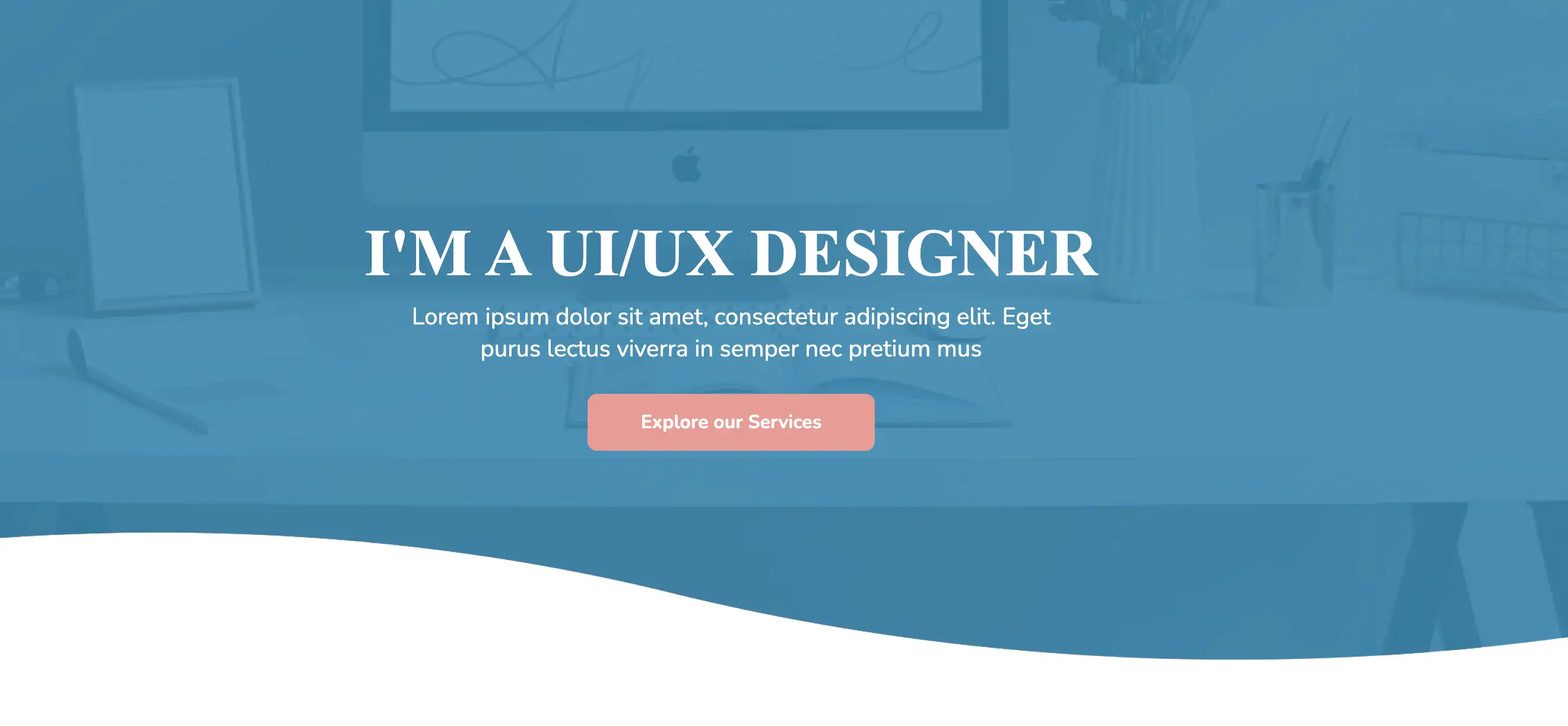
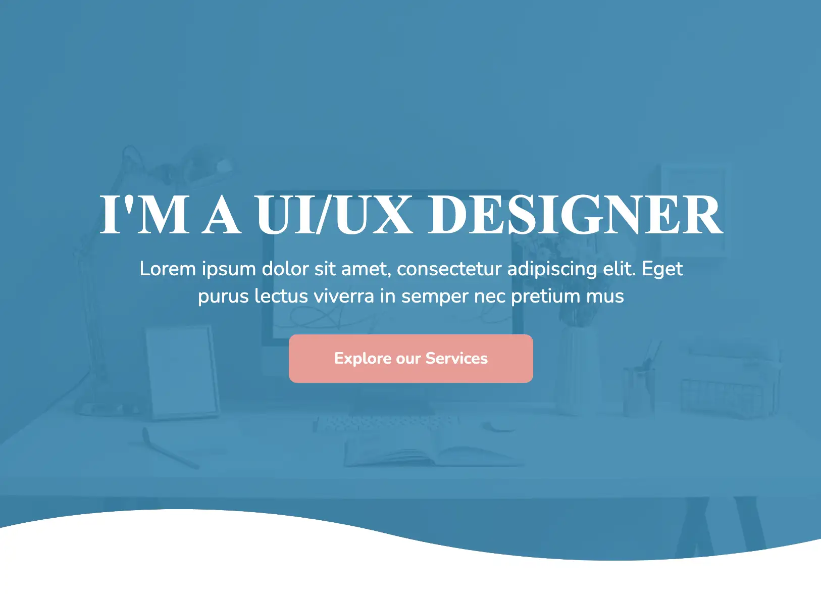
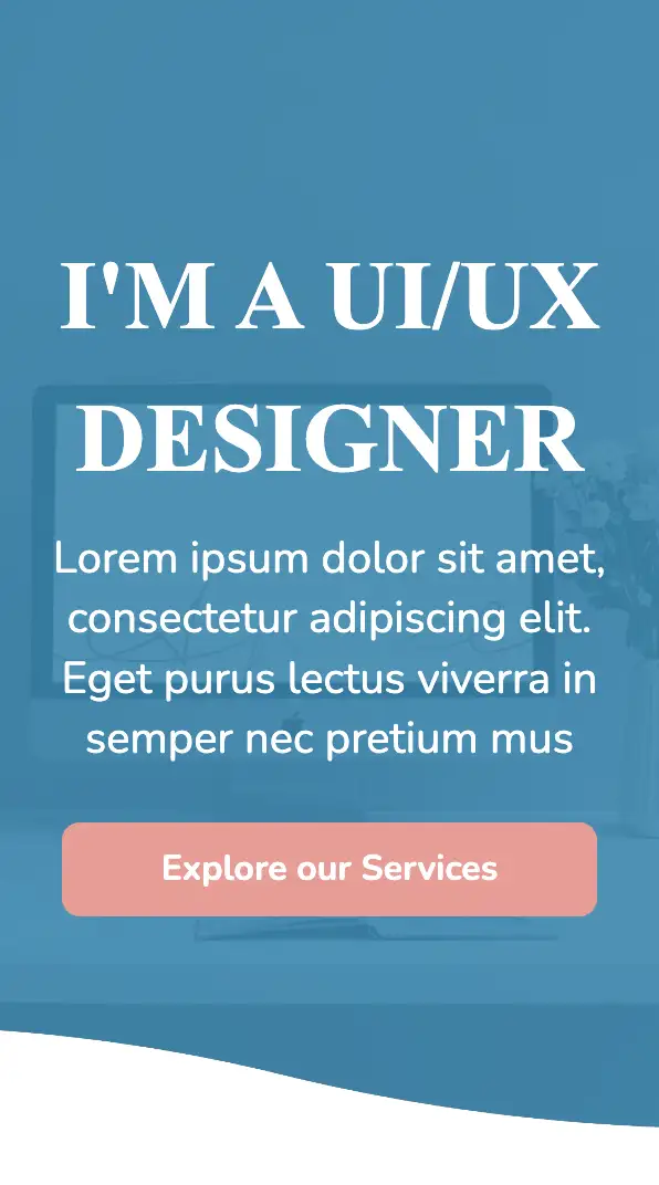
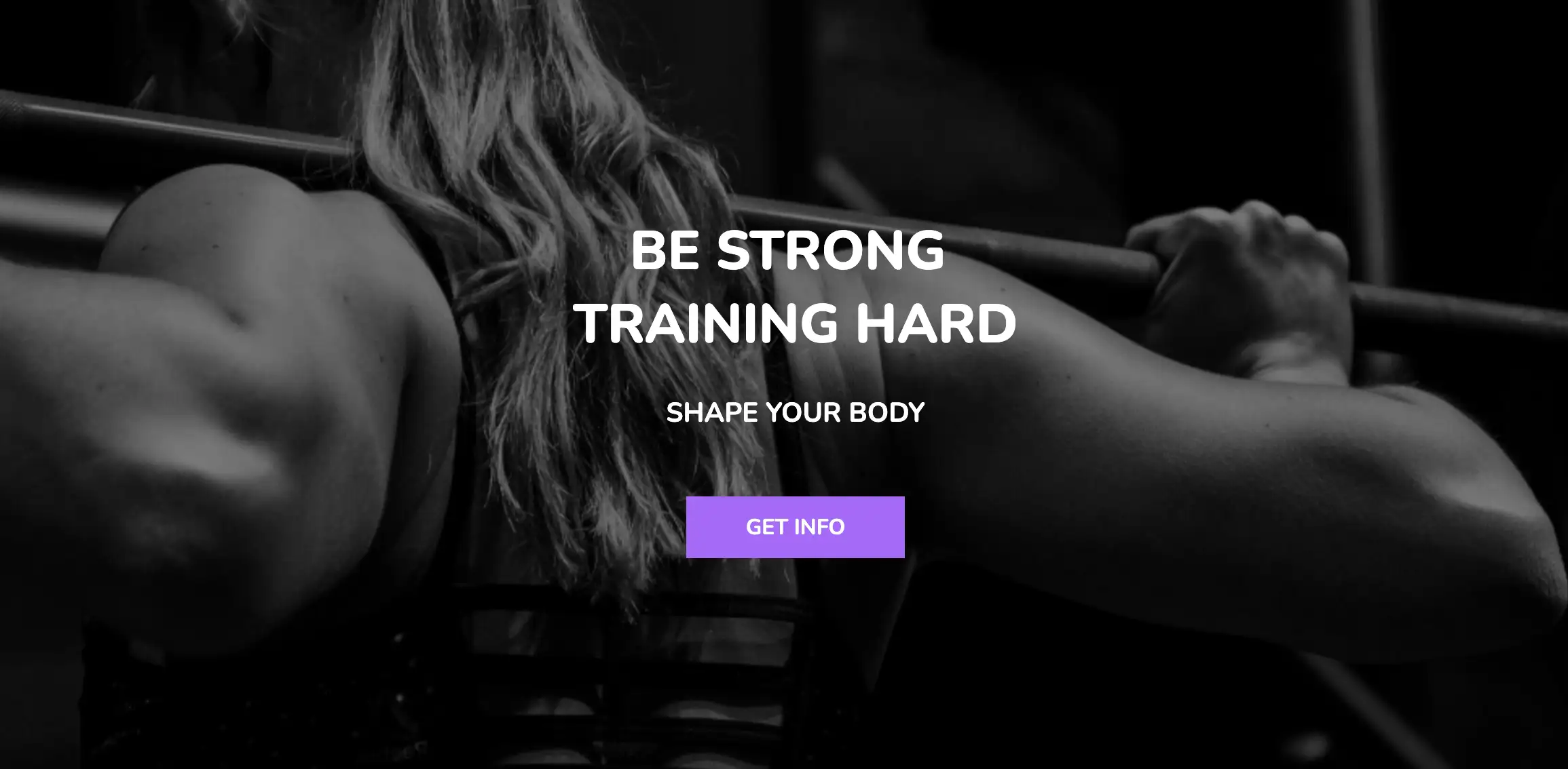
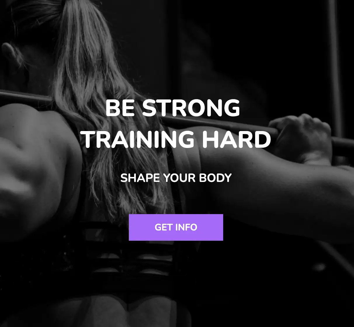
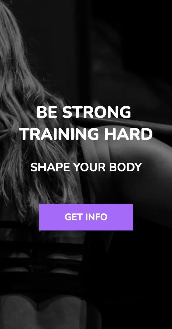
The distinguishing feature of the above design is the wavy pattern of its background. The background comprises an image and a blue overlay, imparting a rich feel to the design. The white text and contrasting CTA also strike a great balance with each other.
View Code
HTML
CSS
JS
Responsive CSS
Output
I'M A UI/UX DESIGNER
Lorem ipsum dolor sit amet, consectetur adipiscing elit. Eget purus lectus viverra in semper nec pretium mus
         .atf_40 * {
    font-family: Nunito, sans-serif;
}

.atf_40 .text-blk {
    margin-top: 0px;
    margin-right: 0px;
    margin-bottom: 0px;
    margin-left: 0px;
    padding-top: 10px;
    padding-right: 10px;
    padding-bottom: 10px;
    padding-left: 10px;
    line-height: 25px;
    opacity: 1;
}

.atf_40 .responsive-container-block {
    min-height: 75px;
    height: fit-content;
    width: 100%;
    padding-top: 10px;
    padding-right: 10px;
    padding-bottom: 10px;
    padding-left: 10px;
    display: flex;
    flex-wrap: wrap;
    margin-top: 0px;
    margin-right: auto;
    margin-bottom: 0px;
    margin-left: auto;
    justify-content: flex-start;
}

.atf_40 .responsive-container-block.bg {
    flex-direction: column;
    align-items: center;
    max-width: 1500px;
    opacity: 1;
    z-index: 1;
}

.atf_40 .text-blk.title {
    font-size: 70px;
    line-height: 80.49px;
    font-family: "Times New Roman", Times, serif;
    font-weight: 700;
    padding-top: 10px;
    padding-right: 10px;
    padding-bottom: 0px;
    padding-left: 10px;
    margin-top: 200px;
    margin-right: 0px;
    margin-bottom: 0px;
    margin-left: 0px;
    text-align: center;
    color: white;
}

.atf_40 .text-blk.heading {
    font-size: 25px;
    line-height: 34.1px;
    max-width: 700px;
    text-align: center;
    margin-top: 0px;
    margin-right: 0px;
    margin-bottom: 20px;
    margin-left: 0px;
    color: white;
}

.atf_40 .text-blk.button {
    margin-top: 0px;
    margin-right: 0px;
    margin-bottom: 200px;
    margin-left: 0px;
    width: 302px;
    font-size: 20px;
    line-height: 27.28px;
    text-align: center;
    font-weight: 700;
    background-color: #f49892;
    color: white;
    display: flex;
    cursor: pointer;
    opacity: 1;
    z-index: 2;
    border-top-left-radius: 10px;
    border-top-right-radius: 10px;
    border-bottom-right-radius: 10px;
    border-bottom-left-radius: 10px;
    height: 60px;
    justify-content: center;
    align-items: center;
}

.atf_40 .form-blk {
    margin-top: 0px;
    margin-right: 0px;
    margin-bottom: 0px;
    margin-left: 0px;
}

.atf_40 .responsive-container-block.blue {
    background-size: cover;
    background-position-x: 50%;
    background-position-y: 100%;
    margin-top: 0px;
    margin-right: 0px;
    margin-bottom: 0px;
    margin-left: 0px;
    background-image: url("https://workik-widget-assets.s3.amazonaws.com/widget-assets/images/P1.2.png");
    opacity: 0.9;
    position: absolute;
    width: 100%;
    height: 100%;
    z-index: -1;
    top: 0px;
    left: 0px;
}

.atf_40 .responsive-container-block.big-cont {
    position: relative;
    background-image: url("https://workik-widget-assets.s3.amazonaws.com/widget-assets/images/P1.1.png");
    background-size: cover;
    background-position-x: 50%;
    background-position-y: 100%;
    z-index: 1;
}

@media (max-width: 768px) {
    .atf_40 .text-blk.heading {
        width: 700px;
        max-width: 100%;
    }
}

@media (max-width: 500px) {
    .atf_40 .text-blk.title {
        font-size: 55px;
        margin-top: 100px;
        margin-right: 0px;
        margin-bottom: 0px;
        margin-left: 0px;
    }

    .atf_40 .text-blk.button {
        max-width: 100%;
        margin-top: 0px;
        margin-right: 0px;
        margin-bottom: 100px;
        margin-left: 0px;
    }

    .atf_40 .form-blk {
        max-width: 100%;
    }

    .atf_40 .text-blk.button {
        height: 53px;
    }
}
         @import url('https://fonts.googleapis.com/css2?family=Nunito:wght@200;300;400;600;700;800&display=swap');
                            *, *:before, *:after {
                            -moz-box-sizing: border-box;
                            -webkit-box-sizing: border-box;
                            box-sizing: border-box;
                            }
                            body {
                            margin: 0;
                            }
                            .wk-desk-1{
                            width: 8.333333%;
                            }
                            .wk-desk-2{
                            width: 16.666667%;
                            }
                            .wk-desk-3{
                            width: 25%;
                            }
                            .wk-desk-4{
                            width: 33.333333%;
                            }
                            .wk-desk-5{
                            width: 41.666667%;
                            }
                            .wk-desk-6{
                            width: 50%;
                            }
                            .wk-desk-7{
                            width: 58.333333%;
                            }
                            .wk-desk-8{
                            width: 66.666667%;
                            }
                            .wk-desk-9{
                            width: 75%;
                            }
                            .wk-desk-10{
                            width: 83.333333%;
                            }
                            .wk-desk-11{
                            width: 91.666667%;
                            }
                            .wk-desk-12{
                            width: 100%;
                            }
                            @media (max-width: 1024px) {
                            .wk-ipadp-1{
                            width: 8.333333%;
                            }
                            .wk-ipadp-2{
                            width: 16.666667%;
                            }
                            .wk-ipadp-3{
                            width: 25%;
                            }
                            .wk-ipadp-4{
                            width: 33.333333%;
                            }
                            .wk-ipadp-5{
                            width: 41.666667%;
                            }
                            .wk-ipadp-6{
                            width: 50%;
                            }
                            .wk-ipadp-7{
                            width: 58.333333%;
                            }
                            .wk-ipadp-8{
                            width: 66.666667%;
                            }
                            .wk-ipadp-9{
                            width: 75%;
                            }
                            .wk-ipadp-10{
                            width: 83.333333%;
                            }
                            .wk-ipadp-11{
                            width: 91.666667%;
                            }
                            .wk-ipadp-12{
                            width: 100%;
                            }
                            }
                            @media (max-width: 768px) {
                            .wk-tab-1{
                            width: 8.333333%;
                            }
                            .wk-tab-2{
                            width: 16.666667%;
                            }
                            .wk-tab-3{
                            width: 25%;
                            }
                            .wk-tab-4{
                            width: 33.333333%;
                            }
                            .wk-tab-5{
                            width: 41.666667%;
                            }
                            .wk-tab-6{
                            width: 50%;
                            }
                            .wk-tab-7{
                            width: 58.333333%;
                            }
                            .wk-tab-8{
                            width: 66.666667%;
                            }
                            .wk-tab-9{
                            width: 75%;
                            }
                            .wk-tab-10{
                            width: 83.333333%;
                            }
                            .wk-tab-11{
                            width: 91.666667%;
                            }
                            .wk-tab-12{
                            width: 100%;
                            }
                            }
                            @media (max-width: 500px) {
                            .wk-mobile-1{
                            width: 8.333333%;
                            }
                            .wk-mobile-2{
                            width: 16.666667%;
                            }
                            .wk-mobile-3{
                            width: 25%;
                            }
                            .wk-mobile-4{
                            width: 33.333333%;
                            }
                            .wk-mobile-5{
                            width: 41.666667%;
                            }
                            .wk-mobile-6{
                            width: 50%;
                            }
                            .wk-mobile-7{
                            width: 58.333333%;
                            }
                            .wk-mobile-8{
                            width: 66.666667%;
                            }
                            .wk-mobile-9{
                            width: 75%;
                            }
                            .wk-mobile-10{
                            width: 83.333333%;
                            }
                            .wk-mobile-11{
                            width: 91.666667%;
                            }
                            .wk-mobile-12{
                            width: 100%;
                            }
                            }
Reset
The above ATF is an extremely simple and neat template that can be incorporated into any webpage with ease. This homepage makes use of high-quality images, enabling visitors to visualize your services. The widget also includes a catchy headline and a vibrant clickable button.
View Code
HTML
CSS
JS
Responsive CSS
Output
         .section_1 * {
    font-family: Nunito, sans-serif;
}

.section_1 .responsive-container-block {
    min-height: 75px;
    height: fit-content;
    width: 100%;
    display: flex;
    flex-wrap: wrap;
    margin-top: 0px;
    margin-right: auto;
    margin-bottom: 0px;
    margin-left: auto;
    justify-content: flex-start;
}

.section_1 a {
    text-decoration-line: none;
    text-decoration-thickness: initial;
    text-decoration-style: initial;
    text-decoration-color: initial;
    color: inherit;
}

.section_1 .text-blk {
    margin-top: 0px;
    margin-right: 0px;
    margin-bottom: 0px;
    margin-left: 0px;
    line-height: 25px;
}

.section_1 .responsive-container-block.container {
    max-width: 1320px;
    min-height: 600px;
    flex-direction: column;
    justify-content: center;
    margin-top: 60px;
    margin-right: auto;
    margin-bottom: 60px;
    margin-left: auto;
    position: relative;
}

.section_1 .responsive-container-block.big-container {
    padding-top: 0px;
    padding-right: 50px;
    padding-bottom: 0px;
    padding-left: 50px;
    position: relative;
    background-color: black;
}

.section_1 .text-blk.section-title {
    font-size: 25px;
    font-weight: 700;
    line-height: 34px;
    margin-top: 0px;
    margin-right: 0px;
    margin-bottom: 5px;
    margin-left: 0px;
}

.section_1 .text-blk.section-headtext {
    font-size: 50px;
    line-height: 68px;
    font-weight: 800;
    margin-top: 0px;
    margin-right: 0px;
    margin-bottom: 10px;
    margin-left: 0px;
    margin: 0 0 0 0;
}

.section_1 .text-blk.section-subheadtext {
    font-size: 25px;
    line-height: 34px;
    max-width: 500px;
    margin-top: 0px;
    margin-right: 0px;
    margin-bottom: 50px;
    margin-left: 0px;
    font-weight: 700;
    margin: 10px 0 50px 0;
}

.section_1 .button {
    font-size: 20px;
    font-weight: 700;
    color: white;
    background-color: #b062ff;
    padding-top: 15px;
    padding-right: 55px;
    padding-bottom: 15px;
    padding-left: 55px;
    border-top-width: 2px;
    border-right-width: 2px;
    border-bottom-width: 2px;
    border-left-width: 2px;
    border-top-style: none;
    border-right-style: none;
    border-bottom-style: none;
    border-left-style: none;
    border-top-color: white;
    border-right-color: white;
    border-bottom-color: white;
    border-left-color: white;
    border-image-source: initial;
    border-image-slice: initial;
    border-image-width: initial;
    border-image-outset: initial;
    border-image-repeat: initial;
}

.section_1 .content-text {
    color: white;
    position: static;
    display: flex;
    flex-direction: column;
    align-items: center;
    text-align: center;
}

.section_1 .landing-img {
    position: absolute;
    width: 100%;
    opacity: 0.5;
    background-color: black;
    height: 100%;
    left: 0px;
    right: 0px;
    object-fit: cover;
}

.section_1 .swiper-container-horizontal>.swiper-pagination-bullets .swiper-pagination-bullet {
    margin-top: 0px;
    margin-right: 5px;
    margin-bottom: 0px;
    margin-left: 5px;
    height: 15px;
    width: 15px;
    border-top-left-radius: 0px;
    border-top-right-radius: 0px;
    border-bottom-right-radius: 0px;
    border-bottom-left-radius: 0px;
    background-image: initial;
    background-position-x: initial;
    background-position-y: initial;
    background-size: initial;
    background-repeat-x: initial;
    background-repeat-y: initial;
    background-attachment: initial;
    background-origin: initial;
    background-clip: initial;
    background-color: #d97a0b;
}

.section_1 .section-headtext {
    margin: 0 0 0 0;
}

@media (max-width: 768px) {
    .section_1 .text-blk.section-headtext {
        font-size: 40px;
        line-height: 55px;
    }
}

@media (max-width: 500px) {
    .section_1 .responsive-container-block.big-container {
        padding-top: 0px;
        padding-right: 20px;
        padding-bottom: 0px;
        padding-left: 20px;
    }

    .section_1 .responsive-container-block.container {
        text-align: center;
    }

    .section_1 .text-blk.section-headtext {
        font-size: 35px;
        line-height: 47px;
    }
}
         @import url('https://fonts.googleapis.com/css2?family=Nunito:wght@200;300;400;600;700;800&display=swap');
                            *, *:before, *:after {
                            -moz-box-sizing: border-box;
                            -webkit-box-sizing: border-box;
                            box-sizing: border-box;
                            }
                            body {
                            margin: 0;
                            }
                            .wk-desk-1{
                            width: 8.333333%;
                            }
                            .wk-desk-2{
                            width: 16.666667%;
                            }
                            .wk-desk-3{
                            width: 25%;
                            }
                            .wk-desk-4{
                            width: 33.333333%;
                            }
                            .wk-desk-5{
                            width: 41.666667%;
                            }
                            .wk-desk-6{
                            width: 50%;
                            }
                            .wk-desk-7{
                            width: 58.333333%;
                            }
                            .wk-desk-8{
                            width: 66.666667%;
                            }
                            .wk-desk-9{
                            width: 75%;
                            }
                            .wk-desk-10{
                            width: 83.333333%;
                            }
                            .wk-desk-11{
                            width: 91.666667%;
                            }
                            .wk-desk-12{
                            width: 100%;
                            }
                            @media (max-width: 1024px) {
                            .wk-ipadp-1{
                            width: 8.333333%;
                            }
                            .wk-ipadp-2{
                            width: 16.666667%;
                            }
                            .wk-ipadp-3{
                            width: 25%;
                            }
                            .wk-ipadp-4{
                            width: 33.333333%;
                            }
                            .wk-ipadp-5{
                            width: 41.666667%;
                            }
                            .wk-ipadp-6{
                            width: 50%;
                            }
                            .wk-ipadp-7{
                            width: 58.333333%;
                            }
                            .wk-ipadp-8{
                            width: 66.666667%;
                            }
                            .wk-ipadp-9{
                            width: 75%;
                            }
                            .wk-ipadp-10{
                            width: 83.333333%;
                            }
                            .wk-ipadp-11{
                            width: 91.666667%;
                            }
                            .wk-ipadp-12{
                            width: 100%;
                            }
                            }
                            @media (max-width: 768px) {
                            .wk-tab-1{
                            width: 8.333333%;
                            }
                            .wk-tab-2{
                            width: 16.666667%;
                            }
                            .wk-tab-3{
                            width: 25%;
                            }
                            .wk-tab-4{
                            width: 33.333333%;
                            }
                            .wk-tab-5{
                            width: 41.666667%;
                            }
                            .wk-tab-6{
                            width: 50%;
                            }
                            .wk-tab-7{
                            width: 58.333333%;
                            }
                            .wk-tab-8{
                            width: 66.666667%;
                            }
                            .wk-tab-9{
                            width: 75%;
                            }
                            .wk-tab-10{
                            width: 83.333333%;
                            }
                            .wk-tab-11{
                            width: 91.666667%;
                            }
                            .wk-tab-12{
                            width: 100%;
                            }
                            }
                            @media (max-width: 500px) {
                            .wk-mobile-1{
                            width: 8.333333%;
                            }
                            .wk-mobile-2{
                            width: 16.666667%;
                            }
                            .wk-mobile-3{
                            width: 25%;
                            }
                            .wk-mobile-4{
                            width: 33.333333%;
                            }
                            .wk-mobile-5{
                            width: 41.666667%;
                            }
                            .wk-mobile-6{
                            width: 50%;
                            }
                            .wk-mobile-7{
                            width: 58.333333%;
                            }
                            .wk-mobile-8{
                            width: 66.666667%;
                            }
                            .wk-mobile-9{
                            width: 75%;
                            }
                            .wk-mobile-10{
                            width: 83.333333%;
                            }
                            .wk-mobile-11{
                            width: 91.666667%;
                            }
                            .wk-mobile-12{
                            width: 100%;
                            }
                            }
Reset
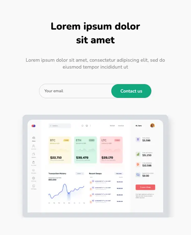
This top section has a split-screen layout and is completely responsive. The left section incorporates an email capture form to gather leads, whereas the right includes an attractive image. This page is a perfect fit for SaaS companies as well as firms providing digital services. The image is clipped/cropped on desktop screens, gradually expanding to full width on smaller devices.
View Code
HTML
CSS
JS
Responsive CSS
Output
Lorem ipsum dolor
sit amet
Lorem ipsum dolor sit amet, consectetur adipiscing elit, sed do eiusmod tempor incididunt ut
         .landing_section_1 * {
    font-family: Nunito, sans-serif;
}

.landing_section_1 .text-blk {
    margin-top: 0px;
    margin-right: 0px;
    margin-bottom: 0px;
    margin-left: 0px;
    line-height: 25px;
}

.landing_section_1 input:focus {
    outline-color: initial;
    outline-style: none;
    outline-width: initial;
}

.landing_section_1 .responsive-container-block {
    min-height: 75px;
    height: fit-content;
    width: 100%;
    display: flex;
    flex-wrap: wrap;
    margin-top: 0px;
    margin-right: auto;
    margin-bottom: 0px;
    margin-left: auto;
    justify-content: flex-start;
}

.landing_section_1 .responsive-cell-block {
    min-height: 75px;
}

.landing_section_1 .responsive-container-block.container {
    max-width: 1320px;
    margin-top: 80px;
    margin-right: auto;
    margin-bottom: 80px;
    margin-left: auto;
}

.landing_section_1 .responsive-cell-block.wk-desk-6.wk-ipadp-6.wk-tab-12.wk-mobile-12 {
    padding-top: 0px;
    padding-right: 0px;
    padding-bottom: 0px;
    padding-left: 0px;
    display: flex;
    justify-content: flex-end;
    overflow-x: hidden;
}

.landing_section_1 .responsive-container-block.big-container {
    padding-top: 0px;
    padding-right: 50px;
    padding-bottom: 0px;
    padding-left: 50px;
    background-color: #fafafa;
}

.landing_section_1 .text-blk.section-headtext {
    font-size: 45px;
    line-height: 55px;
    font-weight: 800;
    color: #060606;
    margin-top: 0px;
    margin-right: 0px;
    margin-bottom: 10px;
    margin-left: 0px;
}

.landing_section_1 .text-blk.section-subheadtext {
    font-size: 20px;
    line-height: 27px;
    color: #9f9f9f;
    max-width: 400px;
    margin-top: 0px;
    margin-right: 0px;
    margin-bottom: 44px;
    margin-left: 0px;
}

.landing_section_1 .input {
    border-top-width: 2px;
    border-right-width: 2px;
    border-bottom-width: 2px;
    border-left-width: 2px;
    border-top-style: none;
    border-right-style: none;
    border-bottom-style: none;
    border-left-style: none;
    border-top-color: #767676;
    border-right-color: #767676;
    border-bottom-color: #767676;
    border-left-color: #767676;
    border-image-source: initial;
    border-image-slice: initial;
    border-image-width: initial;
    border-image-outset: initial;
    border-image-repeat: initial;
    height: 55px;
    width: 90%;
    font-size: 16px;
    padding-top: 1px;
    padding-right: 2px;
    padding-bottom: 1px;
    padding-left: 20px;
    border-top-left-radius: 28px;
    border-top-right-radius: 28px;
    border-bottom-right-radius: 28px;
    border-bottom-left-radius: 28px;
    background-color: #fafafa;
}

.landing_section_1 .button {
    height: 55px;
    width: 50%;
    border-top-left-radius: 28px;
    border-top-right-radius: 28px;
    border-bottom-right-radius: 28px;
    border-bottom-left-radius: 28px;
    border-top-width: 2px;
    border-right-width: 2px;
    border-bottom-width: 2px;
    border-left-width: 2px;
    border-top-style: none;
    border-right-style: none;
    border-bottom-style: none;
    border-left-style: none;
    border-top-color: #767676;
    border-right-color: #767676;
    border-bottom-color: #767676;
    border-left-color: #767676;
    border-image-source: initial;
    border-image-slice: initial;
    border-image-width: initial;
    border-image-outset: initial;
    border-image-repeat: initial;
    background-color: #00b289;
    font-size: 18px;
    font-weight: 600;
    color: white;
    cursor: pointer;
}

.landing_section_1 .form {
    display: flex;
    max-width: 440px;
    border-top-width: 1px;
    border-right-width: 1px;
    border-bottom-width: 1px;
    border-left-width: 1px;
    border-top-style: solid;
    border-right-style: solid;
    border-bottom-style: solid;
    border-left-style: solid;
    border-top-color: lightgray;
    border-right-color: lightgray;
    border-bottom-color: lightgray;
    border-left-color: lightgray;
    border-image-source: initial;
    border-image-slice: initial;
    border-image-width: initial;
    border-image-outset: initial;
    border-image-repeat: initial;
    border-top-left-radius: 28px;
    border-top-right-radius: 28px;
    border-bottom-right-radius: 28px;
    border-bottom-left-radius: 28px;
    width: 100%;
}

.landing_section_1 .responsive-cell-block.wk-desk-6.wk-ipadp-6.wk-tab-12.wk-mobile-12.left-one {
    display: flex;
    flex-direction: column;
    justify-content: center;
    padding-top: 0px;
    padding-right: 20px;
    padding-bottom: 0px;
    padding-left: 8%;
}

.landing_section_1 .img-card {
    width: 90%;
    height: 100%;
    background-color: #dee1e7;
    min-height: 598px;
    box-shadow: rgba(0, 0, 0, 0.16) 6px 12px 24px;
    border-top-left-radius: 15px;
    border-top-right-radius: 15px;
    border-bottom-right-radius: 15px;
    border-bottom-left-radius: 15px;
    position: relative;
    right: -76px;
    padding-top: 30px;
    padding-right: 20px;
    padding-bottom: 30px;
    padding-left: 30px;
}

.landing_section_1 .img {
    width: 150%;
    height: 100%;
}

.landing_section_1 .responsive-cell-block.wk-desk-6.wk-tab-12.wk-mobile-12.left-one.wk-ipadp-12 {
    display: flex;
    flex-direction: column;
    justify-content: center;
}

.landing_section_1 .responsive-cell-block.wk-desk-6.wk-tab-12.wk-mobile-12.wk-ipadp-12 {
    overflow-x: hidden;
}

@media (max-width: 1024px) {
    .landing_section_1 .responsive-cell-block.wk-desk-6.wk-ipadp-6.wk-tab-12.wk-mobile-12.left-one {
        padding-top: 0px;
        padding-right: 20px;
        padding-bottom: 0px;
        padding-left: 4%;
    }

    .landing_section_1 .button {
        min-width: 139px;
    }

    .landing_section_1 .responsive-cell-block.wk-desk-6.wk-tab-12.wk-mobile-12.left-one.wk-ipadp-12 {
        align-items: center;
        text-align: center;
        margin-top: 0px;
        margin-right: 0px;
        margin-bottom: 50px;
        margin-left: 0px;
    }

    .landing_section_1 .img {
        width: 100%;
    }

    .landing_section_1 .img-card {
        padding-top: 30px;
        padding-right: 30px;
        padding-bottom: 30px;
        padding-left: 30px;
        right: 0px;
        left: 0px;
    }

    .landing_section_1 .responsive-cell-block.wk-desk-6.wk-tab-12.wk-mobile-12.wk-ipadp-12 {
        display: flex;
        justify-content: center;
    }

    .landing_section_1 .text-blk.section-subheadtext {
        max-width: 750px;
    }
}

@media (max-width: 768px) {
    .landing_section_1 .responsive-cell-block.wk-desk-6.wk-ipadp-6.wk-tab-12.wk-mobile-12.left-one {
        padding-top: 0px;
        padding-right: 0px;
        padding-bottom: 0px;
        padding-left: 0px;
        align-items: center;
        text-align: center;
    }

    .landing_section_1 .form {
        max-width: 450px;
        width: 100%;
    }

    .landing_section_1 .text-blk.section-headtext {
        font-size: 40px;
    }

    .landing_section_1 .text-blk.section-subheadtext {
        font-size: 20px;
    }

    .landing_section_1 .img-card {
        min-height: auto;
        position: static;
    }

    .landing_section_1 .text-blk.section-headtext {
        margin-top: 0px;
        margin-right: 0px;
        margin-bottom: 20px;
        margin-left: 0px;
    }

    .landing_section_1 .responsive-cell-block.wk-desk-6.wk-ipadp-6.wk-tab-12.wk-mobile-12 {
        justify-content: center;
    }

    .landing_section_1 .img-card {
        padding-top: 20px;
        padding-right: 20px;
        padding-bottom: 20px;
        padding-left: 20px;
    }
}

@media (max-width: 500px) {
    .landing_section_1 .text-blk.section-headtext {
        font-size: 30px;
        line-height: 35px;
    }

    .landing_section_1 .text-blk.section-subheadtext {
        font-size: 16px;
        line-height: 22px;
    }

    .landing_section_1 .responsive-container-block.big-container {
        padding-top: 0px;
        padding-right: 20px;
        padding-bottom: 0px;
        padding-left: 20px;
    }

    .landing_section_1 .input {
        border-top-left-radius: 30px;
        border-top-right-radius: 30px;
        border-bottom-right-radius: 30px;
        border-bottom-left-radius: 30px;
    }

    .landing_section_1 .form {
        max-width: 100%;
        width: 100%;
    }

    .landing_section_1 .form {
        width: 90%;
    }

    .landing_section_1 .input {
        height: 33px;
    }

    .landing_section_1 .button {
        height: 33px;
        min-width: auto;
    }

    .landing_section_1 .text-blk.section-subheadtext {
        font-size: 18px;
        line-height: 25px;
    }

    .landing_section_1 .responsive-cell-block.wk-desk-6.wk-ipadp-6.wk-tab-12.wk-mobile-12.left-one {
        margin-top: 0px;
        margin-right: 0px;
        margin-bottom: 50px;
        margin-left: 0px;
    }

    .landing_section_1 .input {
        height: 40px;
        font-size: 14px;
    }

    .landing_section_1 .button {
        height: 40px;
        font-size: 16px;
    }

    .landing_section_1 .responsive-cell-block.wk-desk-6.wk-tab-12.wk-mobile-12.left-one.wk-ipadp-12 {
        margin-top: 0px;
        margin-right: 0px;
        margin-bottom: 30px;
        margin-left: 0px;
    }

    .landing_section_1 .img-card {
        padding-top: 10px;
        padding-right: 10px;
        padding-bottom: 10px;
        padding-left: 10px;
        width: 100%;
    }
}
         @import url('https://fonts.googleapis.com/css2?family=Nunito:wght@200;300;400;600;700;800&display=swap');
                            *, *:before, *:after {
                            -moz-box-sizing: border-box;
                            -webkit-box-sizing: border-box;
                            box-sizing: border-box;
                            }
                            body {
                            margin: 0;
                            }
                            .wk-desk-1{
                            width: 8.333333%;
                            }
                            .wk-desk-2{
                            width: 16.666667%;
                            }
                            .wk-desk-3{
                            width: 25%;
                            }
                            .wk-desk-4{
                            width: 33.333333%;
                            }
                            .wk-desk-5{
                            width: 41.666667%;
                            }
                            .wk-desk-6{
                            width: 50%;
                            }
                            .wk-desk-7{
                            width: 58.333333%;
                            }
                            .wk-desk-8{
                            width: 66.666667%;
                            }
                            .wk-desk-9{
                            width: 75%;
                            }
                            .wk-desk-10{
                            width: 83.333333%;
                            }
                            .wk-desk-11{
                            width: 91.666667%;
                            }
                            .wk-desk-12{
                            width: 100%;
                            }
                            @media (max-width: 1024px) {
                            .wk-ipadp-1{
                            width: 8.333333%;
                            }
                            .wk-ipadp-2{
                            width: 16.666667%;
                            }
                            .wk-ipadp-3{
                            width: 25%;
                            }
                            .wk-ipadp-4{
                            width: 33.333333%;
                            }
                            .wk-ipadp-5{
                            width: 41.666667%;
                            }
                            .wk-ipadp-6{
                            width: 50%;
                            }
                            .wk-ipadp-7{
                            width: 58.333333%;
                            }
                            .wk-ipadp-8{
                            width: 66.666667%;
                            }
                            .wk-ipadp-9{
                            width: 75%;
                            }
                            .wk-ipadp-10{
                            width: 83.333333%;
                            }
                            .wk-ipadp-11{
                            width: 91.666667%;
                            }
                            .wk-ipadp-12{
                            width: 100%;
                            }
                            }
                            @media (max-width: 768px) {
                            .wk-tab-1{
                            width: 8.333333%;
                            }
                            .wk-tab-2{
                            width: 16.666667%;
                            }
                            .wk-tab-3{
                            width: 25%;
                            }
                            .wk-tab-4{
                            width: 33.333333%;
                            }
                            .wk-tab-5{
                            width: 41.666667%;
                            }
                            .wk-tab-6{
                            width: 50%;
                            }
                            .wk-tab-7{
                            width: 58.333333%;
                            }
                            .wk-tab-8{
                            width: 66.666667%;
                            }
                            .wk-tab-9{
                            width: 75%;
                            }
                            .wk-tab-10{
                            width: 83.333333%;
                            }
                            .wk-tab-11{
                            width: 91.666667%;
                            }
                            .wk-tab-12{
                            width: 100%;
                            }
                            }
                            @media (max-width: 500px) {
                            .wk-mobile-1{
                            width: 8.333333%;
                            }
                            .wk-mobile-2{
                            width: 16.666667%;
                            }
                            .wk-mobile-3{
                            width: 25%;
                            }
                            .wk-mobile-4{
                            width: 33.333333%;
                            }
                            .wk-mobile-5{
                            width: 41.666667%;
                            }
                            .wk-mobile-6{
                            width: 50%;
                            }
                            .wk-mobile-7{
                            width: 58.333333%;
                            }
                            .wk-mobile-8{
                            width: 66.666667%;
                            }
                            .wk-mobile-9{
                            width: 75%;
                            }
                            .wk-mobile-10{
                            width: 83.333333%;
                            }
                            .wk-mobile-11{
                            width: 91.666667%;
                            }
                            .wk-mobile-12{
                            width: 100%;
                            }
                            }
Reset
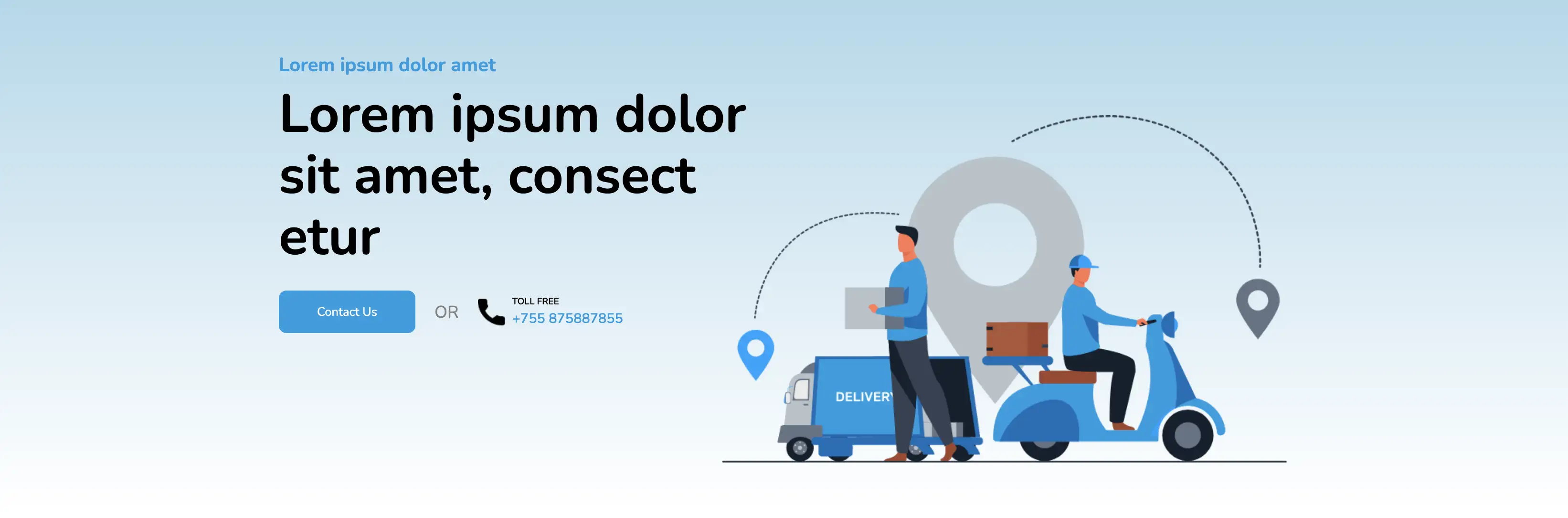
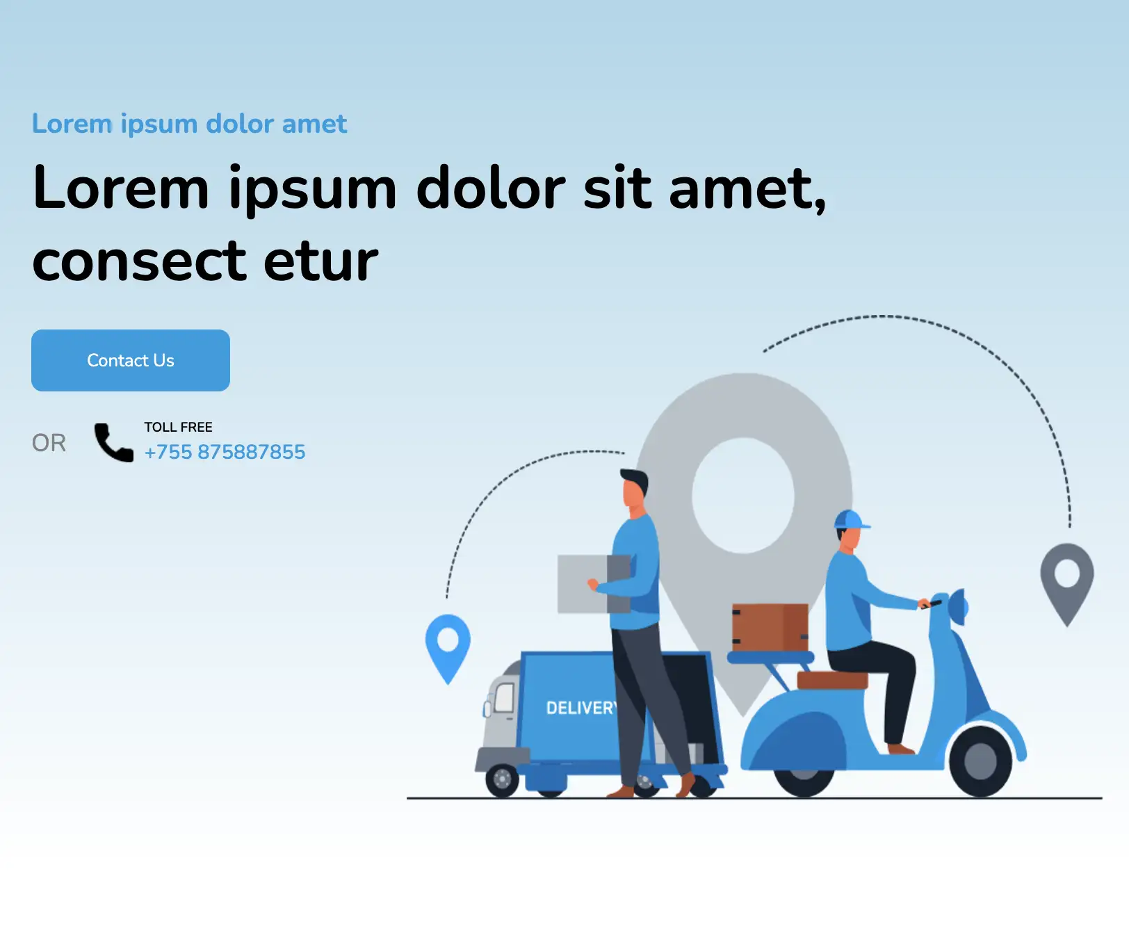
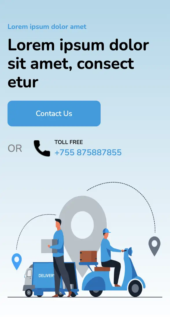
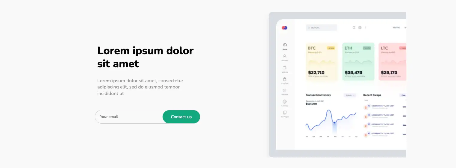
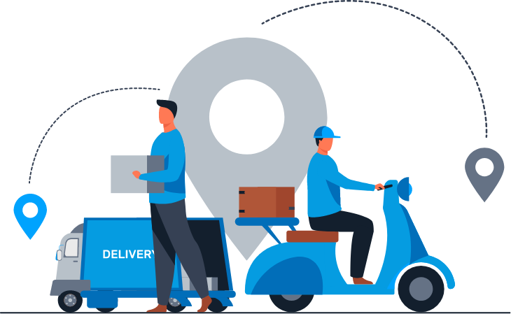
This widget incorporates a light blue background with a linear color gradient. A high-resolution infographic is effectively used to convey the services provided. The design ideal for service companies provides a contact form and a toll-free number for contact purposes in case of any service-related queries.
View Code
HTML
CSS
JS
Responsive CSS
Output
              Lorem ipsum dolor amet


              Lorem ipsum dolor sit amet, consect etur


               Contact Us


                OR


                  TOLL FREE


                   +755 875887855
         .top * {
    font-family: Nunito, sans-serif;
}

.top .text-blk {
    line-height: 25px;
    padding-top: 0px;
    padding-right: 0px;
    padding-bottom: 0px;
    padding-left: 0px;
    margin-top: 0px;
    margin-right: 0px;
    margin-bottom: 0px;
    margin-left: 0px;
}

.top a {
    text-decoration-line: none;
}

.top .responsive-container-block {
    min-height: 75px;
    height: fit-content;
    width: 100%;
    padding-top: 10px;
    padding-right: 10px;
    padding-bottom: 10px;
    padding-left: 10px;
    display: flex;
    flex-wrap: wrap;
    margin-top: 0px;
    margin-right: auto;
    margin-bottom: 0px;
    margin-left: auto;
    justify-content: flex-start;
}

.top .responsive-container-block.bigContainer {
    padding-top: 10px;
    padding-right: 30px;
    padding-bottom: 10px;
    padding-left: 30px;
    background-image: linear-gradient(#a9d6ea, rgba(230, 243, 249, 0));
    background-position-x: initial;
    background-position-y: initial;
    background-size: initial;
    background-repeat-x: initial;
    background-repeat-y: initial;
    background-attachment: initial;
    background-origin: initial;
    background-clip: initial;
    background-color: initial;
}

.top .responsive-container-block.Container {
    max-width: 1320px;
    margin-top: 100px;
    margin-right: auto;
    margin-bottom: 50px;
    margin-left: auto;
    position: relative;
    padding-top: 0px;
    padding-right: 0px;
    padding-bottom: 170px;
    padding-left: 0px;
}

.top .text-blk.heading {
    font-size: 25px;
    line-height: 30px;
    color: #059ce1;
    font-weight: 700;
    margin-top: 0px;
    margin-right: 0px;
    margin-bottom: 10px;
    margin-left: 0px;
}

.top .text-blk.subHeading {
    font-size: 70px;
    line-height: 80px;
    font-weight: 700;
    margin-top: 0px;
    margin-right: 0px;
    margin-bottom: 30px;
    margin-left: 0px;
}

.top .leftSide {
    width: 50%;
    z-index: 50;
}

.top .contactUs {
    margin-top: 0px;
    margin-right: 0px;
    margin-bottom: 0px;
    margin-left: 0px;
    padding-top: 17px;
    padding-right: 50px;
    padding-bottom: 17px;
    padding-left: 50px;
    color: white;
    background-color: #059ce1;
    border-top-left-radius: 10px;
    border-top-right-radius: 10px;
    border-bottom-right-radius: 10px;
    border-bottom-left-radius: 10px;
}

.top .contactUs:hover {
    background-image: initial;
    background-position-x: initial;
    background-position-y: initial;
    background-size: initial;
    background-repeat-x: initial;
    background-repeat-y: initial;
    background-attachment: initial;
    background-origin: initial;
    background-clip: initial;
    background-color: #05baf5;
}

.top .text-blk.orBetween {
    font-size: 22px;
    color: #818181;
    margin-top: 0px;
    margin-right: 25px;
    margin-bottom: 0px;
    margin-left: 25px;
}

.top .text-blk.tollFree {
    font-size: 12px;
    line-height: 16px;
    font-weight: 600;
    margin-top: 0px;
    margin-right: 0px;
    margin-bottom: 2px;
    margin-left: 0px;
}

.top .text-blk.phoneNumber {
    font-size: 18px;
    line-height: 24px;
    font-weight: 600;
    color: #059ce1;
}

.top .lastRow {
    display: flex;
    align-items: center;
    justify-content: flex-start;
    padding-top: 0px;
    padding-right: 0px;
    padding-bottom: 0px;
    padding-left: 0px;
}

.top .phoneBlock {
    display: flex;
    flex-direction: row;
    align-items: center;
    justify-content: center;
}

.top .icon {
    margin-top: 0px;
    margin-right: 10px;
    margin-bottom: 0px;
    margin-left: 0px;
    width: 35px;
    height: 35px;
}

.top .phoneDetails {
    display: flex;
    flex-direction: column;
    align-items: flex-start;
    justify-content: center;
}

.top .mainImg {
    width: 56%;
    height: 85%;
    position: absolute;
    right: 0px;
    bottom: 0px;
}

.top .afterOR {
    display: flex;
    flex-direction: row;
    justify-content: center;
    align-items: center;
}

@media (max-width: 1024px) {
    .top .text-blk.subHeading {
        font-size: 55px;
        line-height: 65px;
    }

    .top .contactUs {
        margin: 0 0 25px 0;
    }

    .top .lastRow {
        flex-direction: column;
        align-items: flex-start;
    }

    .top .text-blk.orBetween {
        margin: 0 25px 0 0;
    }

    .top .leftSide {
        width: 80%;
    }

    .top .responsive-container-block.Container {
        padding: 0 0 300px 0;
    }

    .top .mainImg {
        height: 70%;
        width: 65%;
    }
}

@media (max-width: 768px) {
    .top .mainImg {
        position: static;
        height: 350px;
        width: 80%;
    }

    .top .responsive-container-block.Container {
        padding: 0 0 0 0;
        flex-direction: column;
        align-items: center;
        justify-content: center;
        margin: 50px 0 50px 0;
    }

    .top .leftSide {
        width: 100%;
        margin: 0 0 50px 0;
    }

    .top .text-blk.subHeading {
        font-size: 47px;
        line-height: 60px;
    }
}

@media (max-width: 500px) {
    .top .text-blk.orBetween {
        margin: 10px 25px 10px 0;
    }

    .top .responsive-container-block.bigContainer {
        padding: 10px 20px 10px 20px;
    }

    .top .text-blk.heading {
        font-size: 15px;
        line-height: 20px;
    }

    .top .text-blk.subHeading {
        font-size: 35px;
        line-height: 40px;
        margin: 0 0 20px 0;
    }

    .top .leftSide {
        width: 100%;
    }

    .top .contactUs {
        padding: 17px 0 17px 0;
        width: 60%;
        text-align: center;
    }

    .top .afterOR {
        flex-wrap: wrap;
    }

    .top .mainImg {
        width: 100%;
        height: 250px;
    }
}
         @import url('https://fonts.googleapis.com/css2?family=Nunito:wght@200;300;400;600;700;800&display=swap');
                            *, *:before, *:after {
                            -moz-box-sizing: border-box;
                            -webkit-box-sizing: border-box;
                            box-sizing: border-box;
                            }
                            body {
                            margin: 0;
                            }
                            .wk-desk-1{
                            width: 8.333333%;
                            }
                            .wk-desk-2{
                            width: 16.666667%;
                            }
                            .wk-desk-3{
                            width: 25%;
                            }
                            .wk-desk-4{
                            width: 33.333333%;
                            }
                            .wk-desk-5{
                            width: 41.666667%;
                            }
                            .wk-desk-6{
                            width: 50%;
                            }
                            .wk-desk-7{
                            width: 58.333333%;
                            }
                            .wk-desk-8{
                            width: 66.666667%;
                            }
                            .wk-desk-9{
                            width: 75%;
                            }
                            .wk-desk-10{
                            width: 83.333333%;
                            }
                            .wk-desk-11{
                            width: 91.666667%;
                            }
                            .wk-desk-12{
                            width: 100%;
                            }
                            @media (max-width: 1024px) {
                            .wk-ipadp-1{
                            width: 8.333333%;
                            }
                            .wk-ipadp-2{
                            width: 16.666667%;
                            }
                            .wk-ipadp-3{
                            width: 25%;
                            }
                            .wk-ipadp-4{
                            width: 33.333333%;
                            }
                            .wk-ipadp-5{
                            width: 41.666667%;
                            }
                            .wk-ipadp-6{
                            width: 50%;
                            }
                            .wk-ipadp-7{
                            width: 58.333333%;
                            }
                            .wk-ipadp-8{
                            width: 66.666667%;
                            }
                            .wk-ipadp-9{
                            width: 75%;
                            }
                            .wk-ipadp-10{
                            width: 83.333333%;
                            }
                            .wk-ipadp-11{
                            width: 91.666667%;
                            }
                            .wk-ipadp-12{
                            width: 100%;
                            }
                            }
                            @media (max-width: 768px) {
                            .wk-tab-1{
                            width: 8.333333%;
                            }
                            .wk-tab-2{
                            width: 16.666667%;
                            }
                            .wk-tab-3{
                            width: 25%;
                            }
                            .wk-tab-4{
                            width: 33.333333%;
                            }
                            .wk-tab-5{
                            width: 41.666667%;
                            }
                            .wk-tab-6{
                            width: 50%;
                            }
                            .wk-tab-7{
                            width: 58.333333%;
                            }
                            .wk-tab-8{
                            width: 66.666667%;
                            }
                            .wk-tab-9{
                            width: 75%;
                            }
                            .wk-tab-10{
                            width: 83.333333%;
                            }
                            .wk-tab-11{
                            width: 91.666667%;
                            }
                            .wk-tab-12{
                            width: 100%;
                            }
                            }
                            @media (max-width: 500px) {
                            .wk-mobile-1{
                            width: 8.333333%;
                            }
                            .wk-mobile-2{
                            width: 16.666667%;
                            }
                            .wk-mobile-3{
                            width: 25%;
                            }
                            .wk-mobile-4{
                            width: 33.333333%;
                            }
                            .wk-mobile-5{
                            width: 41.666667%;
                            }
                            .wk-mobile-6{
                            width: 50%;
                            }
                            .wk-mobile-7{
                            width: 58.333333%;
                            }
                            .wk-mobile-8{
                            width: 66.666667%;
                            }
                            .wk-mobile-9{
                            width: 75%;
                            }
                            .wk-mobile-10{
                            width: 83.333333%;
                            }
                            .wk-mobile-11{
                            width: 91.666667%;
                            }
                            .wk-mobile-12{
                            width: 100%;
                            }
                            }
Reset
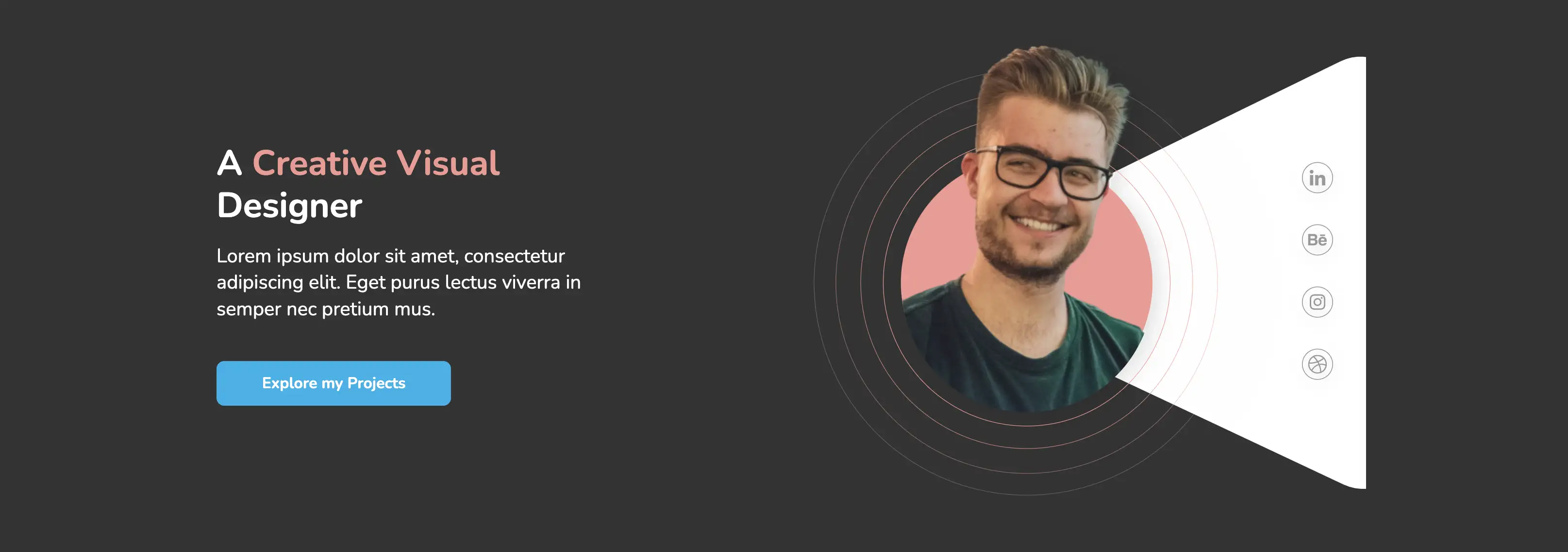
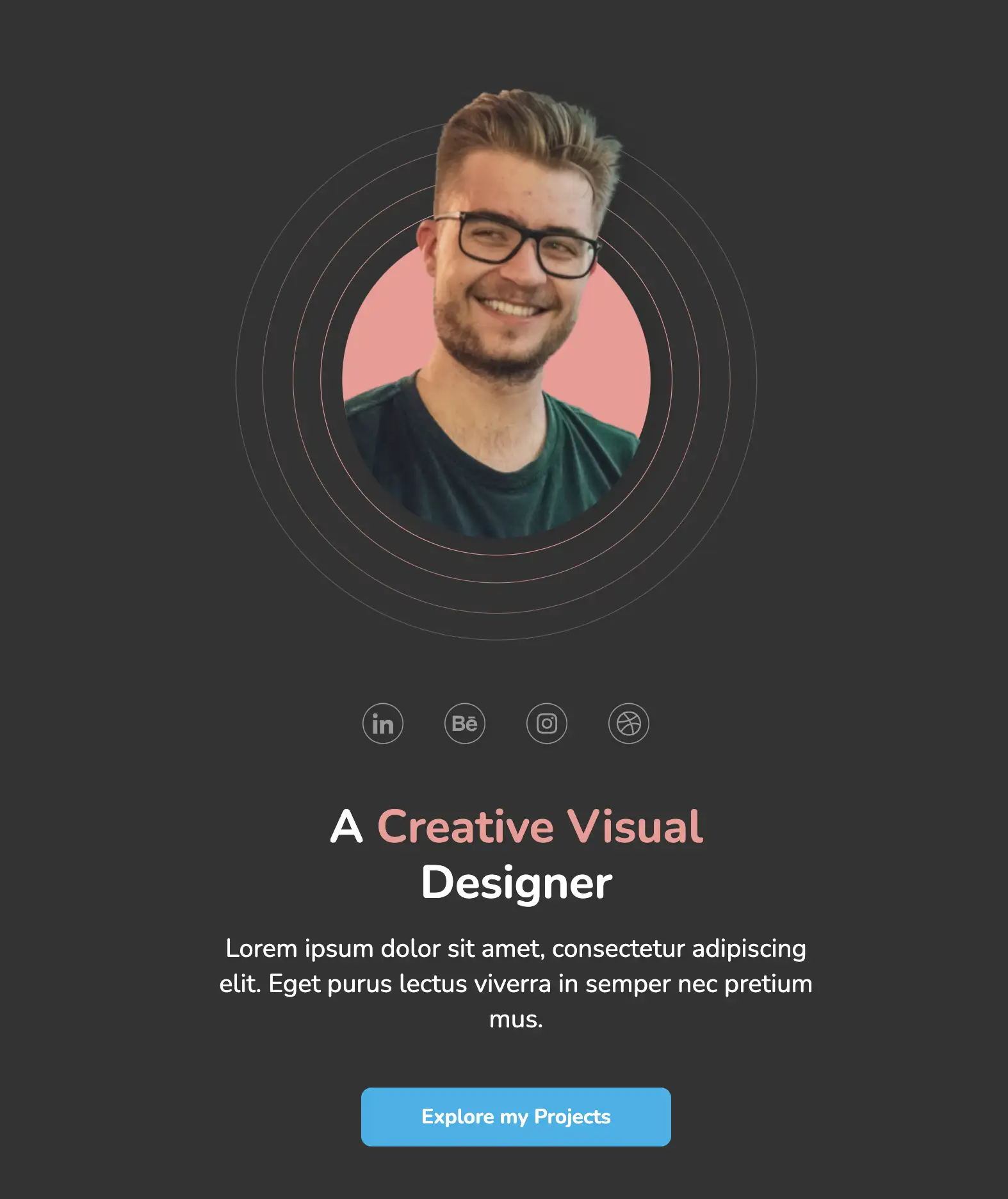
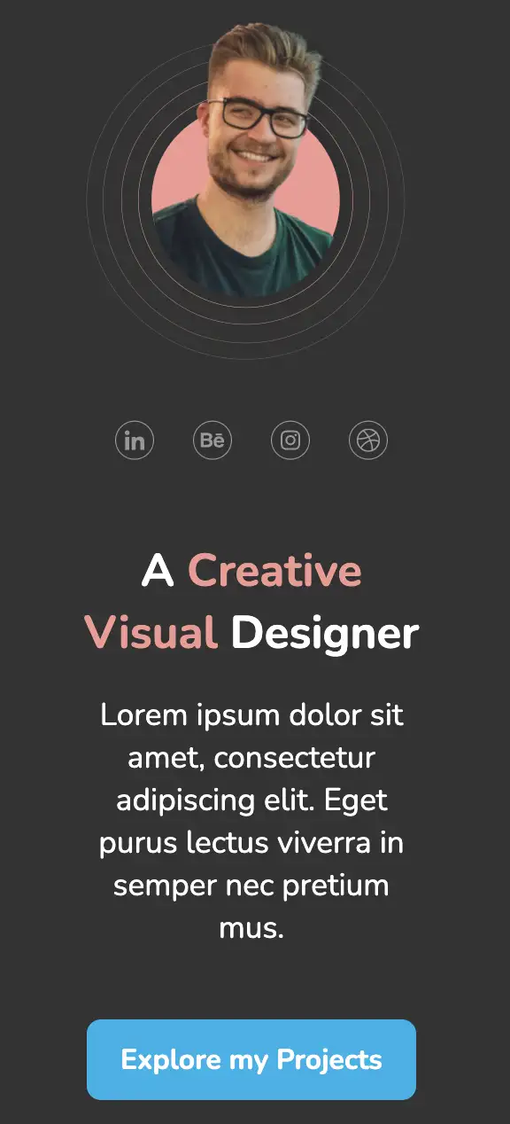
This website header design is ideal for portfolio landing pages. The above design incorporates a high-quality photograph of the designer on a circular frame. Focus is drawn to social media links, enticing users to explore their projects.
View Code
HTML
CSS
JS
Responsive CSS
Output
              A

               Creative Visual

              Designer


              Lorem ipsum dolor sit amet, consectetur adipiscing elit. Eget purus lectus viverra in semper nec pretium mus.


              Explore my Projects


         .above_the_fold * {
    font-family: Nunito, sans-serif;
}

.above_the_fold .text-blk {
    margin-top: 0px;
    margin-right: 0px;
    margin-bottom: 0px;
    margin-left: 0px;
    padding-top: 0px;
    padding-right: 0px;
    padding-bottom: 0px;
    padding-left: 0px;
    line-height: 25px;
}

.above_the_fold .responsive-cell-block {
    min-height: 75px;
}

.above_the_fold .responsive-container-block {
    min-height: 75px;
    height: fit-content;
    width: 100%;
    padding-top: 0px;
    padding-right: 0px;
    padding-bottom: 0px;
    padding-left: 0px;
    display: flex;
    flex-wrap: wrap;
    margin-top: 0px;
    margin-right: auto;
    margin-bottom: 0px;
    margin-left: auto;
    justify-content: flex-start;
}

.above_the_fold .responsive-container-block.bg {
    max-width: 1500px;
    margin-top: 0px;
    margin-right: 0px;
    margin-bottom: 0px;
    margin-left: 0px;
}

.above_the_fold .text-blk.title {
    font-size: 45px;
    line-height: 54.52px;
    font-weight: 700;
    max-width: 500px;
    color: white;
    margin-top: 0px;
    margin-right: 0px;
    margin-bottom: 20px;
    margin-left: 0px;
    padding-top: 0px;
    padding-right: 0px;
    padding-bottom: 0px;
    padding-left: 0px;
}

.above_the_fold .text-blk.info {
    font-size: 25px;
    line-height: 34.1px;
    max-width: 490px;
    color: white;
    margin-top: 0px;
    margin-right: 0px;
    margin-bottom: 50px;
    margin-left: 0px;
    padding-top: 0px;
    padding-right: 0px;
    padding-bottom: 0px;
    padding-left: 0px;
}

.above_the_fold .text-blk.btn {
    width: 302px;
    padding-top: 15px;
    padding-right: 10px;
    padding-bottom: 15px;
    padding-left: 10px;
    text-align: center;
    background-color: #00b2eb;
    border-top-left-radius: 10px;
    border-top-right-radius: 10px;
    border-bottom-right-radius: 10px;
    border-bottom-left-radius: 10px;
    font-size: 20px;
    line-height: 27.28px;
    color: white;
    font-weight: 700;
    display: block;
    cursor: pointer;
    max-width: 95%;
}

.above_the_fold .responsive-cell-block.wk-desk-6.wk-ipadp-6.wk-tab-12.wk-mobile-12.img {
    position: relative;
    min-height: 700px;
    display: flex;
    align-items: center;
}

.above_the_fold #itp57 {
    color: black;
    position: absolute;
    right: 0px;
}

.above_the_fold #iql3u {
    color: black;
}

.above_the_fold .circ {
    position: static;
    z-index: 2;
    top: 11%;
    width: auto;
    max-width: 90%;
}

.above_the_fold .tri {
    width: auto;
    max-width: 70%;
}

.above_the_fold .responsive-cell-block.wk-desk-6.wk-ipadp-6.wk-tab-12.wk-mobile-12.txt {
    display: flex;
    flex-direction: column;
    justify-content: center;
}

.above_the_fold .responsive-cell-block.wk-desk-6.wk-tab-12.wk-mobile-12.img.wk-ipadp-12 {
    display: flex;
    min-height: 700px;
    position: relative;
    align-items: center;
}

.above_the_fold .responsive-cell-block.wk-desk-6.wk-tab-12.wk-mobile-12.txt.wk-ipadp-12 {
    display: flex;
    flex-direction: column;
    justify-content: center;
    padding-top: 0px;
    padding-right: 0px;
    padding-bottom: 0px;
    padding-left: 20px;
}

.above_the_fold .responsive-container-block.icon-cont {
    position: absolute;
    flex-direction: column;
    align-items: flex-end;
    padding-top: 0px;
    padding-right: 3%;
    padding-bottom: 0px;
    padding-left: 0px;
}

.above_the_fold #ilonq {
    color: black;
    cursor: pointer;
}

.above_the_fold #ikrug {
    color: #f49892;
}

.above_the_fold #ilonq-2 {
    cursor: pointer;
}

.above_the_fold #ilonq-3 {
    cursor: pointer;
}

.above_the_fold #ilonq-4 {
    cursor: pointer;
}

.above_the_fold .responsive-container-block.big-cont {
    justify-content: center;
    background-color: #333333;
    padding: 40px 0 40px 0;
}

@media (max-width: 1024px) {
    .above_the_fold .tri {
        display: none;
    }

    .above_the_fold .responsive-container-block.bg {
        flex-direction: column-reverse;
    }

    .above_the_fold .responsive-cell-block.wk-desk-6.wk-tab-12.wk-mobile-12.img.wk-ipadp-12 {
        justify-content: center;
    }

    .above_the_fold .responsive-cell-block.wk-desk-6.wk-tab-12.wk-mobile-12.txt.wk-ipadp-12 {
        align-items: center;
    }

    .above_the_fold .text-blk.title {
        text-align: center;
    }

    .above_the_fold .text-blk.info {
        text-align: center;
    }

    .above_the_fold .text-blk.info {
        max-width: 100%;
    }

    .above_the_fold .text-blk.title {
        max-width: 100%;
        min-width: 100px;
    }

    .above_the_fold .responsive-container-block.icon-cont {
        position: absolute;
        bottom: 0px;
        flex-direction: row;
        justify-content: center;
        padding-top: 0px;
        padding-right: 0px;
        padding-bottom: 0px;
        padding-left: 0px;
        margin-top: 0px;
        margin-right: 0px;
        margin-bottom: 0px;
        margin-left: 0px;
    }

    .above_the_fold .responsive-cell-block.wk-desk-6.wk-tab-12.wk-mobile-12.img.wk-ipadp-12 {
        margin-top: 0px;
        margin-right: 0px;
        margin-bottom: 30px;
        margin-left: 0px;
        min-height: 780px;
        align-items: center;
    }

    .above_the_fold .circ {
        width: 600px;
        max-width: 100%;
    }

    .above_the_fold .text-blk.info {
        max-width: 600px;
    }

    .above_the_fold .text-blk.title {
        max-width: 500px;
    }

    .above_the_fold .responsive-container-block.big-cont {
        padding: 0 50px 80px 50px;
    }
}

@media (max-width: 768px) {
    .above_the_fold .text-blk.info {
        min-width: 90%;
    }

    .above_the_fold .text-blk.title {
        width: auto;
        min-width: 90%;
    }

    .above_the_fold .circ {
        width: 500px;
    }

    .above_the_fold .responsive-cell-block.wk-desk-6.wk-tab-12.wk-mobile-12.img.wk-ipadp-12 {
        align-items: center;
        flex-direction: column;
        justify-content: flex-start;
        min-height: auto;
    }

    .above_the_fold .responsive-container-block.icon-cont {
        position: static;
    }

    .above_the_fold .responsive-container-block.big-cont {
        padding: 40px 50px 80px 50px;
    }
}

@media (max-width: 500px) {
    .above_the_fold .circ {
        width: 100%;
    }

    .above_the_fold .text-blk.info {
        padding-top: 0px;
        padding-right: 0px;
        padding-bottom: 0px;
        padding-left: 0px;
    }

    .above_the_fold .responsive-cell-block.wk-desk-6.wk-tab-12.wk-mobile-12.img.wk-ipadp-12 {
        min-height: 400px;
        margin-top: 0px;
        margin-right: 0px;
        margin-bottom: 50px;
        margin-left: 0px;
    }

    .above_the_fold .text-blk.title {
        padding-top: 0px;
        padding-right: 0px;
        padding-bottom: 0px;
        padding-left: 0px;
    }

    .above_the_fold .responsive-cell-block.wk-desk-6.wk-tab-12.wk-mobile-12.txt.wk-ipadp-12 {
        padding-top: 0px;
        padding-right: 10px;
        padding-bottom: 0px;
        padding-left: 10px;
    }

    .above_the_fold .responsive-cell-block.wk-desk-6.wk-tab-12.wk-mobile-12.img.wk-ipadp-12 {
        min-height: 640px;
        margin-top: 0px;
        margin-right: 0px;
        margin-bottom: 30px;
        margin-left: 0px;
    }

    .above_the_fold .circ {
        margin-top: 0px;
        margin-right: 0px;
        margin-bottom: 0px;
        margin-left: 0px;
    }

    .above_the_fold #ilonq {
        width: 55px;
        height: 55px;
    }

    .above_the_fold .responsive-container-block.icon-cont {
        align-items: center;
    }

    .above_the_fold #ilonq-2 {
        width: 55px;
        height: 55px;
    }

    .above_the_fold #ilonq-3 {
        width: 55px;
        height: 55px;
    }

    .above_the_fold #ilonq-4 {
        width: 55px;
        height: 55px;
    }

    .above_the_fold .text-blk.title {
        font-size: 32px;
        line-height: 44px;
    }

    .above_the_fold .text-blk.info {
        font-size: 22px;
        line-height: 30px;
    }

    .above_the_fold .responsive-cell-block.wk-desk-6.wk-tab-12.wk-mobile-12.img.wk-ipadp-12 {
        min-height: auto;
    }

    .above_the_fold .responsive-container-block.bg {
        margin-top: 40px;
        margin-right: 0px;
        margin-bottom: 0px;
        margin-left: 0px;
    }

    .above_the_fold .text-blk.title {
        min-width: auto;
    }
}
         @import url('https://fonts.googleapis.com/css2?family=Nunito:wght@200;300;400;600;700;800&display=swap');
                            *, *:before, *:after {
                            -moz-box-sizing: border-box;
                            -webkit-box-sizing: border-box;
                            box-sizing: border-box;
                            }
                            body {
                            margin: 0;
                            }
                            .wk-desk-1{
                            width: 8.333333%;
                            }
                            .wk-desk-2{
                            width: 16.666667%;
                            }
                            .wk-desk-3{
                            width: 25%;
                            }
                            .wk-desk-4{
                            width: 33.333333%;
                            }
                            .wk-desk-5{
                            width: 41.666667%;
                            }
                            .wk-desk-6{
                            width: 50%;
                            }
                            .wk-desk-7{
                            width: 58.333333%;
                            }
                            .wk-desk-8{
                            width: 66.666667%;
                            }
                            .wk-desk-9{
                            width: 75%;
                            }
                            .wk-desk-10{
                            width: 83.333333%;
                            }
                            .wk-desk-11{
                            width: 91.666667%;
                            }
                            .wk-desk-12{
                            width: 100%;
                            }
                            @media (max-width: 1024px) {
                            .wk-ipadp-1{
                            width: 8.333333%;
                            }
                            .wk-ipadp-2{
                            width: 16.666667%;
                            }
                            .wk-ipadp-3{
                            width: 25%;
                            }
                            .wk-ipadp-4{
                            width: 33.333333%;
                            }
                            .wk-ipadp-5{
                            width: 41.666667%;
                            }
                            .wk-ipadp-6{
                            width: 50%;
                            }
                            .wk-ipadp-7{
                            width: 58.333333%;
                            }
                            .wk-ipadp-8{
                            width: 66.666667%;
                            }
                            .wk-ipadp-9{
                            width: 75%;
                            }
                            .wk-ipadp-10{
                            width: 83.333333%;
                            }
                            .wk-ipadp-11{
                            width: 91.666667%;
                            }
                            .wk-ipadp-12{
                            width: 100%;
                            }
                            }
                            @media (max-width: 768px) {
                            .wk-tab-1{
                            width: 8.333333%;
                            }
                            .wk-tab-2{
                            width: 16.666667%;
                            }
                            .wk-tab-3{
                            width: 25%;
                            }
                            .wk-tab-4{
                            width: 33.333333%;
                            }
                            .wk-tab-5{
                            width: 41.666667%;
                            }
                            .wk-tab-6{
                            width: 50%;
                            }
                            .wk-tab-7{
                            width: 58.333333%;
                            }
                            .wk-tab-8{
                            width: 66.666667%;
                            }
                            .wk-tab-9{
                            width: 75%;
                            }
                            .wk-tab-10{
                            width: 83.333333%;
                            }
                            .wk-tab-11{
                            width: 91.666667%;
                            }
                            .wk-tab-12{
                            width: 100%;
                            }
                            }
                            @media (max-width: 500px) {
                            .wk-mobile-1{
                            width: 8.333333%;
                            }
                            .wk-mobile-2{
                            width: 16.666667%;
                            }
                            .wk-mobile-3{
                            width: 25%;
                            }
                            .wk-mobile-4{
                            width: 33.333333%;
                            }
                            .wk-mobile-5{
                            width: 41.666667%;
                            }
                            .wk-mobile-6{
                            width: 50%;
                            }
                            .wk-mobile-7{
                            width: 58.333333%;
                            }
                            .wk-mobile-8{
                            width: 66.666667%;
                            }
                            .wk-mobile-9{
                            width: 75%;
                            }
                            .wk-mobile-10{
                            width: 83.333333%;
                            }
                            .wk-mobile-11{
                            width: 91.666667%;
                            }
                            .wk-mobile-12{
                            width: 100%;
                            }
                            }
Reset
.webp)
.webp)
.webp)
The above widget is based entirely on the HTML5 and CSS3 frameworks. A section of the background image is blurred by the text block using the backdrop-filter property, thereby enhancing the legibility of the content.
View Code
HTML
CSS
JS
Responsive CSS
Output
We’ll help you find the right workplace for you
Lorem ipsum dolor sit amet, consectetur adipiscing elit, sed do eiusmod tempor incididunt ut labore et dolore magna aliqua. Ut enim ad minim veniam, quis nostrud exercitation ullamco laboris.
         .atf_20 * {
   font-family: Nunito, sans-serif;
 }

 .atf_20 a {
   text-decoration-line: none;
   text-decoration-thickness: initial;
   text-decoration-style: initial;
   text-decoration-color: initial;
   color: inherit;
 }

 .atf_20 .text-blk {
   margin-top: 0px;
   margin-right: 0px;
   margin-bottom: 0px;
   margin-left: 0px;
   line-height: 25px;
 }

 .atf_20 .container-block {
   min-height: 75px;
   height: fit-content;
   width: 100%;
   display: block;
 }

 .atf_20 img {
   object-fit: cover;
 }

 .atf_20 .responsive-container-block {
   min-height: 75px;
   height: fit-content;
   width: 100%;
   display: flex;
   flex-wrap: wrap;
   margin-top: 0px;
   margin-right: auto;
   margin-bottom: 0px;
   margin-left: auto;
   justify-content: flex-start;
 }

 .atf_20 .responsive-container-block.blur-container {
   max-width: 1320px;
   margin-top: 80px;
   margin-right: 132px;
   margin-bottom: 60px;
   margin-left: 132px;
   position: relative;
   min-height: 700px;
   justify-content: flex-start;
   align-items: flex-end;
   margin: 80px auto 120px auto;
 }

 .atf_20 .img-bg {
   width: 100%;
   height: 100%;
   position: absolute;
   top: 0px;
   left: 0px;
   opacity: 0.5;
 }

 .atf_20 .responsive-container-block.big-container {
   position: relative;
   background-image: linear-gradient(0deg, #0c1d4d 0%, rgba(12, 29, 77, 0.063) 100%, rgba(0, 0, 0, 0) 100%);
   background-position-x: 0%;
   background-position-y: 0%;
   background-size: initial;
   background-repeat-x: initial;
   background-repeat-y: initial;
   background-attachment: initial;
   background-origin: initial;
   background-clip: initial;
   background-color: #0c1d4d;
   padding: 0 50px 0 50px;
 }

 .atf_20 .container-block.blur-container {
   max-width: 870px;
   padding-top: 50px;
   padding-right: 50px;
   padding-bottom: 50px;
   padding-left: 50px;
   backdrop-filter: blur(18px);
   color: white;
 }

 .atf_20 .text-blk.section-head {
   font-size: 50px;
   line-height: 60px;
   font-weight: 700;
   margin-top: 0px;
   margin-right: 0px;
   margin-bottom: 18px;
   margin-left: 0px;
 }

 .atf_20 .text-blk.section-subhead {
   max-width: 620px;
   margin-top: 0px;
   margin-right: 0px;
   margin-bottom: 40px;
   margin-left: 0px;
   font-size: 18px;
   line-height: 27px;
 }

 .atf_20 .button {
   height: 54px;
   display: flex;
   justify-content: center;
   align-items: center;
   padding-top: 0px;
   padding-right: 50px;
   padding-bottom: 0px;
   padding-left: 50px;
   font-size: 20px;
   font-weight: 600;
   border-top-width: 2px;
   border-right-width: 2px;
   border-bottom-width: 2px;
   border-left-width: 2px;
   border-top-style: solid;
   border-right-style: solid;
   border-bottom-style: solid;
   border-left-style: solid;
   border-top-color: white;
   border-right-color: white;
   border-bottom-color: white;
   border-left-color: white;
   border-image-source: initial;
   border-image-slice: initial;
   border-image-width: initial;
   border-image-outset: initial;
   border-image-repeat: initial;
 }

 .atf_20 .btn-box {
   display: flex;
 }

 @media (max-width: 1024px) {
   .atf_20 .text-blk.section-head {
     font-size: 50px;
   }
 }

 @media (max-width: 768px) {
   .atf_20 .text-blk.section-subhead {
     font-size: 17px;
     line-height: 25px;
   }

   .atf_20 .responsive-container-block.blur-container {
     min-height: 650px;
   }

   .atf_20 .text-blk.section-head {
     font-size: 55px;
     line-height: 60px;
   }

   .atf_20 .text-blk.section-head {
     font-size: 45px;
   }
 }

 @media (max-width: 500px) {
   .atf_20 .responsive-container-block.big-container {
     padding: 0 20px 0 20px;
   }

   .atf_20 .container-block.blur-container {
     padding: 20px 20px 20px 20px;
   }

   .atf_20 .text-blk.section-head {
     font-size: 35px;
     line-height: 40px;
     margin: 0 0 12px 0;
   }

   .atf_20 .text-blk.section-subhead {
     font-size: 16px;
     line-height: 22px;
     margin: 0 0 25px 0;
   }

   .atf_20 .button {
     height: 45px;
     padding: 0 30px 0 30px;
     font-size: 17px;
   }

   .atf_20 .responsive-container-block.blur-container {
     min-height: 500px;
     margin: 80px 0 80px 0;
   }

   .atf_20 .text-blk.section-head {
     font-size: 34px;
     line-height: 45px;
   }

   .atf_20 .text-blk.section-subhead {
     line-height: 23px;
   }
 }
         @import url('https://fonts.googleapis.com/css2?family=Nunito:wght@200;300;400;600;700;800&display=swap');
                            *, *:before, *:after {
                            -moz-box-sizing: border-box;
                            -webkit-box-sizing: border-box;
                            box-sizing: border-box;
                            }
                            body {
                            margin: 0;
                            }
                            .wk-desk-1{
                            width: 8.333333%;
                            }
                            .wk-desk-2{
                            width: 16.666667%;
                            }
                            .wk-desk-3{
                            width: 25%;
                            }
                            .wk-desk-4{
                            width: 33.333333%;
                            }
                            .wk-desk-5{
                            width: 41.666667%;
                            }
                            .wk-desk-6{
                            width: 50%;
                            }
                            .wk-desk-7{
                            width: 58.333333%;
                            }
                            .wk-desk-8{
                            width: 66.666667%;
                            }
                            .wk-desk-9{
                            width: 75%;
                            }
                            .wk-desk-10{
                            width: 83.333333%;
                            }
                            .wk-desk-11{
                            width: 91.666667%;
                            }
                            .wk-desk-12{
                            width: 100%;
                            }
                            @media (max-width: 1024px) {
                            .wk-ipadp-1{
                            width: 8.333333%;
                            }
                            .wk-ipadp-2{
                            width: 16.666667%;
                            }
                            .wk-ipadp-3{
                            width: 25%;
                            }
                            .wk-ipadp-4{
                            width: 33.333333%;
                            }
                            .wk-ipadp-5{
                            width: 41.666667%;
                            }
                            .wk-ipadp-6{
                            width: 50%;
                            }
                            .wk-ipadp-7{
                            width: 58.333333%;
                            }
                            .wk-ipadp-8{
                            width: 66.666667%;
                            }
                            .wk-ipadp-9{
                            width: 75%;
                            }
                            .wk-ipadp-10{
                            width: 83.333333%;
                            }
                            .wk-ipadp-11{
                            width: 91.666667%;
                            }
                            .wk-ipadp-12{
                            width: 100%;
                            }
                            }
                            @media (max-width: 768px) {
                            .wk-tab-1{
                            width: 8.333333%;
                            }
                            .wk-tab-2{
                            width: 16.666667%;
                            }
                            .wk-tab-3{
                            width: 25%;
                            }
                            .wk-tab-4{
                            width: 33.333333%;
                            }
                            .wk-tab-5{
                            width: 41.666667%;
                            }
                            .wk-tab-6{
                            width: 50%;
                            }
                            .wk-tab-7{
                            width: 58.333333%;
                            }
                            .wk-tab-8{
                            width: 66.666667%;
                            }
                            .wk-tab-9{
                            width: 75%;
                            }
                            .wk-tab-10{
                            width: 83.333333%;
                            }
                            .wk-tab-11{
                            width: 91.666667%;
                            }
                            .wk-tab-12{
                            width: 100%;
                            }
                            }
                            @media (max-width: 500px) {
                            .wk-mobile-1{
                            width: 8.333333%;
                            }
                            .wk-mobile-2{
                            width: 16.666667%;
                            }
                            .wk-mobile-3{
                            width: 25%;
                            }
                            .wk-mobile-4{
                            width: 33.333333%;
                            }
                            .wk-mobile-5{
                            width: 41.666667%;
                            }
                            .wk-mobile-6{
                            width: 50%;
                            }
                            .wk-mobile-7{
                            width: 58.333333%;
                            }
                            .wk-mobile-8{
                            width: 66.666667%;
                            }
                            .wk-mobile-9{
                            width: 75%;
                            }
                            .wk-mobile-10{
                            width: 83.333333%;
                            }
                            .wk-mobile-11{
                            width: 91.666667%;
                            }
                            .wk-mobile-12{
                            width: 100%;
                            }
                            }
Reset

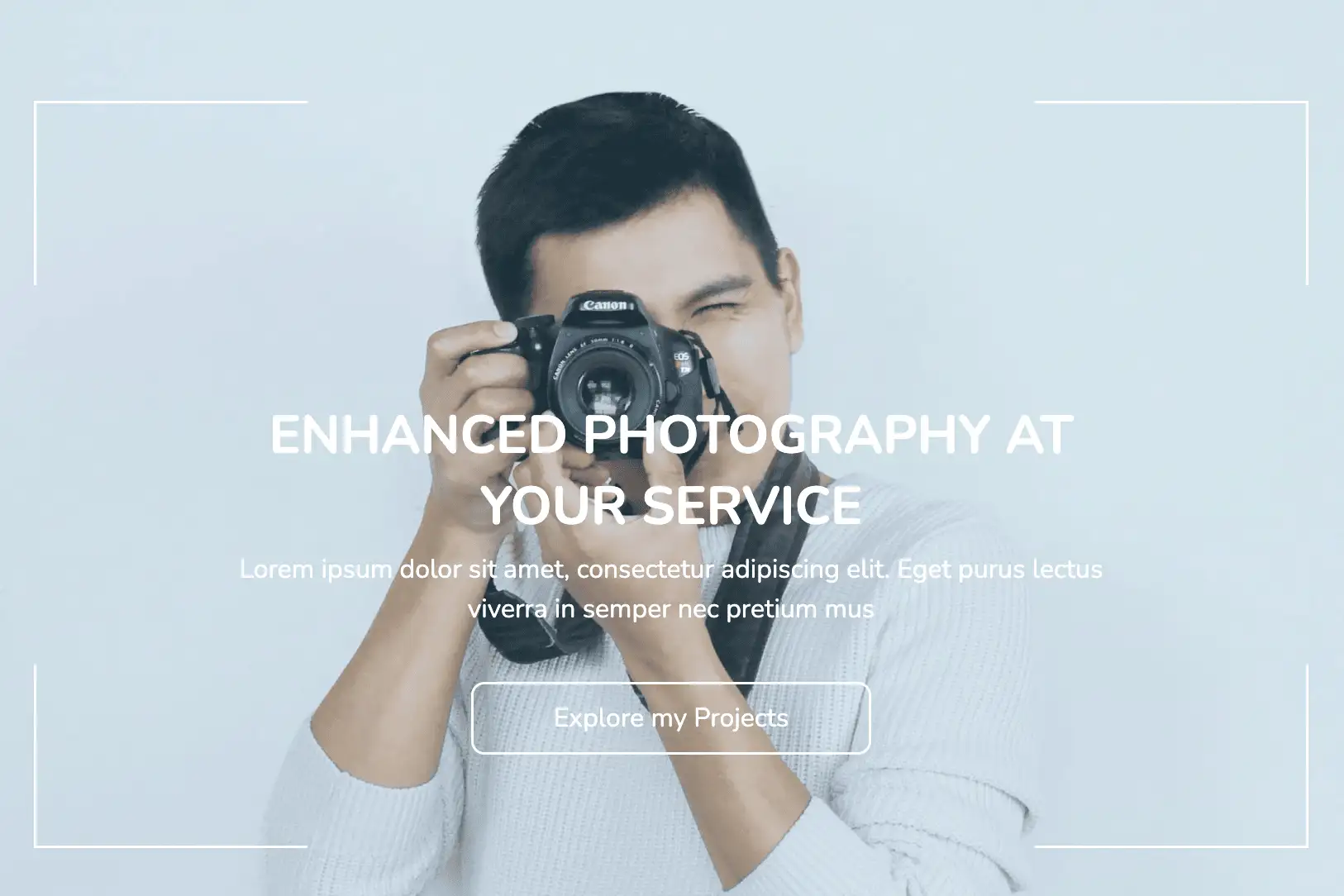
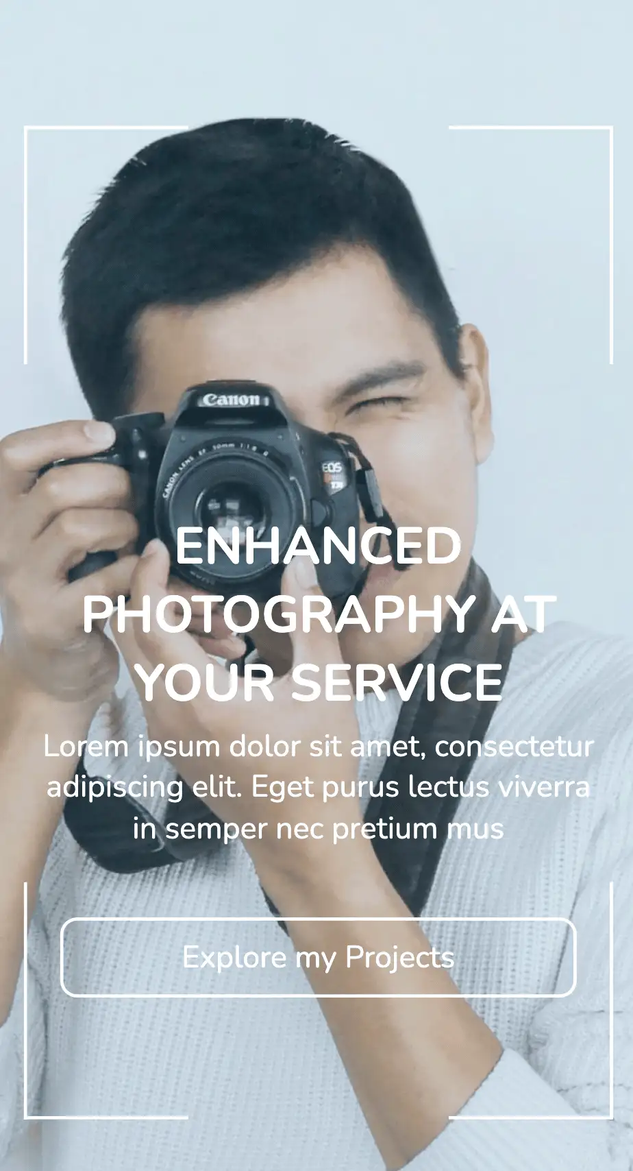
The above design includes image of the photographer with a blue overlay as the background. A reduced opacity is applied to the image, thereby increasing the readability of the content. Responsive containers with thin borders are positioned along with the corners, creating an effect of a photo being clicked. It is a niche design that is sure to appeal to photographers/creative professionals.
View Code
HTML
CSS
JS
Responsive CSS
Output
             ENHANCED PHOTOGRAPHY AT YOUR SERVICE


             Lorem ipsum dolor sit amet, consectetur adipiscing elit. Eget purus lectus viverra in semper nec pretium mus


             Explore my Projects
         .above_the_fold .text-blk {
    margin-top: 0px;
    margin-right: 0px;
    margin-bottom: 0px;
    margin-left: 0px;
    padding-top: 10px;
    padding-right: 10px;
    padding-bottom: 10px;
    padding-left: 10px;
    line-height: 25px;
}

.above_the_fold * {
    font-family: Nunito, sans-serif;
}

.above_the_fold .responsive-container-block {
    min-height: 75px;
    height: fit-content;
    width: 100%;
    padding-top: 10px;
    padding-right: 10px;
    padding-bottom: 10px;
    padding-left: 10px;
    display: flex;
    flex-wrap: wrap;
    margin-top: 0px;
    margin-right: auto;
    margin-bottom: 0px;
    margin-left: auto;
    justify-content: flex-start;
}

.above_the_fold .responsive-container-block.bg {
    max-width: 1500px;
    margin-top: 0px;
    margin-right: 0px;
    margin-bottom: 0px;
    margin-left: 0px;
    flex-direction: column;
    align-items: center;
    z-index: 2;
}

.above_the_fold .responsive-container-block.big-cont {
    display: flex;
    justify-content: center;
    background-image: url("https://workik-widget-assets.s3.amazonaws.com/widget-assets/images/P10.1.jpg");
    background-size: cover;
    background-position-x: 50%;
    background-position-y: 50%;
    position: relative;
    padding: 0 0 0 0;
}

.above_the_fold .text-blk.title {
    font-size: 40px;
    line-height: 54px;
    font-weight: 700;
    max-width: 750px;
    text-align: center;
    padding-top: 10px;
    padding-right: 10px;
    padding-bottom: 0px;
    padding-left: 10px;
    margin-top: 300px;
    margin-right: 0px;
    margin-bottom: 0px;
    margin-left: 0px;
    color: white;
}

.above_the_fold .text-blk.heading {
    padding-top: 5px;
    padding-right: 10px;
    padding-bottom: 10px;
    padding-left: 10px;
    font-size: 20px;
    line-height: 30px;
    max-width: 725px;
    text-align: center;
    margin-top: 0px;
    margin-right: 0px;
    margin-bottom: 30px;
    margin-left: 0px;
    color: white;
}

.above_the_fold .text-blk.button {
    width: 302px;
    max-width: 95%;
    padding-top: 15px;
    padding-right: 10px;
    padding-bottom: 15px;
    padding-left: 10px;
    text-align: center;
    font-size: 20px;
    line-height: 27px;
    border-top-left-radius: 10px;
    border-top-right-radius: 10px;
    border-bottom-right-radius: 10px;
    border-bottom-left-radius: 10px;
    display: block;
    cursor: pointer;
    margin-top: 0px;
    margin-right: 0px;
    margin-bottom: 100px;
    margin-left: 0px;
    color: white;
    border-top-width: 2px;
    border-right-width: 2px;
    border-bottom-width: 2px;
    border-left-width: 2px;
    border-top-style: solid;
    border-right-style: solid;
    border-bottom-style: solid;
    border-left-style: solid;
    border-top-color: white;
    border-right-color: white;
    border-bottom-color: white;
    border-left-color: white;
    border-image-source: initial;
    border-image-slice: initial;
    border-image-width: initial;
    border-image-outset: initial;
    border-image-repeat: initial;
    padding: 12px 10px 12px 10px;
}

.above_the_fold .responsive-container-block.blue {
    justify-content: center;
    padding-top: 0px;
    padding-right: 10px;
    padding-bottom: 0px;
    padding-left: 10px;
    position: absolute;
    height: 100%;
    background-color: #00b2eb;
    opacity: 0.1;
}

.above_the_fold .responsive-container-block.tl {
    position: absolute;
    top: 94px;
    left: 50px;
    width: 207px;
    height: 139px;
    border-top-width: 2px;
    border-top-style: solid;
    border-top-color: white;
    border-left-width: 2px;
    border-left-style: solid;
    border-left-color: white;
}

.above_the_fold .responsive-container-block.tr {
    position: absolute;
    top: 94px;
    right: 50px;
    width: 207px;
    height: 139px;
    border-top-width: 2px;
    border-top-style: solid;
    border-top-color: white;
    border-right-width: 2px;
    border-right-style: solid;
    border-right-color: white;
}

.above_the_fold .responsive-container-block.bl {
    position: absolute;
    bottom: 39px;
    left: 50px;
    width: 207px;
    height: 139px;
    border-bottom-width: 2px;
    border-bottom-style: solid;
    border-bottom-color: white;
    border-left-width: 2px;
    border-left-style: solid;
    border-left-color: white;
}

.above_the_fold .responsive-container-block.br {
    position: absolute;
    bottom: 39px;
    right: 50px;
    width: 207px;
    height: 139px;
    border-bottom-width: 2px;
    border-bottom-style: solid;
    border-bottom-color: white;
    border-right-width: 2px;
    border-right-style: solid;
    border-right-color: white;
}

@media (max-width: 1024px) {
    .above_the_fold .responsive-container-block.tr {
        right: 30px;
    }

    .above_the_fold .responsive-container-block.br {
        right: 30px;
    }

    .above_the_fold .responsive-container-block.tl {
        left: 30px;
    }

    .above_the_fold .responsive-container-block.bl {
        left: 30px;
    }
}

@media (max-width: 768px) {
    .above_the_fold .responsive-container-block.bl {
        width: 150px;
        left: 25px;
    }

    .above_the_fold .text-blk.title {
        font-size: 38px;
        line-height: 44px;
    }

    .above_the_fold .text-blk.heading {
        font-size: 22px;
        line-height: 30px;
    }

    .above_the_fold .responsive-container-block.tl {
        width: 150px;
        left: 25px;
    }

    .above_the_fold .responsive-container-block.tr {
        width: 150px;
        right: 25px;
    }

    .above_the_fold .responsive-container-block.br {
        width: 150px;
        right: 25px;
    }

    .above_the_fold .text-blk.title {
        width: 85%;
        line-height: 50px;
    }

    .above_the_fold .text-blk.heading {
        width: 85%;
    }
}

@media (max-width: 500px) {
    .above_the_fold .responsive-container-block.tl {
        width: 96px;
        left: 15px;
    }

    .above_the_fold .responsive-container-block.bl {
        width: 96px;
        left: 15px;
    }

    .above_the_fold .responsive-container-block.tr {
        width: 96px;
        right: 15px;
    }

    .above_the_fold .responsive-container-block.br {
        width: 96px;
        right: 15px;
    }

    .above_the_fold .text-blk.button {
        max-width: 90%;
        font-size: 18px;
        padding: 8px 10px 8px 10px;
    }

    .above_the_fold .text-blk.heading {
        width: 100%;
        font-size: 18px;
        line-height: 24px;
    }

    .above_the_fold .text-blk.title {
        width: 100%;
        font-size: 30px;
        line-height: 40px;
    }
}
         @import url('https://fonts.googleapis.com/css2?family=Nunito:wght@200;300;400;600;700;800&display=swap');
                            *, *:before, *:after {
                            -moz-box-sizing: border-box;
                            -webkit-box-sizing: border-box;
                            box-sizing: border-box;
                            }
                            body {
                            margin: 0;
                            }
                            .wk-desk-1{
                            width: 8.333333%;
                            }
                            .wk-desk-2{
                            width: 16.666667%;
                            }
                            .wk-desk-3{
                            width: 25%;
                            }
                            .wk-desk-4{
                            width: 33.333333%;
                            }
                            .wk-desk-5{
                            width: 41.666667%;
                            }
                            .wk-desk-6{
                            width: 50%;
                            }
                            .wk-desk-7{
                            width: 58.333333%;
                            }
                            .wk-desk-8{
                            width: 66.666667%;
                            }
                            .wk-desk-9{
                            width: 75%;
                            }
                            .wk-desk-10{
                            width: 83.333333%;
                            }
                            .wk-desk-11{
                            width: 91.666667%;
                            }
                            .wk-desk-12{
                            width: 100%;
                            }
                            @media (max-width: 1024px) {
                            .wk-ipadp-1{
                            width: 8.333333%;
                            }
                            .wk-ipadp-2{
                            width: 16.666667%;
                            }
                            .wk-ipadp-3{
                            width: 25%;
                            }
                            .wk-ipadp-4{
                            width: 33.333333%;
                            }
                            .wk-ipadp-5{
                            width: 41.666667%;
                            }
                            .wk-ipadp-6{
                            width: 50%;
                            }
                            .wk-ipadp-7{
                            width: 58.333333%;
                            }
                            .wk-ipadp-8{
                            width: 66.666667%;
                            }
                            .wk-ipadp-9{
                            width: 75%;
                            }
                            .wk-ipadp-10{
                            width: 83.333333%;
                            }
                            .wk-ipadp-11{
                            width: 91.666667%;
                            }
                            .wk-ipadp-12{
                            width: 100%;
                            }
                            }
                            @media (max-width: 768px) {
                            .wk-tab-1{
                            width: 8.333333%;
                            }
                            .wk-tab-2{
                            width: 16.666667%;
                            }
                            .wk-tab-3{
                            width: 25%;
                            }
                            .wk-tab-4{
                            width: 33.333333%;
                            }
                            .wk-tab-5{
                            width: 41.666667%;
                            }
                            .wk-tab-6{
                            width: 50%;
                            }
                            .wk-tab-7{
                            width: 58.333333%;
                            }
                            .wk-tab-8{
                            width: 66.666667%;
                            }
                            .wk-tab-9{
                            width: 75%;
                            }
                            .wk-tab-10{
                            width: 83.333333%;
                            }
                            .wk-tab-11{
                            width: 91.666667%;
                            }
                            .wk-tab-12{
                            width: 100%;
                            }
                            }
                            @media (max-width: 500px) {
                            .wk-mobile-1{
                            width: 8.333333%;
                            }
                            .wk-mobile-2{
                            width: 16.666667%;
                            }
                            .wk-mobile-3{
                            width: 25%;
                            }
                            .wk-mobile-4{
                            width: 33.333333%;
                            }
                            .wk-mobile-5{
                            width: 41.666667%;
                            }
                            .wk-mobile-6{
                            width: 50%;
                            }
                            .wk-mobile-7{
                            width: 58.333333%;
                            }
                            .wk-mobile-8{
                            width: 66.666667%;
                            }
                            .wk-mobile-9{
                            width: 75%;
                            }
                            .wk-mobile-10{
                            width: 83.333333%;
                            }
                            .wk-mobile-11{
                            width: 91.666667%;
                            }
                            .wk-mobile-12{
                            width: 100%;
                            }
                            }
Reset
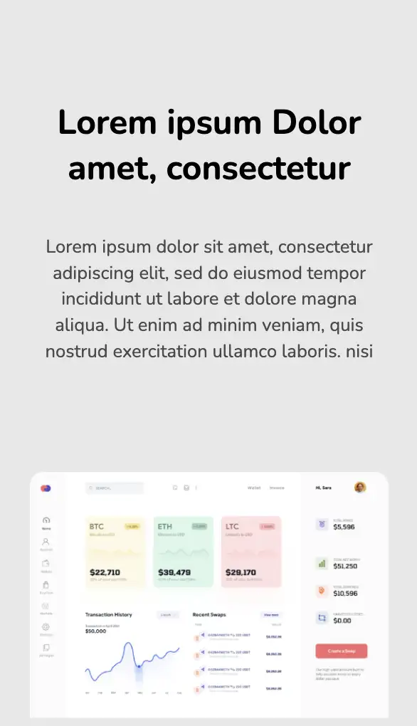
This top section leverages images to make a lasting impression on visitors. The images have appropriate margins and z-indices set to them, creating a feel of being stacked one above the other. The widget also includes a summary of the services provided by the organization. This designs could work for software development/SaaS services companies.
View Code
HTML
CSS
JS
Responsive CSS
Output
              Lorem ipsum Dolor amet, consectetur


              Lorem ipsum dolor sit amet, consectetur adipiscing elit, sed do eiusmod tempor incididunt ut labore et dolore magna aliqua. Ut enim ad minim veniam, quis nostrud exercitation ullamco laboris. nisi
          .landing_section_6 * {
    font-family: Nunito, sans-serif;
}

.landing_section_6 .text-blk {
    margin-top: 0px;
    margin-right: 0px;
    margin-bottom: 0px;
    margin-left: 0px;
    line-height: 25px;
}

.landing_section_6 .responsive-container-block {
    min-height: 75px;
    height: fit-content;
    width: 100%;
    display: flex;
    flex-wrap: wrap;
    margin-top: 0px;
    margin-right: auto;
    margin-bottom: 0px;
    margin-left: auto;
    justify-content: flex-start;
}

.landing_section_6 .responsive-container-block.container {
    max-width: 1320px;
    margin-top: 100px;
    margin-right: auto;
    margin-bottom: 0px;
    margin-left: auto;
    flex-direction: column;
    align-items: center;
    text-align: center;
    min-height: 75px;
}

.landing_section_6 .responsive-container-block.big-container {
    background-color: #e8e8e8;
    padding: 0 50px 0 50px;
}

.landing_section_6 .responsive-container-block.img-box-container {
    justify-content: center;
    position: relative;
    min-height: 400px;
    max-width: 1200px;
    overflow-y: hidden;
}

.landing_section_6 .text-blk.section-subheadtext {
    color: #4a4a4a;
    max-width: 900px;
    margin-top: 0px;
    margin-right: 0px;
    margin-bottom: 90px;
    margin-left: 0px;
    font-size: 18px;
    line-height: 24px;
}

.landing_section_6 .text-blk.section-headtext {
    margin-top: 0px;
    margin-right: 0px;
    margin-bottom: 18px;
    margin-left: 0px;
    font-size: 40px;
    font-weight: 700;
    line-height: 60px;
}

.landing_section_6 .responsive-container-block.img-box {
    justify-content: center;
    position: relative;
    min-height: 400px;
    max-width: 1200px;
    overflow-y: hidden;
}

.landing_section_6 .img-two {
    position: absolute;
    left: 20%;
    bottom: -20%;
    transform: translate(-20%);
}

.landing_section_6 .img-one {
    position: absolute;
    bottom: 0px;
    left: 50%;
    right: auto;
    transform: translate(-50%);
}

.landing_section_6 .img-three {
    position: absolute;
    right: 20%;
    transform: translate(20%);
    left: auto;
    bottom: -20%;
}

.landing_section_6 .img-four {
    position: absolute;
    left: 0%;
    bottom: -48%;
    transform: translate(0%);
}

.landing_section_6 .img-five {
    position: absolute;
    right: 0%;
    bottom: -48%;
    transform: translate(0%);
}

.landing_section_6 #ieia4 {
    width: 100%;
}

.landing_section_6 .img-box {
    max-width: 525px;
    max-height: 360px;
}

.landing_section_6 .img {
    width: 100%;
}

@media (max-width: 1024px) {
    .landing_section_6 .img-box.img-two {
        bottom: -30%;
    }

    .landing_section_6 .img-box.img-three {
        bottom: -30%;
    }

    .landing_section_6 .text-blk.section-subheadtext {
        margin: 0 0 60px 0;
    }
}

@media (max-width: 768px) {
    .landing_section_6 .img-box.img-two {
        bottom: -40%;
    }

    .landing_section_6 .img-box.img-three {
        bottom: -40%;
    }

    .landing_section_6 .responsive-container-block.img-box-container {
        min-height: 300px;
    }

    .landing_section_6 .responsive-container-block.big-container {
        padding: 0 30px 0 30px;
    }

    .landing_section_6 .img-box.img-two {
        bottom: -50%;
    }

    .landing_section_6 .img-box.img-three {
        bottom: -50%;
    }

    .landing_section_6 .text-blk.section-subheadtext {
        margin: 0 0 50px 0;
    }

    .landing_section_6 .text-blk.section-headtext {
        font-size: 32px;
    }
}

@media (max-width: 500px) {
    .landing_section_6 .responsive-container-block.img-box-container {
        min-height: 250px;
    }

    .landing_section_6 .img {
        width: 100%;
        height: 100%;
    }

    .landing_section_6 .img-box {
        width: 100%;
    }

    .landing_section_6 .img-box.img-three {
        display: none;
    }

    .landing_section_6 .img-box.img-four {
        display: none;
    }

    .landing_section_6 .img-box.img-five {
        display: none;
    }

    .landing_section_6 .img-box.img-two {
        display: none;
    }

    .landing_section_6 .responsive-container-block.big-container {
        padding: 0 20px 0 20px;
    }

    .landing_section_6 .text-blk.section-headtext {
        font-size: 35px;
        line-height: 45px;
    }

    .landing_section_6 .text-blk.section-subheadtext {
        margin: 0 0 50px 0;
    }

    .landing_section_6 .text-blk.section-headtext {
        font-size: 30px;
        line-height: 40px;
    }

    .landing_section_6 .text-blk.section-subheadtext {
        font-size: 16px;
        line-height: 23px;
    }
}
          @import url('https://fonts.googleapis.com/css2?family=Nunito:wght@200;300;400;600;700;800&display=swap');
        *, *:before, *:after {
        -moz-box-sizing: border-box;
        -webkit-box-sizing: border-box;
        box-sizing: border-box;
        }
        body {
        margin: 0;
        }
        .wk-desk-1{
        width: 8.333333%;
        }
        .wk-desk-2{
        width: 16.666667%;
        }
        .wk-desk-3{
        width: 25%;
        }
        .wk-desk-4{
        width: 33.333333%;
        }
        .wk-desk-5{
        width: 41.666667%;
        }
        .wk-desk-6{
        width: 50%;
        }
        .wk-desk-7{
        width: 58.333333%;
        }
        .wk-desk-8{
        width: 66.666667%;
        }
        .wk-desk-9{
        width: 75%;
        }
        .wk-desk-10{
        width: 83.333333%;
        }
        .wk-desk-11{
        width: 91.666667%;
        }
        .wk-desk-12{
        width: 100%;
        }
        @media (max-width: 1024px) {
        .wk-ipadp-1{
        width: 8.333333%;
        }
        .wk-ipadp-2{
        width: 16.666667%;
        }
        .wk-ipadp-3{
        width: 25%;
        }
        .wk-ipadp-4{
        width: 33.333333%;
        }
        .wk-ipadp-5{
        width: 41.666667%;
        }
        .wk-ipadp-6{
        width: 50%;
        }
        .wk-ipadp-7{
        width: 58.333333%;
        }
        .wk-ipadp-8{
        width: 66.666667%;
        }
        .wk-ipadp-9{
        width: 75%;
        }
        .wk-ipadp-10{
        width: 83.333333%;
        }
        .wk-ipadp-11{
        width: 91.666667%;
        }
        .wk-ipadp-12{
        width: 100%;
        }
        }
        @media (max-width: 768px) {
        .wk-tab-1{
        width: 8.333333%;
        }
        .wk-tab-2{
        width: 16.666667%;
        }
        .wk-tab-3{
        width: 25%;
        }
        .wk-tab-4{
        width: 33.333333%;
        }
        .wk-tab-5{
        width: 41.666667%;
        }
        .wk-tab-6{
        width: 50%;
        }
        .wk-tab-7{
        width: 58.333333%;
        }
        .wk-tab-8{
        width: 66.666667%;
        }
        .wk-tab-9{
        width: 75%;
        }
        .wk-tab-10{
        width: 83.333333%;
        }
        .wk-tab-11{
        width: 91.666667%;
        }
        .wk-tab-12{
        width: 100%;
        }
        }
        @media (max-width: 500px) {
        .wk-mobile-1{
        width: 8.333333%;
        }
        .wk-mobile-2{
        width: 16.666667%;
        }
        .wk-mobile-3{
        width: 25%;
        }
        .wk-mobile-4{
        width: 33.333333%;
        }
        .wk-mobile-5{
        width: 41.666667%;
        }
        .wk-mobile-6{
        width: 50%;
        }
        .wk-mobile-7{
        width: 58.333333%;
        }
        .wk-mobile-8{
        width: 66.666667%;
        }
        .wk-mobile-9{
        width: 75%;
        }
        .wk-mobile-10{
        width: 83.333333%;
        }
        .wk-mobile-11{
        width: 91.666667%;
        }
        .wk-mobile-12{
        width: 100%;
        }
        }
Reset
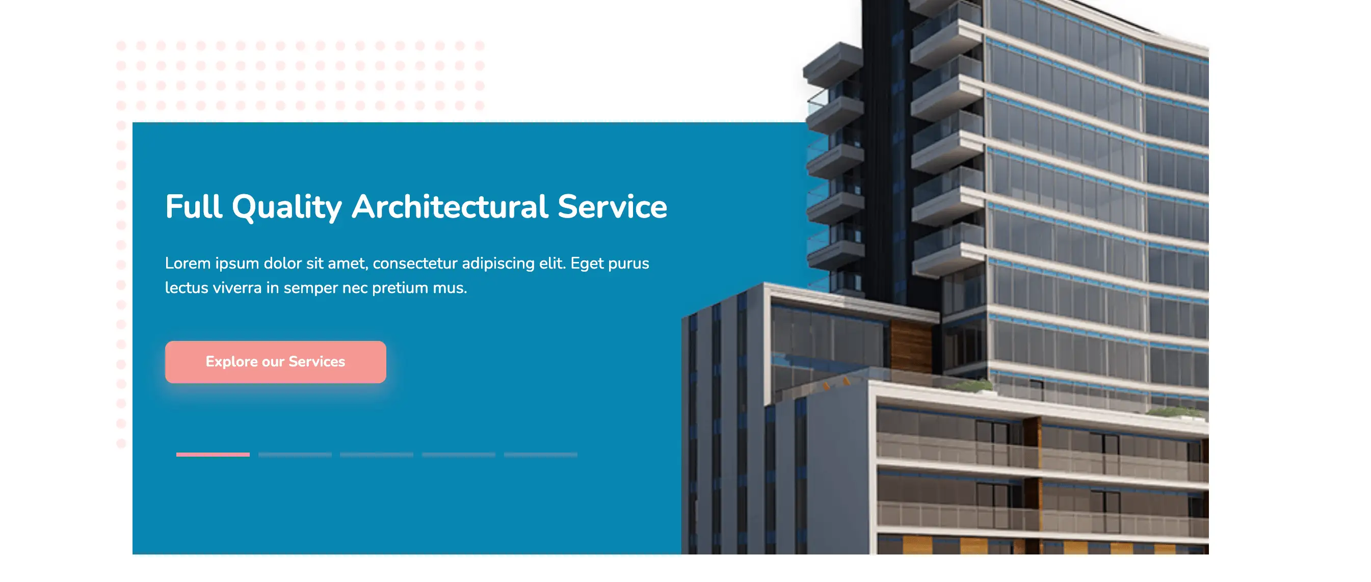
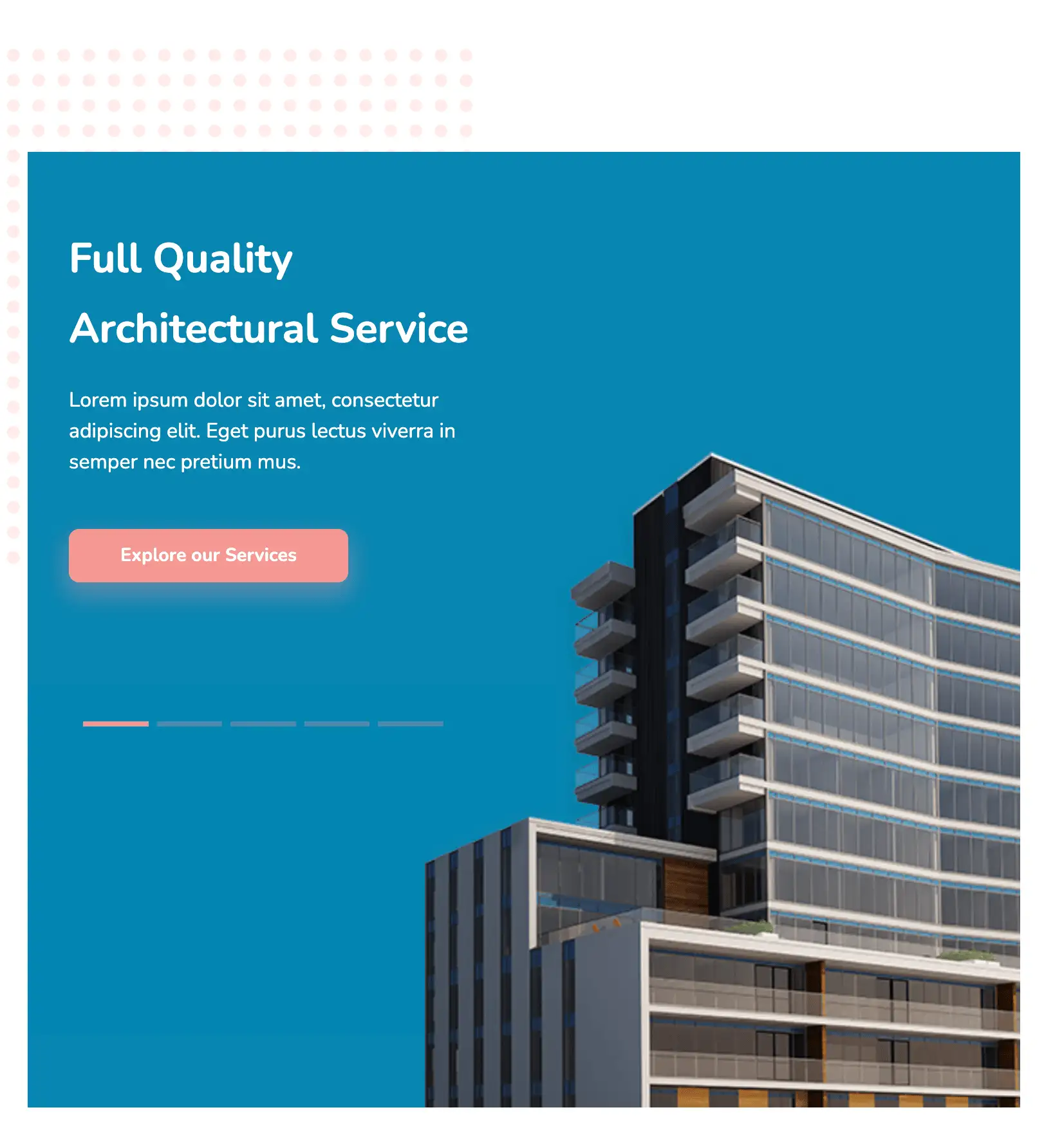
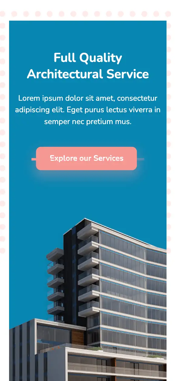
This top section incorporates a slider element with horizontal pagination elements. Each slide displays an appealing headline and a vibrant CTA, inviting users to explore their services. The colors strike a great balance between one another, imparting a rich look to the design. If you’re an architecture firm on the lookout for a design that highlights your products/services, it will be hard to top this one.
View Code
HTML
CSS
JS
Responsive CSS
Output


          .atf_33 * {
    font-family: Nunito, sans-serif;
    }
    .atf_33 .responsive-container-block {
    min-height: 75px;
    height: fit-content;
    width: 100%;
    padding-top: 10px;
    padding-right: 10px;
    padding-bottom: 10px;
    padding-left: 10px;
    display: flex;
    flex-wrap: wrap;
    margin-top: 0px;
    margin-right: auto;
    margin-bottom: 0px;
    margin-left: auto;
    justify-content: flex-start;
    }
    .atf_33 .swiper-horizontal .swiper-pagination-bullets .swiper-pagination-bullet {
    margin-top: 0px;
    margin-right: 4px;
    margin-bottom: 0px;
    margin-left: 4px;
    background-image: initial;
    background-position-x: initial;
    background-position-y: initial;
    background-size: initial;
    background-repeat-x: initial;
    background-repeat-y: initial;
    background-attachment: initial;
    background-origin: initial;
    background-clip: initial;
    background-color: #f49892;
    height: 5px;
    width: 18%;
    border-top-left-radius: 0px;
    border-top-right-radius: 0px;
    border-bottom-right-radius: 0px;
    border-bottom-left-radius: 0px;
    }
    .atf_33 .text-blk {
    margin-top: 0px;
    margin-right: 0px;
    margin-bottom: 0px;
    margin-left: 0px;
    line-height: 25px;
    padding-top: 0px;
    padding-right: 0px;
    padding-bottom: 0px;
    padding-left: 0px;
    }
    .atf_33 .responsive-container-block.bigContainer {
    padding-top: 10px;
    padding-right: 30px;
    padding-bottom: 10px;
    padding-left: 30px;
    }
    .atf_33 .responsive-container-block.Container {
    max-width: 1320px;
    margin-top: 150px;
    margin-right: auto;
    margin-bottom: 50px;
    margin-left: auto;
    background-color: #0087b1;
    position: relative;
    }
    .atf_33 .dotsImg {
    position: absolute;
    z-index: -100;
    top: -100px;
    left: -20px;
    height: 500px;
    }
    .atf_33 .text-blk.heading {
    font-size: 40px;
    line-height: 68px;
    font-weight: 700;
    color: white;
    margin-top: 0px;
    margin-right: 0px;
    margin-bottom: 20px;
    margin-left: 0px;
    }
    .atf_33 .text-blk.subHeading {
    margin-top: 0px;
    margin-right: 0px;
    margin-bottom: 50px;
    margin-left: 0px;
    color: white;
    font-size: 20px;
    line-height: 30px;
    }
    .atf_33 .leftSide {
    max-width: 100%;
    margin-top: 60px;
    margin-right: 0px;
    margin-bottom: 200px;
    margin-left: 0px;
    padding-top: 0px;
    padding-right: 0px;
    padding-bottom: 0px;
    padding-left: 30px;
    z-index: 100;
    }
    .atf_33 .explore {
    font-size: 18px;
    line-height: 28px;
    font-weight: 700;
    color: white;
    background-color: #f49892;
    box-shadow: rgba(244, 152, 146, 0.25) 0px 10px 20px;
    border-top-left-radius: 10px;
    border-top-right-radius: 10px;
    border-bottom-right-radius: 10px;
    border-bottom-left-radius: 10px;
    border-top-width: 0px;
    border-right-width: 0px;
    border-bottom-width: 0px;
    border-left-width: 0px;
    border-top-style: initial;
    border-right-style: initial;
    border-bottom-style: initial;
    border-left-style: initial;
    border-top-color: initial;
    border-right-color: initial;
    border-bottom-color: initial;
    border-left-color: initial;
    border-image-source: initial;
    border-image-slice: initial;
    border-image-width: initial;
    border-image-outset: initial;
    border-image-repeat: initial;
    cursor: pointer;
    padding-top: 12px;
    padding-right: 50px;
    padding-bottom: 12px;
    padding-left: 50px;
    }
    .atf_33 .explore:hover {
    background-image: initial;
    background-position-x: initial;
    background-position-y: initial;
    background-size: initial;
    background-repeat-x: initial;
    background-repeat-y: initial;
    background-attachment: initial;
    background-origin: initial;
    background-clip: initial;
    background-color: #f4b6b0;
    }
    .atf_33 #izsmn {
    color: black;
    }
    .atf_33 .bigImg {
    width: 49%;
    position: absolute;
    bottom: 0px;
    right: 0px;
    top: auto;
    height: 770px;
    object-fit: cover;
    z-index: 0;
    }
    .atf_33 .swiper-slide {
    width: auto;
    max-width: 100%;
    }
    .atf_33 .swiper-wrapper {
    width: 100%;
    }
    .atf_33 .swiper.mySwiper {
    width: 50%;
    position: relative;
    }
    .atf_33 .swiper-pagination {
    display: flex;
    justify-content: space-between;
    bottom: 50px;
    top: auto;
    width: 80%;
    margin-top: 0px;
    margin-right: 0px;
    margin-bottom: 0px;
    margin-left: 0px;
    }
    .atf_33 .swiper-pagination.container-block {
    width: 80%;
    bottom: 50px;
    left: 30px;
    }
    @media (max-width: 1024px) {
    .atf_33 .bigImg {
    height: 650px;
    width: 58%;
    }
    .atf_33 .leftSide {
    margin-top: 60px;
    margin-right: 0px;
    margin-bottom: 500px;
    margin-left: 0px;
    }
    .atf_33 .bigImg {
    width: 60%;
    }
    .atf_33 .swiper-pagination.container-block {
    bottom: 300px;
    }
    }
    @media (max-width: 768px) {
    .atf_33 .leftSide {
    margin-top: 60px;
    margin-right: 0px;
    margin-bottom: 80px;
    margin-left: 0px;
    width: 100%;
    max-width: 100%;
    padding-top: 0px;
    padding-right: 0px;
    padding-bottom: 0px;
    padding-left: 0px;
    display: flex;
    flex-direction: column;
    align-items: center;
    justify-content: center;
    }
    .atf_33 .bigImg {
    position: static;
    margin-top: 0px;
    margin-right: 0px;
    margin-bottom: 0px;
    margin-left: auto;
    width: 85%;
    }
    .atf_33 .responsive-container-block.Container {
    padding-top: 10px;
    padding-right: 0px;
    padding-bottom: 0px;
    padding-left: 0px;
    flex-direction: column;
    justify-content: flex-start;
    align-items: center;
    }
    .atf_33 .text-blk.heading {
    text-align: center;
    font-size: 36px;
    }
    .atf_33 .text-blk.subHeading {
    text-align: center;
    font-size: 20px;
    }
    .atf_33 #iymhg {
    margin-top: 0px;
    margin-right: auto;
    margin-bottom: 0px;
    margin-left: auto;
    }
    .atf_33 .dotsImg {
    top: -20px;
    }
    .atf_33 .responsive-container-block.Container {
    margin-top: 50px;
    margin-right: 0px;
    margin-bottom: 50px;
    margin-left: 0px;
    }
    .atf_33 .leftSide {
    padding-top: 20px;
    padding-right: 20px;
    padding-bottom: 20px;
    padding-left: 20px;
    margin-top: 30px;
    margin-right: 0px;
    margin-bottom: 80px;
    margin-left: 0px;
    }
    .atf_33 .swiper-pagination {
    margin-top: 0px;
    margin-right: 0px;
    margin-bottom: 0px;
    margin-left: 0px;
    left: 50%;
    transform: translateX(-50%);
    }
    .atf_33 .swiper-slide {
    width: 100%;
    }
    .atf_33 .leftSide {
    width: 100%;
    }
    .atf_33 .swiper.mySwiper {
    width: 100%;
    }
    .atf_33 .swiper-pagination.container-block {
    left: 50%;
    bottom: 50px;
    }
    }
    @media (max-width: 500px) {
    .atf_33 .leftSide {
    margin-top: 40px;
    margin-right: 0px;
    margin-bottom: 80px;
    margin-left: 0px;
    }
    .atf_33 .responsive-container-block.bigContainer {
    padding-top: 10px;
    padding-right: 20px;
    padding-bottom: 10px;
    padding-left: 20px;
    }
    .atf_33 #iymhg {
    width: 70%;
    }
    .atf_33 .text-blk.heading {
    font-size: 26px;
    line-height: 34px;
    }
    .atf_33 .text-blk.subHeading {
    font-size: 16px;
    line-height: 24px;
    margin-top: 0px;
    margin-right: 0px;
    margin-bottom: 40px;
    margin-left: 0px;
    }
    .atf_33 .leftSide {
    padding-top: 10px;
    padding-right: 10px;
    padding-bottom: 10px;
    padding-left: 10px;
    }
    .atf_33 .bigImg {
    width: 100%;
    height: 380px;
    }
    .atf_33 .explore {
    font-size: 16px;
    padding-top: 10px;
    padding-right: 50px;
    padding-bottom: 10px;
    padding-left: 50px;
    padding: 10px 28px 10px 28px;
    }
    }
          var swiper = new Swiper(`[unique-script-id="w-w-dm-id"] .mySwiper`, {
    pagination: {
        el: `[unique-script-id="w-w-dm-id"] .swiper-pagination`,
        clickable: true,
    },
    breakpoints: {
        150: {
            slidesPerView: 1,
            spaceBetween: 1750,
        }
    }
});
          @import url('https://fonts.googleapis.com/css2?family=Nunito:wght@200;300;400;600;700;800&display=swap');
        *, *:before, *:after {
        -moz-box-sizing: border-box;
        -webkit-box-sizing: border-box;
        box-sizing: border-box;
        }
        body {
        margin: 0;
        }
        .wk-desk-1{
        width: 8.333333%;
        }
        .wk-desk-2{
        width: 16.666667%;
        }
        .wk-desk-3{
        width: 25%;
        }
        .wk-desk-4{
        width: 33.333333%;
        }
        .wk-desk-5{
        width: 41.666667%;
        }
        .wk-desk-6{
        width: 50%;
        }
        .wk-desk-7{
        width: 58.333333%;
        }
        .wk-desk-8{
        width: 66.666667%;
        }
        .wk-desk-9{
        width: 75%;
        }
        .wk-desk-10{
        width: 83.333333%;
        }
        .wk-desk-11{
        width: 91.666667%;
        }
        .wk-desk-12{
        width: 100%;
        }
        @media (max-width: 1024px) {
        .wk-ipadp-1{
        width: 8.333333%;
        }
        .wk-ipadp-2{
        width: 16.666667%;
        }
        .wk-ipadp-3{
        width: 25%;
        }
        .wk-ipadp-4{
        width: 33.333333%;
        }
        .wk-ipadp-5{
        width: 41.666667%;
        }
        .wk-ipadp-6{
        width: 50%;
        }
        .wk-ipadp-7{
        width: 58.333333%;
        }
        .wk-ipadp-8{
        width: 66.666667%;
        }
        .wk-ipadp-9{
        width: 75%;
        }
        .wk-ipadp-10{
        width: 83.333333%;
        }
        .wk-ipadp-11{
        width: 91.666667%;
        }
        .wk-ipadp-12{
        width: 100%;
        }
        }
        @media (max-width: 768px) {
        .wk-tab-1{
        width: 8.333333%;
        }
        .wk-tab-2{
        width: 16.666667%;
        }
        .wk-tab-3{
        width: 25%;
        }
        .wk-tab-4{
        width: 33.333333%;
        }
        .wk-tab-5{
        width: 41.666667%;
        }
        .wk-tab-6{
        width: 50%;
        }
        .wk-tab-7{
        width: 58.333333%;
        }
        .wk-tab-8{
        width: 66.666667%;
        }
        .wk-tab-9{
        width: 75%;
        }
        .wk-tab-10{
        width: 83.333333%;
        }
        .wk-tab-11{
        width: 91.666667%;
        }
        .wk-tab-12{
        width: 100%;
        }
        }
        @media (max-width: 500px) {
        .wk-mobile-1{
        width: 8.333333%;
        }
        .wk-mobile-2{
        width: 16.666667%;
        }
        .wk-mobile-3{
        width: 25%;
        }
        .wk-mobile-4{
        width: 33.333333%;
        }
        .wk-mobile-5{
        width: 41.666667%;
        }
        .wk-mobile-6{
        width: 50%;
        }
        .wk-mobile-7{
        width: 58.333333%;
        }
        .wk-mobile-8{
        width: 66.666667%;
        }
        .wk-mobile-9{
        width: 75%;
        }
        .wk-mobile-10{
        width: 83.333333%;
        }
        .wk-mobile-11{
        width: 91.666667%;
        }
        .wk-mobile-12{
        width: 100%;
        }
        }
Reset
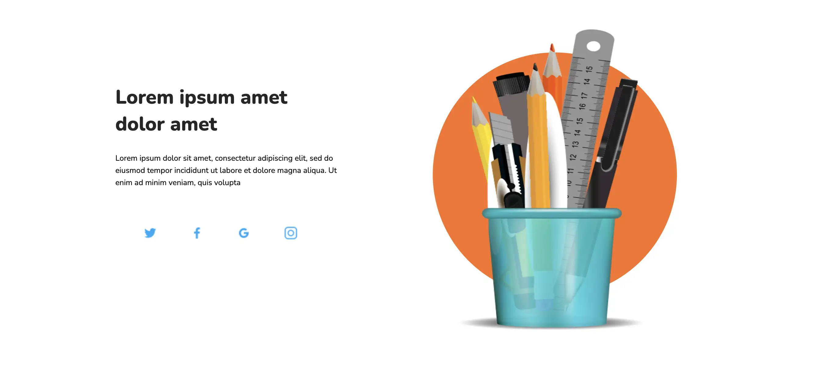
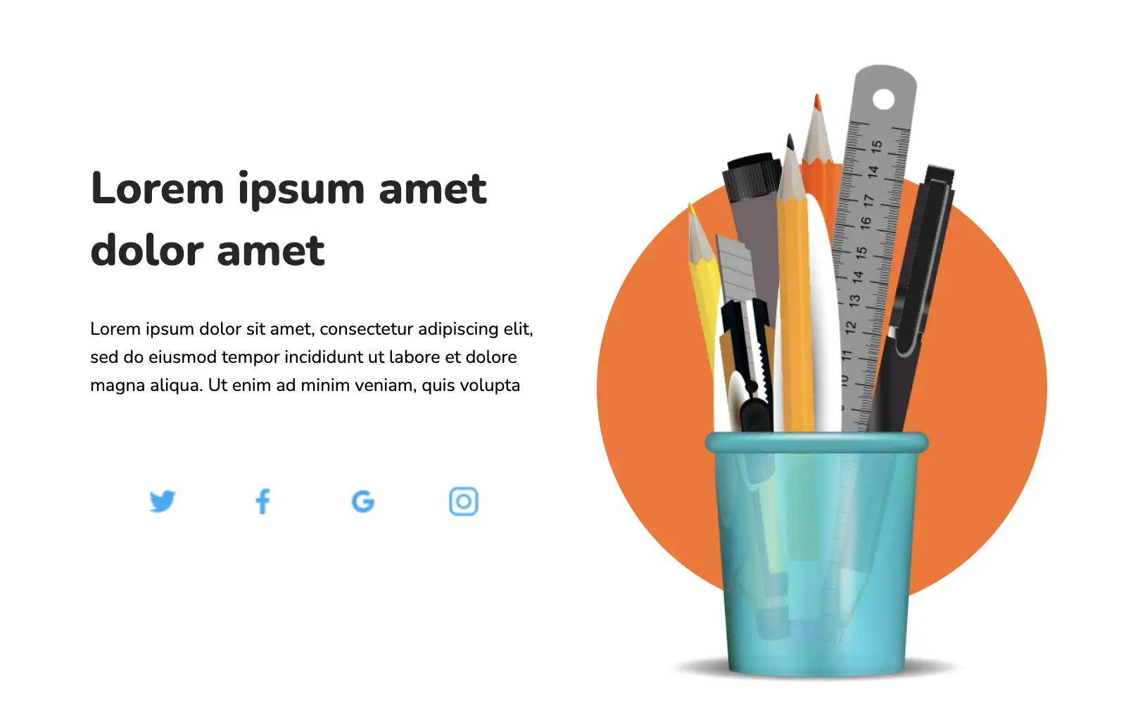
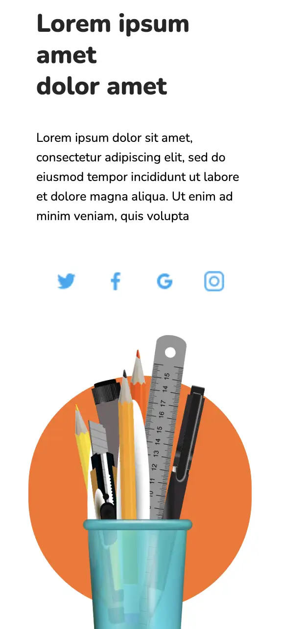
This widget comprises a product image on an absolute position circular background. Links to social media pages are incorporated as part of the design, encouraging visitors to check out their social media handles.
View Code
HTML
CSS
JS
Responsive CSS
Output
               Lorem ipsum amet


               dolor amet


               Lorem ipsum dolor sit amet, consectetur adipiscing elit, sed do eiusmod tempor incididunt ut labore et dolore magna aliqua. Ut enim ad minim veniam, quis volupta


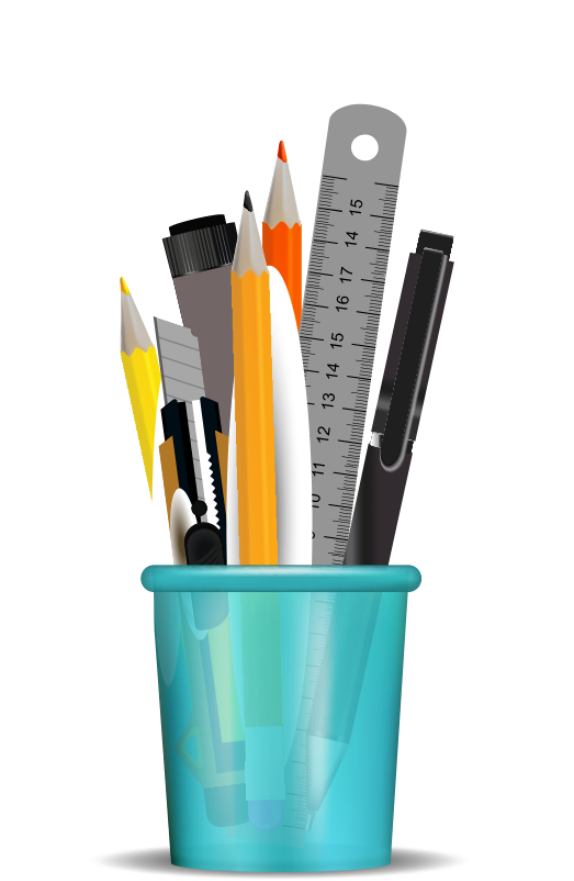
          .landing_page * {
    font-family: Nunito, sans-serif;
}

.landing_page .text-blk {
    margin-top: 0px;
    margin-right: 0px;
    margin-bottom: 0px;
    margin-left: 0px;
    line-height: 25px;
}

.landing_page .responsive-cell-block {
    min-height: 75px;
}

.landing_page .responsive-container-block {
    min-height: 75px;
    height: fit-content;
    width: 100%;
    display: flex;
    flex-wrap: wrap;
    margin-top: 0px;
    margin-right: auto;
    margin-bottom: 0px;
    margin-left: auto;
    justify-content: flex-start;
}

.landing_page .responsive-container-block.container {
    margin-top: 0px;
    margin-right: auto;
    margin-bottom: 50px;
    margin-left: auto;
    max-width: 1320px;
}

.landing_page .responsive-container-block.big-container {
    padding-top: 0px;
    padding-right: 50px;
    padding-bottom: 0px;
    padding-left: 50px;
}

.landing_page .responsive-cell-block.wk-desk-6.wk-ipadp-6.wk-tab-12.wk-mobile-12.left-one {
    display: flex;
    flex-direction: column;
    align-items: flex-start;
    justify-content: center;
    padding-top: 0px;
    padding-right: 5%;
    padding-bottom: 0px;
    padding-left: 5%;
}

.landing_page .text-blk.section-head {
    font-size: 40px;
    line-height: 55px;
    font-weight: 800;
    color: #262626;
    margin-top: 0px;
    margin-right: 0px;
    margin-bottom: 10px;
    margin-left: 0px;
}

.landing_page .text-blk.section-subhead {
    margin-top: 0px;
    margin-right: 0px;
    margin-bottom: 65px;
    margin-left: 0px;
    max-width: 500px;
}

.landing_page .share-icon {
    width: 31px;
    height: 31px;
}

.landing_page .icons-container {
    max-width: 450px;
    width: 100%;
    display: flex;
    justify-content: space-evenly;
}

.landing_page .img {
    width: 100%;
}

.landing_page .landing-image {
    width: 90%;
    height: 100%;
    position: relative;
    max-width: 600px;
    max-height: 700px;
}

.landing_page .img-container {
    height: 100%;
    max-height: 750px;
    display: flex;
    justify-content: center;
    position: relative;
}

.landing_page .big-circle {
    max-width: 500px;
    max-height: 500px;
    width: 100%;
    height: 100%;
    background-color: #fb7222;
    border-top-left-radius: 250px;
    border-top-right-radius: 250px;
    border-bottom-right-radius: 250px;
    border-bottom-left-radius: 250px;
    position: absolute;
    bottom: 10%;
}

@media (max-width: 1024px) {
    .landing_page .responsive-cell-block.wk-desk-6.wk-ipadp-6.wk-tab-12.wk-mobile-12.left-one {
        padding-top: 0px;
        padding-right: 2%;
        padding-bottom: 0px;
        padding-left: 2%;
    }

    .landing_page .big-circle {
        max-width: 400px;
        max-height: 400px;
    }
}

@media (max-width: 768px) {
    .landing_page .responsive-cell-block.wk-desk-6.wk-ipadp-6.wk-tab-12.wk-mobile-12.left-one {
        padding-top: 0px;
        padding-right: 50px;
        padding-bottom: 0px;
        padding-left: 50px;
    }

    .landing_page .responsive-container-block.container {
        flex-direction: column-reverse;
    }

    .landing_page .responsive-container-block.big-container {
        padding-top: 0px;
        padding-right: 0px;
        padding-bottom: 0px;
        padding-left: 0px;
    }

    .landing_page .responsive-cell-block.wk-desk-6.wk-ipadp-6.wk-tab-12.wk-mobile-12 {
        margin-top: 0px;
        margin-right: 0px;
        margin-bottom: 50px;
        margin-left: 0px;
    }

    .landing_page .responsive-container-block.big-container {
        padding-top: 0px;
        padding-right: 50px;
        padding-bottom: 0px;
        padding-left: 50px;
    }

    .landing_page .landing-image {
        width: auto;
        height: 500px;
    }

    .landing_page .responsive-container-block.container {
        flex-direction: column;
        margin-top: 50px;
        margin-right: 0px;
        margin-bottom: 50px;
        margin-left: 0px;
    }

    .landing_page .big-circle {
        max-width: 450px;
        max-height: 450px;
    }

    .landing_page .responsive-cell-block.wk-desk-6.wk-ipadp-6.wk-tab-12.wk-mobile-12.left-one {
        padding-top: 0px;
        padding-right: 50px;
        padding-bottom: 0px;
        padding-left: 30px;
    }

    .landing_page .text-blk.section-head {
        font-size: 36px;
        line-height: 50px;
    }
}

@media (max-width: 500px) {
    .landing_page .text-blk.section-head {
        font-size: 32px;
        line-height: 40px;
        margin-top: 0px;
        margin-right: 0px;
        margin-bottom: 14px;
        margin-left: 0px;
    }

    .landing_page .responsive-cell-block.wk-desk-6.wk-ipadp-6.wk-tab-12.wk-mobile-12.left-one {
        padding-top: 0px;
        padding-right: 0px;
        padding-bottom: 0px;
        padding-left: 0px;
    }

    .landing_page .text-blk.section-subhead {
        margin-top: 0px;
        margin-right: 0px;
        margin-bottom: 45px;
        margin-left: 0px;
    }

    .landing_page .responsive-container-block.big-container {
        padding-top: 0px;
        padding-right: 30px;
        padding-bottom: 0px;
        padding-left: 30px;
    }

    .landing_page .landing-image {
        width: 100%;
        height: 450px;
    }

    .landing_page .big-circle {
        width: 100%;
        height: 100%;
        max-width: 300px;
        max-height: 300px;
    }

    .landing_page .responsive-container-block.container {
        margin-top: 50px;
        margin-right: 0px;
        margin-bottom: 50px;
        margin-left: 0px;
    }

    .landing_page .responsive-cell-block.wk-desk-6.wk-ipadp-6.wk-tab-12.wk-mobile-12 {
        margin-top: 0px;
        margin-right: 0px;
        margin-bottom: 0px;
        margin-left: 0px;
    }
}
          @import url('https://fonts.googleapis.com/css2?family=Nunito:wght@200;300;400;600;700;800&display=swap');
        *, *:before, *:after {
        -moz-box-sizing: border-box;
        -webkit-box-sizing: border-box;
        box-sizing: border-box;
        }
        body {
        margin: 0;
        }
        .wk-desk-1{
        width: 8.333333%;
        }
        .wk-desk-2{
        width: 16.666667%;
        }
        .wk-desk-3{
        width: 25%;
        }
        .wk-desk-4{
        width: 33.333333%;
        }
        .wk-desk-5{
        width: 41.666667%;
        }
        .wk-desk-6{
        width: 50%;
        }
        .wk-desk-7{
        width: 58.333333%;
        }
        .wk-desk-8{
        width: 66.666667%;
        }
        .wk-desk-9{
        width: 75%;
        }
        .wk-desk-10{
        width: 83.333333%;
        }
        .wk-desk-11{
        width: 91.666667%;
        }
        .wk-desk-12{
        width: 100%;
        }
        @media (max-width: 1024px) {
        .wk-ipadp-1{
        width: 8.333333%;
        }
        .wk-ipadp-2{
        width: 16.666667%;
        }
        .wk-ipadp-3{
        width: 25%;
        }
        .wk-ipadp-4{
        width: 33.333333%;
        }
        .wk-ipadp-5{
        width: 41.666667%;
        }
        .wk-ipadp-6{
        width: 50%;
        }
        .wk-ipadp-7{
        width: 58.333333%;
        }
        .wk-ipadp-8{
        width: 66.666667%;
        }
        .wk-ipadp-9{
        width: 75%;
        }
        .wk-ipadp-10{
        width: 83.333333%;
        }
        .wk-ipadp-11{
        width: 91.666667%;
        }
        .wk-ipadp-12{
        width: 100%;
        }
        }
        @media (max-width: 768px) {
        .wk-tab-1{
        width: 8.333333%;
        }
        .wk-tab-2{
        width: 16.666667%;
        }
        .wk-tab-3{
        width: 25%;
        }
        .wk-tab-4{
        width: 33.333333%;
        }
        .wk-tab-5{
        width: 41.666667%;
        }
        .wk-tab-6{
        width: 50%;
        }
        .wk-tab-7{
        width: 58.333333%;
        }
        .wk-tab-8{
        width: 66.666667%;
        }
        .wk-tab-9{
        width: 75%;
        }
        .wk-tab-10{
        width: 83.333333%;
        }
        .wk-tab-11{
        width: 91.666667%;
        }
        .wk-tab-12{
        width: 100%;
        }
        }
        @media (max-width: 500px) {
        .wk-mobile-1{
        width: 8.333333%;
        }
        .wk-mobile-2{
        width: 16.666667%;
        }
        .wk-mobile-3{
        width: 25%;
        }
        .wk-mobile-4{
        width: 33.333333%;
        }
        .wk-mobile-5{
        width: 41.666667%;
        }
        .wk-mobile-6{
        width: 50%;
        }
        .wk-mobile-7{
        width: 58.333333%;
        }
        .wk-mobile-8{
        width: 66.666667%;
        }
        .wk-mobile-9{
        width: 75%;
        }
        .wk-mobile-10{
        width: 83.333333%;
        }
        .wk-mobile-11{
        width: 91.666667%;
        }
        .wk-mobile-12{
        width: 100%;
        }
        }
Reset
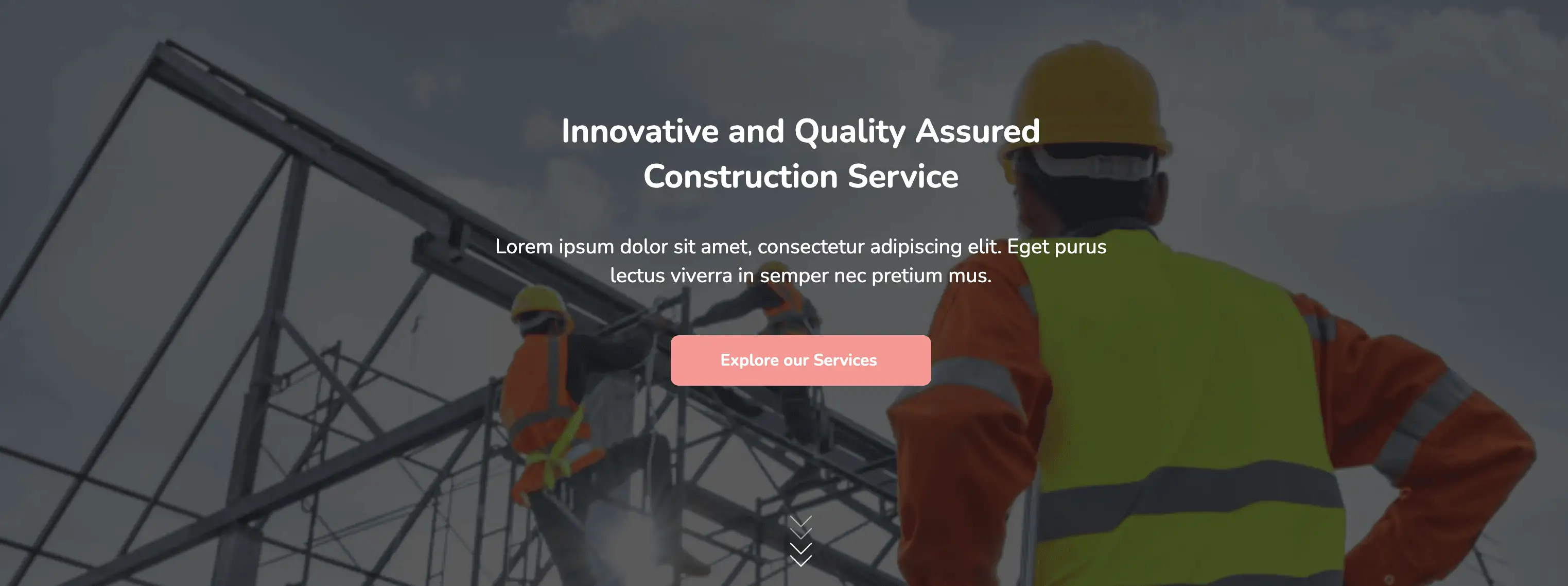
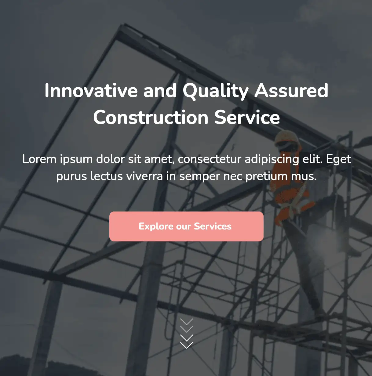
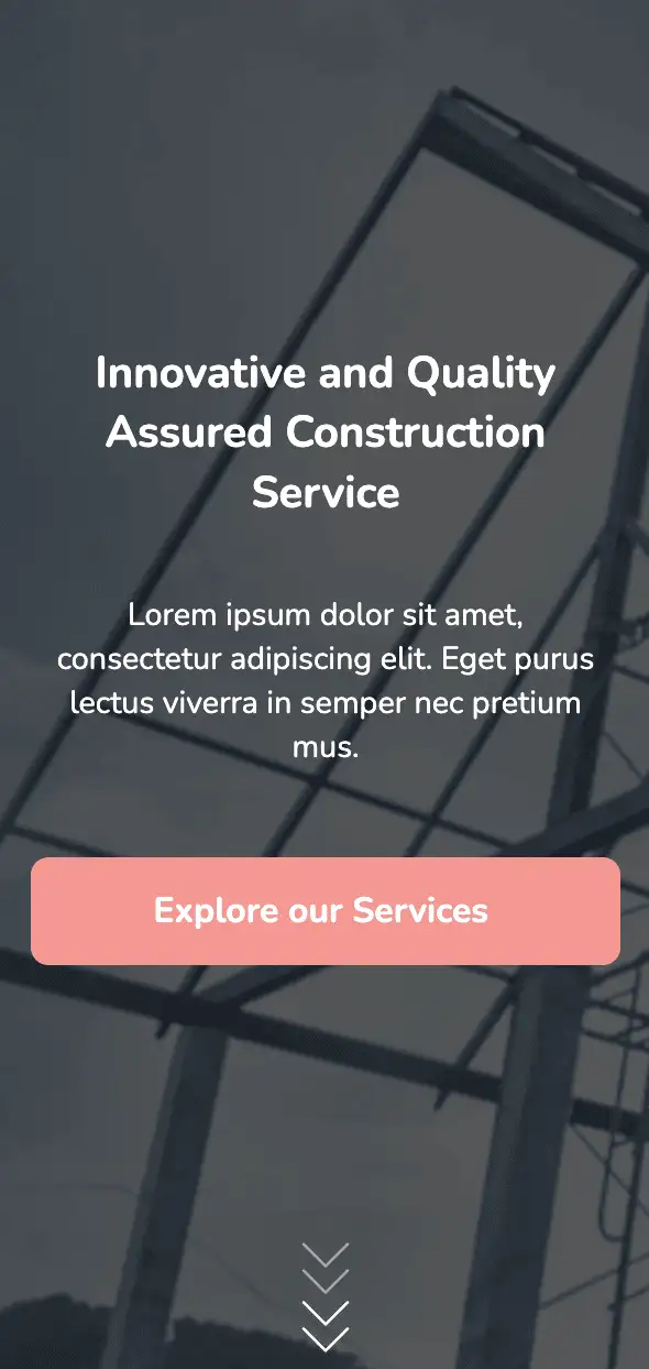
The above design does not overwhelm visitors with a list of their services on the homepage. Instead, they are greeted with a headline, enticing them to explore further. The arrows at the bottom of the widget on click, enable the user to scroll further down the page.
View Code
HTML
CSS
JS
Responsive CSS
Output
          .atf_36 * {
    font-family: Nunito, sans-serif;
}

.atf_36 .text-blk {
    margin-top: 0px;
    margin-right: 0px;
    margin-bottom: 0px;
    margin-left: 0px;
    line-height: 25px;
}

.atf_36 input:focus {
    outline-color: initial;
    outline-style: none;
    outline-width: initial;
}

.atf_36 .responsive-container-block {
    min-height: 75px;
    height: fit-content;
    width: 100%;
    padding-top: 10px;
    padding-right: 10px;
    padding-bottom: 10px;
    padding-left: 10px;
    display: flex;
    flex-wrap: wrap;
    margin-top: 0px;
    margin-right: auto;
    margin-bottom: 0px;
    margin-left: auto;
    justify-content: flex-start;
}

.atf_36 .responsive-container-block.big-container {
    padding-top: 10px;
    padding-right: 30px;
    padding-bottom: 10px;
    padding-left: 30px;
    min-height: 800px;
    background-size: cover;
    align-items: center;
    background-color: rgba(21, 21, 21, 0.7);
    flex-direction: column;
    justify-content: center;
}

.atf_36 .imgBG {
    background-image: url("https://workik-widget-assets.s3.amazonaws.com/widget-assets/images/cw1.svg");
    background-size: cover;
    background-repeat-x: no-repeat;
    background-repeat-y: no-repeat;
}

.atf_36 .responsive-container-block.container {
    max-width: 1320px;
    padding-top: 0px;
    padding-right: 0px;
    padding-bottom: 0px;
    padding-left: 0px;
    color: white;
    text-decoration-line: none;
    text-decoration-thickness: initial;
    text-decoration-style: initial;
    text-decoration-color: initial;
    flex-direction: column;
    justify-content: flex-start;
    align-items: center;
    text-align: center;
    margin-top: 120px;
    margin-right: auto;
    margin-bottom: 150px;
    margin-left: auto;
}

.atf_36 .text-blk.landing10-head {
    font-size: 40px;
    line-height: 55px;
    font-weight: 700;
    max-width: 750px;
    margin-top: 0px;
    margin-right: 0px;
    margin-bottom: 20px;
    margin-left: 0px;
}

.atf_36 .text-blk.landing10-subhead {
    max-width: 790px;
    font-size: 25px;
    line-height: 35px;
    margin-top: 0px;
    margin-right: 0px;
    margin-bottom: 45px;
    margin-left: 0px;
}

.atf_36 .input-box {
    max-width: 650px;
    width: 100%;
}

.atf_36 .landing-button {
    height: auto;
    width: auto;
    font-size: 20px;
    font-weight: 700;
    color: white;
    background-color: #f49892;
    cursor: pointer;
    border-top-width: 0px;
    border-right-width: 0px;
    border-bottom-width: 0px;
    border-left-width: 0px;
    border-top-style: outset;
    border-right-style: outset;
    border-bottom-style: outset;
    border-left-style: outset;
    border-top-color: #767676;
    border-right-color: #767676;
    border-bottom-color: #767676;
    border-left-color: #767676;
    border-image-source: initial;
    border-image-slice: initial;
    border-image-width: initial;
    border-image-outset: initial;
    border-image-repeat: initial;
    border-top-left-radius: 10px;
    border-top-right-radius: 10px;
    border-bottom-right-radius: 10px;
    border-bottom-left-radius: 10px;
    padding-top: 17px;
    padding-right: 60px;
    padding-bottom: 17px;
    padding-left: 60px;
    line-height: 27px;
}

.atf_36 .landing-button:hover {
    background-image: initial;
    background-position-x: initial;
    background-position-y: initial;
    background-size: initial;
    background-repeat-x: initial;
    background-repeat-y: initial;
    background-attachment: initial;
    background-origin: initial;
    background-clip: initial;
    background-color: #f49832;
}

.atf_36 .text-blk.onlineEducation {
    font-size: 20px;
    line-height: 28px;
    font-weight: 700;
    margin-top: 0px;
    margin-right: 0px;
    margin-bottom: 10px;
    margin-left: 0px;
}

.atf_36 .btn {
    padding-top: 0px;
    padding-right: 0px;
    padding-bottom: 0px;
    padding-left: 0px;
}

.atf_36 .downArrowImg {
    margin-top: 0px;
    margin-right: auto;
    margin-bottom: 0px;
    margin-left: auto;
    width: 40px;
    height: 75px;
    cursor: pointer;
}

.atf_36 #iuy3u {
    margin: 0 auto 0 auto;
}

@media (max-width: 1024px) {
    .atf_36 .responsive-container-block.big-container {
        background-size: contain;
        background-repeat-x: no-repeat;
        background-repeat-y: no-repeat;
    }

    .atf_36 .responsive-container-block.big-container {
        background-size: cover;
    }

    .atf_36 .responsive-container-block.big-container {
        background-position-x: 50%;
        background-position-y: 50%;
    }
}

@media (max-width: 768px) {
    .atf_36 .responsive-container-block.big-container {
        background-size: cover;
    }

    .atf_36 .text-blk.landing10-head {
        font-size: 36px;
        line-height: 45px;
    }

    .atf_36 .text-blk.landing10-subhead {
        font-size: 16px;
        line-height: 26px;
    }

    .atf_36 .text-blk.landing10-subhead {
        margin-top: 0px;
        margin-right: 0px;
        margin-bottom: 40px;
        margin-left: 0px;
    }

    .atf_36 .responsive-container-block.big-container {
        background-position-x: 50%;
        background-position-y: 50%;
    }

    .atf_36 .text-blk.landing10-head {
        font-size: 40px;
        line-height: 55px;
    }

    .atf_36 .text-blk.landing10-subhead {
        font-size: 25px;
        line-height: 34px;
    }
}

@media (max-width: 500px) {
    .atf_36 .landing-button {
        width: 100%;
    }

    .atf_36 .responsive-container-block.big-container {
        background-position-x: 50%;
        background-position-y: 50%;
    }

    .atf_36 .responsive-container-block.big-container {
        padding-top: 10px;
        padding-right: 20px;
        padding-bottom: 10px;
        padding-left: 20px;
    }

    .atf_36 .text-blk.landing10-head {
        font-size: 25px;
        line-height: 34px;
        margin-top: 0px;
        margin-right: 0px;
        margin-bottom: 20px;
        margin-left: 0px;
    }

    .atf_36 .text-blk.landing10-subhead {
        font-size: 20px;
        line-height: 27px;
    }

    .atf_36 .text-blk.onlineEducation {
        margin-top: 0px;
        margin-right: 0px;
        margin-bottom: 20px;
        margin-left: 0px;
    }

    .atf_36 .responsive-container-block.container {
        margin-top: 200px;
        margin-right: 0px;
        margin-bottom: 150px;
        margin-left: 0px;
    }

    .atf_36 .text-blk.landing10-subhead {
        font-size: 18px;
        line-height: 25px;
    }
}
          @import url('https://fonts.googleapis.com/css2?family=Nunito:wght@200;300;400;600;700;800&display=swap');
        *, *:before, *:after {
        -moz-box-sizing: border-box;
        -webkit-box-sizing: border-box;
        box-sizing: border-box;
        }
        body {
        margin: 0;
        }
        .wk-desk-1{
        width: 8.333333%;
        }
        .wk-desk-2{
        width: 16.666667%;
        }
        .wk-desk-3{
        width: 25%;
        }
        .wk-desk-4{
        width: 33.333333%;
        }
        .wk-desk-5{
        width: 41.666667%;
        }
        .wk-desk-6{
        width: 50%;
        }
        .wk-desk-7{
        width: 58.333333%;
        }
        .wk-desk-8{
        width: 66.666667%;
        }
        .wk-desk-9{
        width: 75%;
        }
        .wk-desk-10{
        width: 83.333333%;
        }
        .wk-desk-11{
        width: 91.666667%;
        }
        .wk-desk-12{
        width: 100%;
        }
        @media (max-width: 1024px) {
        .wk-ipadp-1{
        width: 8.333333%;
        }
        .wk-ipadp-2{
        width: 16.666667%;
        }
        .wk-ipadp-3{
        width: 25%;
        }
        .wk-ipadp-4{
        width: 33.333333%;
        }
        .wk-ipadp-5{
        width: 41.666667%;
        }
        .wk-ipadp-6{
        width: 50%;
        }
        .wk-ipadp-7{
        width: 58.333333%;
        }
        .wk-ipadp-8{
        width: 66.666667%;
        }
        .wk-ipadp-9{
        width: 75%;
        }
        .wk-ipadp-10{
        width: 83.333333%;
        }
        .wk-ipadp-11{
        width: 91.666667%;
        }
        .wk-ipadp-12{
        width: 100%;
        }
        }
        @media (max-width: 768px) {
        .wk-tab-1{
        width: 8.333333%;
        }
        .wk-tab-2{
        width: 16.666667%;
        }
        .wk-tab-3{
        width: 25%;
        }
        .wk-tab-4{
        width: 33.333333%;
        }
        .wk-tab-5{
        width: 41.666667%;
        }
        .wk-tab-6{
        width: 50%;
        }
        .wk-tab-7{
        width: 58.333333%;
        }
        .wk-tab-8{
        width: 66.666667%;
        }
        .wk-tab-9{
        width: 75%;
        }
        .wk-tab-10{
        width: 83.333333%;
        }
        .wk-tab-11{
        width: 91.666667%;
        }
        .wk-tab-12{
        width: 100%;
        }
        }
        @media (max-width: 500px) {
        .wk-mobile-1{
        width: 8.333333%;
        }
        .wk-mobile-2{
        width: 16.666667%;
        }
        .wk-mobile-3{
        width: 25%;
        }
        .wk-mobile-4{
        width: 33.333333%;
        }
        .wk-mobile-5{
        width: 41.666667%;
        }
        .wk-mobile-6{
        width: 50%;
        }
        .wk-mobile-7{
        width: 58.333333%;
        }
        .wk-mobile-8{
        width: 66.666667%;
        }
        .wk-mobile-9{
        width: 75%;
        }
        .wk-mobile-10{
        width: 83.333333%;
        }
        .wk-mobile-11{
        width: 91.666667%;
        }
        .wk-mobile-12{
        width: 100%;
        }
        }
Reset
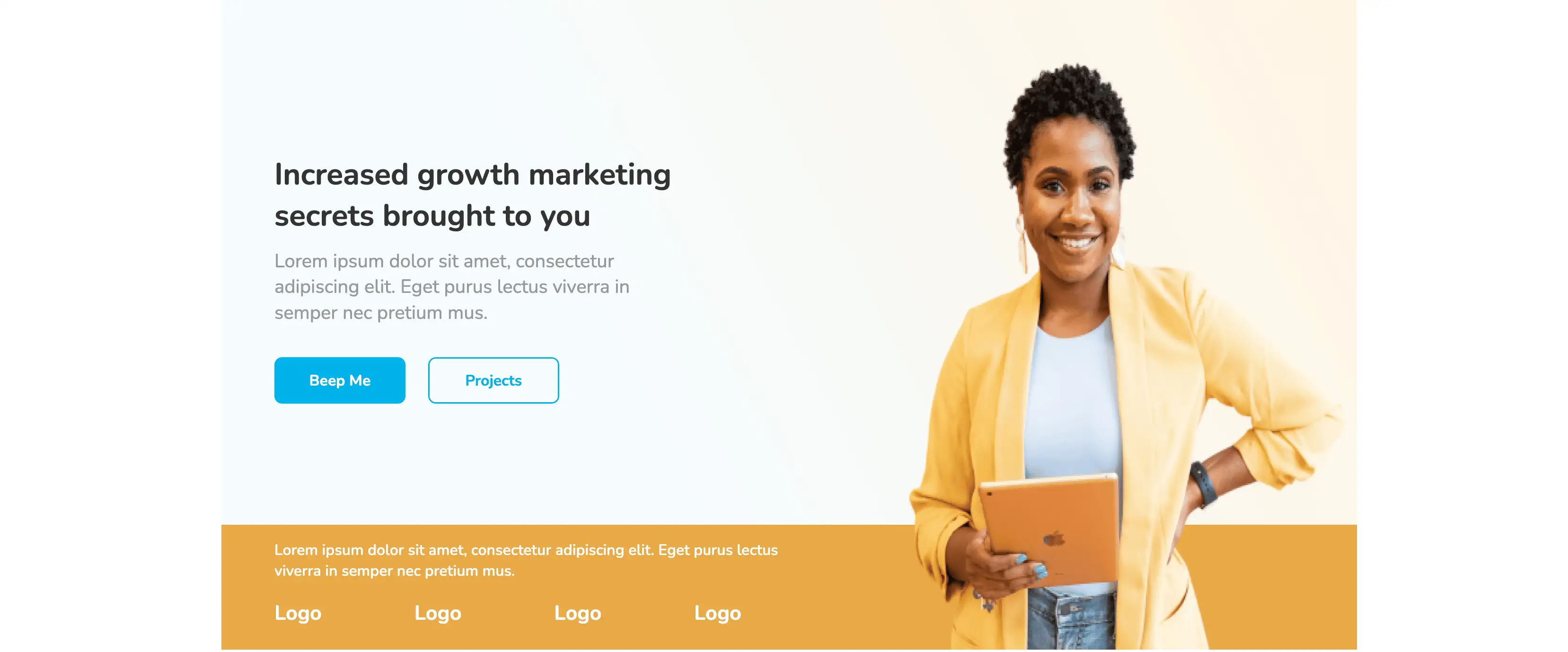
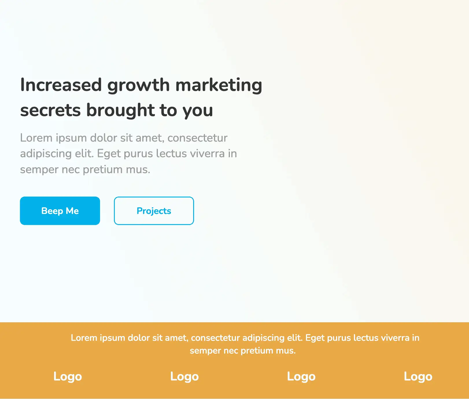
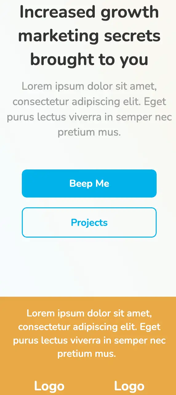
This design includes two sections: one for presenting the company tagline and the other for displaying brand links. The top section incorporates a background with a subtle color gradient. It concisely explains organization services and the vibrant CTA attracts visitors. The client brand logo helps to build the brand credibility for the company.
View Code
HTML
CSS
JS
Responsive CSS
Output
Increased growth marketing secrets brought to you
Lorem ipsum dolor sit amet, consectetur adipiscing elit. Eget purus lectus viverra in semper nec pretium mus.

Lorem ipsum dolor sit amet, consectetur adipiscing elit. Eget purus lectus viverra in semper nec pretium mus.
Logo
Logo
Logo
Logo
          .atf_28 .text-blk {
    margin-top: 0px;
    margin-right: 0px;
    margin-bottom: 0px;
    margin-left: 0px;
    padding-top: 10px;
    padding-right: 10px;
    padding-bottom: 10px;
    padding-left: 10px;
    line-height: 25px;
}

.atf_28 * {
    font-family: Nunito, sans-serif;
}

.atf_28 .responsive-container-block {
    min-height: 75px;
    height: fit-content;
    width: 100%;
    padding-top: 10px;
    padding-right: 10px;
    padding-bottom: 10px;
    padding-left: 10px;
    display: flex;
    flex-wrap: wrap;
    margin-top: 0px;
    margin-right: auto;
    margin-bottom: 0px;
    margin-left: auto;
    justify-content: flex-start;
}

.atf_28 .responsive-container-block.bg {
    max-width: 1500px;
    flex-direction: column;
    align-items: flex-start;
    position: relative;
    padding-top: 10px;
    padding-right: 0px;
    padding-bottom: 0px;
    padding-left: 0px;
    background-image: url("https://workik-widget-assets.s3.amazonaws.com/widget-assets/images/PM5.10.jpg");
    background-size: cover;
    background-position-x: 50%;
    background-position-y: 50%;
}

.atf_28 .text-blk.title {
    font-size: 40px;
    line-height: 54.56px;
    font-weight: 700;
    max-width: 50%;
    color: #333333;
    width: 560px;
    margin-top: 200px;
    margin-right: 0px;
    margin-bottom: 0px;
    margin-left: 60px;
}

.atf_28 .text-blk.heading {
    font-size: 25px;
    line-height: 34.1px;
    max-width: 50%;
    padding-top: 5px;
    padding-right: 10px;
    padding-bottom: 10px;
    padding-left: 10px;
    color: #999999;
    width: 520px;
    margin-top: 0px;
    margin-right: 0px;
    margin-bottom: 22px;
    margin-left: 60px;
}

.atf_28 .responsive-container-block.btn-cont {
    width: auto;
    margin-top: 0px;
    margin-right: 0px;
    margin-bottom: 200px;
    margin-left: 0px;
}

.atf_28 .text-blk.beep {
    margin-top: 0px;
    margin-right: 30px;
    margin-bottom: 0px;
    margin-left: 0px;
    font-size: 20px;
    line-height: 27.28px;
    display: flex;
    align-items: center;
    font-weight: 700;
    padding-top: 15px;
    padding-right: 10px;
    padding-bottom: 15px;
    padding-left: 10px;
    max-width: 173px;
    width: 173px;
    text-align: left;
    justify-content: center;
    background-color: #00b2eb;
    color: white;
    border-top-left-radius: 10px;
    border-top-right-radius: 10px;
    border-bottom-right-radius: 10px;
    border-bottom-left-radius: 10px;
    cursor: pointer;
}

.atf_28 .text-blk.proj {
    display: flex;
    align-items: center;
    justify-content: center;
    width: 173px;
    max-width: 173px;
    padding-top: 15px;
    padding-right: 10px;
    padding-bottom: 15px;
    padding-left: 10px;
    border-top-left-radius: 10px;
    border-top-right-radius: 10px;
    border-bottom-right-radius: 10px;
    border-bottom-left-radius: 10px;
    font-size: 20px;
    line-height: 27.28px;
    font-weight: 700;
    cursor: pointer;
    color: #00b2eb;
    border-top-width: 2px;
    border-right-width: 2px;
    border-bottom-width: 2px;
    border-left-width: 2px;
    border-top-style: solid;
    border-right-style: solid;
    border-bottom-style: solid;
    border-left-style: solid;
    border-top-color: #00b2eb;
    border-right-color: #00b2eb;
    border-bottom-color: #00b2eb;
    border-left-color: #00b2eb;
    border-image-source: initial;
    border-image-slice: initial;
    border-image-width: initial;
    border-image-outset: initial;
    border-image-repeat: initial;
}

.atf_28 .responsive-container-block.form-blk.btn-cont {
    max-width: 50%;
    flex-wrap: nowrap;
    margin-top: 0px;
    margin-right: 0px;
    margin-bottom: 150px;
    margin-left: 60px;
}

.atf_28 #iczii {
    color: black;
}

.atf_28 .im {
    width: 48%;
    height: 100%;
    position: absolute;
    top: 0px;
    right: 0px;
}

.atf_28 .responsive-container-block.yellow {
    width: 100%;
    background-color: #eaa947;
    flex-direction: column;
    align-items: flex-start;
}

.atf_28 .text-blk.info {
    max-width: 50%;
    font-size: 20px;
    line-height: 27.28px;
    color: white;
    font-weight: 600;
    padding-top: 10px;
    padding-right: 10px;
    padding-bottom: 5px;
    padding-left: 10px;
    margin-top: 0px;
    margin-right: 0px;
    margin-bottom: 0px;
    margin-left: 50px;
}

.atf_28 .responsive-container-block.logo-cont {
    max-width: 50%;
    margin-top: 0px;
    margin-right: 0px;
    margin-bottom: 0px;
    margin-left: 40px;
    justify-content: space-between;
}

.atf_28 .text-blk.logo {
    width: 23%;
    font-size: 27px;
    line-height: 24px;
    color: white;
    font-weight: 700;
    text-align: left;
    display: flex;
    justify-content: flex-start;
    align-items: center;
}

@media (max-width: 1024px) {
    .atf_28 .text-blk.heading {
        margin-top: 0px;
        margin-right: 0px;
        margin-bottom: 22px;
        margin-left: 40px;
        max-width: 515px;
    }

    .atf_28 .text-blk.title {
        margin-top: 200px;
        margin-right: 0px;
        margin-bottom: 0px;
        margin-left: 40px;
        max-width: 550%;
    }

    .atf_28 .responsive-container-block.form-blk.btn-cont {
        margin-top: 0px;
        margin-right: 0px;
        margin-bottom: 200px;
        margin-left: 40px;
    }

    .atf_28 .responsive-container-block.logo-cont {
        margin-top: 0px;
        margin-right: 0px;
        margin-bottom: 0px;
        margin-left: 20px;
        text-align: left;
        max-width: 100%;
    }

    .atf_28 .text-blk.info {
        margin-top: 0px;
        margin-right: 0px;
        margin-bottom: 0px;
        margin-left: 30px;
        max-width: 80%;
        text-align: center;
    }

    .atf_28 .im {
        display: none;
    }

    .atf_28 .text-blk.logo {
        justify-content: center;
    }

    .atf_28 .responsive-container-block.yellow {
        align-items: center;
    }
}

@media (max-width: 768px) {
    .atf_28 .responsive-container-block.bg {
        align-items: center;
    }

    .atf_28 .text-blk.title {
        text-align: center;
    }

    .atf_28 .text-blk.heading {
        text-align: center;
    }

    .atf_28 .responsive-container-block.form-blk.btn-cont {
        margin-top: 0px;
        margin-right: 0px;
        margin-bottom: 200px;
        margin-left: 0px;
    }

    .atf_28 .text-blk.title {
        margin-top: 200px;
        margin-right: 0px;
        margin-bottom: 0px;
        margin-left: 0px;
    }

    .atf_28 .text-blk.heading {
        margin-top: 0px;
        margin-right: 0px;
        margin-bottom: 22px;
        margin-left: 0px;
    }

    .atf_28 .im {
        display: none;
    }

    .atf_28 .responsive-container-block.form-blk.btn-cont {
        max-width: 100%;
        width: auto;
        flex-direction: row;
        flex-wrap: wrap;
        margin-top: 0px;
        margin-right: 0px;
        margin-bottom: 150px;
        margin-left: 0px;
    }

    .atf_28 .text-blk.title {
        max-width: 100%;
    }

    .atf_28 .text-blk.heading {
        max-width: 100%;
    }

    .atf_28 .responsive-container-block.logo-cont {
        max-width: 100%;
        margin-top: 0px;
        margin-right: 0px;
        margin-bottom: 0px;
        margin-left: 0px;
    }

    .atf_28 .text-blk.info {
        max-width: 100%;
        margin-top: 0px;
        margin-right: 0px;
        margin-bottom: 0px;
        margin-left: 0px;
        text-align: center;
    }

    .atf_28 .text-blk.logo {
        justify-content: center;
    }
}

@media (max-width: 500px) {
    .atf_28 .text-blk.heading {
        margin-top: 0px;
        margin-right: 0px;
        margin-bottom: 40px;
        margin-left: 0px;
    }

    .atf_28 .responsive-container-block.btn-cont {
        flex-direction: column;
        width: 80%;
        margin-top: 0px;
        margin-right: 0px;
        margin-bottom: 100px;
        margin-left: 0px;
    }

    .atf_28 .text-blk.beep {
        margin-top: 0px;
        margin-right: 0px;
        margin-bottom: 20px;
        margin-left: 0px;
        width: 100%;
        min-width: 100%;
    }

    .atf_28 .text-blk.proj {
        min-width: 100%;
    }

    .atf_28 .text-blk.title {
        margin-top: 100px;
        margin-right: 0px;
        margin-bottom: 0px;
        margin-left: 0px;
    }

    .atf_28 .responsive-container-block.form-blk.btn-cont {
        flex-wrap: wrap;
        margin-top: 0px;
        margin-right: 0px;
        margin-bottom: 110px;
        margin-left: 0px;
    }

    .atf_28 .text-blk.info {
        margin-top: 0px;
        margin-right: 0px;
        margin-bottom: 15px;
        margin-left: 0px;
    }

    .atf_28 .text-blk.logo {
        width: 50%;
        margin-top: 0px;
        margin-right: 0px;
        margin-bottom: 10px;
        margin-left: 0px;
    }

    .atf_28 .text-blk.title {
        font-size: 35px;
        line-height: 48px;
    }

    .atf_28 .text-blk.heading {
        font-size: 22px;
        line-height: 31px;
    }
}
          @import url('https://fonts.googleapis.com/css2?family=Nunito:wght@200;300;400;600;700;800&display=swap');
        *, *:before, *:after {
        -moz-box-sizing: border-box;
        -webkit-box-sizing: border-box;
        box-sizing: border-box;
        }
        body {
        margin: 0;
        }
        .wk-desk-1{
        width: 8.333333%;
        }
        .wk-desk-2{
        width: 16.666667%;
        }
        .wk-desk-3{
        width: 25%;
        }
        .wk-desk-4{
        width: 33.333333%;
        }
        .wk-desk-5{
        width: 41.666667%;
        }
        .wk-desk-6{
        width: 50%;
        }
        .wk-desk-7{
        width: 58.333333%;
        }
        .wk-desk-8{
        width: 66.666667%;
        }
        .wk-desk-9{
        width: 75%;
        }
        .wk-desk-10{
        width: 83.333333%;
        }
        .wk-desk-11{
        width: 91.666667%;
        }
        .wk-desk-12{
        width: 100%;
        }
        @media (max-width: 1024px) {
        .wk-ipadp-1{
        width: 8.333333%;
        }
        .wk-ipadp-2{
        width: 16.666667%;
        }
        .wk-ipadp-3{
        width: 25%;
        }
        .wk-ipadp-4{
        width: 33.333333%;
        }
        .wk-ipadp-5{
        width: 41.666667%;
        }
        .wk-ipadp-6{
        width: 50%;
        }
        .wk-ipadp-7{
        width: 58.333333%;
        }
        .wk-ipadp-8{
        width: 66.666667%;
        }
        .wk-ipadp-9{
        width: 75%;
        }
        .wk-ipadp-10{
        width: 83.333333%;
        }
        .wk-ipadp-11{
        width: 91.666667%;
        }
        .wk-ipadp-12{
        width: 100%;
        }
        }
        @media (max-width: 768px) {
        .wk-tab-1{
        width: 8.333333%;
        }
        .wk-tab-2{
        width: 16.666667%;
        }
        .wk-tab-3{
        width: 25%;
        }
        .wk-tab-4{
        width: 33.333333%;
        }
        .wk-tab-5{
        width: 41.666667%;
        }
        .wk-tab-6{
        width: 50%;
        }
        .wk-tab-7{
        width: 58.333333%;
        }
        .wk-tab-8{
        width: 66.666667%;
        }
        .wk-tab-9{
        width: 75%;
        }
        .wk-tab-10{
        width: 83.333333%;
        }
        .wk-tab-11{
        width: 91.666667%;
        }
        .wk-tab-12{
        width: 100%;
        }
        }
        @media (max-width: 500px) {
        .wk-mobile-1{
        width: 8.333333%;
        }
        .wk-mobile-2{
        width: 16.666667%;
        }
        .wk-mobile-3{
        width: 25%;
        }
        .wk-mobile-4{
        width: 33.333333%;
        }
        .wk-mobile-5{
        width: 41.666667%;
        }
        .wk-mobile-6{
        width: 50%;
        }
        .wk-mobile-7{
        width: 58.333333%;
        }
        .wk-mobile-8{
        width: 66.666667%;
        }
        .wk-mobile-9{
        width: 75%;
        }
        .wk-mobile-10{
        width: 83.333333%;
        }
        .wk-mobile-11{
        width: 91.666667%;
        }
        .wk-mobile-12{
        width: 100%;
        }
        }
Reset


