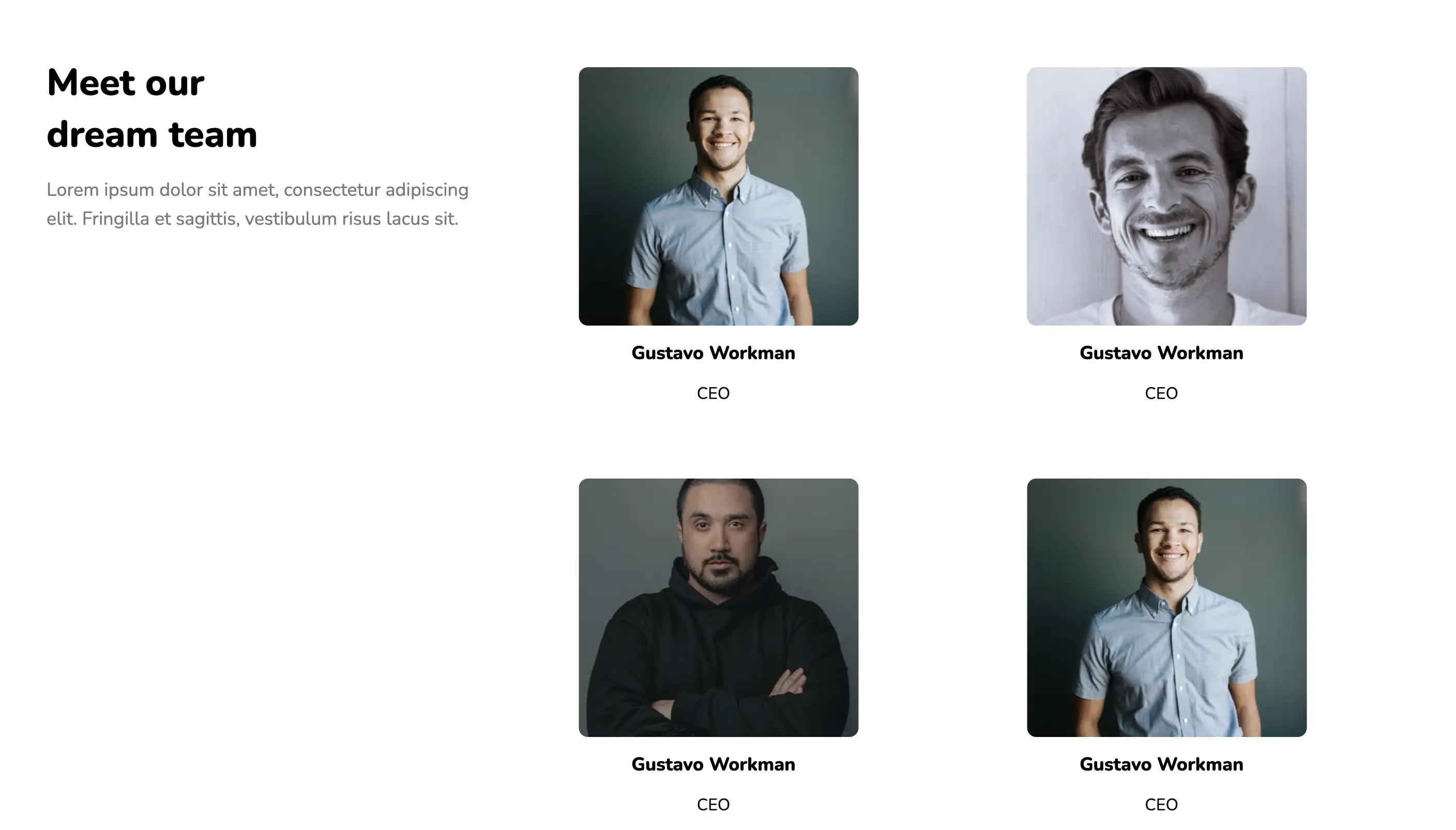
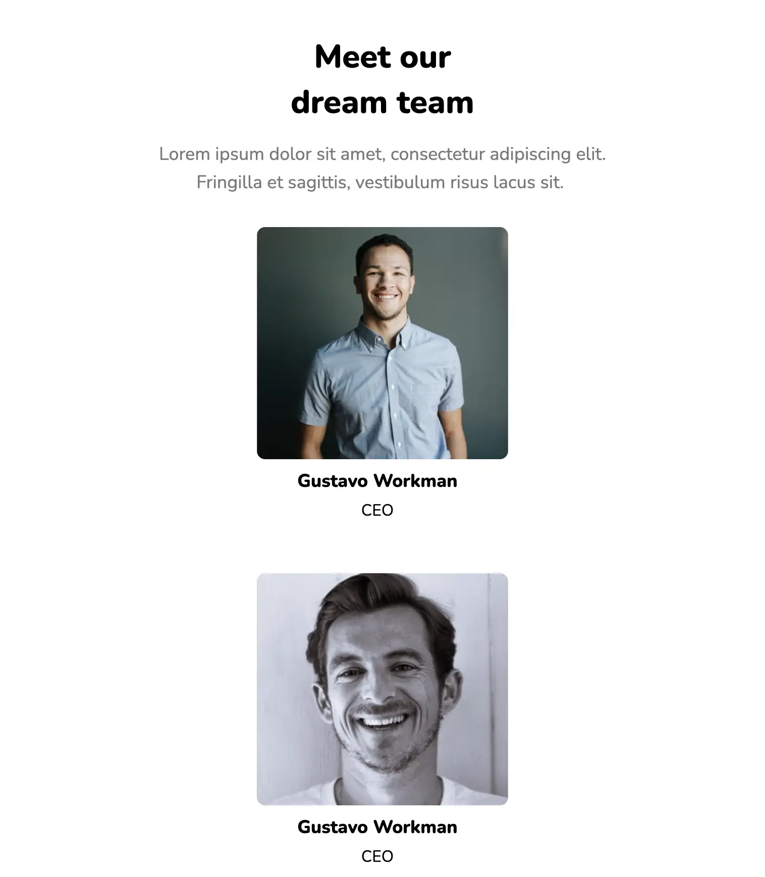
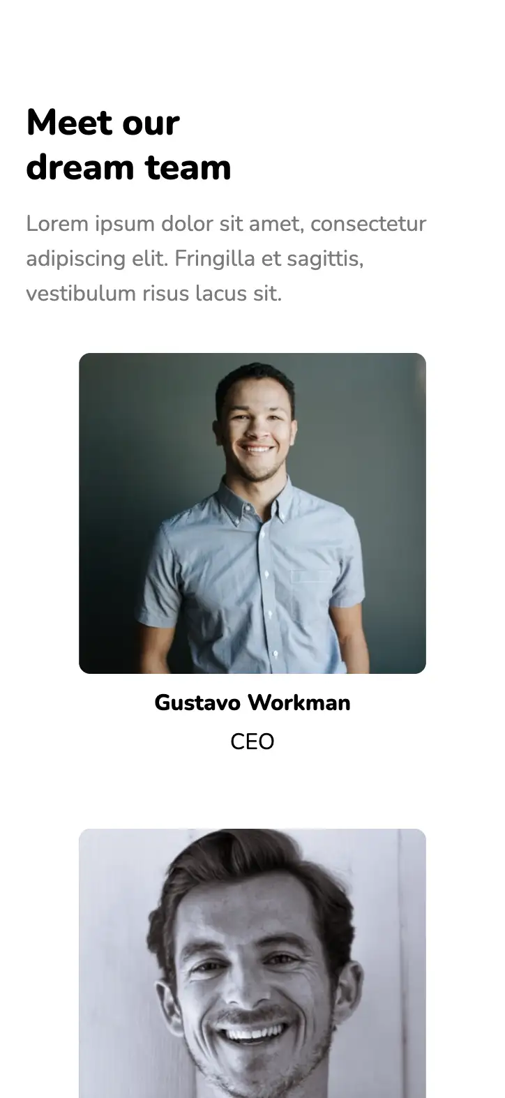
This design makes use of high-quality, cheerful images of each team member. The text below allows the user to add the name and position of the team member on the website. They are all organised in a grid layout which makes things easier to follow. Individual cards have a flex display and wrap around one another.
View Code
HTML
CSS
JS
Responsive CSS
Output
              Meet our dream team


              Lorem ipsum dolor sit amet, consectetur adipiscing elit. Fringilla et sagittis,
          vestibulum risus lacus sit.


                Gustavo Workman


                CEO


                Gustavo Workman


                CEO


                Gustavo Workman


                CEO


                Gustavo Workman


                CEO


                Gustavo Workman


                CEO


                Gustavo Workman


                CEO
          *{
      font-family:Nunito, sans-serif;
    }
    .text-blk{
      margin-top:0px;
      margin-right:0px;
      margin-bottom:0px;
      margin-left:0px;
      padding-top:10px;
      padding-right:10px;
      padding-bottom:10px;
      padding-left:10px;
      line-height:25px;
    }
    .responsive-cell-block{
      min-height:75px;
    }
    .responsive-container-block{
      min-height:75px;
      height:fit-content;
      width:100%;
      padding-top:10px;
      padding-right:10px;
      padding-bottom:10px;
      padding-left:10px;
      display:flex;
      flex-wrap:wrap;
      margin-top:0px;
      margin-right:auto;
      margin-bottom:0px;
      margin-left:auto;
      justify-content:flex-start;
    }
    .outer-container{
      padding-top:10px;
      padding-right:30px;
      padding-bottom:10px;
      padding-left:30px;
    }
    .inner-container{
      max-width:1320px;
      padding-top:10px;
      padding-right:10px;
      padding-bottom:10px;
      padding-left:10px;
      margin-top:50px;
      margin-right:auto;
      margin-bottom:50px;
      margin-left:auto;
    }
    .heading-text{
      font-size:48px;
      line-height:50px;
      font-weight:900;
      display:flex;
      flex-direction:column;
      margin-top:0px;
      margin-right:0px;
      margin-bottom:15px;
      margin-left:0px;
      padding-top:0px;
      padding-right:0px;
      padding-bottom:0px;
      padding-left:0px;
    }
    .sub-heading-text{
      line-height:30px;
      color:rgb(122, 122, 122);
      margin-top:0px;
      margin-right:0px;
      margin-bottom:0px;
      margin-left:0px;
      padding-top:0px;
      padding-right:0px;
      padding-bottom:0px;
      padding-left:0px;
    }
    .name{
      font-size:18px;
      font-weight:800;
      line-height:24px;
      padding-top:15px;
      padding-right:10px;
      padding-bottom:5px;
      padding-left:0px;
      margin-top:0px;
      margin-right:0px;
      margin-bottom:0px;
      margin-left:0px;
    }
    .position{
      line-height:24px;
      padding-top:10px;
      padding-right:10px;
      padding-bottom:10px;
      padding-left:0px;
      margin-top:0px;
      margin-right:0px;
      margin-bottom:0px;
      margin-left:0px;
    }
    .card{
      display:block;
      flex-direction:column;
      align-items:center;
      padding-top:10px;
      padding-right:10px;
      padding-bottom:10px;
      padding-left:10px;
    }
    .card-img{
      width:100%;
      height:250px;
      margin-top:0px;
      margin-right:auto;
      margin-bottom:0px;
      margin-left:auto;
      max-width:300px;
    }
    .card-container{
      display:inline-block;
      margin-top:0px;
      margin-right:0px;
      margin-bottom:40px;
      margin-left:0px;
    }
    .headings-container{
      padding-top:0px;
      padding-right:10px;
      padding-bottom:0px;
      padding-left:0px;
    }
    .team-members-container{
      display:flex;
      flex-wrap:wrap;
    }
    @media (max-width: 1024px){
      .name{
        margin-top:0px;
        margin-right:0px;
        margin-bottom:0px;
        margin-left:0px;
        padding-top:10px;
        padding-right:10px;
        padding-bottom:5px;
        padding-left:0px;
      }
      .position{
        margin-top:0px;
        margin-right:0px;
        margin-bottom:0px;
        margin-left:0px;
        padding-top:0px;
        padding-right:10px;
        padding-bottom:10px;
        padding-left:0px;
      }
      .card-img{
        width:100%;
        min-width:100%;
        height:250px;
        min-height:230px;
        max-height:230px;
      }
    }
    @media (max-width: 768px){
      .position{
        margin-top:0px;
        margin-right:0px;
        margin-bottom:0px;
        margin-left:0px;
      }
      .name{
        margin-top:0px;
        margin-right:0px;
        margin-bottom:0px;
        margin-left:0px;
      }
      .heading-text{
        text-align:center;
        padding-top:10px;
        padding-right:0px;
        padding-bottom:10px;
        padding-left:0px;
      }
      .sub-heading-text{
        text-align:center;
        color:rgb(122, 122, 122);
        max-width:500px;
        margin-top:0px;
        margin-right:auto;
        margin-bottom:0px;
        margin-left:auto;
      }
      .team-members-container{
        padding-top:0px;
        padding-right:0px;
        padding-bottom:0px;
        padding-left:0px;
        margin-top:30px;
        margin-right:0px;
        margin-bottom:0px;
        margin-left:0px;
      }
      .card{
        display:flex;
      }
      .card-img{
        max-width:300px;
        min-width:250px;
      }
      .headings-container{
        padding-top:0px;
        padding-right:0px;
        padding-bottom:0px;
        padding-left:0px;
      }
      .card{
        padding-top:0px;
        padding-right:0px;
        padding-bottom:0px;
        padding-left:0px;
      }
      .heading-text{
        padding-top:0px;
        padding-right:0px;
        padding-bottom:0px;
        padding-left:0px;
      }
      .inner-container{
        padding-top:0px;
        padding-right:0px;
        padding-bottom:0px;
        padding-left:0px;
      }
    }
    @media (max-width: 500px){
      .heading-text{
        text-align:left;
        line-height:65px;
      }
      .sub-heading-text{
        color:rgb(122, 122, 122);
        text-align:left;
      }
      .name{
        margin-top:0px;
        margin-right:0px;
        margin-bottom:0px;
        margin-left:0px;
        padding-top:10px;
        padding-right:0px;
        padding-bottom:5px;
        padding-left:0px;
      }
      .position{
        margin-top:0px;
        margin-right:0px;
        margin-bottom:0px;
        margin-left:0px;
        padding-top:0px;
        padding-right:0px;
        padding-bottom:10px;
        padding-left:0px;
      }
      .inner-container{
        margin-top:80px;
        margin-right:0px;
        margin-bottom:50px;
        margin-left:0px;
        padding-top:0px;
        padding-right:0px;
        padding-bottom:0px;
        padding-left:0px;
      }
      .card{
        display:flex;
        flex-direction:column;
        align-items:center;
        justify-content:center;
      }
      .outer-container{
        padding-top:10px;
        padding-right:20px;
        padding-bottom:10px;
        padding-left:20px;
      }
      .card-img{
        width:100%;
      }
      .heading-text{
        font-size:40px;
        line-height:45px;
      }
      .card-img{
        min-width:auto;
      }
    }
          @import url('https://fonts.googleapis.com/css2?family=Nunito:wght@200;300;400;600;700;800&display=swap');
        *, *:before, *:after {
        -moz-box-sizing: border-box;
        -webkit-box-sizing: border-box;
        box-sizing: border-box;
        }
        body {
        margin: 0;
        }
        .wk-desk-1{
        width: 8.333333%;
        }
        .wk-desk-2{
        width: 16.666667%;
        }
        .wk-desk-3{
        width: 25%;
        }
        .wk-desk-4{
        width: 33.333333%;
        }
        .wk-desk-5{
        width: 41.666667%;
        }
        .wk-desk-6{
        width: 50%;
        }
        .wk-desk-7{
        width: 58.333333%;
        }
        .wk-desk-8{
        width: 66.666667%;
        }
        .wk-desk-9{
        width: 75%;
        }
        .wk-desk-10{
        width: 83.333333%;
        }
        .wk-desk-11{
        width: 91.666667%;
        }
        .wk-desk-12{
        width: 100%;
        }
        @media (max-width: 1024px) {
        .wk-ipadp-1{
        width: 8.333333%;
        }
        .wk-ipadp-2{
        width: 16.666667%;
        }
        .wk-ipadp-3{
        width: 25%;
        }
        .wk-ipadp-4{
        width: 33.333333%;
        }
        .wk-ipadp-5{
        width: 41.666667%;
        }
        .wk-ipadp-6{
        width: 50%;
        }
        .wk-ipadp-7{
        width: 58.333333%;
        }
        .wk-ipadp-8{
        width: 66.666667%;
        }
        .wk-ipadp-9{
        width: 75%;
        }
        .wk-ipadp-10{
        width: 83.333333%;
        }
        .wk-ipadp-11{
        width: 91.666667%;
        }
        .wk-ipadp-12{
        width: 100%;
        }
        }
        @media (max-width: 768px) {
        .wk-tab-1{
        width: 8.333333%;
        }
        .wk-tab-2{
        width: 16.666667%;
        }
        .wk-tab-3{
        width: 25%;
        }
        .wk-tab-4{
        width: 33.333333%;
        }
        .wk-tab-5{
        width: 41.666667%;
        }
        .wk-tab-6{
        width: 50%;
        }
        .wk-tab-7{
        width: 58.333333%;
        }
        .wk-tab-8{
        width: 66.666667%;
        }
        .wk-tab-9{
        width: 75%;
        }
        .wk-tab-10{
        width: 83.333333%;
        }
        .wk-tab-11{
        width: 91.666667%;
        }
        .wk-tab-12{
        width: 100%;
        }
        }
        @media (max-width: 500px) {
        .wk-mobile-1{
        width: 8.333333%;
        }
        .wk-mobile-2{
        width: 16.666667%;
        }
        .wk-mobile-3{
        width: 25%;
        }
        .wk-mobile-4{
        width: 33.333333%;
        }
        .wk-mobile-5{
        width: 41.666667%;
        }
        .wk-mobile-6{
        width: 50%;
        }
        .wk-mobile-7{
        width: 58.333333%;
        }
        .wk-mobile-8{
        width: 66.666667%;
        }
        .wk-mobile-9{
        width: 75%;
        }
        .wk-mobile-10{
        width: 83.333333%;
        }
        .wk-mobile-11{
        width: 91.666667%;
        }
        .wk-mobile-12{
        width: 100%;
        }
        }
Reset
Join our community to see how developers are using Workik AI everyday.
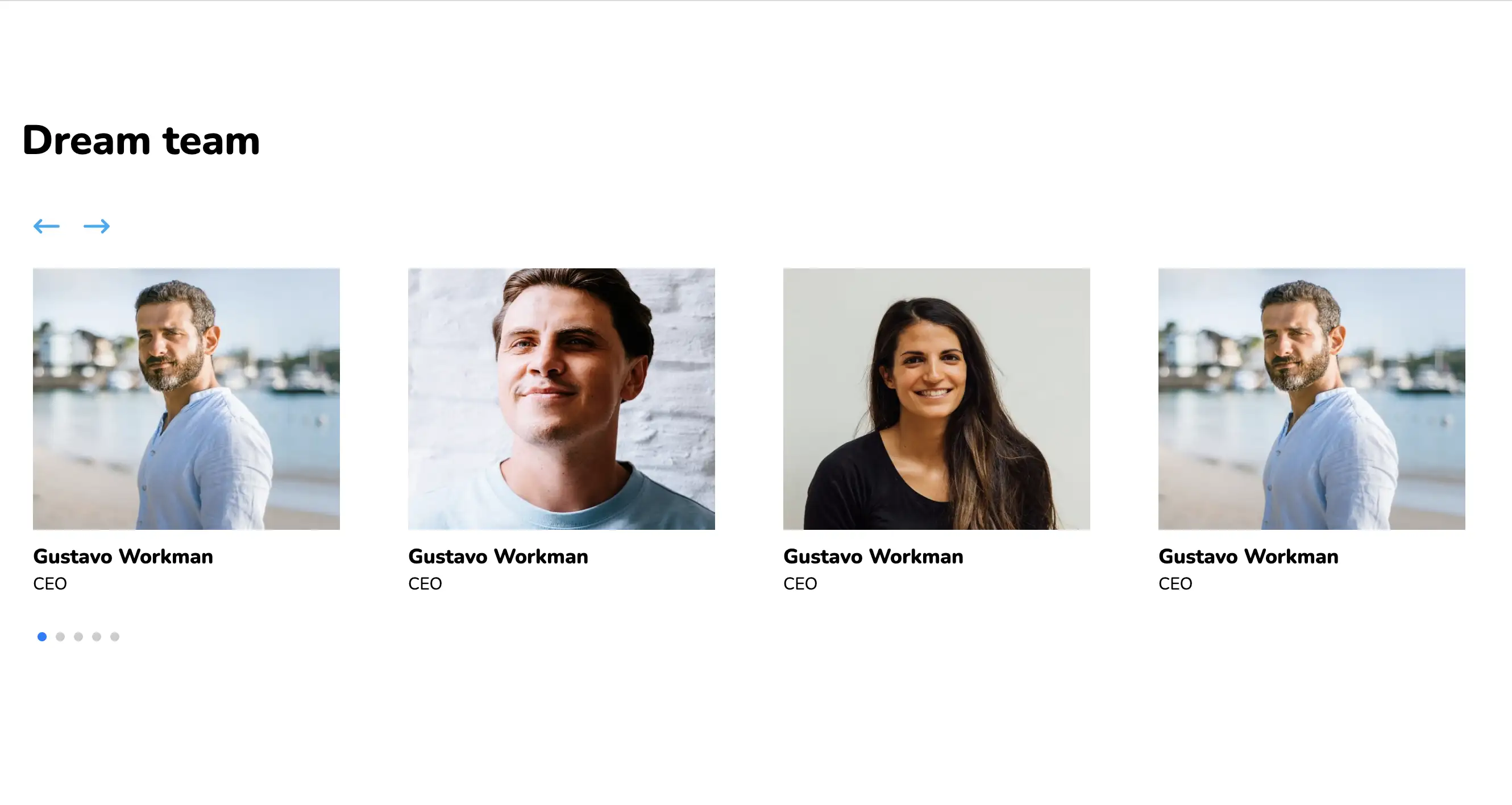
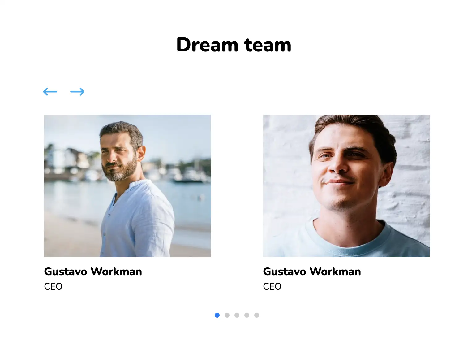
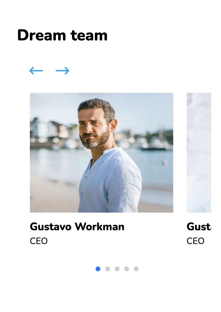
This slider-based team page has been created using the SwiperJS library. The carousel showcases the members of the team along with a short text describing their position in the company.
View Code
HTML
CSS
JS
Responsive CSS
Output
Dream team

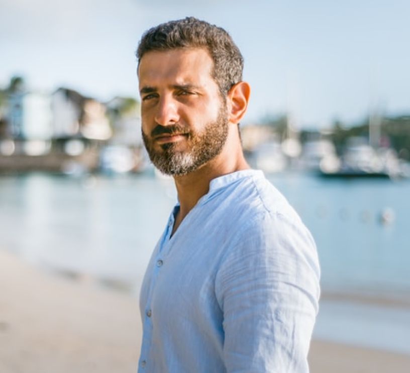
Gustavo Workman
CEO
Gustavo Workman
CEO
Gustavo Workman
CEO
Gustavo Workman
CEO
Gustavo Workman
CEO
          *{
  font-family:Nunito, sans-serif;
}
.swiper-container{
  width:100%;
  height:100%;
}
.text-blk{
  padding-top:10px;
  padding-right:10px;
  padding-bottom:10px;
  padding-left:10px;
  line-height:24px;
  font-size:16px;
  font-weight:400;
  margin-top:0px;
  margin-right:0px;
  margin-bottom:0px;
  margin-left:0px;
}
.responsive-container-block{
  min-height:75px;
  height:fit-content;
  width:100%;
  display:flex;
  flex-wrap:wrap;
  margin-top:0px;
  margin-right:auto;
  margin-bottom:0px;
  margin-left:auto;
  justify-content:flex-start;
}
.outer-container{
  padding-top:10px;
  padding-right:30px;
  padding-bottom:10px;
  padding-left:30px;
}
.inner-container{
  max-width:1320px;
  flex-direction:column;
  margin-top:80px;
  margin-right:0px;
  margin-bottom:0px;
  margin-left:200px;
}
.card-container{
  overflow-x:visible;
  overflow-y:visible;
}
.heading-text{
  font-size:48px;
  line-height:65px;
  font-weight:900;
  margin-top:0px;
  margin-right:0px;
  margin-bottom:30px;
  margin-left:0px;
  padding-top:10px;
  padding-right:10px;
  padding-bottom:10px;
  padding-left:0px;
}
.name{
  font-size:18px;
  line-height:24px;
  font-weight:800;
  padding-top:0px;
  padding-right:0px;
  padding-bottom:0px;
  padding-left:0px;
  margin-top:0px;
  margin-right:0px;
  margin-bottom:0px;
  margin-left:0px;
}
.team-member-image{
  height:230px;
  margin-top:0px;
  margin-right:0px;
  margin-bottom:0px;
  margin-left:0px;
  width:270px;
}
.card{
  display:block;
}
.position{
  padding-top:0px;
  padding-right:0px;
  padding-bottom:0px;
  padding-left:0px;
  margin-top:0px;
  margin-right:0px;
  margin-bottom:0px;
  margin-left:0px;
}
.swiper-slide{
  justify-content:flex-start;
  display:flex;
}
.arrow-right{
  transform:rotateX(0deg) rotateY(0deg) rotateZ(0deg) scaleX(1) scaleY(1) scaleZ(1);
  margin-top:0px;
  margin-right:0px;
  margin-bottom:0px;
  margin-left:20px;
  cursor:pointer;
  height:14px;
  width:24px;
}
.arrow-left{
  height:14px;
  transform:rotateX(0deg) rotateY(180deg) rotateZ(0deg) scaleX(1) scaleY(1) scaleZ(1);
  cursor:pointer;
}
.btn{
  display:flex;
  margin-top:0px;
  margin-right:0px;
  margin-bottom:30px;
  margin-left:0px;
  flex-direction:row-reverse;
}
.swiper-pagination{
  position:static;
  text-align:left;
  margin-top:30px;
  margin-right:0px;
  margin-bottom:0px;
  margin-left:0px;
}
.team-swiper{
    overflow:hidden;
}
@media (max-width: 768px){
  .inner-container{
    margin-top:80px;
    margin-right:0px;
    margin-bottom:0px;
    margin-left:0px;
    justify-content:center;
  }
  .card-container{
    margin-top:0px;
    margin-right:auto;
    margin-bottom:0px;
    margin-left:auto;
  }
  .swiper-slide{
    justify-content:center;
  }
  .heading-text{
    text-align:center;
  }
  .swiper-pagination{
    text-align:center;
  }
  .arrow-left{
    margin-top:0px;
    margin-right:0px;
    margin-bottom:0px;
    margin-left:20px;
  }
  .arrow-right{
    height:14px;
  }
  .swiper-slide.empty{
    display:none;
  }
}
@media (max-width: 500px){
  .inner-container{
    margin-top:80px;
    margin-right:auto;
    margin-bottom:0px;
    margin-left:auto;
    align-items:flex-start;
  }
  .card-container{
    margin-top:0px;
    margin-right:auto;
    margin-bottom:0px;
    margin-left:auto;
  }
  .heading-text{
    text-align:center;
  }
  .card-container{
    align-items:flex-start;
  }
  .btn{
    justify-content:flex-start;
    margin-top:0px;
    margin-right:0px;
    margin-bottom:30px;
    margin-left:0px;
    text-align:left;
  }
  .arrow-left{
    margin-top:0px;
    margin-right:0px;
    margin-bottom:0px;
    margin-left:0px;
  }
  .team-member-image{
    width:240px;
    height:200px;
  }
  .outer-container{
    padding-top:10px;
    padding-right:0px;
    padding-bottom:10px;
    padding-left:20px;
  }
  .btn{
    margin-top:0px;
    margin-right:0px;
    margin-bottom:30px;
    margin-left:10px;
  }
}
          var swiper = new Swiper(".team-swiper", {
  navigation: {
    nextEl: ".swiper-button-nexts",
    prevEl: ".swiper-button-prevs",
  },
  pagination: {
    el: ".swiper-pagination",
    clickable: true,
  },
  loop: true,
  slidesPerView: 1,
  spaceBetween: 10,
  // Responsive breakpoints
  breakpoints: {
    250: {
      slidesPerView: 1.2,
      spaceBetween: 80
    },
    // when window width is >= 320px
    300: {
      slidesPerView: 1.2,
      spaceBetween: 0
    },
    // when window width is >= 480px
    400: {
      slidesPerView: 1.5,
      spaceBetween: 20
    },
    // when window width is >= 640px
    640: {
      slidesPerView: 2,
      spaceBetween: 40
    },
    840: {
      slidesPerView: 3,
      spaceBetween: 40
    },
    1150: {
      slidesPerView: 4,
      spaceBetween: 40
    }
  }
});
          @import url('https://fonts.googleapis.com/css2?family=Nunito:wght@200;300;400;600;700;800&display=swap');
        *, *:before, *:after {
        -moz-box-sizing: border-box;
        -webkit-box-sizing: border-box;
        box-sizing: border-box;
        }
        body {
        margin: 0;
        }
        .wk-desk-1{
        width: 8.333333%;
        }
        .wk-desk-2{
        width: 16.666667%;
        }
        .wk-desk-3{
        width: 25%;
        }
        .wk-desk-4{
        width: 33.333333%;
        }
        .wk-desk-5{
        width: 41.666667%;
        }
        .wk-desk-6{
        width: 50%;
        }
        .wk-desk-7{
        width: 58.333333%;
        }
        .wk-desk-8{
        width: 66.666667%;
        }
        .wk-desk-9{
        width: 75%;
        }
        .wk-desk-10{
        width: 83.333333%;
        }
        .wk-desk-11{
        width: 91.666667%;
        }
        .wk-desk-12{
        width: 100%;
        }
        @media (max-width: 1024px) {
        .wk-ipadp-1{
        width: 8.333333%;
        }
        .wk-ipadp-2{
        width: 16.666667%;
        }
        .wk-ipadp-3{
        width: 25%;
        }
        .wk-ipadp-4{
        width: 33.333333%;
        }
        .wk-ipadp-5{
        width: 41.666667%;
        }
        .wk-ipadp-6{
        width: 50%;
        }
        .wk-ipadp-7{
        width: 58.333333%;
        }
        .wk-ipadp-8{
        width: 66.666667%;
        }
        .wk-ipadp-9{
        width: 75%;
        }
        .wk-ipadp-10{
        width: 83.333333%;
        }
        .wk-ipadp-11{
        width: 91.666667%;
        }
        .wk-ipadp-12{
        width: 100%;
        }
        }
        @media (max-width: 768px) {
        .wk-tab-1{
        width: 8.333333%;
        }
        .wk-tab-2{
        width: 16.666667%;
        }
        .wk-tab-3{
        width: 25%;
        }
        .wk-tab-4{
        width: 33.333333%;
        }
        .wk-tab-5{
        width: 41.666667%;
        }
        .wk-tab-6{
        width: 50%;
        }
        .wk-tab-7{
        width: 58.333333%;
        }
        .wk-tab-8{
        width: 66.666667%;
        }
        .wk-tab-9{
        width: 75%;
        }
        .wk-tab-10{
        width: 83.333333%;
        }
        .wk-tab-11{
        width: 91.666667%;
        }
        .wk-tab-12{
        width: 100%;
        }
        }
        @media (max-width: 500px) {
        .wk-mobile-1{
        width: 8.333333%;
        }
        .wk-mobile-2{
        width: 16.666667%;
        }
        .wk-mobile-3{
        width: 25%;
        }
        .wk-mobile-4{
        width: 33.333333%;
        }
        .wk-mobile-5{
        width: 41.666667%;
        }
        .wk-mobile-6{
        width: 50%;
        }
        .wk-mobile-7{
        width: 58.333333%;
        }
        .wk-mobile-8{
        width: 66.666667%;
        }
        .wk-mobile-9{
        width: 75%;
        }
        .wk-mobile-10{
        width: 83.333333%;
        }
        .wk-mobile-11{
        width: 91.666667%;
        }
        .wk-mobile-12{
        width: 100%;
        }
        }
Reset
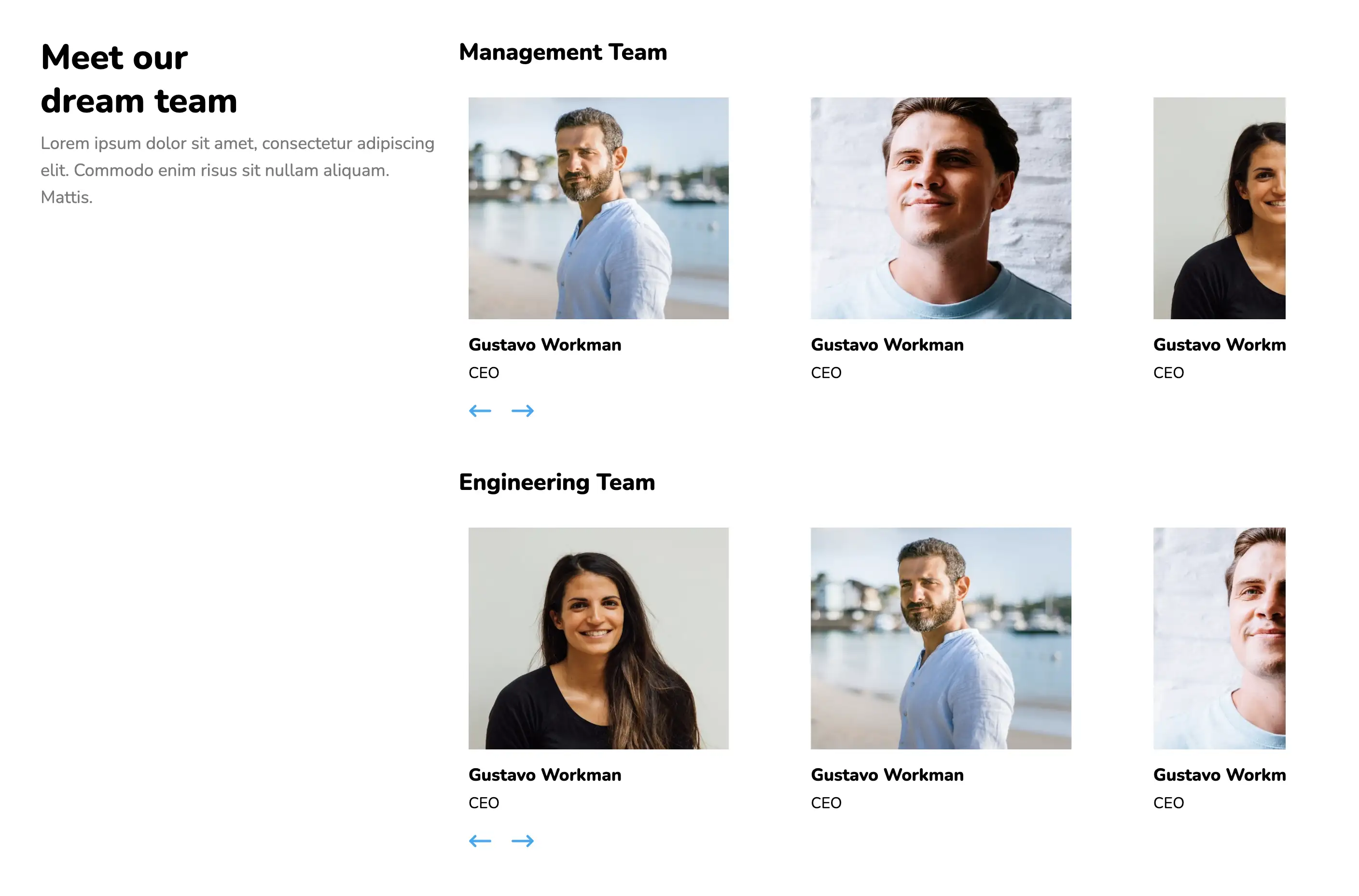
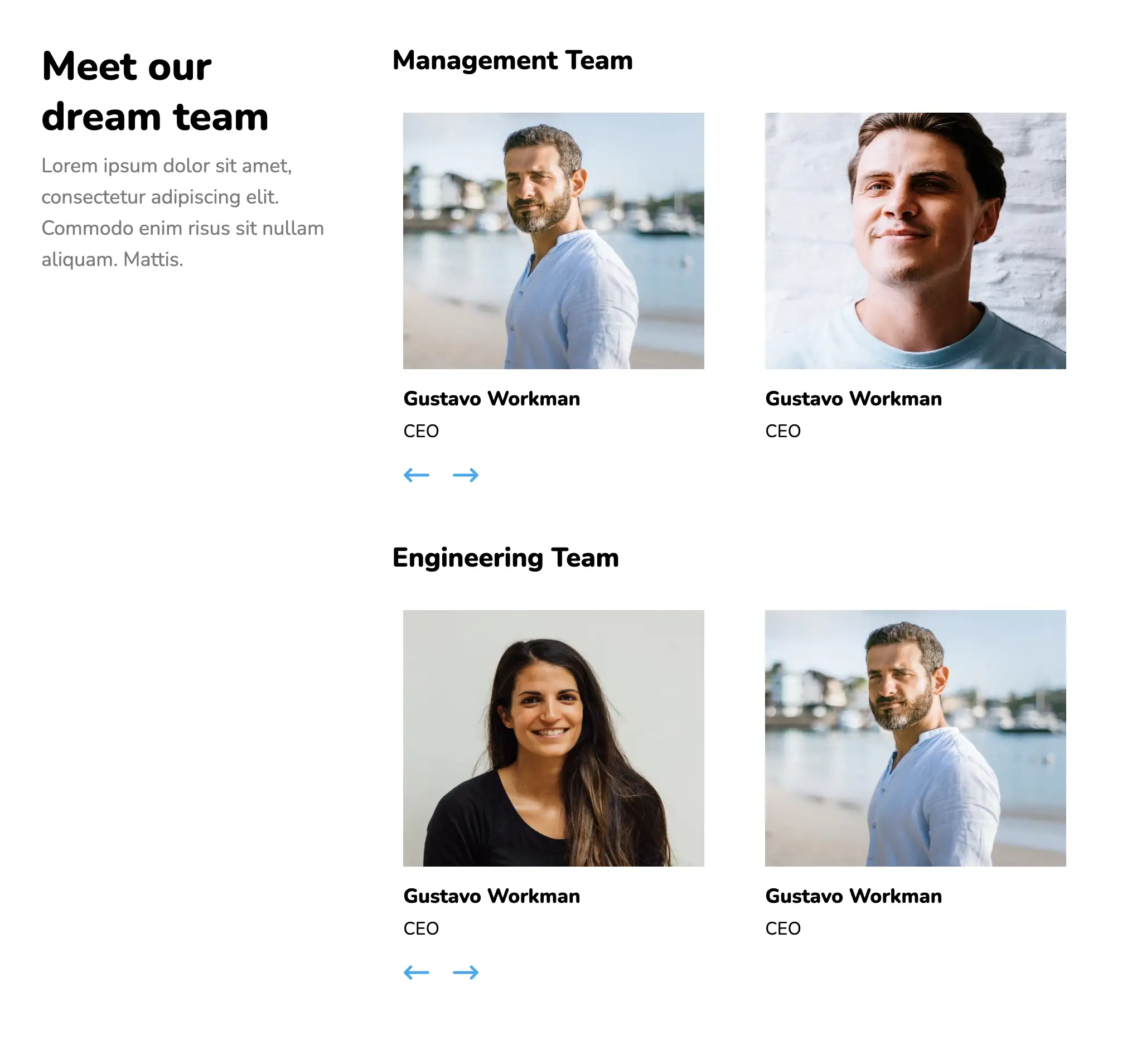
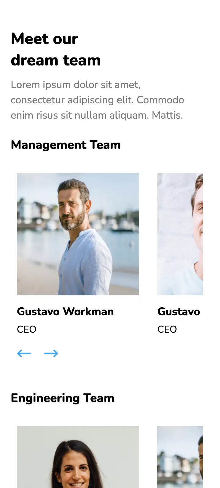
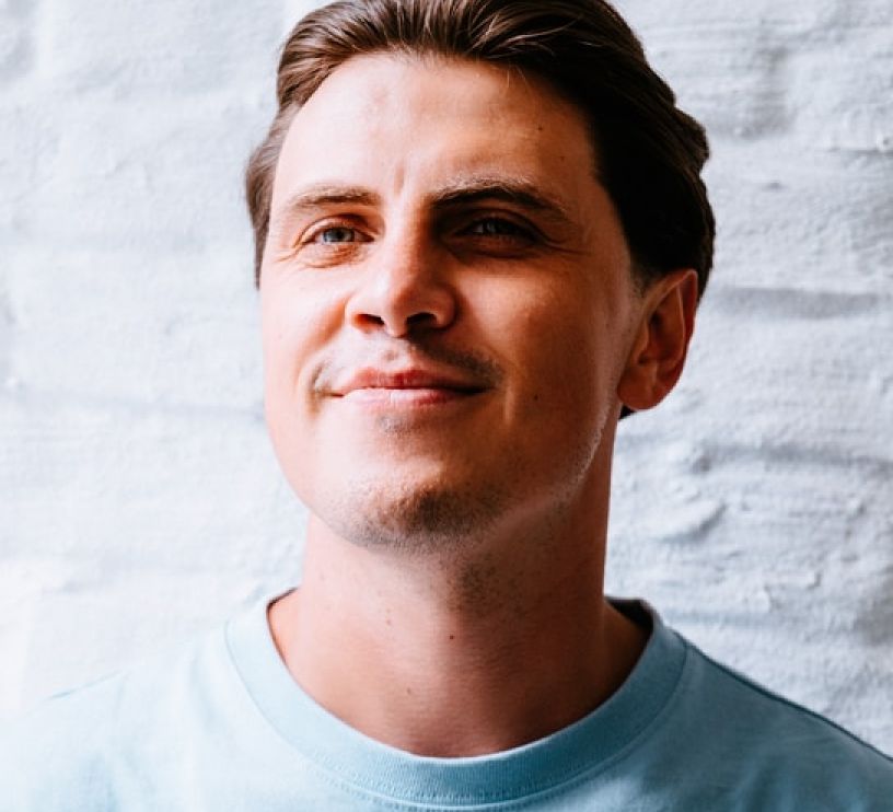
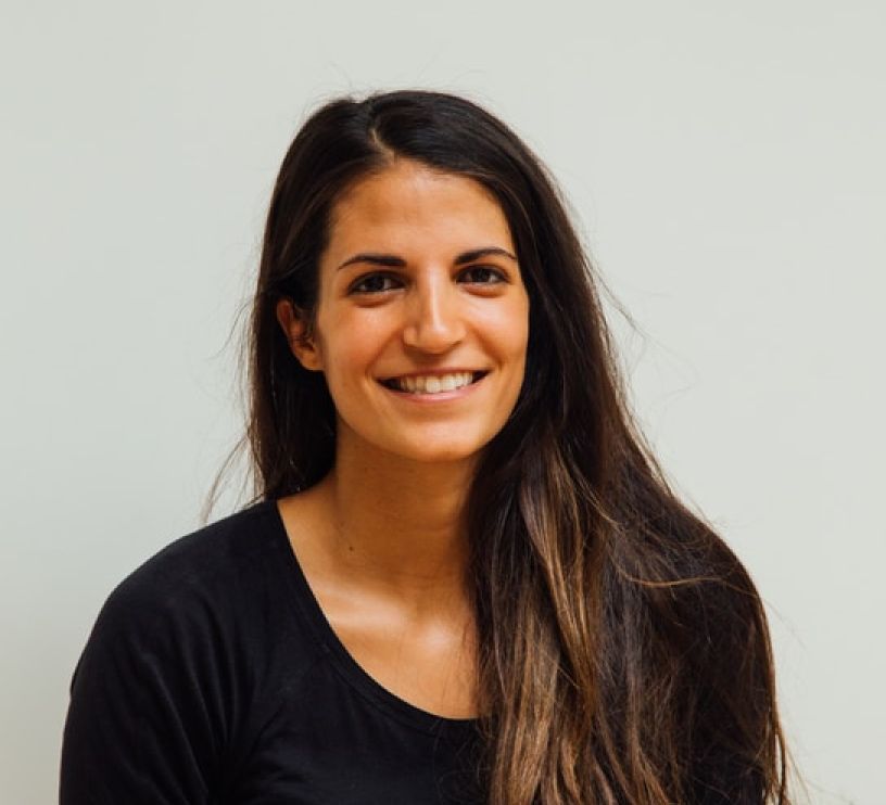
This page contains two carousel-based galleries one below the other. Each slider presents basic information about team members belonging to a department and has pagination elements to aid navigation. A general description of the team can also be provided, thereby enhancing user appeal.
View Code
HTML
CSS
JS
Responsive CSS
Output
              Meet our dream team


              Lorem ipsum dolor sit amet, consectetur adipiscing elit. Commodo enim risus
        sit nullam aliquam. Mattis.


              Management Team


                   Gustavo Workman


                   CEO


                   Gustavo Workman


                   CEO


                   Gustavo Workman


                   CEO


                   Gustavo Workman


                   CEO


              Engineering Team


                   Gustavo Workman


                   CEO


                   Gustavo Workman


                   CEO


                   Gustavo Workman


                   CEO


                   Gustavo Workman


                   CEO
          *{
  font-family:Nunito, sans-serif;
}
.text-blk{
  margin-top:0px;
  margin-right:0px;
  margin-bottom:0px;
  margin-left:0px;
  padding-top:10px;
  padding-right:10px;
  padding-bottom:10px;
  padding-left:10px;
  line-height:25px;
}
.responsive-cell-block{
  min-height:75px;
}
.responsive-container-block{
  min-height:75px;
  height:fit-content;
  width:100%;
  padding-top:10px;
  padding-right:10px;
  padding-bottom:10px;
  padding-left:10px;
  display:flex;
  flex-wrap:wrap;
  justify-content:flex-start;
  margin-top:0px;
  margin-right:auto;
  margin-bottom:40px;
  margin-left:auto;
}
.outer-container{
  padding-top:10px;
  padding-right:30px;
  padding-bottom:10px;
  padding-left:30px;
}
.inner-container{
  max-width:1320px;
  margin-top:50px;
  margin-right:auto;
  margin-bottom:50px;
  margin-left:auto;
}
.heading-text{
  font-size:48px;
  line-height:65px;
  font-weight:900;
  margin-top:0px;
  margin-right:0px;
  margin-bottom:5px;
  margin-left:0px;
}
.sub-heading-text{
  color:rgb(122, 122, 122);
  line-height:30px;
}
.team-1-swiper{
    overflow:hidden;
}
.team-2-swiper{
    overflow:hidden;
}
.team-name{
  font-size:24px;
  line-height:34px;
  font-weight:900;
  margin-top:0px;
  margin-right:0px;
  margin-bottom:0px;
  margin-left:0px;
}
.team-member-image{
  width:270px;
  height:230px;
  margin-top:0px;
  margin-right:0px;
  margin-bottom:0px;
  margin-left:0px;
}
.name{
  font-size:18px;
  line-height:24px;
  font-weight:800;
  padding-top:0px;
  padding-right:0px;
  padding-bottom:0px;
  padding-left:0px;
  width:200px;
  margin-top:15px;
  margin-right:0px;
  margin-bottom:0px;
  margin-left:0px;
}
.position{
  padding-top:0px;
  padding-right:0px;
  padding-bottom:0px;
  padding-left:0px;
  line-height:24px;
  width:200px;
  margin-top:5px;
  margin-right:0px;
  margin-bottom:0px;
  margin-left:0px;
}
.arrow-left-1{
  transform:rotateX(0deg) rotateY(180deg) rotateZ(0deg) scaleX(1) scaleY(1) scaleZ(1);
  margin-top:0px;
  margin-right:20px;
  margin-bottom:0px;
  margin-left:0px;
  cursor:pointer;
}
.btn{
  display:flex;
  flex-direction:row-reverse;
  margin-top:20px;
  margin-right:0px;
  margin-bottom:0px;
  margin-left:0px;
}
.swiper-slide{
  margin-top:0px;
  margin-right:40px;
  margin-bottom:0px;
  margin-left:0px;
}
.arrow-left-2{
  transform:rotateX(0deg) rotateY(180deg) rotateZ(0deg) scaleX(1) scaleY(1) scaleZ(1);
  margin-top:0px;
  margin-right:20px;
  margin-bottom:0px;
  margin-left:0px;
  cursor:pointer;
}
.arrow-right-1{
  height:14px;
  cursor:pointer;
}
.swiper-slide.empty{
  width:auto;
  margin-top:0px;
  margin-right:40px;
  margin-bottom:0px;
  margin-left:-20px;
}
.swiper-container.team-1-swiper,
.swiper-container.team-2-swiper{
  margin-top:0px;
  margin-right:0px;
  margin-bottom:0px;
  margin-left:0px;
}
.arrow-right-2{
  cursor:pointer;
}
@media (max-width: 768px){
  .heading-text{
    margin-top:0px;
    margin-right:0px;
    margin-bottom:0px;
    margin-left:0px;
  }
  .sub-heading-text{
    margin-top:0px;
    margin-right:0px;
    margin-bottom:20px;
    margin-left:0px;
  }
}
@media (max-width: 500px){
  .team-member-image{
    width:200px;
    height:200px;
  }
  .outer-container{
    padding-top:10px;
    padding-right:10px;
    padding-bottom:10px;
    padding-left:10px;
  }
}
          var swiper = new Swiper(".team-1-swiper", {
  navigation: {
    nextEl: ".swiper-button-nexts",
    prevEl: ".swiper-button-prevs",
  },
  loop: true,
  breakpoints: {

    100: {
      slidesPerView: 1.2,
      spaceBetween: 40
    },

    340: {
      slidesPerView: 1.5,
      spaceBetween: 40
    },

    500: {
      slidesPerView: 1.5,
      spaceBetween: 20
    },

    630: {
      slidesPerView: 2,
      spaceBetween: 30
    },

    769: {
      slidesPerView: 1.5,
      spaceBetween: 30
    },

    890: {
      slidesPerView: 2,
      spaceBetween: 40
    },
    1090: {
      slidesPerView: 2.5,
      spaceBetween: 40
    },
  }
});


var swiper2 = new Swiper(".team-2-swiper", {
  navigation: {
    nextEl: ".swiper-button-nexts2",
    prevEl: ".swiper-button-prevs2",
  },
  loop: true,
  breakpoints: {

    300: {
      slidesPerView: 1.5,
      spaceBetween: 40
    },

    500: {
      slidesPerView: 1.5,
      spaceBetween: 20
    },

    630: {
      slidesPerView: 2,
      spaceBetween: 30
    },

    769: {
      slidesPerView: 1.5,
      spaceBetween: 30
    },

    890: {
      slidesPerView: 2,
      spaceBetween: 40
    },
    1090: {
      slidesPerView: 2.5,
      spaceBetween: 40
    },
  }
});
          @import url('https://fonts.googleapis.com/css2?family=Nunito:wght@200;300;400;600;700;800&display=swap');
        *, *:before, *:after {
        -moz-box-sizing: border-box;
        -webkit-box-sizing: border-box;
        box-sizing: border-box;
        }
        body {
        margin: 0;
        }
        .wk-desk-1{
        width: 8.333333%;
        }
        .wk-desk-2{
        width: 16.666667%;
        }
        .wk-desk-3{
        width: 25%;
        }
        .wk-desk-4{
        width: 33.333333%;
        }
        .wk-desk-5{
        width: 41.666667%;
        }
        .wk-desk-6{
        width: 50%;
        }
        .wk-desk-7{
        width: 58.333333%;
        }
        .wk-desk-8{
        width: 66.666667%;
        }
        .wk-desk-9{
        width: 75%;
        }
        .wk-desk-10{
        width: 83.333333%;
        }
        .wk-desk-11{
        width: 91.666667%;
        }
        .wk-desk-12{
        width: 100%;
        }
        @media (max-width: 1024px) {
        .wk-ipadp-1{
        width: 8.333333%;
        }
        .wk-ipadp-2{
        width: 16.666667%;
        }
        .wk-ipadp-3{
        width: 25%;
        }
        .wk-ipadp-4{
        width: 33.333333%;
        }
        .wk-ipadp-5{
        width: 41.666667%;
        }
        .wk-ipadp-6{
        width: 50%;
        }
        .wk-ipadp-7{
        width: 58.333333%;
        }
        .wk-ipadp-8{
        width: 66.666667%;
        }
        .wk-ipadp-9{
        width: 75%;
        }
        .wk-ipadp-10{
        width: 83.333333%;
        }
        .wk-ipadp-11{
        width: 91.666667%;
        }
        .wk-ipadp-12{
        width: 100%;
        }
        }
        @media (max-width: 768px) {
        .wk-tab-1{
        width: 8.333333%;
        }
        .wk-tab-2{
        width: 16.666667%;
        }
        .wk-tab-3{
        width: 25%;
        }
        .wk-tab-4{
        width: 33.333333%;
        }
        .wk-tab-5{
        width: 41.666667%;
        }
        .wk-tab-6{
        width: 50%;
        }
        .wk-tab-7{
        width: 58.333333%;
        }
        .wk-tab-8{
        width: 66.666667%;
        }
        .wk-tab-9{
        width: 75%;
        }
        .wk-tab-10{
        width: 83.333333%;
        }
        .wk-tab-11{
        width: 91.666667%;
        }
        .wk-tab-12{
        width: 100%;
        }
        }
        @media (max-width: 500px) {
        .wk-mobile-1{
        width: 8.333333%;
        }
        .wk-mobile-2{
        width: 16.666667%;
        }
        .wk-mobile-3{
        width: 25%;
        }
        .wk-mobile-4{
        width: 33.333333%;
        }
        .wk-mobile-5{
        width: 41.666667%;
        }
        .wk-mobile-6{
        width: 50%;
        }
        .wk-mobile-7{
        width: 58.333333%;
        }
        .wk-mobile-8{
        width: 66.666667%;
        }
        .wk-mobile-9{
        width: 75%;
        }
        .wk-mobile-10{
        width: 83.333333%;
        }
        .wk-mobile-11{
        width: 91.666667%;
        }
        .wk-mobile-12{
        width: 100%;
        }
        }
Reset
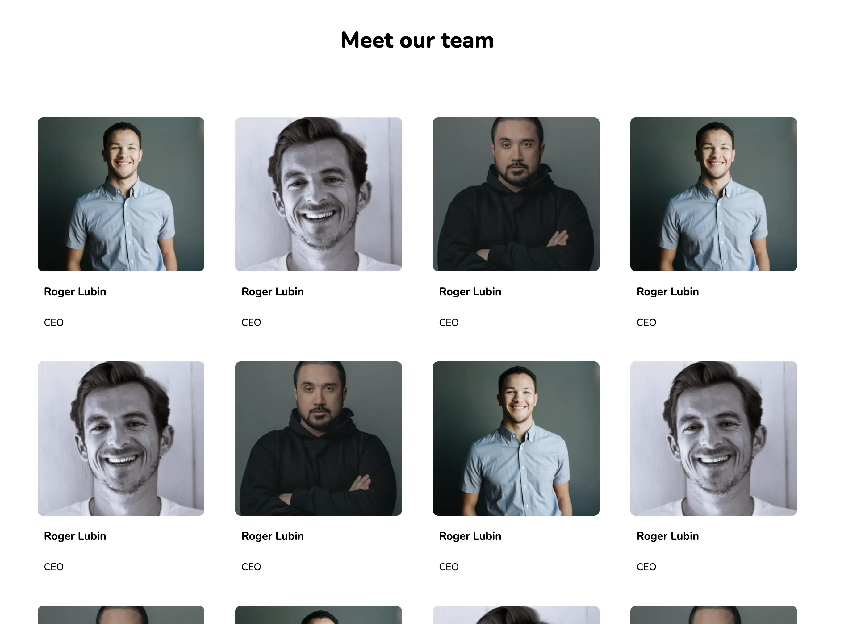
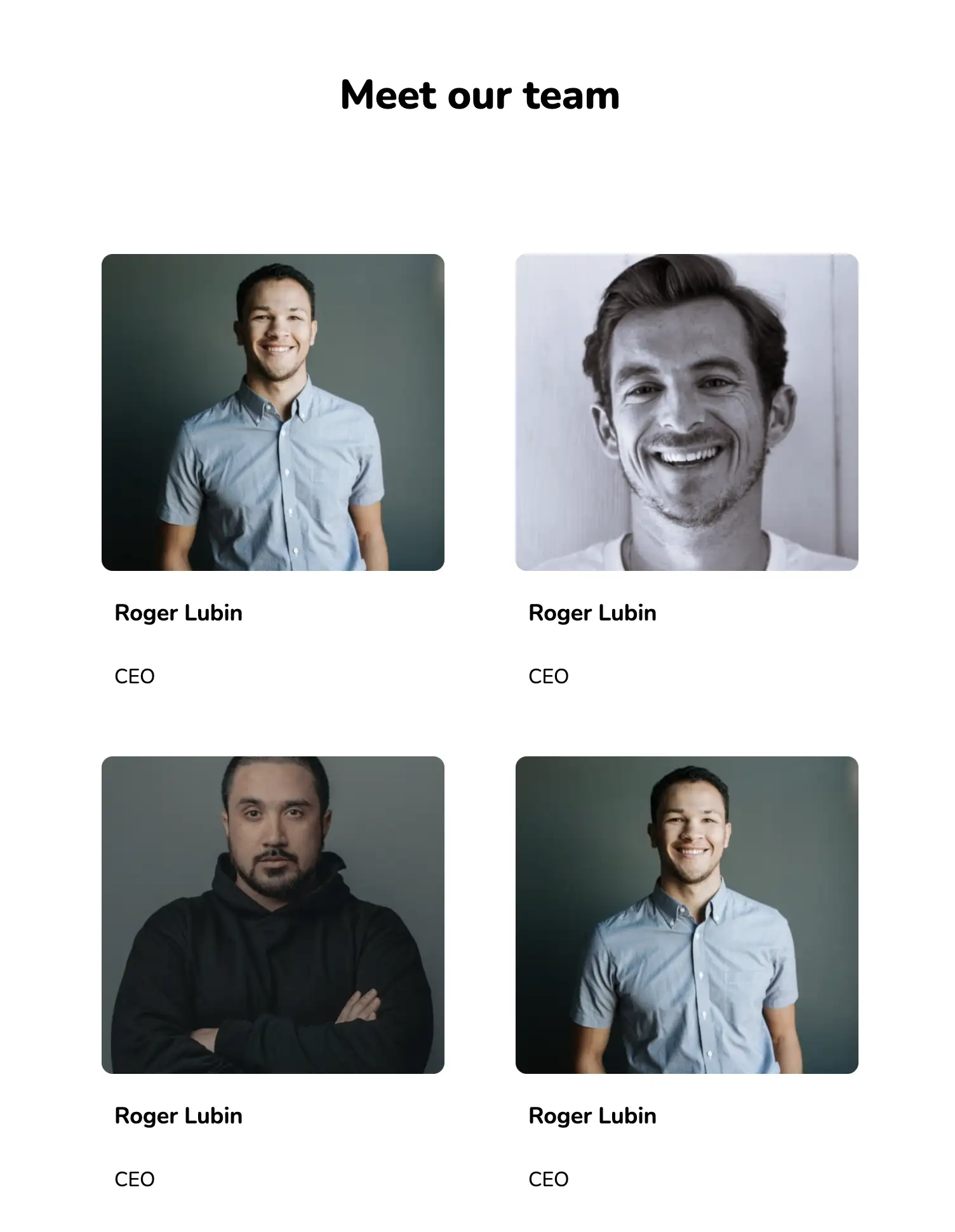
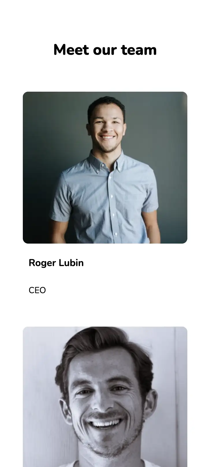
This widget has a great grid layout and provides a classic, subtle look. A short bio is included below the image of each team member, giving the viewers an idea on who they are dealing with. The design has a flex display and is completely responsive.
View Code
HTML
CSS
JS
Responsive CSS
Output
            Our Team


                Roger Lubin


                CEO


                Roger Lubin


                CEO


                Roger Lubin


                CEO


                Roger Lubin


                CEO


                Roger Lubin


                CEO


                Roger Lubin


                CEO


                Roger Lubin


                CEO


                Roger Lubin


                CEO


                Roger Lubin


                CEO


                Roger Lubin


                CEO


                Roger Lubin


                CEO


                Roger Lubin


                CEO
          *{
  font-family:Nunito, sans-serif;
}
.text-blk{
  margin-top:0px;
  margin-right:0px;
  margin-bottom:0px;
  margin-left:0px;
  line-height:25px;
}
.responsive-container-block{
  min-height:75px;
  height:fit-content;
  width:100%;
  display:flex;
  flex-wrap:wrap;
  margin-top:0px;
  margin-right:auto;
  margin-bottom:0px;
  margin-left:auto;
  justify-content:flex-start;
}
.container-block{
  min-height:75px;
  height:fit-content;
  width:100%;
  padding-top:10px;
  padding-right:10px;
  padding-bottom:10px;
  padding-left:10px;
  display:block;
}
.responsive-cell-block{
  min-height:75px;
}
.container{
  max-width:1380px;
  margin-top:80px;
  margin-right:auto;
  margin-bottom:80px;
  margin-left:auto;
  padding-top:0px;
  padding-right:30px;
  padding-bottom:0px;
  padding-left:30px;
}
.team-head-text{
  font-size:48px;
  line-height:50px;
  font-weight:900;
  text-align:center;
  margin-top:0px;
  margin-right:0px;
  margin-bottom:70px;
  margin-left:0px;
}
.name{
  font-size:18px;
  margin-top:11px;
  margin-right:0px;
  margin-bottom:0px;
  margin-left:0px;
  font-weight:700;
}
.position{
  margin-top:5px;
  margin-right:0px;
  margin-bottom:0px;
  margin-left:0px;
}
.team-card-container{
  width:263px;
  margin-top:0px;
  margin-right:15px;
  margin-bottom:30px;
  margin-left:15px;
}
.teamcard-container{
  justify-content:space-evenly;
}
.team-img-wrapper{
  border-top-left-radius:6px;
  border-top-right-radius:6px;
  border-bottom-right-radius:6px;
  border-bottom-left-radius:6px;
}
.team-img{
  max-width:100%;
}
@media (max-width: 500px){
  .team-card-container{
    margin-top:0px;
    margin-right:0px;
    margin-bottom:30px;
    margin-left:0px;
    width:100%;
  }
  .team-img{
    width:100%;
  }
}
          @import url('https://fonts.googleapis.com/css2?family=Nunito:wght@200;300;400;600;700;800&display=swap');
        *, *:before, *:after {
        -moz-box-sizing: border-box;
        -webkit-box-sizing: border-box;
        box-sizing: border-box;
        }
        body {
        margin: 0;
        }
        .wk-desk-1{
        width: 8.333333%;
        }
        .wk-desk-2{
        width: 16.666667%;
        }
        .wk-desk-3{
        width: 25%;
        }
        .wk-desk-4{
        width: 33.333333%;
        }
        .wk-desk-5{
        width: 41.666667%;
        }
        .wk-desk-6{
        width: 50%;
        }
        .wk-desk-7{
        width: 58.333333%;
        }
        .wk-desk-8{
        width: 66.666667%;
        }
        .wk-desk-9{
        width: 75%;
        }
        .wk-desk-10{
        width: 83.333333%;
        }
        .wk-desk-11{
        width: 91.666667%;
        }
        .wk-desk-12{
        width: 100%;
        }
        @media (max-width: 1024px) {
        .wk-ipadp-1{
        width: 8.333333%;
        }
        .wk-ipadp-2{
        width: 16.666667%;
        }
        .wk-ipadp-3{
        width: 25%;
        }
        .wk-ipadp-4{
        width: 33.333333%;
        }
        .wk-ipadp-5{
        width: 41.666667%;
        }
        .wk-ipadp-6{
        width: 50%;
        }
        .wk-ipadp-7{
        width: 58.333333%;
        }
        .wk-ipadp-8{
        width: 66.666667%;
        }
        .wk-ipadp-9{
        width: 75%;
        }
        .wk-ipadp-10{
        width: 83.333333%;
        }
        .wk-ipadp-11{
        width: 91.666667%;
        }
        .wk-ipadp-12{
        width: 100%;
        }
        }
        @media (max-width: 768px) {
        .wk-tab-1{
        width: 8.333333%;
        }
        .wk-tab-2{
        width: 16.666667%;
        }
        .wk-tab-3{
        width: 25%;
        }
        .wk-tab-4{
        width: 33.333333%;
        }
        .wk-tab-5{
        width: 41.666667%;
        }
        .wk-tab-6{
        width: 50%;
        }
        .wk-tab-7{
        width: 58.333333%;
        }
        .wk-tab-8{
        width: 66.666667%;
        }
        .wk-tab-9{
        width: 75%;
        }
        .wk-tab-10{
        width: 83.333333%;
        }
        .wk-tab-11{
        width: 91.666667%;
        }
        .wk-tab-12{
        width: 100%;
        }
        }
        @media (max-width: 500px) {
        .wk-mobile-1{
        width: 8.333333%;
        }
        .wk-mobile-2{
        width: 16.666667%;
        }
        .wk-mobile-3{
        width: 25%;
        }
        .wk-mobile-4{
        width: 33.333333%;
        }
        .wk-mobile-5{
        width: 41.666667%;
        }
        .wk-mobile-6{
        width: 50%;
        }
        .wk-mobile-7{
        width: 58.333333%;
        }
        .wk-mobile-8{
        width: 66.666667%;
        }
        .wk-mobile-9{
        width: 75%;
        }
        .wk-mobile-10{
        width: 83.333333%;
        }
        .wk-mobile-11{
        width: 91.666667%;
        }
        .wk-mobile-12{
        width: 100%;
        }
        }
Reset
.webp)
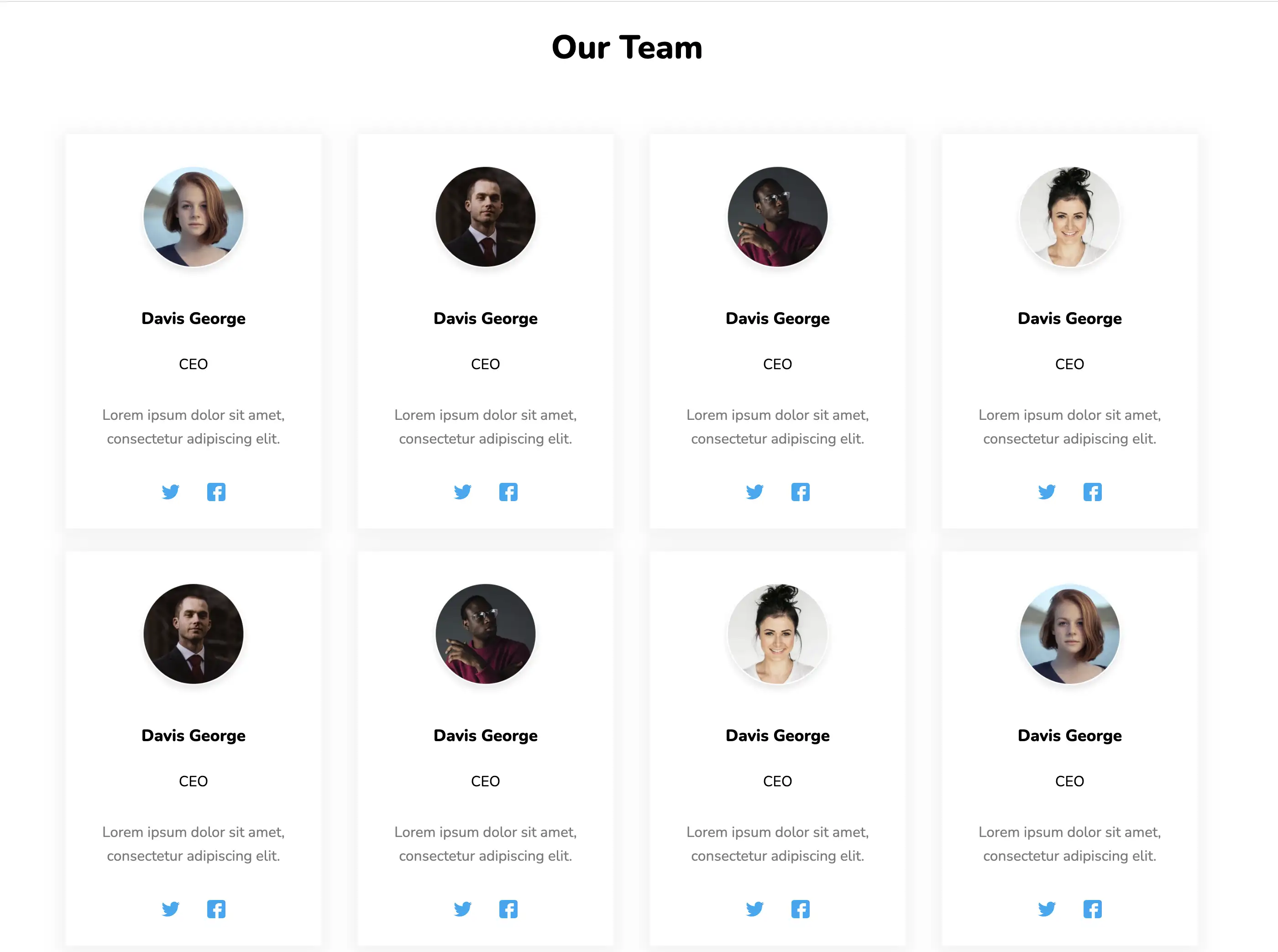
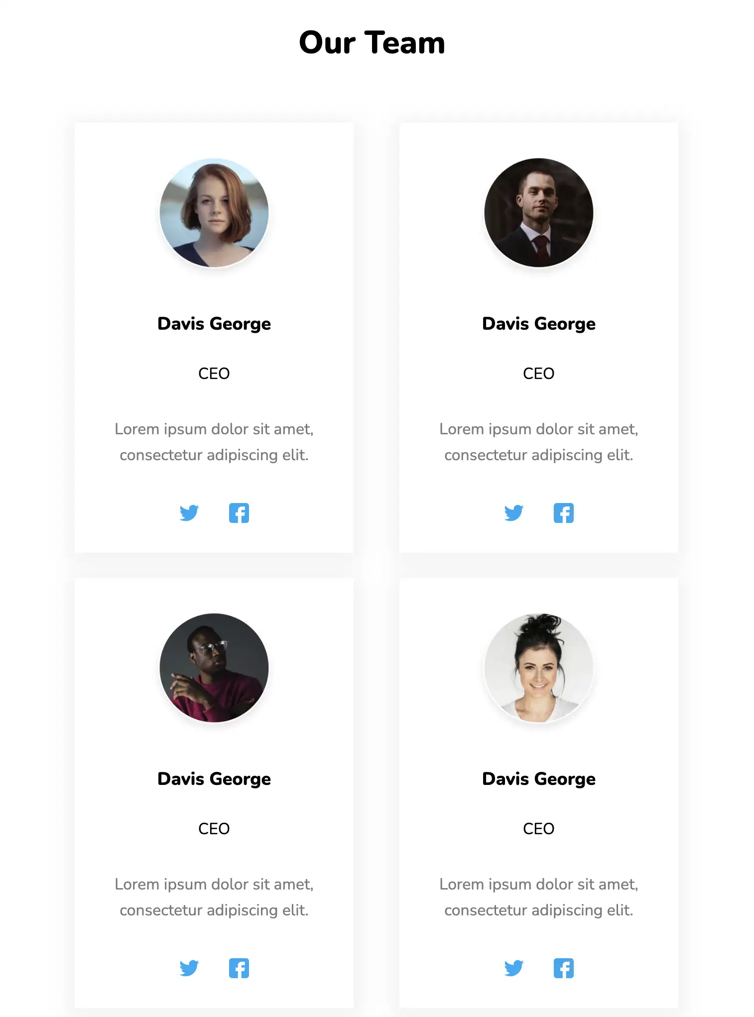
This design showcases each team member with short text and images. Cards are properly separated from one another and have a box shadow applied to them, distinguishing them from the white background. On reducing the screen size, they break down into rows, providing a perfect display on all devices.
View Code
HTML
CSS
JS
Responsive CSS
Output
            Our Team


               Davis George


               CEO


               Lorem ipsum dolor sit amet, consectetur adipiscing elit.


               Davis George


               CEO


               Lorem ipsum dolor sit amet, consectetur adipiscing elit.


               Davis George


               CEO


               Lorem ipsum dolor sit amet, consectetur adipiscing elit.


               Davis George


               CEO


               Lorem ipsum dolor sit amet, consectetur adipiscing elit.


               Davis George


               CEO


               Lorem ipsum dolor sit amet, consectetur adipiscing elit.


               Davis George


               CEO


               Lorem ipsum dolor sit amet, consectetur adipiscing elit.


               Davis George


               CEO


               Lorem ipsum dolor sit amet, consectetur adipiscing elit.


               Davis George


               CEO


               Lorem ipsum dolor sit amet, consectetur adipiscing elit.
          *{
  font-family:Nunito, sans-serif;
}
.responsive-cell-block{
  min-height:75px;
}
.text-blk{
  margin-top:0px;
  margin-right:0px;
  margin-bottom:0px;
  margin-left:0px;
  line-height:25px;
}
.responsive-container-block{
  min-height:75px;
  height:fit-content;
  width:100%;
  display:flex;
  flex-wrap:wrap;
  margin-top:0px;
  margin-right:auto;
  margin-bottom:0px;
  margin-left:auto;
  justify-content:space-evenly;
}
.team-head-text{
  font-size:48px;
  font-weight:900;
  text-align:center;
}
.team-head-text{
  line-height:50px;
  width:100%;
  margin-top:0px;
  margin-right:0px;
  margin-bottom:50px;
  margin-left:0px;
}
.container{
  max-width:1380px;
  margin-top:60px;
  margin-right:auto;
  margin-bottom:60px;
  margin-left:auto;
  padding-top:0px;
  padding-right:30px;
  padding-bottom:0px;
  padding-left:30px;
}
.card{
  text-align:center;
  box-shadow:rgba(0, 0, 0, 0.05) 0px 4px 20px 7px;
  display:flex;
  flex-direction:column;
  align-items:center;
  padding-top:30px;
  padding-right:25px;
  padding-bottom:30px;
  padding-left:25px;
}
.card-container{
  width:280px;
  margin-top:0px;
  margin-right:10px;
  margin-bottom:25px;
  margin-left:10px;
}
.name{
  margin-top:20px;
  margin-right:0px;
  margin-bottom:5px;
  margin-left:0px;
  font-size:18px;
  font-weight:800;
}
.position{
  margin-top:0px;
  margin-right:0px;
  margin-bottom:10px;
  margin-left:0px;
}
.feature-text{
  margin-top:0px;
  margin-right:0px;
  margin-bottom:20px;
  margin-left:0px;
  color:rgb(122, 122, 122);
  line-height:30px;
}
.social-icons{
  width:70px;
  display:flex;
  justify-content:space-between;
}
.team-image-wrapper{
  clip-path:circle(50% at 50% 50%);
  width:130px;
  height:130px;
}
.team-member-image {
  max-width: 100%;
}
@media (max-width: 500px){
  .card-container{
    width:100%;
    margin-top:0px;
    margin-right:0px;
    margin-bottom:25px;
    margin-left:0px;
  }
}
          @import url('https://fonts.googleapis.com/css2?family=Nunito:wght@200;300;400;600;700;800&display=swap');
        *, *:before, *:after {
        -moz-box-sizing: border-box;
        -webkit-box-sizing: border-box;
        box-sizing: border-box;
        }
        body {
        margin: 0;
        }
        .wk-desk-1{
        width: 8.333333%;
        }
        .wk-desk-2{
        width: 16.666667%;
        }
        .wk-desk-3{
        width: 25%;
        }
        .wk-desk-4{
        width: 33.333333%;
        }
        .wk-desk-5{
        width: 41.666667%;
        }
        .wk-desk-6{
        width: 50%;
        }
        .wk-desk-7{
        width: 58.333333%;
        }
        .wk-desk-8{
        width: 66.666667%;
        }
        .wk-desk-9{
        width: 75%;
        }
        .wk-desk-10{
        width: 83.333333%;
        }
        .wk-desk-11{
        width: 91.666667%;
        }
        .wk-desk-12{
        width: 100%;
        }
        @media (max-width: 1024px) {
        .wk-ipadp-1{
        width: 8.333333%;
        }
        .wk-ipadp-2{
        width: 16.666667%;
        }
        .wk-ipadp-3{
        width: 25%;
        }
        .wk-ipadp-4{
        width: 33.333333%;
        }
        .wk-ipadp-5{
        width: 41.666667%;
        }
        .wk-ipadp-6{
        width: 50%;
        }
        .wk-ipadp-7{
        width: 58.333333%;
        }
        .wk-ipadp-8{
        width: 66.666667%;
        }
        .wk-ipadp-9{
        width: 75%;
        }
        .wk-ipadp-10{
        width: 83.333333%;
        }
        .wk-ipadp-11{
        width: 91.666667%;
        }
        .wk-ipadp-12{
        width: 100%;
        }
        }
        @media (max-width: 768px) {
        .wk-tab-1{
        width: 8.333333%;
        }
        .wk-tab-2{
        width: 16.666667%;
        }
        .wk-tab-3{
        width: 25%;
        }
        .wk-tab-4{
        width: 33.333333%;
        }
        .wk-tab-5{
        width: 41.666667%;
        }
        .wk-tab-6{
        width: 50%;
        }
        .wk-tab-7{
        width: 58.333333%;
        }
        .wk-tab-8{
        width: 66.666667%;
        }
        .wk-tab-9{
        width: 75%;
        }
        .wk-tab-10{
        width: 83.333333%;
        }
        .wk-tab-11{
        width: 91.666667%;
        }
        .wk-tab-12{
        width: 100%;
        }
        }
        @media (max-width: 500px) {
        .wk-mobile-1{
        width: 8.333333%;
        }
        .wk-mobile-2{
        width: 16.666667%;
        }
        .wk-mobile-3{
        width: 25%;
        }
        .wk-mobile-4{
        width: 33.333333%;
        }
        .wk-mobile-5{
        width: 41.666667%;
        }
        .wk-mobile-6{
        width: 50%;
        }
        .wk-mobile-7{
        width: 58.333333%;
        }
        .wk-mobile-8{
        width: 66.666667%;
        }
        .wk-mobile-9{
        width: 75%;
        }
        .wk-mobile-10{
        width: 83.333333%;
        }
        .wk-mobile-11{
        width: 91.666667%;
        }
        .wk-mobile-12{
        width: 100%;
        }
        }
Reset
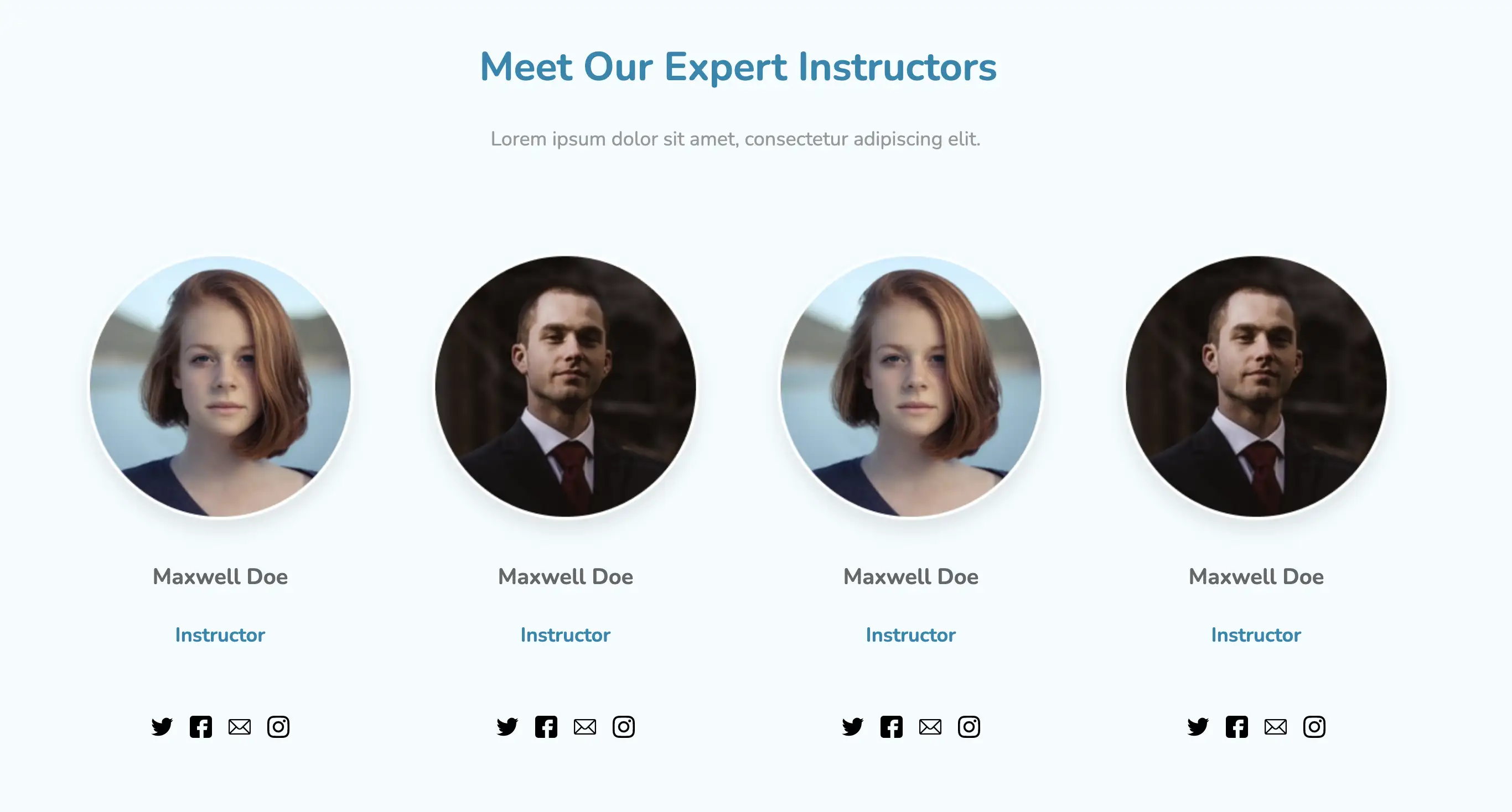
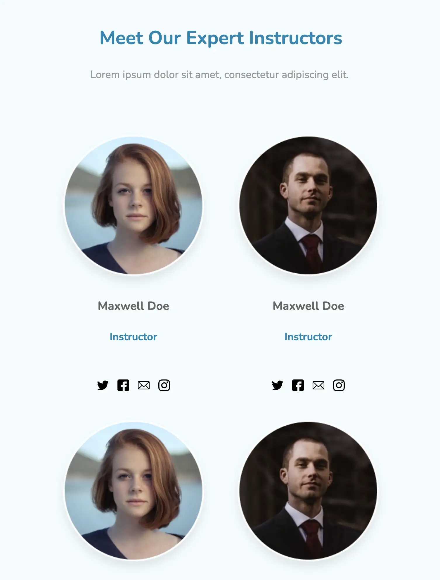
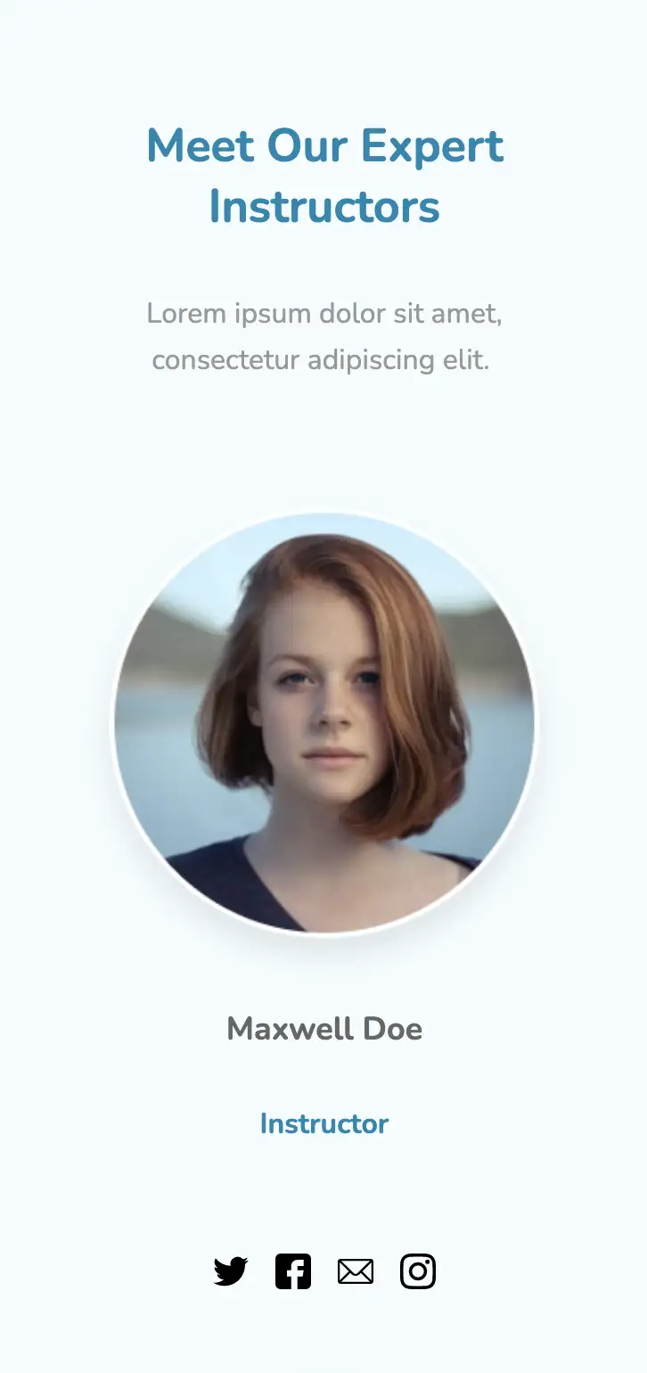
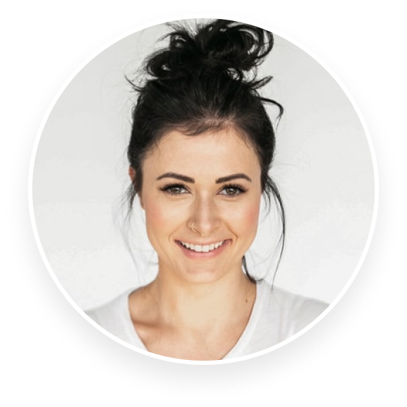
This page has a beautiful design with soft, subtle colors. It takes a minimalistic approach, showcasing members with only their names and titles. The mission of the team can also be displayed across the top, helping one to understand them better.
View Code
HTML
CSS
JS
Responsive CSS
Output
             Meet Our Expert Instructors


             Lorem ipsum dolor sit amet, consectetur adipiscing elit.


                Maxwell Doe


                Instructor


                Maxwell Doe


                Instructor


                Maxwell Doe


                Instructor


                Maxwell Doe


                Instructor
          *{
  font-family:Nunito, sans-serif;
}
.text-blk{
  margin-top:0px;
  margin-right:0px;
  margin-bottom:0px;
  margin-left:0px;
  line-height:25px;
}
.responsive-cell-block{
  min-height:75px;
}
.responsive-container-block{
  min-height:75px;
  height:fit-content;
  width:100%;
  display:flex;
  flex-wrap:wrap;
  margin-top:0px;
  margin-right:auto;
  margin-bottom:0px;
  margin-left:auto;
  justify-content:space-evenly;
}
.outer-container{
  padding-top:10px;
  padding-right:50px;
  padding-bottom:10px;
  padding-left:50px;
  background-color:rgb(244, 252, 255);
}
.inner-container{
  max-width:1320px;
  flex-direction:column;
  align-items:center;
  margin-top:50px;
  margin-right:auto;
  margin-bottom:50px;
  margin-left:auto;
}
.section-head-text{
  margin-top:0px;
  margin-right:0px;
  margin-bottom:5px;
  margin-left:0px;
  font-size:35px;
  font-weight:700;
  line-height:48px;
  color:rgb(0, 135, 177);
  margin:0 0 10px 0;
}
.section-subhead-text{
  font-size:25px;
  color:rgb(153, 153, 153);
  line-height:35px;
  max-width:470px;
  text-align:center;
  margin-top:0px;
  margin-right:0px;
  margin-bottom:60px;
  margin-left:0px;
}
.img-wrapper{
  width:100%;
}
.team-card{
  display:flex;
  flex-direction:column;
  align-items:center;
}
.social-media-links{
  width:125px;
  display:flex;
  justify-content:space-between;
}
.name{
  font-size:25px;
  font-weight:700;
  color:rgb(102, 102, 102);
  margin-top:0px;
  margin-right:0px;
  margin-bottom:5px;
  margin-left:0px;
}
.position{
  font-size:25px;
  font-weight:700;
  color:rgb(0, 135, 177);
  margin-top:0px;
  margin-right:0px;
  margin-bottom:50px;
  margin-left:0px;
}
.team-img{
  width:100%;
  height:100%;
}
.team-card-container{
  width:280px;
  margin:0 0 40px 0;
}
@media (max-width: 500px){
  .outer-container{
    padding:10px 20px 10px 20px;
  }
  .section-head-text{
    text-align:center;
  }
}
          @import url('https://fonts.googleapis.com/css2?family=Nunito:wght@200;300;400;600;700;800&display=swap');
        *, *:before, *:after {
        -moz-box-sizing: border-box;
        -webkit-box-sizing: border-box;
        box-sizing: border-box;
        }
        body {
        margin: 0;
        }
        .wk-desk-1{
        width: 8.333333%;
        }
        .wk-desk-2{
        width: 16.666667%;
        }
        .wk-desk-3{
        width: 25%;
        }
        .wk-desk-4{
        width: 33.333333%;
        }
        .wk-desk-5{
        width: 41.666667%;
        }
        .wk-desk-6{
        width: 50%;
        }
        .wk-desk-7{
        width: 58.333333%;
        }
        .wk-desk-8{
        width: 66.666667%;
        }
        .wk-desk-9{
        width: 75%;
        }
        .wk-desk-10{
        width: 83.333333%;
        }
        .wk-desk-11{
        width: 91.666667%;
        }
        .wk-desk-12{
        width: 100%;
        }
        @media (max-width: 1024px) {
        .wk-ipadp-1{
        width: 8.333333%;
        }
        .wk-ipadp-2{
        width: 16.666667%;
        }
        .wk-ipadp-3{
        width: 25%;
        }
        .wk-ipadp-4{
        width: 33.333333%;
        }
        .wk-ipadp-5{
        width: 41.666667%;
        }
        .wk-ipadp-6{
        width: 50%;
        }
        .wk-ipadp-7{
        width: 58.333333%;
        }
        .wk-ipadp-8{
        width: 66.666667%;
        }
        .wk-ipadp-9{
        width: 75%;
        }
        .wk-ipadp-10{
        width: 83.333333%;
        }
        .wk-ipadp-11{
        width: 91.666667%;
        }
        .wk-ipadp-12{
        width: 100%;
        }
        }
        @media (max-width: 768px) {
        .wk-tab-1{
        width: 8.333333%;
        }
        .wk-tab-2{
        width: 16.666667%;
        }
        .wk-tab-3{
        width: 25%;
        }
        .wk-tab-4{
        width: 33.333333%;
        }
        .wk-tab-5{
        width: 41.666667%;
        }
        .wk-tab-6{
        width: 50%;
        }
        .wk-tab-7{
        width: 58.333333%;
        }
        .wk-tab-8{
        width: 66.666667%;
        }
        .wk-tab-9{
        width: 75%;
        }
        .wk-tab-10{
        width: 83.333333%;
        }
        .wk-tab-11{
        width: 91.666667%;
        }
        .wk-tab-12{
        width: 100%;
        }
        }
        @media (max-width: 500px) {
        .wk-mobile-1{
        width: 8.333333%;
        }
        .wk-mobile-2{
        width: 16.666667%;
        }
        .wk-mobile-3{
        width: 25%;
        }
        .wk-mobile-4{
        width: 33.333333%;
        }
        .wk-mobile-5{
        width: 41.666667%;
        }
        .wk-mobile-6{
        width: 50%;
        }
        .wk-mobile-7{
        width: 58.333333%;
        }
        .wk-mobile-8{
        width: 66.666667%;
        }
        .wk-mobile-9{
        width: 75%;
        }
        .wk-mobile-10{
        width: 83.333333%;
        }
        .wk-mobile-11{
        width: 91.666667%;
        }
        .wk-mobile-12{
        width: 100%;
        }
        }
Reset
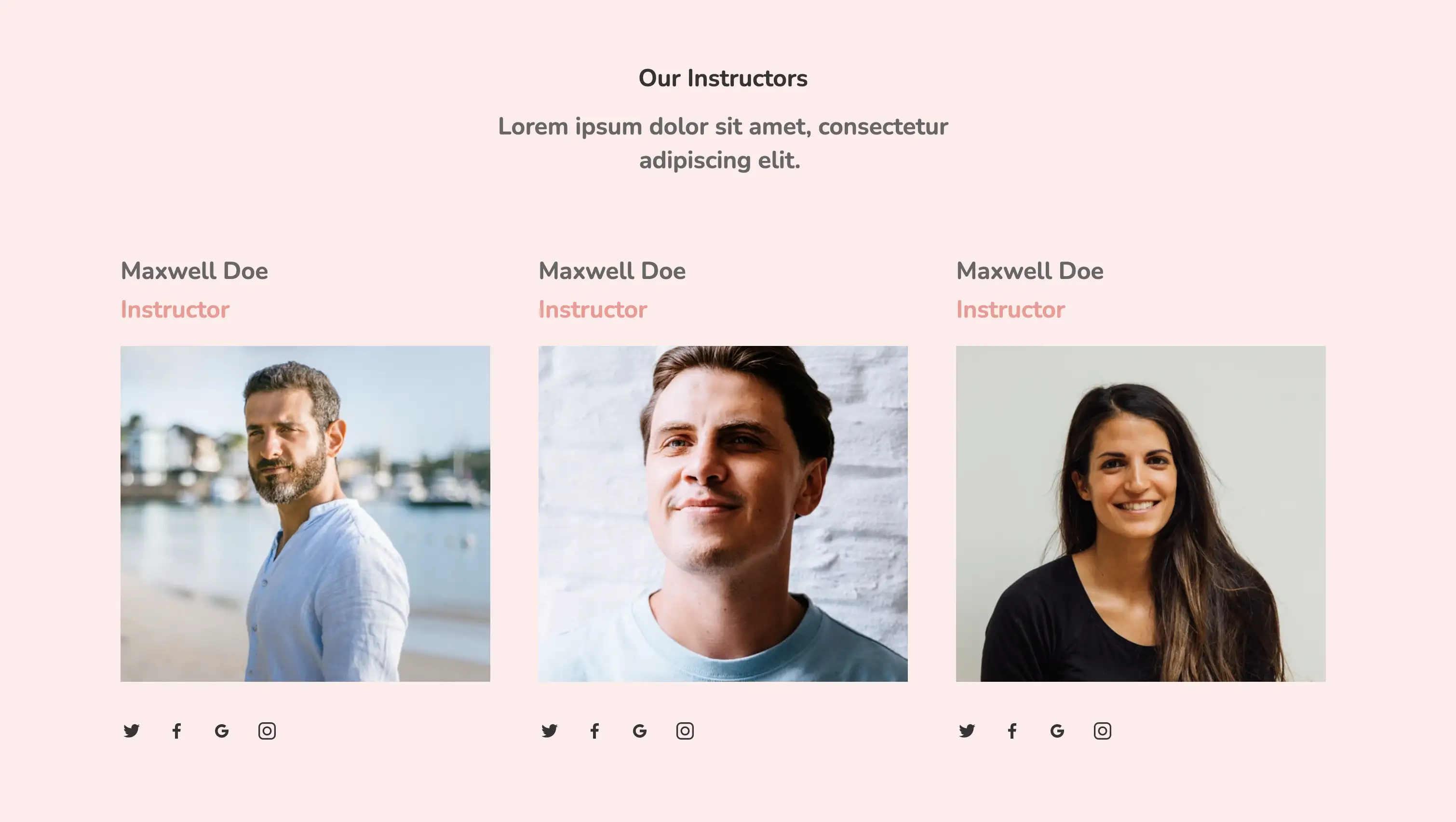
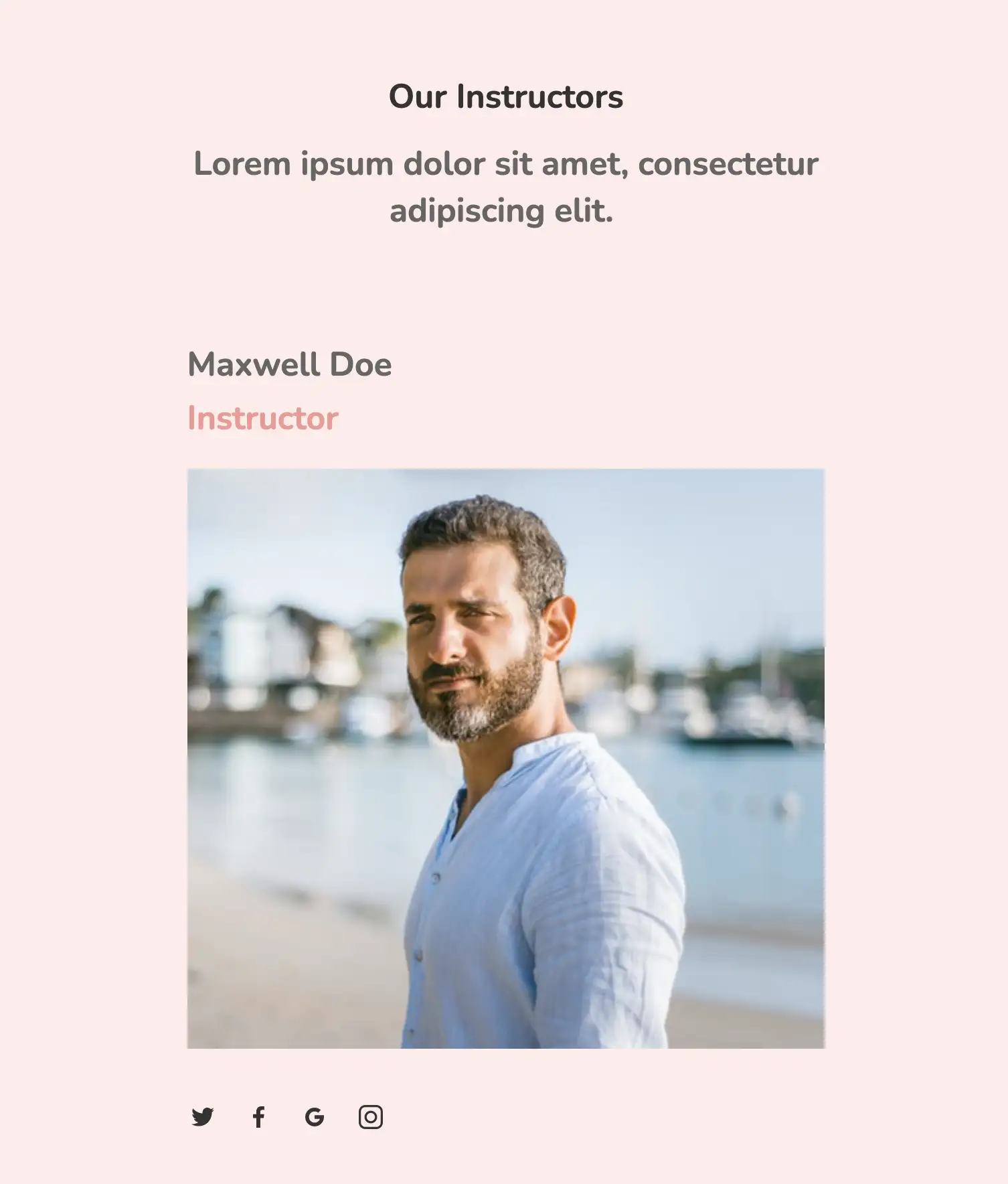
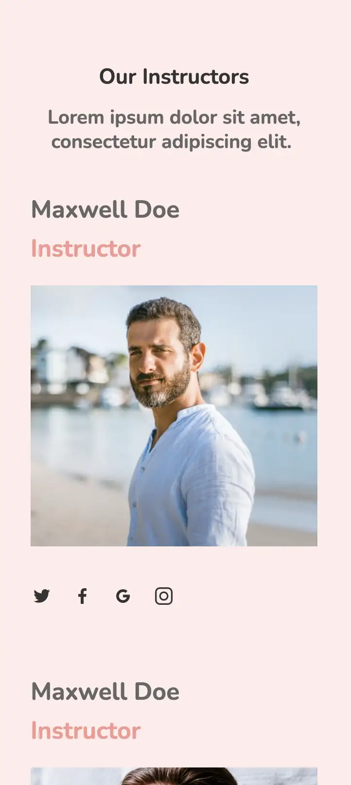
This responsive design is one of the best choices for clients with a classic taste. It provides for a very clean and professional presentation with high-quality images of the team. Icons that connect visitors to the individual’s social media page are also included below their photos.
View Code
HTML
CSS
JS
Responsive CSS
Output
             Our Instructors


             Lorem ipsum dolor sit amet, consectetur adipiscing elit.


               Maxwell Doe


               Instructor


               Maxwell Doe


               Instructor


               Maxwell Doe


               Instructor

          .responsive-cell-block{
  min-height:75px;
}
*{
  font-family:Nunito, sans-serif;
}
.text-blk{
  margin-top:0px;
  margin-right:0px;
  margin-bottom:0px;
  margin-left:0px;
  line-height:25px;
  padding-top:0px;
  padding-right:0px;
  padding-bottom:0px;
  padding-left:0px;
}
.responsive-container-block{
  min-height:75px;
  height:fit-content;
  width:100%;
  padding-top:10px;
  padding-right:10px;
  padding-bottom:10px;
  padding-left:10px;
  display:flex;
  flex-wrap:wrap;
  margin-top:0px;
  margin-right:auto;
  margin-bottom:0px;
  margin-left:auto;
  justify-content:flex-start;
}
.outer-container{
  padding-top:10px;
  padding-right:30px;
  padding-bottom:10px;
  padding-left:30px;
  background-color:rgb(255, 235, 234);
}
.heading-text{
  font-weight:700;
  font-size:48px;
  line-height:35px;
  color:rgb(51, 51, 51);
  margin-top:0px;
  margin-right:0px;
  margin-bottom:32px;
  margin-left:0px;
  text-align:center;
}
.sub-heading-text{
  max-width:470px;
  font-size:25px;
  line-height:35px;
  text-align:center;
  font-weight:700;
  color:rgb(102, 102, 102);
  margin-top:0px;
  margin-right:0px;
  margin-bottom:100px;
  margin-left:0px;
  margin:0 0 70px 0;
}
.inner-container{
  flex-direction:column;
  align-items:center;
  margin-top:80px;
  margin-right:0px;
  margin-bottom:50px;
  margin-left:0px;
}
.cards-container{
  max-width:1320px;
}
.name{
  font-size:22px;
  line-height:35px;
  font-weight:700;
  color:rgb(102, 102, 102);
  margin-top:0px;
  margin-right:0px;
  margin-bottom:5px;
  margin-left:0px;
}
.position{
  color:rgb(244, 152, 146);
  font-size:22px;
  line-height:35px;
  font-weight:700;
  margin-top:0px;
  margin-right:0px;
  margin-bottom:20px;
  margin-left:0px;
}
.team-member-image{
  width:100%;
  margin-top:0px;
  margin-right:0px;
  margin-bottom:40px;
  margin-left:0px;
}
.social-media-icon{
  margin-top:0px;
  margin-right:25px;
  margin-bottom:0px;
  margin-left:0px;
  cursor:pointer;
  margin:0 25px 10px 0;
}
.card-container{
  padding-top:0px;
  padding-right:25px;
  padding-bottom:0px;
  padding-left:25px;
  margin:0 0 30px 0;
}
@media (max-width: 1024px){
  .socialMediaIcons{
    margin:0 20px 10px 0;
  }
}
@media (max-width: 768px){
  .card-container{
    margin:0 0 60px 0;
    width:80%;
  }
  .cards-container{
    flex-direction:column;
    align-items:center;
    justify-content:center;
  }
}
@media (max-width: 500px){
  .inner-container{
    padding:10px 0 10px 0;
    margin:50px 0 50px 0;
  }
  .cards-container{
    padding:10px 0 10px 0;
  }
  .card-container{
    width:100%;
    padding:0 15px 0 15px;
  }
  .outer-container{
    padding:10px 20px 10px 20px;
  }
  .sub-heading-text{
    font-size:20px;
    line-height:25px;
    margin:0 0 30px 0;
  }
  .heading-text{
    font-size:22px;
    line-height:28px;
  }
}
          @import url('https://fonts.googleapis.com/css2?family=Nunito:wght@200;300;400;600;700;800&display=swap');
        *, *:before, *:after {
        -moz-box-sizing: border-box;
        -webkit-box-sizing: border-box;
        box-sizing: border-box;
        }
        body {
        margin: 0;
        }
        .wk-desk-1{
        width: 8.333333%;
        }
        .wk-desk-2{
        width: 16.666667%;
        }
        .wk-desk-3{
        width: 25%;
        }
        .wk-desk-4{
        width: 33.333333%;
        }
        .wk-desk-5{
        width: 41.666667%;
        }
        .wk-desk-6{
        width: 50%;
        }
        .wk-desk-7{
        width: 58.333333%;
        }
        .wk-desk-8{
        width: 66.666667%;
        }
        .wk-desk-9{
        width: 75%;
        }
        .wk-desk-10{
        width: 83.333333%;
        }
        .wk-desk-11{
        width: 91.666667%;
        }
        .wk-desk-12{
        width: 100%;
        }
        @media (max-width: 1024px) {
        .wk-ipadp-1{
        width: 8.333333%;
        }
        .wk-ipadp-2{
        width: 16.666667%;
        }
        .wk-ipadp-3{
        width: 25%;
        }
        .wk-ipadp-4{
        width: 33.333333%;
        }
        .wk-ipadp-5{
        width: 41.666667%;
        }
        .wk-ipadp-6{
        width: 50%;
        }
        .wk-ipadp-7{
        width: 58.333333%;
        }
        .wk-ipadp-8{
        width: 66.666667%;
        }
        .wk-ipadp-9{
        width: 75%;
        }
        .wk-ipadp-10{
        width: 83.333333%;
        }
        .wk-ipadp-11{
        width: 91.666667%;
        }
        .wk-ipadp-12{
        width: 100%;
        }
        }
        @media (max-width: 768px) {
        .wk-tab-1{
        width: 8.333333%;
        }
        .wk-tab-2{
        width: 16.666667%;
        }
        .wk-tab-3{
        width: 25%;
        }
        .wk-tab-4{
        width: 33.333333%;
        }
        .wk-tab-5{
        width: 41.666667%;
        }
        .wk-tab-6{
        width: 50%;
        }
        .wk-tab-7{
        width: 58.333333%;
        }
        .wk-tab-8{
        width: 66.666667%;
        }
        .wk-tab-9{
        width: 75%;
        }
        .wk-tab-10{
        width: 83.333333%;
        }
        .wk-tab-11{
        width: 91.666667%;
        }
        .wk-tab-12{
        width: 100%;
        }
        }
        @media (max-width: 500px) {
        .wk-mobile-1{
        width: 8.333333%;
        }
        .wk-mobile-2{
        width: 16.666667%;
        }
        .wk-mobile-3{
        width: 25%;
        }
        .wk-mobile-4{
        width: 33.333333%;
        }
        .wk-mobile-5{
        width: 41.666667%;
        }
        .wk-mobile-6{
        width: 50%;
        }
        .wk-mobile-7{
        width: 58.333333%;
        }
        .wk-mobile-8{
        width: 66.666667%;
        }
        .wk-mobile-9{
        width: 75%;
        }
        .wk-mobile-10{
        width: 83.333333%;
        }
        .wk-mobile-11{
        width: 91.666667%;
        }
        .wk-mobile-12{
        width: 100%;
        }
        }
Reset
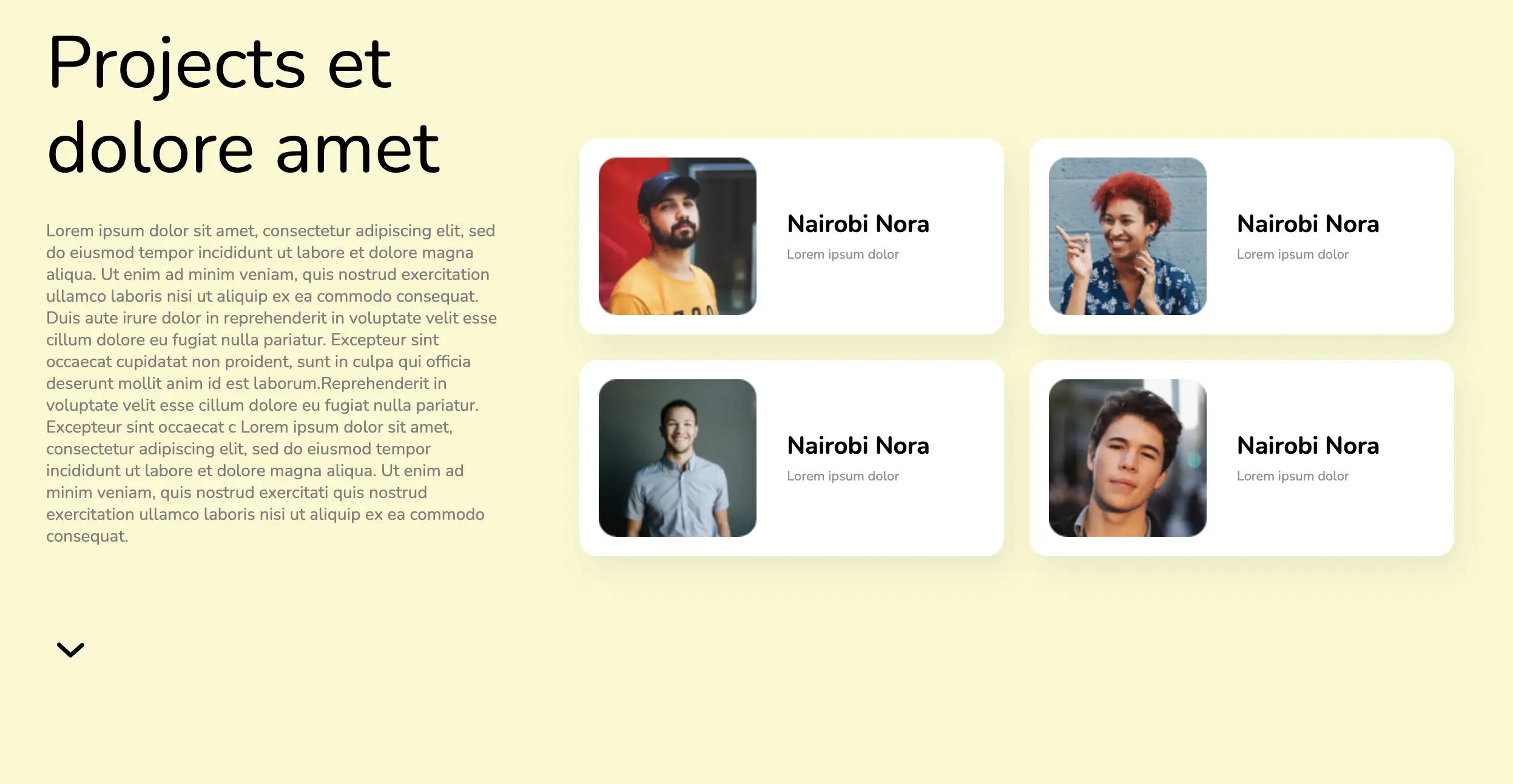
This responsive design is based purely on HTML and CSS. With a two-column layout, this page is simple on the eyes and makes it easy to find out more about the team project and team members. The business approach and achievement of the team can be highlighted, thereby increasing brand value and credibility.
View Code
HTML
CSS
JS
Responsive CSS
Output
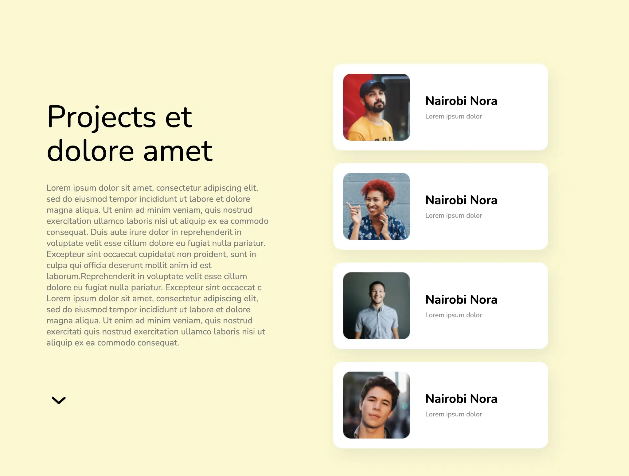
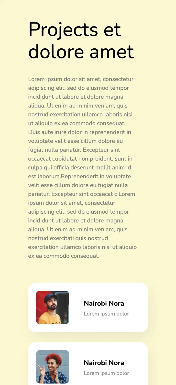
               Projects et dolore amet


               Lorem ipsum dolor sit amet, consectetur adipiscing
          elit, sed do eiusmod tempor incididunt ut labore et dolore magna aliqua. Ut enim ad minim veniam, quis nostrud
          exercitation ullamco laboris nisi ut aliquip ex ea commodo consequat. Duis aute irure dolor in reprehenderit
          in voluptate velit esse cillum dolore eu fugiat nulla pariatur. Excepteur sint occaecat cupidatat non
          proident, sunt in culpa qui officia deserunt mollit anim id est laborum.Reprehenderit in voluptate velit esse
          cillum dolore eu fugiat nulla pariatur. Excepteur sint occaecat c
          Lorem ipsum dolor sit amet, consectetur adipiscing elit, sed do eiusmod tempor incididunt ut labore et dolore
          magna aliqua. Ut enim ad minim veniam, quis nostrud exercitati quis nostrud exercitation ullamco laboris nisi
          ut aliquip ex ea commodo consequat.


                  Nairobi Nora


                  Lorem ipsum dolor


                  Nairobi Nora


                  Lorem ipsum dolor


                  Nairobi Nora


                  Lorem ipsum dolor


                  Nairobi Nora


                  Lorem ipsum dolor
          .icon-block svg{
    width:100%;
    height:100%;
    }
    *{
    font-family:Nunito, sans-serif;
    }
    .team-cards-inner-container{
    display:flex;
    row-gap:1.3rem;
    column-gap:1.3rem;
    }
    .text-blk{
    margin-top:0px;
    margin-right:0px;
    margin-bottom:0px;
    margin-left:0px;
    padding-top:0px;
    padding-right:0px;
    padding-bottom:0px;
    padding-left:0px;
    line-height:25px;
    }
    .responsive-cell-block{
    min-height:75px;
    }
    .responsive-container-block{
    min-height:75px;
    height:fit-content;
    width:100%;
    padding-top:0px;
    padding-right:0px;
    padding-bottom:0px;
    padding-left:0px;
    display:flex;
    flex-wrap:wrap;
    margin-top:0px;
    margin-right:auto;
    margin-bottom:0px;
    margin-left:auto;
    justify-content:flex-start;
    }
    .inner-container{
    max-width:1200px;
    min-height:100vh;
    margin-top:0px;
    margin-right:0px;
    margin-bottom:0px;
    margin-left:0px;
    justify-content:center;
    }
    .section-head{
    font-size:60px;
    line-height:70px;
    margin-top:0px;
    margin-right:0px;
    margin-bottom:24px;
    margin-left:0px;
    }
    .section-body{
    font-size:14px;
    line-height:18px;
    margin-top:0px;
    margin-right:0px;
    margin-bottom:64px;
    margin-left:0px;
    }
    .team-cards-outer-container{
    display:flex;
    align-items:center;
    }
    .content-container{
    display:flex;
    justify-content:flex-start;
    flex-direction:row;
    align-items:center;
    padding-top:0px;
    padding-right:25px;
    padding-bottom:0px;
    padding-left:0px;
    }
    .img-box{
    max-width:130px;
    max-height:130px;
    width:100%;
    height:100%;
    overflow-x:hidden;
    overflow-y:hidden;
    margin-top:0px;
    margin-right:25px;
    margin-bottom:0px;
    margin-left:0px;
    }
    .card{
    background-color:rgb(255, 255, 255);
    display:flex;
    padding-top:16px;
    padding-right:16px;
    padding-bottom:16px;
    padding-left:16px;
    box-shadow:rgba(95, 95, 95, 0.1) 6px 12px 24px;
    flex-direction:row;
    border-top-left-radius:15px;
    border-top-right-radius:15px;
    border-bottom-right-radius:15px;
    border-bottom-left-radius:15px;
    }
    .card-container {
    max-width: 350px;
    }
    .card-content-box{
    display:flex;
    flex-direction:column;
    justify-content:center;
    }
    .person-name{
    font-size:20px;
    font-weight:700;
    margin-top:0px;
    margin-right:0px;
    margin-bottom:5px;
    margin-left:0px;
    }
    .person-info{
    font-size:11px;
    line-height:15px;
    }
    .card-container{
    max-width:350px;
    }
    .outer-container{
    justify-content:center;
    padding-top:0px;
    padding-right:50px;
    padding-bottom:0px;
    padding-left:50px;
    background-color: #FAF8CD;
    }
    .person-img{
    width:100%;
    height:100%;
    border-top-left-radius:6px;
    border-top-right-radius:6px;
    border-bottom-right-radius:6px;
    border-bottom-left-radius:6px;
    }
    @keyframes bounce{
    0%, 20%, 50%, 80%, 100%{
    transform:translateY(0px);
    }
    40%{
    transform:translateY(-30px);
    }
    60%{
    transform:translateY(-15px);
    }
    0%, 20%, 50%, 80%, 100%{
    transform:translateY(0px);
    }
    40%{
    transform:translateY(-30px);
    }
    60%{
    transform:translateY(-15px);
    }
    }
    @media (max-width: 1024px){
    .team-card-container{
    justify-content:center;
    }
    .section-head{
    font-size:50px;
    line-height:55px;
    }
    .img-box{
    max-width:109px;
    max-height:109px;
    }
    .content-container{
    padding-top:0px;
    padding-right:20px;
    padding-bottom:0px;
    padding-left:0px;
    }
    .inner-container{
    justify-content:space-evenly;
    }
    }
    @media (max-width: 768px){
    .inner-container{
    margin-top:60px;
    margin-right:0px;
    margin-bottom:60px;
    margin-left:0px;
    }
    .section-body{
    margin-top:0px;
    margin-right:0px;
    margin-bottom:0px;
    margin-left:0px;
    }
    .img-box{
    margin-top:0px;
    margin-right:30px;
    margin-bottom:0px;
    margin-left:0px;
    }
    .content-box{
    text-align:center;
    }
    .content-container{
    margin-top:0px;
    margin-right:0px;
    margin-bottom:30px;
    margin-left:0px;
    }
    .card-container {
    max-width: 45%;
    }
    .team-cards-inner-container {
    justify-content: center;
    }
    }
    @media (max-width: 500px){
    .outer-container{
    padding-top:0px;
    padding-right:60px;
    padding-bottom:0px;
    padding-left:60px;
    }
    .section-head{
    font-size:40px;
    line-height:45px;
    }
    .content-box{
    padding-top:0px;
    padding-right:0px;
    padding-bottom:0px;
    padding-left:0px;
    }
    .section-body{
    font-size:12px;
    }
    .img-box{
    max-width:68px;
    max-height:68px;
    }
    .person-name{
    font-size:14px;
    margin-top:0px;
    margin-right:0px;
    margin-bottom:1px;
    margin-left:0px;
    }
    .content-box{
    margin-top:0px;
    margin-right:0px;
    margin-bottom:46px;
    margin-left:0px;
    text-align:left;
    }
    .content-container{
    margin-top:0px;
    margin-right:0px;
    margin-bottom:0px;
    margin-left:0px;
    }
    .card-container {
    max-width: 100%;
    }
    }
          @import url('https://fonts.googleapis.com/css2?family=Nunito:wght@200;300;400;600;700;800&display=swap');
        *, *:before, *:after {
        -moz-box-sizing: border-box;
        -webkit-box-sizing: border-box;
        box-sizing: border-box;
        }
        body {
        margin: 0;
        }
        .wk-desk-1{
        width: 8.333333%;
        }
        .wk-desk-2{
        width: 16.666667%;
        }
        .wk-desk-3{
        width: 25%;
        }
        .wk-desk-4{
        width: 33.333333%;
        }
        .wk-desk-5{
        width: 41.666667%;
        }
        .wk-desk-6{
        width: 50%;
        }
        .wk-desk-7{
        width: 58.333333%;
        }
        .wk-desk-8{
        width: 66.666667%;
        }
        .wk-desk-9{
        width: 75%;
        }
        .wk-desk-10{
        width: 83.333333%;
        }
        .wk-desk-11{
        width: 91.666667%;
        }
        .wk-desk-12{
        width: 100%;
        }
        @media (max-width: 1024px) {
        .wk-ipadp-1{
        width: 8.333333%;
        }
        .wk-ipadp-2{
        width: 16.666667%;
        }
        .wk-ipadp-3{
        width: 25%;
        }
        .wk-ipadp-4{
        width: 33.333333%;
        }
        .wk-ipadp-5{
        width: 41.666667%;
        }
        .wk-ipadp-6{
        width: 50%;
        }
        .wk-ipadp-7{
        width: 58.333333%;
        }
        .wk-ipadp-8{
        width: 66.666667%;
        }
        .wk-ipadp-9{
        width: 75%;
        }
        .wk-ipadp-10{
        width: 83.333333%;
        }
        .wk-ipadp-11{
        width: 91.666667%;
        }
        .wk-ipadp-12{
        width: 100%;
        }
        }
        @media (max-width: 768px) {
        .wk-tab-1{
        width: 8.333333%;
        }
        .wk-tab-2{
        width: 16.666667%;
        }
        .wk-tab-3{
        width: 25%;
        }
        .wk-tab-4{
        width: 33.333333%;
        }
        .wk-tab-5{
        width: 41.666667%;
        }
        .wk-tab-6{
        width: 50%;
        }
        .wk-tab-7{
        width: 58.333333%;
        }
        .wk-tab-8{
        width: 66.666667%;
        }
        .wk-tab-9{
        width: 75%;
        }
        .wk-tab-10{
        width: 83.333333%;
        }
        .wk-tab-11{
        width: 91.666667%;
        }
        .wk-tab-12{
        width: 100%;
        }
        }
        @media (max-width: 500px) {
        .wk-mobile-1{
        width: 8.333333%;
        }
        .wk-mobile-2{
        width: 16.666667%;
        }
        .wk-mobile-3{
        width: 25%;
        }
        .wk-mobile-4{
        width: 33.333333%;
        }
        .wk-mobile-5{
        width: 41.666667%;
        }
        .wk-mobile-6{
        width: 50%;
        }
        .wk-mobile-7{
        width: 58.333333%;
        }
        .wk-mobile-8{
        width: 66.666667%;
        }
        .wk-mobile-9{
        width: 75%;
        }
        .wk-mobile-10{
        width: 83.333333%;
        }
        .wk-mobile-11{
        width: 91.666667%;
        }
        .wk-mobile-12{
        width: 100%;
        }
        }
Reset
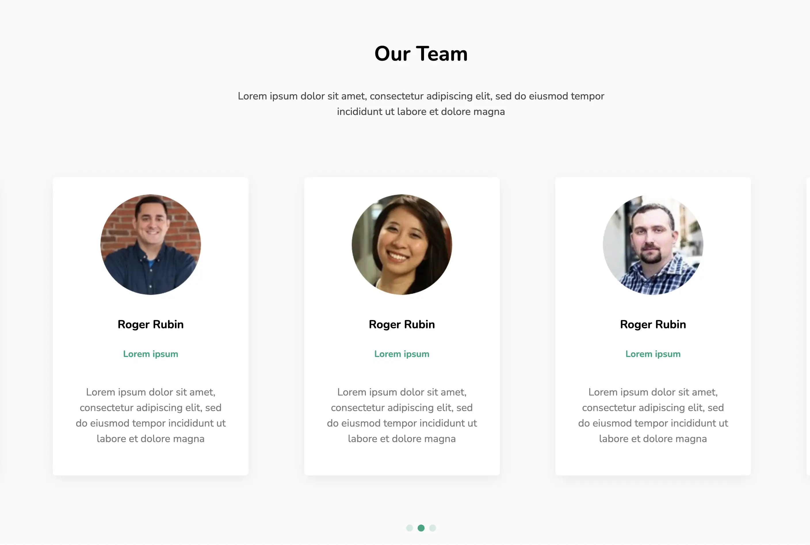
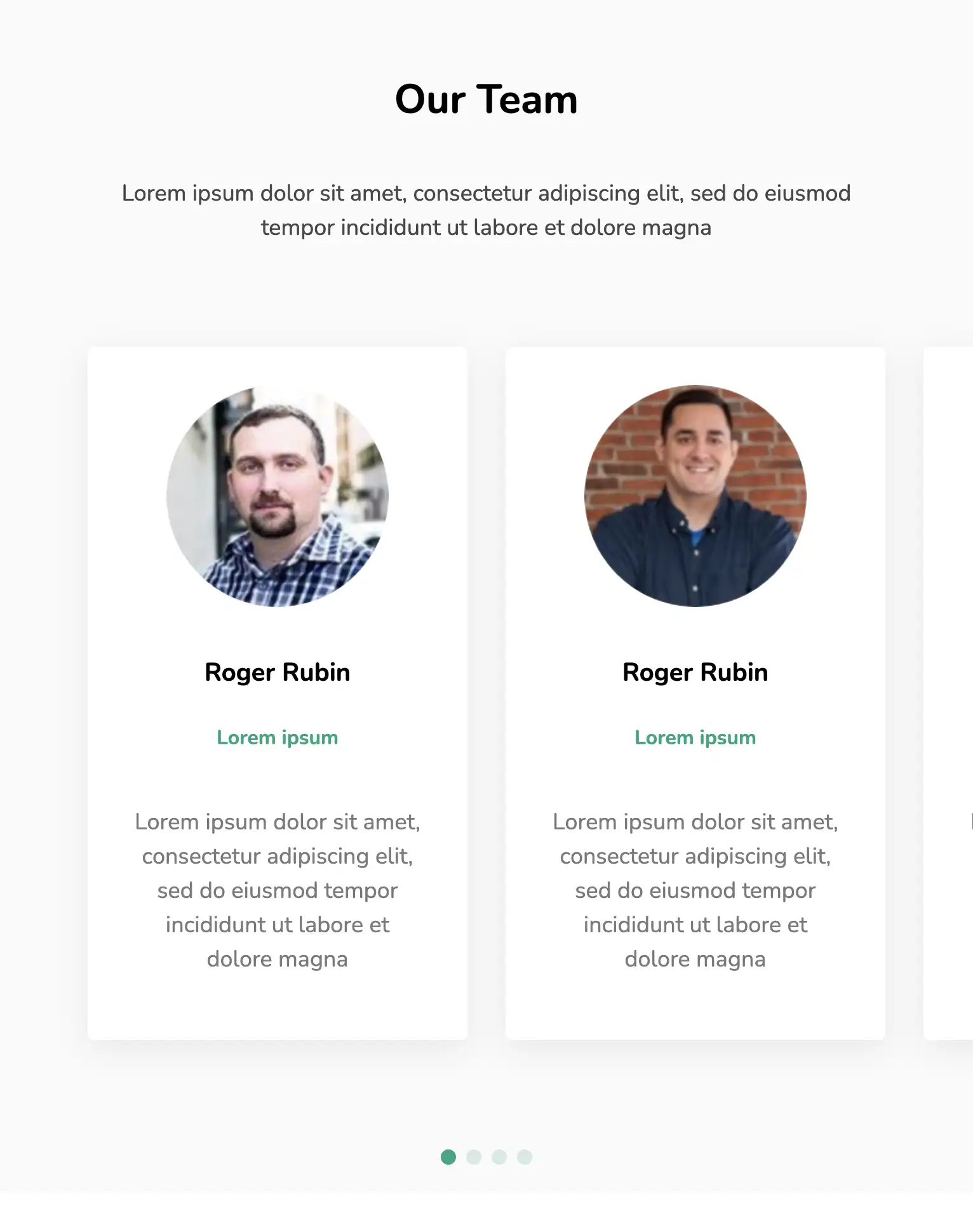
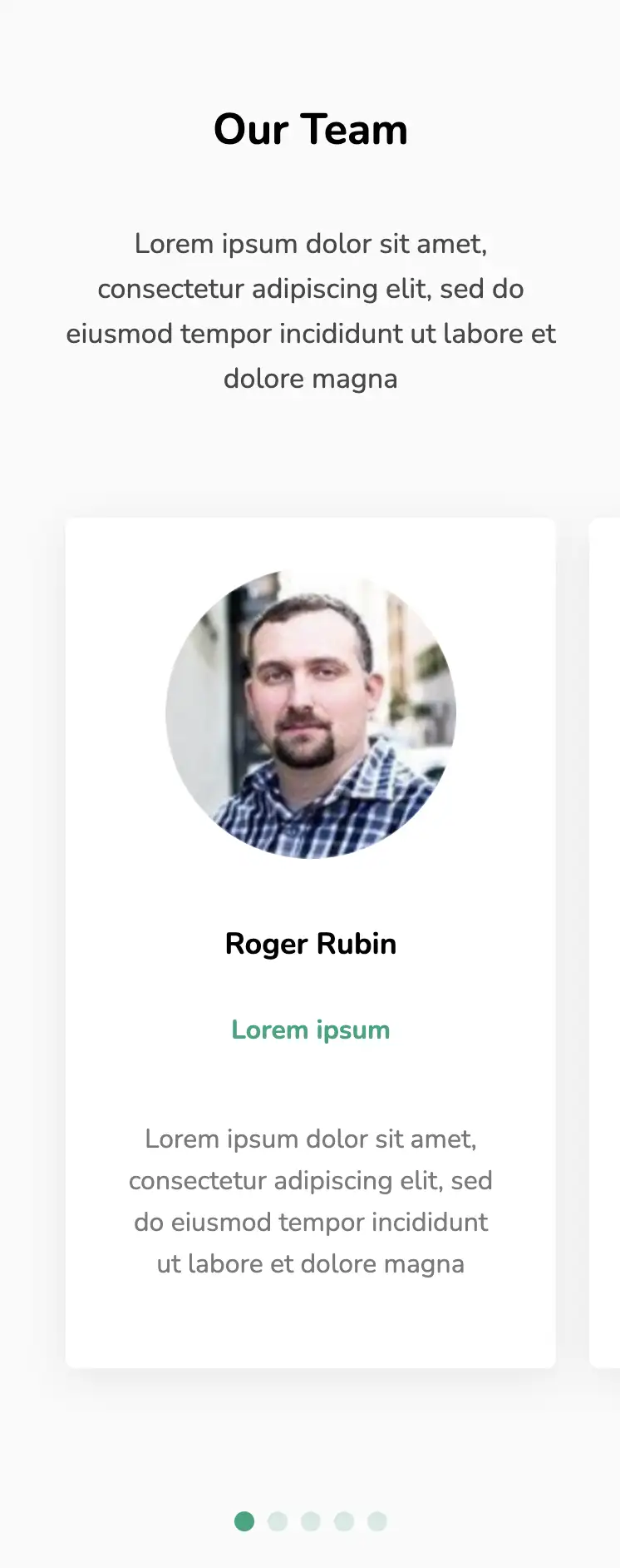
The above design demonstrates another way to present your team to the visitors with a scrollable slider. This layout provides a short description about each member, highlighting their personality. Individual cards have a box shadow, distinguishing them from the soft, grey background.
View Code
HTML
CSS
JS
Responsive CSS
Output
             Our Team


             Lorem ipsum dolor sit amet, consectetur adipiscing elit, sed do eiusmod
      tempor incididunt ut labore et dolore magna


                   Roger Rubin


                   Lorem ipsum


                   Lorem ipsum dolor sit amet, consectetur adipiscing elit, sed do
                  eiusmod tempor incididunt ut labore et dolore magna


                   Roger Rubin


                   Lorem ipsum


                   Lorem ipsum dolor sit amet, consectetur adipiscing elit, sed do
                  eiusmod tempor incididunt ut labore et dolore magna


                   Roger Rubin


                   Lorem ipsum


                   Lorem ipsum dolor sit amet, consectetur adipiscing elit, sed do
                  eiusmod tempor incididunt ut labore et dolore magna


                   Roger Rubin


                   Lorem ipsum


                   Lorem ipsum dolor sit amet, consectetur adipiscing elit, sed do
                  eiusmod tempor incididunt ut labore et dolore magna


                   Roger Rubin


                   Lorem ipsum


                   Lorem ipsum dolor sit amet, consectetur adipiscing elit, sed do
                  eiusmod tempor incididunt ut labore et dolore magna
          *{
  font-family:Nunito, sans-serif;
}
.text-blk{
  line-height:25px;
  margin-top:0px;
  margin-right:0px;
  margin-bottom:0px;
  margin-left:0px;
}
.responsive-container-block{
  min-height:75px;
  height:fit-content;
  width:100%;
  display:flex;
  flex-wrap:wrap;
  margin-top:0px;
  margin-right:auto;
  margin-bottom:0px;
  margin-left:auto;
  justify-content:flex-start;
}
.inner-container {
  max-width:1320px;
  flex-direction:column;
  align-items:center;
  text-align:center;
  margin-top:80px;
  margin-right:auto;
  margin-bottom:100px;
  margin-left:auto;
}
.section-head-text{
  font-size:50px;
  line-height:60px;
  font-weight:700;
  margin-top:0px;
  margin-right:0px;
  margin-bottom:18px;
  margin-left:0px;
}
.section-subhead-text{
  color:rgb(72, 72, 72);
  font-size:20px;
  line-height:27px;
  max-width:670px;
  margin-top:0px;
  margin-right:0px;
  margin-bottom:80px;
  margin-left:0px;
}
.card{
  width:340px;
  display:flex;
  flex-direction:column;
  align-items:center;
  padding-top:30px;
  padding-right:25px;
  padding-bottom:40px;
  padding-left:25px;
  box-shadow:rgba(134, 134, 134, 0.16) 0px 6px 24px;
  border-top-left-radius:6px;
  border-top-right-radius:6px;
  border-bottom-right-radius:6px;
  border-bottom-left-radius:6px;
  background-color:rgb(255, 255, 255);
}
.img-wrapper{
  width:175px;
  height:175px;
  clip-path:circle(50% at 50% 50%);
}
.name{
  font-size:20px;
  font-weight:700;
  margin-top:28px;
  margin-right:0px;
  margin-bottom:5px;
  margin-left:0px;
  line-height:27px;
}
.position{
  line-height:26px;
  color:rgb(0, 166, 127);
  font-weight:700;
  margin-top:0px;
  margin-right:0px;
  margin-bottom:20px;
  margin-left:0px;
}
.testimonial{
  color:rgb(122, 122, 122);
  font-size:18px;
  line-height:27px;
}
.outer-container{
  background-color:rgb(250, 250, 250);
  padding-top:0px;
  padding-right:50px;
  padding-bottom:0px;
  padding-left:50px;
}
.container-block{
  min-height:75px;
  height:fit-content;
  width:100%;
  padding-top:10px;
  padding-right:10px;
  padding-bottom:10px;
  padding-left:10px;
  display:block;
}
.swiper.team-swiper{
  max-width:100%;
  width:100%;
  height:fit-content;
}
.swiper-slide{
  display:flex;
  justify-content:flex-start;
  height:auto;
}
.swiper-pagination.container-block{
  position:relative;
  top:0px;
  margin-top:36px;
  margin-right:0px;
  margin-bottom:0px;
  margin-left:0px;
}
.swiper-container-horizontal > .swiper-pagination-bullets .swiper-pagination-bullet{
  margin-top:0px;
  margin-right:4px;
  margin-bottom:0px;
  margin-left:4px;
  height:12px;
  width:12px;
  background-image:initial;
  background-position-x:initial;
  background-position-y:initial;
  background-size:initial;
  background-repeat-x:initial;
  background-repeat-y:initial;
  background-attachment:initial;
  background-origin:initial;
  background-clip:initial;
  background-color:rgb(0, 166, 127);
}
.swiper-wrapper{
  position:relative;
  top:0px;
}
@media (max-width: 1024px){
  .swiper-slide{
    justify-content:center;
  }
}
@media (max-width: 500px){
  .outer-container{
    padding-top:0px;
    padding-right:20px;
    padding-bottom:0px;
    padding-left:20px;
  }
}
          var swiper = new Swiper(".team-swiper", {
  slidesPerView: 3,
  spaceBetween: 30,
  pagination: {
    el: ".swiper-pagination",
    clickable: true,
  },
  breakpoints: {

    200: {
      slidesPerView: 1,
      spaceBetween: 20
    },
    750: {
      slidesPerView: 2,
      spaceBetween: 30
    },
    1024: {
      slidesPerView: 2.5,
      spaceBetween: 30
    },
    1100: {
      slidesPerView: 3,
      spaceBetween: 30
    },
  }
});
          @import url('https://fonts.googleapis.com/css2?family=Nunito:wght@200;300;400;600;700;800&display=swap');
        *, *:before, *:after {
        -moz-box-sizing: border-box;
        -webkit-box-sizing: border-box;
        box-sizing: border-box;
        }
        body {
        margin: 0;
        }
        .wk-desk-1{
        width: 8.333333%;
        }
        .wk-desk-2{
        width: 16.666667%;
        }
        .wk-desk-3{
        width: 25%;
        }
        .wk-desk-4{
        width: 33.333333%;
        }
        .wk-desk-5{
        width: 41.666667%;
        }
        .wk-desk-6{
        width: 50%;
        }
        .wk-desk-7{
        width: 58.333333%;
        }
        .wk-desk-8{
        width: 66.666667%;
        }
        .wk-desk-9{
        width: 75%;
        }
        .wk-desk-10{
        width: 83.333333%;
        }
        .wk-desk-11{
        width: 91.666667%;
        }
        .wk-desk-12{
        width: 100%;
        }
        @media (max-width: 1024px) {
        .wk-ipadp-1{
        width: 8.333333%;
        }
        .wk-ipadp-2{
        width: 16.666667%;
        }
        .wk-ipadp-3{
        width: 25%;
        }
        .wk-ipadp-4{
        width: 33.333333%;
        }
        .wk-ipadp-5{
        width: 41.666667%;
        }
        .wk-ipadp-6{
        width: 50%;
        }
        .wk-ipadp-7{
        width: 58.333333%;
        }
        .wk-ipadp-8{
        width: 66.666667%;
        }
        .wk-ipadp-9{
        width: 75%;
        }
        .wk-ipadp-10{
        width: 83.333333%;
        }
        .wk-ipadp-11{
        width: 91.666667%;
        }
        .wk-ipadp-12{
        width: 100%;
        }
        }
        @media (max-width: 768px) {
        .wk-tab-1{
        width: 8.333333%;
        }
        .wk-tab-2{
        width: 16.666667%;
        }
        .wk-tab-3{
        width: 25%;
        }
        .wk-tab-4{
        width: 33.333333%;
        }
        .wk-tab-5{
        width: 41.666667%;
        }
        .wk-tab-6{
        width: 50%;
        }
        .wk-tab-7{
        width: 58.333333%;
        }
        .wk-tab-8{
        width: 66.666667%;
        }
        .wk-tab-9{
        width: 75%;
        }
        .wk-tab-10{
        width: 83.333333%;
        }
        .wk-tab-11{
        width: 91.666667%;
        }
        .wk-tab-12{
        width: 100%;
        }
        }
        @media (max-width: 500px) {
        .wk-mobile-1{
        width: 8.333333%;
        }
        .wk-mobile-2{
        width: 16.666667%;
        }
        .wk-mobile-3{
        width: 25%;
        }
        .wk-mobile-4{
        width: 33.333333%;
        }
        .wk-mobile-5{
        width: 41.666667%;
        }
        .wk-mobile-6{
        width: 50%;
        }
        .wk-mobile-7{
        width: 58.333333%;
        }
        .wk-mobile-8{
        width: 66.666667%;
        }
        .wk-mobile-9{
        width: 75%;
        }
        .wk-mobile-10{
        width: 83.333333%;
        }
        .wk-mobile-11{
        width: 91.666667%;
        }
        .wk-mobile-12{
        width: 100%;
        }
        }
Reset
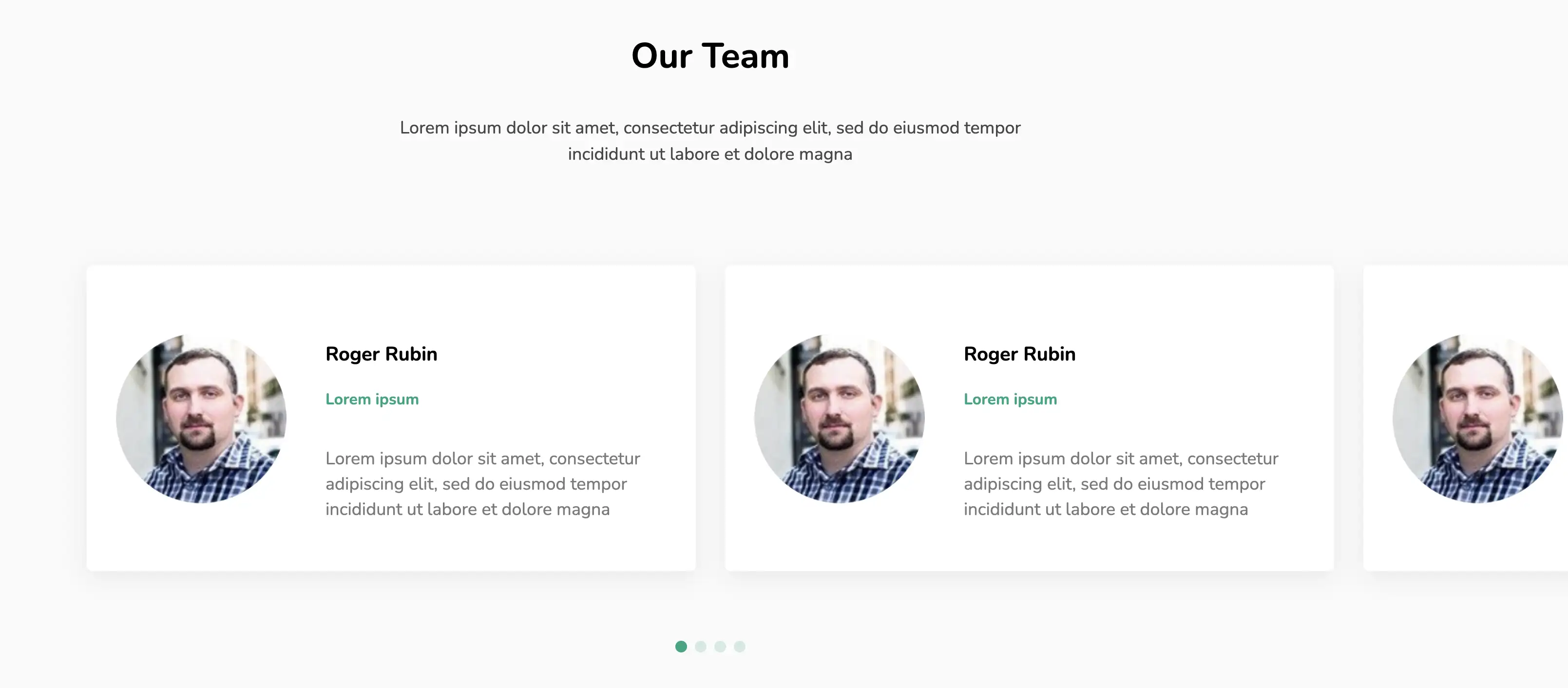
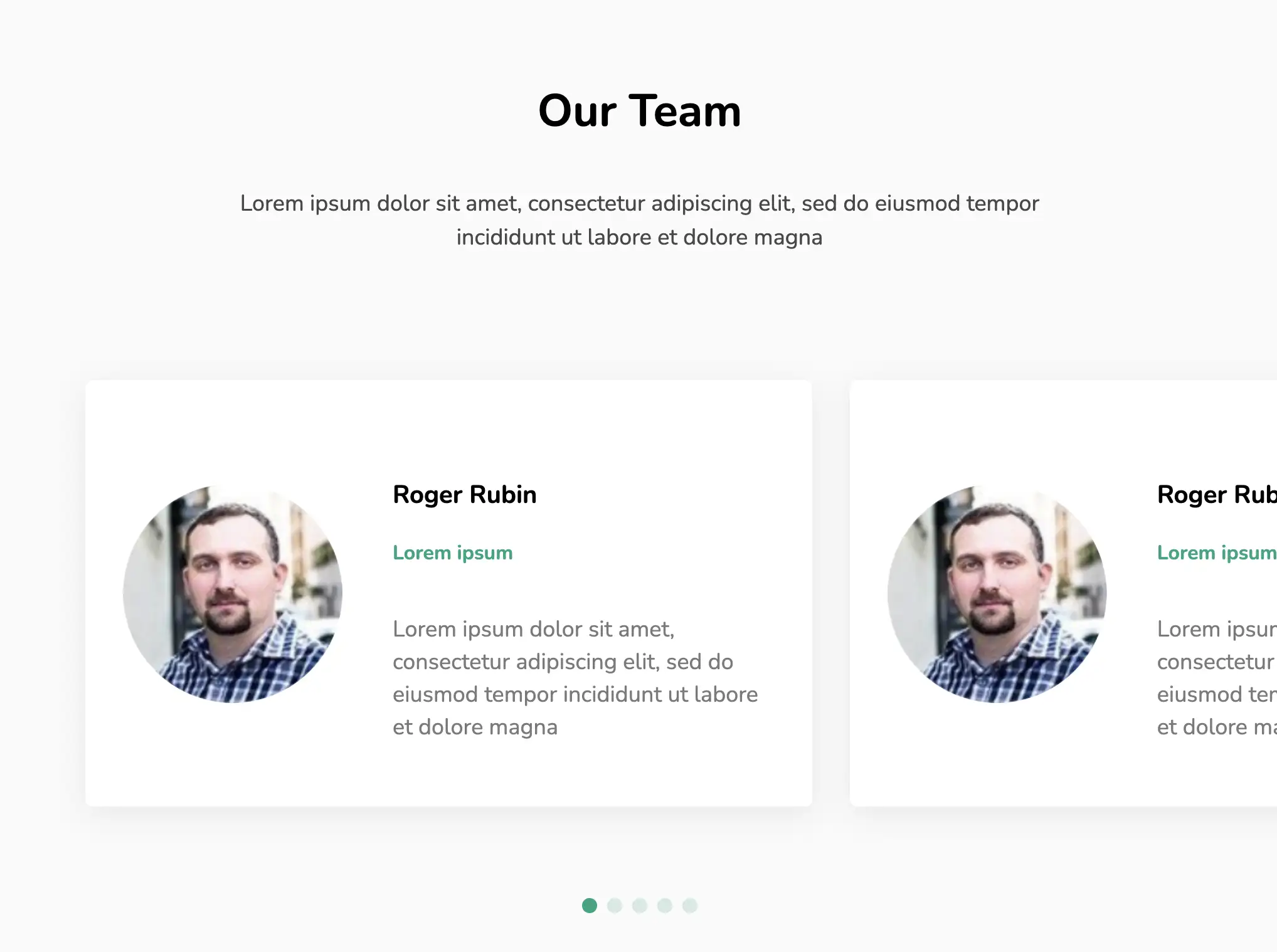
This page showcases team members with the help of a scrollable, horizontal slider created with the SwiperJS library. One can find basic information about each individual alongside their picture. The cards have a flex display with the content wrapping around each other as the screen width is reduced.
View Code
HTML
CSS
JS
Responsive CSS
Output
             Our Team


             Lorem ipsum dolor sit amet, consectetur adipiscing elit, sed do eiusmod
      tempor incididunt ut labore et dolore magna


                   Roger Rubin


                   Lorem ipsum


                   Lorem ipsum dolor sit amet, consectetur adipiscing elit, sed do eiusmod
                  tempor incididunt ut labore et dolore magna


                   Roger Rubin


                   Lorem ipsum


                   Lorem ipsum dolor sit amet, consectetur adipiscing elit, sed do eiusmod
                  tempor incididunt ut labore et dolore magna


                   Roger Rubin


                   Lorem ipsum


                   Lorem ipsum dolor sit amet, consectetur adipiscing elit, sed do eiusmod
                  tempor incididunt ut labore et dolore magna


                   Roger Rubin


                   Lorem ipsum


                   Lorem ipsum dolor sit amet, consectetur adipiscing elit, sed do eiusmod
                  tempor incididunt ut labore et dolore magna


                   Roger Rubin


                   Lorem ipsum


                   Lorem ipsum dolor sit amet, consectetur adipiscing elit, sed do eiusmod
                  tempor incididunt ut labore et dolore magna
          *{
  font-family:Nunito, sans-serif;
}
.text-blk{
  line-height:25px;
  margin-top:0px;
  margin-right:0px;
  margin-bottom:0px;
  margin-left:0px;
}
.responsive-container-block{
  min-height:75px;
  height:fit-content;
  width:100%;
  display:flex;
  flex-wrap:wrap;
  margin-top:0px;
  margin-right:auto;
  margin-bottom:0px;
  margin-left:auto;
  justify-content:flex-start;
}
.inner-container {
  max-width:1320px;
  flex-direction:column;
  align-items:center;
  text-align:center;
  position:relative;
  margin-top:80px;
  margin-right:auto;
  margin-bottom:100px;
  margin-left:auto;
}
.section-head-text{
  font-size:50px;
  line-height:60px;
  font-weight:700;
  margin-top:0px;
  margin-right:0px;
  margin-bottom:18px;
  margin-left:0px;
}
.section-subhead-text{
  color:rgb(72, 72, 72);
  font-size:20px;
  line-height:27px;
  max-width:670px;
  margin-top:0px;
  margin-right:0px;
  margin-bottom:80px;
  margin-left:0px;
}
.card{
  width:auto;
  display:flex;
  flex-direction:row;
  align-items:center;
  box-shadow:rgba(134, 134, 134, 0.16) 0px 6px 24px;
  border-top-left-radius:6px;
  border-top-right-radius:6px;
  border-bottom-right-radius:6px;
  border-bottom-left-radius:6px;
  background-color:rgb(255, 255, 255);
  max-width:750px;
  padding-top:40px;
  padding-right:30px;
  padding-bottom:40px;
  padding-left:30px;
}
.img-wrapper{
  width:175px;
  height:175px;
  clip-path:circle(50% at 50% 50%);
}
.name{
  font-size:20px;
  font-weight:700;
  margin-top:28px;
  margin-right:0px;
  margin-bottom:5px;
  margin-left:0px;
  line-height:27px;
}
.position{
  line-height:26px;
  color:rgb(0, 166, 127);
  font-weight:700;
  margin-top:0px;
  margin-right:0px;
  margin-bottom:20px;
  margin-left:0px;
}
.testimonial{
  color:rgb(122, 122, 122);
  font-size:18px;
  line-height:27px;
}
.outer-container{
  background-color:rgb(250, 250, 250);
  padding-top:0px;
  padding-right:50px;
  padding-bottom:0px;
  padding-left:50px;
}
.container-block{
  min-height:75px;
  height:fit-content;
  width:100%;
  padding-top:10px;
  padding-right:10px;
  padding-bottom:10px;
  padding-left:10px;
  display:block;
}
.swiper.team-swiper{
  max-width:100%;
  width:100%;
}
.swiper-slide{
  position:static;
  display:flex;
  justify-content:flex-start;
}
.swiper-wrapper{
  position:static;
  height:fit-content;
}
.swiper-pagination.container-block{
  top:auto;
  position:relative;
  bottom:auto;
  right:auto;
  left:auto;
  margin:36px 0 0 0;
}
.swiper-container-horizontal > .swiper-pagination-bullets .swiper-pagination-bullet{
  margin-top:0px;
  margin-right:4px;
  margin-bottom:0px;
  margin-left:4px;
  height:12px;
  width:12px;
  background-image:initial;
  background-position-x:initial;
  background-position-y:initial;
  background-size:initial;
  background-repeat-x:initial;
  background-repeat-y:initial;
  background-attachment:initial;
  background-origin:initial;
  background-clip:initial;
  background-color:rgb(0, 166, 127);
}
.card-content{
  text-align:left;
  margin-top:0px;
  margin-right:0px;
  margin-bottom:0px;
  margin-left:30px;
}
@media (max-width: 1024px){
  .swiper-slide{
    justify-content:center;
  }
}
@media (max-width: 768px){
  .card{
    flex-direction:column;
  }
  .card-content{
    text-align:center;
    margin-top:0px;
    margin-right:0px;
    margin-bottom:0px;
    margin-left:0px;
  }
  .section-head-text{
    font-size:40px;
  }
}
@media (max-width: 500px){
  .outer-container{
    padding-top:0px;
    padding-right:20px;
    padding-bottom:0px;
    padding-left:20px;
  }
  .section-head-text{
    font-size:35px;
  }
  .section-subhead-text{
    font-size:18px;
    line-height:25px;
    margin-top:0px;
    margin-right:0px;
    margin-bottom:50px;
    margin-left:0px;
  }
}
          var swiper = new Swiper(".team-swiper", {
  slidesPerView: 3,
  spaceBetween: 30,
  pagination: {
    el: ".swiper-pagination",
    clickable: true,
  },
  breakpoints: {

    200: {
      slidesPerView: 1,
      spaceBetween: 20
    },
    750: {
      slidesPerView: 1,
      spaceBetween: 30
    },
    1024: {
      slidesPerView: 1.5,
      spaceBetween: 30
    },
    1100: {
      slidesPerView: 2,
      spaceBetween: 30
    },
  }
});
          @import url('https://fonts.googleapis.com/css2?family=Nunito:wght@200;300;400;600;700;800&display=swap');
        *, *:before, *:after {
        -moz-box-sizing: border-box;
        -webkit-box-sizing: border-box;
        box-sizing: border-box;
        }
        body {
        margin: 0;
        }
        .wk-desk-1{
        width: 8.333333%;
        }
        .wk-desk-2{
        width: 16.666667%;
        }
        .wk-desk-3{
        width: 25%;
        }
        .wk-desk-4{
        width: 33.333333%;
        }
        .wk-desk-5{
        width: 41.666667%;
        }
        .wk-desk-6{
        width: 50%;
        }
        .wk-desk-7{
        width: 58.333333%;
        }
        .wk-desk-8{
        width: 66.666667%;
        }
        .wk-desk-9{
        width: 75%;
        }
        .wk-desk-10{
        width: 83.333333%;
        }
        .wk-desk-11{
        width: 91.666667%;
        }
        .wk-desk-12{
        width: 100%;
        }
        @media (max-width: 1024px) {
        .wk-ipadp-1{
        width: 8.333333%;
        }
        .wk-ipadp-2{
        width: 16.666667%;
        }
        .wk-ipadp-3{
        width: 25%;
        }
        .wk-ipadp-4{
        width: 33.333333%;
        }
        .wk-ipadp-5{
        width: 41.666667%;
        }
        .wk-ipadp-6{
        width: 50%;
        }
        .wk-ipadp-7{
        width: 58.333333%;
        }
        .wk-ipadp-8{
        width: 66.666667%;
        }
        .wk-ipadp-9{
        width: 75%;
        }
        .wk-ipadp-10{
        width: 83.333333%;
        }
        .wk-ipadp-11{
        width: 91.666667%;
        }
        .wk-ipadp-12{
        width: 100%;
        }
        }
        @media (max-width: 768px) {
        .wk-tab-1{
        width: 8.333333%;
        }
        .wk-tab-2{
        width: 16.666667%;
        }
        .wk-tab-3{
        width: 25%;
        }
        .wk-tab-4{
        width: 33.333333%;
        }
        .wk-tab-5{
        width: 41.666667%;
        }
        .wk-tab-6{
        width: 50%;
        }
        .wk-tab-7{
        width: 58.333333%;
        }
        .wk-tab-8{
        width: 66.666667%;
        }
        .wk-tab-9{
        width: 75%;
        }
        .wk-tab-10{
        width: 83.333333%;
        }
        .wk-tab-11{
        width: 91.666667%;
        }
        .wk-tab-12{
        width: 100%;
        }
        }
        @media (max-width: 500px) {
        .wk-mobile-1{
        width: 8.333333%;
        }
        .wk-mobile-2{
        width: 16.666667%;
        }
        .wk-mobile-3{
        width: 25%;
        }
        .wk-mobile-4{
        width: 33.333333%;
        }
        .wk-mobile-5{
        width: 41.666667%;
        }
        .wk-mobile-6{
        width: 50%;
        }
        .wk-mobile-7{
        width: 58.333333%;
        }
        .wk-mobile-8{
        width: 66.666667%;
        }
        .wk-mobile-9{
        width: 75%;
        }
        .wk-mobile-10{
        width: 83.333333%;
        }
        .wk-mobile-11{
        width: 91.666667%;
        }
        .wk-mobile-12{
        width: 100%;
        }
        }
Reset