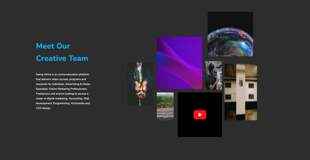


This widget uses a mix of multimedia elements to provide users an insight into the creative team. The absolute position applied to the images helps to render an elegant gallery section. The design is entirely responsive, with the sections positioning themselves one below the other on smaller screens.
View Code
HTML
CSS
JS
Responsive CSS
Output
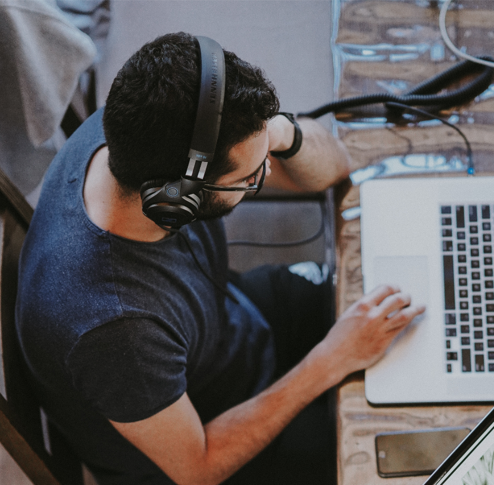
              Meet Our Creative Team


              Semaj Africa is an online education platform that delivers video courses, programs and resources for Individual, Advertising & Media Specialist, Online Marketing Professionals, Freelancers and anyone looking to pursue a career in digital marketing, Accounting, Web development, Programming. Multimedia and CAD design.
          * {
    font-family: Nunito, sans-serif;
}

.text-blk {
    padding-top: 0px;
    padding-right: 0px;
    padding-bottom: 0px;
    padding-left: 0px;
    line-height: 20px;
    color: white;
    font-size: 14px;
    margin-top: 0px;
    margin-right: 0px;
    margin-bottom: 40px;
    margin-left: 0px;
}

.responsive-container-block {
    min-height: 75px;
    height: fit-content;
    width: 100%;
    padding-top: 10px;
    padding-right: 10px;
    padding-bottom: 10px;
    padding-left: 10px;
    display: flex;
    flex-wrap: wrap;
    margin-top: 0px;
    margin-right: auto;
    margin-bottom: 0px;
    margin-left: auto;
    justify-content: flex-start;
}

.responsive-container-block.bigContainer {
    background-image: initial;
    background-position-x: initial;
    background-position-y: initial;
    background-size: initial;
    background-repeat-x: initial;
    background-repeat-y: initial;
    background-attachment: initial;
    background-origin: initial;
    background-clip: initial;
    background-color: rgb(51, 51, 51);
    padding-top: 10px;
    padding-right: 20px;
    padding-bottom: 10px;
    padding-left: 20px;
    margin: 0 0 0 0;
}

.responsive-container-block.Container {
    max-width: 1320px;
    align-items: center;
    justify-content: center;
    margin-top: 80px;
    margin-right: auto;
    margin-bottom: 80px;
    margin-left: auto;
    padding-top: 10px;
    padding-right: 0px;
    padding-bottom: 10px;
    padding-left: 0px;
}

.responsive-container-block.leftSide {
    width: auto;
    align-items: flex-start;
    padding-top: 10px;
    padding-right: 0px;
    padding-bottom: 10px;
    padding-left: 0px;
    flex-direction: column;
    position: static;
    margin-top: 0px;
    margin-right: auto;
    margin-bottom: 0px;
    margin-left: auto;
    max-width: 300px;
}

.text-blk.heading {
    font-size: 40px;
    line-height: 64px;
    font-weight: 900;
    color: #00B2EB;
    margin-top: 0px;
    margin-right: 0px;
    margin-bottom: 40px;
    margin-left: 0px;
}

.text-blk.btn {
    color: rgb(0, 178, 235);
    background-image: initial;
    background-position-x: initial;
    background-position-y: initial;
    background-size: initial;
    background-repeat-x: initial;
    background-repeat-y: initial;
    background-attachment: initial;
    background-origin: initial;
    background-clip: initial;
    background-color: rgb(255, 255, 255);
    box-shadow: rgba(160, 121, 0, 0.2) 0px 12px 35px;
    border-top-left-radius: 100px;
    border-top-right-radius: 100px;
    border-bottom-right-radius: 100px;
    border-bottom-left-radius: 100px;
    padding-top: 20px;
    padding-right: 50px;
    padding-bottom: 20px;
    padding-left: 50px;
    cursor: pointer;
}

.responsive-container-block.rightSide {
    width: 675px;
    position: relative;
    padding-top: 0px;
    padding-right: 0px;
    padding-bottom: 0px;
    padding-left: 0px;
    display: flex;
    height: 700px;
    min-height: auto;
}

.number1img {
    margin-top: 39%;
    margin-right: 80%;
    margin-bottom: 29%;
    margin-left: 0px;
    height: 32%;
    width: 20%;
    position: absolute;
}

.number2img {
    margin-top: 19%;
    margin-right: 42%;
    margin-bottom: 42%;
    margin-left: 23%;
    width: 35%;
    height: 39%;
    position: absolute;
}

.number3img {
    width: 13%;
    height: 21%;
    position: absolute;
    margin-top: 62%;
    margin-right: 64%;
    margin-bottom: 30%;
    margin-left: 23%;
}

.number4vid {
    width: 34%;
    height: 33%;
    position: absolute;
    margin-top: 62%;
    margin-right: 27%;
    margin-bottom: 0px;
    margin-left: 39%;
}

.number5img {
    position: absolute;
    width: 13%;
    height: 21%;
    margin-top: 38%;
    margin-right: 27%;
    margin-bottom: 41%;
    margin-left: 60%;
}

.number6img {
    position: absolute;
    margin-top: 0px;
    margin-right: 3%;
    margin-bottom: 67%;
    margin-left: 62%;
    width: 35%;
    height: 33%;
}

.number7img {
    position: absolute;
    width: 25%;
    margin-top: 40%;
    margin-right: 0px;
    margin-bottom: 18%;
    margin-left: 75%;
    height: 42%;
}

.text-blk.subHeading {
    font-size: 14px;
    line-height: 25px;
}

@media (max-width: 1024px) {
    .responsive-container-block.Container {
        flex-direction: column-reverse;
    }

    .text-blk.heading {
        text-align: center;
        max-width: 370px;
    }

    .text-blk.subHeading {
        text-align: center;
    }

    .responsive-container-block.leftSide {
        align-items: center;
        max-width: 480px;
    }

    .responsive-container-block.rightSide {
        margin-top: 0px;
        margin-right: auto;
        margin-bottom: 100px;
        margin-left: auto;
    }

    .responsive-container-block.rightSide {
        margin: 0 auto 70px auto;
    }
}

@media (max-width: 768px) {
    .responsive-container-block.rightSide {
        width: 450px;
        height: 450px;
    }

    .responsive-container-block.leftSide {
        max-width: 450px;
    }
}

@media (max-width: 500px) {
    .number1img {
        display: none;
    }

    .number2img {
        display: none;
    }

    .number3img {
        display: none;
    }

    .number5img {
        display: none;
    }

    .number6img {
        display: none;
    }

    .number7img {
        display: none;
    }

    .responsive-container-block.rightSide {
        width: 100%;
        height: 250px;
        margin-top: 0px;
        margin-right: 0px;
        margin-bottom: 100px;
        margin-left: 0px;
    }

    .number4vid {
        position: static;
        margin-top: 0px;
        margin-right: auto;
        margin-bottom: 0px;
        margin-left: auto;
        width: 100%;
        height: 100%;
    }

    .text-blk.heading {
        font-size: 25px;
        line-height: 40px;
        max-width: 370px;
        width: auto;
    }

    .text-blk.subHeading {
        font-size: 14px;
        line-height: 25px;
    }

    .responsive-container-block.leftSide {
        width: 100%;
    }
}
          @import url('https://fonts.googleapis.com/css2?family=Nunito:wght@200;300;400;600;700;800&display=swap');
        *, *:before, *:after {
        -moz-box-sizing: border-box;
        -webkit-box-sizing: border-box;
        box-sizing: border-box;
        }
        body {
        margin: 0;
        }
        .wk-desk-1{
        width: 8.333333%;
        }
        .wk-desk-2{
        width: 16.666667%;
        }
        .wk-desk-3{
        width: 25%;
        }
        .wk-desk-4{
        width: 33.333333%;
        }
        .wk-desk-5{
        width: 41.666667%;
        }
        .wk-desk-6{
        width: 50%;
        }
        .wk-desk-7{
        width: 58.333333%;
        }
        .wk-desk-8{
        width: 66.666667%;
        }
        .wk-desk-9{
        width: 75%;
        }
        .wk-desk-10{
        width: 83.333333%;
        }
        .wk-desk-11{
        width: 91.666667%;
        }
        .wk-desk-12{
        width: 100%;
        }
        @media (max-width: 1024px) {
        .wk-ipadp-1{
        width: 8.333333%;
        }
        .wk-ipadp-2{
        width: 16.666667%;
        }
        .wk-ipadp-3{
        width: 25%;
        }
        .wk-ipadp-4{
        width: 33.333333%;
        }
        .wk-ipadp-5{
        width: 41.666667%;
        }
        .wk-ipadp-6{
        width: 50%;
        }
        .wk-ipadp-7{
        width: 58.333333%;
        }
        .wk-ipadp-8{
        width: 66.666667%;
        }
        .wk-ipadp-9{
        width: 75%;
        }
        .wk-ipadp-10{
        width: 83.333333%;
        }
        .wk-ipadp-11{
        width: 91.666667%;
        }
        .wk-ipadp-12{
        width: 100%;
        }
        }
        @media (max-width: 768px) {
        .wk-tab-1{
        width: 8.333333%;
        }
        .wk-tab-2{
        width: 16.666667%;
        }
        .wk-tab-3{
        width: 25%;
        }
        .wk-tab-4{
        width: 33.333333%;
        }
        .wk-tab-5{
        width: 41.666667%;
        }
        .wk-tab-6{
        width: 50%;
        }
        .wk-tab-7{
        width: 58.333333%;
        }
        .wk-tab-8{
        width: 66.666667%;
        }
        .wk-tab-9{
        width: 75%;
        }
        .wk-tab-10{
        width: 83.333333%;
        }
        .wk-tab-11{
        width: 91.666667%;
        }
        .wk-tab-12{
        width: 100%;
        }
        }
        @media (max-width: 500px) {
        .wk-mobile-1{
        width: 8.333333%;
        }
        .wk-mobile-2{
        width: 16.666667%;
        }
        .wk-mobile-3{
        width: 25%;
        }
        .wk-mobile-4{
        width: 33.333333%;
        }
        .wk-mobile-5{
        width: 41.666667%;
        }
        .wk-mobile-6{
        width: 50%;
        }
        .wk-mobile-7{
        width: 58.333333%;
        }
        .wk-mobile-8{
        width: 66.666667%;
        }
        .wk-mobile-9{
        width: 75%;
        }
        .wk-mobile-10{
        width: 83.333333%;
        }
        .wk-mobile-11{
        width: 91.666667%;
        }
        .wk-mobile-12{
        width: 100%;
        }
        }
Reset
Join our community to see how developers are using Workik AI everyday.
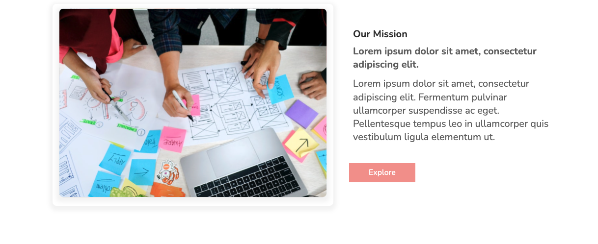
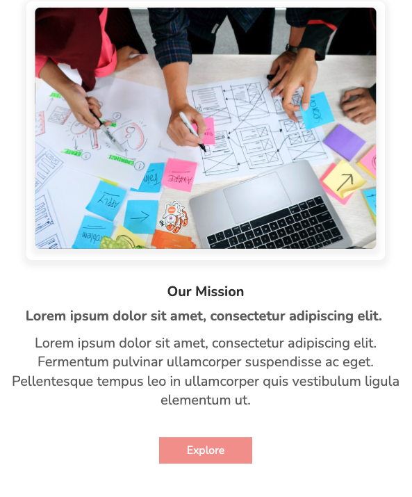
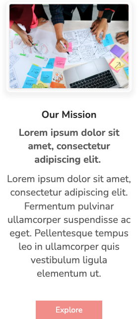
The above page presents the mission and vision of the organization in separate blocks with contrasting flex directions. Each block features a high-quality image and a short description text. The bright call-to-action could redirect visitors to the company portfolio page.
View Code
HTML
CSS
JS
Responsive CSS
Output

Our Mission
Lorem ipsum dolor sit amet, consectetur adipiscing elit.
Lorem ipsum dolor sit amet, consectetur adipiscing elit. Fermentum pulvinar ullamcorper suspendisse ac eget. Pellentesque tempus leo in ullamcorper quis vestibulum ligula elementum ut.

Our Vision
Lorem ipsum dolor sit amet, consectetur adipiscing elit.
Lorem ipsum dolor sit amet, consectetur adipiscing elit. Fermentum pulvinar ullamcorper suspendisse ac eget. Pellentesque tempus leo in ullamcorper quis vestibulum ligula elementum ut.
          * {
    font-family: Nunito, sans-serif;
}

.responsive-container-block {
    min-height: 75px;
    height: fit-content;
    width: 100%;
    padding-top: 10px;
    padding-right: 10px;
    padding-bottom: 10px;
    padding-left: 10px;
    display: flex;
    flex-wrap: wrap;
    margin-top: 0px;
    margin-right: auto;
    margin-bottom: 0px;
    margin-left: auto;
    justify-content: flex-start;
}

.text-blk {
    margin-top: 0px;
    margin-right: 0px;
    margin-bottom: 0px;
    margin-left: 0px;
    padding-top: 10px;
    padding-right: 10px;
    padding-bottom: 10px;
    padding-left: 10px;
    line-height: 25px;
}

.responsive-container-block.bigContainer {
    padding-top: 10px;
    padding-right: 30px;
    padding-bottom: 10px;
    padding-left: 30px;
    flex-direction: column;
    align-items: center;
    justify-content: center;
}

.mainImg {
    color: black;
    width: 55%;
    height: auto;
    box-shadow: rgba(0, 0, 0, 0.05) 0px 5px 10px 7px;
    border-top-left-radius: 10px;
    border-top-right-radius: 10px;
    border-bottom-right-radius: 10px;
    border-bottom-left-radius: 10px;
}

.text-blk.headingText {
    font-size: 25px;
    font-weight: 700;
    line-height: 34px;
    color: rgb(51, 51, 51);
    padding-top: 0px;
    padding-right: 10px;
    padding-bottom: 0px;
    padding-left: 10px;
    margin-top: 0px;
    margin-right: 0px;
    margin-bottom: 10px;
    margin-left: 0px;
}

.allText {
    padding-top: 0px;
    padding-right: 0px;
    padding-bottom: 0px;
    padding-left: 0px;
    margin-top: 0px;
    margin-right: 0px;
    margin-bottom: 0px;
    margin-left: 40px;
    width: 40%;
    margin: 0 0 0 0;
}

.text-blk.subHeadingText {
    color: rgb(102, 102, 102);
    font-size: 25px;
    line-height: 34px;
    font-weight: 700;
    padding-top: 0px;
    padding-right: 10px;
    padding-bottom: 0px;
    padding-left: 10px;
    margin-top: 0px;
    margin-right: 0px;
    margin-bottom: 15px;
    margin-left: 0px;
}

.text-blk.description {
    font-size: 25px;
    line-height: 34px;
    color: rgb(102, 102, 102);
    margin-top: 0px;
    margin-right: 0px;
    margin-bottom: 50px;
    margin-left: 0px;
    padding-top: 0px;
    padding-right: 10px;
    padding-bottom: 0px;
    padding-left: 10px;
}

.explore {
    font-size: 20px;
    line-height: 28px;
    color: rgb(255, 255, 255);
    background-color: rgb(244, 152, 146);
    padding-top: 10px;
    padding-right: 50px;
    padding-bottom: 10px;
    padding-left: 50px;
    border-top-width: 0px;
    border-right-width: 0px;
    border-bottom-width: 0px;
    border-left-width: 0px;
    border-top-style: outset;
    border-right-style: outset;
    border-bottom-style: outset;
    border-left-style: outset;
    border-top-color: rgb(244, 152, 146);
    border-right-color: rgb(244, 152, 146);
    border-bottom-color: rgb(244, 152, 146);
    border-left-color: rgb(244, 152, 146);
    border-image-source: initial;
    border-image-slice: initial;
    border-image-width: initial;
    border-image-outset: initial;
    border-image-repeat: initial;
    cursor: pointer;
}

.explore:hover {
    background-image: initial;
    background-position-x: initial;
    background-position-y: initial;
    background-size: initial;
    background-repeat-x: initial;
    background-repeat-y: initial;
    background-attachment: initial;
    background-origin: initial;
    background-clip: initial;
    background-color: rgb(255, 235, 234);
    color: rgb(244, 152, 146);
}

.responsive-container-block.Container {
    margin-top: 80px;
    margin-right: auto;
    margin-bottom: 50px;
    margin-left: auto;
    justify-content: center;
    align-items: center;
    max-width: 1320px;
    padding-top: 10px;
    padding-right: 10px;
    padding-bottom: 10px;
    padding-left: 10px;
}

.responsive-container-block.Container.bottomContainer {
    margin-top: 100px;
    margin-right: 0px;
    margin-bottom: 50px;
    margin-left: 0px;
    flex-direction: row-reverse;
    margin: 100px auto 50px auto;
}

.allText.aboveText {
    margin: 0 0 0 40px;
}

.allText.bottomText {
    margin: 0 40px 0 0;
}

@media (max-width: 1024px) {
    .responsive-container-block.Container {
        max-width: 850px;
    }

    .mainImg {
        width: 55%;
        height: auto;
    }

    .text-blk.description {
        font-size: 20px;
    }

    .allText {
        width: 40%;
        margin-top: 0px;
        margin-right: 0px;
        margin-bottom: 0px;
        margin-left: 20px;
    }

    .responsive-container-block.bigContainer {
        padding-top: 10px;
        padding-right: 10px;
        padding-bottom: 10px;
        padding-left: 10px;
    }

    .text-blk.subHeadingText {
        font-size: 22px;
    }

    .responsive-container-block.Container.bottomContainer {
        margin: 80px auto 50px auto;
    }

    .responsive-container-block.Container {
        max-width: 830px;
    }

    .allText.aboveText {
        margin: 30px 0 0 40px;
    }

    .allText.bottomText {
        margin: 30px 40px 0 0;
    }
}

@media (max-width: 768px) {
    .mainImg {
        width: 90%;
    }

    .allText {
        width: 100%;
        margin-top: 0px;
        margin-right: 0px;
        margin-bottom: 0px;
        margin-left: 0px;
        display: flex;
        flex-direction: column;
        justify-content: center;
        align-items: center;
        padding-top: 0px;
        padding-right: 0px;
        padding-bottom: 0px;
        padding-left: 0px;
    }

    .responsive-container-block.Container {
        flex-direction: column;
        height: auto;
    }

    .text-blk.headingText {
        text-align: center;
    }

    .text-blk.subHeadingText {
        text-align: center;
        font-size: 25px;
    }

    .text-blk.description {
        text-align: center;
        font-size: 25px;
    }

    .allText {
        margin-top: 40px;
        margin-right: 0px;
        margin-bottom: 0px;
        margin-left: 0px;
    }

    .allText.aboveText {
        margin: 40px 0 0 0;
    }

    .responsive-container-block.Container {
        margin: 80px auto 50px auto;
    }

    .responsive-container-block.Container.bottomContainer {
        margin: 50px auto 50px auto;
    }

    .allText.bottomText {
        margin: 40px 0 0 0;
    }
}

@media (max-width: 500px) {
    .responsive-container-block.Container {
        padding-top: 10px;
        padding-right: 0px;
        padding-bottom: 10px;
        padding-left: 0px;
        width: 100%;
        max-width: 100%;
    }

    .mainImg {
        width: 100%;
    }

    .responsive-container-block.bigContainer {
        padding-top: 10px;
        padding-right: 25px;
        padding-bottom: 10px;
        padding-left: 25px;
    }

    .text-blk.subHeadingText {
        font-size: 25px;
        padding-top: 0px;
        padding-right: 0px;
        padding-bottom: 0px;
        padding-left: 0px;
    }

    .text-blk.description {
        font-size: 25px;
        padding-top: 0px;
        padding-right: 0px;
        padding-bottom: 0px;
        padding-left: 0px;
    }

    .allText {
        padding-top: 0px;
        padding-right: 0px;
        padding-bottom: 0px;
        padding-left: 0px;
        width: 100%;
    }
}
          @import url('https://fonts.googleapis.com/css2?family=Nunito:wght@200;300;400;600;700;800&display=swap');
        *, *:before, *:after {
        -moz-box-sizing: border-box;
        -webkit-box-sizing: border-box;
        box-sizing: border-box;
        }
        body {
        margin: 0;
        }
        .wk-desk-1{
        width: 8.333333%;
        }
        .wk-desk-2{
        width: 16.666667%;
        }
        .wk-desk-3{
        width: 25%;
        }
        .wk-desk-4{
        width: 33.333333%;
        }
        .wk-desk-5{
        width: 41.666667%;
        }
        .wk-desk-6{
        width: 50%;
        }
        .wk-desk-7{
        width: 58.333333%;
        }
        .wk-desk-8{
        width: 66.666667%;
        }
        .wk-desk-9{
        width: 75%;
        }
        .wk-desk-10{
        width: 83.333333%;
        }
        .wk-desk-11{
        width: 91.666667%;
        }
        .wk-desk-12{
        width: 100%;
        }
        @media (max-width: 1024px) {
        .wk-ipadp-1{
        width: 8.333333%;
        }
        .wk-ipadp-2{
        width: 16.666667%;
        }
        .wk-ipadp-3{
        width: 25%;
        }
        .wk-ipadp-4{
        width: 33.333333%;
        }
        .wk-ipadp-5{
        width: 41.666667%;
        }
        .wk-ipadp-6{
        width: 50%;
        }
        .wk-ipadp-7{
        width: 58.333333%;
        }
        .wk-ipadp-8{
        width: 66.666667%;
        }
        .wk-ipadp-9{
        width: 75%;
        }
        .wk-ipadp-10{
        width: 83.333333%;
        }
        .wk-ipadp-11{
        width: 91.666667%;
        }
        .wk-ipadp-12{
        width: 100%;
        }
        }
        @media (max-width: 768px) {
        .wk-tab-1{
        width: 8.333333%;
        }
        .wk-tab-2{
        width: 16.666667%;
        }
        .wk-tab-3{
        width: 25%;
        }
        .wk-tab-4{
        width: 33.333333%;
        }
        .wk-tab-5{
        width: 41.666667%;
        }
        .wk-tab-6{
        width: 50%;
        }
        .wk-tab-7{
        width: 58.333333%;
        }
        .wk-tab-8{
        width: 66.666667%;
        }
        .wk-tab-9{
        width: 75%;
        }
        .wk-tab-10{
        width: 83.333333%;
        }
        .wk-tab-11{
        width: 91.666667%;
        }
        .wk-tab-12{
        width: 100%;
        }
        }
        @media (max-width: 500px) {
        .wk-mobile-1{
        width: 8.333333%;
        }
        .wk-mobile-2{
        width: 16.666667%;
        }
        .wk-mobile-3{
        width: 25%;
        }
        .wk-mobile-4{
        width: 33.333333%;
        }
        .wk-mobile-5{
        width: 41.666667%;
        }
        .wk-mobile-6{
        width: 50%;
        }
        .wk-mobile-7{
        width: 58.333333%;
        }
        .wk-mobile-8{
        width: 66.666667%;
        }
        .wk-mobile-9{
        width: 75%;
        }
        .wk-mobile-10{
        width: 83.333333%;
        }
        .wk-mobile-11{
        width: 91.666667%;
        }
        .wk-mobile-12{
        width: 100%;
        }
        }
Reset
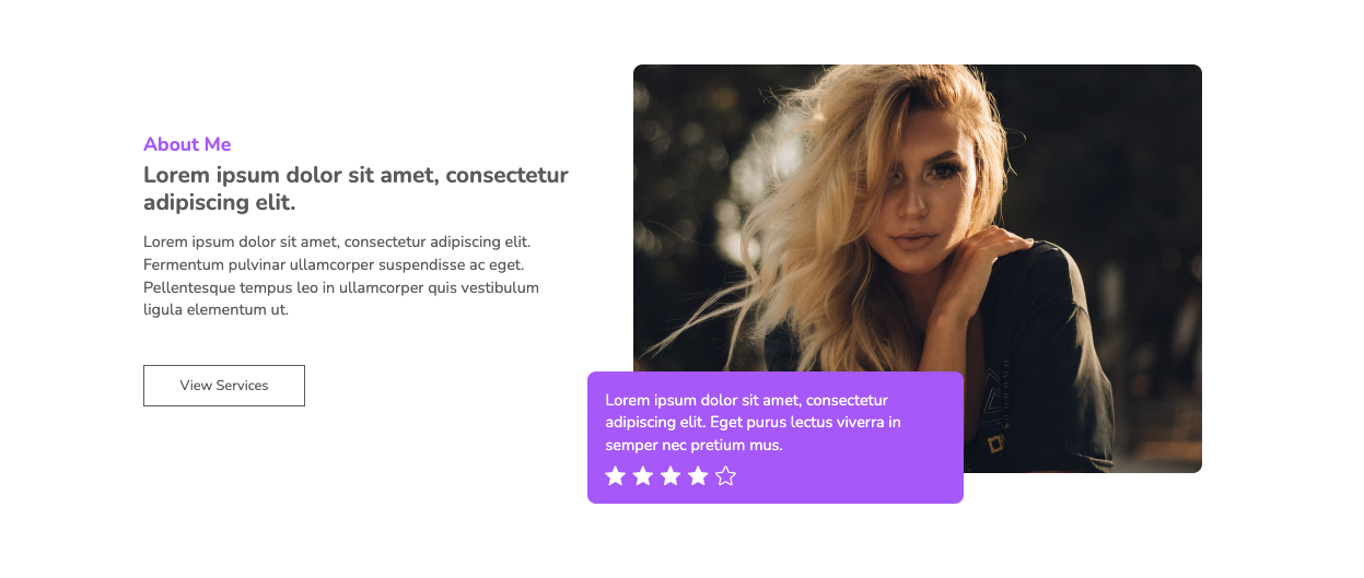
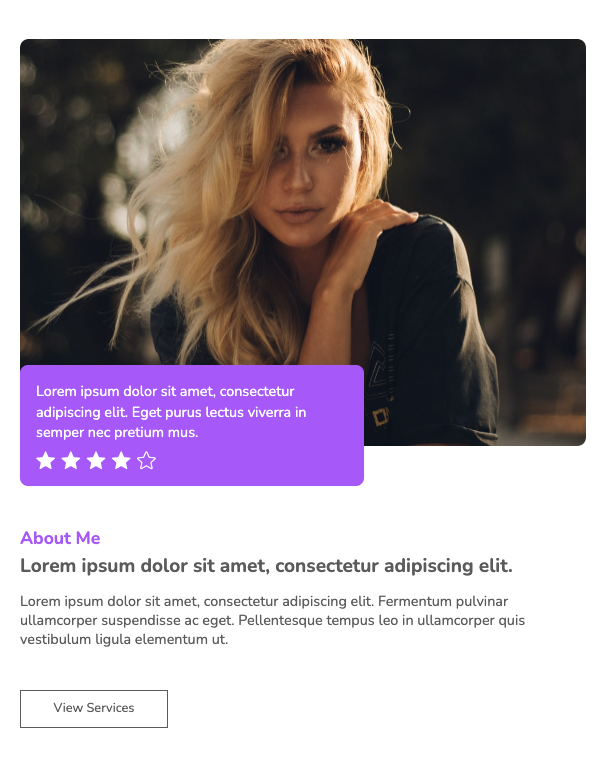
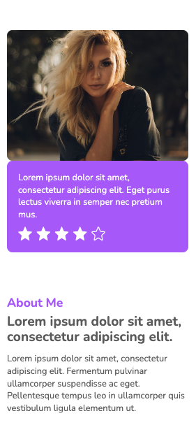
This About Us page also includes a combination of text and images to present agent information. Star ratings are displayed on a relative positioned card, highlighting customer satisfaction. The rounded web elements and vibrant color scheme add a touch of elegance to the design.
View Code
HTML
CSS
JS
Responsive CSS
Output

               Lorem ipsum dolor sit amet, consectetur adipiscing elit. Eget purus lectus viverra in semper nec pretium mus.


              About Me


              Lorem ipsum dolor sit amet, consectetur adipiscing elit.


              Lorem ipsum dolor sit amet, consectetur adipiscing elit. Fermentum pulvinar ullamcorper suspendisse ac eget. Pellentesque tempus leo in ullamcorper quis vestibulum ligula elementum ut.


              View Services
          * {
    font-family: Nunito, sans-serif;
}

.responsive-container-block {
    min-height: 75px;
    height: fit-content;
    width: 100%;
    padding-top: 10px;
    padding-right: 10px;
    padding-bottom: 10px;
    padding-left: 10px;
    display: flex;
    flex-wrap: wrap;
    margin-top: 0px;
    margin-right: auto;
    margin-bottom: 0px;
    margin-left: auto;
    justify-content: flex-start;
}

a {
    text-decoration-line: none;
    text-decoration-thickness: initial;
    text-decoration-style: initial;
    text-decoration-color: initial;
}

.text-blk {
    margin-top: 0px;
    margin-right: 0px;
    margin-bottom: 0px;
    margin-left: 0px;
    padding-top: 10px;
    padding-right: 10px;
    padding-bottom: 10px;
    padding-left: 10px;
    line-height: 25px;
}

.responsive-container-block.bigContainer {
    padding-top: 10px;
    padding-right: 30px;
    padding-bottom: 10px;
    padding-left: 30px;
    flex-direction: column;
    align-items: center;
    justify-content: center;
    padding: 10px 50px 10px 50px;
}

.mainImg {
    color: black;
    width: 100%;
    height: auto;
    border-top-left-radius: 10px;
    border-top-right-radius: 10px;
    border-bottom-right-radius: 10px;
    border-bottom-left-radius: 10px;
}

.text-blk.headingText {
    font-size: 22px;
    font-weight: 700;
    line-height: 30px;
    color: rgb(176, 98, 255);
    padding-top: 0px;
    padding-right: 10px;
    padding-bottom: 0px;
    padding-left: 0px;
    margin-top: 0px;
    margin-right: 0px;
    margin-bottom: 5px;
    margin-left: 0px;
}

.allText {
    padding-top: 0px;
    padding-right: 0px;
    padding-bottom: 0px;
    padding-left: 0px;
    width: 40%;
    margin-top: 0px;
    margin-right: 0px;
    margin-bottom: 0px;
    margin-left: 0px;
}

.text-blk.subHeadingText {
    color: rgb(102, 102, 102);
    font-size: 26px;
    line-height: 32px;
    font-weight: 700;
    margin-top: 0px;
    margin-right: 0px;
    margin-bottom: 15px;
    margin-left: 0px;
    padding-top: 0px;
    padding-right: 10px;
    padding-bottom: 0px;
    padding-left: 0px;
}

.text-blk.description {
    font-size: 18px;
    line-height: 26px;
    color: rgb(102, 102, 102);
    margin-top: 0px;
    margin-right: 0px;
    margin-bottom: 50px;
    margin-left: 0px;
    font-weight: 400;
    padding-top: 0px;
    padding-right: 10px;
    padding-bottom: 0px;
    padding-left: 0px;
}

.explore {
    font-size: 16px;
    line-height: 28px;
    color: rgb(102, 102, 102);
    border-top-width: 2px;
    border-right-width: 2px;
    border-bottom-width: 2px;
    border-left-width: 2px;
    border-top-style: solid;
    border-right-style: solid;
    border-bottom-style: solid;
    border-left-style: solid;
    border-top-color: rgb(102, 102, 102);
    border-right-color: rgb(102, 102, 102);
    border-bottom-color: rgb(102, 102, 102);
    border-left-color: rgb(102, 102, 102);
    border-image-source: initial;
    border-image-slice: initial;
    border-image-width: initial;
    border-image-outset: initial;
    border-image-repeat: initial;
    cursor: pointer;
    background-color: white;
    margin-top: 0px;
    margin-right: 0px;
    margin-bottom: 0px;
    margin-left: 0px;
    padding-top: 8px;
    padding-right: 40px;
    padding-bottom: 8px;
    padding-left: 40px;
}

.explore:hover {
    background-image: initial;
    background-position-x: initial;
    background-position-y: initial;
    background-size: initial;
    background-repeat-x: initial;
    background-repeat-y: initial;
    background-attachment: initial;
    background-origin: initial;
    background-clip: initial;
    background-color: rgb(176, 98, 255);
    color: white;
    border-top-width: initial;
    border-right-width: initial;
    border-bottom-width: initial;
    border-left-width: initial;
    border-top-style: none;
    border-right-style: none;
    border-bottom-style: none;
    border-left-style: none;
    border-top-color: initial;
    border-right-color: initial;
    border-bottom-color: initial;
    border-left-color: initial;
    border-image-source: initial;
    border-image-slice: initial;
    border-image-width: initial;
    border-image-outset: initial;
    border-image-repeat: initial;
}

.responsive-container-block.Container {
    margin-top: 80px;
    margin-right: auto;
    margin-bottom: 50px;
    margin-left: auto;
    justify-content: center;
    align-items: center;
    max-width: 1320px;
    padding-top: 10px;
    padding-right: 10px;
    padding-bottom: 10px;
    padding-left: 10px;
}

.responsive-container-block.Container.bottomContainer {
    flex-direction: row-reverse;
    margin-top: 80px;
    margin-right: auto;
    margin-bottom: 50px;
    margin-left: auto;
    position: static;
}

.allText.aboveText {
    margin-top: 0px;
    margin-right: 0px;
    margin-bottom: 0px;
    margin-left: 40px;
}

.allText.bottomText {
    margin-top: 0px;
    margin-right: 40px;
    margin-bottom: 0px;
    margin-left: 0px;
    display: flex;
    flex-direction: column;
    align-items: flex-start;
    justify-content: flex-start;
    padding-top: 0px;
    padding-right: 15px;
    padding-bottom: 0px;
    padding-left: 0px;
}

.purpleBox {
    display: flex;
    flex-direction: column;
    align-items: flex-start;
    max-width: 430px;
    background-color: rgb(176, 98, 255);
    padding-top: 20px;
    padding-right: 20px;
    padding-bottom: 20px;
    padding-left: 20px;
    border-top-left-radius: 10px;
    border-top-right-radius: 10px;
    border-bottom-right-radius: 10px;
    border-bottom-left-radius: 10px;
    position: absolute;
    bottom: -35px;
    left: -8%;
}

.purpleText {
    font-size: 18px;
    line-height: 26px;
    color: white;
    margin-top: 0px;
    margin-right: 0px;
    margin-bottom: 10px;
    margin-left: 0px;
}

.ultimateImg {
    width: 50%;
    position: relative;
}

@media (max-width: 1024px) {
    .responsive-container-block.Container {
        max-width: 850px;
    }

    .mainImg {
        width: 55%;
        height: auto;
    }

    .allText {
        width: 40%;
        margin-top: 0px;
        margin-right: 0px;
        margin-bottom: 0px;
        margin-left: 20px;
    }

    .responsive-container-block.bigContainer {
        padding-top: 10px;
        padding-right: 10px;
        padding-bottom: 10px;
        padding-left: 10px;
    }

    .responsive-container-block.Container.bottomContainer {
        margin-top: 80px;
        margin-right: auto;
        margin-bottom: 50px;
        margin-left: auto;
    }

    .responsive-container-block.Container {
        max-width: 830px;
    }

    .allText.aboveText {
        margin-top: 30px;
        margin-right: 0px;
        margin-bottom: 0px;
        margin-left: 40px;
    }

    .allText.bottomText {
        margin-top: 30px;
        margin-right: 40px;
        margin-bottom: 0px;
        margin-left: 0px;
        text-align: left;
    }

    .text-blk.headingText {
        text-align: center;
    }

    .allText.aboveText {
        display: flex;
        flex-direction: column;
        align-items: center;
        justify-content: center;
        margin-top: 30px;
        margin-right: 0px;
        margin-bottom: 0px;
        margin-left: 0px;
    }

    .text-blk.subHeadingText {
        text-align: left;
        font-size: 26px;
        line-height: 32px;
    }

    .text-blk.description {
        text-align: left;
        line-height: 24px;
    }

    .explore {
        margin-top: 0px;
        margin-right: 0px;
        margin-bottom: 0px;
        margin-left: 0px;
    }

    .responsive-container-block.bigContainer {
        padding-top: 10px;
        padding-right: 30px;
        padding-bottom: 10px;
        padding-left: 30px;
    }

    .responsive-container-block.Container {
        justify-content: space-evenly;
    }

    .purpleBox {
        bottom: 10%;
    }

    .responsive-container-block.Container.bottomContainer {
        padding-top: 10px;
        padding-right: 0px;
        padding-bottom: 10px;
        padding-left: 0px;
        max-width: 930px;
    }

    .allText.bottomText {
        width: 40%;
    }

    .purpleBox {
        bottom: auto;
        left: -10%;
        top: 70%;
    }

    .mainImg {
        width: 100%;
    }

    .text-blk.headingText {
        text-align: left;
    }
}

@media (max-width: 768px) {
    .allText {
        width: 100%;
        display: flex;
        flex-direction: column;
        justify-content: center;
        align-items: center;
        padding-top: 0px;
        padding-right: 0px;
        padding-bottom: 0px;
        padding-left: 0px;
    }

    .responsive-container-block.Container {
        flex-direction: column;
        height: auto;
    }

    .text-blk.headingText {
        text-align: center;
    }

    .text-blk.subHeadingText {
        text-align: center;
        font-size: 24px;
    }

    .text-blk.description {
        text-align: center;
        font-size: 18px;
    }

    .allText {
        margin-top: 40px;
        margin-right: 0px;
        margin-bottom: 0px;
        margin-left: 0px;
    }

    .allText.aboveText {
        margin-top: 40px;
        margin-right: 0px;
        margin-bottom: 0px;
        margin-left: 0px;
    }

    .responsive-container-block.Container {
        margin-top: 80px;
        margin-right: auto;
        margin-bottom: 50px;
        margin-left: auto;
    }

    .responsive-container-block.Container.bottomContainer {
        margin-top: 50px;
        margin-right: auto;
        margin-bottom: 50px;
        margin-left: auto;
    }

    .allText.bottomText {
        margin-top: 40px;
        margin-right: 0px;
        margin-bottom: 0px;
        margin-left: 0px;
    }

    .mainImg {
        width: 100%;
        margin-top: 0px;
        margin-right: 0px;
        margin-bottom: -70px;
        margin-left: 0px;
    }

    .responsive-container-block.Container.bottomContainer {
        flex-direction: column;
    }

    .ultimateImg {
        width: 100%;
    }

    .purpleBox {
        position: static;
    }

    .allText.bottomText {
        width: 100%;
        align-items: flex-start;
    }

    .text-blk.headingText {
        text-align: left;
    }

    .text-blk.subHeadingText {
        text-align: left;
    }

    .text-blk.description {
        text-align: left;
    }

    .ultimateImg {
        position: static;
    }

    .mainImg {
        margin-top: 0px;
        margin-right: 0px;
        margin-bottom: 0px;
        margin-left: 0px;
    }

    .ultimateImg {
        position: relative;
    }

    .purpleBox {
        margin-top: 0px;
        margin-right: 0px;
        margin-bottom: 0px;
        margin-left: 0px;
        position: absolute;
        left: 0px;
        top: 80%;
    }

    .allText.bottomText {
        margin-top: 100px;
        margin-right: 0px;
        margin-bottom: 0px;
        margin-left: 0px;
    }
}

@media (max-width: 500px) {
    .responsive-container-block.Container {
        padding-top: 10px;
        padding-right: 0px;
        padding-bottom: 10px;
        padding-left: 0px;
        width: 100%;
        max-width: 100%;
    }

    .mainImg {
        width: 100%;
    }

    .responsive-container-block.bigContainer {
        padding-top: 10px;
        padding-right: 25px;
        padding-bottom: 10px;
        padding-left: 25px;
    }

    .text-blk.subHeadingText {
        font-size: 24px;
        padding-top: 0px;
        padding-right: 0px;
        padding-bottom: 0px;
        padding-left: 0px;
        line-height: 28px;
    }

    .text-blk.description {
        font-size: 16px;
        padding-top: 0px;
        padding-right: 0px;
        padding-bottom: 0px;
        padding-left: 0px;
        line-height: 22px;
    }

    .allText {
        padding-top: 0px;
        padding-right: 0px;
        padding-bottom: 0px;
        padding-left: 0px;
        width: 100%;
    }

    .allText.bottomText {
        margin-top: 50px;
        margin-right: 0px;
        margin-bottom: 0px;
        margin-left: 0px;
        padding: 0 0 0 0;
        margin: 30px 0 0 0;
    }

    .ultimateImg {
        position: static;
    }

    .purpleBox {
        position: static;
    }

    .stars {
        width: 55%;
    }

    .allText.bottomText {
        margin-top: 75px;
        margin-right: 0px;
        margin-bottom: 0px;
        margin-left: 0px;
    }

    .responsive-container-block.bigContainer {
        padding-top: 10px;
        padding-right: 20px;
        padding-bottom: 10px;
        padding-left: 20px;
    }

    .purpleText {
        font-size: 16px;
        line-height: 22px;
    }

    .explore {
        padding: 6px 35px 6px 35px;
        font-size: 15px;
    }
}
          @import url('https://fonts.googleapis.com/css2?family=Nunito:wght@200;300;400;600;700;800&display=swap');
        *, *:before, *:after {
        -moz-box-sizing: border-box;
        -webkit-box-sizing: border-box;
        box-sizing: border-box;
        }
        body {
        margin: 0;
        }
        .wk-desk-1{
        width: 8.333333%;
        }
        .wk-desk-2{
        width: 16.666667%;
        }
        .wk-desk-3{
        width: 25%;
        }
        .wk-desk-4{
        width: 33.333333%;
        }
        .wk-desk-5{
        width: 41.666667%;
        }
        .wk-desk-6{
        width: 50%;
        }
        .wk-desk-7{
        width: 58.333333%;
        }
        .wk-desk-8{
        width: 66.666667%;
        }
        .wk-desk-9{
        width: 75%;
        }
        .wk-desk-10{
        width: 83.333333%;
        }
        .wk-desk-11{
        width: 91.666667%;
        }
        .wk-desk-12{
        width: 100%;
        }
        @media (max-width: 1024px) {
        .wk-ipadp-1{
        width: 8.333333%;
        }
        .wk-ipadp-2{
        width: 16.666667%;
        }
        .wk-ipadp-3{
        width: 25%;
        }
        .wk-ipadp-4{
        width: 33.333333%;
        }
        .wk-ipadp-5{
        width: 41.666667%;
        }
        .wk-ipadp-6{
        width: 50%;
        }
        .wk-ipadp-7{
        width: 58.333333%;
        }
        .wk-ipadp-8{
        width: 66.666667%;
        }
        .wk-ipadp-9{
        width: 75%;
        }
        .wk-ipadp-10{
        width: 83.333333%;
        }
        .wk-ipadp-11{
        width: 91.666667%;
        }
        .wk-ipadp-12{
        width: 100%;
        }
        }
        @media (max-width: 768px) {
        .wk-tab-1{
        width: 8.333333%;
        }
        .wk-tab-2{
        width: 16.666667%;
        }
        .wk-tab-3{
        width: 25%;
        }
        .wk-tab-4{
        width: 33.333333%;
        }
        .wk-tab-5{
        width: 41.666667%;
        }
        .wk-tab-6{
        width: 50%;
        }
        .wk-tab-7{
        width: 58.333333%;
        }
        .wk-tab-8{
        width: 66.666667%;
        }
        .wk-tab-9{
        width: 75%;
        }
        .wk-tab-10{
        width: 83.333333%;
        }
        .wk-tab-11{
        width: 91.666667%;
        }
        .wk-tab-12{
        width: 100%;
        }
        }
        @media (max-width: 500px) {
        .wk-mobile-1{
        width: 8.333333%;
        }
        .wk-mobile-2{
        width: 16.666667%;
        }
        .wk-mobile-3{
        width: 25%;
        }
        .wk-mobile-4{
        width: 33.333333%;
        }
        .wk-mobile-5{
        width: 41.666667%;
        }
        .wk-mobile-6{
        width: 50%;
        }
        .wk-mobile-7{
        width: 58.333333%;
        }
        .wk-mobile-8{
        width: 66.666667%;
        }
        .wk-mobile-9{
        width: 75%;
        }
        .wk-mobile-10{
        width: 83.333333%;
        }
        .wk-mobile-11{
        width: 91.666667%;
        }
        .wk-mobile-12{
        width: 100%;
        }
        }
Reset
This section incorporates a video element on one section of the page and features an overview of the company/team in the other section. Also, the simple background of the design enhances the overall look of the widget.
View Code
HTML
CSS
JS
Responsive CSS
Output
About
We build to your bespoke
Lorem ipsum dolor sit amet, consectetur adipiscing elit. Fermentum pulvinar ullamcorper suspendisse ac eget. Pellentesque tempus leo in ullamcorper quis vestibulum ligula elementum ut. Congue in dignissim tincidunt ut dolor eu. Mi, eget posuere vitae sed purus nisl lorem.

          * {
    font-family: Nunito, sans-serif;
}

.responsive-container-block {
    min-height: 75px;
    height: fit-content;
    width: 100%;
    padding-top: 0px;
    padding-right: 0px;
    padding-bottom: 0px;
    padding-left: 0px;
    display: flex;
    flex-wrap: wrap;
    margin-top: 0px;
    margin-right: auto;
    margin-bottom: 0px;
    margin-left: auto;
    justify-content: flex-start;
}

.text-blk {
    margin-top: 0px;
    margin-right: 0px;
    margin-bottom: 0px;
    margin-left: 0px;
    padding-top: 10px;
    padding-right: 10px;
    padding-bottom: 10px;
    padding-left: 10px;
    line-height: 25px;
}

.responsive-container-block.bigContainer {
    flex-direction: column;
    align-items: center;
    justify-content: center;
    padding-top: 10px;
    padding-right: 50px;
    padding-bottom: 10px;
    padding-left: 50px;
}

.text-blk.headingText {
    font-size: 23px;
    font-weight: 700;
    line-height: 28px;
    color: rgb(0, 135, 177);
    margin-top: 0px;
    margin-right: 0px;
    margin-bottom: 10px;
    margin-left: 0px;
    padding-top: 0px;
    padding-right: 10px;
    padding-bottom: 0px;
    padding-left: 0px;
}

.allText {
    padding-top: 0px;
    padding-right: 0px;
    padding-bottom: 0px;
    padding-left: 0px;
    width: 50%;
    margin-top: 0px;
    margin-right: 0px;
    margin-bottom: 0px;
    margin-left: 0px;
}

.text-blk.subHeadingText {
    color: rgb(102, 102, 102);
    font-size: 32px;
    line-height: 40px;
    font-weight: 700;
    margin-top: 0px;
    margin-right: 0px;
    margin-bottom: 15px;
    margin-left: 0px;
    padding-top: 0px;
    padding-right: 10px;
    padding-bottom: 0px;
    padding-left: 0px;
}

.text-blk.description {
    font-size: 18px;
    line-height: 28px;
    color: rgb(153, 153, 153);
    padding-top: 0px;
    padding-right: 10px;
    padding-bottom: 0px;
    padding-left: 0px;
    margin-top: 0px;
    margin-right: 0px;
    margin-bottom: 40px;
    margin-left: 0px;
}

.explore {
    font-size: 18px;
    line-height: 28px;
    color: rgb(255, 255, 255);
    background-color: rgb(244, 152, 146);
    border-top-width: 0px;
    border-right-width: 0px;
    border-bottom-width: 0px;
    border-left-width: 0px;
    border-top-style: outset;
    border-right-style: outset;
    border-bottom-style: outset;
    border-left-style: outset;
    border-top-color: rgb(244, 152, 146);
    border-right-color: rgb(244, 152, 146);
    border-bottom-color: rgb(244, 152, 146);
    border-left-color: rgb(244, 152, 146);
    border-image-source: initial;
    border-image-slice: initial;
    border-image-width: initial;
    border-image-outset: initial;
    border-image-repeat: initial;
    cursor: pointer;
    box-shadow: rgba(244, 152, 146, 0.25) 0px 10px 20px;
    border-top-left-radius: 10px;
    border-top-right-radius: 10px;
    border-bottom-right-radius: 10px;
    border-bottom-left-radius: 10px;
    padding-top: 9px;
    padding-right: 45px;
    padding-bottom: 9px;
    padding-left: 45px;
}

.explore:hover {
    background-image: initial;
    background-position-x: initial;
    background-position-y: initial;
    background-size: initial;
    background-repeat-x: initial;
    background-repeat-y: initial;
    background-attachment: initial;
    background-origin: initial;
    background-clip: initial;
    background-color: rgb(255, 235, 234);
    color: rgb(244, 152, 146);
}

.responsive-container-block.Container {
    margin-top: 80px;
    margin-right: auto;
    margin-bottom: 50px;
    margin-left: auto;
    justify-content: center;
    align-items: center;
    max-width: 1320px;
    padding-top: 10px;
    padding-right: 10px;
    padding-bottom: 10px;
    padding-left: 10px;
}

.responsive-container-block.Container.bottomContainer {
    flex-direction: row;
    margin-top: 50px;
    margin-right: auto;
    margin-bottom: 50px;
    margin-left: auto;
}

.allText.aboveText {
    margin-top: 0px;
    margin-right: 0px;
    margin-bottom: 0px;
    margin-left: 40px;
}

.allText.bottomText {
    margin-top: 0px;
    margin-right: 10px;
    margin-bottom: 0px;
    margin-left: 0px;
}

.mainVideo {
    width: 85%;
    height: 450px;
    margin-top: -30px;
    margin-right: 0px;
    margin-bottom: 0px;
    margin-left: 0px;
    border-top-left-radius: 10px;
    border-top-right-radius: 10px;
    border-bottom-right-radius: 10px;
    border-bottom-left-radius: 10px;
}

.videoContainer {
    width: 46%;
    height: 600px;
    display: flex;
    justify-content: flex-start;
    align-items: center;
    position: relative;
    padding-top: 0px;
    padding-right: 0px;
    padding-bottom: 0px;
    padding-left: 10px;
}

.mainVideo {
    z-index: 10;
}

.dotsImg {
    position: absolute;
    width: 80%;
    height: 600px;
    top: 0px;
    right: 0px;
    object-fit: cover;
}

@media (max-width: 1024px) {
    .responsive-container-block.Container {
        max-width: 850px;
    }

    .text-blk.description {
        font-size: 18px;
    }

    .allText {
        width: 40%;
        margin-top: 0px;
        margin-right: 0px;
        margin-bottom: 0px;
        margin-left: 20px;
    }

    .responsive-container-block.bigContainer {
        padding-top: 10px;
        padding-right: 10px;
        padding-bottom: 10px;
        padding-left: 10px;
    }

    .text-blk.subHeadingText {
        font-size: 30px;
    }

    .responsive-container-block.Container.bottomContainer {
        margin-top: 80px;
        margin-right: auto;
        margin-bottom: 50px;
        margin-left: auto;
    }

    .responsive-container-block.Container {
        max-width: 830px;
    }

    .allText.aboveText {
        margin-top: 30px;
        margin-right: 0px;
        margin-bottom: 0px;
        margin-left: 40px;
    }

    .allText.bottomText {
        margin-top: 30px;
        margin-right: 40px;
        margin-bottom: 0px;
        margin-left: 0px;
    }

    .allText.bottomText {
        width: 100%;
        display: flex;
        flex-direction: column;
        justify-content: center;
        align-items: center;
        margin-top: 30px;
        margin-right: 0px;
        margin-bottom: 30px;
        margin-left: 0px;
    }

    .responsive-container-block.Container.bottomContainer {
        flex-direction: column;
    }

    .text-blk.headingText {
        text-align: center;
        font-size: 22px;
    }

    .text-blk.subHeadingText {
        text-align: center;
    }

    .text-blk.description {
        text-align: center;
    }

    .explore {
        margin-top: 0px;
        margin-right: auto;
        margin-bottom: 0px;
        margin-left: auto;
    }

    #inc0s {
        margin-top: 0px;
        margin-right: auto;
        margin-bottom: 0px;
        margin-left: auto;
    }

    .dotsImg {
        width: 50%;
        left: 50%;
        transform: translateX(-50%);
    }

    .videoContainer {
        width: 100%;
        padding-top: 0px;
        padding-right: 0px;
        padding-bottom: 0px;
        padding-left: 0px;
    }

    .mainVideo {
        width: 100%;
    }

    .allText.bottomText {
        margin-top: 30px;
        margin-right: 0px;
        margin-bottom: 60px;
        margin-left: 0px;
    }

    .text-blk.description {
        padding-top: 0px;
        padding-right: 0px;
        padding-bottom: 0px;
        padding-left: 0px;
    }

    .text-blk.headingText {
        padding-top: 0px;
        padding-right: 0px;
        padding-bottom: 0px;
        padding-left: 0px;
    }

    .text-blk.subHeadingText {
        padding-top: 0px;
        padding-right: 0px;
        padding-bottom: 0px;
        padding-left: 0px;
    }

    .mainVideo {
        margin-top: 0px;
        margin-right: 0px;
        margin-bottom: 0px;
        margin-left: 0px;
    }
}

@media (max-width: 768px) {
    .allText {
        width: 100%;
        margin-top: 0px;
        margin-right: 0px;
        margin-bottom: 0px;
        margin-left: 0px;
        display: flex;
        flex-direction: column;
        justify-content: center;
        align-items: center;
        padding-top: 0px;
        padding-right: 0px;
        padding-bottom: 0px;
        padding-left: 0px;
    }

    .responsive-container-block.Container {
        flex-direction: column;
        height: auto;
    }

    .text-blk.headingText {
        text-align: center;
    }

    .text-blk.subHeadingText {
        text-align: center;
        font-size: 28px;
        line-height: 38px;
    }

    .text-blk.description {
        text-align: center;
        font-size: 18px;
        line-height: 27px;
    }

    .allText {
        margin-top: 40px;
        margin-right: 0px;
        margin-bottom: 0px;
        margin-left: 0px;
    }

    .allText.aboveText {
        margin-top: 40px;
        margin-right: 0px;
        margin-bottom: 0px;
        margin-left: 0px;
    }

    .responsive-container-block.Container {
        margin-top: 80px;
        margin-right: auto;
        margin-bottom: 50px;
        margin-left: auto;
    }

    .responsive-container-block.Container.bottomContainer {
        margin-top: 50px;
        margin-right: auto;
        margin-bottom: 50px;
        margin-left: auto;
        padding-top: 0px;
        padding-right: 0px;
        padding-bottom: 0px;
        padding-left: 10px;
    }

    .allText.bottomText {
        margin-top: 40px;
        margin-right: 0px;
        margin-bottom: 0px;
        margin-left: 0px;
    }

    .allText.bottomText {
        margin-top: 40px;
        margin-right: 0px;
        margin-bottom: 60px;
        margin-left: 0px;
    }

    .mainVideo {
        height: 400px;
    }

    .videoContainer {
        height: 550px;
    }

    .explore {
        font-size: 16px;
        padding-top: 8px;
        padding-right: 40px;
        padding-bottom: 8px;
        padding-left: 40px;
    }

    .responsive-container-block.bigContainer {
        padding-top: 0px;
        padding-right: 50px;
        padding-bottom: 0px;
        padding-left: 50px;
    }
}

@media (max-width: 500px) {
    .responsive-container-block.Container {
        padding-top: 10px;
        padding-right: 0px;
        padding-bottom: 10px;
        padding-left: 0px;
        width: 100%;
        max-width: 100%;
    }

    .responsive-container-block.bigContainer {
        padding-top: 10px;
        padding-right: 25px;
        padding-bottom: 10px;
        padding-left: 25px;
    }

    .allText {
        padding-top: 0px;
        padding-right: 0px;
        padding-bottom: 0px;
        padding-left: 0px;
        width: 100%;
    }

    .responsive-container-block.bigContainer {
        padding-top: 10px;
        padding-right: 20px;
        padding-bottom: 10px;
        padding-left: 20px;
    }

    .explore {
        font-size: 16px;
        line-height: 25px;
        padding: 8px 35px 8px 35px;
    }

    .dotsImg {
        width: 80%;
        height: 100%;
    }

    .mainVideo {
        height: 260px;
    }

    .videoContainer {
        height: 320px;
    }

    .responsive-container-block.Container.bottomContainer {
        padding: 0 0 0 0;
    }

    .text-blk.description {
        font-size: 16px;
        line-height: 23px;
        margin: 0 0 30px 0;
    }

    .text-blk.subHeadingText {
        font-size: 24px;
    }
}
          @import url('https://fonts.googleapis.com/css2?family=Nunito:wght@200;300;400;600;700;800&display=swap');
        *, *:before, *:after {
        -moz-box-sizing: border-box;
        -webkit-box-sizing: border-box;
        box-sizing: border-box;
        }
        body {
        margin: 0;
        }
        .wk-desk-1{
        width: 8.333333%;
        }
        .wk-desk-2{
        width: 16.666667%;
        }
        .wk-desk-3{
        width: 25%;
        }
        .wk-desk-4{
        width: 33.333333%;
        }
        .wk-desk-5{
        width: 41.666667%;
        }
        .wk-desk-6{
        width: 50%;
        }
        .wk-desk-7{
        width: 58.333333%;
        }
        .wk-desk-8{
        width: 66.666667%;
        }
        .wk-desk-9{
        width: 75%;
        }
        .wk-desk-10{
        width: 83.333333%;
        }
        .wk-desk-11{
        width: 91.666667%;
        }
        .wk-desk-12{
        width: 100%;
        }
        @media (max-width: 1024px) {
        .wk-ipadp-1{
        width: 8.333333%;
        }
        .wk-ipadp-2{
        width: 16.666667%;
        }
        .wk-ipadp-3{
        width: 25%;
        }
        .wk-ipadp-4{
        width: 33.333333%;
        }
        .wk-ipadp-5{
        width: 41.666667%;
        }
        .wk-ipadp-6{
        width: 50%;
        }
        .wk-ipadp-7{
        width: 58.333333%;
        }
        .wk-ipadp-8{
        width: 66.666667%;
        }
        .wk-ipadp-9{
        width: 75%;
        }
        .wk-ipadp-10{
        width: 83.333333%;
        }
        .wk-ipadp-11{
        width: 91.666667%;
        }
        .wk-ipadp-12{
        width: 100%;
        }
        }
        @media (max-width: 768px) {
        .wk-tab-1{
        width: 8.333333%;
        }
        .wk-tab-2{
        width: 16.666667%;
        }
        .wk-tab-3{
        width: 25%;
        }
        .wk-tab-4{
        width: 33.333333%;
        }
        .wk-tab-5{
        width: 41.666667%;
        }
        .wk-tab-6{
        width: 50%;
        }
        .wk-tab-7{
        width: 58.333333%;
        }
        .wk-tab-8{
        width: 66.666667%;
        }
        .wk-tab-9{
        width: 75%;
        }
        .wk-tab-10{
        width: 83.333333%;
        }
        .wk-tab-11{
        width: 91.666667%;
        }
        .wk-tab-12{
        width: 100%;
        }
        }
        @media (max-width: 500px) {
        .wk-mobile-1{
        width: 8.333333%;
        }
        .wk-mobile-2{
        width: 16.666667%;
        }
        .wk-mobile-3{
        width: 25%;
        }
        .wk-mobile-4{
        width: 33.333333%;
        }
        .wk-mobile-5{
        width: 41.666667%;
        }
        .wk-mobile-6{
        width: 50%;
        }
        .wk-mobile-7{
        width: 58.333333%;
        }
        .wk-mobile-8{
        width: 66.666667%;
        }
        .wk-mobile-9{
        width: 75%;
        }
        .wk-mobile-10{
        width: 83.333333%;
        }
        .wk-mobile-11{
        width: 91.666667%;
        }
        .wk-mobile-12{
        width: 100%;
        }
        }
Reset
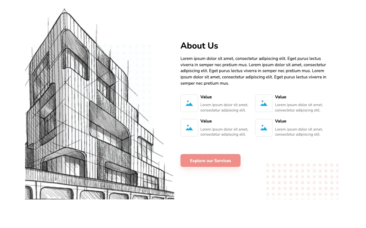

The above about us page features the text and images to provide an overview of the organization. Company values are presented on flex-based cards. The blueprint image adds an artistic touch to the design, making it a perfect fit for showcasing organization projects.
View Code
HTML
CSS
JS
Responsive CSS
Output


About Us
Lorem ipsum dolor sit amet, consectetur adipiscing elit. Eget purus lectus viverra in semper nec pretium mus. Lorem ipsum dolor sit amet, consectetur adipiscing elit. Eget purus lectus viverra in semper nec pretium mus. Lorem ipsum dolor sit amet, consectetur adipiscing elit. Eget purus lectus viverra in semper nec pretium mus.

Value
Lorem ipsum dolor sit amet, consectetur adipiscing elit.
Value
Lorem ipsum dolor sit amet, consectetur adipiscing elit.
Value
Lorem ipsum dolor sit amet, consectetur adipiscing elit.
Value
Lorem ipsum dolor sit amet, consectetur adipiscing elit.
          * {
    font-family: Nunito, sans-serif;
}

.text-blk {
    margin-top: 0px;
    margin-right: 0px;
    margin-bottom: 0px;
    margin-left: 0px;
    line-height: 25px;
    padding-top: 0px;
    padding-right: 0px;
    padding-bottom: 0px;
    padding-left: 0px;
}

.responsive-cell-block {
    min-height: 75px;
}

.responsive-container-block {
    min-height: 75px;
    height: fit-content;
    width: 100%;
    padding-top: 10px;
    padding-right: 10px;
    padding-bottom: 10px;
    padding-left: 10px;
    display: flex;
    flex-wrap: wrap;
    margin-top: 0px;
    margin-right: auto;
    margin-bottom: 0px;
    margin-left: auto;
    justify-content: flex-start;
}

.responsive-container-block.bigContainer {
    padding-top: 0px;
    padding-right: 50px;
    padding-bottom: 0px;
    padding-left: 50px;
    margin-top: 50px;
    margin-right: 0px;
    margin-bottom: 50px;
    margin-left: 0px;
}

.responsive-container-block.Container {
    max-width: 1320px;
    justify-content: space-evenly;
    align-items: center;
    padding-top: 10px;
    padding-right: 10px;
    padding-bottom: 0px;
    padding-left: 10px;
    position: relative;
    overflow-x: hidden;
    overflow-y: hidden;
    margin-top: 0px;
    margin-right: auto;
    margin-bottom: 0px;
    margin-left: auto;
}

.mainImg {
    width: 100%;
    height: 800px;
    object-fit: cover;
}

.blueDots {
    position: absolute;
    top: 150px;
    right: 15%;
    z-index: -1;
    left: auto;
    width: 80%;
    height: 500px;
    object-fit: cover;
}

.imgContainer {
    position: relative;
    width: 48%;
}

.responsive-container-block.textSide {
    width: 48%;
    padding-top: 0px;
    padding-right: 0px;
    padding-bottom: 0px;
    padding-left: 0px;
    z-index: 100;
}

.text-blk.heading {
    font-size: 36px;
    line-height: 40px;
    font-weight: 700;
    margin-top: 0px;
    margin-right: 0px;
    margin-bottom: 20px;
    margin-left: 0px;
}

.text-blk.subHeading {
    font-size: 18px;
    line-height: 26px;
    margin-top: 0px;
    margin-right: 0px;
    margin-bottom: 20px;
    margin-left: 0px;
}

.cardImg {
    width: 31px;
    height: 31px;
}

.cardImgContainer {
    padding-top: 20px;
    padding-right: 20px;
    padding-bottom: 20px;
    padding-left: 20px;
    border-top-width: 1px;
    border-right-width: 1px;
    border-bottom-width: 1px;
    border-left-width: 1px;
    border-top-style: solid;
    border-right-style: solid;
    border-bottom-style: solid;
    border-left-style: solid;
    border-top-color: rgb(229, 229, 229);
    border-right-color: rgb(229, 229, 229);
    border-bottom-color: rgb(229, 229, 229);
    border-left-color: rgb(229, 229, 229);
    border-image-source: initial;
    border-image-slice: initial;
    border-image-width: initial;
    border-image-outset: initial;
    border-image-repeat: initial;
    border-top-left-radius: 10px;
    border-top-right-radius: 10px;
    border-bottom-right-radius: 10px;
    border-bottom-left-radius: 10px;
    margin-top: 0px;
    margin-right: 10px;
    margin-bottom: 0px;
    margin-left: 0px;
}

.responsive-cell-block.wk-desk-6.wk-ipadp-6.wk-tab-12.wk-mobile-12 {
    display: flex;
    justify-content: center;
    align-items: center;
    padding-top: 10px;
    padding-right: 15px;
    padding-bottom: 10px;
    padding-left: 0px;
}

.text-blk.cardHeading {
    font-size: 18px;
    line-height: 28px;
    font-weight: 700;
    margin-top: 0px;
    margin-right: 0px;
    margin-bottom: 10px;
    margin-left: 0px;
}

.text-blk.cardSubHeading {
    color: rgb(153, 153, 153);
    line-height: 22px;
}

.explore {
    font-size: 18px;
    line-height: 20px;
    font-weight: 700;
    color: white;
    background-color: rgb(244, 152, 146);
    box-shadow: rgba(244, 152, 146, 0.25) 0px 10px 20px;
    border-top-left-radius: 10px;
    border-top-right-radius: 10px;
    border-bottom-right-radius: 10px;
    border-bottom-left-radius: 10px;
    cursor: pointer;
    border-top-width: 0px;
    border-right-width: 0px;
    border-bottom-width: 0px;
    border-left-width: 0px;
    border-top-style: initial;
    border-right-style: initial;
    border-bottom-style: initial;
    border-left-style: initial;
    border-top-color: initial;
    border-right-color: initial;
    border-bottom-color: initial;
    border-left-color: initial;
    border-image-source: initial;
    border-image-slice: initial;
    border-image-width: initial;
    border-image-outset: initial;
    border-image-repeat: initial;
    padding-top: 17px;
    padding-right: 40px;
    padding-bottom: 17px;
    padding-left: 40px;
}

.explore:hover {
    background-image: initial;
    background-position-x: initial;
    background-position-y: initial;
    background-size: initial;
    background-repeat-x: initial;
    background-repeat-y: initial;
    background-attachment: initial;
    background-origin: initial;
    background-clip: initial;
    background-color: rgb(244, 182, 176);
}

#ixvck {
    margin-top: 60px;
    margin-right: 0px;
    margin-bottom: 0px;
    margin-left: 0px;
}

.redDots {
    position: absolute;
    bottom: -350px;
    right: -100px;
    height: 500px;
    width: 400px;
    object-fit: cover;
    top: auto;
}

@media (max-width: 1024px) {
    .responsive-container-block.Container {
        position: relative;
        align-items: flex-start;
        justify-content: center;
    }

    .mainImg {
        bottom: 0px;
    }

    .imgContainer {
        position: absolute;
        bottom: 0px;
        left: 0px;
        height: auto;
        width: 60%;
    }

    .responsive-container-block.textSide {
        margin-top: 0px;
        margin-right: 0px;
        margin-bottom: 0px;
        margin-left: auto;
        width: 70%;
    }

    .responsive-container-block.Container {
        flex-direction: column-reverse;
    }

    .imgContainer {
        position: relative;
        width: auto;
        margin-top: 0px;
        margin-right: auto;
        margin-bottom: 0px;
        margin-left: auto;
    }

    .responsive-container-block.textSide {
        margin-top: 0px;
        margin-right: 0px;
        margin-bottom: 20px;
        margin-left: 0px;
        width: 100%;
    }

    .responsive-container-block.Container {
        flex-direction: row-reverse;
    }

    .responsive-container-block.Container {
        flex-direction: column-reverse;
    }
}

@media (max-width: 768px) {
    .responsive-container-block.textSide {
        width: 100%;
        align-items: center;
        flex-direction: column;
        justify-content: center;
    }

    .text-blk.subHeading {
        text-align: center;
        font-size: 17px;
        max-width: 520px;
    }

    .text-blk.heading {
        text-align: center;
    }

    .imgContainer {
        opacity: 0.8;
    }

    .imgContainer {
        height: 500px;
    }

    .imgContainer {
        width: 30px;
    }

    .responsive-container-block.Container {
        flex-direction: column-reverse;
    }

    .responsive-container-block.Container {
        flex-wrap: nowrap;
    }

    .responsive-container-block.textSide {
        width: 100%;
        margin-top: 0px;
        margin-right: 0px;
        margin-bottom: 20px;
        margin-left: 0px;
    }

    .imgContainer {
        width: 90%;
    }

    .imgContainer {
        height: 450px;
        margin-top: 5px;
        margin-right: 33.9062px;
        margin-bottom: 0px;
        margin-left: 33.9062px;
    }

    .redDots {
        display: none;
    }

    .explore {
        font-size: 16px;
        line-height: 14px;
    }
}

@media (max-width: 500px) {
    .imgContainer {
        position: static;
        height: 450px;
    }

    .mainImg {
        height: 100%;
    }

    .blueDots {
        width: 100%;
        left: 0px;
        top: 0px;
        bottom: auto;
        right: auto;
    }

    .imgContainer {
        width: 100%;
    }

    .responsive-container-block.textSide {
        margin-top: 0px;
        margin-right: 0px;
        margin-bottom: 0px;
        margin-left: 0px;
    }

    .responsive-container-block.Container {
        padding-top: 0px;
        padding-right: 0px;
        padding-bottom: 0px;
        padding-left: 0px;
        overflow-x: visible;
        overflow-y: visible;
    }

    .responsive-container-block.bigContainer {
        padding-top: 10px;
        padding-right: 20px;
        padding-bottom: 10px;
        padding-left: 20px;
        padding: 0 30px 0 30px;
    }

    .redDots {
        display: none;
    }

    .text-blk.subHeading {
        font-size: 16px;
        line-height: 23px;
    }

    .text-blk.heading {
        font-size: 28px;
        line-height: 28px;
    }

    .responsive-container-block.textSide {
        margin-top: 40px;
        margin-right: 0px;
        margin-bottom: 50px;
        margin-left: 0px;
    }

    .imgContainer {
        margin-top: 5px;
        margin-right: auto;
        margin-bottom: 0px;
        margin-left: auto;
        width: 100%;
        position: relative;
    }

    .explore {
        padding-top: 17px;
        padding-right: 0px;
        padding-bottom: 17px;
        padding-left: 0px;
        width: 100%;
    }

    #ixvck {
        width: 90%;
        margin-top: 40px;
        margin-right: 0px;
        margin-bottom: 0px;
        margin-left: 0px;
        font-size: 15px;
    }

    .blueDots {
        bottom: 0px;
        width: 100%;
        height: 80%;
        top: 10%;
    }

    .text-blk.cardHeading {
        font-size: 16px;
        margin-top: 0px;
        margin-right: 0px;
        margin-bottom: 8px;
        margin-left: 0px;
        line-height: 25px;
    }

    .responsive-cell-block.wk-desk-6.wk-ipadp-6.wk-tab-12.wk-mobile-12 {
        padding-top: 10px;
        padding-right: 0px;
        padding-bottom: 10px;
        padding-left: 0px;
    }
}
          @import url('https://fonts.googleapis.com/css2?family=Nunito:wght@200;300;400;600;700;800&display=swap');
        *, *:before, *:after {
        -moz-box-sizing: border-box;
        -webkit-box-sizing: border-box;
        box-sizing: border-box;
        }
        body {
        margin: 0;
        }
        .wk-desk-1{
        width: 8.333333%;
        }
        .wk-desk-2{
        width: 16.666667%;
        }
        .wk-desk-3{
        width: 25%;
        }
        .wk-desk-4{
        width: 33.333333%;
        }
        .wk-desk-5{
        width: 41.666667%;
        }
        .wk-desk-6{
        width: 50%;
        }
        .wk-desk-7{
        width: 58.333333%;
        }
        .wk-desk-8{
        width: 66.666667%;
        }
        .wk-desk-9{
        width: 75%;
        }
        .wk-desk-10{
        width: 83.333333%;
        }
        .wk-desk-11{
        width: 91.666667%;
        }
        .wk-desk-12{
        width: 100%;
        }
        @media (max-width: 1024px) {
        .wk-ipadp-1{
        width: 8.333333%;
        }
        .wk-ipadp-2{
        width: 16.666667%;
        }
        .wk-ipadp-3{
        width: 25%;
        }
        .wk-ipadp-4{
        width: 33.333333%;
        }
        .wk-ipadp-5{
        width: 41.666667%;
        }
        .wk-ipadp-6{
        width: 50%;
        }
        .wk-ipadp-7{
        width: 58.333333%;
        }
        .wk-ipadp-8{
        width: 66.666667%;
        }
        .wk-ipadp-9{
        width: 75%;
        }
        .wk-ipadp-10{
        width: 83.333333%;
        }
        .wk-ipadp-11{
        width: 91.666667%;
        }
        .wk-ipadp-12{
        width: 100%;
        }
        }
        @media (max-width: 768px) {
        .wk-tab-1{
        width: 8.333333%;
        }
        .wk-tab-2{
        width: 16.666667%;
        }
        .wk-tab-3{
        width: 25%;
        }
        .wk-tab-4{
        width: 33.333333%;
        }
        .wk-tab-5{
        width: 41.666667%;
        }
        .wk-tab-6{
        width: 50%;
        }
        .wk-tab-7{
        width: 58.333333%;
        }
        .wk-tab-8{
        width: 66.666667%;
        }
        .wk-tab-9{
        width: 75%;
        }
        .wk-tab-10{
        width: 83.333333%;
        }
        .wk-tab-11{
        width: 91.666667%;
        }
        .wk-tab-12{
        width: 100%;
        }
        }
        @media (max-width: 500px) {
        .wk-mobile-1{
        width: 8.333333%;
        }
        .wk-mobile-2{
        width: 16.666667%;
        }
        .wk-mobile-3{
        width: 25%;
        }
        .wk-mobile-4{
        width: 33.333333%;
        }
        .wk-mobile-5{
        width: 41.666667%;
        }
        .wk-mobile-6{
        width: 50%;
        }
        .wk-mobile-7{
        width: 58.333333%;
        }
        .wk-mobile-8{
        width: 66.666667%;
        }
        .wk-mobile-9{
        width: 75%;
        }
        .wk-mobile-10{
        width: 83.333333%;
        }
        .wk-mobile-11{
        width: 91.666667%;
        }
        .wk-mobile-12{
        width: 100%;
        }
        }
Reset
The above widget features a neat, clean, and simple design. Company information is presented on a rounded card element in the center keeping it the focus of the section. Links to social media pages are also incorporated as part of the design, redirecting visitors to explore more.
View Code
HTML
CSS
JS
Responsive CSS
Output
             About Us


             Lorem ipsum dolor sit amet, consectetur adipiscing elit, sed do eiusmod tempor incididunt ut labore et dolore magna aliqua. Ut enim ad minim veniam, quis nostrud exercitation ullamco laboris nisi ut aliquip ex ea commodo consequat. Duis aute irure dolor in reprehenderit in voluptate velit esse cillum dolore eu


          * {
    font-family: Nunito, sans-serif;
    }
    .text-blk {
    margin-top: 0px;
    margin-right: 0px;
    margin-bottom: 0px;
    margin-left: 0px;
    padding-top: 0px;
    padding-right: 0px;
    padding-bottom: 0px;
    padding-left: 0px;
    line-height: 25px;
    }
    .responsive-container-block {
    min-height: 75px;
    height: fit-content;
    width: 100%;
    padding-top: 10px;
    padding-right: 10px;
    padding-bottom: 10px;
    padding-left: 10px;
    display: flex;
    flex-wrap: wrap;
    margin-top: 0px;
    margin-right: auto;
    margin-bottom: 0px;
    margin-left: auto;
    justify-content: flex-start;
    }
    .responsive-container-block.bigContainer {
    padding-top: 10px;
    padding-right: 30px;
    padding-bottom: 10px;
    padding-left: 30px;
    background-image: url("https://workik-widget-assets.s3.amazonaws.com/widget-assets/images/bb29.png");
    background-position-x: initial;
    background-position-y: initial;
    background-size: cover;
    background-attachment: initial;
    background-origin: initial;
    background-clip: initial;
    background-color: initial;
    background-repeat-x: no-repeat;
    background-repeat-y: no-repeat;
    }
    .responsive-container-block.Container {
    max-width: 800px;
    flex-direction: column;
    align-items: center;
    padding-top: 20px;
    padding-right: 20px;
    padding-bottom: 20px;
    padding-left: 20px;
    margin-top: 150px;
    margin-right: auto;
    margin-bottom: 150px;
    margin-left: auto;
    background-color: white;
    border-top-left-radius: 10px;
    border-top-right-radius: 10px;
    border-bottom-right-radius: 10px;
    border-bottom-left-radius: 10px;
    }
    .text-blk.heading {
    font-size: 36px;
    line-height: 45px;
    font-weight: 800;
    margin-top: 0px;
    margin-right: 0px;
    margin-bottom: 30px;
    margin-left: 0px;
    }
    .text-blk.subHeading {
    text-align: center;
    font-size: 18px;
    line-height: 26px;
    margin-top: 0px;
    margin-right: 0px;
    margin-bottom: 60px;
    margin-left: 0px;
    }
    .socialIcon {
    width: 33px;
    height: 33px;
    }
    .social-icons-container {
    display: flex;
    flex-direction: row;
    align-items: flex-start;
    }
    .social-icon {
    margin: 0 50px 0 50px;
    }
    .social-icon:hover {
    cursor: pointer;
    }
    @media (max-width: 768px) {
    .text-blk.heading {
    font-size: 55px;
    line-height: 65px;
    }
    .text-blk.subHeading {
    font-size: 18px;
    line-height: 24px;
    }
    .socialIcon {
    width: 20px;
    height: 20px;
    }
    .text-blk.subHeading {
    line-height: 27px;
    }
    .text-blk.heading {
    font-size: 32px;
    line-height: 40px;
    margin-top: 0px;
    margin-right: 0px;
    margin-bottom: 20px;
    margin-left: 0px;
    }
    .social-icon {
    margin: 0 25px 0 25px;
    }
    }
    @media (max-width: 500px) {
    .responsive-container-block.bigContainer {
    padding-top: 10px;
    padding-right: 20px;
    padding-bottom: 10px;
    padding-left: 20px;
    }
    .text-blk.heading {
    font-size: 45px;
    line-height: 55px;
    margin-top: 0px;
    margin-right: 0px;
    margin-bottom: 20px;
    margin-left: 0px;
    }
    .text-blk.subHeading {
    font-size: 14px;
    line-height: 22px;
    margin-top: 0px;
    margin-right: 0px;
    margin-bottom: 30px;
    margin-left: 0px;
    }
    .social-icons-container {
    flex-wrap: wrap;
    align-items: center;
    justify-content: center;
    }
    .text-blk.subHeading {
    font-size: 16px;
    line-height: 23px;
    }
    .text-blk.heading {
    font-size: 26px;
    line-height: 30px;
    }
     .social-icon {
    margin: 0 20px 0 20px;
  }
    }
          @import url('https://fonts.googleapis.com/css2?family=Nunito:wght@200;300;400;600;700;800&display=swap');
        *, *:before, *:after {
        -moz-box-sizing: border-box;
        -webkit-box-sizing: border-box;
        box-sizing: border-box;
        }
        body {
        margin: 0;
        }
        .wk-desk-1{
        width: 8.333333%;
        }
        .wk-desk-2{
        width: 16.666667%;
        }
        .wk-desk-3{
        width: 25%;
        }
        .wk-desk-4{
        width: 33.333333%;
        }
        .wk-desk-5{
        width: 41.666667%;
        }
        .wk-desk-6{
        width: 50%;
        }
        .wk-desk-7{
        width: 58.333333%;
        }
        .wk-desk-8{
        width: 66.666667%;
        }
        .wk-desk-9{
        width: 75%;
        }
        .wk-desk-10{
        width: 83.333333%;
        }
        .wk-desk-11{
        width: 91.666667%;
        }
        .wk-desk-12{
        width: 100%;
        }
        @media (max-width: 1024px) {
        .wk-ipadp-1{
        width: 8.333333%;
        }
        .wk-ipadp-2{
        width: 16.666667%;
        }
        .wk-ipadp-3{
        width: 25%;
        }
        .wk-ipadp-4{
        width: 33.333333%;
        }
        .wk-ipadp-5{
        width: 41.666667%;
        }
        .wk-ipadp-6{
        width: 50%;
        }
        .wk-ipadp-7{
        width: 58.333333%;
        }
        .wk-ipadp-8{
        width: 66.666667%;
        }
        .wk-ipadp-9{
        width: 75%;
        }
        .wk-ipadp-10{
        width: 83.333333%;
        }
        .wk-ipadp-11{
        width: 91.666667%;
        }
        .wk-ipadp-12{
        width: 100%;
        }
        }
        @media (max-width: 768px) {
        .wk-tab-1{
        width: 8.333333%;
        }
        .wk-tab-2{
        width: 16.666667%;
        }
        .wk-tab-3{
        width: 25%;
        }
        .wk-tab-4{
        width: 33.333333%;
        }
        .wk-tab-5{
        width: 41.666667%;
        }
        .wk-tab-6{
        width: 50%;
        }
        .wk-tab-7{
        width: 58.333333%;
        }
        .wk-tab-8{
        width: 66.666667%;
        }
        .wk-tab-9{
        width: 75%;
        }
        .wk-tab-10{
        width: 83.333333%;
        }
        .wk-tab-11{
        width: 91.666667%;
        }
        .wk-tab-12{
        width: 100%;
        }
        }
        @media (max-width: 500px) {
        .wk-mobile-1{
        width: 8.333333%;
        }
        .wk-mobile-2{
        width: 16.666667%;
        }
        .wk-mobile-3{
        width: 25%;
        }
        .wk-mobile-4{
        width: 33.333333%;
        }
        .wk-mobile-5{
        width: 41.666667%;
        }
        .wk-mobile-6{
        width: 50%;
        }
        .wk-mobile-7{
        width: 58.333333%;
        }
        .wk-mobile-8{
        width: 66.666667%;
        }
        .wk-mobile-9{
        width: 75%;
        }
        .wk-mobile-10{
        width: 83.333333%;
        }
        .wk-mobile-11{
        width: 91.666667%;
        }
        .wk-mobile-12{
        width: 100%;
        }
        }
Reset
This widget features a detailed company description spanning multiple paragraphs on one half of the page and a high-resolution image on the other. This responsive design is based entirely on the HTML5 and CSS3 framework, thus easily facilitating any changes to the design as per user requirements.
View Code
HTML
CSS
JS
Responsive CSS
Output
               Lorem ipsum dolor


               Lorem ipsum dolor sit amet, consectetur adipiscing elit, sed do eiusmod
                    tempor incididunt ut labore et dolore magna aliqua. Ut enim ad minim
                    veniam, quis nostrud exercitation ullamco laboris nisi ut aliquip ex ea
                    commodo consequat. Duis aute irure dolor in reprehenderit in voluptate
                    velit esse cillum dolore eu fugiat nulla pariatur. Excepteur sint
                    occaecat cupidatat non proident, sunt in culpa qui officia deserunt
                    mollit anim id est laborum.


               Lorem ipsum dolor sit amet, consectetur adipiscing elit, sed do eiusmod
                    tempor incididunt ut labore et dolore magna aliqua. Ut enim ad minim
                    veniam, quis nostrud exercitation ullamco laboris nisi ut aliquip ex ea
                    commodo consequat. Duis aute irure dolor in reprehenderit in volupta
          .responsive-cell-block {
    min-height: 75px;
}

* {
    font-family: Nunito, sans-serif;
}

a {
    text-decoration-line: none;
    text-decoration-thickness: initial;
    text-decoration-style: initial;
    text-decoration-color: initial;
    color: inherit;
}

.text-blk {
    margin-top: 0px;
    margin-right: 0px;
    margin-bottom: 0px;
    margin-left: 0px;
    padding-top: 0px;
    padding-right: 0px;
    padding-bottom: 0px;
    padding-left: 0px;
    line-height: 25px;
}

.responsive-container-block {
    min-height: 75px;
    height: fit-content;
    width: 100%;
    display: flex;
    flex-wrap: wrap;
    margin-top: 0px;
    margin-right: auto;
    margin-bottom: 0px;
    margin-left: auto;
    justify-content: flex-start;
    padding-top: 0px;
    padding-right: 0px;
    padding-bottom: 0px;
    padding-left: 0px;
}

.responsive-container-block.container {
    max-width: 1320px;
    flex-direction: column;
    text-align: center;
    align-items: center;
    margin-top: 0px;
    margin-right: 0px;
    margin-bottom: 0px;
    margin-left: 0px;
}

.responsive-container-block.big-container {
    justify-content: center;
    padding-top: 0px;
    padding-right: 50px;
    padding-bottom: 0px;
    padding-left: 50px;
    overflow-x: hidden;
    overflow-y: hidden;
}

.text-blk.section-text {
    color: rgb(147, 147, 147);
    max-width: 750px;
    margin-top: 25px;
    margin-right: 0px;
    margin-bottom: 0px;
    margin-left: 0px;
    font-size: 18px;
    line-height: 27px;
}

.text-blk.section-head {
    max-width: 750px;
    font-size: 45px;
    line-height: 50px;
    font-weight: 700;
    margin-top: 0px;
    margin-right: 0px;
    margin-bottom: 10px;
    margin-left: 0px;
}

.responsive-cell-block.wk-ipadp-6.wk-tab-12.wk-mobile-12.wk-desk-6.content-one {
    display: flex;
    flex-direction: column;
    justify-content: center;
}

.responsive-cell-block.wk-tab-12.wk-mobile-12.wk-desk-6.wk-ipadp-12.img-one {
    display: flex;
    flex-direction: column;
    justify-content: center;
}

.responsive-cell-block.wk-tab-12.wk-mobile-12.wk-desk-6.wk-ipadp-12.content-one {
    display: flex;
    flex-direction: column;
    justify-content: center;
}

@media (max-width: 1024px) {
    .responsive-container-block {
        flex-direction: column-reverse;
    }

    .responsive-cell-block.wk-tab-12.wk-mobile-12.wk-desk-6.wk-ipadp-12.content-one {
        display: flex;
        flex-direction: column;
        align-items: center;
    }

    .responsive-cell-block.wk-tab-12.wk-mobile-12.wk-desk-6.wk-ipadp-12.img-one {
        display: flex;
        max-height: 300px;
        height: 100%;
        justify-content: center;
        align-items: center;
    }

    .bg-image {
        transform: rotateX(0deg) rotateY(0deg) rotateZ(-90deg) scaleX(1) scaleY(1) scaleZ(1);
        width: 100%;
    }

    .responsive-container-block.container {
        margin-top: 50px;
        margin-right: 0px;
        margin-bottom: 0px;
        margin-left: 0px;
    }
}

@media (max-width: 768px) {
    .text-blk.section-text {
        font-size: 18px;
    }

    .text-blk.section-head {
        font-size: 40px;
        line-height: 45px;
    }
}

@media (max-width: 500px) {
    .text-blk.section-head {
        font-size: 30px;
        line-height: 35px;
    }

    .responsive-container-block.big-container {
        padding-top: 0px;
        padding-right: 30px;
        padding-bottom: 0px;
        padding-left: 30px;
    }

    .text-blk.section-text {
        font-size: 16px;
        line-height: 24px;
    }

    .responsive-cell-block.wk-tab-12.wk-mobile-12.wk-desk-6.wk-ipadp-12.img-one {
        max-height: 250px;
    }

    .responsive-container-block.container {
        margin-top: 0px;
        margin-right: 0px;
        margin-bottom: 0px;
        margin-left: 0px;
    }

    .responsive-container-block.big-container {
        padding-top: 0px;
        padding-right: 20px;
        padding-bottom: 0px;
        padding-left: 20px;
    }

    .responsive-container-block.container {
        margin-top: 40px;
        margin-right: 0px;
        margin-bottom: 0px;
        margin-left: 0px;
    }
}
          @import url('https://fonts.googleapis.com/css2?family=Nunito:wght@200;300;400;600;700;800&display=swap');
        *, *:before, *:after {
        -moz-box-sizing: border-box;
        -webkit-box-sizing: border-box;
        box-sizing: border-box;
        }
        body {
        margin: 0;
        }
        .wk-desk-1{
        width: 8.333333%;
        }
        .wk-desk-2{
        width: 16.666667%;
        }
        .wk-desk-3{
        width: 25%;
        }
        .wk-desk-4{
        width: 33.333333%;
        }
        .wk-desk-5{
        width: 41.666667%;
        }
        .wk-desk-6{
        width: 50%;
        }
        .wk-desk-7{
        width: 58.333333%;
        }
        .wk-desk-8{
        width: 66.666667%;
        }
        .wk-desk-9{
        width: 75%;
        }
        .wk-desk-10{
        width: 83.333333%;
        }
        .wk-desk-11{
        width: 91.666667%;
        }
        .wk-desk-12{
        width: 100%;
        }
        @media (max-width: 1024px) {
        .wk-ipadp-1{
        width: 8.333333%;
        }
        .wk-ipadp-2{
        width: 16.666667%;
        }
        .wk-ipadp-3{
        width: 25%;
        }
        .wk-ipadp-4{
        width: 33.333333%;
        }
        .wk-ipadp-5{
        width: 41.666667%;
        }
        .wk-ipadp-6{
        width: 50%;
        }
        .wk-ipadp-7{
        width: 58.333333%;
        }
        .wk-ipadp-8{
        width: 66.666667%;
        }
        .wk-ipadp-9{
        width: 75%;
        }
        .wk-ipadp-10{
        width: 83.333333%;
        }
        .wk-ipadp-11{
        width: 91.666667%;
        }
        .wk-ipadp-12{
        width: 100%;
        }
        }
        @media (max-width: 768px) {
        .wk-tab-1{
        width: 8.333333%;
        }
        .wk-tab-2{
        width: 16.666667%;
        }
        .wk-tab-3{
        width: 25%;
        }
        .wk-tab-4{
        width: 33.333333%;
        }
        .wk-tab-5{
        width: 41.666667%;
        }
        .wk-tab-6{
        width: 50%;
        }
        .wk-tab-7{
        width: 58.333333%;
        }
        .wk-tab-8{
        width: 66.666667%;
        }
        .wk-tab-9{
        width: 75%;
        }
        .wk-tab-10{
        width: 83.333333%;
        }
        .wk-tab-11{
        width: 91.666667%;
        }
        .wk-tab-12{
        width: 100%;
        }
        }
        @media (max-width: 500px) {
        .wk-mobile-1{
        width: 8.333333%;
        }
        .wk-mobile-2{
        width: 16.666667%;
        }
        .wk-mobile-3{
        width: 25%;
        }
        .wk-mobile-4{
        width: 33.333333%;
        }
        .wk-mobile-5{
        width: 41.666667%;
        }
        .wk-mobile-6{
        width: 50%;
        }
        .wk-mobile-7{
        width: 58.333333%;
        }
        .wk-mobile-8{
        width: 66.666667%;
        }
        .wk-mobile-9{
        width: 75%;
        }
        .wk-mobile-10{
        width: 83.333333%;
        }
        .wk-mobile-11{
        width: 91.666667%;
        }
        .wk-mobile-12{
        width: 100%;
        }
        }
Reset