.webp)
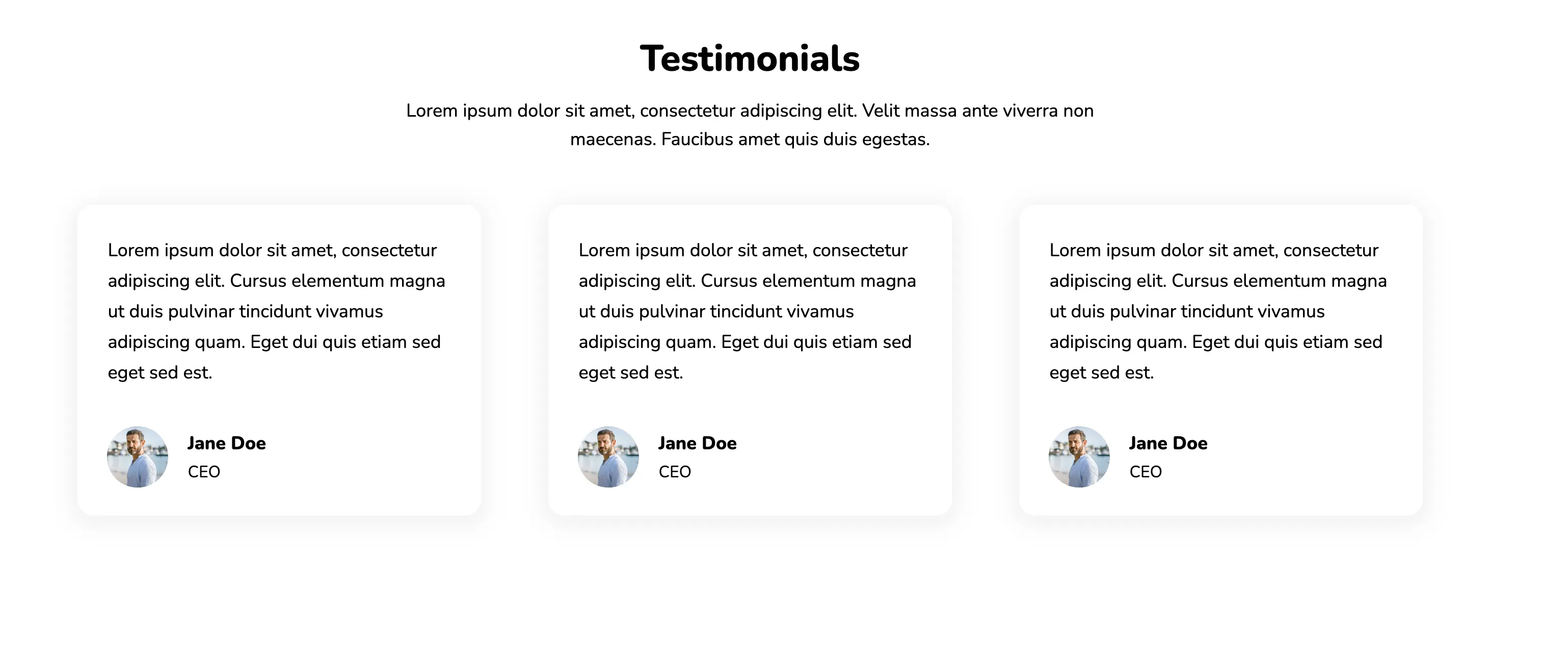
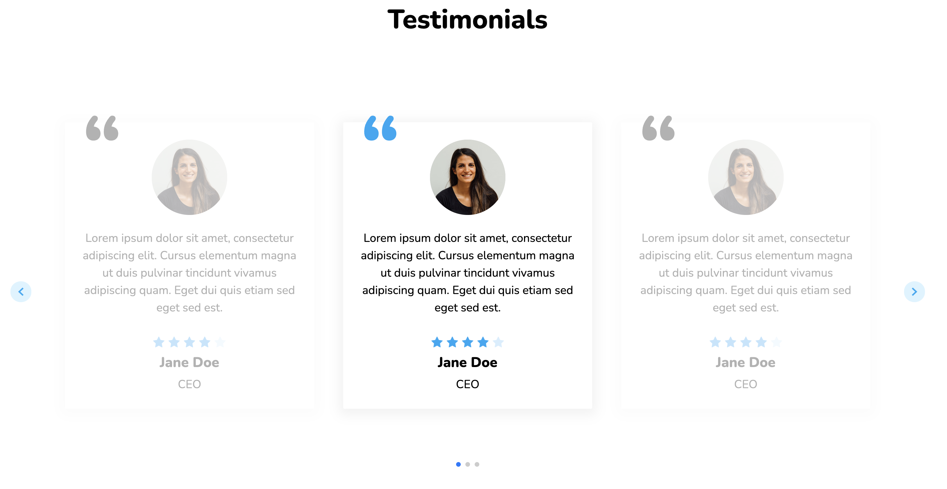
The above design is both simple and beautiful. Each card has a box shadow to distinguish it from the white background. Cards also encourage smaller amounts of content, keeping visitors thoroughly engaged.
View Code
HTML
CSS
JS
Responsive CSS
Output
             Testimonials


             Lorem ipsum dolor sit amet, consectetur adipiscing elit. Velit massa ante viverra non maecenas. Faucibus amet quis duis egestas.


               Lorem ipsum dolor sit amet, consectetur adipiscing elit. Cursus elementum magna ut duis pulvinar tincidunt vivamus adipiscing quam. Eget dui quis etiam sed eget sed est.


                 Jane Doe


                 CEO


               Lorem ipsum dolor sit amet, consectetur adipiscing elit. Cursus elementum magna ut duis pulvinar tincidunt vivamus adipiscing quam. Eget dui quis etiam sed eget sed est.


                 Jane Doe


                 CEO


               Lorem ipsum dolor sit amet, consectetur adipiscing elit. Cursus elementum magna ut duis pulvinar tincidunt vivamus adipiscing quam. Eget dui quis etiam sed eget sed est.


                 Jane Doe


                 CEO
.responsive-cell-block {
min-height: 75px;
}
.text-blk {
margin-top: 0px;
margin-right: 0px;
margin-bottom: 0px;
margin-left: 0px;
padding-top: 0px;
padding-right: 0px;
padding-bottom: 0px;
padding-left: 0px;
line-height: 25px;
height: 50%;
width: 100%;
}
img {
object-fit: cover;
}
.responsive-container-block {
min-height: 75px;
height: fit-content;
width: 100%;
padding-top: 0px;
padding-right: 0px;
padding-bottom: 0px;
padding-left: 0px;
display: flex;
flex-wrap: wrap;
margin-top: 0px;
margin-right: auto;
margin-bottom: 0px;
margin-left: auto;
justify-content: flex-start;
}
.responsive-container-block.bg {
width: 100%;
height: auto;
flex-direction: column;
justify-content: flex-start;
align-items: center;
max-width: 1320px;
margin: 50px 0 50px 0;
}
.text-blk.title {
width: 100%;
height: auto;
text-align: center;
font-size: 36px;
line-height: 45px;
font-weight: 900;
margin-top: 0px;
margin-right: 0px;
margin-bottom: 0px;
margin-left: 0px;
margin: 0 0 15px 0;
}
* {
font-family: Nunito, sans-serif;
}
.text-blk.desc {
text-align: center;
font-size: 18px;
line-height: 28px;
height: auto;
margin-top: 0px;
margin-right: 0px;
margin-bottom: 50px;
margin-left: 0px;
max-width: 750px;
}
.responsive-container-block.blocks {
width: 100%;
min-height: 0px;
justify-content: space-between;
max-width: 1320px;
}
.responsive-cell-block.wk-desk-1.wk-tab-1.wk-mobile-1.wk-ipadp-1.content {
width: 30%;
height: auto;
box-shadow: rgba(0, 0, 0, 0.05) 0px 4px 20px 7px;
border-top-left-radius: 16px;
border-top-right-radius: 16px;
border-bottom-right-radius: 16px;
border-bottom-left-radius: 16px;
display: flex;
flex-direction: column;
justify-content: center;
align-items: center;
}
.text-blk.info-block {
width: 85%;
height: auto;
font-size: 18px;
line-height: 30px;
margin-top: 30px;
margin-right: 0px;
margin-bottom: 50px;
margin-left: 0px;
margin: 30px 0 30px 0;
}
.responsive-container-block.person {
width: 90%;
min-height: 0px;
height: auto;
margin-top: 0px;
margin-right: 31.25px;
margin-bottom: 20px;
margin-left: 31.25px;
}
.responsive-cell-block.wk-desk-6.wk-ipadp-6.wk-tab-12.wk-mobile-12.icon-block {
width: 22%;
height: auto;
display: flex;
justify-content: center;
align-items: center;
}
.responsive-cell-block.wk-desk-6.wk-ipadp-6.wk-tab-12.wk-mobile-12.text-block {
width: 78%;
height: 100%;
display: flex;
flex-direction: column;
align-items: flex-start;
justify-content: center;
}
.text-blk.name {
font-size: 18px;
line-height: 20px;
font-weight: 900;
height: auto;
width: 100%;
padding-top: 10px;
padding-right: 10px;
padding-bottom: 0px;
padding-left: 10px;
}
.text-blk.desig {
line-height: 16px;
height: auto;
width: 100%;
padding-top: 10px;
padding-right: 10px;
padding-bottom: 10px;
padding-left: 10px;
}
.profile-img {
width: 60px;
height: 60px;
border-top-left-radius: 50%;
border-top-right-radius: 50%;
border-bottom-right-radius: 50%;
border-bottom-left-radius: 50%;
}
.responsive-container-block.big-container {
justify-content: center;
padding: 0 50px 0 50px;
}
@media (max-width: 1024px) {
.responsive-cell-block.wk-desk-1.wk-tab-1.wk-mobile-1.wk-ipadp-1.content {
width: 47%;
}
.responsive-cell-block.wk-desk-1.wk-tab-1.wk-mobile-1.wk-ipadp-1.content.bottom {
margin-top: 5%;
margin-right: 0px;
margin-bottom: 0px;
margin-left: 25%;
}
.text-blk.desc {
width: 70%;
}
.responsive-container-block.person {
margin-top: 5%;
margin-right: 31.25px;
margin-bottom: 0px;
margin-left: 31.25px;
}
.text-blk.title {
margin-top: 0px;
margin-right: 0px;
margin-bottom: 0px;
margin-left: 0px;
}
.responsive-container-block.person {
margin-top: 21.9375px;
margin-right: 31.25px;
margin-bottom: 20px;
margin-left: 31.25px;
}
.text-blk.info-block {
margin-top: 30px;
margin-right: 0px;
margin-bottom: 25px;
margin-left: 0px;
}
}
@media (max-width: 768px) {
.responsive-container-block.person {
margin-top: 0px;
margin-right: 31.25px;
margin-bottom: 0px;
margin-left: 31.25px;
}
.text-blk.info-block {
height: 50%;
font-size: 17px;
}
.responsive-cell-block.wk-desk-1.wk-tab-1.wk-mobile-1.wk-ipadp-1.content {
width: 100%;
margin-top: 0px;
margin-right: 0px;
margin-bottom: 5%;
margin-left: 0px;
}
.text-blk.desc {
margin-top: 0px;
margin-right: 0px;
margin-bottom: 80px;
margin-left: 0px;
width: 85%;
font-size: 17px;
}
.text-blk.title {
margin-top: 0px;
margin-right: 0px;
margin-bottom: 0px;
margin-left: 0px;
font-size: 30px;
}
.responsive-cell-block.wk-desk-1.wk-tab-1.wk-mobile-1.wk-ipadp-1.content.bottom {
width: 100%;
margin-top: 0px;
margin-right: 0px;
margin-bottom: 0px;
margin-left: 0px;
}
.responsive-container-block.blocks {
margin-top: 0px;
margin-right: 0px;
margin-bottom: 0px;
margin-left: 0px;
}
.responsive-container-block.bg {
flex-wrap: nowrap;
}
.responsive-container-block.person {
margin-top: 0px;
margin-right: 31.25px;
margin-bottom: 20px;
margin-left: 31.25px;
}
.text-blk.info-block {
margin-top: 30px;
margin-right: 0px;
margin-bottom: 30px;
margin-left: 0px;
}
.text-blk.desc {
margin-top: 0px;
margin-right: 0px;
margin-bottom: 30px;
margin-left: 0px;
}
.text-blk.desig {
font-size: 15px;
}
.text-blk.name {
font-size: 17px;
}
}
@media (max-width: 500px) {
.responsive-cell-block.wk-desk-1.wk-tab-1.wk-mobile-1.wk-ipadp-1.content {
width: 100%;
margin-top: 0px;
margin-right: 0px;
margin-bottom: 8%;
margin-left: 0px;
}
.text-blk.desc {
width: 90%;
margin-top: 0px;
margin-right: 0px;
margin-bottom: 0px;
margin-left: 0px;
font-size: 16px;
line-height: 24px;
}
.text-blk.title {
margin-top: 0px;
margin-right: 0px;
margin-bottom: 0px;
margin-left: 0px;
font-size: 26px;
}
.text-blk.info-block {
margin-top: 30px;
margin-right: 0px;
margin-bottom: 50px;
margin-left: 0px;
font-size: 16px;
line-height: 26px;
margin: 30px 0 20px 0;
}
.text-blk.desc {
margin-top: 0px;
margin-right: 0px;
margin-bottom: 30px;
margin-left: 0px;
}
.responsive-container-block.big-container {
padding: 0 30px 0 30px;
}
.text-blk.name {
font-size: 17px;
}
.text-blk.desig {
font-size: 15px;
}
}
@import url('https://fonts.googleapis.com/css2?family=Nunito:wght@200;300;400;600;700;800&display=swap');
*, *:before, *:after {
-moz-box-sizing: border-box;
-webkit-box-sizing: border-box;
box-sizing: border-box;
}
body {
margin: 0;
}
.wk-desk-1{
width: 8.333333%;
}
.wk-desk-2{
width: 16.666667%;
}
.wk-desk-3{
width: 25%;
}
.wk-desk-4{
width: 33.333333%;
}
.wk-desk-5{
width: 41.666667%;
}
.wk-desk-6{
width: 50%;
}
.wk-desk-7{
width: 58.333333%;
}
.wk-desk-8{
width: 66.666667%;
}
.wk-desk-9{
width: 75%;
}
.wk-desk-10{
width: 83.333333%;
}
.wk-desk-11{
width: 91.666667%;
}
.wk-desk-12{
width: 100%;
}
@media (max-width: 1024px) {
.wk-ipadp-1{
width: 8.333333%;
}
.wk-ipadp-2{
width: 16.666667%;
}
.wk-ipadp-3{
width: 25%;
}
.wk-ipadp-4{
width: 33.333333%;
}
.wk-ipadp-5{
width: 41.666667%;
}
.wk-ipadp-6{
width: 50%;
}
.wk-ipadp-7{
width: 58.333333%;
}
.wk-ipadp-8{
width: 66.666667%;
}
.wk-ipadp-9{
width: 75%;
}
.wk-ipadp-10{
width: 83.333333%;
}
.wk-ipadp-11{
width: 91.666667%;
}
.wk-ipadp-12{
width: 100%;
}
}
@media (max-width: 768px) {
.wk-tab-1{
width: 8.333333%;
}
.wk-tab-2{
width: 16.666667%;
}
.wk-tab-3{
width: 25%;
}
.wk-tab-4{
width: 33.333333%;
}
.wk-tab-5{
width: 41.666667%;
}
.wk-tab-6{
width: 50%;
}
.wk-tab-7{
width: 58.333333%;
}
.wk-tab-8{
width: 66.666667%;
}
.wk-tab-9{
width: 75%;
}
.wk-tab-10{
width: 83.333333%;
}
.wk-tab-11{
width: 91.666667%;
}
.wk-tab-12{
width: 100%;
}
}
@media (max-width: 500px) {
.wk-mobile-1{
width: 8.333333%;
}
.wk-mobile-2{
width: 16.666667%;
}
.wk-mobile-3{
width: 25%;
}
.wk-mobile-4{
width: 33.333333%;
}
.wk-mobile-5{
width: 41.666667%;
}
.wk-mobile-6{
width: 50%;
}
.wk-mobile-7{
width: 58.333333%;
}
.wk-mobile-8{
width: 66.666667%;
}
.wk-mobile-9{
width: 75%;
}
.wk-mobile-10{
width: 83.333333%;
}
.wk-mobile-11{
width: 91.666667%;
}
.wk-mobile-12{
width: 100%;
}
}
Reset
Join our community to see how developers are using Workik AI everyday.
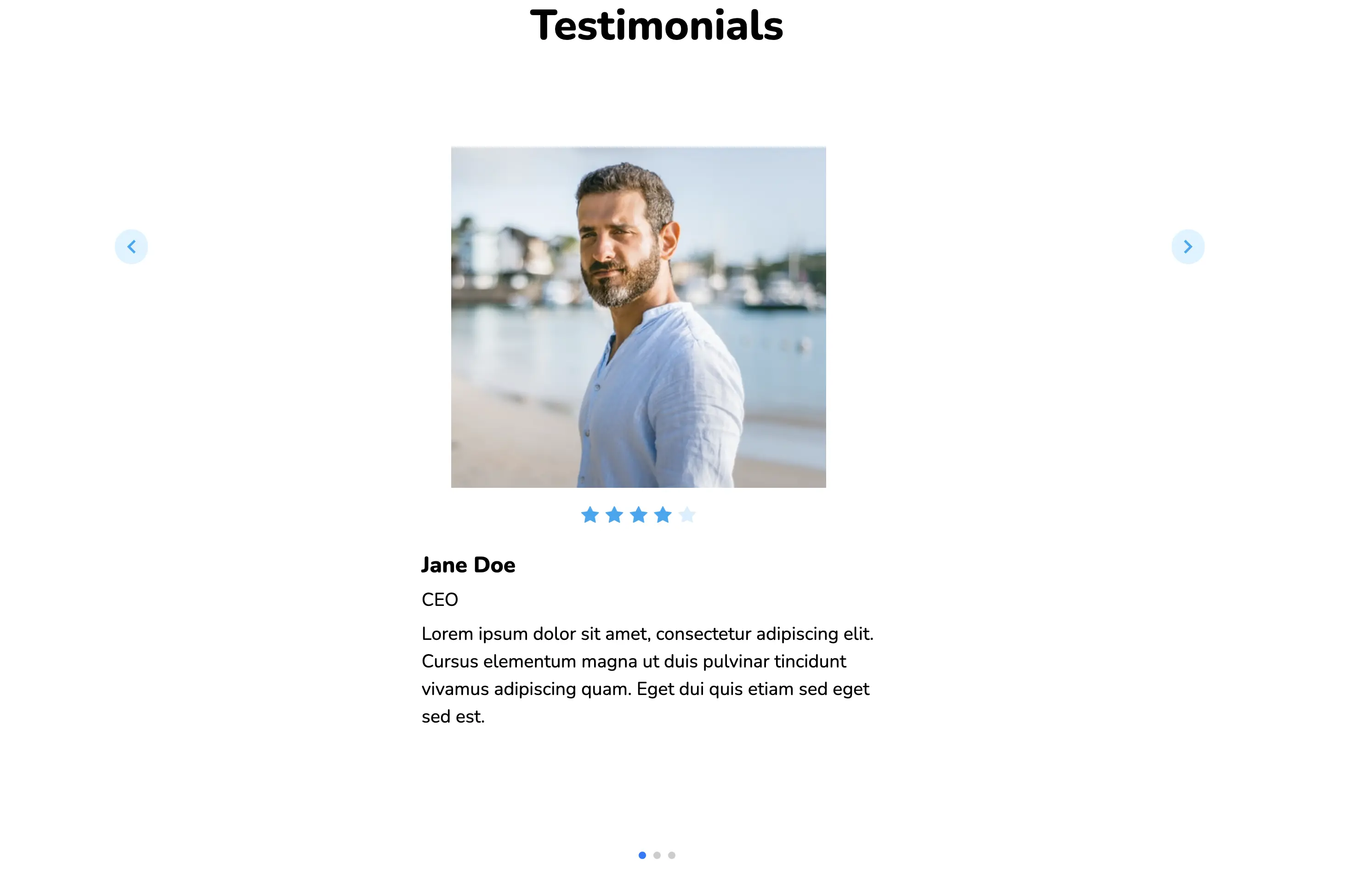
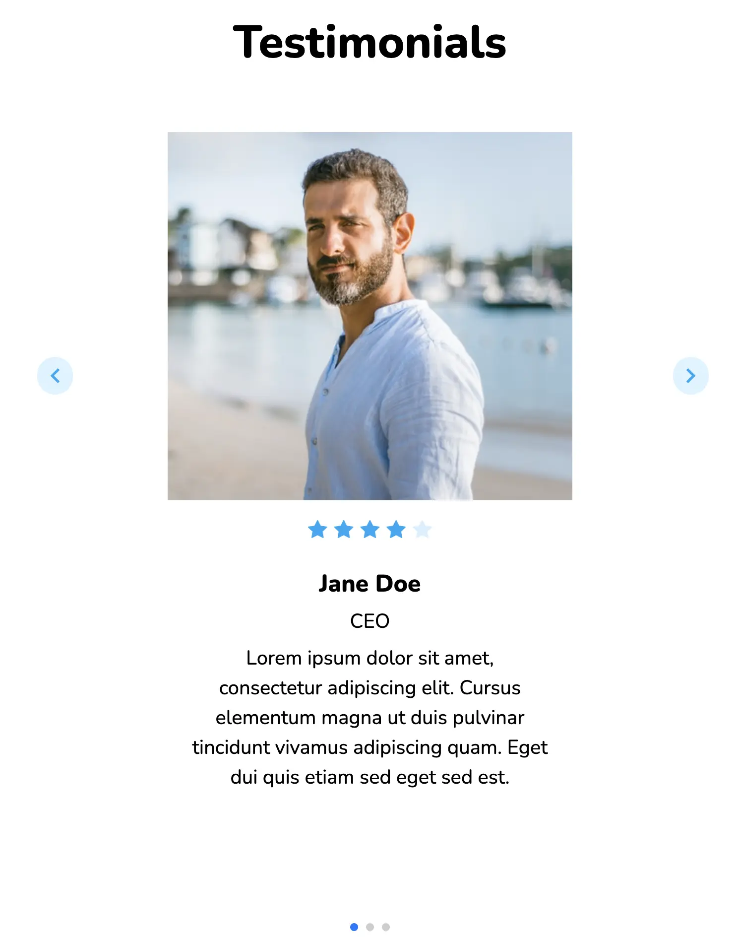
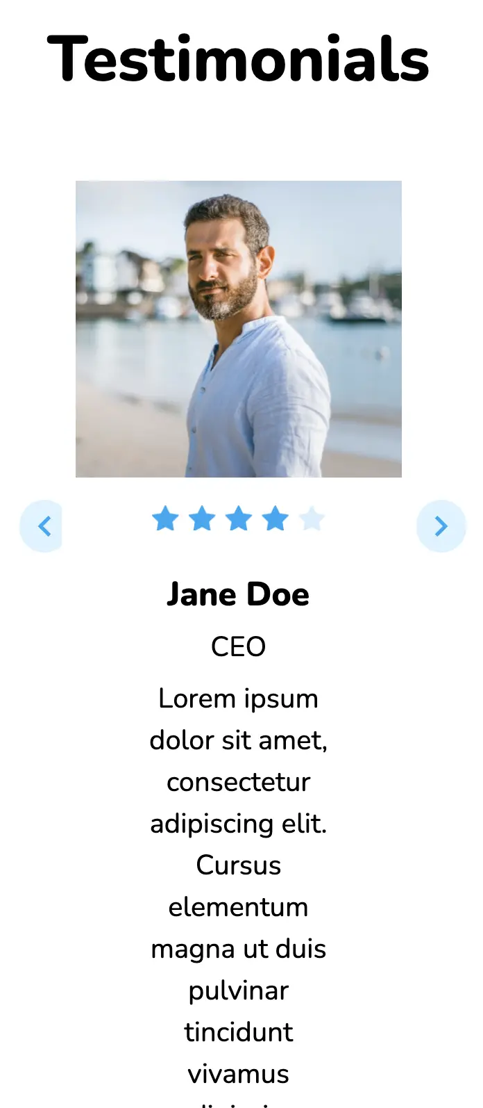
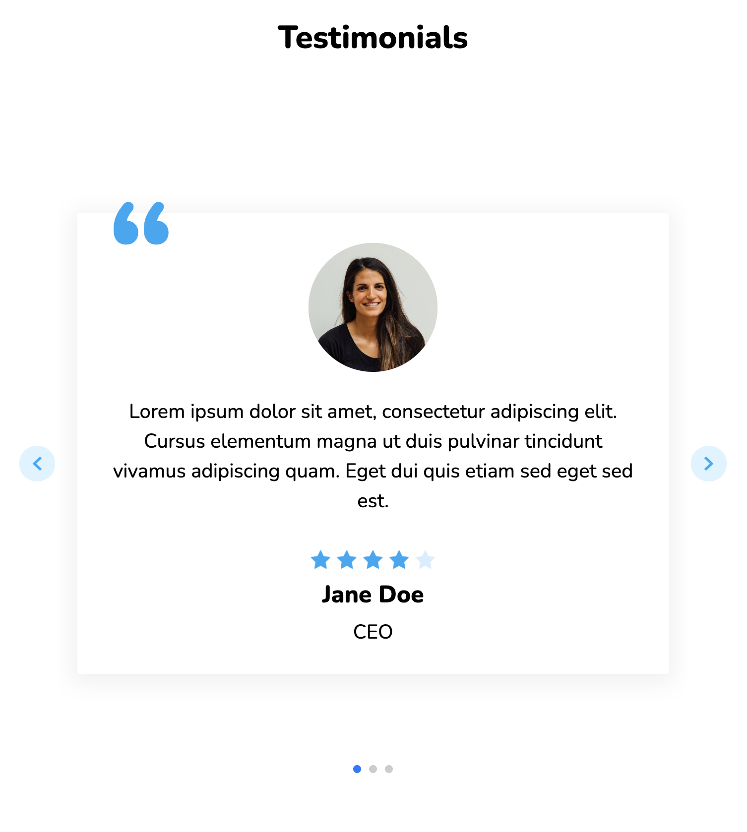
This eye-catching slider has been created with the help of the SwiperJS library. It is based on a traditional horizontal slide and offers arrows for navigation. The design has three screens by default, and this number can be built as per user requirements.
View Code
HTML
CSS
JS
Responsive CSS
Output
            Testimonials


                 Jane Doe


                 CEO


                 Lorem ipsum dolor sit amet, consectetur adipiscing elit. Cursus elementum magna ut duis pulvinar tincidunt vivamus adipiscing quam. Eget dui quis etiam sed eget sed est.


                 Jane Doe


                 CEO


                 Lorem ipsum dolor sit amet, consectetur adipiscing elit. Cursus elementum magna ut duis pulvinar tincidunt vivamus adipiscing quam. Eget dui quis etiam sed eget sed est.


                 Jane Doe


                 CEO


                 Lorem ipsum dolor sit amet, consectetur adipiscing elit. Cursus elementum magna ut duis pulvinar tincidunt vivamus adipiscing quam. Eget dui quis etiam sed eget sed est.
          .responsive-cell-block {
    min-height: 75px;
    }
    * {
    font-family: Nunito, sans-serif;
    }
    .text-blk {
    margin-top: 0px;
    margin-right: 0px;
    margin-bottom: 0px;
    margin-left: 0px;
    padding-top: 10px;
    padding-right: 10px;
    padding-bottom: 10px;
    padding-left: 10px;
    line-height: 25px;
    }
    .responsive-container-block {
    min-height: 75px;
    height: fit-content;
    width: 100%;
    padding-top: 10px;
    padding-right: 10px;
    padding-bottom: 10px;
    padding-left: 10px;
    display: flex;
    flex-wrap: wrap;
    margin-top: 0px;
    margin-right: auto;
    margin-bottom: 0px;
    margin-left: auto;
    justify-content: flex-start;
    }
    .responsive-container-block.bg {
    width: auto;
    height: auto;
    justify-content: center;
    flex-direction: column;
    align-items: center;
    max-width: 1320px;
    }
    .text-blk.title {
    width: 100%;
    height: auto;
    font-size: 46px;
    line-height: 64px;
    font-weight: 900;
    text-align: center;
    margin-top: 0px;
    margin-right: 0px;
    margin-bottom: 80px;
    margin-left: 0px;
    }
    .container-block {
    min-height: 75px;
    height: fit-content;
    width: 50px;
    padding-top: 10px;
    padding-right: 10px;
    padding-bottom: 10px;
    padding-left: 10px;
    display: block;
    }
    .swiper-container {
    width: 50%;
    height: 60%;
    }
    .swiper-slide {
    text-align: center;
    font-size: 18px;
    background-image: initial;
    background-position-x: initial;
    background-position-y: initial;
    background-size: initial;
    background-repeat-x: initial;
    background-repeat-y: initial;
    background-attachment: initial;
    background-origin: initial;
    background-clip: initial;
    background-color: rgb(255, 255, 255);
    display: flex;
    -webkit-box-pack: center;
    justify-content: center;
    -webkit-box-align: center;
    align-items: flex-start;
    flex-wrap: nowrap;
    width: 100%;
    height: auto;
    max-width: 1320px;
    }
    .swiper-button-nexts img, .swiper-button-prevs img {
    	width: 40px;
    height: 40px;
    }
    .swiper-slide img {
    display: block;
    object-fit: cover;
    }
    .rating {
    width: 125px;
    }
    .swiper-button-next.container-block {
    left: 0px;
    right: 0px;
    display: flex;
    justify-content: center;
    align-items: center;
    width: 50px;
    top: 28%;
    bottom: 0px;
    height: 75px;
    min-height: 0px;
    position: static;
    margin-top: 0px;
    margin-right: 0px;
    margin-bottom: 0px;
    margin-left: 0px;
    padding-top: 10px;
    padding-right: 0px;
    padding-bottom: 10px;
    padding-left: 0px;
    flex-wrap: nowrap;
    }
    .swiper-button-prev.container-block {
    display: flex;
    justify-content: flex-start;
    left: 0px;
    right: 0px;
    width: 50px;
    top: 28%;
    bottom: 0px;
    position: static;
    margin-top: 0px;
    margin-right: 0px;
    margin-bottom: 0px;
    margin-left: 0px;
    flex-wrap: nowrap;
    }
    .swiper-pagination.container-block {
    display: flex;
    justify-content: center;
    align-items: flex-end;
    bottom: 0px;
    min-height: 0px;
    position: relative;
    }
    .responsive-cell-block.wk-desk-1.wk-tab-1.wk-mobile-1.wk-ipadp-1.content {
    width: 95%;
    height: auto;
    box-shadow: rgba(0, 0, 0, 0.05) 0px 4px 20px 7px;
    border-top-left-radius: 16px;
    border-top-right-radius: 16px;
    border-bottom-right-radius: 16px;
    border-bottom-left-radius: 16px;
    display: flex;
    flex-direction: column;
    justify-content: center;
    align-items: center;
    }
    .text-blk.info-block {
    width: 90%;
    height: auto;
    font-size: 20px;
    line-height: 34px;
    margin-top: 0px;
    margin-right: 0px;
    margin-bottom: 50px;
    margin-left: 0px;
    }
    .responsive-container-block.person {
    width: 90%;
    min-height: 0px;
    height: 25%;
    margin-top: 8%;
    margin-right: 31.25px;
    margin-bottom: 0px;
    margin-left: 31.25px;
    }
    .text-blk.name {
    font-size: 24px;
    line-height: 32px;
    font-weight: 900;
    height: auto;
    width: auto;
    margin-top: 0px;
    margin-right: 0px;
    margin-bottom: 0px;
    margin-left: 0px;
    text-align: left;
    padding-top: 10px;
    padding-right: 10px;
    padding-bottom: 0px;
    padding-left: 10px;
    }
    .text-blk.desig {
    line-height: 24px;
    height: auto;
    width: auto;
    font-size: 20px;
    text-align: left;
    margin-top: 0px;
    margin-right: 0px;
    margin-bottom: 0px;
    margin-left: 0px;
    padding-top: 10px;
    padding-right: 10px;
    padding-bottom: 0px;
    padding-left: 10px;
    }
    .btn {
    width: 80%;
    height: 75px;
    position: absolute;
    display: flex;
    justify-content: space-between;
    cursor: pointer;
    top: 255px;
    max-width: 1200px;
    }
    .container-block.swiper-button-nexts {
    display: flex;
    align-items: center;
    }
    .container-block.swiper-button-prevs {
    display: flex;
    align-items: center;
    }
    .swiper-wrapper {
    height: auto;
    width: 100%;
    }
    .swiper-container.mySwiper {
    width: 60%;
    height: auto;
    }
    .responsive-container-block.content {
    flex-direction: row;
    align-items: center;
    justify-content: center;
    margin-top: 0px;
    margin-right: 0px;
    margin-bottom: 110px;
    margin-left: 0px;
    }
    .text-blk.info {
    font-size: 20px;
    line-height: 30px;
    width: auto;
    text-align: left;
    margin-top: 0px;
    margin-right: 0px;
    margin-bottom: 20px;
    margin-left: 0px;
    }
    .responsive-cell-block.wk-desk-6.wk-ipadp-6.wk-tab-12.wk-mobile-12.images {
    display: flex;
    flex-direction: column;
    align-items: center;
    width: auto;
    margin-top: 0px;
    margin-right: 40px;
    margin-bottom: 0px;
    margin-left: 0px;
    justify-content: space-between;
    }
    .responsive-cell-block.wk-desk-6.wk-ipadp-6.wk-tab-12.wk-mobile-12.text {
    width: 70%;
    }
    .profile-img {
    width: 130px;
    height: 130px;
    margin: 0 0 20px 0;
    }
    @media (max-width: 1024px) {
    .swiper-slide {
    width: auto;
    }
    .responsive-container-block.bg {
    align-items: center;
    flex-direction: column;
    }
    .responsive-cell-block.wk-desk-1.wk-tab-1.wk-mobile-1.wk-ipadp-1.content {
    height: 80%;
    }
    .text-blk.info-block {
    height: 35%;
    }
    .swiper-pagination.container-block {
    bottom: 40px;
    }
    .swiper-slide {
    margin-top: 0px;
    margin-right: 0px;
    margin-bottom: 0px;
    margin-left: 0px;
    }
    .btn {
    width: 75%;
    }
    .text-blk.title {
    margin-top: 0px;
    margin-right: 0px;
    margin-bottom: 80px;
    margin-left: 0px;
    }
    .swiper-slide {
    height: 100%;
    }
    .swiper-wrapper {
    height: 100%;
    }
    .swiper-container.mySwiper {
    width: 65%;
    height: 55%;
    }
    .btn {
    width: 85%;
    }
    .text-blk.info-block {
    height: 25%;
    margin-top: 0px;
    margin-right: 0px;
    margin-bottom: 60px;
    margin-left: 0px;
    }
    .swiper-pagination.container-block {
    bottom: 60px;
    }
    .text-blk.title {
    margin-top: 0px;
    margin-right: 0px;
    margin-bottom: 38px;
    margin-left: 0px;
    }
    .btn {
    top: 320px;
    }
    .responsive-cell-block.wk-desk-6.wk-ipadp-6.wk-tab-12.wk-mobile-12.images {
    margin-top: 0px;
    margin-right: 0px;
    margin-bottom: 0px;
    margin-left: 0px;
    }
    .responsive-container-block.content {
    flex-direction: column;
    }
    .text-blk.name {
    text-align: center;
    }
    .text-blk.desig {
    text-align: center;
    }
    .text-blk.info {
    text-align: center;
    }
    .swiper-pagination.container-block {
    bottom: 0px;
    }
    }
    @media (max-width: 768px) {
    .swiper-pagination.container-block {
    bottom: 10px;
    }
    .text-blk.info-block {
    height: 45%;
    }
    .btn {
    width: 85%;
    }
    .text-blk.title {
    margin-top: 0px;
    margin-right: 0px;
    margin-bottom: 50px;
    margin-left: 0px;
    }
    .swiper-slide {
    height: 100%;
    }
    .text-blk.info-block {
    height: 38%;
    margin-top: 0px;
    margin-right: 0px;
    margin-bottom: 28px;
    margin-left: 0px;
    }
    .btn {
    width: 95%;
    }
    .swiper-wrapper {
    height: 100%;
    }
    .swiper-container.mySwiper {
    width: 75%;
    }
    .swiper-pagination.container-block {
    bottom: 60px;
    }
    .btn {
    top: 350px;
    }
    .responsive-container-block.content {
    flex-direction: column;
    align-items: center;
    }
    .responsive-cell-block.wk-desk-6.wk-ipadp-6.wk-tab-12.wk-mobile-12.images {
    margin-top: 0px;
    margin-right: 0px;
    margin-bottom: 0px;
    margin-left: 0px;
    }
    .text-blk.name {
    text-align: center;
    }
    .text-blk.desig {
    text-align: center;
    }
    .text-blk.info {
    text-align: center;
    }
    .swiper-pagination.container-block {
    bottom: 0px;
    }
    .text-blk.title {
    margin-top: 0px;
    margin-right: 0px;
    margin-bottom: 38px;
    margin-left: 0px;
    }
    .btn {
    width: 90%;
    }
    }
    @media (max-width: 500px) {
    .btn {
    width: 95%;
    }
    .text-blk.title {
    margin-top: 0px;
    margin-right: 0px;
    margin-bottom: 50px;
    margin-left: 0px;
    height: 8%;
    }
    .text-blk.title {
    margin-top: 0px;
    margin-right: 0px;
    margin-bottom: 25px;
    margin-left: 0px;
    }
    .swiper-slide {
    height: 100%;
    }
    .swiper-wrapper {
    height: 100%;
    }
    .swiper-container.mySwiper {
    width: 74%;
    }
    .btn {
    width: 95%;
    }
    .text-blk.title {
    margin-top: 0px;
    margin-right: 0px;
    margin-bottom: 35px;
    margin-left: 0px;
    }
    .btn {
    width: 92%;
    }
    }
          var swiper = new Swiper(".mySwiper", {
                                cssMode: true,
                                navigation: {
                                nextEl: ".swiper-button-nexts",
                                prevEl: ".swiper-button-prevs",
                                },
                                pagination: {
                                el: ".swiper-pagination",
                                },
                                mousewheel: true,
                                keyboard: true,
                                });
@import url('https://fonts.googleapis.com/css2?family=Nunito:wght@200;300;400;600;700;800&display=swap');
*, *:before, *:after {
-moz-box-sizing: border-box;
-webkit-box-sizing: border-box;
box-sizing: border-box;
}
body {
margin: 0;
}
.wk-desk-1{
width: 8.333333%;
}
.wk-desk-2{
width: 16.666667%;
}
.wk-desk-3{
width: 25%;
}
.wk-desk-4{
width: 33.333333%;
}
.wk-desk-5{
width: 41.666667%;
}
.wk-desk-6{
width: 50%;
}
.wk-desk-7{
width: 58.333333%;
}
.wk-desk-8{
width: 66.666667%;
}
.wk-desk-9{
width: 75%;
}
.wk-desk-10{
width: 83.333333%;
}
.wk-desk-11{
width: 91.666667%;
}
.wk-desk-12{
width: 100%;
}
@media (max-width: 1024px) {
.wk-ipadp-1{
width: 8.333333%;
}
.wk-ipadp-2{
width: 16.666667%;
}
.wk-ipadp-3{
width: 25%;
}
.wk-ipadp-4{
width: 33.333333%;
}
.wk-ipadp-5{
width: 41.666667%;
}
.wk-ipadp-6{
width: 50%;
}
.wk-ipadp-7{
width: 58.333333%;
}
.wk-ipadp-8{
width: 66.666667%;
}
.wk-ipadp-9{
width: 75%;
}
.wk-ipadp-10{
width: 83.333333%;
}
.wk-ipadp-11{
width: 91.666667%;
}
.wk-ipadp-12{
width: 100%;
}
}
@media (max-width: 768px) {
.wk-tab-1{
width: 8.333333%;
}
.wk-tab-2{
width: 16.666667%;
}
.wk-tab-3{
width: 25%;
}
.wk-tab-4{
width: 33.333333%;
}
.wk-tab-5{
width: 41.666667%;
}
.wk-tab-6{
width: 50%;
}
.wk-tab-7{
width: 58.333333%;
}
.wk-tab-8{
width: 66.666667%;
}
.wk-tab-9{
width: 75%;
}
.wk-tab-10{
width: 83.333333%;
}
.wk-tab-11{
width: 91.666667%;
}
.wk-tab-12{
width: 100%;
}
}
@media (max-width: 500px) {
.wk-mobile-1{
width: 8.333333%;
}
.wk-mobile-2{
width: 16.666667%;
}
.wk-mobile-3{
width: 25%;
}
.wk-mobile-4{
width: 33.333333%;
}
.wk-mobile-5{
width: 41.666667%;
}
.wk-mobile-6{
width: 50%;
}
.wk-mobile-7{
width: 58.333333%;
}
.wk-mobile-8{
width: 66.666667%;
}
.wk-mobile-9{
width: 75%;
}
.wk-mobile-10{
width: 83.333333%;
}
.wk-mobile-11{
width: 91.666667%;
}
.wk-mobile-12{
width: 100%;
}
}
Reset
.webp)
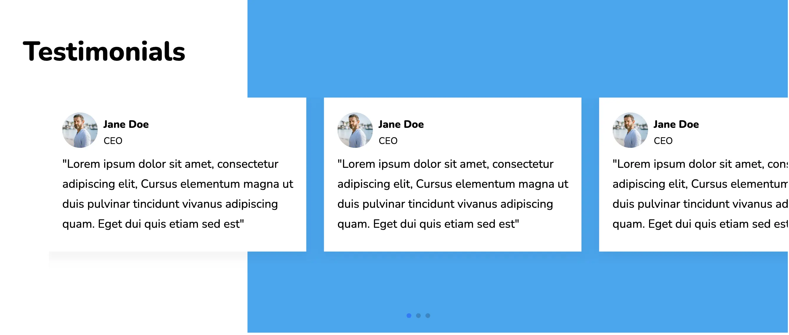
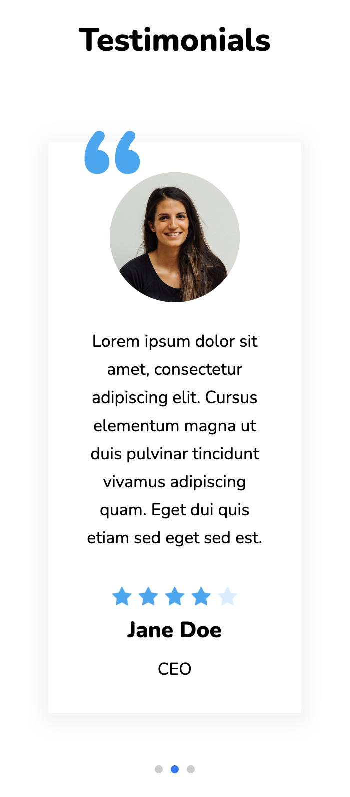
On the lookout for something out of the norm? This design is a perfect fit. The duotone immediately grabs the attention of the audience and also causes the cards to pop-out. Users can navigate through the various slides with the help of the pagination elements or a simple swipe.
View Code
HTML
CSS
JS
Responsive CSS
Output
            Testimonials


                  Jane Doe


                  CEO


                "Lorem ipsum dolor sit amet, consectetur adipiscing elit, Cursus elementum magna ut duis pulvinar tincidunt vivanus adipiscing quam. Eget dui quis etiam sed est"


                  Jane Doe


                  CEO


                "Lorem ipsum dolor sit amet, consectetur adipiscing elit, Cursus elementum magna ut duis pulvinar tincidunt vivanus adipiscing quam. Eget dui quis etiam sed est"


                  Jane Doe


                  CEO


                "Lorem ipsum dolor sit amet, consectetur adipiscing elit, Cursus elementum magna ut duis pulvinar tincidunt vivanus adipiscing quam. Eget dui quis etiam sed est"


                 Jane Doe


                 CEO


               "Lorem ipsum dolor sit amet, consectetur adipiscing elit, Cursus elementum magna ut duis pulvinar tincidunt vivanus adipiscing quam. Eget dui quis etiam sed est"
          .responsive-cell-block {
    min-height: 75px;
    }
    * {
    font-family: Nunito, sans-serif;
    }
    .text-blk {
    margin-top: 0px;
    margin-right: 0px;
    margin-bottom: 0px;
    margin-left: 0px;
    padding-top: 10px;
    padding-right: 10px;
    padding-bottom: 10px;
    padding-left: 10px;
    line-height: 25px;
    }
    .responsive-container-block {
    min-height: 75px;
    height: fit-content;
    width: 100%;
    padding-top: 10px;
    padding-right: 10px;
    padding-bottom: 10px;
    padding-left: 10px;
    display: flex;
    flex-wrap: wrap;
    margin-top: 0px;
    margin-right: auto;
    margin-bottom: 0px;
    margin-left: auto;
    justify-content: flex-start;
    }
    .responsive-container-block.bg {
    max-width: 1320px;
    justify-content: flex-end;
    position: relative;
    height: auto;
    padding-top: 0px;
    padding-right: 0px;
    padding-bottom: 0px;
    padding-left: 10px;
    min-height: 600px;
    }
    .responsive-container-block.blue-cont {
    background-color: rgb(3, 169, 244);
    width: 70%;
    margin-top: 0px;
    margin-right: 0px;
    margin-bottom: 0px;
    margin-left: 0px;
    height: auto;
    min-height: auto;
    }
    .text-blk.title {
    font-size: 46px;
    line-height: 64px;
    font-weight: 900;
    position: absolute;
    left: 12px;
    top: auto;
    bottom: auto;
    right: auto;
    margin-top: 80px;
    margin-right: 0px;
    margin-bottom: 0px;
    margin-left: 0px;
    }
    .container-block {
    min-height: 75px;
    height: fit-content;
    width: 100%;
    padding-top: 10px;
    padding-right: 10px;
    padding-bottom: 10px;
    padding-left: 10px;
    display: block;
    }
    .swiper-container {
    width: 95%;
    height: 65%;
    position: absolute;
    right: 0px;
    top: 100px;
    overflow: hidden;
    }
    .swiper-slide {
    text-align: center;
    font-size: 18px;
    background-image: initial;
    background-position-x: initial;
    background-position-y: initial;
    background-size: initial;
    background-repeat-x: initial;
    background-repeat-y: initial;
    background-attachment: initial;
    background-origin: initial;
    background-clip: initial;
    display: flex;
    -webkit-box-pack: center;
    justify-content: center;
    -webkit-box-align: center;
    align-items: flex-start;
    margin-top: 0px;
    margin-right: 35px;
    margin-bottom: 20px;
    margin-left: 0px;
    }
    .swiper-slide img {
    display: block;
    width: 100%;
    height: 100%;
    object-fit: cover;
    }
    .swiper-wrapper {
    position: absolute;
    left: 0px;
    }
    .responsive-container-block.content {
    background-color: rgb(255, 255, 255);
    box-shadow: rgba(0, 0, 0, 0.05) 0px 4px 20px 7px;
    flex-direction: column;
    flex-wrap: wrap;
    margin-top: 0px;
    margin-right: 0px;
    margin-bottom: 80px;
    margin-left: 0px;
    min-height: auto;
    height: auto;
    }
    .text-blk.info {
    font-size: 20px;
    line-height: 34px;
    text-align: left;
    margin-top: 0px;
    margin-right: 0px;
    margin-bottom: 10px;
    margin-left: 3px;
    }
    .swiper-pagination.container-block {
    min-height: auto;
    bottom: 5px;
    top: auto;
    position: absolute;
    left: auto;
    }
    .responsive-cell-block.wk-desk-6.wk-ipadp-6.wk-tab-12.wk-mobile-12.icon {
    min-height: auto;
    width: auto;
    display: flex;
    align-items: center;
    }
    .responsive-cell-block.wk-desk-6.wk-ipadp-6.wk-tab-12.wk-mobile-12.details {
    min-height: auto;
    }
    .responsive-container-block.person {
    min-height: auto;
    padding-top: 0px;
    padding-right: 10px;
    padding-bottom: 0px;
    padding-left: 10px;
    margin-top: 15px;
    margin-right: 0px;
    margin-bottom: 0px;
    margin-left: 3px;
    }
    .text-blk.name {
    line-height: 32px;
    font-weight: 900;
    text-align: left;
    padding-top: 5px;
    padding-right: 10px;
    padding-bottom: 0px;
    padding-left: 10px;
    }
    .text-blk.desig {
    text-align: left;
    font-size: 16px;
    line-height: 24px;
    padding-top: 0px;
    padding-right: 10px;
    padding-bottom: 0px;
    padding-left: 10px;
    }
    .swiper-container.mySwiper {
    top: 200px;
    display: flex;
    flex-direction: column;
    flex-wrap: nowrap;
    }
    .profile-img {
    width: 60px;
    height: 60px;
    max-width: 60px;
    max-height: 60px;
    }
    @media (max-width: 1024px) {
    .responsive-container-block.blue-cont {
    width: 100%;
    height: 55%;
    }
    .responsive-container-block.bg {
    flex-direction: column;
    justify-content: flex-end;
    align-items: flex-start;
    padding-top: 10px;
    padding-right: 0px;
    padding-bottom: 10px;
    padding-left: 0px;
    height: 100%;
    }
    .text-blk.title {
    margin-top: 0px;
    margin-right: auto;
    margin-bottom: 0px;
    margin-left: 0px;
    position: absolute;
    top: 50px;
    left: 350px;
    }
    .swiper-container {
    position: absolute;
    right: 0px;
    top: 1000px;
    }
    .swiper-slide {
    align-items: flex-start;
    }
    .responsive-container-block.content {
    margin-top: 0px;
    margin-right: 0px;
    margin-bottom: 0px;
    margin-left: 0px;
    }
    .responsive-container-block.blue-cont {
    height: 70%;
    }
    .swiper-container.mySwiper {
    top: 200px;
    right: auto;
    left: auto;
    }
    .responsive-container-block.bg {
    height: 100%;
    align-items: center;
    }
    .swiper-pagination.container-block {
    top: auto;
    bottom: 55px;
    }
    .text-blk.title {
    left: auto;
    right: auto;
    }
    .responsive-container-block.bg {
    padding-top: 10px;
    padding-right: 0px;
    padding-bottom: 0px;
    padding-left: 0px;
    }
    .text-blk.title {
    top: 10px;
    }
    .swiper-container.mySwiper {
    top: 120px;
    }
    .swiper-pagination.container-block {
    bottom: 30px;
    }
    .text-blk.title {
    top: 0px;
    }
    .responsive-container-block.blue-cont {
    height: 58%;
    }
    .swiper-pagination.container-block {
    bottom: 30px;
    top: auto;
    }
    .text-blk.info {
    margin-top: 0px;
    margin-right: 0px;
    margin-bottom: 0px;
    margin-left: 3px;
    }
    }
    @media (max-width: 768px) {
    .swiper-pagination.container-block {
    bottom: 55px;
    }
    .swiper-container.mySwiper {
    left: auto;
    top: 170px;
    }
    .responsive-container-block.person {
    flex-direction: column;
    justify-content: flex-start;
    align-items: center;
    }
    .text-blk.name {
    text-align: center;
    }
    .text-blk.desig {
    text-align: center;
    }
    .text-blk.info {
    text-align: center;
    }
    .responsive-cell-block.wk-desk-6.wk-ipadp-6.wk-tab-12.wk-mobile-12.icon {
    margin-top: 0px;
    margin-right: 0px;
    margin-bottom: 5px;
    margin-left: 0px;
    }
    .responsive-container-block.bg {
    padding-top: 0px;
    padding-right: 0px;
    padding-bottom: 0px;
    padding-left: 0px;
    }
    .swiper-container.mySwiper {
    top: 120px;
    }
    .responsive-container-block.person {
    margin-top: 0px;
    margin-right: 0px;
    margin-bottom: 0px;
    margin-left: 3px;
    }
    .text-blk.info {
    margin-top: 0px;
    margin-right: 0px;
    margin-bottom: 5px;
    margin-left: 3px;
    }
    .swiper-pagination.container-block {
    bottom: 25px;
    }
    .responsive-container-block.content {
    max-width: 550px;
    }
    }
    @media (max-width: 500px) {
    .swiper-pagination.container-block {
    bottom: 0px;
    margin-top: 30px;
    margin-right: 0px;
    margin-bottom: 0px;
    margin-left: 0px;
    }
    .responsive-container-block.content {
    margin-top: 0px;
    margin-right: 0px;
    margin-bottom: 30px;
    margin-left: 0px;
    }
    .text-blk.info {
    text-align: center;
    }
    .responsive-container-block.bg {
    padding-top: 0px;
    padding-right: 0px;
    padding-bottom: 0px;
    padding-left: 0px;
    }
    .swiper-pagination.container-block {
    bottom: 0px;
    }
    }
          var swiper = new Swiper(".mySwiper", {
                                slidesPerView: 3,
                                spaceBetween: 30,
                                pagination: {
                                el: ".swiper-pagination",
                                clickable: true,
                                },
                                loop: true,
                                breakpoints: {

                                300: {
                                slidesPerView: 1
                                },

                                501: {
                                slidesPerView: 1
                                },

                                769: {
                                slidesPerView: 2,
                                spaceBetween: 25
                                },
                                1025: {
                                slidesPerView: 2.75,
                                spaceBetween: 30
                                },
                                }
                                });
@import url('https://fonts.googleapis.com/css2?family=Nunito:wght@200;300;400;600;700;800&display=swap');
*, *:before, *:after {
-moz-box-sizing: border-box;
-webkit-box-sizing: border-box;
box-sizing: border-box;
}
body {
margin: 0;
}
.wk-desk-1{
width: 8.333333%;
}
.wk-desk-2{
width: 16.666667%;
}
.wk-desk-3{
width: 25%;
}
.wk-desk-4{
width: 33.333333%;
}
.wk-desk-5{
width: 41.666667%;
}
.wk-desk-6{
width: 50%;
}
.wk-desk-7{
width: 58.333333%;
}
.wk-desk-8{
width: 66.666667%;
}
.wk-desk-9{
width: 75%;
}
.wk-desk-10{
width: 83.333333%;
}
.wk-desk-11{
width: 91.666667%;
}
.wk-desk-12{
width: 100%;
}
@media (max-width: 1024px) {
.wk-ipadp-1{
width: 8.333333%;
}
.wk-ipadp-2{
width: 16.666667%;
}
.wk-ipadp-3{
width: 25%;
}
.wk-ipadp-4{
width: 33.333333%;
}
.wk-ipadp-5{
width: 41.666667%;
}
.wk-ipadp-6{
width: 50%;
}
.wk-ipadp-7{
width: 58.333333%;
}
.wk-ipadp-8{
width: 66.666667%;
}
.wk-ipadp-9{
width: 75%;
}
.wk-ipadp-10{
width: 83.333333%;
}
.wk-ipadp-11{
width: 91.666667%;
}
.wk-ipadp-12{
width: 100%;
}
}
@media (max-width: 768px) {
.wk-tab-1{
width: 8.333333%;
}
.wk-tab-2{
width: 16.666667%;
}
.wk-tab-3{
width: 25%;
}
.wk-tab-4{
width: 33.333333%;
}
.wk-tab-5{
width: 41.666667%;
}
.wk-tab-6{
width: 50%;
}
.wk-tab-7{
width: 58.333333%;
}
.wk-tab-8{
width: 66.666667%;
}
.wk-tab-9{
width: 75%;
}
.wk-tab-10{
width: 83.333333%;
}
.wk-tab-11{
width: 91.666667%;
}
.wk-tab-12{
width: 100%;
}
}
@media (max-width: 500px) {
.wk-mobile-1{
width: 8.333333%;
}
.wk-mobile-2{
width: 16.666667%;
}
.wk-mobile-3{
width: 25%;
}
.wk-mobile-4{
width: 33.333333%;
}
.wk-mobile-5{
width: 41.666667%;
}
.wk-mobile-6{
width: 50%;
}
.wk-mobile-7{
width: 58.333333%;
}
.wk-mobile-8{
width: 66.666667%;
}
.wk-mobile-9{
width: 75%;
}
.wk-mobile-10{
width: 83.333333%;
}
.wk-mobile-11{
width: 91.666667%;
}
.wk-mobile-12{
width: 100%;
}
}
Reset
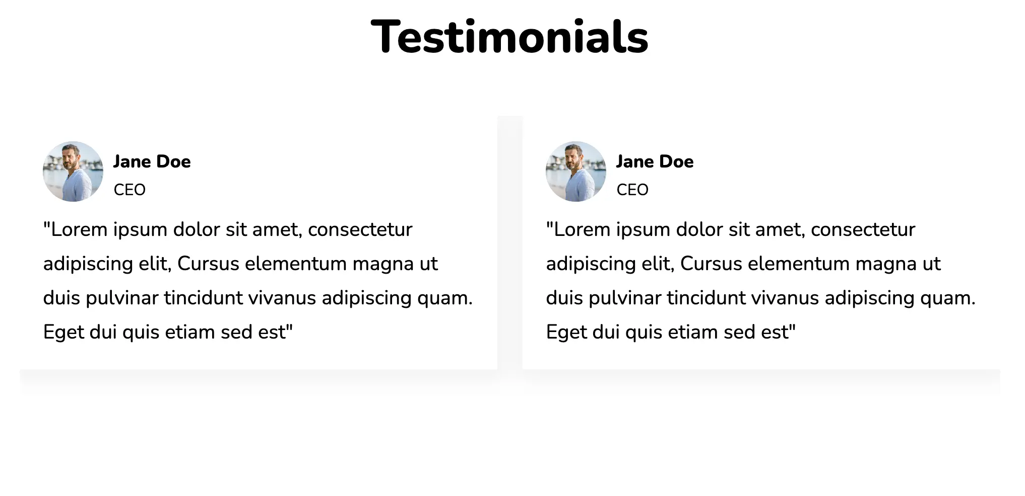
Reviews are often paired with carousels for interactivity and efficiency. The slide currently under focus is distinguished by a different colour scheme and a higher opacity. A box shadow is applied to the cards, offering them a depth/ elevation.
View Code
HTML
CSS
JS
Responsive CSS
Output
            Testimonials


                “


                Lorem ipsum dolor sit amet, consectetur adipiscing elit. Cursus elementum magna ut duis pulvinar tincidunt vivamus adipiscing quam. Eget dui quis etiam sed eget sed est.


                Jane Doe


                CEO


                “


                Lorem ipsum dolor sit amet, consectetur adipiscing elit. Cursus elementum magna ut duis pulvinar tincidunt vivamus adipiscing quam. Eget dui quis etiam sed eget sed est.


                Jane Doe


                CEO


                “


                Lorem ipsum dolor sit amet, consectetur adipiscing elit. Cursus elementum magna ut duis pulvinar tincidunt vivamus adipiscing quam. Eget dui quis etiam sed eget sed est.


                Jane Doe


                CEO
* {
font-family: Nunito, sans-serif;
}
.btn {
width: 95%;
height: auto;
position: relative;
display: flex;
justify-content: space-between;
top: 370px;
cursor: pointer;
max-width: 1700px;
}
.text-blk {
margin-top: 0px;
margin-right: 0px;
margin-bottom: 0px;
margin-left: 0px;
padding-top: 10px;
padding-right: 10px;
padding-bottom: 10px;
padding-left: 10px;
line-height: 25px;
}
.responsive-container-block {
min-height: 75px;
height: fit-content;
width: 100%;
padding-top: 10px;
padding-right: 10px;
padding-bottom: 10px;
padding-left: 10px;
display: flex;
flex-wrap: wrap;
margin-top: 0px;
margin-right: auto;
margin-bottom: 0px;
margin-left: auto;
justify-content: flex-start;
}
.responsive-container-block.bg {
flex-direction: column;
align-items: center;
height: auto;
max-width: 1700px;
}
.text-blk.title {
font-size: 46px;
line-height: 64px;
font-weight: 900;
margin-top: 0px;
margin-right: 0px;
margin-bottom: 20px;
margin-left: 0px;
}
.container-block {
min-height: 75px;
height: fit-content;
width: 100%;
padding-top: 10px;
padding-right: 10px;
padding-bottom: 10px;
padding-left: 10px;
display: block;
}
.swiper-container {
width: 85%;
max-width: 1520px;
height: auto;
overflow: hidden;
}
.swiper-slide {
text-align: center;
font-size: 18px;
background-image: initial;
background-position-x: initial;
background-position-y: initial;
background-size: initial;
background-repeat-x: initial;
background-repeat-y: initial;
background-attachment: initial;
background-origin: initial;
background-clip: initial;
background-color: rgb(255, 255, 255);
display: flex;
-webkit-box-pack: center;
justify-content: center;
-webkit-box-align: center;
align-items: center;
opacity: 0.3;
height: fit-content;
}
.swiper-slide.swiper-slide-next {
opacity: 1;
}
.swiper-slide.swiper-slide-next .content .quotes {
color: rgb(3, 169, 244);
}
.swiper-slide img {
display: block;
width: 100%;
height: 100%;
object-fit: cover;
}
.responsive-container-block.content {
flex-direction: column;
align-items: center;
box-shadow: rgba(0, 0, 0, 0.05) 0px 4px 20px 7px;
border-top-left-radius: 2px;
border-top-right-radius: 2px;
border-bottom-right-radius: 2px;
border-bottom-left-radius: 2px;
padding-top: 10px;
padding-right: 20px;
padding-bottom: 10px;
padding-left: 20px;
position: relative;
margin-top: 40px;
margin-right: 20px;
margin-bottom: 120px;
margin-left: 20px;
}
.text-blk.name {
font-size: 24px;
line-height: 32px;
font-weight: 900;
padding-top: 10px;
padding-right: 10px;
padding-bottom: 0px;
padding-left: 10px;
}
.text-blk.desig {
font-size: 20px;
line-height: 24px;
margin-top: 0px;
margin-right: 0px;
margin-bottom: 10px;
margin-left: 0px;
}
.text-blk.info {
max-width: 550px;
margin-top: 0px;
margin-right: 0px;
margin-bottom: 25px;
margin-left: 0px;
font-size: 20px;
line-height: 30px;
}
.text-blk.quotes {
position: absolute;
left: 20px;
font-size: 144px;
line-height: 32px;
top: 17px;
font-weight: 900;
color: rgb(0, 0, 0);
}
.container-block.swiper-button-prevs {
width: auto;
display: flex;
flex-direction: row;
justify-content: center;
align-items: center;
}
.container-block.swiper-button-nexts {
width: auto;
display: flex;
justify-content: center;
flex-direction: row;
align-items: center;
}
.profile-img {
width: auto;
max-width: 130px;
margin-top: 20px;
margin-right: 0px;
margin-bottom: 15px;
margin-left: 0px;
border-top-left-radius: 50%;
border-top-right-radius: 50%;
border-bottom-right-radius: 50%;
border-bottom-left-radius: 50%;
min-height: 130px;
}
.swiper-slide img.review {
width: 125px;
}
.pagination-button {
width: 36px;
height: 36px;
}
.swiper-pagination {
min-height: auto;
position: relative;
}
.content {
margin-top: 40px;
margin-right: 20px;
margin-bottom: 120px;
margin-left: 20px;
}
@media (max-width: 1024px) {
.swiper-slide {
opacity: 0.3;
}
.swiper-slide.swiper-slide-next .content .quotes {
color: rgb(0, 0, 0);
}
.swiper-slide.swiper-slide-next {
opacity: 1;
}
.swiper-slide.swiper-slide-next .content .quotes {
color: rgb(3, 169, 244);
}
}
@media (max-width: 768px) {
.swiper-slide {
opacity: 0.3;
}
.swiper-slide.swiper-slide-next {
opacity: 0.3;
}
.swiper-slide.swiper-slide-next .content .quotes {
color: rgb(0, 0, 0);
}
.swiper-slide.swiper-slide-active {
opacity: 1;
}
.swiper-slide.swiper-slide-active .content .quotes {
color: rgb(3, 169, 244);
}
.btn {
width: 98%;
}
.text-blk.title {
font-size: 32px;
}
}
@media (max-width: 500px) {
.swiper-slide {
opacity: 0.3;
}
.swiper-slide .content .quotes {
color: rgb(0, 0, 0);
}
.swiper-slide.swiper-slide-active {
opacity: 1;
}
.swiper-slide.swiper-slide-active .content .quotes {
color: rgb(3, 169, 244);
}
.btn {
width: 99%;
}
.text-blk.info {
font-size: 17px;
line-height: 28px;
}
.text-blk.name {
font-size: 22px;
line-height: 30px;
}
.text-blk.desig {
font-size: 17px;
line-height: 28px;
}
.btn {
display: none;
}
.responsive-container-block.content {
margin-top: 40px;
margin-right: 20px;
margin-bottom: 80px;
margin-left: 20px;
}
.title {
font-size: 32px;
}
.text-blk.title {
font-size: 32px;
}
}
          var swiper = new Swiper(".mySwiper", {
                                slidesPerView: 3,
                                spaceBetween: 5,
                                pagination: {
                                el: ".swiper-pagination",
                                clickable: true,
                                },
                                navigation: {
                                nextEl: ".swiper-button-nexts",
                                prevEl: ".swiper-button-prevs",
                                },
                                mousewheel: true,
                                keyboard: true,
                                loop: true,
                                breakpoints: {

                                300: {
                                slidesPerView: 1
                                },

                                501: {
                                slidesPerView: 1
                                },

                                769: {
                                slidesPerView: 3,
                                spaceBetween: 10
                                },
                                1025: {
                                slidesPerView: 3,
                                spaceBetween: 10
                                },
                                }
                                });
@import url('https://fonts.googleapis.com/css2?family=Nunito:wght@200;300;400;600;700;800&display=swap');
*, *:before, *:after {
-moz-box-sizing: border-box;
-webkit-box-sizing: border-box;
box-sizing: border-box;
}
body {
margin: 0;
}
.wk-desk-1{
width: 8.333333%;
}
.wk-desk-2{
width: 16.666667%;
}
.wk-desk-3{
width: 25%;
}
.wk-desk-4{
width: 33.333333%;
}
.wk-desk-5{
width: 41.666667%;
}
.wk-desk-6{
width: 50%;
}
.wk-desk-7{
width: 58.333333%;
}
.wk-desk-8{
width: 66.666667%;
}
.wk-desk-9{
width: 75%;
}
.wk-desk-10{
width: 83.333333%;
}
.wk-desk-11{
width: 91.666667%;
}
.wk-desk-12{
width: 100%;
}
@media (max-width: 1024px) {
.wk-ipadp-1{
width: 8.333333%;
}
.wk-ipadp-2{
width: 16.666667%;
}
.wk-ipadp-3{
width: 25%;
}
.wk-ipadp-4{
width: 33.333333%;
}
.wk-ipadp-5{
width: 41.666667%;
}
.wk-ipadp-6{
width: 50%;
}
.wk-ipadp-7{
width: 58.333333%;
}
.wk-ipadp-8{
width: 66.666667%;
}
.wk-ipadp-9{
width: 75%;
}
.wk-ipadp-10{
width: 83.333333%;
}
.wk-ipadp-11{
width: 91.666667%;
}
.wk-ipadp-12{
width: 100%;
}
}
@media (max-width: 768px) {
.wk-tab-1{
width: 8.333333%;
}
.wk-tab-2{
width: 16.666667%;
}
.wk-tab-3{
width: 25%;
}
.wk-tab-4{
width: 33.333333%;
}
.wk-tab-5{
width: 41.666667%;
}
.wk-tab-6{
width: 50%;
}
.wk-tab-7{
width: 58.333333%;
}
.wk-tab-8{
width: 66.666667%;
}
.wk-tab-9{
width: 75%;
}
.wk-tab-10{
width: 83.333333%;
}
.wk-tab-11{
width: 91.666667%;
}
.wk-tab-12{
width: 100%;
}
}
@media (max-width: 500px) {
.wk-mobile-1{
width: 8.333333%;
}
.wk-mobile-2{
width: 16.666667%;
}
.wk-mobile-3{
width: 25%;
}
.wk-mobile-4{
width: 33.333333%;
}
.wk-mobile-5{
width: 41.666667%;
}
.wk-mobile-6{
width: 50%;
}
.wk-mobile-7{
width: 58.333333%;
}
.wk-mobile-8{
width: 66.666667%;
}
.wk-mobile-9{
width: 75%;
}
.wk-mobile-10{
width: 83.333333%;
}
.wk-mobile-11{
width: 91.666667%;
}
.wk-mobile-12{
width: 100%;
}
}
Reset
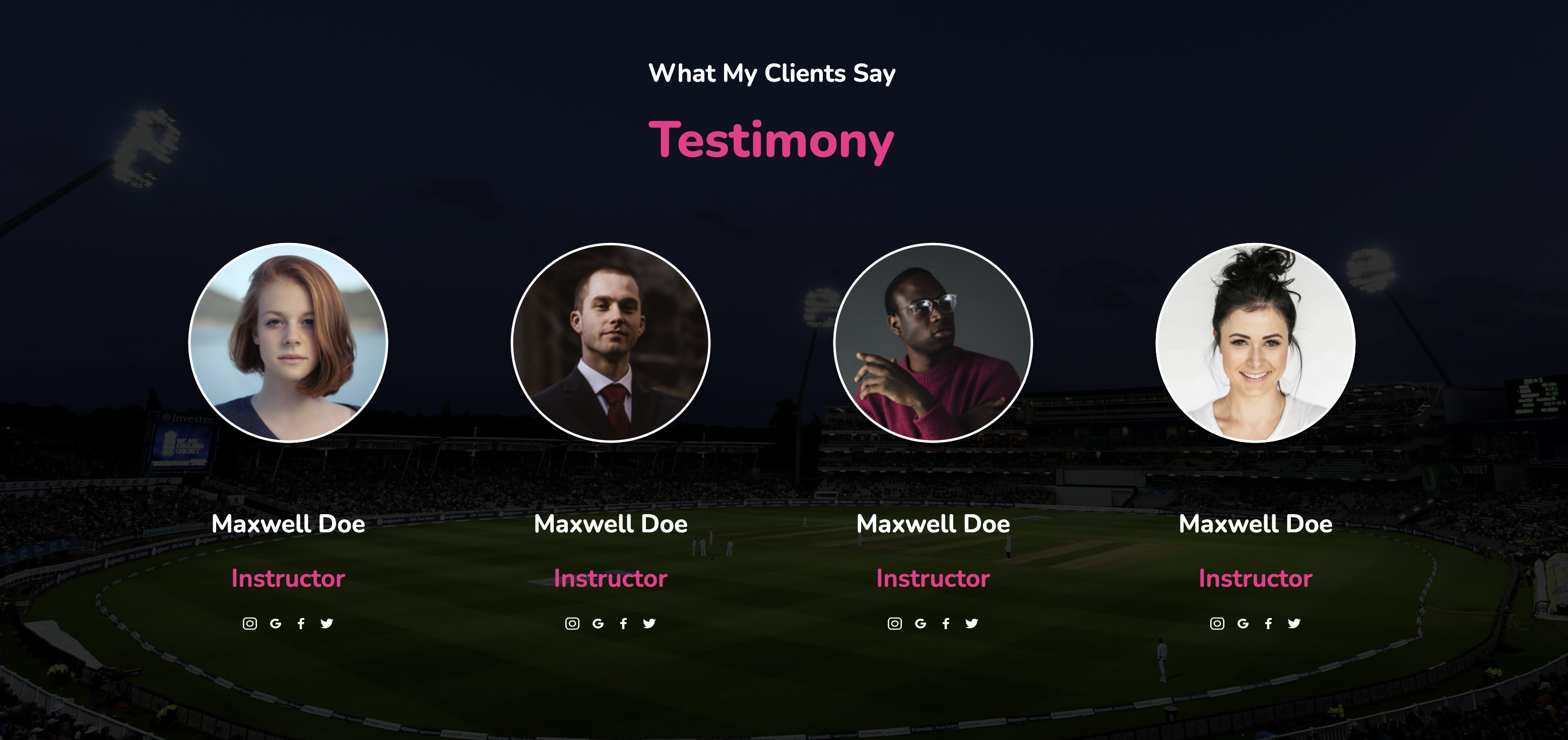
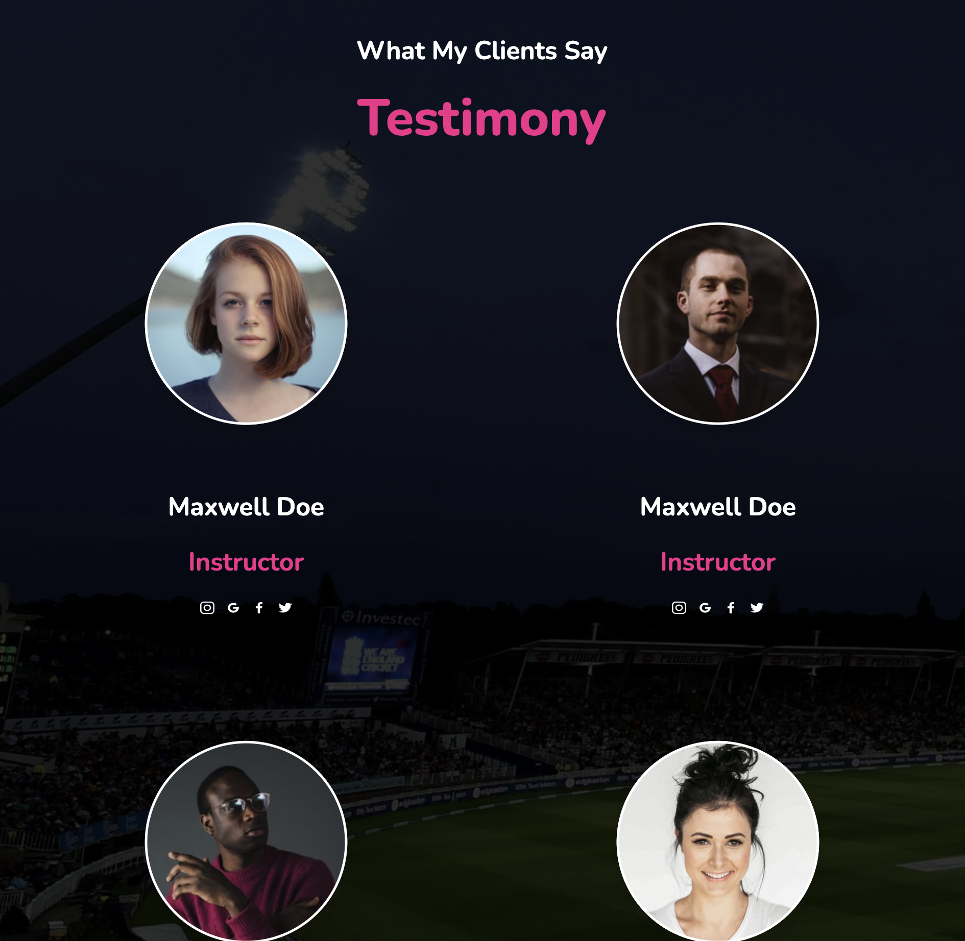
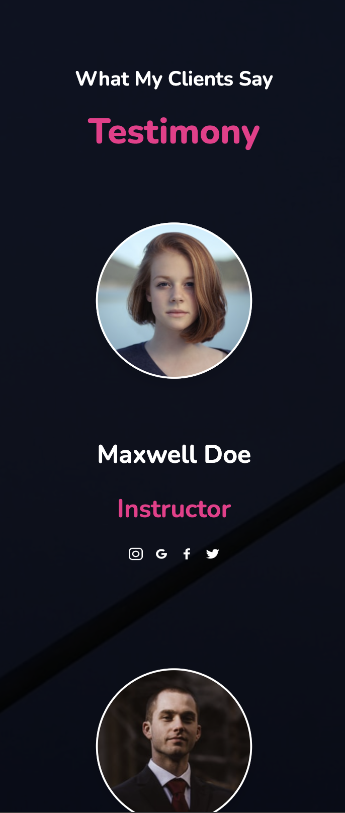
This widget presents client testimonials against a neat, dark background. Links to their social media pages have also been incorporated as part of the design. The blocks have a flex display and wrap around one another as the screen width is reduced.
View Code
HTML
CSS
JS
Responsive CSS
Output
             What My Clients Say


             Testimony


               Maxwell Doe


               Instructor


               Maxwell Doe


               Instructor


               Maxwell Doe


               Instructor


               Maxwell Doe


               Instructor
.responsive-cell-block {
min-height: 75px;
}
* {
font-family: Nunito, sans-serif;
}
.text-blk {
margin-top: 0px;
margin-right: 0px;
margin-bottom: 0px;
margin-left: 0px;
padding-top: 10px;
padding-right: 10px;
padding-bottom: 10px;
padding-left: 10px;
line-height: 24px;
}
.responsive-container-block {
min-height: 75px;
height: fit-content;
width: 100%;
padding-top: 10px;
padding-right: 10px;
padding-bottom: 10px;
padding-left: 10px;
display: flex;
flex-wrap: wrap;
margin-top: 0px;
margin-right: auto;
margin-bottom: 0px;
margin-left: auto;
justify-content: flex-start;
}
.responsive-container-block.bigContainer {
padding-top: 10px;
padding-right: 30px;
padding-bottom: 10px;
padding-left: 30px;
background-image: url("https://workik-widget-assets.s3.amazonaws.com/widget-assets/images/ct11.svg");
background-position-x: initial;
background-position-y: initial;
background-size: cover;
background-attachment: initial;
background-origin: initial;
background-clip: initial;
background-color: initial;
background-repeat-x: no-repeat;
background-repeat-y: no-repeat;
}
.responsive-container-block.Container {
max-width: 1320px;
flex-direction: column;
margin-top: 50px;
margin-right: auto;
margin-bottom: 50px;
margin-left: auto;
align-items: center;
justify-content: center;
}
.text-blk.headingText {
font-size: 25px;
line-height: 34px;
text-align: center;
font-weight: 700;
padding-top: 0px;
padding-right: 0px;
padding-bottom: 0px;
padding-left: 0px;
color: white;
margin-top: 0px;
margin-right: 0px;
margin-bottom: 5px;
margin-left: 0px;
}
.responsive-container-block.cardContainer {
margin-top: 0px;
margin-right: 0px;
margin-bottom: 0px;
margin-left: 0px;
}
.responsive-cell-block.wk-desk-3.wk-ipadp-4.wk-tab-6.wk-mobile-12 {
display: flex;
flex-direction: column;
justify-content: flex-start;
align-items: center;
}
.text-blk.name {
font-size: 25px;
line-height: 34px;
font-weight: 700;
margin-top: 20px;
margin-right: 0px;
margin-bottom: 0px;
margin-left: 0px;
color: white;
text-align: center;
}
.responsive-cell-block.wk-desk-3.wk-tab-6.wk-mobile-12.wk-ipadp-6 {
display: flex;
flex-direction: column;
align-items: center;
padding-top: 10px;
padding-right: 20px;
padding-bottom: 35px;
padding-left: 20px;
}
.responsive-cell-block.wk-desk-3.wk-tab-6.wk-mobile-12.wk-ipadp-6.oddCellBG {
padding-top: 10px;
padding-right: 20px;
padding-bottom: 35px;
padding-left: 20px;
}
.desktopImage {
width: 250px;
height: 250px;
border-top-left-radius: 100px;
border-top-right-radius: 100px;
border-bottom-right-radius: 100px;
border-bottom-left-radius: 100px;
padding-top: 10px;
padding-right: 10px;
padding-bottom: 10px;
padding-left: 10px;
}
.socialIcons {
display: flex;
margin-top: 10px;
margin-right: 0px;
margin-bottom: 0px;
margin-left: 0px;
align-items: center;
justify-content: space-evenly;
width: 110px;
}
.facebook {
cursor: pointer;
}
.text-blk.position {
color: rgb(244, 40, 138);
font-size: 25px;
line-height: 34px;
font-weight: 700;
text-align: center;
}
.text-blk.subHeading {
color: rgb(244, 40, 138);
font-size: 50px;
line-height: 68px;
font-weight: 800;
text-align: center;
margin-top: 0px;
margin-right: 0px;
margin-bottom: 20px;
margin-left: 0px;
}
.instagram.socialMediaIcons {
width: 17px;
height: 13px;
}
.socialMediaIcons {
width: 17px;
height: 15px;
}
@media (max-width: 1024px) {
.responsive-cell-block.wk-desk-3.wk-tab-6.wk-mobile-12.wk-ipadp-6 {
margin-top: 0px;
margin-right: 0px;
margin-bottom: 70px;
margin-left: 0px;
}
.responsive-cell-block.wk-desk-3.wk-tab-6.wk-mobile-12.wk-ipadp-6 {
padding-top: 20px;
padding-right: 20px;
padding-bottom: 20px;
padding-left: 20px;
margin-top: 0px;
margin-right: 0px;
margin-bottom: 60px;
margin-left: 0px;
}
.text-blk.headingText {
margin-top: 100px;
margin-right: 0px;
margin-bottom: 40px;
margin-left: 0px;
}
.responsive-cell-block.wk-desk-3.wk-tab-6.wk-mobile-12.wk-ipadp-6 {
padding-top: 10px;
padding-right: 20px;
padding-bottom: 20px;
padding-left: 20px;
}
.text-blk.headingText {
margin-top: 0px;
margin-right: 0px;
margin-bottom: 5px;
margin-left: 0px;
}
}
@media (max-width: 768px) {
.responsive-cell-block.wk-desk-3.wk-tab-6.wk-mobile-12.wk-ipadp-6 {
padding-top: 20px;
padding-right: 20px;
padding-bottom: 20px;
padding-left: 20px;
}
.desktopImage {
width: 200px;
height: 200px;
}
.responsive-cell-block.wk-desk-3.wk-tab-6.wk-mobile-12.wk-ipadp-6 {
padding-top: 10px;
padding-right: 20px;
padding-bottom: 20px;
padding-left: 20px;
}
}
@media (max-width: 500px) {
.responsive-cell-block.wk-desk-3.wk-tab-6.wk-mobile-12.wk-ipadp-6.oddCellBG {
padding-top: 20px;
padding-right: 20px;
padding-bottom: 20px;
padding-left: 20px;
}
.text-blk.headingText {
margin-top: 100px;
margin-right: 0px;
margin-bottom: 40px;
margin-left: 0px;
}
.responsive-cell-block.wk-desk-3.wk-tab-6.wk-mobile-12.wk-ipadp-6 {
padding-top: 10px;
padding-right: 10px;
padding-bottom: 20px;
padding-left: 10px;
}
.text-blk.headingText {
margin-top: 0px;
margin-right: 0px;
margin-bottom: 5px;
margin-left: 0px;
font-size: 20px;
line-height: 27px;
}
.responsive-container-block.Container {
padding-top: 10px;
padding-right: 0px;
padding-bottom: 10px;
padding-left: 0px;
}
.text-blk.subHeading {
font-size: 35px;
line-height: 48px;
}
.responsive-container-block.cardContainer {
padding-top: 10px;
padding-right: 0px;
padding-bottom: 10px;
padding-left: 0px;
}
.responsive-cell-block.wk-desk-3.wk-tab-6.wk-mobile-12.wk-ipadp-6.oddCellBG {
padding-top: 10px;
padding-right: 10px;
padding-bottom: 20px;
padding-left: 10px;
}
}
@import url('https://fonts.googleapis.com/css2?family=Nunito:wght@200;300;400;600;700;800&display=swap');
*, *:before, *:after {
-moz-box-sizing: border-box;
-webkit-box-sizing: border-box;
box-sizing: border-box;
}
body {
margin: 0;
}
.wk-desk-1{
width: 8.333333%;
}
.wk-desk-2{
width: 16.666667%;
}
.wk-desk-3{
width: 25%;
}
.wk-desk-4{
width: 33.333333%;
}
.wk-desk-5{
width: 41.666667%;
}
.wk-desk-6{
width: 50%;
}
.wk-desk-7{
width: 58.333333%;
}
.wk-desk-8{
width: 66.666667%;
}
.wk-desk-9{
width: 75%;
}
.wk-desk-10{
width: 83.333333%;
}
.wk-desk-11{
width: 91.666667%;
}
.wk-desk-12{
width: 100%;
}
@media (max-width: 1024px) {
.wk-ipadp-1{
width: 8.333333%;
}
.wk-ipadp-2{
width: 16.666667%;
}
.wk-ipadp-3{
width: 25%;
}
.wk-ipadp-4{
width: 33.333333%;
}
.wk-ipadp-5{
width: 41.666667%;
}
.wk-ipadp-6{
width: 50%;
}
.wk-ipadp-7{
width: 58.333333%;
}
.wk-ipadp-8{
width: 66.666667%;
}
.wk-ipadp-9{
width: 75%;
}
.wk-ipadp-10{
width: 83.333333%;
}
.wk-ipadp-11{
width: 91.666667%;
}
.wk-ipadp-12{
width: 100%;
}
}
@media (max-width: 768px) {
.wk-tab-1{
width: 8.333333%;
}
.wk-tab-2{
width: 16.666667%;
}
.wk-tab-3{
width: 25%;
}
.wk-tab-4{
width: 33.333333%;
}
.wk-tab-5{
width: 41.666667%;
}
.wk-tab-6{
width: 50%;
}
.wk-tab-7{
width: 58.333333%;
}
.wk-tab-8{
width: 66.666667%;
}
.wk-tab-9{
width: 75%;
}
.wk-tab-10{
width: 83.333333%;
}
.wk-tab-11{
width: 91.666667%;
}
.wk-tab-12{
width: 100%;
}
}
@media (max-width: 500px) {
.wk-mobile-1{
width: 8.333333%;
}
.wk-mobile-2{
width: 16.666667%;
}
.wk-mobile-3{
width: 25%;
}
.wk-mobile-4{
width: 33.333333%;
}
.wk-mobile-5{
width: 41.666667%;
}
.wk-mobile-6{
width: 50%;
}
.wk-mobile-7{
width: 58.333333%;
}
.wk-mobile-8{
width: 66.666667%;
}
.wk-mobile-9{
width: 75%;
}
.wk-mobile-10{
width: 83.333333%;
}
.wk-mobile-11{
width: 91.666667%;
}
.wk-mobile-12{
width: 100%;
}
}
Reset
This pricing table comes with prominent headers to display the product title as well as its price. The cards are separated from one another and hover animations are applied to the buttons and the header. Services provided by each plan are presented in a neat, concise way with a bulleted list. This design works perfectly on all browsers and devices.
View Code
HTML
CSS
JS
Responsive CSS
Output
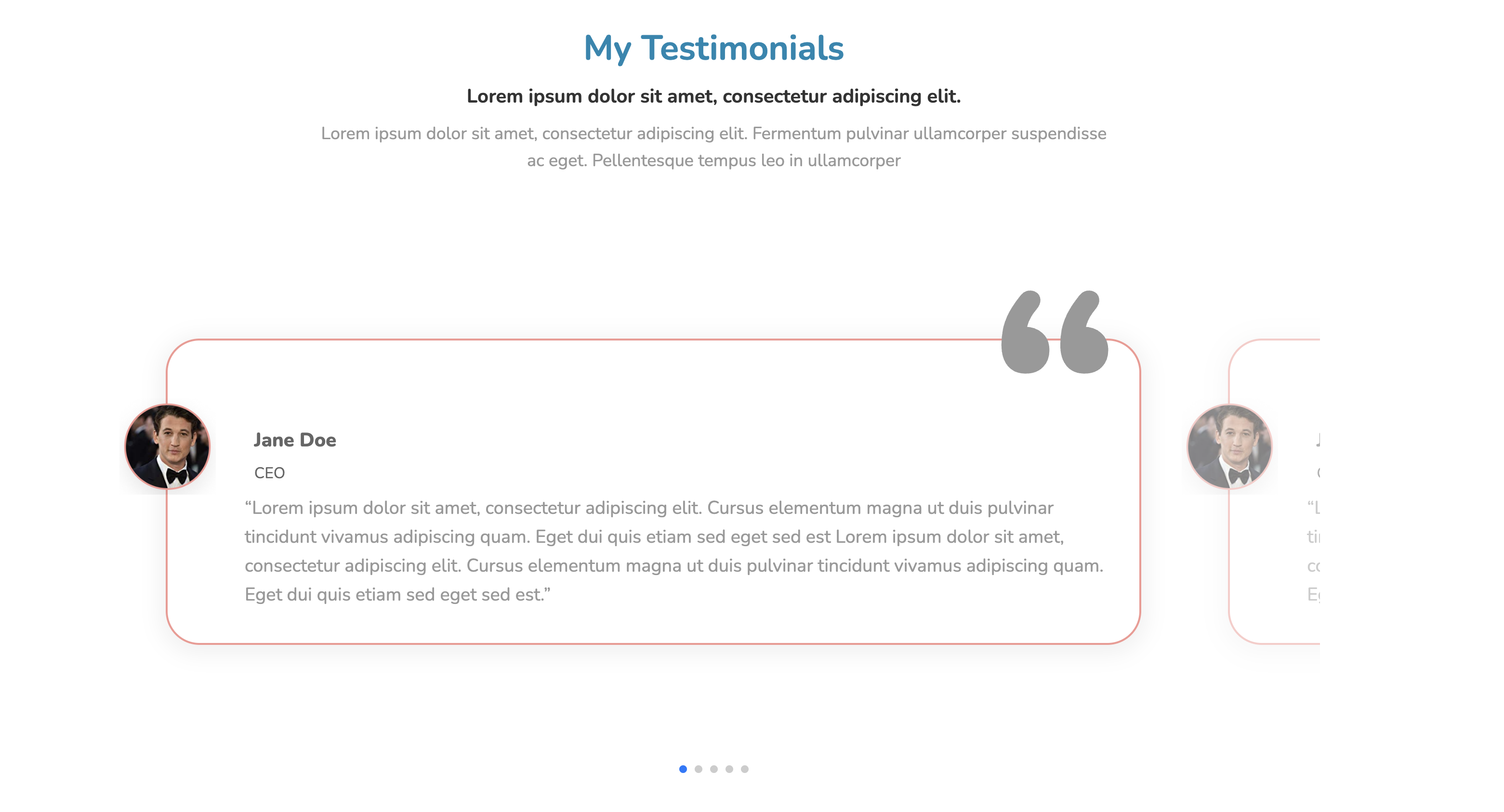
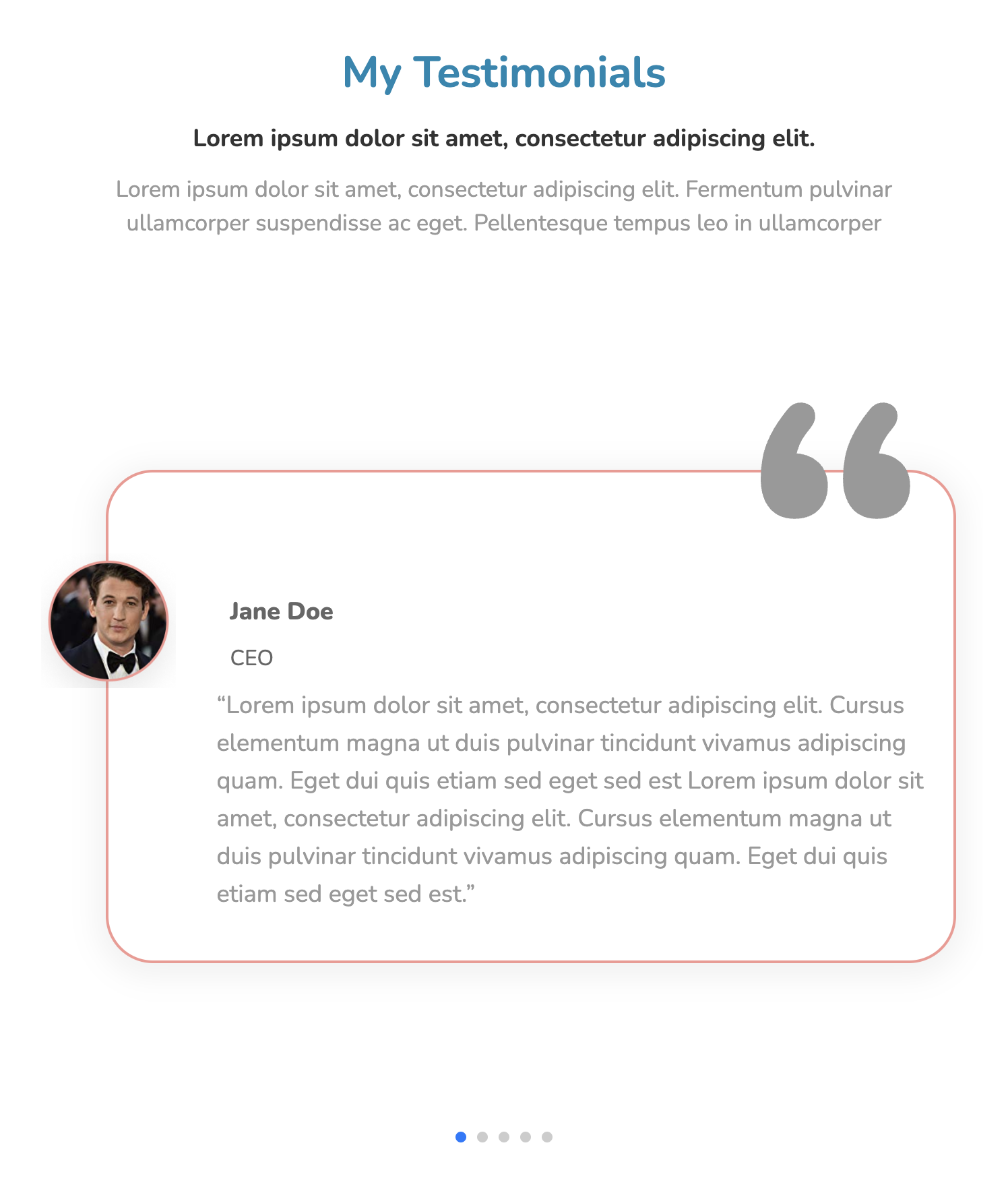
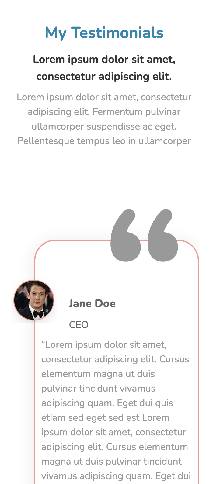
            My Testimonials


            Lorem ipsum dolor sit amet, consectetur adipiscing elit.


            Lorem ipsum dolor sit amet, consectetur adipiscing elit. Fermentum pulvinar ullamcorper suspendisse ac eget. Pellentesque tempus leo in ullamcorper


                “


                Jane Doe


                CEO


                “Lorem ipsum dolor sit amet, consectetur adipiscing elit. Cursus elementum magna ut duis pulvinar tincidunt vivamus adipiscing quam. Eget dui quis etiam sed eget sed est Lorem ipsum dolor sit amet, consectetur adipiscing elit. Cursus elementum magna ut duis pulvinar tincidunt vivamus adipiscing quam. Eget dui quis etiam sed eget sed est.”


                Jane Doe


                “


                CEO


                “Lorem ipsum dolor sit amet, consectetur adipiscing elit. Cursus elementum magna ut duis pulvinar tincidunt vivamus adipiscing quam. Eget dui quis etiam sed eget sed est Lorem ipsum dolor sit amet, consectetur adipiscing elit. Cursus elementum magna ut duis pulvinar tincidunt vivamus adipiscing quam. Eget dui quis etiam sed eget sed est.”
          * {
    font-family: Nunito, sans-serif;
    }
    .text-blk {
    margin-top: 0px;
    margin-right: 0px;
    margin-bottom: 0px;
    margin-left: 0px;
    padding-top: 0px;
    padding-right: 0px;
    padding-bottom: 0px;
    padding-left: 0px;
    line-height: 25px;
    }
    .responsive-container-block {
    min-height: 75px;
    height: fit-content;
    width: 100%;
    padding-top: 10px;
    padding-right: 10px;
    padding-bottom: 10px;
    padding-left: 10px;
    display: flex;
    flex-wrap: wrap;
    margin-top: 0px;
    margin-right: auto;
    margin-bottom: 0px;
    margin-left: auto;
    justify-content: flex-start;
    }
    .responsive-container-block.bg {
    flex-direction: column;
    align-items: center;
    height: auto;
    max-width: 1500px;
    }
    .text-blk.title {
    font-size: 36px;
    line-height: 42px;
    font-weight: 700;
    color: rgb(244, 152, 146);
    padding-top: 0px;
    padding-right: 0px;
    padding-bottom: 0px;
    padding-left: 0px;
    margin-top: 40px;
    margin-right: 0px;
    margin-bottom: 12px;
    margin-left: 0px;
    }
    .container-block {
    min-height: 75px;
    height: fit-content;
    width: 100%;
    padding-top: 10px;
    padding-right: 10px;
    padding-bottom: 10px;
    padding-left: 10px;
    display: block;
    }
    .swiper-container {
    width: 85%;
    max-width: 1520px;
    height: auto;
    overflow-x: hidden;
    overflow-y: hidden;
    }
    .swiper-container .swiper-slide-active {
    opacity: 1 !important;
    }
    .swiper-slide {
    text-align: center;
    font-size: 18px;
    background-image: initial;
    background-position-x: initial;
    background-position-y: initial;
    background-size: initial;
    background-repeat-x: initial;
    background-repeat-y: initial;
    background-attachment: initial;
    background-origin: initial;
    background-clip: initial;
    background-color: rgb(255, 255, 255);
    display: flex;
    -webkit-box-pack: center;
    justify-content: center;
    -webkit-box-align: center;
    align-items: center;
    opacity: 0.5;
    margin-top: 50px;
    margin-right: 10px;
    margin-bottom: 0px;
    margin-left: 0px;
    padding-top: 0px;
    padding-right: 0px;
    padding-bottom: 0px;
    padding-left: 40px;
    }
    .swiper-slide-next>.content>.quotes {
    color: rgb(153, 153, 153);
    }
    .swiper-slide img {
    display: block;
    object-fit: cover;
    }
    .responsive-container-block.content {
    flex-direction: column;
    align-items: flex-start;
    box-shadow: rgba(0, 0, 0, 0.05) 0px 4px 20px 7px;
    position: relative;
    margin-top: 40px;
    margin-right: 20px;
    margin-bottom: 200px;
    margin-left: 20px;
    border-top-left-radius: 35px;
    border-top-right-radius: 35px;
    border-bottom-right-radius: 35px;
    border-bottom-left-radius: 35px;
    border-top-width: 2px;
    border-right-width: 2px;
    border-bottom-width: 2px;
    border-left-width: 2px;
    border-top-style: solid;
    border-right-style: solid;
    border-bottom-style: solid;
    border-left-style: solid;
    border-top-color: rgb(244, 152, 146);
    border-right-color: rgb(244, 152, 146);
    border-bottom-color: rgb(244, 152, 146);
    border-left-color: rgb(244, 152, 146);
    border-image-source: initial;
    border-image-slice: initial;
    border-image-width: initial;
    border-image-outset: initial;
    border-image-repeat: initial;
    padding-top: 10px;
    padding-right: 20px;
    padding-bottom: 10px;
    padding-left: 80px;
    }
    .text-blk.name {
    font-size: 20px;
    line-height: 27.28px;
    font-weight: 900;
    color: rgb(102, 102, 102);
    text-align: left;
    padding-top: 0px;
    padding-right: 10px;
    padding-bottom: 0px;
    padding-left: 10px;
    margin-top: 80px;
    margin-right: 0px;
    margin-bottom: 0px;
    margin-left: 0px;
    }
    .text-blk.desig {
    font-size: 16px;
    line-height: 21.82px;
    margin-top: 0px;
    margin-right: 0px;
    margin-bottom: 0px;
    margin-left: 0px;
    text-align: left;
    color: rgb(102, 102, 102);
    padding-top: 10px;
    padding-right: 10px;
    padding-bottom: 0px;
    padding-left: 10px;
    }
    .text-blk.info {
    font-size: 19px;
    line-height: 30px;
    text-align: left;
    color: rgb(153, 153, 153);
    margin-top: 10px;
    margin-right: 0px;
    margin-bottom: 25px;
    margin-left: 0px;
    }
    .text-blk.quotes {
    position: absolute;
    left: auto;
    font-size: 288px;
    line-height: 392.83px;
    top: -140px;
    font-weight: 900;
    color: rgb(153, 153, 153);
    margin-top: 0px;
    margin-right: 0px;
    margin-bottom: 0px;
    margin-left: 0px;
    right: 20px;
    }
    .container-block.swiper-button-prevs {
    width: auto;
    display: flex;
    flex-direction: row;
    justify-content: center;
    align-items: center;
    }
    .container-block.swiper-button-nexts {
    width: auto;
    display: flex;
    justify-content: center;
    flex-direction: row;
    align-items: center;
    }
    .responsive-container-block.person {
    margin-top: 0px;
    margin-right: 0px;
    margin-bottom: 30px;
    margin-left: 0px;
    }
    .responsive-cell-block.wk-desk-6.wk-ipadp-6.wk-tab-12.wk-mobile-12.info {
    min-height: auto;
    width: auto;
    display: flex;
    flex-direction: column;
    justify-content: center;
    margin-top: 0px;
    margin-right: 0px;
    margin-bottom: 0px;
    margin-left: 15px;
    }
    .quotes {
    color: rgb(241, 59, 103);
    }
    .text-blk.heading {
    font-size: 20px;
    line-height: 34.1px;
    text-align: center;
    color: rgb(51, 51, 51);
    font-weight: 700;
    margin-top: 0px;
    margin-right: 0px;
    margin-bottom: 8px;
    margin-left: 0px;
    padding-top: 0px;
    padding-right: 10px;
    padding-bottom: 0px;
    padding-left: 10px;
    }
    .text-blk.desc {
    max-width: 850px;
    font-size: 18px;
    line-height: 28.1px;
    color: rgb(153, 153, 153);
    text-align: center;
    margin-top: 0px;
    margin-right: 0px;
    margin-bottom: 80px;
    margin-left: 0px;
    padding-top: 0px;
    padding-right: 10px;
    padding-bottom: 0px;
    padding-left: 10px;
    }
    #ibvmy {
    color: black;
    width: 100px;
    height: 100px;
    position: absolute;
    top: 60px;
    left: -50px;
    z-index: 2;
    }
    .profile-image {
    color: black;
    width: 100px;
    height: 100px;
    position: absolute;
    top: 60px;
    left: -50px;
    z-index: 2;
    }
    .title {
    color: rgb(244, 152, 146);
    }
    .swiper-pagination {
    	position: relative;
    }
    .swiper-pagination .swiper-pagination-bullet {
    width: 28px;
    height: 4px;
    opacity: 0.1;
    border-top-left-radius: 0px;
    border-top-right-radius: 0px;
    border-bottom-right-radius: 0px;
    border-bottom-left-radius: 0px;
    }
    .swiper-pagination .swiper-pagination-bullet.swiper-pagination-bullet-active {
    background-image: initial;
    background-position-x: initial;
    background-position-y: initial;
    background-size: initial;
    background-repeat-x: initial;
    background-repeat-y: initial;
    background-attachment: initial;
    background-origin: initial;
    background-clip: initial;
    background-color: rgb(244, 152, 146);
    opacity: 1;
    }
    @media (max-width: 1024px) {
    .swiper-slide {
    opacity: 0.5;
    }
    }
    @media (max-width: 768px) {
    .swiper-slide {
    opacity: 0.5;
    }
    .swiper-container {
    min-width: 95%;
    }
    .swiper-slide {
    min-width: 100%;
    }
    .swiper-wrapper {
    min-width: 100%;
    }
    .text-blk.heading {
    font-size: 18px;
    }
    .text-blk.title {
    font-size: 32px;
    line-height: 40px;
    }
    .text-blk.desc {
    font-size: 17px;
    line-height: 25.1px;
    max-width: 600px;
    }
    .text-blk.info {
    font-size: 18px;
    line-height: 28px;
    }
    .text-blk.name {
    font-size: 18px;
    }
    }
    @media (max-width: 500px) {
    .swiper-slide {
    opacity: 0.5;
    }
    .responsive-container-block.content {
    padding-top: 10px;
    padding-right: 10px;
    padding-bottom: 10px;
    padding-left: 10px;
    width: 100%;
    margin-top: 40px;
    margin-right: 0px;
    margin-bottom: 200px;
    margin-left: 0px;
    }
    .swiper-container {
    min-width: 90%;
    }
    .swiper-slide {
    min-width: 100%;
    }
    .swiper-wrapper {
    min-width: 100%;
    }
    .profile-image {
    width: 75px;
    height: 75px;
    left: -40px;
    }
    .responsive-container-block.content {
    padding-top: 10px;
    padding-right: 10px;
    padding-bottom: 10px;
    padding-left: 35px;
    }
    .text-blk.info {
    margin-top: 10px;
    margin-right: 0px;
    margin-bottom: 25px;
    margin-left: -25px;
    font-size: 16px;
    line-height: 24px;
    }
    .text-blk.name {
    margin-top: 80px;
    margin-right: 0px;
    margin-bottom: 0px;
    margin-left: 10px;
    }
    .text-blk.desig {
    margin-top: 0px;
    margin-right: 0px;
    margin-bottom: 0px;
    margin-left: 10px;
    }
    .text-blk.desc {
    font-size: 16px;
    line-height: 24px;
    margin-top: 0px;
    margin-right: 0px;
    margin-bottom: 60px;
    margin-left: 0px;
    }
    .text-blk.heading {
    font-size: 18px;
    line-height: 28px;
    }
    .text-blk.title {
    font-size: 26px;
    line-height: 36px;
    }
    }
          var swiper = new Swiper(`.mySwiper`, {
                                slidesPerView: 3,
                                spaceBetween: 5,
                                pagination: {
                                el: `.swiper-pagination`,
                                clickable: true,
                                },
                                breakpoints: {

                                300: {
                                slidesPerView: 1
                                },

                                501: {
                                slidesPerView: 1
                                },

                                769: {
                                slidesPerView: 1.20,
                                spaceBetween: 10
                                },
                                1025: {
                                slidesPerView: 1.15,
                                spaceBetween: 10
                                },
                                }
                                });
@import url('https://fonts.googleapis.com/css2?family=Nunito:wght@200;300;400;600;700;800&display=swap');
*, *:before, *:after {
-moz-box-sizing: border-box;
-webkit-box-sizing: border-box;
box-sizing: border-box;
}
body {
margin: 0;
}
.wk-desk-1{
width: 8.333333%;
}
.wk-desk-2{
width: 16.666667%;
}
.wk-desk-3{
width: 25%;
}
.wk-desk-4{
width: 33.333333%;
}
.wk-desk-5{
width: 41.666667%;
}
.wk-desk-6{
width: 50%;
}
.wk-desk-7{
width: 58.333333%;
}
.wk-desk-8{
width: 66.666667%;
}
.wk-desk-9{
width: 75%;
}
.wk-desk-10{
width: 83.333333%;
}
.wk-desk-11{
width: 91.666667%;
}
.wk-desk-12{
width: 100%;
}
@media (max-width: 1024px) {
.wk-ipadp-1{
width: 8.333333%;
}
.wk-ipadp-2{
width: 16.666667%;
}
.wk-ipadp-3{
width: 25%;
}
.wk-ipadp-4{
width: 33.333333%;
}
.wk-ipadp-5{
width: 41.666667%;
}
.wk-ipadp-6{
width: 50%;
}
.wk-ipadp-7{
width: 58.333333%;
}
.wk-ipadp-8{
width: 66.666667%;
}
.wk-ipadp-9{
width: 75%;
}
.wk-ipadp-10{
width: 83.333333%;
}
.wk-ipadp-11{
width: 91.666667%;
}
.wk-ipadp-12{
width: 100%;
}
}
@media (max-width: 768px) {
.wk-tab-1{
width: 8.333333%;
}
.wk-tab-2{
width: 16.666667%;
}
.wk-tab-3{
width: 25%;
}
.wk-tab-4{
width: 33.333333%;
}
.wk-tab-5{
width: 41.666667%;
}
.wk-tab-6{
width: 50%;
}
.wk-tab-7{
width: 58.333333%;
}
.wk-tab-8{
width: 66.666667%;
}
.wk-tab-9{
width: 75%;
}
.wk-tab-10{
width: 83.333333%;
}
.wk-tab-11{
width: 91.666667%;
}
.wk-tab-12{
width: 100%;
}
}
@media (max-width: 500px) {
.wk-mobile-1{
width: 8.333333%;
}
.wk-mobile-2{
width: 16.666667%;
}
.wk-mobile-3{
width: 25%;
}
.wk-mobile-4{
width: 33.333333%;
}
.wk-mobile-5{
width: 41.666667%;
}
.wk-mobile-6{
width: 50%;
}
.wk-mobile-7{
width: 58.333333%;
}
.wk-mobile-8{
width: 66.666667%;
}
.wk-mobile-9{
width: 75%;
}
.wk-mobile-10{
width: 83.333333%;
}
.wk-mobile-11{
width: 91.666667%;
}
.wk-mobile-12{
width: 100%;
}
}
Reset
This iconified pricing table has a clean and flat design style. The content becomes horizontally scrollable by reducing the screen size. The mild color gradient from blue to green gives the table a catchy look.
View Code
HTML
CSS
JS
Responsive CSS
Output
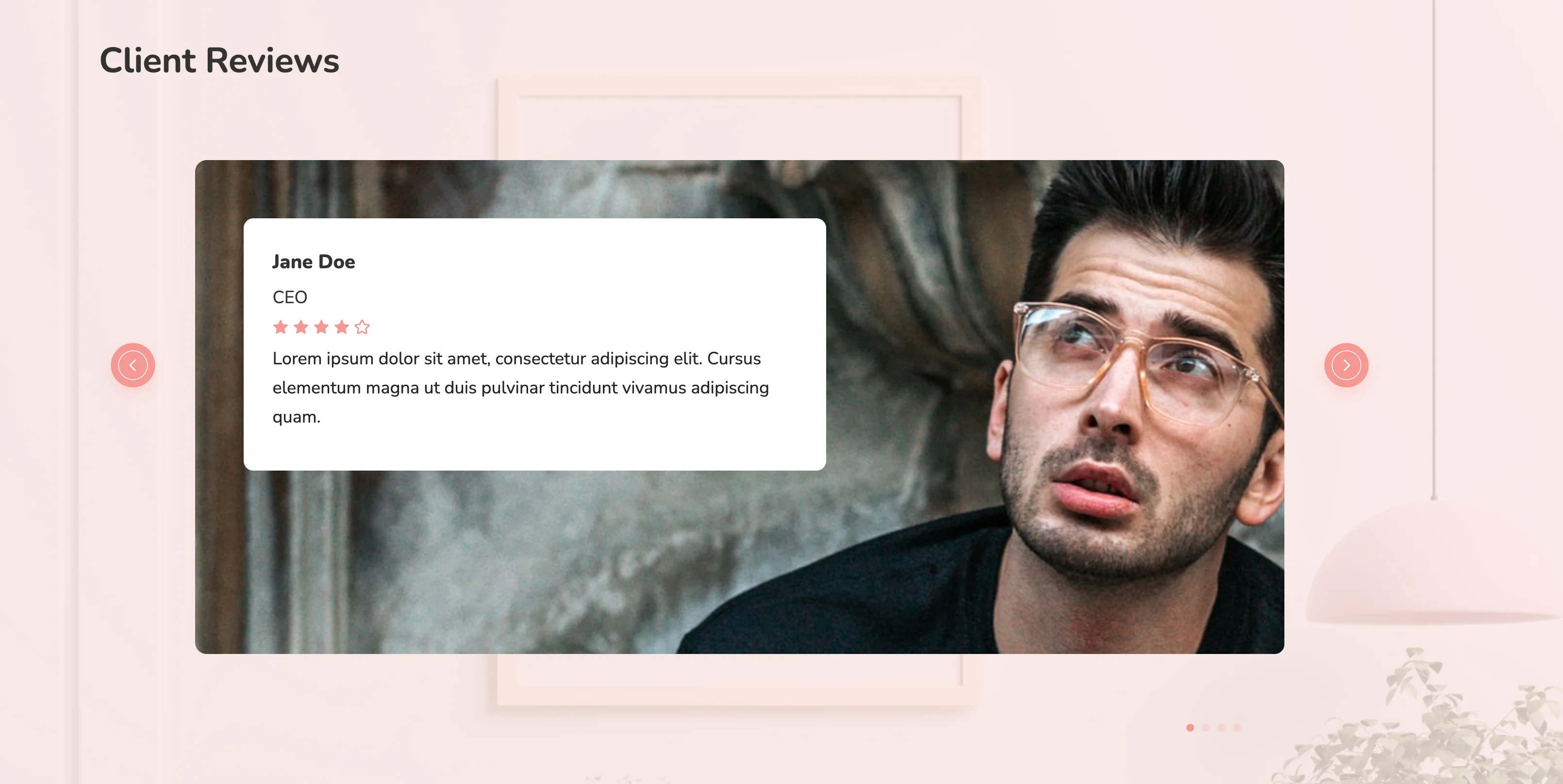
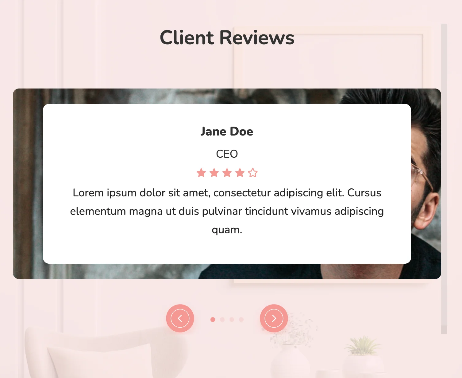
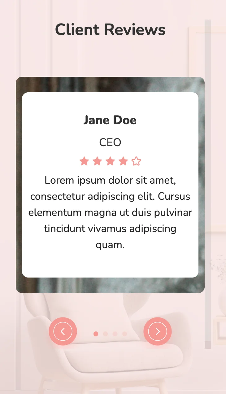
               Client Reviews


                   Jane Doe


                   CEO


                   Lorem ipsum dolor sit amet, consectetur adipiscing elit. Cursus elementum magna ut duis pulvinar tincidunt vivamus adipiscing quam.


                   Jane Doe


                   CEO


                   Lorem ipsum dolor sit amet, consectetur adipiscing elit. Cursus elementum magna ut duis pulvinar tincidunt vivamus adipiscing quam.


                   Jane Doe


                   CEO


                   Lorem ipsum dolor sit amet, consectetur adipiscing elit. Cursus elementum magna ut duis pulvinar tincidunt vivamus adipiscing quam.


                   Jane Doe


                   CEO


                   Lorem ipsum dolor sit amet, consectetur adipiscing elit. Cursus elementum magna ut duis pulvinar tincidunt vivamus adipiscing quam.
          * {
    font-family: Nunito, sans-serif;
    }
    .text-blk {
    margin-top: 0px;
    margin-right: 0px;
    margin-bottom: 0px;
    margin-left: 0px;
    line-height: 25px;
    padding-top: 0px;
    padding-right: 0px;
    padding-bottom: 0px;
    padding-left: 0px;
    }
    .swiper-pagination-bullets .swiper-pagination-bullet {
    margin-top: 0px;
    margin-right: 4px;
    margin-bottom: 0px;
    margin-left: 4px;
    background-image: initial;
    background-position-x: initial;
    background-position-y: initial;
    background-size: initial;
    background-repeat-x: initial;
    background-repeat-y: initial;
    background-attachment: initial;
    background-origin: initial;
    background-clip: initial;
    background-color: rgb(244, 152, 146);
    }
    .responsive-container-block {
    min-height: 75px;
    height: fit-content;
    width: 100%;
    padding-top: 10px;
    padding-right: 10px;
    padding-bottom: 10px;
    padding-left: 10px;
    display: flex;
    flex-wrap: wrap;
    margin-top: 0px;
    margin-right: auto;
    margin-bottom: 0px;
    margin-left: auto;
    justify-content: flex-start;
    }
    .responsive-container-block.bigContainer {
    background-image: url("https://workik-widget-assets.s3.amazonaws.com/widget-assets/images/id4re.svg");
    background-position-x: initial;
    background-position-y: initial;
    background-size: cover;
    background-attachment: initial;
    background-origin: initial;
    background-clip: initial;
    background-color: initial;
    background-repeat-x: no-repeat;
    background-repeat-y: no-repeat;
    padding-top: 0px;
    padding-right: 0px;
    padding-bottom: 0px;
    padding-left: 0px;
    }
    .responsive-container-block.Container {
    max-width: 1320px;
    padding-top: 0px;
    padding-right: 0px;
    padding-bottom: 0px;
    padding-left: 0px;
    margin-top: 50px;
    margin-right: auto;
    margin-bottom: 50px;
    margin-left: auto;
    flex-direction: column;
    justify-content: flex-start;
    align-items: flex-start;
    overflow-x: hidden;
    overflow-y: visible;
    }
    .text-blk.heading {
    font-size: 36px;
    line-height: 45px;
    font-weight: 700;
    color: rgb(51, 51, 51);
    text-align: center;
    }
    .firstRow {
    display: flex;
    flex-direction: row;
    justify-content: center;
    align-items: center;
    margin-top: 0px;
    margin-right: 0px;
    margin-bottom: 80px;
    margin-left: 0px;
    }
    .pinkBG {
    width: 100%;
    padding-top: 10px;
    padding-right: 30px;
    padding-bottom: 10px;
    padding-left: 30px;
    background-image: initial;
    background-position-x: initial;
    background-position-y: initial;
    background-size: cover;
    background-attachment: initial;
    background-origin: initial;
    background-clip: initial;
    background-color: rgba(255, 235, 234, 0.8);
    background-repeat-x: no-repeat;
    background-repeat-y: no-repeat;
    height: 100%;
    }
    .responsive-container-block.cardContainer {
    width: 85%;
    border-top-left-radius: 10px;
    border-top-right-radius: 10px;
    border-bottom-right-radius: 10px;
    border-bottom-left-radius: 10px;
    background-image: url("https://workik-widget-assets.s3.amazonaws.com/widget-assets/images/id6.svg");
    opacity: 1;
    margin-top: 0px;
    margin-right: auto;
    margin-bottom: 100px;
    margin-left: auto;
    position: static;
    padding-top: 60px;
    padding-right: 10px;
    padding-bottom: 189px;
    padding-left: 50px;
    background-repeat-x: no-repeat;
    background-repeat-y: no-repeat;
    background-size: cover;
    }
    .text-blk.name {
    font-size: 20px;
    line-height: 30px;
    font-weight: 900;
    color: rgb(51, 51, 51);
    margin-top: 0px;
    margin-right: 0px;
    margin-bottom: 10px;
    margin-left: 0px;
    }
    .text-blk.position {
    font-size: 18px;
    line-height: 24px;
    color: rgb(51, 51, 51);
    margin-top: 0px;
    margin-right: 0px;
    margin-bottom: 10px;
    margin-left: 0px;
    }
    .text-blk.cardDescription {
    font-size: 18px;
    line-height: 30px;
    color: rgb(37, 37, 37);
    margin-top: 0px;
    margin-right: 0px;
    margin-bottom: 10px;
    margin-left: 0px;
    }
    .card {
    display: flex;
    flex-direction: column;
    justify-content: flex-start;
    align-items: flex-start;
    max-width: 600px;
    background-color: white;
    padding-top: 30px;
    padding-right: 30px;
    padding-bottom: 30px;
    padding-left: 30px;
    border-top-left-radius: 10px;
    border-top-right-radius: 10px;
    border-bottom-right-radius: 10px;
    border-bottom-left-radius: 10px;
    }
    .container-block {
    min-height: 75px;
    height: fit-content;
    width: 100%;
    padding-top: 10px;
    padding-right: 10px;
    padding-bottom: 10px;
    padding-left: 10px;
    display: block;
    }
    .swiper.mySwiper {
    width: 100%;
    position: relative;
    }
    .container-block {
    min-height: 75px;
    height: fit-content;
    width: 100%;
    padding-top: 10px;
    padding-right: 10px;
    padding-bottom: 10px;
    padding-left: 10px;
    display: block;
    }
    .btns {
    display: flex;
    flex-direction: row-reverse;
    align-items: center;
    justify-content: space-between;
    width: 100%;
    position: absolute;
    top: 30%;
    z-index: 100;
    }
    .prevBtn {
    width: 70px;
    height: 70px;
    cursor: pointer;
    }
    .swiper-button-prevs {
    width: auto;
    cursor: pointer;
    }
    .nextBtn {
    width: 70px;
    height: 70px;
    cursor: pointer;
    }
    .swiper-pagination.container-block {
    display: flex;
    justify-content: flex-end;
    align-items: flex-end;
    margin-top: 0px;
    margin-right: 0px;
    margin-bottom: 0px;
    margin-left: 0px;
    padding-top: 10px;
    padding-right: 140px;
    padding-bottom: 10px;
    padding-left: 10px;
    }
    .swiper-button-nexts {
    cursor: pointer;
    }
    .stars {
    margin-top: 0px;
    margin-right: 0px;
    margin-bottom: 10px;
    margin-left: 0px;
    }
    @media (max-width: 1024px) {
    .firstRow {
    flex-direction: column-reverse;
    }
    .responsive-container-block.Container {
    align-items: center;
    justify-content: center;
    }
    .btns {
    top: 90%;
    }
    .swiper-pagination {
    z-index: 101;
    }
    .swiper-pagination.container-block {
    width: 82px;
    margin-top: 0px;
    margin-right: 0px;
    margin-bottom: 0px;
    margin-left: auto;
    padding-top: 10px;
    padding-right: 10px;
    padding-bottom: 10px;
    padding-left: 10px;
    float: none;
    right: 170px;
    left: auto;
    }
    .btns {
    width: 223px;
    left: auto;
    margin-top: 0px;
    margin-right: 0px;
    margin-bottom: 0px;
    margin-left: auto;
    right: 100px;
    }
    .text-blk.heading {
    margin-top: 0px;
    margin-right: 0px;
    margin-bottom: 10px;
    margin-left: 0px;
    }
    }
    @media (max-width: 768px) {
    .btns {
    left: 50%;
    right: auto;
    transform: translateX(-50%);
    }
    .swiper-pagination.container-block {
    left: 50%;
    right: auto;
    transform: translateX(-50%);
    }
    .responsive-container-block.cardContainer {
    padding-top: 60px;
    padding-right: 10px;
    padding-bottom: 60px;
    padding-left: 10px;
    }
    .card {
    justify-content: center;
    align-items: center;
    }
    .text-blk.name {
    text-align: center;
    }
    .text-blk.position {
    text-align: center;
    }
    .text-blk.cardDescription {
    text-align: center;
    }
    .cardContainer {
    width: 100%;
    }
    .card {
    width: 100%;
    }
    .responsive-container-block.cardContainer {
    width: 100%;
    margin-top: 0px;
    margin-right: 0px;
    margin-bottom: 90px;
    margin-left: 0px;
    padding-top: 25px;
    padding-right: 10px;
    padding-bottom: 25px;
    padding-left: 10px;
    }
    .card {
    margin-top: 0px;
    margin-right: auto;
    margin-bottom: 0px;
    margin-left: auto;
    }
    .responsive-container-block.bigContainer {
    background-repeat-x: no-repeat;
    background-repeat-y: no-repeat;
    background-size: cover;
    }
    .firstRow {
    margin-top: 0px;
    margin-right: 0px;
    margin-bottom: 50px;
    margin-left: 0px;
    }
    .bigContainer {
    height: 100%;
    }
    .responsive-container-block.Container {
    overflow-y: visible;
    }
    .btns {
    bottom: 0px;
    }
    .text-blk.heading {
    font-size: 32px;
    }
    }
    @media (max-width: 500px) {
    .responsive-container-block.bigContainer {
    padding-top: 10px;
    padding-right: 20px;
    padding-bottom: 10px;
    padding-left: 20px;
    }
    .card {
    padding-top: 30px;
    padding-right: 10px;
    padding-bottom: 30px;
    padding-left: 10px;
    }
    .responsive-container-block.bigContainer {
    padding-top: 0px;
    padding-right: 0px;
    padding-bottom: 0px;
    padding-left: 0px;
    }
    .pinkBG {
    padding-top: 10px;
    padding-right: 30px;
    padding-bottom: 10px;
    padding-left: 30px;
    }
    .responsive-container-block.Container {
    margin-top: 30px;
    margin-right: 0px;
    margin-bottom: 30px;
    margin-left: 0px;
    }
    .text-blk.heading {
    font-size: 26px;
    line-height: 32px;
    }
    .text-blk.cardDescription {
    font-size: 17px;
    line-height: 26px;
    }
    .text-blk.name {
    font-size: 20px;
    line-height: 30px;
    }
    .text-blk.position {
    font-size: 18px;
    line-height: 23px;
    }
    }
          var swiper = new Swiper(`.mySwiper`, {
                                navigation: {
                                nextEl: `.swiper-button-nexts`,
                                prevEl: `.swiper-button-prevs`,
                                },
                                pagination: {
                                el: `.swiper-pagination`,
                                clickable: true,
                                },
                                breakpoints: {
                                200: {
                                slidesPerView: 1,
                                spaceBetween: 150,
                                },
                                }
                                });
@import url('https://fonts.googleapis.com/css2?family=Nunito:wght@200;300;400;600;700;800&display=swap');
*, *:before, *:after {
-moz-box-sizing: border-box;
-webkit-box-sizing: border-box;
box-sizing: border-box;
}
body {
margin: 0;
}
.wk-desk-1{
width: 8.333333%;
}
.wk-desk-2{
width: 16.666667%;
}
.wk-desk-3{
width: 25%;
}
.wk-desk-4{
width: 33.333333%;
}
.wk-desk-5{
width: 41.666667%;
}
.wk-desk-6{
width: 50%;
}
.wk-desk-7{
width: 58.333333%;
}
.wk-desk-8{
width: 66.666667%;
}
.wk-desk-9{
width: 75%;
}
.wk-desk-10{
width: 83.333333%;
}
.wk-desk-11{
width: 91.666667%;
}
.wk-desk-12{
width: 100%;
}
@media (max-width: 1024px) {
.wk-ipadp-1{
width: 8.333333%;
}
.wk-ipadp-2{
width: 16.666667%;
}
.wk-ipadp-3{
width: 25%;
}
.wk-ipadp-4{
width: 33.333333%;
}
.wk-ipadp-5{
width: 41.666667%;
}
.wk-ipadp-6{
width: 50%;
}
.wk-ipadp-7{
width: 58.333333%;
}
.wk-ipadp-8{
width: 66.666667%;
}
.wk-ipadp-9{
width: 75%;
}
.wk-ipadp-10{
width: 83.333333%;
}
.wk-ipadp-11{
width: 91.666667%;
}
.wk-ipadp-12{
width: 100%;
}
}
@media (max-width: 768px) {
.wk-tab-1{
width: 8.333333%;
}
.wk-tab-2{
width: 16.666667%;
}
.wk-tab-3{
width: 25%;
}
.wk-tab-4{
width: 33.333333%;
}
.wk-tab-5{
width: 41.666667%;
}
.wk-tab-6{
width: 50%;
}
.wk-tab-7{
width: 58.333333%;
}
.wk-tab-8{
width: 66.666667%;
}
.wk-tab-9{
width: 75%;
}
.wk-tab-10{
width: 83.333333%;
}
.wk-tab-11{
width: 91.666667%;
}
.wk-tab-12{
width: 100%;
}
}
@media (max-width: 500px) {
.wk-mobile-1{
width: 8.333333%;
}
.wk-mobile-2{
width: 16.666667%;
}
.wk-mobile-3{
width: 25%;
}
.wk-mobile-4{
width: 33.333333%;
}
.wk-mobile-5{
width: 41.666667%;
}
.wk-mobile-6{
width: 50%;
}
.wk-mobile-7{
width: 58.333333%;
}
.wk-mobile-8{
width: 66.666667%;
}
.wk-mobile-9{
width: 75%;
}
.wk-mobile-10{
width: 83.333333%;
}
.wk-mobile-11{
width: 91.666667%;
}
.wk-mobile-12{
width: 100%;
}
}
Reset
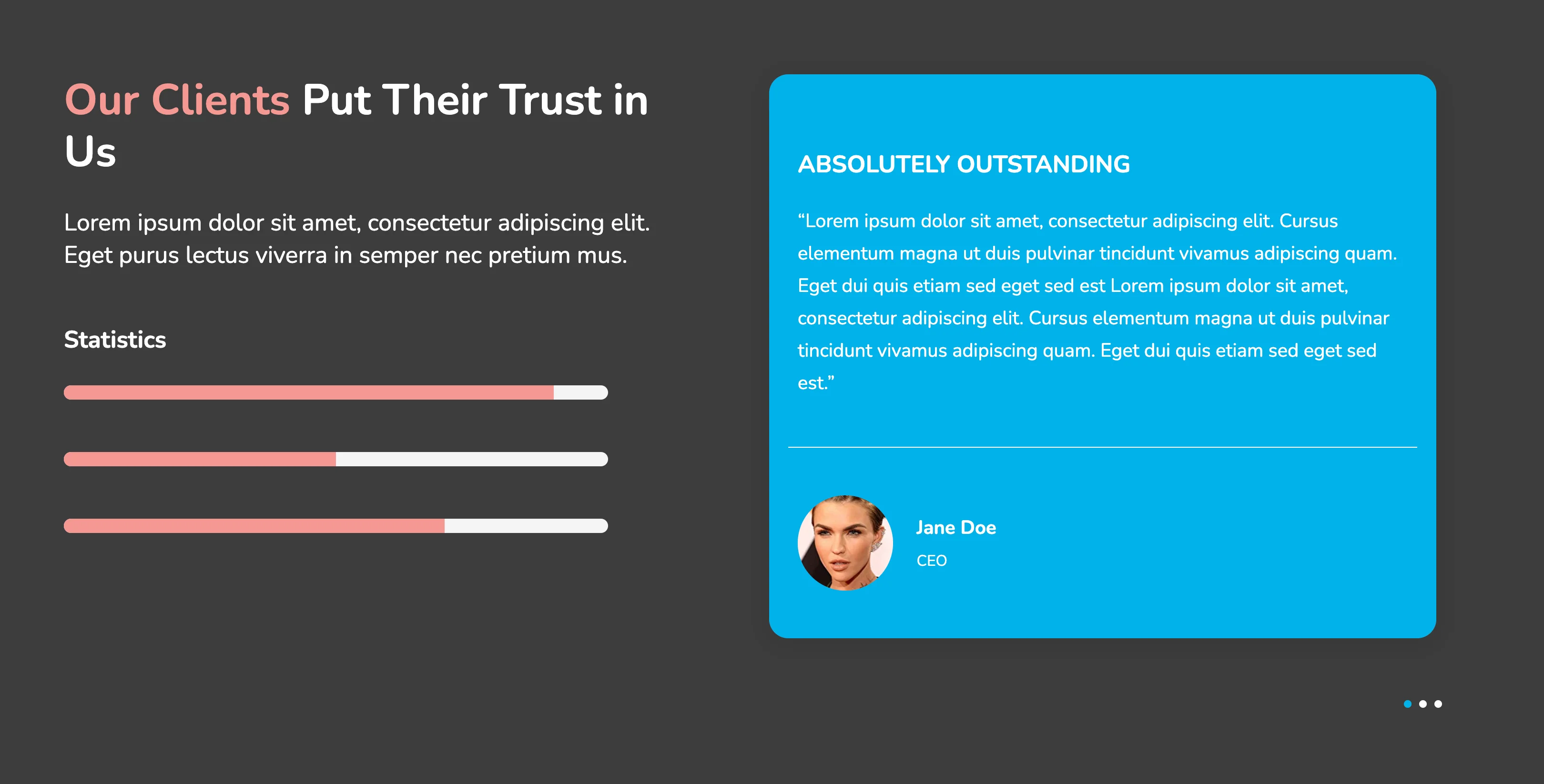
.webp)
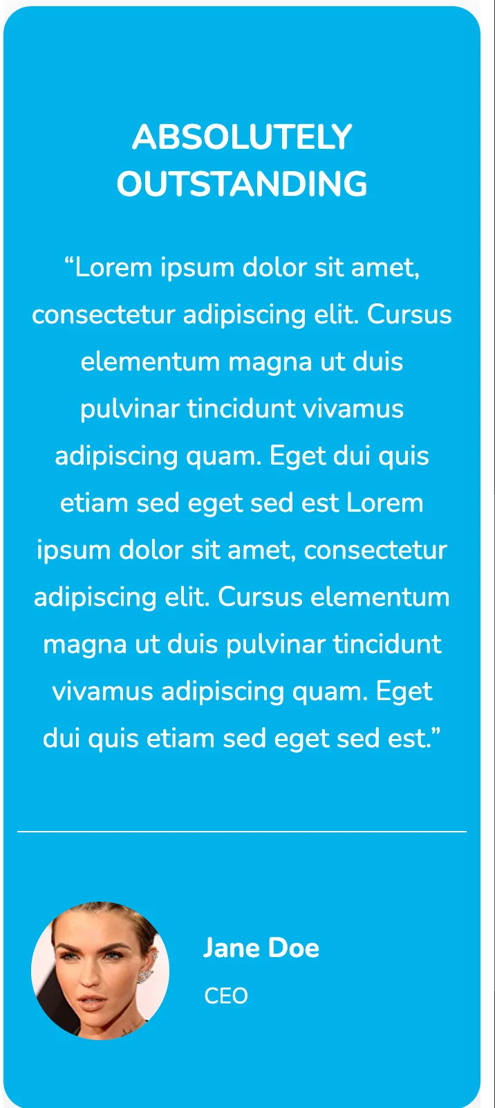
This responsive HTML5 and CSS3 pricing table is an elegant design that is suitable for any business. Its dark background and the sleek design on the bottom-right edge of each card add to the richness of the table. Both monthly and annual services are displayed on the same page which eliminates the need for a toggle switch. The user, on clicking the button, is directed to the sign-up page.
View Code
HTML
CSS
JS
Responsive CSS
Output
                ABSOLUTELY OUTSTANDING


                “Lorem ipsum dolor sit amet, consectetur adipiscing elit. Cursus elementum magna ut duis pulvinar tincidunt vivamus adipiscing quam. Eget dui quis etiam sed eget sed est Lorem ipsum dolor sit amet, consectetur adipiscing elit. Cursus elementum magna ut duis pulvinar tincidunt vivamus adipiscing quam. Eget dui quis etiam sed eget sed est.”


                  Jane Doe


                  CEO


              Our Clients

               Put Their Trust in Us


             Lorem ipsum dolor sit amet, consectetur adipiscing elit. Eget purus lectus viverra in semper nec pretium mus.


             Statistics
          * {
    font-family: Nunito, sans-serif;
    }
    .text-blk {
    margin-top: 0px;
    margin-right: 0px;
    margin-bottom: 0px;
    margin-left: 0px;
    padding-top: 10px;
    padding-right: 10px;
    padding-bottom: 10px;
    padding-left: 10px;
    line-height: 25px;
    }
    .responsive-cell-block {
    min-height: 75px;
    }
    .responsive-container-block {
    min-height: 75px;
    height: fit-content;
    width: 100%;
    padding-top: 10px;
    padding-right: 10px;
    padding-bottom: 10px;
    padding-left: 10px;
    display: flex;
    flex-wrap: wrap;
    margin-top: 0px;
    margin-right: auto;
    margin-bottom: 0px;
    margin-left: auto;
    justify-content: flex-start;
    }
    .responsive-container-block.bg {
    flex-direction: row-reverse;
    align-items: flex-start;
    height: auto;
    max-width: 1500px;
    justify-content: space-between;
    background-color: rgb(60, 60, 60);
    }
    .text-blk.title {
    font-size: 20px;
    line-height: 27.28px;
    font-weight: 700;
    color: rgb(0, 135, 177);
    padding-top: 10px;
    padding-right: 10px;
    padding-bottom: 5px;
    padding-left: 10px;
    width: 530px;
    text-align: left;
    max-width: 100%;
    margin-top: 40px;
    margin-right: 0px;
    margin-bottom: 0px;
    margin-left: 0px;
    }
    .container-block {
    min-height: 75px;
    height: fit-content;
    width: 100%;
    padding-top: 10px;
    padding-right: 10px;
    padding-bottom: 10px;
    padding-left: 10px;
    display: block;
    }
    .swiper-container {
    width: 50%;
    max-width: 50%;
    height: auto;
    margin-left: 0px;
    margin-right: 0px;
    overflow: hidden;
    }
    .swiper-slide {
    text-align: center;
    font-size: 18px;
    background-image: initial;
    background-position-x: initial;
    background-position-y: initial;
    background-size: initial;
    background-repeat-x: initial;
    background-repeat-y: initial;
    background-attachment: initial;
    background-origin: initial;
    background-clip: initial;
    display: flex;
    -webkit-box-pack: center;
    justify-content: center;
    -webkit-box-align: center;
    align-items: center;
    margin-top: 50px;
    margin-right: 10px;
    margin-bottom: 0px;
    margin-left: 0px;
    max-width: 100%;
    }
    .swiper-slide-next .content .quotes {
    color: rgb(241, 59, 103);
    }
    .swiper-slide img {
    display: block;
    width: 100%;
    height: 100%;
    object-fit: cover;
    }
    .responsive-container-block.content {
    flex-direction: column;
    align-items: center;
    box-shadow: rgba(0, 0, 0, 0.05) 0px 4px 20px 7px;
    padding-top: 10px;
    padding-right: 20px;
    padding-bottom: 10px;
    padding-left: 20px;
    position: relative;
    max-width: 100%;
    margin-top: 40px;
    margin-right: 20px;
    margin-bottom: 40px;
    margin-left: 20px;
    background-color: rgb(0, 178, 235);
    border-top-left-radius: 20px;
    border-top-right-radius: 20px;
    border-bottom-right-radius: 20px;
    border-bottom-left-radius: 20px;
    }
    .text-blk.name {
    font-size: 20px;
    line-height: 27.28px;
    font-weight: 700;
    color: rgb(255, 255, 255);
    text-align: left;
    margin-top: 0px;
    margin-right: 0px;
    margin-bottom: 0px;
    margin-left: 0px;
    padding-top: 0px;
    padding-right: 10px;
    padding-bottom: 0px;
    padding-left: 10px;
    }
    .text-blk.desig {
    font-size: 16px;
    line-height: 21.82px;
    margin-top: 0px;
    margin-right: 0px;
    margin-bottom: 0px;
    margin-left: 0px;
    text-align: left;
    color: rgb(255, 255, 255);
    padding-top: 10px;
    padding-right: 10px;
    padding-bottom: 0px;
    padding-left: 10px;
    }
    .text-blk.info {
    font-size: 20px;
    line-height: 34px;
    text-align: left;
    color: rgb(153, 153, 153);
    margin-top: 0px;
    margin-right: 0px;
    margin-bottom: 25px;
    margin-left: 0px;
    padding-top: 0px;
    padding-right: 10px;
    padding-bottom: 10px;
    padding-left: 10px;
    }
    .text-blk.quotes {
    position: absolute;
    left: 20px;
    font-size: 288px;
    line-height: 392.83px;
    top: -140px;
    font-weight: 900;
    color: rgb(234, 169, 71);
    margin-top: 0px;
    margin-right: 0px;
    margin-bottom: 0px;
    margin-left: 0px;
    }
    .container-block.swiper-button-prevs {
    width: auto;
    display: flex;
    flex-direction: row;
    justify-content: center;
    align-items: center;
    }
    .container-block.swiper-button-nexts {
    width: auto;
    display: flex;
    justify-content: center;
    flex-direction: row;
    align-items: center;
    }
    .responsive-container-block.person {
    margin-top: 0px;
    margin-right: 0px;
    margin-bottom: 30px;
    margin-left: 0px;
    }
    .responsive-cell-block.wk-desk-6.wk-ipadp-6.wk-tab-12.wk-mobile-12.icon {
    min-height: auto;
    height: auto;
    width: auto;
    display: flex;
    align-items: center;
    }
    .responsive-cell-block.wk-desk-6.wk-ipadp-6.wk-tab-12.wk-mobile-12.info {
    min-height: auto;
    width: auto;
    display: flex;
    flex-direction: column;
    justify-content: center;
    margin-top: 0px;
    margin-right: 0px;
    margin-bottom: 0px;
    margin-left: 15px;
    }
    .text-blk.heading {
    font-size: 25px;
    line-height: 34.1px;
    text-align: left;
    color: rgb(255, 255, 255);
    font-weight: 700;
    width: 100%;
    max-width: 100%;
    margin-top: 58px;
    margin-right: 0px;
    margin-bottom: 5px;
    margin-left: 0px;
    }
    .text-blk.desc {
    max-width: 100%;
    font-size: 20px;
    line-height: 34px;
    color: rgb(255, 255, 255);
    text-align: left;
    margin-top: 0px;
    margin-right: 0px;
    margin-bottom: 40px;
    margin-left: 0px;
    width: 100%;
    padding-top: 10px;
    padding-right: 10px;
    padding-bottom: 50px;
    padding-left: 10px;
    border-bottom-width: 1px;
    border-bottom-style: solid;
    border-bottom-color: rgb(255, 255, 255);
    }
    .responsive-container-block.card {
    width: 50%;
    min-height: 75px;
    position: relative;
    margin-top: 90px;
    margin-right: 0px;
    margin-bottom: 0px;
    margin-left: 0px;
    flex-direction: column;
    max-width: 45%;
    padding-top: 0px;
    padding-right: 10px;
    padding-bottom: 10px;
    padding-left: 10px;
    }
    .swiper-pagination.container-block {
    display: flex;
    padding-top: 10px;
    padding-right: 20px;
    padding-bottom: 10px;
    padding-left: 25px;
    justify-content: flex-end;
    position: relative;
    }
    .swiper-pagination .swiper-pagination-bullet {
    background: white;
    opacity: 1;
    }
    .swiper-pagination .swiper-pagination-bullet.swiper-pagination-bullet-active {
    background: rgb(0, 178, 235);
    }
    .text-blk.info.title {
    width: auto;
    font-size: 45px;
    line-height: 54.52px;
    color: rgb(244, 152, 146);
    margin-top: 0px;
    margin-right: 0px;
    margin-bottom: 10px;
    margin-left: 0px;
    }
    .text-blk.txt {
    font-size: 25px;
    line-height: 34.1px;
    color: rgb(255, 255, 255);
    margin-top: 0px;
    margin-right: 0px;
    margin-bottom: 35px;
    margin-left: 0px;
    }
    .text-blk.stat {
    font-size: 25px;
    line-height: 34.1px;
    color: rgb(255, 255, 255);
    font-weight: 700;
    margin-top: 0px;
    margin-right: 0px;
    margin-bottom: 20px;
    margin-left: 0px;
    }
    .responsive-container-block.outer {
    width: 571px;
    min-height: 15px;
    max-width: 90%;
    background-color: rgb(244, 244, 244);
    border-top-left-radius: 10px;
    border-top-right-radius: 10px;
    border-bottom-right-radius: 10px;
    border-bottom-left-radius: 10px;
    padding-top: 0px;
    padding-right: 0px;
    padding-bottom: 0px;
    padding-left: 0px;
    margin-top: 0px;
    margin-right: 0px;
    margin-bottom: 55px;
    margin-left: 10px;
    }
    .responsive-container-block.inner {
    background-color: rgb(244, 152, 146);
    margin-top: 0px;
    margin-right: 0px;
    margin-bottom: 0px;
    margin-left: 0px;
    min-height: 15px;
    border-top-left-radius: 10px;
    border-bottom-left-radius: 10px;
    padding-top: 0px;
    padding-right: 0px;
    padding-bottom: 0px;
    padding-left: 0px;
    }
    .responsive-container-block.inner.i2 {
    width: auto;
    }
    .responsive-container-block.inner.i1 {
    width: auto;
    }
    .responsive-container-block.inner.i3 {
    width: auto;
    }
    .responsive-container-block.black {
    position: absolute;
    height: 100%;
    background-color: rgb(60, 60, 60);
    mix-blend-mode: multiply;
    }
    @media (max-width: 1024px) {
    .swiper-container {
    min-width: 90%;
    }
    .swiper-slide {
    opacity: 1;
    }
    .responsive-container-block.bg {
    flex-direction: column-reverse;
    }
    .responsive-container-block.bg {
    align-items: center;
    }
    .responsive-container-block.card {
    max-width: 90%;
    min-width: 90%;
    }
    .swiper-pagination.container-block {
    justify-content: center;
    }
    .responsive-container-block.card {
    align-items: center;
    }
    .text-blk.txt {
    text-align: center;
    }
    .text-blk.info.title {
    text-align: center;
    }
    }
    @media (max-width: 768px) {
    .swiper-slide {
    opacity: 1;
    }
    .swiper-container {
    min-width: 95%;
    }
    .swiper-slide {
    min-width: 100%;
    }
    .swiper-wrapper {
    min-width: 100%;
    }
    .responsive-container-block.card {
    width: 100%;
    margin-top: 90px;
    margin-right: 0px;
    margin-bottom: 80px;
    margin-left: 0px;
    }
    .swiper-pagination.container-block {
    justify-content: center;
    }
    .text-blk.title {
    width: 100%;
    text-align: center;
    }
    .text-blk.heading {
    width: 100%;
    text-align: center;
    }
    .text-blk.desc {
    width: 100%;
    text-align: center;
    }
    .responsive-container-block.bg {
    justify-content: center;
    }
    .responsive-container-block.card {
    width: 90%;
    }
    .responsive-container-block.card {
    min-width: 95%;
    }
    .responsive-container-block.content {
    margin-top: 40px;
    margin-right: 20px;
    margin-bottom: 140px;
    margin-left: 20px;
    }
    .responsive-container-block.card {
    margin-top: 90px;
    margin-right: 0px;
    margin-bottom: 0px;
    margin-left: 0px;
    }
    }
    @media (max-width: 500px) {
    .swiper-slide {
    opacity: 1;
    }
    .responsive-container-block.content {
    padding-top: 10px;
    padding-right: 10px;
    padding-bottom: 10px;
    padding-left: 10px;
    width: 100%;
    margin-top: 40px;
    margin-right: 0px;
    margin-bottom: 200px;
    margin-left: 0px;
    }
    .swiper-container {
    min-width: 100%;
    }
    .swiper-slide {
    min-width: 100%;
    }
    .swiper-wrapper {
    min-width: 100%;
    }
    .responsive-container-block.card {
    width: 100%;
    }
    .responsive-container-block.card {
    min-width: 100%;
    }
    .text-blk.txt {
    font-size: 22px;
    line-height: 31px;
    }
    .text-blk.info.title {
    font-size: 40px;
    line-height: 50px;
    }
    }
          var swiper = new Swiper(".mySwiper", {
                                slidesPerView: 3,
                                spaceBetween: 5,
                                pagination: {
                                el: ".swiper-pagination",
                                clickable: true,
                                },
                                breakpoints: {

                                300: {
                                slidesPerView: 1
                                },

                                501: {
                                slidesPerView: 1
                                },

                                769: {
                                slidesPerView: 1,
                                spaceBetween: 10
                                },
                                1025: {
                                slidesPerView: 1,
                                spaceBetween: 10
                                },
                                }
                                });
                                var v1 = $(".i1").attr("data-pg");
                                $(".i1").animate({
                                width: v1
                                }, 2000);
                                var v2 = $(".i2").attr("data-pg");
                                $(".i2").animate({
                                width: v2
                                }, 2000);
                                var v3 = $(".i3").attr("data-pg");
                                $(".i3").animate({
                                width: v3
                                }, 2000);
@import url('https://fonts.googleapis.com/css2?family=Nunito:wght@200;300;400;600;700;800&display=swap');
*, *:before, *:after {
-moz-box-sizing: border-box;
-webkit-box-sizing: border-box;
box-sizing: border-box;
}
body {
margin: 0;
}
.wk-desk-1{
width: 8.333333%;
}
.wk-desk-2{
width: 16.666667%;
}
.wk-desk-3{
width: 25%;
}
.wk-desk-4{
width: 33.333333%;
}
.wk-desk-5{
width: 41.666667%;
}
.wk-desk-6{
width: 50%;
}
.wk-desk-7{
width: 58.333333%;
}
.wk-desk-8{
width: 66.666667%;
}
.wk-desk-9{
width: 75%;
}
.wk-desk-10{
width: 83.333333%;
}
.wk-desk-11{
width: 91.666667%;
}
.wk-desk-12{
width: 100%;
}
@media (max-width: 1024px) {
.wk-ipadp-1{
width: 8.333333%;
}
.wk-ipadp-2{
width: 16.666667%;
}
.wk-ipadp-3{
width: 25%;
}
.wk-ipadp-4{
width: 33.333333%;
}
.wk-ipadp-5{
width: 41.666667%;
}
.wk-ipadp-6{
width: 50%;
}
.wk-ipadp-7{
width: 58.333333%;
}
.wk-ipadp-8{
width: 66.666667%;
}
.wk-ipadp-9{
width: 75%;
}
.wk-ipadp-10{
width: 83.333333%;
}
.wk-ipadp-11{
width: 91.666667%;
}
.wk-ipadp-12{
width: 100%;
}
}
@media (max-width: 768px) {
.wk-tab-1{
width: 8.333333%;
}
.wk-tab-2{
width: 16.666667%;
}
.wk-tab-3{
width: 25%;
}
.wk-tab-4{
width: 33.333333%;
}
.wk-tab-5{
width: 41.666667%;
}
.wk-tab-6{
width: 50%;
}
.wk-tab-7{
width: 58.333333%;
}
.wk-tab-8{
width: 66.666667%;
}
.wk-tab-9{
width: 75%;
}
.wk-tab-10{
width: 83.333333%;
}
.wk-tab-11{
width: 91.666667%;
}
.wk-tab-12{
width: 100%;
}
}
@media (max-width: 500px) {
.wk-mobile-1{
width: 8.333333%;
}
.wk-mobile-2{
width: 16.666667%;
}
.wk-mobile-3{
width: 25%;
}
.wk-mobile-4{
width: 33.333333%;
}
.wk-mobile-5{
width: 41.666667%;
}
.wk-mobile-6{
width: 50%;
}
.wk-mobile-7{
width: 58.333333%;
}
.wk-mobile-8{
width: 66.666667%;
}
.wk-mobile-9{
width: 75%;
}
.wk-mobile-10{
width: 83.333333%;
}
.wk-mobile-11{
width: 91.666667%;
}
.wk-mobile-12{
width: 100%;
}
}
Reset
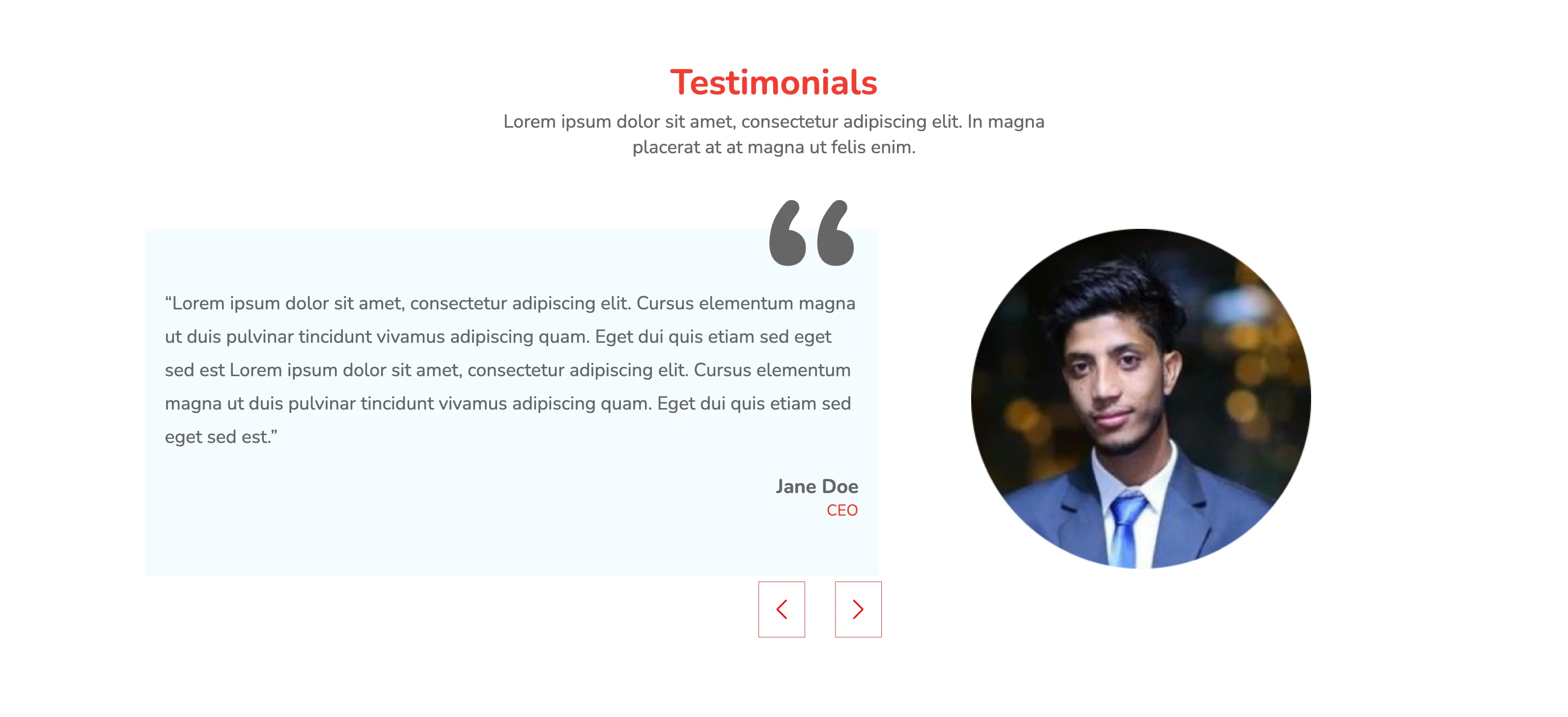
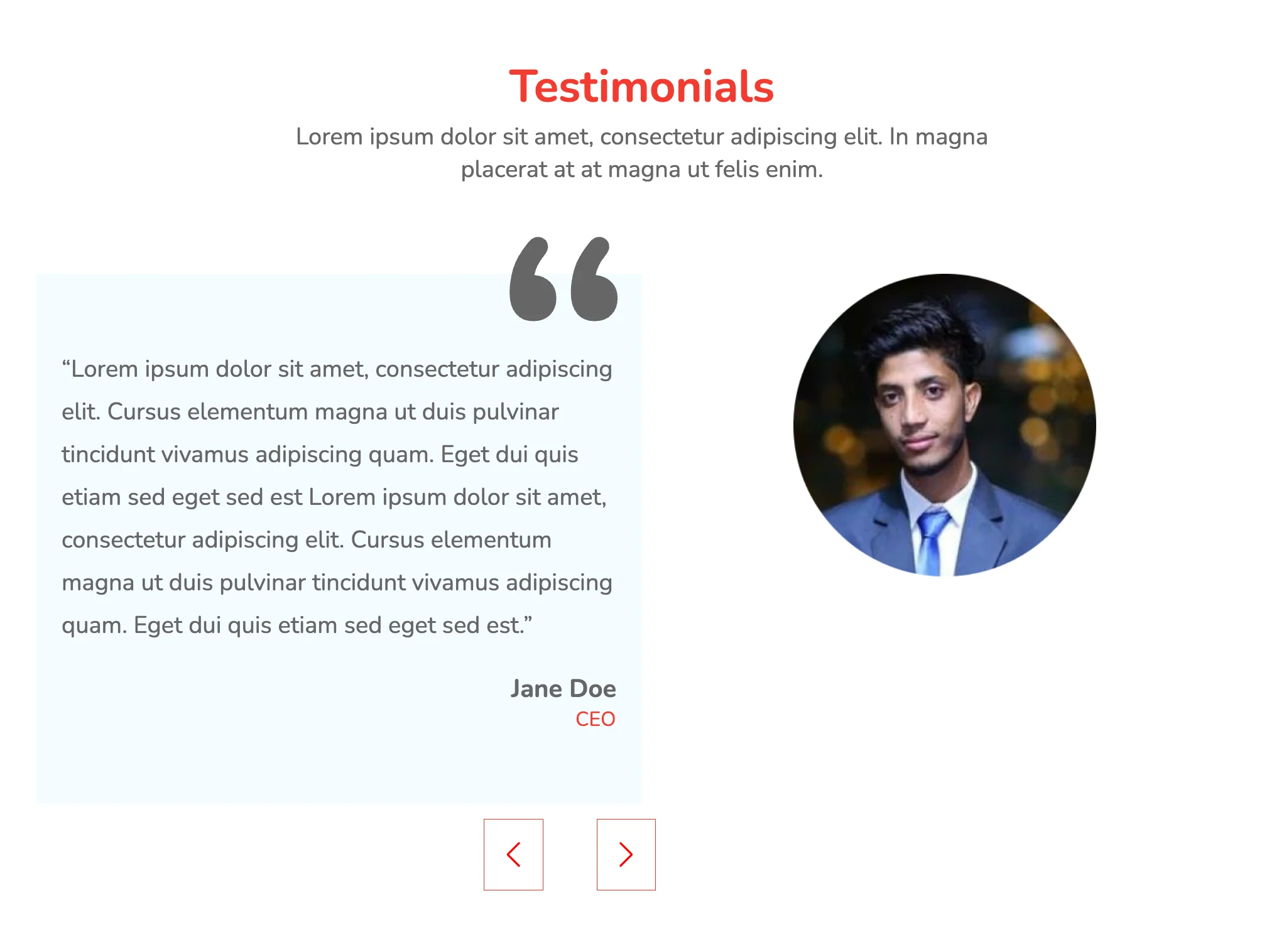
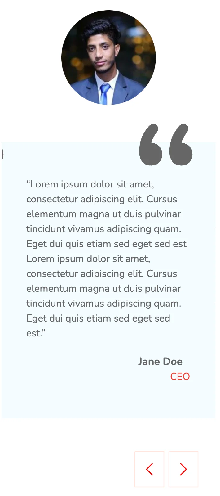
The above table has a much simpler layout and follows conventional design rules. The tabular toggle switch highlights the plan under focus with the help of a different background. Individual flex-based cards are vertically oriented and on reducing the screen width, fall into stack formation for easy browsing.
View Code
HTML
CSS
JS
Responsive CSS
Output
             Testimonials


             Lorem ipsum dolor sit amet, consectetur adipiscing elit. In magna placerat at at magna ut felis enim.


                    “Lorem ipsum dolor sit amet, consectetur adipiscing elit. Cursus elementum magna ut duis pulvinar tincidunt vivamus adipiscing quam. Eget dui quis etiam sed eget sed est Lorem ipsum dolor sit amet, consectetur adipiscing elit. Cursus elementum magna ut duis pulvinar tincidunt vivamus adipiscing quam. Eget dui quis etiam sed eget sed est.”


                    Jane Doe


                    CEO
          .responsive-cell-block {
    min-height: 75px;
}

* {
    font-family: Nunito;
}

.text-blk {
    margin-top: 0px;
    margin-right: 0px;
    margin-bottom: 0px;
    margin-left: 0px;
    padding-top: 0px;
    padding-right: 0px;
    padding-bottom: 0px;
    padding-left: 0px;
    line-height: 25px;
}

.swiper-button-prev::after {
    color: red;
    font-size: 20px;
    border-top-width: 0.75px;
    border-right-width: 0.75px;
    border-bottom-width: 0.75px;
    border-left-width: 0.75px;
    border-top-style: solid;
    border-right-style: solid;
    border-bottom-style: solid;
    border-left-style: solid;
    border-top-color: rgb(244, 59, 47);
    border-right-color: rgb(244, 59, 47);
    border-bottom-color: rgb(244, 59, 47);
    border-left-color: rgb(244, 59, 47);
    border-image-source: initial;
    border-image-slice: initial;
    border-image-width: initial;
    border-image-outset: initial;
    border-image-repeat: initial;
    padding-top: 18px;
    padding-right: 18px;
    padding-bottom: 18px;
    padding-left: 18px;
}

.swiper-button-next::after {
    color: red;
    font-size: 20px;
    border-top-width: 0.75px;
    border-right-width: 0.75px;
    border-bottom-width: 0.75px;
    border-left-width: 0.75px;
    border-top-style: solid;
    border-right-style: solid;
    border-bottom-style: solid;
    border-left-style: solid;
    border-top-color: rgb(244, 59, 47);
    border-right-color: rgb(244, 59, 47);
    border-bottom-color: rgb(244, 59, 47);
    border-left-color: rgb(244, 59, 47);
    border-image-source: initial;
    border-image-slice: initial;
    border-image-width: initial;
    border-image-outset: initial;
    border-image-repeat: initial;
    padding-top: 18px;
    padding-right: 18px;
    padding-bottom: 18px;
    padding-left: 18px;
}

.responsive-container-block {
    min-height: 75px;
    height: fit-content;
    width: 100%;
    padding-top: 10px;
    padding-right: 10px;
    padding-bottom: 10px;
    padding-left: 10px;
    display: flex;
    flex-wrap: wrap;
    margin-top: 0px;
    margin-right: auto;
    margin-bottom: 0px;
    margin-left: auto;
    justify-content: flex-start;
}

.heading {
    font-weight: bold;
    font-size: 25px;
    line-height: 34px;
    color: rgb(244, 59, 47);
}

.desc {
    max-width: 606px;
    width: 100%;
    font-weight: normal;
    font-size: 20px;
    line-height: 27px;
    text-align: center;
    color: rgb(102, 102, 102);
}

.responsive-container-block.Container {
    flex-direction: column;
    max-width: 1320px;
    overflow-x: hidden;
    overflow-y: hidden;
    margin-top: 50px;
    margin-right: 0px;
    margin-bottom: 50px;
    margin-left: 0px;
}

.text-blk.desc {
    margin-top: 0px;
    margin-right: auto;
    margin-bottom: 60px;
    margin-left: auto;
    font-size: 19px;
    line-height: 26px;
}

.para1 {
    width: 100%;
    font-style: normal;
    font-weight: normal;
    font-size: 19px;
    line-height: 34px;
    color: rgb(102, 102, 102);
}

.name {
    width: 84px;
    font-weight: bold;
    font-size: 20px;
    line-height: 27px;
    color: rgb(102, 102, 102);
    margin-top: 20px;
    margin-right: 0px;
    margin-bottom: 0px;
    margin-left: auto;
}

.role {
    width: 33px;
    font-weight: normal;
    font-size: 16px;
    line-height: 22px;
    color: rgb(244, 59, 47);
    margin-top: 0px;
    margin-right: 0px;
    margin-bottom: 16px;
    margin-left: auto;
}

.responsive-cell-block.wk-tab-1.wk-mobile-1.wk-ipadp-1.wk-desk-6 {
    float: none;
    text-align: left;
    position: relative;
}

.responsive-cell-block.wk-tab-1.wk-mobile-1.wk-ipadp-1.wk-desk-6.img-section {
    text-align: center;
}

.card {
    background-color: rgb(244, 252, 255);
    position: relative;
    padding-top: 40px;
    padding-right: 20px;
    padding-bottom: 40px;
    padding-left: 20px;
}

.text-blk.heading {
    text-align: center;
    font-size: 36px;
    margin-top: 0px;
    margin-right: 0px;
    margin-bottom: 10px;
    margin-left: 0px;
    line-height: 34px;
}

.personimg {
    object-fit: cover;
}

.responsive-cell-block.wk-desk-6.img-section.wk-ipadp-6.wk-tab-6.wk-mobile-12 {
    text-align: center;
}

.card-section {
    display: flex;
    flex-direction: row;
}

.responsive-cell-block.img-section.wk-ipadp-6.wk-tab-6.wk-mobile-12.wk-desk-5 {
    text-align: center;
}

.container-block {
    min-height: 75px;
    height: fit-content;
    width: 100%;
    padding-top: 10px;
    padding-right: 10px;
    padding-bottom: 10px;
    padding-left: 10px;
    display: block;
}

.swiper {
    width: 100%;
    height: 100%;
    overflow-x: visible;
    overflow-y: visible;
    position: relative;
}

.swiper-button-next.container-block {
    bottom: 0px;
    top: 100%;
    left: 54%;
    margin-top: 0px;
    margin-right: 0px;
    margin-bottom: 0px;
    margin-left: 0px;
    margin: 26px 0 0 0;
    width: 50px;
}

.swiper-button-prev.container-block {
    top: 100%;
    left: 48%;
    width: auto;
    margin-top: 0px;
    margin-right: 0px;
    margin-bottom: 0px;
    margin-left: 0px;
    bottom: 0;
    margin: 26px 0 0 0;
}

.responsive-container-block.testimonial-section {
    overflow-x: visible;
    overflow-y: visible;
    position: relative;
    max-width: 1500px;
    padding-top: 10px;
    padding-right: 10px;
    padding-bottom: 65px;
    padding-left: 10px;
}

.quotes {
    position: absolute;
    top: -30px;
    right: 0px;
    left: 85%;
}

.responsive-container-block.bigContainer {
    justify-content: center;
}

.swiper-button-next {
    padding: 0 0 0 0;
    min-height: auto;
}

.swiper-button-prev {
    padding: 0 0 0 0;
    min-height: auto;
    top: 100%;
}

@media (max-width: 1024px) {
    .personimg {
        width: 50%;
        text-align: center;
    }

    .responsive-cell-block.wk-tab-1.wk-mobile-1.wk-desk-6.img-section.wk-ipadp-6 {
        display: block;
        flex-direction: row-reverse;
        text-align: center;
    }

    .responsive-cell-block.wk-desk-6.img-section.wk-ipadp-6.wk-tab-6.wk-mobile-12 {
        text-align: center;
    }

    .swiper-button-next.container-block {
        top: 100%;
        left: 45%;
    }

    .swiper-button-prev.container-block {
        top: 100%;
        left: 38%;
    }

    .card-section {
        overflow-x: visible;
        overflow-y: visible;
    }

    .quotes {
        left: 78%;
    }

    .swiper-button-next.container-block {
        left: 445.8px;
    }

    .swiper-button-prev.container-block {
        left: 356px;
    }

    .personimg.image-block {
        display: block;
        margin: 0 auto 0 auto;
    }

    .img-section {
        display: block;
    }
}

@media (max-width: 768px) {
    .responsive-cell-block.wk-mobile-1.wk-desk-6.img-section.wk-ipadp-6.wk-tab-6 {
        background-position-x: 0%;
        background-position-y: 0%;
        background-size: auto;
        text-align: center;
        padding-top: 50px;
        padding-right: 0px;
        padding-bottom: 0px;
        padding-left: 0px;
    }

    .personimg {
        background-position-x: 50%;
        background-position-y: 50%;
    }

    .swiper-button-prev.container-block {
        top: 100%;
        left: 33%;
    }

    .swiper-button-next.container-block {
        top: 100%;
        left: 43%;
    }

    .quotes {
        left: 70%;
    }

    .text-blk.heading {
        font-size: 32px;
    }

    .text-blk.desc {
        font-size: 18px;
    }

    .para1 {
        line-height: 28px;
        font-size: 18px;
    }
}

@media (max-width: 500px) {
    .text-blk.heading {
        width: 100%;
        font-size: 26px;
    }

    .card-section {
        flex-direction: column-reverse;
    }

    .responsive-cell-block.img-section.wk-ipadp-6.wk-tab-6.wk-mobile-12.wk-desk-5 {
        padding-top: 20px;
        padding-right: 0px;
        padding-bottom: 60px;
        padding-left: 0px;
    }

    .swiper-button-next.container-block {
        top: 100%;
        right: 10px;
        left: auto;
    }

    .responsive-cell-block.wk-ipadp-6.wk-tab-6.wk-mobile-12.wk-desk-7 {
        padding-top: 0px;
        padding-right: 0px;
        padding-bottom: 80px;
        padding-left: 0px;
    }

    .swiper-button-prev.container-block {
        top: 100%;
        left: 60%;
    }

    .quotes {
        left: 66%;
    }

    .swiper-slide {
        position: static;
    }

    .text-blk.desc {
        font-size: 16px;
        line-height: 22px;
    }

    .para1 {
        font-size: 16px;
        line-height: 24px;
    }

    .name {
        font-size: 17px;
    }

    #i5d9 {
        padding: 0 0 20px 0;
    }
}
          var swiper = new Swiper(`.swiper`, {
    direction: 'horizontal',
    loop: true,
    navigation: {
        nextEl: `.swiper-button-next`,
        prevEl: `.swiper-button-prev`,
    },
    breakpoints: {

        768: {
            slidesPerView: 1,
            spaceBetween: 30,
        },
        1500: {
            slidesPerView: 1,
            spaceBetween: 30,

        },
        500: {
            slidesPerView: 1,
            spaceBetween: 30,

        },

    }

});
@import url('https://fonts.googleapis.com/css2?family=Nunito:wght@200;300;400;600;700;800&display=swap');
*, *:before, *:after {
-moz-box-sizing: border-box;
-webkit-box-sizing: border-box;
box-sizing: border-box;
}
body {
margin: 0;
}
.wk-desk-1{
width: 8.333333%;
}
.wk-desk-2{
width: 16.666667%;
}
.wk-desk-3{
width: 25%;
}
.wk-desk-4{
width: 33.333333%;
}
.wk-desk-5{
width: 41.666667%;
}
.wk-desk-6{
width: 50%;
}
.wk-desk-7{
width: 58.333333%;
}
.wk-desk-8{
width: 66.666667%;
}
.wk-desk-9{
width: 75%;
}
.wk-desk-10{
width: 83.333333%;
}
.wk-desk-11{
width: 91.666667%;
}
.wk-desk-12{
width: 100%;
}
@media (max-width: 1024px) {
.wk-ipadp-1{
width: 8.333333%;
}
.wk-ipadp-2{
width: 16.666667%;
}
.wk-ipadp-3{
width: 25%;
}
.wk-ipadp-4{
width: 33.333333%;
}
.wk-ipadp-5{
width: 41.666667%;
}
.wk-ipadp-6{
width: 50%;
}
.wk-ipadp-7{
width: 58.333333%;
}
.wk-ipadp-8{
width: 66.666667%;
}
.wk-ipadp-9{
width: 75%;
}
.wk-ipadp-10{
width: 83.333333%;
}
.wk-ipadp-11{
width: 91.666667%;
}
.wk-ipadp-12{
width: 100%;
}
}
@media (max-width: 768px) {
.wk-tab-1{
width: 8.333333%;
}
.wk-tab-2{
width: 16.666667%;
}
.wk-tab-3{
width: 25%;
}
.wk-tab-4{
width: 33.333333%;
}
.wk-tab-5{
width: 41.666667%;
}
.wk-tab-6{
width: 50%;
}
.wk-tab-7{
width: 58.333333%;
}
.wk-tab-8{
width: 66.666667%;
}
.wk-tab-9{
width: 75%;
}
.wk-tab-10{
width: 83.333333%;
}
.wk-tab-11{
width: 91.666667%;
}
.wk-tab-12{
width: 100%;
}
}
@media (max-width: 500px) {
.wk-mobile-1{
width: 8.333333%;
}
.wk-mobile-2{
width: 16.666667%;
}
.wk-mobile-3{
width: 25%;
}
.wk-mobile-4{
width: 33.333333%;
}
.wk-mobile-5{
width: 41.666667%;
}
.wk-mobile-6{
width: 50%;
}
.wk-mobile-7{
width: 58.333333%;
}
.wk-mobile-8{
width: 66.666667%;
}
.wk-mobile-9{
width: 75%;
}
.wk-mobile-10{
width: 83.333333%;
}
.wk-mobile-11{
width: 91.666667%;
}
.wk-mobile-12{
width: 100%;
}
}
Reset
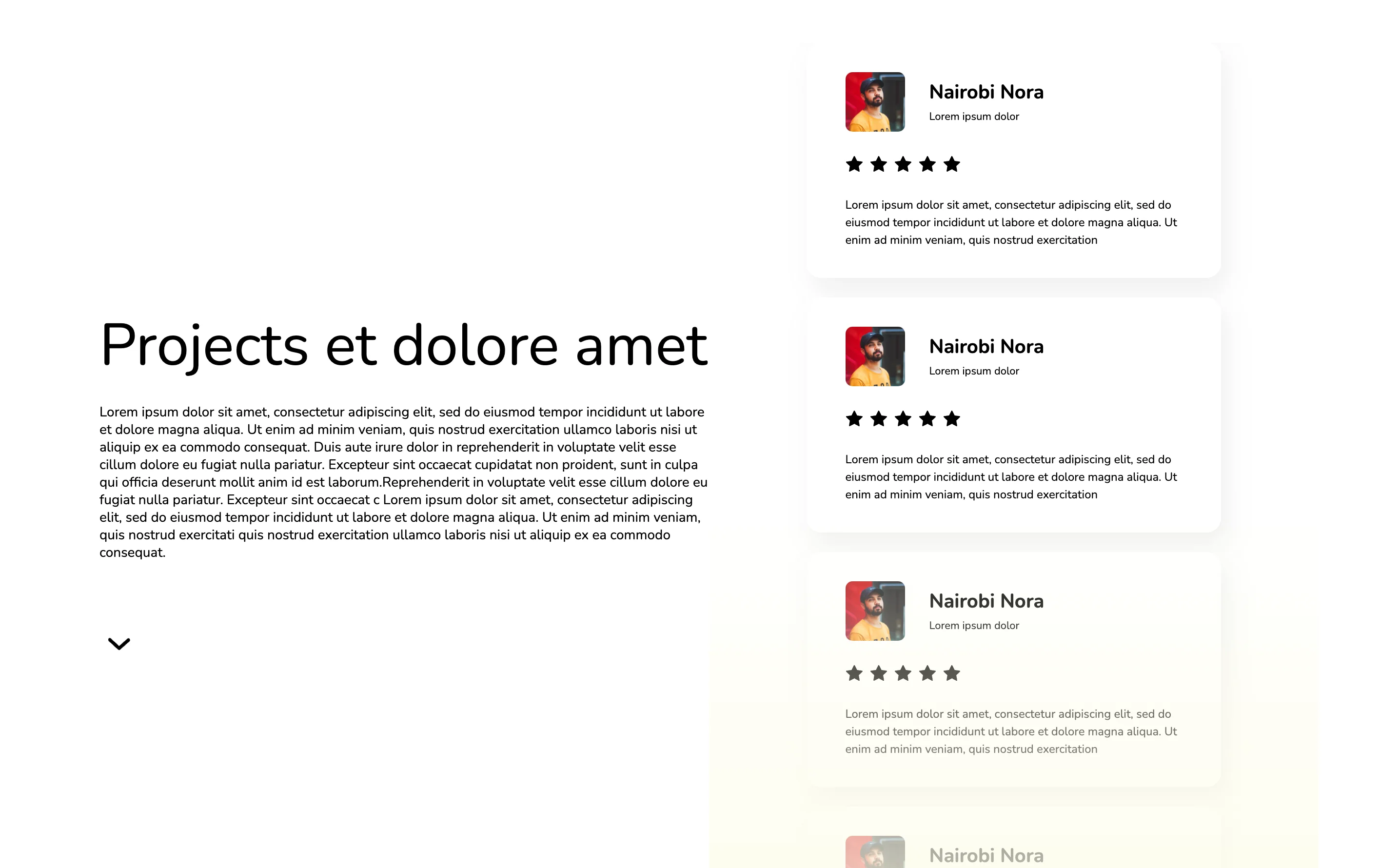
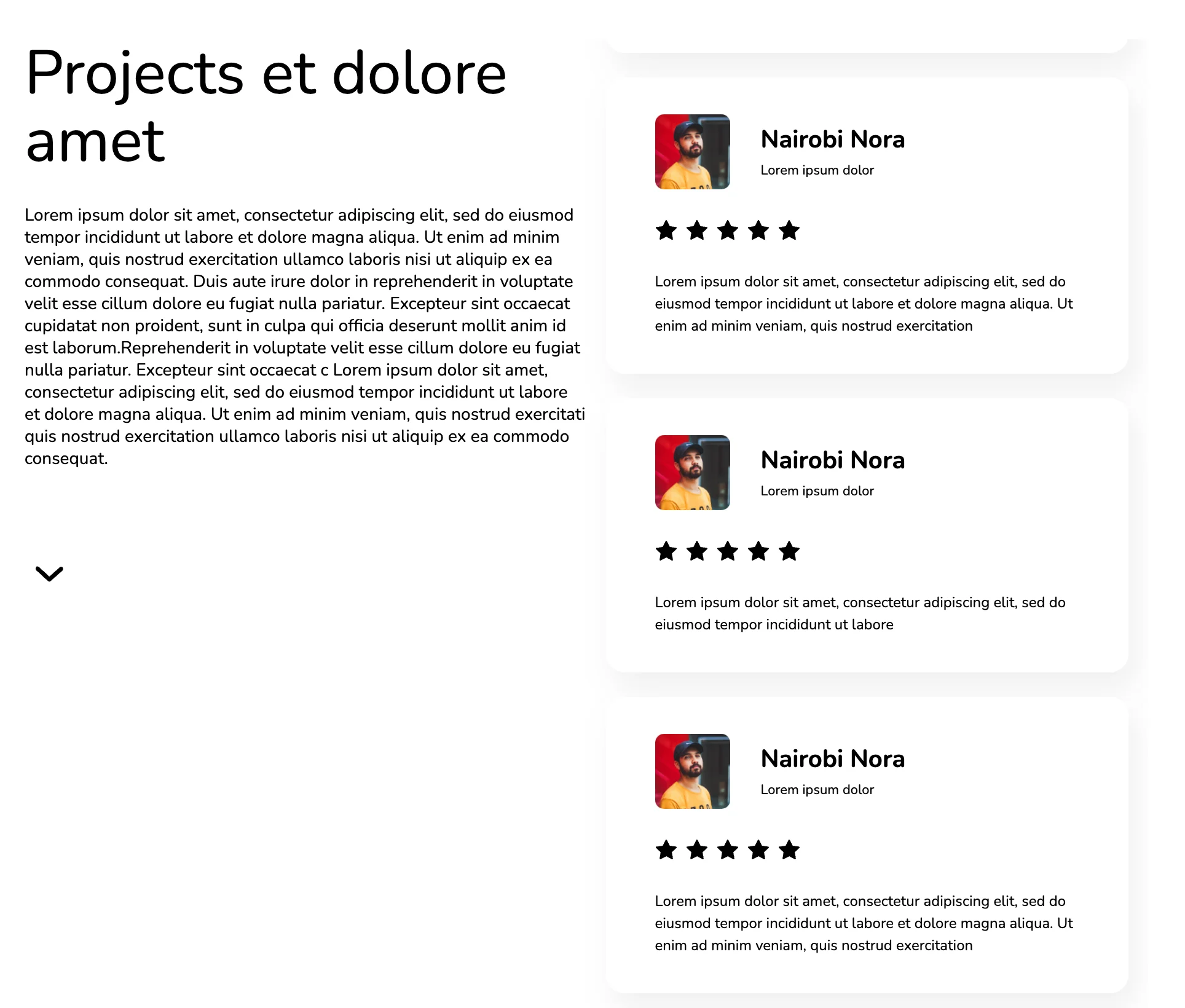
The above design includes a vertical slider to display client reviews. A linear yellow gradient is applied to the background towards the bottom of the page, blurring the sections that follow. Star ratings are also added to the testimonials, indicating customer satisfaction with the company’s services.
View Code
HTML
CSS
JS
Responsive CSS
Output
               Projects et dolore amet


               Lorem ipsum dolor sit amet, consectetur adipiscing elit, sed do eiusmod tempor incididunt ut labore et dolore magna aliqua. Ut enim ad minim veniam, quis nostrud exercitation ullamco laboris nisi ut aliquip ex ea commodo consequat. Duis aute irure dolor in reprehenderit in voluptate velit esse cillum dolore eu fugiat nulla pariatur. Excepteur sint occaecat cupidatat non proident, sunt in culpa qui officia deserunt mollit anim id est laborum.Reprehenderit in voluptate velit esse cillum dolore eu fugiat nulla pariatur. Excepteur sint occaecat c
                    Lorem ipsum dolor sit amet, consectetur adipiscing elit, sed do eiusmod tempor incididunt ut labore et dolore magna aliqua. Ut enim ad minim veniam, quis nostrud exercitati quis nostrud exercitation ullamco laboris nisi ut aliquip ex ea commodo consequat.


                     Nairobi Nora


                     Lorem ipsum dolor


                   Lorem ipsum dolor sit amet, consectetur adipiscing elit, sed do eiusmod tempor incididunt ut labore et dolore magna aliqua. Ut enim ad minim veniam, quis nostrud exercitation


                     Nairobi Nora


                     Lorem ipsum dolor


                   Lorem ipsum dolor sit amet, consectetur adipiscing elit, sed do eiusmod tempor incididunt ut labore


                     Nairobi Nora


                     Lorem ipsum dolor


                   Lorem ipsum dolor sit amet, consectetur adipiscing elit, sed do eiusmod tempor incididunt ut labore et dolore magna aliqua. Ut enim ad minim veniam, quis nostrud exercitation


                     Nairobi Nora


                     Lorem ipsum dolor


                   Lorem ipsum dolor sit amet, consectetur adipiscing elit, sed do eiusmod tempor incididunt ut labore et dolore magna aliqua. Ut enim ad minim veniam, quis nostrud exercitation


                     Nairobi Nora


                     Lorem ipsum dolor


                   Lorem ipsum dolor sit amet, consectetur adipiscing elit, sed do eiusmod tempor incididunt ut labore et dolore magna aliqua. Ut enim ad minim veniam, quis nostrud exercitation
          .icon-block svg {
    width: 100%;
    height: 100%;
    }
    .icon-block {
    width: 18px;
    height: 18px;
    margin-top: 0px;
    margin-right: 7px;
    margin-bottom: 0px;
    margin-left: 0px;
    }
    .swiper-container {
    display: flex;
    row-gap: 1.3rem;
    column-gap: 1.3rem;
    }
    .swiper-slide {
    height: auto;
    }
    .text-blk {
    margin-top: 0px;
    margin-right: 0px;
    margin-bottom: 0px;
    margin-left: 0px;
    padding-top: 0px;
    padding-right: 0px;
    padding-bottom: 0px;
    padding-left: 0px;
    line-height: 25px;
    }
    * {
    font-family: Nunito, sans-serif;
    }
    .responsive-cell-block {
    min-height: 75px;
    }
    .responsive-container-block {
    min-height: 75px;
    height: fit-content;
    width: 100%;
    padding-top: 0px;
    padding-right: 0px;
    padding-bottom: 0px;
    padding-left: 0px;
    display: flex;
    flex-wrap: wrap;
    margin-top: 0px;
    margin-right: auto;
    margin-bottom: 0px;
    margin-left: auto;
    justify-content: flex-start;
    }
    .responsive-container-block.container {
    max-width: 1250px;
    min-height: auto;
    justify-content: center;
    margin-top: 70px;
    margin-right: 0px;
    margin-bottom: 0px;
    margin-left: 0px;
    }
    .text-blk.section-head {
    font-size: 60px;
    line-height: 70px;
    margin-top: 0px;
    margin-right: 0px;
    margin-bottom: 24px;
    margin-left: 0px;
    }
    .text-blk.section-subhead {
    font-size: 14px;
    line-height: 18px;
    margin-top: 0px;
    margin-right: 0px;
    margin-bottom: 64px;
    margin-left: 0px;
    }
    .responsive-cell-block.wk-ipadp-6.wk-tab-12.wk-mobile-12.wk-desk-4 {
    display: flex;
    flex-direction: column;
    justify-content: center;
    }
    .bounce {
    animation-duration: 2s;
    animation-timing-function: ease;
    animation-delay: 0s;
    animation-iteration-count: infinite;
    animation-direction: normal;
    animation-fill-mode: none;
    animation-play-state: running;
    animation-name: bounce;
    margin-top: 50px;
    margin-right: 0px;
    margin-bottom: 0px;
    margin-left: 0px;
    }
    .responsive-cell-block.wk-ipadp-6.wk-tab-12.wk-mobile-12.wk-desk-8 {
    display: flex;
    align-items: center;
    }
    .responsive-cell-block.wk-tab-12.wk-mobile-12.wk-desk-4.wk-ipadp-5 {
    display: flex;
    justify-content: flex-start;
    flex-direction: row;
    align-items: center;
    padding-top: 0px;
    padding-right: 25px;
    padding-bottom: 0px;
    padding-left: 0px;
    }
    .responsive-container-block.swiper-container {
    justify-content: center;
    display: flex;
    flex-direction: row;
    flex-wrap: nowrap;
    max-height: 95vh;
    overflow: hidden;
    position: relative;
    }
    .img-box {
    max-width: 61px;
    max-height: 61px;
    width: 100%;
    height: 100%;
    overflow-x: hidden;
    overflow-y: hidden;
    margin-top: 0px;
    margin-right: 25px;
    margin-bottom: 0px;
    margin-left: 0px;
    }
    .card {
    background-color: rgb(255, 255, 255);
    display: flex;
    box-shadow: rgba(95, 95, 95, 0.1) 6px 12px 24px;
    flex-direction: column;
    border-top-left-radius: 15px;
    border-top-right-radius: 15px;
    border-bottom-right-radius: 15px;
    border-bottom-left-radius: 15px;
    padding-top: 30px;
    padding-right: 40px;
    padding-bottom: 30px;
    padding-left: 40px;
    }
    .card-content-box {
    display: flex;
    flex-direction: column;
    justify-content: center;
    }
    .text-blk.person-name {
    font-size: 20px;
    font-weight: 700;
    margin-top: 0px;
    margin-right: 0px;
    margin-bottom: 5px;
    margin-left: 0px;
    }
    .text-blk.person-info {
    font-size: 11px;
    line-height: 15px;
    }
    .responsive-cell-block.wk-mobile-12.wk-ipadp-10.wk-tab-8.wk-desk-6 {
    max-width: 350px;
    }
    .responsive-container-block.big-container {
    justify-content: center;
    padding-top: 0px;
    padding-right: 50px;
    padding-bottom: 0px;
    padding-left: 50px;
    min-height: 100vh;
    }
    .person-img {
    width: 100%;
    height: 100%;
    }
    .card-top {
    width: 100%;
    display: flex;
    margin-top: 0px;
    margin-right: 0px;
    margin-bottom: 24px;
    margin-left: 0px;
    }
    .text-blk.testimonial-text {
    font-size: 12px;
    line-height: 18px;
    margin-top: 24px;
    margin-right: 0px;
    margin-bottom: 0px;
    margin-left: 0px;
    }
    .ratings-container {
    display: flex;
    }
    .swiper.mySwiper11291 {
    max-width: 50%;
    }
    .swiper.mySwiper11292 {
    max-height: 100vh;
    max-width: 425px;
    }
    .icon-block.bounce {
    width: 40px;
    height: 40px;
    }
    .container-block {
    min-height: 75px;
    height: fit-content;
    width: 100%;
    padding-top: 10px;
    padding-right: 10px;
    padding-bottom: 10px;
    padding-left: 10px;
    display: block;
    }
    .forwhite.container-block {
    width: 100%;
    max-height: 450px;
    height: 100%;
    position: absolute;
    bottom: 0px;
    z-index: 50;
    background-image: linear-gradient(rgba(253, 252, 234, 0) 0%, rgba(253, 252, 234, 0.84) 100%);
    background-position-x: 0%;
    background-position-y: 0%;
    background-size: initial;
    background-repeat-x: no-repeat;
    background-repeat-y: no-repeat;
    background-attachment: initial;
    background-origin: padding-box;
    background-clip: padding-box;
    background-color: transparent;
    }
    .content-box {
    width: 100%;
    margin-top: auto;
    margin-right: 0px;
    margin-bottom: auto;
    margin-left: 0px;
    }
    @keyframes bounce {
    0%,
    20%,
    50%,
    80%,
    100% {
    transform: translateY(0px);
    }
    40% {
    transform: translateY(-30px);
    }
    60% {
    transform: translateY(-15px);
    }
    0%,
    20%,
    50%,
    80%,
    100% {
    transform: translateY(0px);
    }
    40% {
    transform: translateY(-30px);
    }
    60% {
    transform: translateY(-15px);
    }
    }
    @media (max-width: 1024px) {
    .responsive-container-block.swiper-container {
    justify-content: center;
    }
    .text-blk.section-head {
    font-size: 50px;
    line-height: 55px;
    }
    .responsive-cell-block.wk-tab-12.wk-mobile-12.wk-desk-4.wk-ipadp-5 {
    padding-top: 0px;
    padding-right: 20px;
    padding-bottom: 0px;
    padding-left: 0px;
    }
    .responsive-container-block.container {
    justify-content: space-evenly;
    }
    .content-box {
    margin-top: 0px;
    margin-right: 0px;
    margin-bottom: 0px;
    margin-left: 0px;
    }
    }
    @media (max-width: 768px) {
    .responsive-container-block.container {
    margin-top: 60px;
    margin-right: 0px;
    margin-bottom: 60px;
    margin-left: 0px;
    }
    .text-blk.section-subhead {
    margin-top: 0px;
    margin-right: 0px;
    margin-bottom: 0px;
    margin-left: 0px;
    }
    .icon-block.bounce {
    display: none;
    }
    .img-box {
    margin-top: 0px;
    margin-right: 30px;
    margin-bottom: 0px;
    margin-left: 0px;
    }
    .content-box {
    text-align: center;
    margin-top: 0px;
    margin-right: 0px;
    margin-bottom: 32px;
    margin-left: 0px;
    }
    .responsive-cell-block.wk-tab-12.wk-mobile-12.wk-desk-4.wk-ipadp-5 {
    margin-top: 0px;
    margin-right: 0px;
    margin-bottom: 30px;
    margin-left: 0px;
    }
    }
    @media (max-width: 500px) {
    .responsive-container-block.big-container {
    padding-top: 0px;
    padding-right: 60px;
    padding-bottom: 0px;
    padding-left: 60px;
    }
    .text-blk.section-head {
    font-size: 40px;
    line-height: 45px;
    }
    .content-box {
    padding-top: 0px;
    padding-right: 0px;
    padding-bottom: 0px;
    padding-left: 0px;
    margin-top: 0px;
    margin-right: 0px;
    margin-bottom: 16px;
    margin-left: 0px;
    }
    .text-blk.section-subhead {
    font-size: 12px;
    }
    .img-box {
    max-width: 68px;
    max-height: 68px;
    }
    .text-blk.person-name {
    font-size: 14px;
    margin-top: 0px;
    margin-right: 0px;
    margin-bottom: 1px;
    margin-left: 0px;
    }
    .content-box {
    margin-top: 0px;
    margin-right: 0px;
    margin-bottom: 46px;
    margin-left: 0px;
    text-align: left;
    }
    .responsive-cell-block.wk-tab-12.wk-mobile-12.wk-desk-4.wk-ipadp-5 {
    margin-top: 0px;
    margin-right: 0px;
    margin-bottom: 0px;
    margin-left: 0px;
    }
    .responsive-container-block.big-container {
    padding-top: 0px;
    padding-right: 20px;
    padding-bottom: 0px;
    padding-left: 20px;
    }
    #i11j {
    margin-top: 0px;
    margin-right: 0px;
    margin-bottom: 0px;
    margin-left: 0px;
    padding-top: 0px;
    padding-right: 0px;
    padding-bottom: 0px;
    padding-left: 0px;
    }
    .section-subhead {
    padding-top: 0px;
    padding-right: 0px;
    padding-bottom: 0px;
    padding-left: 0px;
    margin-top: 0px;
    margin-right: 0px;
    margin-bottom: 0px;
    margin-left: 0px;
    }
    }
          var swiper2 = new Swiper(".mySwiper11292", {
    slidesPerView: "auto",
    direction: "vertical",
    spaceBetween: 20,
    loop: true,
    autoplay: true
});
          @import url('https://fonts.googleapis.com/css2?family=Nunito:wght@200;300;400;600;700;800&display=swap');
        *, *:before, *:after {
        -moz-box-sizing: border-box;
        -webkit-box-sizing: border-box;
        box-sizing: border-box;
        }
        body {
        margin: 0;
        }
        .wk-desk-1{
        width: 8.333333%;
        }
        .wk-desk-2{
        width: 16.666667%;
        }
        .wk-desk-3{
        width: 25%;
        }
        .wk-desk-4{
        width: 33.333333%;
        }
        .wk-desk-5{
        width: 41.666667%;
        }
        .wk-desk-6{
        width: 50%;
        }
        .wk-desk-7{
        width: 58.333333%;
        }
        .wk-desk-8{
        width: 66.666667%;
        }
        .wk-desk-9{
        width: 75%;
        }
        .wk-desk-10{
        width: 83.333333%;
        }
        .wk-desk-11{
        width: 91.666667%;
        }
        .wk-desk-12{
        width: 100%;
        }
        @media (max-width: 1024px) {
        .wk-ipadp-1{
        width: 8.333333%;
        }
        .wk-ipadp-2{
        width: 16.666667%;
        }
        .wk-ipadp-3{
        width: 25%;
        }
        .wk-ipadp-4{
        width: 33.333333%;
        }
        .wk-ipadp-5{
        width: 41.666667%;
        }
        .wk-ipadp-6{
        width: 50%;
        }
        .wk-ipadp-7{
        width: 58.333333%;
        }
        .wk-ipadp-8{
        width: 66.666667%;
        }
        .wk-ipadp-9{
        width: 75%;
        }
        .wk-ipadp-10{
        width: 83.333333%;
        }
        .wk-ipadp-11{
        width: 91.666667%;
        }
        .wk-ipadp-12{
        width: 100%;
        }
        }
        @media (max-width: 768px) {
        .wk-tab-1{
        width: 8.333333%;
        }
        .wk-tab-2{
        width: 16.666667%;
        }
        .wk-tab-3{
        width: 25%;
        }
        .wk-tab-4{
        width: 33.333333%;
        }
        .wk-tab-5{
        width: 41.666667%;
        }
        .wk-tab-6{
        width: 50%;
        }
        .wk-tab-7{
        width: 58.333333%;
        }
        .wk-tab-8{
        width: 66.666667%;
        }
        .wk-tab-9{
        width: 75%;
        }
        .wk-tab-10{
        width: 83.333333%;
        }
        .wk-tab-11{
        width: 91.666667%;
        }
        .wk-tab-12{
        width: 100%;
        }
        }
        @media (max-width: 500px) {
        .wk-mobile-1{
        width: 8.333333%;
        }
        .wk-mobile-2{
        width: 16.666667%;
        }
        .wk-mobile-3{
        width: 25%;
        }
        .wk-mobile-4{
        width: 33.333333%;
        }
        .wk-mobile-5{
        width: 41.666667%;
        }
        .wk-mobile-6{
        width: 50%;
        }
        .wk-mobile-7{
        width: 58.333333%;
        }
        .wk-mobile-8{
        width: 66.666667%;
        }
        .wk-mobile-9{
        width: 75%;
        }
        .wk-mobile-10{
        width: 83.333333%;
        }
        .wk-mobile-11{
        width: 91.666667%;
        }
        .wk-mobile-12{
        width: 100%;
        }
        }
Reset