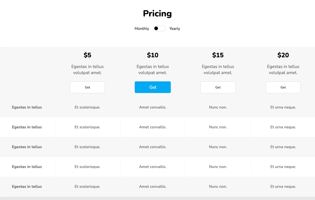
These responsive, simple pricing tables will be perfect for you if you wish to create something minimalistic and clean. Individual tables are flex-based and have a rounded border. The table under focus is highlighted using a different background and a box shadow. It also has options to toggle between monthly and yearly services.
View Code
HTML
CSS
JS
Responsive CSS
Output
Pricing
Monthly
Yearly
Penatibus massa diam.
$5
$100
In enim etiam aliquet.
Ultricies diam arcu.
Pellentesque elementum.
Leo adipiscing adipiscing.
Mattis diam amet.
Risus donec magna turpis.
Lorem nibh odio montes.
Lacus volutpat nunc leo at.
Arcu in augue nunc risus.
Ornare vestibulum.
Penatibus massa diam.
$10
$500
Risus donec magna turpis.
Lorem nibh odio montes.
Lacus volutpat nunc leo at.
Arcu in augue nunc risus.
Ornare vestibulum.
Vulputate sem venenatis.
Vulputate sem venenatis.
Aliquam enim habitant.
Nunc eu eu dolor ac arcu.
Id viverra hac sed semper.
Penatibus massa diam.
$20
$800
In enim etiam aliquet.
Ultricies diam arcu.
Pellentesque elementum.
Leo adipiscing adipiscing.
Mattis diam amet.
Risus donec magna turpis.
Lorem nibh odio montes.
Lacus volutpat nunc leo at.
Arcu in augue nunc risus.
Ornare vestibulum.
          .pricing_1 * {
    font-family: Nunito, sans-serif;
}

.pricing_1 .responsive-cell-block {
    min-height: 75px;
}

.pricing_1 .responsive-container-block {
    min-height: 75px;
    height: fit-content;
    width: 100%;
    padding-top: 10px;
    padding-right: 10px;
    padding-bottom: 10px;
    padding-left: 10px;
    display: flex;
    flex-wrap: wrap;
    margin-top: 0px;
    margin-right: auto;
    margin-bottom: 0px;
    margin-left: auto;
    justify-content: flex-start;
}

.pricing_1 .text-blk {
    margin-top: 0px;
    margin-right: 0px;
    margin-bottom: 0px;
    margin-left: 0px;
    line-height: 25px;
}

.pricing_1 .responsive-container-block.big-container {
    padding-top: 10px;
    padding-right: 30px;
    padding-bottom: 10px;
    padding-left: 30px;
}

.pricing_1 .responsive-container-block.container {
    max-width: 1320px;
    padding-top: 10px;
    padding-right: 0px;
    padding-bottom: 10px;
    padding-left: 0px;
    margin-top: 50px;
    margin-right: auto;
    margin-bottom: 0px;
    margin-left: auto;
}

.pricing_1 .text-blk.head {
    width: 100%;
    text-align: center;
    font-size: 36px;
    font-weight: 900;
    line-height: 52px;
}

.pricing_1 input {
    z-index: 5;
    height: 1.8rem;
    opacity: 0;
    width: 6rem;
    position: absolute;
    cursor: pointer;
    margin-left: -1.5rem;
}

.pricing_1 .switch {
    position: relative;
    display: inline-flex;
    width: 51px;
    height: 24px;
    text-align: center;
    margin-left: 1rem;
    margin-right: 1rem;
}

.pricing_1 .switch-text {
    display: flex;
    align-items: center;
}

.pricing_1 .slider {
    z-index: 0;
    position: absolute;
    cursor: pointer;
    top: 0px;
    left: 0px;
    right: 0px;
    bottom: 0px;
    background-color: white;
    border-top-width: 0.5px;
    border-right-width: 0.5px;
    border-bottom-width: 0.5px;
    border-left-width: 0.5px;
    border-top-style: solid;
    border-right-style: solid;
    border-bottom-style: solid;
    border-left-style: solid;
    border-top-color: #dbdee7;
    border-right-color: #dbdee7;
    border-bottom-color: #dbdee7;
    border-left-color: #dbdee7;
    border-image-source: initial;
    border-image-slice: initial;
    border-image-width: initial;
    border-image-outset: initial;
    border-image-repeat: initial;
    transition-duration: 0.4s;
    transition-timing-function: ease;
    transition-delay: 0s;
    transition-property: all;
}

.pricing_1 .slider::before {
    position: absolute;
    content: "";
    height: 15px;
    width: 15px;
    left: 4px;
    bottom: 4px;
    background-color: black;
    transition-duration: 0.4s;
    transition-timing-function: ease;
    transition-delay: 0s;
    transition-property: all;
}

.pricing_1 input:checked+.slider {
    background-color: white;
}

.pricing_1 input:checked+.slider::before {
    transform: translateX(26px);
}

.pricing_1 .slider.round {
    border-top-left-radius: 34px;
    border-top-right-radius: 34px;
    border-bottom-right-radius: 34px;
    border-bottom-left-radius: 34px;
}

.pricing_1 .slider.round::before {
    border-top-left-radius: 50%;
    border-top-right-radius: 50%;
    border-bottom-right-radius: 50%;
    border-bottom-left-radius: 50%;
}

.pricing_1 .responsive-container-block.swiping-box {
    padding-top: 0px;
    padding-right: 0px;
    padding-bottom: 0px;
    padding-left: 0px;
    min-height: 50px;
    margin-top: 5px;
    margin-right: 0px;
    margin-bottom: 0px;
    margin-left: 0px;
}

.pricing_1 .d-nones {
    display: none;
}

.pricing_1 .card {
    text-align: center;
    width: 350px;
    border-top-width: 1px;
    border-right-width: 1px;
    border-bottom-width: 1px;
    border-left-width: 1px;
    border-top-style: solid;
    border-right-style: solid;
    border-bottom-style: solid;
    border-left-style: solid;
    border-top-color: #dbdee7;
    border-right-color: #dbdee7;
    border-bottom-color: #dbdee7;
    border-left-color: #dbdee7;
    border-image-source: initial;
    border-image-slice: initial;
    border-image-width: initial;
    border-image-outset: initial;
    border-image-repeat: initial;
    border-top-left-radius: 25px;
    border-top-right-radius: 25px;
    border-bottom-right-radius: 25px;
    border-bottom-left-radius: 25px;
    display: flex;
    flex-direction: column;
    position: relative;
    align-items: center;
    min-height: 500px;
    margin-top: 16px;
    margin-bottom: 24px;
    font-size: 18px;
    color: #212529;
    padding-top: 25px;
    padding-right: 25px;
    padding-bottom: 25px;
    padding-left: 25px;
}

.pricing_1 .card-selected {
    border-top-left-radius: 25px;
    border-top-right-radius: 25px;
    border-bottom-right-radius: 25px;
    border-bottom-left-radius: 25px;
    color: white;
    border-top-width: initial;
    border-right-width: initial;
    border-bottom-width: initial;
    border-left-width: initial;
    border-top-style: none;
    border-right-style: none;
    border-bottom-style: none;
    border-left-style: none;
    border-top-color: initial;
    border-right-color: initial;
    border-bottom-color: initial;
    border-left-color: initial;
    border-image-source: initial;
    border-image-slice: initial;
    border-image-width: initial;
    border-image-outset: initial;
    border-image-repeat: initial;
    background-color: #03a9f4;
    box-shadow: rgba(0, 0, 0, 0.54) 1px 2px 13px -1px;
}

.pricing_1 .card-selected .card-text,
.pricing_1 .card-selected .card-description {
    color: white;
}

.pricing_1 .card-description {
    margin-bottom: 8rem;
    color: #686868;
}

.pricing_1 .card h1 {
    font-size: 46px;
    line-height: 64px;
    font-weight: 900;
    margin-top: 1rem;
    margin-right: 0px;
    margin-bottom: 1rem;
    margin-left: 0px;
}

.pricing_1 .card li {
    line-height: 35px;
    list-style-position: initial;
    list-style-image: initial;
    list-style-type: none;
}

.pricing_1 .buy-button {
    bottom: 37px;
    left: 0px;
    position: absolute;
    width: 100%;
    padding-left: 36px;
    padding-right: 36px;
}

.pricing_1 .btns {
    background-color: white;
    border-top-width: 1px;
    border-right-width: 1px;
    border-bottom-width: 1px;
    border-left-width: 1px;
    border-top-style: solid;
    border-right-style: solid;
    border-bottom-style: solid;
    border-left-style: solid;
    border-top-color: #dbdee7;
    border-right-color: #dbdee7;
    border-bottom-color: #dbdee7;
    border-left-color: #dbdee7;
    border-image-source: initial;
    border-image-slice: initial;
    border-image-width: initial;
    border-image-outset: initial;
    border-image-repeat: initial;
    border-top-left-radius: 65px;
    border-top-right-radius: 65px;
    border-bottom-right-radius: 65px;
    border-bottom-left-radius: 65px;
    transition-duration: 0.2s;
    transition-timing-function: ease;
    transition-delay: 0s;
    transition-property: transform;
    width: 100%;
    height: 60px;
    font-size: 20px;
    font-weight: 700;
    cursor: pointer;
}

.pricing_1 .btns:hover {
    text-decoration-line: none;
    text-decoration-thickness: initial;
    text-decoration-style: initial;
    text-decoration-color: initial;
    background-color: white;
    border-top-left-radius: 65px;
    border-top-right-radius: 65px;
    border-bottom-right-radius: 65px;
    border-bottom-left-radius: 65px;
    transform: scale(1.05);
}

.pricing_1 .responsive-cell-block.wk-desk-4.wk-ipadp-4.wk-tab-6.wk-mobile-12 {
    display: flex;
    justify-content: center;
    width: auto;
    margin-top: 0px;
    margin-right: 10px;
    margin-bottom: 0px;
    margin-left: 10px;
    max-width: 360px;
}

.pricing_1 .text-center.witch.switch-text {
    width: 100%;
    justify-content: center;
    margin-top: 20px;
    margin-right: 0px;
    margin-bottom: 0px;
    margin-left: 0px;
}

.pricing_1 .responsive-container-block.card-container {
    margin-top: 40px;
    margin-right: 0px;
    margin-bottom: 0px;
    margin-left: 0px;
    justify-content: center;
}

.pricing_1 .text-blk.card-points {
    line-height: 35px;
}

@media (max-width: 768px) {
    .pricing_1 .text-blk.head {
        font-size: 32px;
        line-height: 40px;
    }
}

@media (max-width: 500px) {
    .pricing_1 .card {
        width: 306px;
    }

    .pricing_1 .card.card-selected {
        padding-top: 25px;
        padding-right: 15px;
        padding-bottom: 25px;
        padding-left: 15px;
    }

    .pricing_1 .text-blk.card-points {
        font-size: 15px;
        line-height: 35px;
    }

    .pricing_1 .text-blk {
        font-size: 16px;
    }

    .pricing_1 .text-blk.head {
        font-size: 28px;
        line-height: 34px;
    }

    .pricing_1 .btns {
        font-size: 18px;
        height: 50px;
    }

    .pricing_1 .card.card-selected {
        min-height: 470px;
    }
}
          $(document).ready(function() {
    $(' input[type="checkbox"]').change(function() {
    if ($(`input[type="checkbox"]`).is(":checked")) {
    $(`.monthly-price`).addClass("d-nones");
    $(`.yearly-price`).removeClass("d-nones");
    $(`.monthly-plan`).addClass("d-nones");
    $(`.yearly-plan`).removeClass("d-nones");
    } else {
    $(`.monthly-price`).removeClass("d-nones");
    $(`.yearly-price`).addClass("d-nones");
    $(`.monthly-plan`).removeClass("d-nones");
    $(`.yearly-plan`).addClass("d-nones");
    }
    });
    $(`.card`).mouseenter(function(item) {
    $(`.card`).removeClass("card-selected");
    item.currentTarget.classList.add("card-selected")
    });
    })
          @import url('https://fonts.googleapis.com/css2?family=Nunito:wght@200;300;400;600;700;800&display=swap');
        *, *:before, *:after {
        -moz-box-sizing: border-box;
        -webkit-box-sizing: border-box;
        box-sizing: border-box;
        }
        body {
        margin: 0;
        }
        .wk-desk-1{
        width: 8.333333%;
        }
        .wk-desk-2{
        width: 16.666667%;
        }
        .wk-desk-3{
        width: 25%;
        }
        .wk-desk-4{
        width: 33.333333%;
        }
        .wk-desk-5{
        width: 41.666667%;
        }
        .wk-desk-6{
        width: 50%;
        }
        .wk-desk-7{
        width: 58.333333%;
        }
        .wk-desk-8{
        width: 66.666667%;
        }
        .wk-desk-9{
        width: 75%;
        }
        .wk-desk-10{
        width: 83.333333%;
        }
        .wk-desk-11{
        width: 91.666667%;
        }
        .wk-desk-12{
        width: 100%;
        }
        @media (max-width: 1024px) {
        .wk-ipadp-1{
        width: 8.333333%;
        }
        .wk-ipadp-2{
        width: 16.666667%;
        }
        .wk-ipadp-3{
        width: 25%;
        }
        .wk-ipadp-4{
        width: 33.333333%;
        }
        .wk-ipadp-5{
        width: 41.666667%;
        }
        .wk-ipadp-6{
        width: 50%;
        }
        .wk-ipadp-7{
        width: 58.333333%;
        }
        .wk-ipadp-8{
        width: 66.666667%;
        }
        .wk-ipadp-9{
        width: 75%;
        }
        .wk-ipadp-10{
        width: 83.333333%;
        }
        .wk-ipadp-11{
        width: 91.666667%;
        }
        .wk-ipadp-12{
        width: 100%;
        }
        }
        @media (max-width: 768px) {
        .wk-tab-1{
        width: 8.333333%;
        }
        .wk-tab-2{
        width: 16.666667%;
        }
        .wk-tab-3{
        width: 25%;
        }
        .wk-tab-4{
        width: 33.333333%;
        }
        .wk-tab-5{
        width: 41.666667%;
        }
        .wk-tab-6{
        width: 50%;
        }
        .wk-tab-7{
        width: 58.333333%;
        }
        .wk-tab-8{
        width: 66.666667%;
        }
        .wk-tab-9{
        width: 75%;
        }
        .wk-tab-10{
        width: 83.333333%;
        }
        .wk-tab-11{
        width: 91.666667%;
        }
        .wk-tab-12{
        width: 100%;
        }
        }
        @media (max-width: 500px) {
        .wk-mobile-1{
        width: 8.333333%;
        }
        .wk-mobile-2{
        width: 16.666667%;
        }
        .wk-mobile-3{
        width: 25%;
        }
        .wk-mobile-4{
        width: 33.333333%;
        }
        .wk-mobile-5{
        width: 41.666667%;
        }
        .wk-mobile-6{
        width: 50%;
        }
        .wk-mobile-7{
        width: 58.333333%;
        }
        .wk-mobile-8{
        width: 66.666667%;
        }
        .wk-mobile-9{
        width: 75%;
        }
        .wk-mobile-10{
        width: 83.333333%;
        }
        .wk-mobile-11{
        width: 91.666667%;
        }
        .wk-mobile-12{
        width: 100%;
        }
        }
Reset
Join our community to see how developers are using Workik AI everyday.
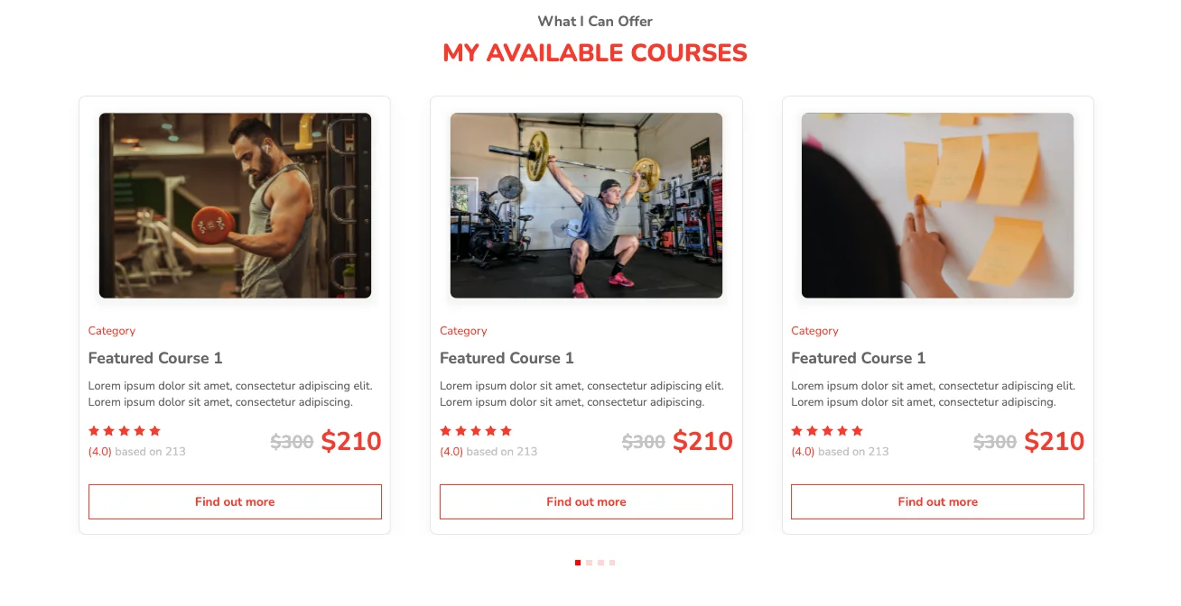
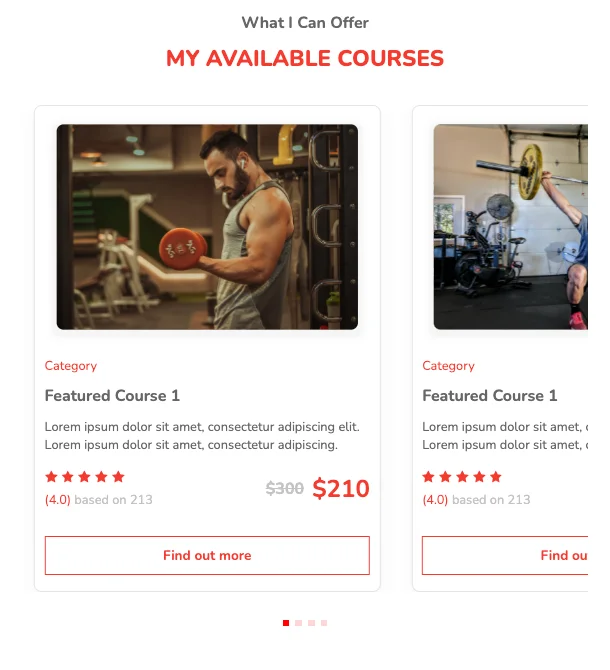
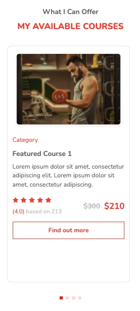
These responsive, carousel-based pricing tables are created using the SwiperJS library. Star rating and a discounted price for each plan are also incorporated as part of this design. The smooth hover effects applied to the call-to-action buttons are light and efficient.
View Code
HTML
CSS
JS
Responsive CSS
Output
              What I Can Offer


              MY AVAILABLE COURSES


                   Category


                   Featured Course 1


                   Lorem ipsum dolor sit amet, consectetur adipiscing elit. Lorem ipsum dolor sit amet, consectetur adipiscing.


                      (4.0)

                     based on 213


                     $300


                     $210


                   Find out more
          .pricing_11 .icon-block svg {
    width: 100%;
    height: 100%;
}

.pricing_11 .icon-block {
    width: 16px;
    height: 16px;
    display: block;
}

.pricing_11 * {
    font-family: Nunito;
}

.pricing_11 .text-blk {
    margin-top: 0px;
    margin-right: 0px;
    margin-bottom: 0px;
    margin-left: 0px;
    padding-top: 10px;
    padding-right: 10px;
    padding-bottom: 10px;
    padding-left: 10px;
    line-height: 25px;
}

.pricing_11 .img {
    width: 100%;
}

.pricing_11 .container-block {
    min-height: 75px;
    height: fit-content;
    width: 100%;
    padding-top: 10px;
    padding-right: 10px;
    padding-bottom: 10px;
    padding-left: 10px;
    display: block;
}

.pricing_11 .responsive-container-block {
    min-height: 75px;
    height: fit-content;
    width: 100%;
    padding-top: 10px;
    padding-right: 10px;
    padding-bottom: 10px;
    padding-left: 10px;
    display: flex;
    flex-wrap: wrap;
    margin-top: 0px;
    margin-right: auto;
    margin-bottom: 0px;
    margin-left: auto;
    justify-content: flex-start;
}

.pricing_11 .container-block.pricing-box {
    max-width: 1500px;
    margin-top: 0px;
    margin-right: auto;
    margin-bottom: 0px;
    margin-left: auto;
}

.pricing_11 .head {
    font-weight: bold;
    font-size: 25px;
    line-height: 34px;
    color: #666666;
}

.pricing_11 .desc {
    font-weight: 800;
    font-size: 50px;
    line-height: 68px;
    color: #f43b2f;
}

.pricing_11 .para1 {
    font-weight: normal;
    font-size: 16px;
    line-height: 22px;
    color: #f43b2f;
    margin-top: 16px;
    margin-right: 0px;
    margin-bottom: 0px;
    margin-left: 0px;
    padding-top: 0px;
    padding-right: 0px;
    padding-bottom: 0px;
    padding-left: 0px;
}

.pricing_11 .para2 {
    max-width: 213px;
    width: 100%;
    font-weight: bold;
    font-size: 22px;
    line-height: 34px;
    color: #666666;
    margin-top: 10px;
    margin-right: 0px;
    margin-bottom: 9px;
    margin-left: 0px;
}

.pricing_11 .desc1 {
    width: 100%;
    max-width: 395px;
    font-weight: normal;
    font-size: 16px;
    line-height: 23px;
    color: #666666;
    margin-top: 0px;
    margin-right: 0px;
    margin-bottom: 0px;
    margin-left: 0px;
}

.pricing_11 .review {
    display: flex;
    justify-content: flex-start;
    column-gap: 5px;
    margin-top: 0px;
    margin-right: 0px;
    margin-bottom: 7px;
    margin-left: 0px;
}

.pricing_11 .value {
    font-style: normal;
    font-weight: normal;
    font-size: 16px;
    line-height: 22px;
    color: #c4c4c4;
    margin-top: 4px;
    margin-right: 0px;
    margin-bottom: 0px;
    margin-left: 0px;
}

.pricing_11 .value>span {
    color: #f43b2f;
}

.pricing_11 .linethrough {
    font-style: normal;
    font-weight: bold;
    font-size: 25px;
    line-height: 34px;
    text-decoration-line: line-through;
    color: #c4c4c4;
    margin-top: 0px;
    margin-right: 0px;
    margin-bottom: 0px;
    margin-left: 0px;
}

.pricing_11 .num {
    font-style: normal;
    font-weight: bold;
    font-size: 35px;
    line-height: 48px;
    color: #f43b2f;
    margin-top: 0px;
    margin-right: 0px;
    margin-bottom: 0px;
    margin-left: 0px;
}

.pricing_11 .button {
    text-decoration-line: none;
    text-decoration-thickness: initial;
    text-decoration-style: initial;
    text-decoration-color: initial;
    border-top-width: 2px;
    border-right-width: 2px;
    border-bottom-width: 2px;
    border-left-width: 2px;
    border-top-style: solid;
    border-right-style: solid;
    border-bottom-style: solid;
    border-left-style: solid;
    border-top-color: #f43b2f;
    border-right-color: #f43b2f;
    border-bottom-color: #f43b2f;
    border-left-color: #f43b2f;
    border-image-source: initial;
    border-image-slice: initial;
    border-image-width: initial;
    border-image-outset: initial;
    border-image-repeat: initial;
    font-weight: bold;
    font-size: 17px;
    line-height: 25px;
    color: #f43b2f;
    text-align: center;
    padding-inline-start: 20px;
    padding-inline-end: 20px;
    padding-block-start: 18px;
    padding-block-end: 18px;
    margin-top: 15px;
    margin-right: 0px;
    margin-bottom: 0px;
    margin-left: 0px;
    height: 50px;
    padding-top: 10px;
    padding-right: 20px;
    padding-bottom: 10px;
    padding-left: 20px;
}

.pricing_11 .card {
    display: flex;
    flex-direction: column;
    padding-top: 12px;
    padding-right: 12px;
    padding-bottom: 20px;
    padding-left: 12px;
}

.pricing_11 .price {
    display: flex;
    justify-content: space-between;
    align-items: flex-start;
    flex-basis: 100%;
    min-height: auto;
    margin-top: 20px;
    margin-right: 0px;
    margin-bottom: 0px;
    margin-left: 0px;
}

.pricing_11 .number {
    display: flex;
    justify-content: flex-start;
    align-items: center;
    height: auto;
    column-gap: 10px;
}

.pricing_11 #isyiv-5 {
    fill: #f43b2f;
}

.pricing_11 #isyiv-4 {
    fill: #f43b2f;
}

.pricing_11 #isyiv-3 {
    fill: #f43b2f;
}

.pricing_11 #isyiv-2 {
    fill: #f43b2f;
}

.pricing_11 #isyiv {
    fill: #f43b2f;
}

.pricing_11 .icon {
    height: auto;
    display: flex;
    flex-direction: column;
    justify-content: center;
}

.pricing_11 .card {
    width: 433px;
    height: 609px;
    background-image: initial;
    background-position-x: initial;
    background-position-y: initial;
    background-size: initial;
    background-repeat-x: initial;
    background-repeat-y: initial;
    background-attachment: initial;
    background-origin: initial;
    background-clip: initial;
    background-color: white;
    border-top-width: 1px;
    border-right-width: 1px;
    border-bottom-width: 1px;
    border-left-width: 1px;
    border-top-style: solid;
    border-right-style: solid;
    border-bottom-style: solid;
    border-left-style: solid;
    border-top-color: #e5e5e5;
    border-right-color: #e5e5e5;
    border-bottom-color: #e5e5e5;
    border-left-color: #e5e5e5;
    border-image-source: initial;
    border-image-slice: initial;
    border-image-width: initial;
    border-image-outset: initial;
    border-image-repeat: initial;
    box-sizing: border-box;
    box-shadow: rgba(0, 0, 0, 0.05) 0px 10px 20px;
    border-top-left-radius: 10px;
    border-top-right-radius: 10px;
    border-bottom-right-radius: 10px;
    border-bottom-left-radius: 10px;
}

.pricing_11 .container-block {
    min-height: 75px;
    height: fit-content;
    width: 100%;
    padding-top: 10px;
    padding-right: 10px;
    padding-bottom: 10px;
    padding-left: 10px;
    display: block;
}

.pricing_11 .swiper {
    width: 100%;
    height: 100%;
    overflow-x: hidden;
    overflow-y: hidden;
}

.pricing_11 .button:hover {
    background-color: #f43b2f;
    color: white;
}

.pricing_11 .swiper-pagination.container-block {
    top: auto;
    display: flex;
    justify-content: center;
    align-items: center;
    bottom: 0px;
    left: 0px;
}

.pricing_11 .swiper.mySwiper {
    position: static;
    padding-top: 0px;
    padding-right: 15px;
    padding-bottom: 0px;
    padding-left: 15px;
}

.pricing_11 .responsive-container-block.card-container {
    position: relative;
    padding-top: 10px;
    padding-right: 10px;
    padding-bottom: 76px;
    padding-left: 10px;
}

.pricing_11 .responsive-container-block.bigContainer {
    padding-top: 10px;
    padding-right: 10px;
    padding-bottom: 10px;
    padding-left: 10px;
}

.pricing_11 .text-blk.desc {
    text-align: center;
    margin-top: 0px;
    margin-right: 0px;
    margin-bottom: 25px;
    margin-left: 0px;
    font-size: 34px;
    padding-top: 0px;
    padding-right: 10px;
    padding-bottom: 0px;
    padding-left: 10px;
    line-height: 45px;
}

.pricing_11 .text-blk.head {
    text-align: center;
    font-size: 20px;
    line-height: 24px;
    padding-top: 0px;
    padding-right: 10px;
    padding-bottom: 10px;
    padding-left: 10px;
}

.pricing_11 #isyiv-6 {
    fill: #f43b2f;
}

.pricing_11 #isyiv-2-2 {
    fill: #f43b2f;
}

.pricing_11 #isyiv-3-2 {
    fill: #f43b2f;
}

.pricing_11 #isyiv-7 {
    fill: #f43b2f;
}

.pricing_11 #isyiv-2-3 {
    fill: #f43b2f;
}

.pricing_11 #isyiv-3-3 {
    fill: #f43b2f;
}

.pricing_11 #isyiv-4-3 {
    fill: #f43b2f;
}

.pricing_11 #isyiv-8 {
    fill: #f43b2f;
}

.pricing_11 #isyiv-2-4 {
    fill: #f43b2f;
}

.pricing_11 #isyiv-3-4 {
    fill: #f43b2f;
}

.pricing_11 #isyiv-4-4 {
    fill: #f43b2f;
}

.pricing_11 #isyiv-5-4 {
    fill: #f43b2f;
}

.pricing_11 .swiper-pagination .swiper-pagination-bullet {
    background-image: initial;
    background-position-x: initial;
    background-position-y: initial;
    background-size: initial;
    background-repeat-x: initial;
    background-repeat-y: initial;
    background-attachment: initial;
    background-origin: initial;
    background-clip: initial;
    background-color: red;
    border-top-left-radius: 0px;
    border-top-right-radius: 0px;
    border-bottom-right-radius: 0px;
    border-bottom-left-radius: 0px;
}

.pricing_11 .swiper-slide {
    position: static;
}

.pricing_11 #isyiv-4-2 {
    fill: #f43b2f;
}

.pricing_11 #isyiv-5-2 {
    fill: #f43b2f;
}

.pricing_11 #isyiv-5-3 {
    fill: #f43b2f;
}

@media (max-width: 768px) {
    .pricing_11 .swiper-slide {
        float: none;
    }

    .pricing_11 .text-blk.desc {
        font-size: 28px;
    }

    .pricing_11 .para2 {
        font-size: 20px;
    }

    .pricing_11 .num {
        font-size: 30px;
    }

    .pricing_11 .linethrough {
        font-size: 20px;
    }
}

@media (max-width: 500px) {
    .pricing_11 .card {
        width: 100%;
    }

    .pricing_11 .price {
        flex-basis: auto;
    }

    .pricing_11 .responsive-container-block.card-container {
        padding-top: 10px;
        padding-right: 10px;
        padding-bottom: 10px;
        padding-left: 10px;
    }

    .pricing_11 .swiper-wrapper {
        padding-top: 0px;
        padding-right: 0px;
        padding-bottom: 0px;
        padding-left: 0px;
    }

    .pricing_11 .swiper.mySwiper {
        padding-top: 0px;
        padding-right: 0px;
        padding-bottom: 0px;
        padding-left: 0px;
    }

    .pricing_11 .text-blk.desc {
        font-size: 22px;
        line-height: normal;
    }

    .pricing_11 .responsive-container-block.card-container {
        padding-top: 10px;
        padding-right: 10px;
        padding-bottom: 77px;
        padding-left: 0px;
    }

    .pricing_11 .text-blk.head {
        font-size: 18px;
    }

    .pricing_11 .para2 {
        font-size: 18px;
        line-height: 26px;
    }

    .pricing_11 .num {
        font-size: 22px;
    }

    .pricing_11 .linethrough {
        font-size: 18px;
    }

    .pricing_11 .value {
        font-size: 15px;
    }

    .pricing_11 .button {
        height: 45px;
        padding-top: 10px;
        padding-right: 20px;
        padding-bottom: 10px;
        padding-left: 20px;
        font-size: 16px;
        line-height: 22px;
    }
}
          $(document).ready(function() {
    var swiper = new Swiper(`.mySwiper`, {
    direction: 'horizontal',
    loop: true,
    slidesPerView: 3,
    pagination: {
    el: ` .swiper-pagination`,
    clickable: true,
    },
    breakpoints: {
    200: {
    slidesPerView: 1,
    },
    501: {
    slidesPerView: 1.5,
    spaceBetween: 30,
    },
    769: {
    slidesPerView: 2,
    spaceBetween: 30,
    },
    1025: {
    slidesPerView: 3,
    spaceBetween: 30,
    },
    },
    });
    })
          @import url('https://fonts.googleapis.com/css2?family=Nunito:wght@200;300;400;600;700;800&display=swap');
        *, *:before, *:after {
        -moz-box-sizing: border-box;
        -webkit-box-sizing: border-box;
        box-sizing: border-box;
        }
        body {
        margin: 0;
        }
        .wk-desk-1{
        width: 8.333333%;
        }
        .wk-desk-2{
        width: 16.666667%;
        }
        .wk-desk-3{
        width: 25%;
        }
        .wk-desk-4{
        width: 33.333333%;
        }
        .wk-desk-5{
        width: 41.666667%;
        }
        .wk-desk-6{
        width: 50%;
        }
        .wk-desk-7{
        width: 58.333333%;
        }
        .wk-desk-8{
        width: 66.666667%;
        }
        .wk-desk-9{
        width: 75%;
        }
        .wk-desk-10{
        width: 83.333333%;
        }
        .wk-desk-11{
        width: 91.666667%;
        }
        .wk-desk-12{
        width: 100%;
        }
        @media (max-width: 1024px) {
        .wk-ipadp-1{
        width: 8.333333%;
        }
        .wk-ipadp-2{
        width: 16.666667%;
        }
        .wk-ipadp-3{
        width: 25%;
        }
        .wk-ipadp-4{
        width: 33.333333%;
        }
        .wk-ipadp-5{
        width: 41.666667%;
        }
        .wk-ipadp-6{
        width: 50%;
        }
        .wk-ipadp-7{
        width: 58.333333%;
        }
        .wk-ipadp-8{
        width: 66.666667%;
        }
        .wk-ipadp-9{
        width: 75%;
        }
        .wk-ipadp-10{
        width: 83.333333%;
        }
        .wk-ipadp-11{
        width: 91.666667%;
        }
        .wk-ipadp-12{
        width: 100%;
        }
        }
        @media (max-width: 768px) {
        .wk-tab-1{
        width: 8.333333%;
        }
        .wk-tab-2{
        width: 16.666667%;
        }
        .wk-tab-3{
        width: 25%;
        }
        .wk-tab-4{
        width: 33.333333%;
        }
        .wk-tab-5{
        width: 41.666667%;
        }
        .wk-tab-6{
        width: 50%;
        }
        .wk-tab-7{
        width: 58.333333%;
        }
        .wk-tab-8{
        width: 66.666667%;
        }
        .wk-tab-9{
        width: 75%;
        }
        .wk-tab-10{
        width: 83.333333%;
        }
        .wk-tab-11{
        width: 91.666667%;
        }
        .wk-tab-12{
        width: 100%;
        }
        }
        @media (max-width: 500px) {
        .wk-mobile-1{
        width: 8.333333%;
        }
        .wk-mobile-2{
        width: 16.666667%;
        }
        .wk-mobile-3{
        width: 25%;
        }
        .wk-mobile-4{
        width: 33.333333%;
        }
        .wk-mobile-5{
        width: 41.666667%;
        }
        .wk-mobile-6{
        width: 50%;
        }
        .wk-mobile-7{
        width: 58.333333%;
        }
        .wk-mobile-8{
        width: 66.666667%;
        }
        .wk-mobile-9{
        width: 75%;
        }
        .wk-mobile-10{
        width: 83.333333%;
        }
        .wk-mobile-11{
        width: 91.666667%;
        }
        .wk-mobile-12{
        width: 100%;
        }
        }
Reset
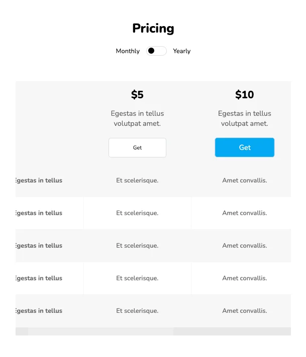
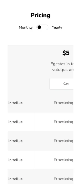
These simple, clean pricing tables provide a catchy look to your webpage. Monthly and yearly formats for pricing plans and button hover effects are also incorporated into this elegant design. On decreasing the size of the screen, the content on the page becomes horizontally scrollable which makes this design unique compared to the rest. The minimal design of these tables is purely responsive and readable across any device.
View Code
HTML
CSS
JS
Responsive CSS
Output
Pricing
Monthly
Yearly
$5
$450
Egestas in tellus volutpat amet.
$10
$500
Egestas in tellus volutpat amet.
$15
$600
Egestas in tellus volutpat amet.
$20
$800
Egestas in tellus volutpat amet.
Egestas in tellus
Et scelerisque.
Amet convallis.
Nunc non.
Et urna neque.
Egestas in tellus
Et scelerisque.
Amet convallis.
Nunc non.
Et urna neque.
Egestas in tellus
Et scelerisque.
Amet convallis.
Nunc non.
Et urna neque.
Egestas in tellus
Et scelerisque.
Amet convallis.
Nunc non.
Et urna neque.
Egestas in tellus
Et scelerisque.
Amet convallis.
Nunc non.
Et urna neque.
          .pricing_6 * {
    font-family: Nunito, sans-serif;
}

.pricing_6 .text-blk {
    margin-top: 0px;
    margin-right: 0px;
    margin-bottom: 0px;
    margin-left: 0px;
    padding-top: 10px;
    padding-right: 10px;
    padding-bottom: 10px;
    padding-left: 10px;
    line-height: 25px;
}

.pricing_6 .responsive-container-block {
    min-height: 75px;
    height: fit-content;
    width: 100%;
    padding-top: 10px;
    padding-right: 10px;
    padding-bottom: 10px;
    padding-left: 10px;
    display: flex;
    flex-wrap: wrap;
    margin-top: 0px;
    margin-right: auto;
    margin-bottom: 0px;
    margin-left: auto;
    justify-content: flex-start;
}

.pricing_6 .responsive-container-block.big-container {
    padding-top: 10px;
    padding-right: 30px;
    padding-bottom: 10px;
    padding-left: 30px;
    justify-content: center;
}

.pricing_6 .responsive-container-block.container {
    max-width: 1320px;
    padding-top: 0px;
    padding-right: 0px;
    padding-bottom: 0px;
    padding-left: 0px;
    margin-top: 50px;
    margin-right: 0px;
    margin-bottom: 50px;
    margin-left: 0px;
}

.pricing_6 input {
    z-index: 5;
    height: 1.8rem;
    opacity: 0;
    width: 6rem;
    position: absolute;
    cursor: pointer;
    margin-left: -1.5rem;
}

.pricing_6 .switch {
    position: relative;
    display: inline-flex;
    width: 51px;
    height: 24px;
    text-align: center;
    margin-left: 1rem;
    margin-right: 1rem;
}

.pricing_6 .switch-text {
    display: flex;
    align-items: center;
}

.pricing_6 .slider {
    z-index: 0;
    position: absolute;
    cursor: pointer;
    top: 0px;
    left: 0px;
    right: 0px;
    bottom: 0px;
    background-color: white;
    border-top-width: 0.5px;
    border-right-width: 0.5px;
    border-bottom-width: 0.5px;
    border-left-width: 0.5px;
    border-top-style: solid;
    border-right-style: solid;
    border-bottom-style: solid;
    border-left-style: solid;
    border-top-color: #dbdee7;
    border-right-color: #dbdee7;
    border-bottom-color: #dbdee7;
    border-left-color: #dbdee7;
    border-image-source: initial;
    border-image-slice: initial;
    border-image-width: initial;
    border-image-outset: initial;
    border-image-repeat: initial;
    transition-duration: 0.4s;
    transition-timing-function: ease;
    transition-delay: 0s;
    transition-property: all;
}

.pricing_6 .slider::before {
    position: absolute;
    content: "";
    height: 15px;
    width: 15px;
    left: 4px;
    bottom: 4px;
    background-color: black;
    transition-duration: 0.4s;
    transition-timing-function: ease;
    transition-delay: 0s;
    transition-property: all;
}

.pricing_6 input:checked+.slider {
    background-color: white;
}

.pricing_6 input:checked+.slider::before {
    transform: translateX(26px);
}

.pricing_6 .slider.round {
    border-top-left-radius: 34px;
    border-top-right-radius: 34px;
    border-bottom-right-radius: 34px;
    border-bottom-left-radius: 34px;
}

.pricing_6 .slider.round::before {
    border-top-left-radius: 50%;
    border-top-right-radius: 50%;
    border-bottom-right-radius: 50%;
    border-bottom-left-radius: 50%;
}

.pricing_6 .responsive-container-block.swiping-box {
    justify-content: center;
    padding-top: 0px;
    padding-right: 0px;
    padding-bottom: 0px;
    padding-left: 0px;
    min-height: 50px;
}

.pricing_6 .text-blk.head {
    width: 100%;
    text-align: center;
    font-size: 36px;
    font-weight: 900;
    line-height: 52px;
    padding-top: 0px;
    padding-right: 0px;
    padding-bottom: 0px;
    padding-left: 0px;
    margin-top: 0px;
    margin-right: 0px;
    margin-bottom: 10px;
    margin-left: 0px;
}

.pricing_6 .table {
    border-top-width: initial;
    border-right-width: initial;
    border-bottom-width: initial;
    border-left-width: initial;
    border-top-style: none;
    border-right-style: none;
    border-bottom-style: none;
    border-left-style: none;
    border-top-color: initial;
    border-right-color: initial;
    border-bottom-color: initial;
    border-left-color: initial;
    border-image-source: initial;
    border-image-slice: initial;
    border-image-width: initial;
    border-image-outset: initial;
    border-image-repeat: initial;
    height: fit-content;
    width: auto;
    min-width: 1298px;
    background-color: #f7f7f7;
    text-align: center;
}

.pricing_6 .table-row {
    height: 80px;
}

.pricing_6 .table-header {
    background-color: #f7f7f7;
    border-bottom-width: 21px;
    border-bottom-style: solid;
    border-bottom-color: white;
}

.pricing_6 .table-row.light-bg {
    background-color: white;
}

.pricing_6 .d-none {
    display: none;
}

.pricing_6 .responsive-container-block.table-wrapper {
    overflow-x: scroll;
    padding-top: 0px;
    padding-right: 0px;
    padding-bottom: 0px;
    padding-left: 0px;
    width: auto;
    margin-top: 50px;
    margin-right: 11px;
    margin-bottom: 0px;
    margin-left: 11px;
}

.pricing_6 .card-info {
    display: inline-block;
    color: #646464;
    font-weight: 700;
    font-size: 18px;
}

.pricing_6 .monthly-price {
    margin-top: 16px;
    margin-right: 0px;
    margin-bottom: 16px;
    margin-left: 0px;
    font-weight: 900;
    font-size: 26px;
    text-align: center;
    line-height: 34px;
}

.pricing_6 .yearly-price {
    margin-top: 16px;
    margin-right: 0px;
    margin-bottom: 16px;
    margin-left: 0px;
    font-weight: 900;
    font-size: 26px;
    text-align: center;
    line-height: 34px;
}

.pricing_6 .text-center.header-text {
    text-align: center;
    font-size: 40px;
    font-weight: 800;
    margin-top: 0px;
    margin-right: 0px;
    margin-bottom: 16px;
    margin-left: 0px;
}

.pricing_6 .card-info {
    display: inline-block;
    font-weight: 400;
    margin-top: 0px;
    margin-right: 0px;
    margin-bottom: 24px;
    margin-left: 0px;
}

.pricing_6 .table {
    text-align: center;
}

.pricing_6 .card-info {
    width: 143px;
}

.pricing_6 .btn {
    background-color: white;
    border-top-width: 1px;
    border-right-width: 1px;
    border-bottom-width: 1px;
    border-left-width: 1px;
    border-top-style: solid;
    border-right-style: solid;
    border-bottom-style: solid;
    border-left-style: solid;
    border-top-color: #dbdee7;
    border-right-color: #dbdee7;
    border-bottom-color: #dbdee7;
    border-left-color: #dbdee7;
    border-image-source: initial;
    border-image-slice: initial;
    border-image-width: initial;
    border-image-outset: initial;
    border-image-repeat: initial;
    color: black;
    border-top-left-radius: 6px;
    border-top-right-radius: 6px;
    border-bottom-right-radius: 6px;
    border-bottom-left-radius: 6px;
    transition-duration: 0.2s;
    transition-timing-function: ease;
    transition-delay: 0s;
    transition-property: transform;
    width: 143px;
    height: 48px;
    margin-top: 0px;
    margin-right: 0px;
    margin-bottom: 16px;
    margin-left: 0px;
    cursor: pointer;
}

.pricing_6 .table-wrapper {
    padding-left: 1%;
    padding-right: 1%;
    overflow-x: auto;
    width: auto;
}

.pricing_6 .table-row {
    height: 80px;
}

.pricing_6 .table-header {
    background-color: #f7f7f7;
    border-bottom-width: 21px;
    border-bottom-style: solid;
    border-bottom-color: white;
}

.pricing_6 .fw-bold {
    font-weight: 700;
    color: #646464;
}

.pricing_6 .light-bg {
    background-color: white !important;
}

.pricing_6 .table-row.one {
    margin-top: 16px;
    margin-right: 0px;
    margin-bottom: 0px;
    margin-left: 0px;
    padding-top: 0px;
    padding-right: 0px;
    padding-bottom: 0px;
    padding-left: 0px;
}

.pricing_6 .btn-selected {
    text-decoration-line: none;
    text-decoration-thickness: initial;
    text-decoration-style: initial;
    text-decoration-color: initial;
    background-color: #03a9f4;
    color: white;
    border-top-left-radius: 6px;
    border-top-right-radius: 6px;
    border-bottom-right-radius: 6px;
    border-bottom-left-radius: 6px;
    font-size: 17px;
    transform: scale(1.05);
}

.pricing_6 td {
    color: #717171;
    font-weight: 600;
}

@media (max-width: 768px) {
    .pricing_6 .text-blk.head {
        font-size: 32px;
        line-height: 42px;
    }
}

@media (max-width: 500px) {
    .pricing_6 .text-blk.head {
        font-size: 26px;
        line-height: 32px;
    }
}
          $(document).ready(function() {
    $(' input[type="checkbox"]').change(function() {
    if ($(`input[type="checkbox"]`).is(":checked")) {
    $(`.monthly-price`).addClass("d-none");
    $(`.yearly-price`).removeClass("d-none");
    } else {
    $(`.monthly-price`).removeClass("d-none");
    $(`.yearly-price`).addClass("d-none");
    }
    });
    $(`.btn`).mouseenter(function(item) {
    $(`.btn`).removeClass("btn-selected");
    item.currentTarget.classList.add("btn-selected")
    });
    })
          @import url('https://fonts.googleapis.com/css2?family=Nunito:wght@200;300;400;600;700;800&display=swap');
        *, *:before, *:after {
        -moz-box-sizing: border-box;
        -webkit-box-sizing: border-box;
        box-sizing: border-box;
        }
        body {
        margin: 0;
        }
        .wk-desk-1{
        width: 8.333333%;
        }
        .wk-desk-2{
        width: 16.666667%;
        }
        .wk-desk-3{
        width: 25%;
        }
        .wk-desk-4{
        width: 33.333333%;
        }
        .wk-desk-5{
        width: 41.666667%;
        }
        .wk-desk-6{
        width: 50%;
        }
        .wk-desk-7{
        width: 58.333333%;
        }
        .wk-desk-8{
        width: 66.666667%;
        }
        .wk-desk-9{
        width: 75%;
        }
        .wk-desk-10{
        width: 83.333333%;
        }
        .wk-desk-11{
        width: 91.666667%;
        }
        .wk-desk-12{
        width: 100%;
        }
        @media (max-width: 1024px) {
        .wk-ipadp-1{
        width: 8.333333%;
        }
        .wk-ipadp-2{
        width: 16.666667%;
        }
        .wk-ipadp-3{
        width: 25%;
        }
        .wk-ipadp-4{
        width: 33.333333%;
        }
        .wk-ipadp-5{
        width: 41.666667%;
        }
        .wk-ipadp-6{
        width: 50%;
        }
        .wk-ipadp-7{
        width: 58.333333%;
        }
        .wk-ipadp-8{
        width: 66.666667%;
        }
        .wk-ipadp-9{
        width: 75%;
        }
        .wk-ipadp-10{
        width: 83.333333%;
        }
        .wk-ipadp-11{
        width: 91.666667%;
        }
        .wk-ipadp-12{
        width: 100%;
        }
        }
        @media (max-width: 768px) {
        .wk-tab-1{
        width: 8.333333%;
        }
        .wk-tab-2{
        width: 16.666667%;
        }
        .wk-tab-3{
        width: 25%;
        }
        .wk-tab-4{
        width: 33.333333%;
        }
        .wk-tab-5{
        width: 41.666667%;
        }
        .wk-tab-6{
        width: 50%;
        }
        .wk-tab-7{
        width: 58.333333%;
        }
        .wk-tab-8{
        width: 66.666667%;
        }
        .wk-tab-9{
        width: 75%;
        }
        .wk-tab-10{
        width: 83.333333%;
        }
        .wk-tab-11{
        width: 91.666667%;
        }
        .wk-tab-12{
        width: 100%;
        }
        }
        @media (max-width: 500px) {
        .wk-mobile-1{
        width: 8.333333%;
        }
        .wk-mobile-2{
        width: 16.666667%;
        }
        .wk-mobile-3{
        width: 25%;
        }
        .wk-mobile-4{
        width: 33.333333%;
        }
        .wk-mobile-5{
        width: 41.666667%;
        }
        .wk-mobile-6{
        width: 50%;
        }
        .wk-mobile-7{
        width: 58.333333%;
        }
        .wk-mobile-8{
        width: 66.666667%;
        }
        .wk-mobile-9{
        width: 75%;
        }
        .wk-mobile-10{
        width: 83.333333%;
        }
        .wk-mobile-11{
        width: 91.666667%;
        }
        .wk-mobile-12{
        width: 100%;
        }
        }
Reset
The selected plan is distinguished by a different background. The design is completely responsive and looks great on all browsers and devices.
View Code
HTML
CSS
JS
Responsive CSS
Output
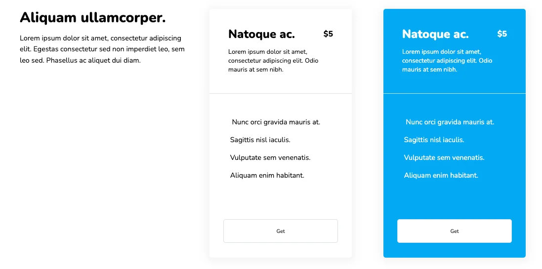
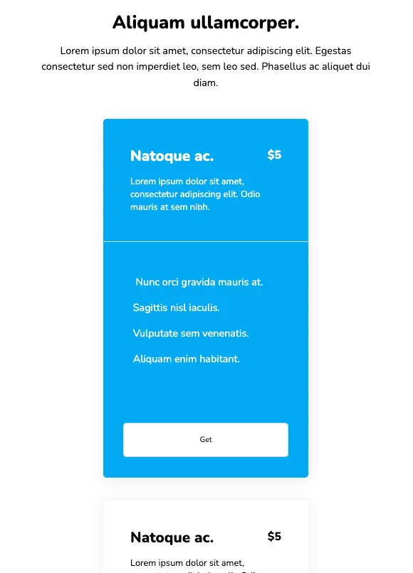
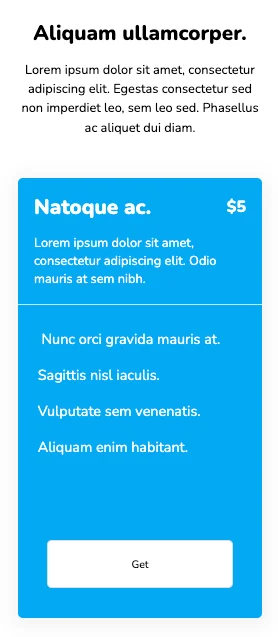
Aliquam ullamcorper.
Lorem ipsum dolor sit amet, consectetur adipiscing elit. Egestas consectetur sed non imperdiet leo, sem leo sed. Phasellus ac aliquet dui diam.
Natoque ac.
$5
Lorem ipsum dolor sit amet, consectetur adipiscing elit. Odio mauris at sem nibh.
Nunc orci gravida mauris at.
Sagittis nisl iaculis.
Vulputate sem venenatis.
Aliquam enim habitant.
Natoque ac.
$5
Lorem ipsum dolor sit amet, consectetur adipiscing elit. Odio mauris at sem nibh.
Nunc orci gravida mauris at.
Sagittis nisl iaculis.
Vulputate sem venenatis.
Aliquam enim habitant.
          .pricing_4 * {
    font-family: Nunito, sans-serif;
}

.pricing_4 .text-blk {
    margin-top: 0px;
    margin-right: 0px;
    margin-bottom: 0px;
    margin-left: 0px;
    padding-top: 10px;
    padding-right: 10px;
    padding-bottom: 10px;
    padding-left: 10px;
    line-height: 25px;
}

.pricing_4 .responsive-cell-block {
    min-height: 75px;
}

.pricing_4 .responsive-container-block {
    min-height: 75px;
    height: fit-content;
    width: 100%;
    padding-top: 0px;
    padding-right: 0px;
    padding-bottom: 0px;
    padding-left: 0px;
    display: flex;
    flex-wrap: wrap;
    margin-top: 0px;
    margin-right: auto;
    margin-bottom: 0px;
    margin-left: auto;
    justify-content: flex-start;
}

.pricing_4 .responsive-container-block.big-container {
    padding-top: 10px;
    padding-right: 30px;
    padding-bottom: 10px;
    padding-left: 30px;
}

.pricing_4 .responsive-container-block.container {
    padding-top: 10px;
    padding-right: 0px;
    padding-bottom: 10px;
    padding-left: 0px;
    max-width: 1320px;
}

.pricing_4 .text-head {
    font-size: 40px;
    line-height: 52px;
    font-weight: 900;
}

.pricing_4 .responsive-cell-block.wk-ipadp-4.wk-tab-6.wk-mobile-12.wk-desk-4 {
    padding-top: 0px;
    padding-right: 60px;
    padding-bottom: 0px;
    padding-left: 0px;
}

.pricing_4 .responsive-container-block.card-container {
    padding-top: 10px;
    padding-right: 0px;
    padding-bottom: 10px;
    padding-left: 0px;
}

.pricing_4 .text-blk.text-subhead {
    font-size: 20px;
    line-height: 32px;
    padding-top: 0px;
    padding-right: 0px;
    padding-bottom: 0px;
    padding-left: 0px;
}

.pricing_4 .card {
    background-color: white;
    min-height: 630px;
    max-width: 361px;
    border-top-left-radius: 6px;
    border-top-right-radius: 6px;
    border-bottom-right-radius: 6px;
    border-bottom-left-radius: 6px;
    border-top-style: none;
    border-right-style: none;
    border-bottom-style: none;
    border-left-style: none;
    margin-top: auto;
    margin-right: auto;
    margin-bottom: auto;
    margin-left: auto;
    box-shadow: rgba(0, 0, 0, 0.05) 0px 4px 20px 7px;
    position: relative;
}

.pricing_4 .card-selected {
    background-color: #03a9f4;
    color: white;
}

.pricing_4 .card-header {
    padding-top: 48px;
    padding-right: 48px;
    padding-bottom: 48px;
    padding-left: 48px;
    border-bottom-width: 2px;
    border-bottom-style: solid;
    border-bottom-color: #dbdee7;
}

.pricing_4 .btn {
    background-color: white;
    border-top-width: 1px;
    border-right-width: 1px;
    border-bottom-width: 1px;
    border-left-width: 1px;
    border-top-style: solid;
    border-right-style: solid;
    border-bottom-style: solid;
    border-left-style: solid;
    border-top-color: #dbdee7;
    border-right-color: #dbdee7;
    border-bottom-color: #dbdee7;
    border-left-color: #dbdee7;
    border-image-source: initial;
    border-image-slice: initial;
    border-image-width: initial;
    border-image-outset: initial;
    border-image-repeat: initial;
    transition-duration: 0.2s;
    transition-timing-function: ease;
    transition-delay: 0s;
    transition-property: transform;
    border-top-left-radius: 6px;
    border-top-right-radius: 6px;
    border-bottom-right-radius: 6px;
    border-bottom-left-radius: 6px;
    width: 100%;
    height: 60px;
}

.pricing_4 .btn:hover {
    text-decoration-line: none;
    text-decoration-thickness: initial;
    text-decoration-style: initial;
    text-decoration-color: initial;
    background-color: white;
    border-top-left-radius: 6px;
    border-top-right-radius: 6px;
    border-bottom-right-radius: 6px;
    border-bottom-left-radius: 6px;
    transform: scale(1.05);
}

.pricing_4 .buy-button {
    bottom: 37px;
    left: 0px;
    position: absolute;
    width: 100%;
    padding-left: 36px;
    padding-right: 36px;
}

.pricing_4 .card-body {
    padding-top: 48px;
    padding-right: 48px;
    padding-bottom: 48px;
    padding-left: 48px;
    text-align: left;
}

.pricing_4 .card-text {
    font-size: 18px;
    line-height: 45px;
}

.pricing_4 .row {
    display: flex;
    justify-content: space-between;
    align-items: center;
}

.pricing_4 .sub-title {
    font-size: 30px;
    line-height: 34px;
    font-weight: 900;
}

.pricing_4 .subtext {
    margin-top: 16px;
    margin-right: 0px;
    margin-bottom: 0px;
    margin-left: 0px;
}

.pricing_4 .price {
    font-weight: 900;
    font-size: 20px;
    line-height: 32px;
}

.pricing_4 .text-blk.text-head {
    font-size: 36px;
    line-height: 45px;
    padding-top: 0px;
    padding-right: 0px;
    padding-bottom: 0px;
    padding-left: 0px;
    margin-top: 0px;
    margin-right: 0px;
    margin-bottom: 15px;
    margin-left: 0px;
}

.pricing_4 #i7qb1 {
    font-size: 18px;
    line-height: 28px;
}

@media (max-width: 1024px) {
    .pricing_4 .responsive-cell-block.wk-mobile-12.wk-desk-4.wk-ipadp-6.wk-tab-12 {
        max-width: 361px;
        margin-top: 0px;
        margin-right: 15px;
        margin-bottom: 0px;
        margin-left: 15px;
    }

    .pricing_4 .responsive-cell-block.wk-mobile-12.wk-desk-4.wk-ipadp-12.wk-tab-12 {
        margin-top: 0px;
        margin-right: 0px;
        margin-bottom: 50px;
        margin-left: 0px;
        text-align: center;
        padding-top: 0px;
        padding-right: 10px;
        padding-bottom: 0px;
        padding-left: 10px;
    }

    .pricing_4 .responsive-container-block.card-container {
        justify-content: center;
    }
}

@media (max-width: 768px) {
    .pricing_4 .responsive-cell-block.wk-mobile-12.wk-desk-4.wk-ipadp-6.wk-tab-12 {
        margin-top: 0px;
        margin-right: 15px;
        margin-bottom: 40px;
        margin-left: 15px;
    }

    .pricing_4 .card.card-selected {
        margin-top: 0px;
        margin-right: 0px;
        margin-bottom: 0px;
        margin-left: 0px;
    }

    .pricing_4 .text-blk.text-head {
        font-size: 32px;
        line-height: 40px;
    }

    .pricing_4 #i7qb1 {
        font-size: 18px;
    }

    .pricing_4 .sub-title {
        font-size: 26px;
    }

    .pricing_4 .text-blk.text-subhead {
        max-width: 600px;
    }

    .pricing_4 .responsive-cell-block.wk-mobile-12.wk-desk-4.wk-ipadp-12.wk-tab-12 {
        display: flex;
        flex-direction: column;
        align-items: center;
    }
}

@media (max-width: 500px) {
    .pricing_4 .responsive-cell-block.wk-mobile-12.wk-desk-4.wk-ipadp-6.wk-tab-12 {
        margin-top: 0px;
        margin-right: 0px;
        margin-bottom: 40px;
        margin-left: 0px;
    }

    .pricing_4 .responsive-cell-block.wk-mobile-12.wk-desk-4.wk-ipadp-12.wk-tab-12 {
        padding-top: 0px;
        padding-right: 0px;
        padding-bottom: 0px;
        padding-left: 0px;
    }

    .pricing_4 .card-body {
        padding-top: 20px;
        padding-right: 20px;
        padding-bottom: 20px;
        padding-left: 20px;
    }

    .pricing_4 .card-header {
        padding-top: 20px;
        padding-right: 20px;
        padding-bottom: 20px;
        padding-left: 20px;
    }

    .pricing_4 .card.card-selected {
        min-height: 550px;
    }

    .pricing_4 .text-blk.text-head {
        font-size: 26px;
    }

    .pricing_4 #i7qb1 {
        font-size: 16px;
        line-height: 24px;
    }
}
          $(`.card`).mouseenter(function(item) {
    $(`.card`).removeClass("card-selected");
    item.currentTarget.classList.add("card-selected")
    });
          @import url('https://fonts.googleapis.com/css2?family=Nunito:wght@200;300;400;600;700;800&display=swap');
        *, *:before, *:after {
        -moz-box-sizing: border-box;
        -webkit-box-sizing: border-box;
        box-sizing: border-box;
        }
        body {
        margin: 0;
        }
        .wk-desk-1{
        width: 8.333333%;
        }
        .wk-desk-2{
        width: 16.666667%;
        }
        .wk-desk-3{
        width: 25%;
        }
        .wk-desk-4{
        width: 33.333333%;
        }
        .wk-desk-5{
        width: 41.666667%;
        }
        .wk-desk-6{
        width: 50%;
        }
        .wk-desk-7{
        width: 58.333333%;
        }
        .wk-desk-8{
        width: 66.666667%;
        }
        .wk-desk-9{
        width: 75%;
        }
        .wk-desk-10{
        width: 83.333333%;
        }
        .wk-desk-11{
        width: 91.666667%;
        }
        .wk-desk-12{
        width: 100%;
        }
        @media (max-width: 1024px) {
        .wk-ipadp-1{
        width: 8.333333%;
        }
        .wk-ipadp-2{
        width: 16.666667%;
        }
        .wk-ipadp-3{
        width: 25%;
        }
        .wk-ipadp-4{
        width: 33.333333%;
        }
        .wk-ipadp-5{
        width: 41.666667%;
        }
        .wk-ipadp-6{
        width: 50%;
        }
        .wk-ipadp-7{
        width: 58.333333%;
        }
        .wk-ipadp-8{
        width: 66.666667%;
        }
        .wk-ipadp-9{
        width: 75%;
        }
        .wk-ipadp-10{
        width: 83.333333%;
        }
        .wk-ipadp-11{
        width: 91.666667%;
        }
        .wk-ipadp-12{
        width: 100%;
        }
        }
        @media (max-width: 768px) {
        .wk-tab-1{
        width: 8.333333%;
        }
        .wk-tab-2{
        width: 16.666667%;
        }
        .wk-tab-3{
        width: 25%;
        }
        .wk-tab-4{
        width: 33.333333%;
        }
        .wk-tab-5{
        width: 41.666667%;
        }
        .wk-tab-6{
        width: 50%;
        }
        .wk-tab-7{
        width: 58.333333%;
        }
        .wk-tab-8{
        width: 66.666667%;
        }
        .wk-tab-9{
        width: 75%;
        }
        .wk-tab-10{
        width: 83.333333%;
        }
        .wk-tab-11{
        width: 91.666667%;
        }
        .wk-tab-12{
        width: 100%;
        }
        }
        @media (max-width: 500px) {
        .wk-mobile-1{
        width: 8.333333%;
        }
        .wk-mobile-2{
        width: 16.666667%;
        }
        .wk-mobile-3{
        width: 25%;
        }
        .wk-mobile-4{
        width: 33.333333%;
        }
        .wk-mobile-5{
        width: 41.666667%;
        }
        .wk-mobile-6{
        width: 50%;
        }
        .wk-mobile-7{
        width: 58.333333%;
        }
        .wk-mobile-8{
        width: 66.666667%;
        }
        .wk-mobile-9{
        width: 75%;
        }
        .wk-mobile-10{
        width: 83.333333%;
        }
        .wk-mobile-11{
        width: 91.666667%;
        }
        .wk-mobile-12{
        width: 100%;
        }
        }
Reset
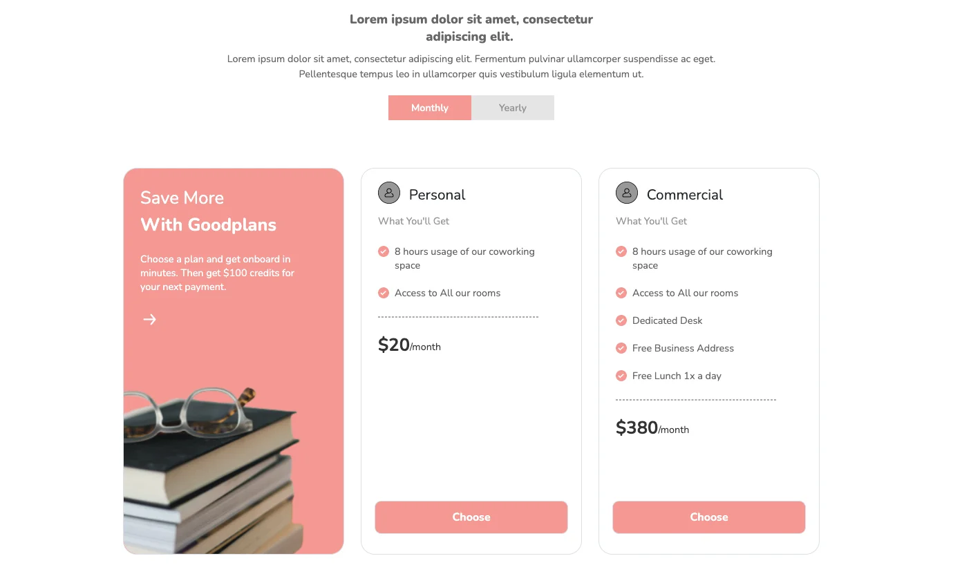
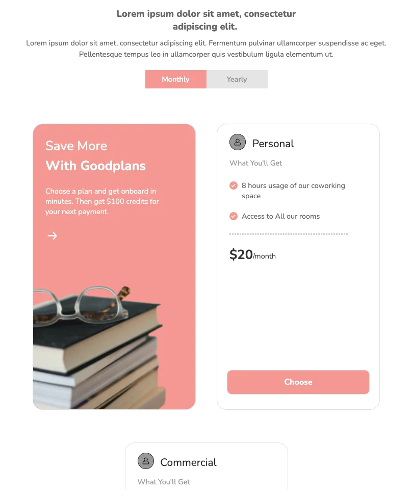
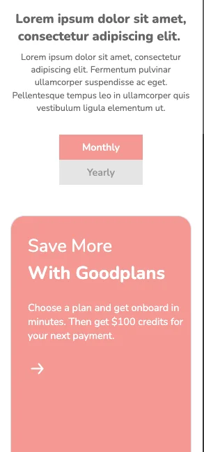
The leftmost card is devoted to providing a general description with minimal text and images and is distinguished by a different background. The toggle switch has a stylish, tabular design, which highlights the plan currently being displayed.
View Code
HTML
CSS
JS
Responsive CSS
Output
Lorem ipsum dolor sit amet, consectetur adipiscing elit.
Lorem ipsum dolor sit amet, consectetur adipiscing elit. Fermentum pulvinar ullamcorper suspendisse ac eget. Pellentesque tempus leo in ullamcorper quis vestibulum ligula elementum ut.
Save More
With Goodplans
Choose a plan and get onboard in minutes. Then get $100 credits for your next payment.


Personal
What You'll Get

8 hours usage of our coworking space
Access to All our rooms
$500
/year
$20
/month
Commercial
What You'll Get
8 hours usage of our coworking space
Access to All our rooms
Dedicated Desk
Free Business Address
Free Lunch 1x a day
$1000
/year
$380
/month
          .pricing_new * {
    font-family: Nunito, sans-serif;
}

.pricing_new .responsive-cell-block {
    min-height: 75px;
}

.pricing_new .bgSelected {
    background-image: initial;
    background-position-x: initial;
    background-position-y: initial;
    background-size: initial;
    background-repeat-x: initial;
    background-repeat-y: initial;
    background-attachment: initial;
    background-origin: initial;
    background-clip: initial;
    color: white !important;
    background-color: #f49892 !important;
}

.pricing_new .responsive-container-block {
    min-height: 75px;
    height: fit-content;
    width: 100%;
    display: flex;
    flex-wrap: wrap;
    margin-top: 0px;
    margin-right: auto;
    margin-bottom: 0px;
    margin-left: auto;
    justify-content: flex-start;
}

.pricing_new .divider {
    border-top-width: 1px;
    border-right-width: 1px;
    border-bottom-width: 1px;
    border-left-width: 1px;
    border-top-style: dashed;
    border-right-style: dashed;
    border-bottom-style: dashed;
    border-left-style: dashed;
    border-top-color: #a9a9aa;
    border-right-color: #a9a9aa;
    border-bottom-color: #a9a9aa;
    border-left-color: #a9a9aa;
    border-image-source: initial;
    border-image-slice: initial;
    border-image-width: initial;
    border-image-outset: initial;
    border-image-repeat: initial;
    height: 2px;
    width: 290px;
    margin-top: 30px;
    margin-right: 0px;
    margin-bottom: 0px;
    margin-left: 30px;
}

.pricing_new .text-blk {
    margin-top: 0px;
    margin-right: 0px;
    margin-bottom: 0px;
    margin-left: 0px;
    padding-top: 0px;
    padding-right: 0px;
    padding-bottom: 0px;
    padding-left: 0px;
    line-height: 25px;
    text-align: left;
    color: white;
}

.pricing_new .responsive-container-block.big-container {
    padding-top: 10px;
    padding-right: 30px;
    padding-bottom: 10px;
    padding-left: 30px;
}

.pricing_new .responsive-container-block.container {
    max-width: 1320px;
    margin-top: 0px;
    margin-right: auto;
    margin-bottom: 0px;
    margin-left: auto;
    padding-top: 10px;
    padding-right: 0px;
    padding-bottom: 10px;
    padding-left: 0px;
}

.pricing_new .text-blk.head {
    width: auto;
    text-align: center;
    font-size: 23px;
    font-weight: 900;
    line-height: 31px;
    color: #666666;
    margin-top: 0px;
    margin-right: auto;
    margin-bottom: 0px;
    margin-left: auto;
    max-width: 475px;
}

.pricing_new input {
    z-index: 5;
    height: 1.8rem;
    opacity: 0;
    width: 6rem;
    position: absolute;
    cursor: pointer;
    margin-left: -1.5rem;
}

.pricing_new input:checked+.slider {
    background-color: white;
}

.pricing_new input:checked+.slider::before {
    transform: translateX(26px);
}

.pricing_new .text-center.witch.switch-text.mt-4 {
    width: 100%;
    justify-content: center;
}

.pricing_new .responsive-container-block.swiping-box {
    padding-top: 0px;
    padding-right: 0px;
    padding-bottom: 0px;
    padding-left: 0px;
    min-height: 50px;
}

.pricing_new .d-nones {
    display: none;
}

.pricing_new .card {
    text-align: center;
    width: 400px;
    border-top-width: 1px;
    border-right-width: 1px;
    border-bottom-width: 1px;
    border-left-width: 1px;
    border-top-style: solid;
    border-right-style: solid;
    border-bottom-style: solid;
    border-left-style: solid;
    border-top-color: #dbdee7;
    border-right-color: #dbdee7;
    border-bottom-color: #dbdee7;
    border-left-color: #dbdee7;
    border-image-source: initial;
    border-image-slice: initial;
    border-image-width: initial;
    border-image-outset: initial;
    border-image-repeat: initial;
    border-top-left-radius: 25px;
    border-top-right-radius: 25px;
    border-bottom-right-radius: 25px;
    border-bottom-left-radius: 25px;
    display: flex;
    flex-direction: column;
    position: relative;
    align-items: flex-start;
    min-height: 700px;
    font-size: 18px;
    color: #212529;
    margin-top: 16px;
    margin-right: 0px;
    margin-bottom: 24px;
    margin-left: 0px;
    padding-top: 0px;
    padding-right: 0px;
    padding-bottom: 0px;
    padding-left: 0px;
}

.pricing_new .card-selected .card-text,
.pricing_new .card-selected .card-description {
    color: white;
}

.pricing_new .card h1 {
    font-size: 46px;
    line-height: 64px;
    font-weight: 900;
    margin-top: 1rem;
    margin-right: 0px;
    margin-bottom: 1rem;
    margin-left: 0px;
}

.pricing_new .card p {
    margin-top: 2rem;
}

.pricing_new .card li {
    line-height: 35px;
    list-style-position: initial;
    list-style-image: initial;
    list-style-type: none;
}

.pricing_new .buy-button {
    bottom: 37px;
    left: 0px;
    position: absolute;
    width: 100%;
    padding-top: 0px;
    padding-right: 24px;
    padding-bottom: 0px;
    padding-left: 24px;
}

.pricing_new .btns {
    background-color: #f49892;
    border-top-width: 1px;
    border-right-width: 1px;
    border-bottom-width: 1px;
    border-left-width: 1px;
    border-top-style: solid;
    border-right-style: solid;
    border-bottom-style: solid;
    border-left-style: solid;
    border-top-color: #dbdee7;
    border-right-color: #dbdee7;
    border-bottom-color: #dbdee7;
    border-left-color: #dbdee7;
    border-image-source: initial;
    border-image-slice: initial;
    border-image-width: initial;
    border-image-outset: initial;
    border-image-repeat: initial;
    transition-duration: 0.2s;
    transition-timing-function: ease;
    transition-delay: 0s;
    transition-property: transform;
    width: 100%;
    height: 60px;
    font-size: 20px;
    font-weight: 700;
    cursor: pointer;
    color: white;
    border-top-left-radius: 12px;
    border-top-right-radius: 12px;
    border-bottom-right-radius: 12px;
    border-bottom-left-radius: 12px;
}

.pricing_new .btns:hover {
    text-decoration-line: none;
    text-decoration-thickness: initial;
    text-decoration-style: initial;
    text-decoration-color: initial;
    background-color: white;
    color: black;
    transform: scale(1.05);
    border-top-left-radius: 12px;
    border-top-right-radius: 12px;
    border-bottom-right-radius: 12px;
    border-bottom-left-radius: 12px;
}

.pricing_new .responsive-cell-block.wk-desk-4.wk-ipadp-4.wk-tab-6.wk-mobile-12 {
    display: flex;
    justify-content: center;
    width: 400px;
    max-width: 400px;
    margin-top: 0px;
    margin-right: 10px;
    margin-bottom: 40px;
    margin-left: 10px;
}

.pricing_new .text-center.witch.switch-text {
    width: 100%;
    justify-content: center;
    margin-top: 20px;
    margin-right: 0px;
    margin-bottom: 0px;
    margin-left: 0px;
}

.pricing_new .responsive-container-block.card-container {
    justify-content: space-evenly;
    margin-top: 30px;
    margin-right: 0px;
    margin-bottom: 0px;
    margin-left: 0px;
}

.pricing_new .card.no-change {
    background-color: #f49892;
    align-items: flex-start;
    justify-content: flex-start;
}

.pricing_new .text-blk.saveMore {
    color: white;
    font-size: 32px;
    line-height: 48px;
    margin-top: 0px;
    margin-right: 0px;
    margin-bottom: 0px;
    margin-left: 0px;
    padding-top: 0px;
    padding-right: 0px;
    padding-bottom: 0px;
    padding-left: 0px;
}

.pricing_new .text-blk.goodplans {
    color: white;
    font-size: 32px;
    line-height: 48px;
    margin-top: 0px;
    margin-right: 0px;
    margin-bottom: 0px;
    margin-left: 0px;
    font-weight: 700;
    padding-top: 0px;
    padding-right: 0px;
    padding-bottom: 0px;
    padding-left: 0px;
}

.pricing_new .saveGoodplan {
    display: flex;
    flex-direction: column;
    align-items: flex-start;
    margin-top: 30px;
    margin-right: 0px;
    margin-bottom: 0px;
    margin-left: 30px;
}

.pricing_new .text-blk.subHeadingCard {
    max-width: 300px;
    margin-top: 25px;
    margin-right: 0px;
    margin-bottom: 0px;
    margin-left: 30px;
    padding-top: 0px;
    padding-right: 0px;
    padding-bottom: 0px;
    padding-left: 0px;
}

.pricing_new .arrow {
    margin-top: 30px;
    margin-right: 0px;
    margin-bottom: 0px;
    margin-left: 30px;
}

.pricing_new .subHeading {
    text-align: center;
    font-size: 18px;
    line-height: 28px;
    color: #666666;
    max-width: 900px;
    margin-top: 10px;
    margin-right: auto;
    margin-bottom: 25px;
    margin-left: auto;
}

.pricing_new .line1 {
    display: flex;
    flex-direction: row;
    align-items: center;
    justify-content: center;
    line-height: 0;
    margin-top: 0px;
    margin-right: 0px;
    margin-bottom: 0px;
    margin-left: 30px;
    flex-wrap: nowrap;
    flex-grow: 0;
}

.pricing_new .epricingimg {
    border-top-left-radius: 25px;
    border-top-right-radius: 25px;
    border-bottom-right-radius: 25px;
    border-bottom-left-radius: 25px;
    position: absolute;
    bottom: 0px;
}

.pricing_new .text-blk.tickText {
    color: #666666;
    margin-top: 0px;
    margin-right: 0px;
    margin-bottom: 0px;
    margin-left: 10px;
    padding-top: 0px;
    padding-right: 0px;
    padding-bottom: 0px;
    padding-left: 0px;
}

.pricing_new .personal {
    font-size: 26px;
    line-height: 30px;
    margin-top: 30px;
    margin-right: 0px;
    margin-bottom: 15px;
    margin-left: 0px;
}

.pricing_new .feature {
    display: flex;
    justify-content: center;
    align-items: flex-start;
    margin-top: 25px;
    margin-right: 0px;
    margin-bottom: 0px;
    margin-left: 30px;
    max-width: 290px;
}

.pricing_new .text-blk.priceTag {
    color: #333333;
    font-size: 32px;
    line-height: 40px;
    font-weight: 700;
    padding-top: 0px;
    padding-right: 0px;
    padding-bottom: 0px;
    padding-left: 0px;
    margin-top: 0px;
    margin-right: 0px;
    margin-bottom: 0px;
    margin-left: 0px;
}

.pricing_new .text-blk.perDay {
    color: #333333;
    line-height: 32px;
    margin-top: 0px;
    margin-right: 0px;
    margin-bottom: 0px;
    margin-left: 0px;
    padding-top: 0px;
    padding-right: 0px;
    padding-bottom: 0px;
    padding-left: 0px;
}

.pricing_new .overallPrice {
    margin-top: 30px;
    margin-right: 0px;
    margin-bottom: 50px;
    margin-left: 30px;
}

.pricing_new .yearly-price {
    margin-top: 30px;
    margin-right: 0px;
    margin-bottom: 50px;
    margin-left: 30px;
}

.pricing_new .epricingman {
    margin-top: 0px;
    margin-right: 16px;
    margin-bottom: 0px;
    margin-left: 0px;
}

.pricing_new .tick {
    margin-top: 3px;
    margin-right: 0px;
    margin-bottom: 0px;
    margin-left: 0px;
}

.pricing_new .fullPrice {
    display: flex;
    align-items: flex-end;
}

.pricing_new .text-center.witch2.switch-text2 {
    width: 100%;
    display: flex;
    justify-content: center;
    margin-top: 0px;
    margin-right: 0px;
    margin-bottom: 30px;
    margin-left: 0px;
}

.pricing_new .monthlySlide {
    padding-top: 10px;
    padding-right: 20px;
    padding-bottom: 10px;
    padding-left: 20px;
    max-width: 150px;
    width: 100%;
    font-weight: 600;
    background-image: initial;
    background-position-x: initial;
    background-position-y: initial;
    background-size: initial;
    background-repeat-x: initial;
    background-repeat-y: initial;
    background-attachment: initial;
    background-origin: initial;
    background-clip: initial;
    background-color: #e5e5e5;
    color: #989898;
    border-top-width: initial;
    border-right-width: initial;
    border-bottom-width: initial;
    border-left-width: initial;
    border-top-style: none;
    border-right-style: none;
    border-bottom-style: none;
    border-left-style: none;
    border-top-color: initial;
    border-right-color: initial;
    border-bottom-color: initial;
    border-left-color: initial;
    border-image-source: initial;
    border-image-slice: initial;
    border-image-width: initial;
    border-image-outset: initial;
    border-image-repeat: initial;
    font-size: 18px;
}

.pricing_new .yearlySlide {
    font-size: 18px;
    padding-top: 10px;
    padding-right: 20px;
    padding-bottom: 10px;
    padding-left: 20px;
    max-width: 150px;
    width: 100%;
    font-weight: 600;
    background-image: initial;
    background-position-x: initial;
    background-position-y: initial;
    background-size: initial;
    background-repeat-x: initial;
    background-repeat-y: initial;
    background-attachment: initial;
    background-origin: initial;
    background-clip: initial;
    background-color: #e5e5e5;
    color: #989898;
    border-top-width: initial;
    border-right-width: initial;
    border-bottom-width: initial;
    border-left-width: initial;
    border-top-style: none;
    border-right-style: none;
    border-bottom-style: none;
    border-left-style: none;
    border-top-color: initial;
    border-right-color: initial;
    border-bottom-color: initial;
    border-left-color: initial;
    border-image-source: initial;
    border-image-slice: initial;
    border-image-width: initial;
    border-image-outset: initial;
    border-image-repeat: initial;
}

.pricing_new .yearlySlide:hover {
    cursor: pointer;
}

.pricing_new .monthlySlide:hover {
    cursor: pointer;
}

.pricing_new .youwillget {
    margin-top: 0px;
    margin-right: 0px;
    margin-bottom: 0px;
    margin-left: 30px;
    color: #999999;
    font-size: 18px;
    line-height: 30px;
}

.pricing_new .epricingman.image-block {
    margin-top: 10px;
    margin-right: 16px;
    margin-bottom: 0px;
    margin-left: 0px;
}

@media (max-width: 768px) {
    .pricing_new .card {
        min-height: 700px;
    }
}

@media (max-width: 500px) {
    .pricing_new .card {
        width: 306px;
    }

    .pricing_new .epricingimg {
        width: 100%;
    }

    .pricing_new .divider {
        width: 80%;
    }

    .pricing_new .feature {
        max-width: 80%;
    }

    .pricing_new .card {
        width: 100%;
    }

    .pricing_new .overallPrice {
        margin-top: 30px;
        margin-right: 0px;
        margin-bottom: 30px;
        margin-left: 30px;
    }

    .pricing_new .responsive-container-block.big-container {
        padding-top: 10px;
        padding-right: 25px;
        padding-bottom: 10px;
        padding-left: 25px;
    }

    .pricing_new .text-blk.head {
        width: 100%;
    }

    .pricing_new .subHeading {
        width: 100%;
        font-size: 16px;
        line-height: 23px;
    }

    .pricing_new .card.no-change {
        width: 100%;
    }

    .pricing_new .responsive-container-block.card-container {
        padding-top: 10px;
        padding-right: 0px;
        padding-bottom: 10px;
        padding-left: 0px;
    }

    .pricing_new .responsive-cell-block.wk-desk-4.wk-ipadp-4.wk-tab-6.wk-mobile-12 {
        margin-top: 0px;
        margin-right: 0px;
        margin-bottom: 40px;
        margin-left: 0px;
    }

    .pricing_new .responsive-container-block.big-container {
        padding-top: 10px;
        padding-right: 20px;
        padding-bottom: 10px;
        padding-left: 20px;
    }

    .pricing_new .text-center.witch2.switch-text2 {
        flex-direction: column;
        align-items: center;
        margin-top: 0px;
        margin-right: 0px;
        margin-bottom: 0px;
        margin-left: 0px;
    }

    .pricing_new .subHeading {
        margin-top: 10px;
        margin-right: 0px;
        margin-bottom: 35px;
        margin-left: 0px;
    }
}
          function func1() {
    $(` .overallPrice`).addClass("d-nones");
    $(` .yearly-price`).removeClass("d-nones");
    $(` .monthly-plan`).addClass("d-nones");
    $(` .yearly-plan`).removeClass("d-nones");
    $(` .monthlySlide`).removeClass("bgSelected");
    $(` .yearlySlide`).addClass("bgSelected");
    }
    function func2() {
    $(` .overallPrice`).removeClass("d-nones");
    $(` .yearly-price`).addClass("d-nones");
    $(` .monthly-plan`).removeClass("d-nones");
    $(` .yearly-plan`).addClass("d-nones");
    $(` .monthlySlide`).addClass("bgSelected");
    $(` .yearlySlide`).removeClass("bgSelected");
    }
          @import url('https://fonts.googleapis.com/css2?family=Nunito:wght@200;300;400;600;700;800&display=swap');
        *, *:before, *:after {
        -moz-box-sizing: border-box;
        -webkit-box-sizing: border-box;
        box-sizing: border-box;
        }
        body {
        margin: 0;
        }
        .wk-desk-1{
        width: 8.333333%;
        }
        .wk-desk-2{
        width: 16.666667%;
        }
        .wk-desk-3{
        width: 25%;
        }
        .wk-desk-4{
        width: 33.333333%;
        }
        .wk-desk-5{
        width: 41.666667%;
        }
        .wk-desk-6{
        width: 50%;
        }
        .wk-desk-7{
        width: 58.333333%;
        }
        .wk-desk-8{
        width: 66.666667%;
        }
        .wk-desk-9{
        width: 75%;
        }
        .wk-desk-10{
        width: 83.333333%;
        }
        .wk-desk-11{
        width: 91.666667%;
        }
        .wk-desk-12{
        width: 100%;
        }
        @media (max-width: 1024px) {
        .wk-ipadp-1{
        width: 8.333333%;
        }
        .wk-ipadp-2{
        width: 16.666667%;
        }
        .wk-ipadp-3{
        width: 25%;
        }
        .wk-ipadp-4{
        width: 33.333333%;
        }
        .wk-ipadp-5{
        width: 41.666667%;
        }
        .wk-ipadp-6{
        width: 50%;
        }
        .wk-ipadp-7{
        width: 58.333333%;
        }
        .wk-ipadp-8{
        width: 66.666667%;
        }
        .wk-ipadp-9{
        width: 75%;
        }
        .wk-ipadp-10{
        width: 83.333333%;
        }
        .wk-ipadp-11{
        width: 91.666667%;
        }
        .wk-ipadp-12{
        width: 100%;
        }
        }
        @media (max-width: 768px) {
        .wk-tab-1{
        width: 8.333333%;
        }
        .wk-tab-2{
        width: 16.666667%;
        }
        .wk-tab-3{
        width: 25%;
        }
        .wk-tab-4{
        width: 33.333333%;
        }
        .wk-tab-5{
        width: 41.666667%;
        }
        .wk-tab-6{
        width: 50%;
        }
        .wk-tab-7{
        width: 58.333333%;
        }
        .wk-tab-8{
        width: 66.666667%;
        }
        .wk-tab-9{
        width: 75%;
        }
        .wk-tab-10{
        width: 83.333333%;
        }
        .wk-tab-11{
        width: 91.666667%;
        }
        .wk-tab-12{
        width: 100%;
        }
        }
        @media (max-width: 500px) {
        .wk-mobile-1{
        width: 8.333333%;
        }
        .wk-mobile-2{
        width: 16.666667%;
        }
        .wk-mobile-3{
        width: 25%;
        }
        .wk-mobile-4{
        width: 33.333333%;
        }
        .wk-mobile-5{
        width: 41.666667%;
        }
        .wk-mobile-6{
        width: 50%;
        }
        .wk-mobile-7{
        width: 58.333333%;
        }
        .wk-mobile-8{
        width: 66.666667%;
        }
        .wk-mobile-9{
        width: 75%;
        }
        .wk-mobile-10{
        width: 83.333333%;
        }
        .wk-mobile-11{
        width: 91.666667%;
        }
        .wk-mobile-12{
        width: 100%;
        }
        }
Reset
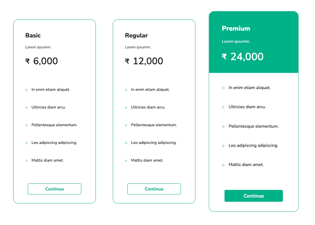
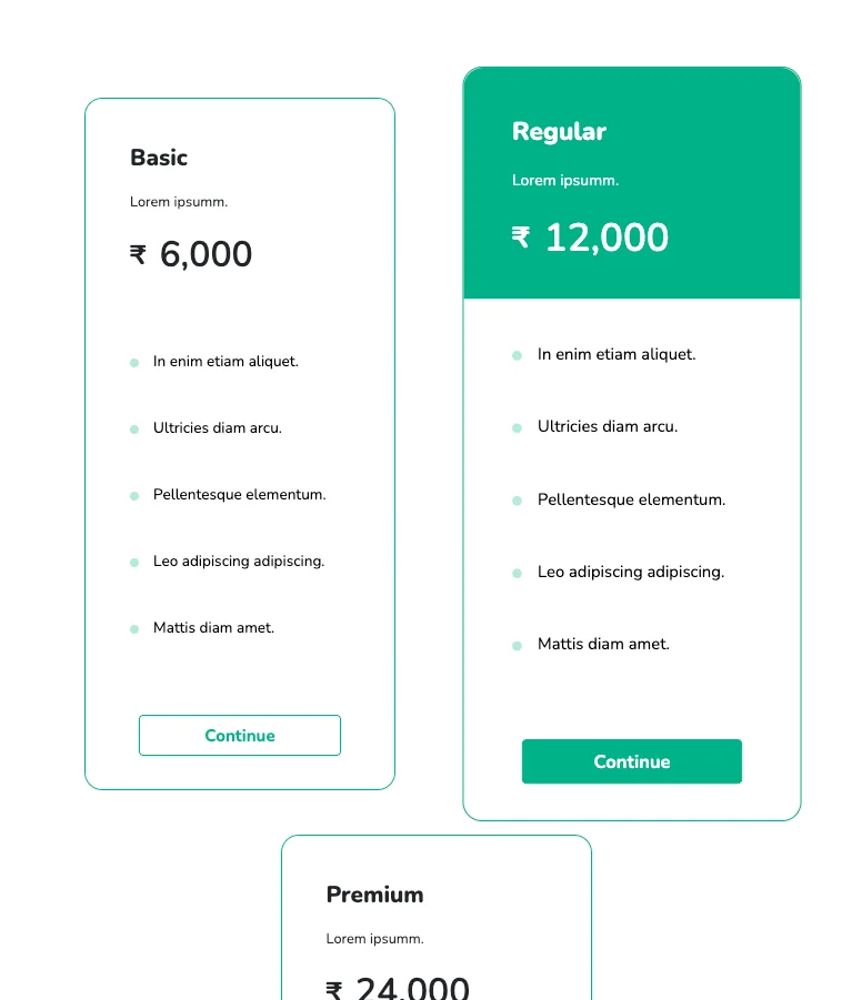
This pricing table comes with prominent headers to display the product title as well as its price. The cards are separated from one another and hover animations are applied to the buttons and the header. Services provided by each plan are presented in a neat, concise way with a bulleted list. This design works perfectly on all browsers and devices.
View Code
HTML
CSS
JS
Responsive CSS
Output
Basic
Lorem ipsumm.
₹
6,000
-
In enim etiam aliquet.
-
Ultricies diam arcu.
-
Pellentesque elementum.
-
Leo adipiscing adipiscing.
-
Mattis diam amet.
Regular
Lorem ipsumm.
₹
12,000
-
In enim etiam aliquet.
-
Ultricies diam arcu.
-
Pellentesque elementum.
-
Leo adipiscing adipiscing.
-
Mattis diam amet.
Premium
Lorem ipsumm.
₹
24,000
-
In enim etiam aliquet.
-
Ultricies diam arcu.
-
Pellentesque elementum.
-
Leo adipiscing adipiscing.
-
Mattis diam amet.
          .pricing_9 * {
    font-family: Nunito, sans-serif;
}

.pricing_9 .responsive-cell-block {
    min-height: 75px;
}

.pricing_9 .responsive-container-block {
    min-height: 75px;
    height: fit-content;
    width: 100%;
    padding-top: 10px;
    padding-right: 10px;
    padding-bottom: 10px;
    padding-left: 10px;
    display: flex;
    flex-wrap: wrap;
    margin-top: 0px;
    margin-right: auto;
    margin-bottom: 0px;
    margin-left: auto;
    justify-content: flex-start;
}

.pricing_9 .text-blk {
    margin-top: 0px;
    margin-right: 0px;
    margin-bottom: 0px;
    margin-left: 0px;
    line-height: 25px;
}

.pricing_9 ul {
    list-style-type: none;
    margin-top: 0px;
    margin-right: 0px;
    margin-bottom: 0px;
    margin-left: 0px;
    padding-top: 0px;
    padding-right: 0px;
    padding-bottom: 0px;
    padding-left: 0px;
}

.pricing_9 .responsive-container-block.big-container {
    padding-top: 10px;
    padding-right: 30px;
    padding-bottom: 10px;
    padding-left: 30px;
}

.pricing_9 .responsive-container-block.container {
    max-width: 1320px;
    padding-top: 10px;
    padding-right: 0px;
    padding-bottom: 10px;
    padding-left: 0px;
    margin-top: 100px;
    margin-right: auto;
    margin-bottom: 80px;
    margin-left: auto;
}

.pricing_9 .text-blk.head {
    width: 100%;
    text-align: center;
    font-size: 40px;
    font-weight: 900;
    line-height: 52px;
}

.pricing_9 .card {
    text-align: center;
    width: 350px;
    display: flex;
    flex-direction: column;
    position: relative;
    align-items: flex-start;
    min-height: 500px;
    font-size: 18px;
    color: #212529;
    padding-top: 0px;
    padding-right: 0px;
    padding-bottom: 0px;
    padding-left: 0px;
    border-top-width: 1px;
    border-right-width: 1px;
    border-bottom-width: 1px;
    border-left-width: 1px;
    border-top-style: solid;
    border-right-style: solid;
    border-bottom-style: solid;
    border-left-style: solid;
    border-top-color: #00b289;
    border-right-color: #00b289;
    border-bottom-color: #00b289;
    border-left-color: #00b289;
    border-image-source: initial;
    border-image-slice: initial;
    border-image-width: initial;
    border-image-outset: initial;
    border-image-repeat: initial;
    border-top-left-radius: 20px;
    border-top-right-radius: 20px;
    border-bottom-right-radius: 20px;
    border-bottom-left-radius: 20px;
    margin-top: 20px;
    margin-right: 0px;
    margin-bottom: 30px;
    margin-left: 0px;
}

.pricing_9 .card-description {
    margin-bottom: 8rem;
    color: #686868;
}

.pricing_9 .card h1 {
    font-size: 46px;
    line-height: 64px;
    font-weight: 900;
    margin-top: 1rem;
    margin-right: 0px;
    margin-bottom: 1rem;
    margin-left: 0px;
}

.pricing_9 .buy-button {
    bottom: 37px;
    left: 0px;
    position: absolute;
    width: 100%;
    padding-top: 0px;
    padding-right: 60px;
    padding-bottom: 0px;
    padding-left: 60px;
}

.pricing_9 .btns {
    background-color: white;
    transition-duration: 0.2s;
    transition-timing-function: ease;
    transition-delay: 0s;
    transition-property: transform;
    width: 100%;
    height: 46px;
    font-size: 19px;
    font-weight: 700;
    cursor: pointer;
    border-top-left-radius: 5px;
    border-top-right-radius: 5px;
    border-bottom-right-radius: 5px;
    border-bottom-left-radius: 5px;
    border-top-width: 1.5px;
    border-right-width: 1.5px;
    border-bottom-width: 1.5px;
    border-left-width: 1.5px;
    border-top-style: solid;
    border-right-style: solid;
    border-bottom-style: solid;
    border-left-style: solid;
    border-top-color: #00b289;
    border-right-color: #00b289;
    border-bottom-color: #00b289;
    border-left-color: #00b289;
    border-image-source: initial;
    border-image-slice: initial;
    border-image-width: initial;
    border-image-outset: initial;
    border-image-repeat: initial;
    color: #00b289;
}

.pricing_9 .btns:hover {
    transform: scale(1.05);
}

.pricing_9 .responsive-cell-block.wk-desk-4.wk-ipadp-4.wk-tab-6.wk-mobile-12 {
    display: flex;
    justify-content: center;
    width: auto;
    max-width: 360px;
    margin-top: 0px;
    margin-right: 15px;
    margin-bottom: 0px;
    margin-left: 25px;
}

.pricing_9 .responsive-container-block.card-container {
    justify-content: space-evenly;
    margin-top: 0px;
    margin-right: 0px;
    margin-bottom: 0px;
    margin-left: 0px;
}

.pricing_9 .text-blk.card-points {
    line-height: 25px;
    margin-top: 0px;
    margin-right: 0px;
    margin-bottom: 30px;
    margin-left: 0px;
    color: black;
    font-size: 17px;
}

.pricing_9 .text-blk.card-head {
    font-size: 26px;
    line-height: 34px;
    font-weight: 800;
}

.pricing_9 .text-blk.card-subhead {
    font-size: 16px;
    margin-top: 0px;
    margin-right: 0px;
    margin-bottom: 15px;
    margin-left: 0px;
}

.pricing_9 .text-blk.rupees {
    font-size: 30px;
    margin-top: 0px;
    margin-right: 5px;
    margin-bottom: 0px;
    margin-left: 0px;
    font-weight: 700;
}

.pricing_9 .price {
    display: flex;
    font-size: 40px;
    font-weight: 600;
    line-height: 45px;
    margin-top: 0px;
    margin-right: 0px;
    margin-bottom: 0px;
    margin-left: 0px;
}

.pricing_9 .card-upper-content {
    width: 100%;
    display: flex;
    flex-direction: column;
    align-items: flex-start;
    padding-top: 40px;
    padding-right: 20px;
    padding-bottom: 40px;
    padding-left: 40px;
    margin-top: 0px;
    margin-right: 0px;
    margin-bottom: 35px;
    margin-left: 0px;
    border-top-left-radius: 20px;
    border-top-right-radius: 20px;
    border-bottom-right-radius: 0px;
    border-bottom-left-radius: 0px;
}

.pricing_9 .card-lower-content {
    width: 100%;
    display: flex;
    align-items: flex-start;
    flex-direction: column;
    padding-top: 0px;
    padding-right: 20px;
    padding-bottom: 0px;
    padding-left: 40px;
    text-align: left;
}

.pricing_9 li::before {
    display: inline-block;
    vertical-align: middle;
    width: 10px;
    height: 10px;
    border-top-left-radius: 10px;
    border-top-right-radius: 10px;
    border-bottom-right-radius: 10px;
    border-bottom-left-radius: 10px;
    background-color: #b5e9dd;
    margin-right: 12px;
    content: " ";
}

.pricing_9 .card-selected .card-upper-content,
.pricing_9 .card-selected .btns {
    color: white;
    background-image: initial;
    background-position-x: initial;
    background-position-y: initial;
    background-size: initial;
    background-repeat-x: initial;
    background-repeat-y: initial;
    background-attachment: initial;
    background-origin: initial;
    background-clip: initial;
    background-color: #00b289;
}

.pricing_9 .card-selected {
    transform: scale(1.09);
}

@media (max-width: 500px) {
    .pricing_9 .card {
        width: 306px;
    }

    .pricing_9 .card-selected {
        transform: scale(1);
    }

    .pricing_9 .card-upper-content {
        padding-top: 40px;
        padding-right: 15px;
        padding-bottom: 40px;
        padding-left: 30px;
    }

    .pricing_9 .card-lower-content {
        padding-top: 0px;
        padding-right: 15px;
        padding-bottom: 0px;
        padding-left: 30px;
    }
}
          $(`.card`).mouseenter(function(item) {
    $(` .card`).removeClass("card-selected");
    item.currentTarget.classList.add("card-selected")
    });
          @import url('https://fonts.googleapis.com/css2?family=Nunito:wght@200;300;400;600;700;800&display=swap');
        *, *:before, *:after {
        -moz-box-sizing: border-box;
        -webkit-box-sizing: border-box;
        box-sizing: border-box;
        }
        body {
        margin: 0;
        }
        .wk-desk-1{
        width: 8.333333%;
        }
        .wk-desk-2{
        width: 16.666667%;
        }
        .wk-desk-3{
        width: 25%;
        }
        .wk-desk-4{
        width: 33.333333%;
        }
        .wk-desk-5{
        width: 41.666667%;
        }
        .wk-desk-6{
        width: 50%;
        }
        .wk-desk-7{
        width: 58.333333%;
        }
        .wk-desk-8{
        width: 66.666667%;
        }
        .wk-desk-9{
        width: 75%;
        }
        .wk-desk-10{
        width: 83.333333%;
        }
        .wk-desk-11{
        width: 91.666667%;
        }
        .wk-desk-12{
        width: 100%;
        }
        @media (max-width: 1024px) {
        .wk-ipadp-1{
        width: 8.333333%;
        }
        .wk-ipadp-2{
        width: 16.666667%;
        }
        .wk-ipadp-3{
        width: 25%;
        }
        .wk-ipadp-4{
        width: 33.333333%;
        }
        .wk-ipadp-5{
        width: 41.666667%;
        }
        .wk-ipadp-6{
        width: 50%;
        }
        .wk-ipadp-7{
        width: 58.333333%;
        }
        .wk-ipadp-8{
        width: 66.666667%;
        }
        .wk-ipadp-9{
        width: 75%;
        }
        .wk-ipadp-10{
        width: 83.333333%;
        }
        .wk-ipadp-11{
        width: 91.666667%;
        }
        .wk-ipadp-12{
        width: 100%;
        }
        }
        @media (max-width: 768px) {
        .wk-tab-1{
        width: 8.333333%;
        }
        .wk-tab-2{
        width: 16.666667%;
        }
        .wk-tab-3{
        width: 25%;
        }
        .wk-tab-4{
        width: 33.333333%;
        }
        .wk-tab-5{
        width: 41.666667%;
        }
        .wk-tab-6{
        width: 50%;
        }
        .wk-tab-7{
        width: 58.333333%;
        }
        .wk-tab-8{
        width: 66.666667%;
        }
        .wk-tab-9{
        width: 75%;
        }
        .wk-tab-10{
        width: 83.333333%;
        }
        .wk-tab-11{
        width: 91.666667%;
        }
        .wk-tab-12{
        width: 100%;
        }
        }
        @media (max-width: 500px) {
        .wk-mobile-1{
        width: 8.333333%;
        }
        .wk-mobile-2{
        width: 16.666667%;
        }
        .wk-mobile-3{
        width: 25%;
        }
        .wk-mobile-4{
        width: 33.333333%;
        }
        .wk-mobile-5{
        width: 41.666667%;
        }
        .wk-mobile-6{
        width: 50%;
        }
        .wk-mobile-7{
        width: 58.333333%;
        }
        .wk-mobile-8{
        width: 66.666667%;
        }
        .wk-mobile-9{
        width: 75%;
        }
        .wk-mobile-10{
        width: 83.333333%;
        }
        .wk-mobile-11{
        width: 91.666667%;
        }
        .wk-mobile-12{
        width: 100%;
        }
        }
Reset
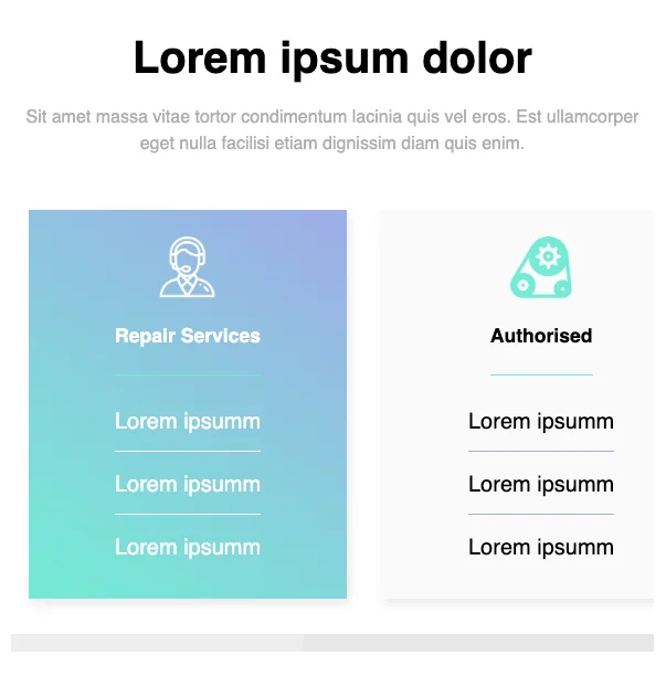
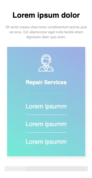
This iconified pricing table has a clean and flat design style. The content becomes horizontally scrollable by reducing the screen size. The mild color gradient from blue to green gives the table a catchy look.
View Code
HTML
CSS
JS
Responsive CSS
Output
              Lorem ipsum dolor


              Sit amet massa vitae tortor condimentum lacinia quis vel eros. Est ullamcorper eget nulla facilisi etiam dignissim diam quis enim.


                  Repair Services


                 Lorem ipsumm


                 Lorem ipsumm


                 Lorem ipsumm


                  Authorised


                 Lorem ipsumm


                 Lorem ipsumm


                 Lorem ipsumm


                  Local Repair


                 Lorem ipsumm


                 Lorem ipsumm


                 Lorem ipsumm


                  Repair Services


                 Lorem ipsumm


                 Lorem ipsumm


                 Lorem ipsumm
          .services * {
    font-family: Nunit, sans-serif;
}

.services .responsive-cell-block {
    min-height: 75px;
}

.services .text-blk {
    margin-top: 0px;
    margin-right: 0px;
    margin-bottom: 0px;
    margin-left: 0px;
    line-height: 25px;
    padding-top: 0px;
    padding-right: 0px;
    padding-bottom: 0px;
    padding-left: 0px;
}

.services .responsive-container-block {
    min-height: 75px;
    height: fit-content;
    width: 100%;
    padding-top: 10px;
    padding-right: 10px;
    padding-bottom: 10px;
    padding-left: 10px;
    display: flex;
    flex-wrap: wrap;
    margin-top: 0px;
    margin-right: auto;
    margin-bottom: 0px;
    margin-left: auto;
    justify-content: flex-start;
}

.services .responsive-container-block.bigContainer {
    padding-top: 10px;
    padding-right: 30px;
    padding-bottom: 10px;
    padding-left: 30px;
}

.services .responsive-container-block.Container {
    max-width: 1320px;
    margin-top: 50px;
    margin-right: auto;
    margin-bottom: 50px;
    margin-left: auto;
    padding-top: 40px;
    padding-right: 0px;
    padding-bottom: 0px;
    padding-left: 0px;
    flex-direction: column;
    align-items: center;
    justify-content: center;
    padding: 0 0 0 0;
}

.services .text-blk.cardHeading {
    font-size: 22px;
    font-weight: 600;
    text-align: center;
    padding-top: 0px;
    padding-right: 0px;
    padding-bottom: 30px;
    padding-left: 0px;
    border-bottom-width: 2px;
    border-bottom-style: solid;
    border-bottom-color: #74ebd5;
    color: white;
    margin-top: 0px;
    margin-right: 0px;
    margin-bottom: 0px;
    margin-left: 0px;
}

.services .card {
    display: flex;
    flex-direction: column;
    align-items: center;
    justify-content: center;
    background-image: linear-gradient(32deg, #74ebd5, #9face6);
    background-position-x: initial;
    background-position-y: initial;
    background-size: initial;
    background-repeat-x: initial;
    background-repeat-y: initial;
    background-attachment: initial;
    background-origin: initial;
    background-clip: initial;
    background-color: initial;
    box-shadow: rgba(0, 0, 0, 0.1) 3px 6px 12px;
    padding-top: 0px;
    padding-right: 0px;
    padding-bottom: 0px;
    padding-left: 0px;
}

.services .responsive-cell-block.wk-desk-3.wk-ipadp-6.wk-tab-6.wk-mobile-12 {
    padding-top: 0px;
    padding-right: 10px;
    padding-bottom: 0px;
    padding-left: 10px;
    margin: 0 0 40px 0;
    padding: 0 15px 0 15px;
    height: 100%;
}

.services .icon {
    margin-top: 0px;
    margin-right: 0px;
    margin-bottom: 30px;
    margin-left: 0px;
    width: 70px;
    height: 70px;
}

.services .text-blk.cardSubHeading {
    color: white;
    font-size: 25px;
    padding-top: 0px;
    padding-right: 0px;
    padding-bottom: 20px;
    padding-left: 0px;
    border-bottom-width: 1px;
    border-bottom-style: solid;
    border-bottom-color: white;
    margin-top: 0px;
    margin-right: 30px;
    margin-bottom: 25px;
    margin-left: 30px;
    text-align: center;
}

.services .text-blk.cardSubHeading.last {
    border-top-width: 0px;
    border-right-width: 0px;
    border-bottom-width: 0px;
    border-left-width: 0px;
    border-top-style: initial;
    border-right-style: initial;
    border-bottom-style: initial;
    border-left-style: initial;
    border-top-color: initial;
    border-right-color: initial;
    border-bottom-color: initial;
    border-left-color: initial;
    border-image-source: initial;
    border-image-slice: initial;
    border-image-width: initial;
    border-image-outset: initial;
    border-image-repeat: initial;
}

.services .card.whiteCard {
    background-image: initial;
    background-position-x: initial;
    background-position-y: initial;
    background-size: initial;
    background-repeat-x: initial;
    background-repeat-y: initial;
    background-attachment: initial;
    background-origin: initial;
    background-clip: initial;
    background-color: #fafafa;
}

.services .text-blk.cardSubHeading.blackText {
    color: black;
    border-bottom-width: 1px;
    border-bottom-style: solid;
    border-bottom-color: #9face6;
}

.services .text-blk.cardSubHeading.blackText.last {
    border-top-width: 0px;
    border-right-width: 0px;
    border-bottom-width: 0px;
    border-left-width: 0px;
    border-top-style: initial;
    border-right-style: initial;
    border-bottom-style: initial;
    border-left-style: initial;
    border-top-color: initial;
    border-right-color: initial;
    border-bottom-color: initial;
    border-left-color: initial;
    border-image-source: initial;
    border-image-slice: initial;
    border-image-width: initial;
    border-image-outset: initial;
    border-image-repeat: initial;
}

.services .text-blk.cardHeading.blackHeading {
    color: black;
}

.services .topRow {
    width: 100%;
    margin-top: 0px;
    margin-right: 0px;
    margin-bottom: 40px;
    margin-left: 0px;
    display: flex;
    flex-direction: column;
    align-items: center;
    justify-content: center;
    padding-top: 30px;
    padding-right: 30px;
    padding-bottom: 0px;
    padding-left: 30px;
}

.services .card.card4 {
    background-image: initial;
    background-position-x: initial;
    background-position-y: initial;
    background-size: initial;
    background-repeat-x: initial;
    background-repeat-y: initial;
    background-attachment: initial;
    background-origin: initial;
    background-clip: initial;
    background-color: white;
}

.services .topRow.card4row {
    background-image: linear-gradient(32deg, #74ebd5, #9face6);
}

.services .text-blk.cardSubHeading.card4text {
    color: #4b5ba2;
    border-bottom-width: 1px;
    border-bottom-style: solid;
    border-bottom-color: #4b5ba2;
}

.services .text-blk.cardSubHeading.card4text.last {
    border-top-width: 0px;
    border-right-width: 0px;
    border-bottom-width: 0px;
    border-left-width: 0px;
    border-top-style: initial;
    border-right-style: initial;
    border-bottom-style: initial;
    border-left-style: initial;
    border-top-color: initial;
    border-right-color: initial;
    border-bottom-color: initial;
    border-left-color: initial;
    border-image-source: initial;
    border-image-slice: initial;
    border-image-width: initial;
    border-image-outset: initial;
    border-image-repeat: initial;
}

.services .allCardContainer {
    width: 100%;
    display: flex;
    flex-direction: row;
    align-items: flex-start;
    justify-content: flex-start;
    flex-wrap: nowrap;
    overflow-x: scroll;
}

.services .text-blk.heading {
    font-size: 50px;
    line-height: 65px;
    font-weight: 700;
    margin: 0 0 20px 0;
    text-align: center;
}

.services .text-blk.subHeading {
    font-size: 20px;
    line-height: 30px;
    text-align: center;
    margin: 0 0 60px 0;
    max-width: 730px;
    color: #AEAEAE;
}

@media (max-width: 1024px) {
    .services .allCardContainer {
        overflow-y: visible;
    }

    .services .responsive-cell-block.wk-desk-3.wk-ipadp-6.wk-tab-6.wk-mobile-12 {
        min-width: 40%;
        padding: 0 20px 0 20px;
    }
}

@media (max-width: 768px) {
    .services .responsive-cell-block.wk-desk-3.wk-ipadp-6.wk-tab-6.wk-mobile-12 {
        min-width: 55%;
    }

    .services .responsive-container-block.bigContainer {
        padding: 10px 20px 10px 20px;
    }
}

@media (max-width: 500px) {
    .services .responsive-cell-block.wk-desk-3.wk-ipadp-6.wk-tab-6.wk-mobile-12 {
        min-width: 100%;
        padding: 0 10px 0 10px;
    }

    .services .text-blk.heading {
        font-size: 30px;
        line-height: 35px;
    }

    .services .text-blk.subHeading {
        font-size: 14px;
        line-height: 20px;
        margin: 0 0 30px 0;
    }

    .services .topRow {
        padding: 30px 10px 0 10px;
    }

    .services .text-blk.cardSubHeading {
        margin: 0 10px 25px 10px;
    }
}
          @import url('https://fonts.googleapis.com/css2?family=Nunito:wght@200;300;400;600;700;800&display=swap');
        *, *:before, *:after {
        -moz-box-sizing: border-box;
        -webkit-box-sizing: border-box;
        box-sizing: border-box;
        }
        body {
        margin: 0;
        }
        .wk-desk-1{
        width: 8.333333%;
        }
        .wk-desk-2{
        width: 16.666667%;
        }
        .wk-desk-3{
        width: 25%;
        }
        .wk-desk-4{
        width: 33.333333%;
        }
        .wk-desk-5{
        width: 41.666667%;
        }
        .wk-desk-6{
        width: 50%;
        }
        .wk-desk-7{
        width: 58.333333%;
        }
        .wk-desk-8{
        width: 66.666667%;
        }
        .wk-desk-9{
        width: 75%;
        }
        .wk-desk-10{
        width: 83.333333%;
        }
        .wk-desk-11{
        width: 91.666667%;
        }
        .wk-desk-12{
        width: 100%;
        }
        @media (max-width: 1024px) {
        .wk-ipadp-1{
        width: 8.333333%;
        }
        .wk-ipadp-2{
        width: 16.666667%;
        }
        .wk-ipadp-3{
        width: 25%;
        }
        .wk-ipadp-4{
        width: 33.333333%;
        }
        .wk-ipadp-5{
        width: 41.666667%;
        }
        .wk-ipadp-6{
        width: 50%;
        }
        .wk-ipadp-7{
        width: 58.333333%;
        }
        .wk-ipadp-8{
        width: 66.666667%;
        }
        .wk-ipadp-9{
        width: 75%;
        }
        .wk-ipadp-10{
        width: 83.333333%;
        }
        .wk-ipadp-11{
        width: 91.666667%;
        }
        .wk-ipadp-12{
        width: 100%;
        }
        }
        @media (max-width: 768px) {
        .wk-tab-1{
        width: 8.333333%;
        }
        .wk-tab-2{
        width: 16.666667%;
        }
        .wk-tab-3{
        width: 25%;
        }
        .wk-tab-4{
        width: 33.333333%;
        }
        .wk-tab-5{
        width: 41.666667%;
        }
        .wk-tab-6{
        width: 50%;
        }
        .wk-tab-7{
        width: 58.333333%;
        }
        .wk-tab-8{
        width: 66.666667%;
        }
        .wk-tab-9{
        width: 75%;
        }
        .wk-tab-10{
        width: 83.333333%;
        }
        .wk-tab-11{
        width: 91.666667%;
        }
        .wk-tab-12{
        width: 100%;
        }
        }
        @media (max-width: 500px) {
        .wk-mobile-1{
        width: 8.333333%;
        }
        .wk-mobile-2{
        width: 16.666667%;
        }
        .wk-mobile-3{
        width: 25%;
        }
        .wk-mobile-4{
        width: 33.333333%;
        }
        .wk-mobile-5{
        width: 41.666667%;
        }
        .wk-mobile-6{
        width: 50%;
        }
        .wk-mobile-7{
        width: 58.333333%;
        }
        .wk-mobile-8{
        width: 66.666667%;
        }
        .wk-mobile-9{
        width: 75%;
        }
        .wk-mobile-10{
        width: 83.333333%;
        }
        .wk-mobile-11{
        width: 91.666667%;
        }
        .wk-mobile-12{
        width: 100%;
        }
        }
Reset
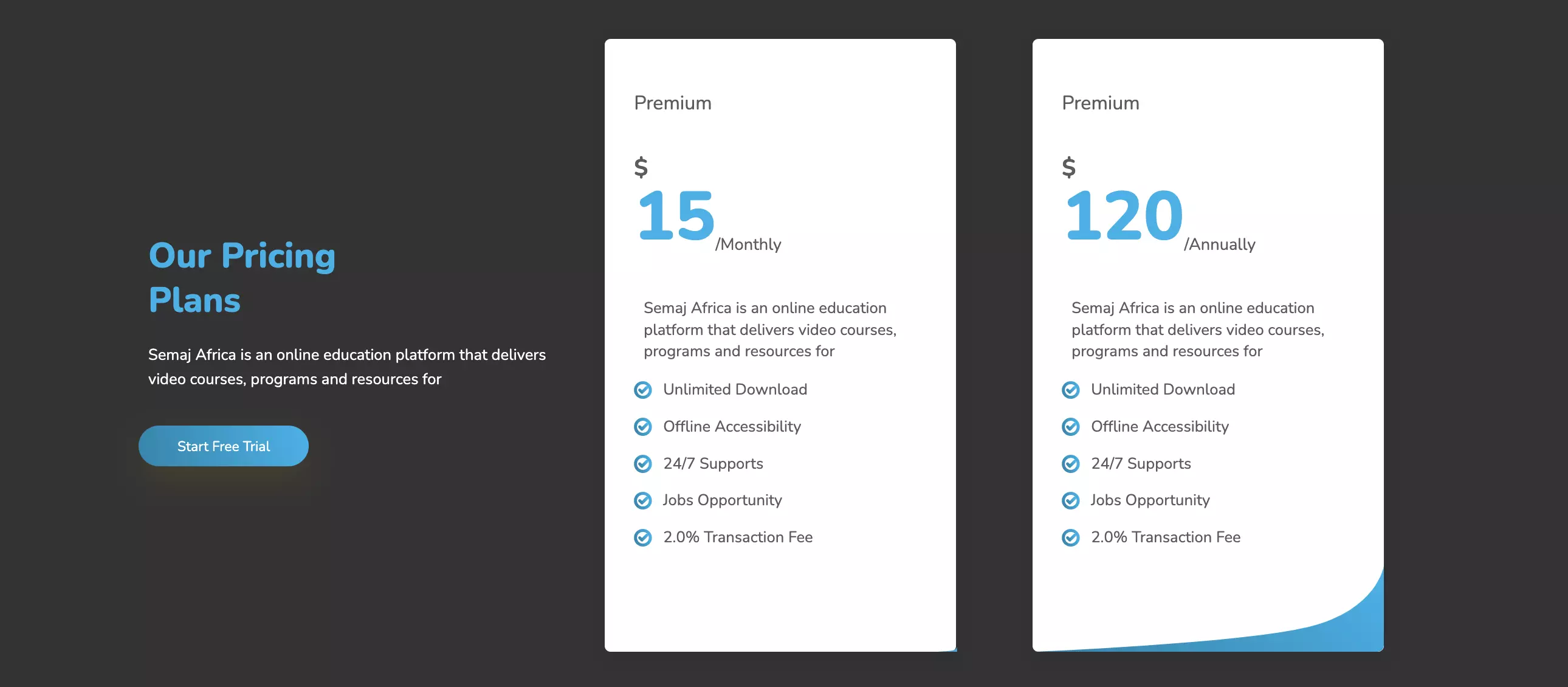
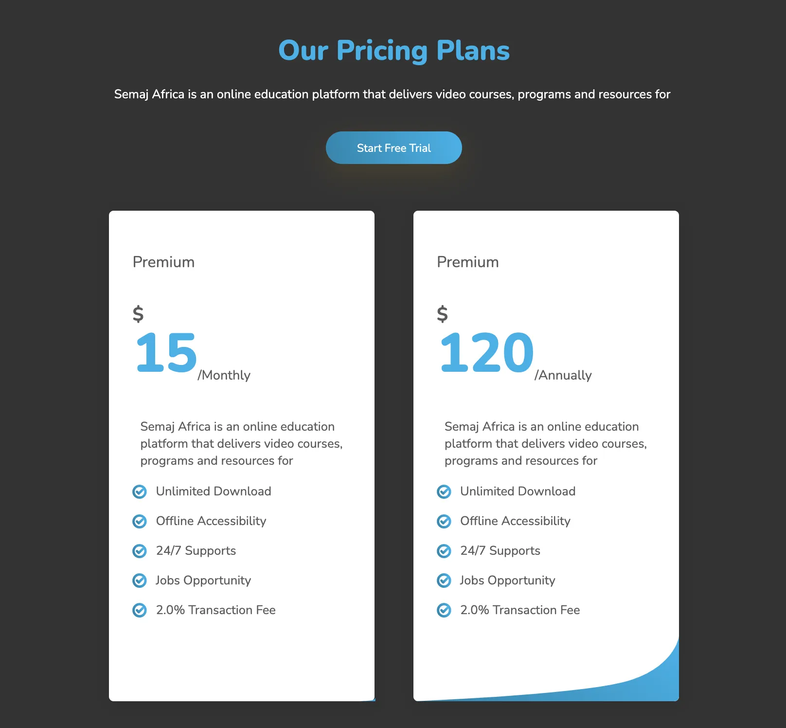

This responsive HTML5 and CSS3 pricing table is an elegant design that is suitable for any business. Its dark background and the sleek design on the bottom-right edge of each card add to the richness of the table. Both monthly and annual services are displayed on the same page which eliminates the need for a toggle switch. The user, on clicking the button, is directed to the sign-up page.
View Code
HTML
CSS
JS
Responsive CSS
Output
Our Pricing Plans
Semaj Africa is an online education platform that delivers video courses, programs and resources for
Premium
$
15
/Monthly
Semaj Africa is an online education platform that delivers video courses, programs and resources for

Unlimited Download
Offline Accessibility
24/7 Supports
Jobs Opportunity
2.0% Transaction Fee
 Premium
$
120
/Annually
Semaj Africa is an online education platform that delivers video courses, programs and resources for
Unlimited Download
Offline Accessibility
24/7 Supports
Jobs Opportunity
2.0% Transaction Fee
          .pricing_8 * {
    font-family: Nunito, sans-serif;
    }
    .pricing_8 .text-blk {
    margin-top: 0px;
    margin-right: 0px;
    margin-bottom: 0px;
    margin-left: 0px;
    line-height: 25px;
    padding-top: 10px;
    padding-right: 10px;
    padding-bottom: 10px;
    padding-left: 10px;
    }
    .pricing_8 .responsive-cell-block {
    min-height: 75px;
    }
    .pricing_8 .responsive-container-block {
    min-height: 75px;
    height: fit-content;
    width: 100%;
    padding-top: 10px;
    padding-right: 10px;
    padding-bottom: 10px;
    padding-left: 10px;
    display: flex;
    flex-wrap: wrap;
    margin-top: 0px;
    margin-right: auto;
    margin-bottom: 0px;
    margin-left: auto;
    justify-content: flex-start;
    }
    .pricing_8 .responsive-container-block.big-container {
    padding-top: 10px;
    padding-right: 30px;
    padding-bottom: 10px;
    padding-left: 30px;
    background-color: #333333;
    margin-top: 0px;
    margin-right: 0px;
    margin-bottom: 0px;
    margin-left: 0px;
    }
    .pricing_8 .responsive-container-block.container {
    max-width: 1320px;
    padding-top: 30px;
    padding-right: 0px;
    padding-bottom: 10px;
    padding-left: 0px;
    flex-direction: column;
    align-items: center;
    justify-content: center;
    }
    .pricing_8 .text-head {
    font-size: 40px;
    line-height: 52px;
    font-weight: 900;
    }
    .pricing_8 .responsive-cell-block.wk-ipadp-4.wk-tab-6.wk-mobile-12.wk-desk-4 {
    padding-top: 0px;
    padding-right: 60px;
    padding-bottom: 0px;
    padding-left: 0px;
    }
    .pricing_8 .responsive-container-block.card-container {
    padding-top: 10px;
    padding-right: 0px;
    padding-bottom: 10px;
    padding-left: 0px;
    align-items: center;
    }
    .pricing_8 .text-blk.text-subhead {
    margin-top: 0px;
    margin-right: 0px;
    margin-bottom: 25px;
    margin-left: 0px;
    font-size: 16px;
    line-height: 25px;
    color: white;
    }
    .pricing_8 .card {
    background-color: white;
    min-height: 630px;
    max-width: 361px;
    border-top-left-radius: 6px;
    border-top-right-radius: 6px;
    border-bottom-right-radius: 6px;
    border-bottom-left-radius: 6px;
    border-top-style: none;
    border-right-style: none;
    border-bottom-style: none;
    border-left-style: none;
    margin-top: auto;
    margin-right: auto;
    margin-bottom: auto;
    margin-left: auto;
    box-shadow: rgba(0, 0, 0, 0.05) 0px 4px 20px 7px;
    position: relative;
    }
    .pricing_8 .card-selected {
    background-color: white;
    color: black;
    }
    .pricing_8 .card-header {
    padding-top: 45px;
    padding-right: 30px;
    padding-bottom: 0px;
    padding-left: 30px;
    margin-top: 0px;
    margin-right: 0px;
    margin-bottom: 0px;
    margin-left: 0px;
    }
    .pricing_8 .card-body {
    text-align: left;
    display: flex;
    flex-direction: column;
    align-items: flex-start;
    justify-content: flex-start;
    padding-top: 0px;
    padding-right: 30px;
    padding-bottom: 0px;
    padding-left: 30px;
    }
    .pricing_8 .row {
    display: flex;
    justify-content: space-between;
    align-items: center;
    margin-top: 0px;
    margin-right: 0px;
    margin-bottom: 25px;
    margin-left: 0px;
    }
    .pricing_8 .sub-title {
    font-size: 20px;
    line-height: 42px;
    font-weight: 400;
    color: #5c5c5c;
    }
    .pricing_8 .text-blk.text-head {
    color: #00b2eb;
    line-height: 46px;
    max-width: 250px;
    font-size: 36px;
    }
    .pricing_8 .text-blk.headingText {
    font-size: 40px;
    line-height: 63px;
    font-weight: 900;
    color: #00b2eb;
    }
    .pricing_8 .btn {
    background-image: linear-gradient(253.58deg, #00b2eb 1.55%, #0087b1 95.8%);
    background-position-x: initial;
    background-position-y: initial;
    background-size: initial;
    background-repeat-x: initial;
    background-repeat-y: initial;
    background-attachment: initial;
    background-origin: initial;
    background-clip: initial;
    background-color: initial;
    box-shadow: rgba(160, 121, 0, 0.2) 0px 12px 35px;
    border-top-left-radius: 100px;
    border-top-right-radius: 100px;
    border-bottom-right-radius: 100px;
    border-bottom-left-radius: 100px;
    border-top-width: 0px;
    border-right-width: 0px;
    border-bottom-width: 0px;
    border-left-width: 0px;
    border-top-style: outset;
    border-right-style: outset;
    border-bottom-style: outset;
    border-left-style: outset;
    border-top-color: #767676;
    border-right-color: #767676;
    border-bottom-color: #767676;
    border-left-color: #767676;
    border-image-source: initial;
    border-image-slice: initial;
    border-image-width: initial;
    border-image-outset: initial;
    border-image-repeat: initial;
    cursor: pointer;
    color: white;
    font-size: 14.3333px;
    padding-top: 12px;
    padding-right: 40px;
    padding-bottom: 11px;
    padding-left: 40px;
    }
    .pricing_8 .btn:hover {
    background-image: initial;
    background-position-x: initial;
    background-position-y: initial;
    background-size: initial;
    background-repeat-x: initial;
    background-repeat-y: initial;
    background-attachment: initial;
    background-origin: initial;
    background-clip: initial;
    background-color: white;
    color: #00b2eb;
    }
    .pricing_8 .price {
    font-size: 70px;
    line-height: 100px;
    color: #00b2eb;
    font-weight: 900;
    margin-top: 0px;
    margin-right: 0px;
    margin-bottom: 0px;
    margin-left: 0px;
    }
    .pricing_8 .dollarSign {
    color: #5c5c5c;
    font-size: 24px;
    line-height: 42px;
    display: inline-block;
    margin-top: 0px;
    margin-right: 0px;
    margin-bottom: -20px;
    margin-left: 0px;
    font-weight: 700;
    }
    .pricing_8 .rowDown {
    display: flex;
    flex-direction: row;
    align-items: flex-end;
    padding-top: 0px;
    padding-right: 0px;
    padding-bottom: 0px;
    padding-left: 0px;
    margin-top: 0px;
    margin-right: 0px;
    margin-bottom: 0px;
    margin-left: 0px;
    }
    .pricing_8 .duration {
    margin-top: 0px;
    margin-right: 0px;
    margin-bottom: 12px;
    margin-left: 0px;
    color: #5c5c5c;
    font-size: 17px;
    line-height: 21px;
    }
    .pricing_8 .cardDescription {
    font-size: 10px;
    line-height: 18px;
    }
    .pricing_8 .text-blk.cardDescription {
    color: #5c5c5c;
    font-size: 16px;
    line-height: 22px;
    }
    .pricing_8 .text-blk.features {
    font-size: 16px;
    line-height: 18px;
    color: #5c5c5c;
    }
    .pricing_8 #itigu {
    color: black;
    }
    .pricing_8 .fullFeature {
    display: flex;
    flex-direction: row;
    align-items: center;
    justify-content: center;
    }
    .pricing_8 .card.card-selected {
    min-height: 630px;
    }
    .pricing_8 .responsive-cell-block.wk-mobile-12.wk-desk-4.wk-ipadp-6.wk-tab-12 {
    padding-top: 10px;
    padding-right: 10px;
    padding-bottom: 10px;
    padding-left: 10px;
    }
    .pricing_8 #i87dj {
    color: black;
    }
    .pricing_8 .cardBottomImg {
    position: absolute;
    bottom: 0px;
    right: -1.5px;
    width: 100%;
    }
    .pricing_8 #ijdri {
    color: black;
    }
    .pricing_8 .image-block {
    width: 20px;
    }
    @media (max-width: 1024px) {
    .pricing_8 .responsive-cell-block.wk-mobile-12.wk-desk-4.wk-ipadp-6.wk-tab-12 {
    max-width: 361px;
    margin-top: 0px;
    margin-right: 15px;
    margin-bottom: 0px;
    margin-left: 15px;
    }
    .pricing_8 .responsive-cell-block.wk-mobile-12.wk-desk-4.wk-ipadp-12.wk-tab-12 {
    margin-top: 0px;
    margin-right: 0px;
    margin-bottom: 50px;
    margin-left: 0px;
    text-align: center;
    padding-top: 0px;
    padding-right: 10px;
    padding-bottom: 0px;
    padding-left: 10px;
    }
    .pricing_8 .responsive-container-block.card-container {
    justify-content: center;
    }
    .pricing_8 .responsive-cell-block.wk-mobile-12.wk-desk-4.wk-ipadp-12.wk-tab-12 {
    display: flex;
    flex-direction: column;
    align-items: center;
    justify-content: center;
    }
    .pricing_8 .text-blk.text-head {
    max-width: 100%;
    }
    }
    @media (max-width: 768px) {
    .pricing_8 .responsive-cell-block.wk-mobile-12.wk-desk-4.wk-ipadp-6.wk-tab-12 {
    margin-top: 0px;
    margin-right: 15px;
    margin-bottom: 40px;
    margin-left: 15px;
    }
    .pricing_8 .card.card-selected {
    margin-top: 0px;
    margin-right: 0px;
    margin-bottom: 0px;
    margin-left: 0px;
    }
    .pricing_8 .text-blk.text-head {
    font-size: 32px;
    line-height: 34px;
    }
    }
    @media (max-width: 500px) {
    .pricing_8 .responsive-cell-block.wk-mobile-12.wk-desk-4.wk-ipadp-6.wk-tab-12 {
    margin-top: 0px;
    margin-right: 0px;
    margin-bottom: 40px;
    margin-left: 0px;
    }
    .pricing_8 .responsive-cell-block.wk-mobile-12.wk-desk-4.wk-ipadp-12.wk-tab-12 {
    padding-top: 0px;
    padding-right: 0px;
    padding-bottom: 0px;
    padding-left: 0px;
    }
    .pricing_8 .card-body {
    padding-top: 0px;
    padding-right: 20px;
    padding-bottom: 20px;
    padding-left: 20px;
    }
    .pricing_8 .card-header {
    padding-top: 20px;
    padding-right: 20px;
    padding-bottom: 0px;
    padding-left: 20px;
    }
    .pricing_8 .card.card-selected {
    min-height: 550px;
    }
    .pricing_8 .responsive-container-block.big-container {
    padding-top: 10px;
    padding-right: 20px;
    padding-bottom: 10px;
    padding-left: 20px;
    }
    .pricing_8 .text-blk.text-head {
    padding-top: 10px;
    padding-right: 0px;
    padding-bottom: 10px;
    padding-left: 0px;
    }
    .pricing_8 .text-blk.text-subhead {
    padding-top: 10px;
    padding-right: 0px;
    padding-bottom: 10px;
    padding-left: 0px;
    }
    .pricing_8 .responsive-cell-block.wk-mobile-12.wk-desk-4.wk-ipadp-6.wk-tab-12 {
    padding-top: 10px;
    padding-right: 0px;
    padding-bottom: 10px;
    padding-left: 0px;
    }
    .pricing_8 .rowDown {
    flex-wrap: wrap;
    }
    .pricing_8 .text-blk.cardDescription {
    padding-top: 0px;
    padding-right: 10px;
    padding-bottom: 10px;
    padding-left: 10px;
    }
    .pricing_8 .price {
    line-height: 75px;
    }
    }
          $(" .card").mouseenter(function(item) {
    $(" .card").removeClass("card-selected");
    $(" #" + $(item.currentTarget).attr("id")).addClass("card-selected");
});
          @import url('https://fonts.googleapis.com/css2?family=Nunito:wght@200;300;400;600;700;800&display=swap');
        *, *:before, *:after {
        -moz-box-sizing: border-box;
        -webkit-box-sizing: border-box;
        box-sizing: border-box;
        }
        body {
        margin: 0;
        }
        .wk-desk-1{
        width: 8.333333%;
        }
        .wk-desk-2{
        width: 16.666667%;
        }
        .wk-desk-3{
        width: 25%;
        }
        .wk-desk-4{
        width: 33.333333%;
        }
        .wk-desk-5{
        width: 41.666667%;
        }
        .wk-desk-6{
        width: 50%;
        }
        .wk-desk-7{
        width: 58.333333%;
        }
        .wk-desk-8{
        width: 66.666667%;
        }
        .wk-desk-9{
        width: 75%;
        }
        .wk-desk-10{
        width: 83.333333%;
        }
        .wk-desk-11{
        width: 91.666667%;
        }
        .wk-desk-12{
        width: 100%;
        }
        @media (max-width: 1024px) {
        .wk-ipadp-1{
        width: 8.333333%;
        }
        .wk-ipadp-2{
        width: 16.666667%;
        }
        .wk-ipadp-3{
        width: 25%;
        }
        .wk-ipadp-4{
        width: 33.333333%;
        }
        .wk-ipadp-5{
        width: 41.666667%;
        }
        .wk-ipadp-6{
        width: 50%;
        }
        .wk-ipadp-7{
        width: 58.333333%;
        }
        .wk-ipadp-8{
        width: 66.666667%;
        }
        .wk-ipadp-9{
        width: 75%;
        }
        .wk-ipadp-10{
        width: 83.333333%;
        }
        .wk-ipadp-11{
        width: 91.666667%;
        }
        .wk-ipadp-12{
        width: 100%;
        }
        }
        @media (max-width: 768px) {
        .wk-tab-1{
        width: 8.333333%;
        }
        .wk-tab-2{
        width: 16.666667%;
        }
        .wk-tab-3{
        width: 25%;
        }
        .wk-tab-4{
        width: 33.333333%;
        }
        .wk-tab-5{
        width: 41.666667%;
        }
        .wk-tab-6{
        width: 50%;
        }
        .wk-tab-7{
        width: 58.333333%;
        }
        .wk-tab-8{
        width: 66.666667%;
        }
        .wk-tab-9{
        width: 75%;
        }
        .wk-tab-10{
        width: 83.333333%;
        }
        .wk-tab-11{
        width: 91.666667%;
        }
        .wk-tab-12{
        width: 100%;
        }
        }
        @media (max-width: 500px) {
        .wk-mobile-1{
        width: 8.333333%;
        }
        .wk-mobile-2{
        width: 16.666667%;
        }
        .wk-mobile-3{
        width: 25%;
        }
        .wk-mobile-4{
        width: 33.333333%;
        }
        .wk-mobile-5{
        width: 41.666667%;
        }
        .wk-mobile-6{
        width: 50%;
        }
        .wk-mobile-7{
        width: 58.333333%;
        }
        .wk-mobile-8{
        width: 66.666667%;
        }
        .wk-mobile-9{
        width: 75%;
        }
        .wk-mobile-10{
        width: 83.333333%;
        }
        .wk-mobile-11{
        width: 91.666667%;
        }
        .wk-mobile-12{
        width: 100%;
        }
        }
Reset
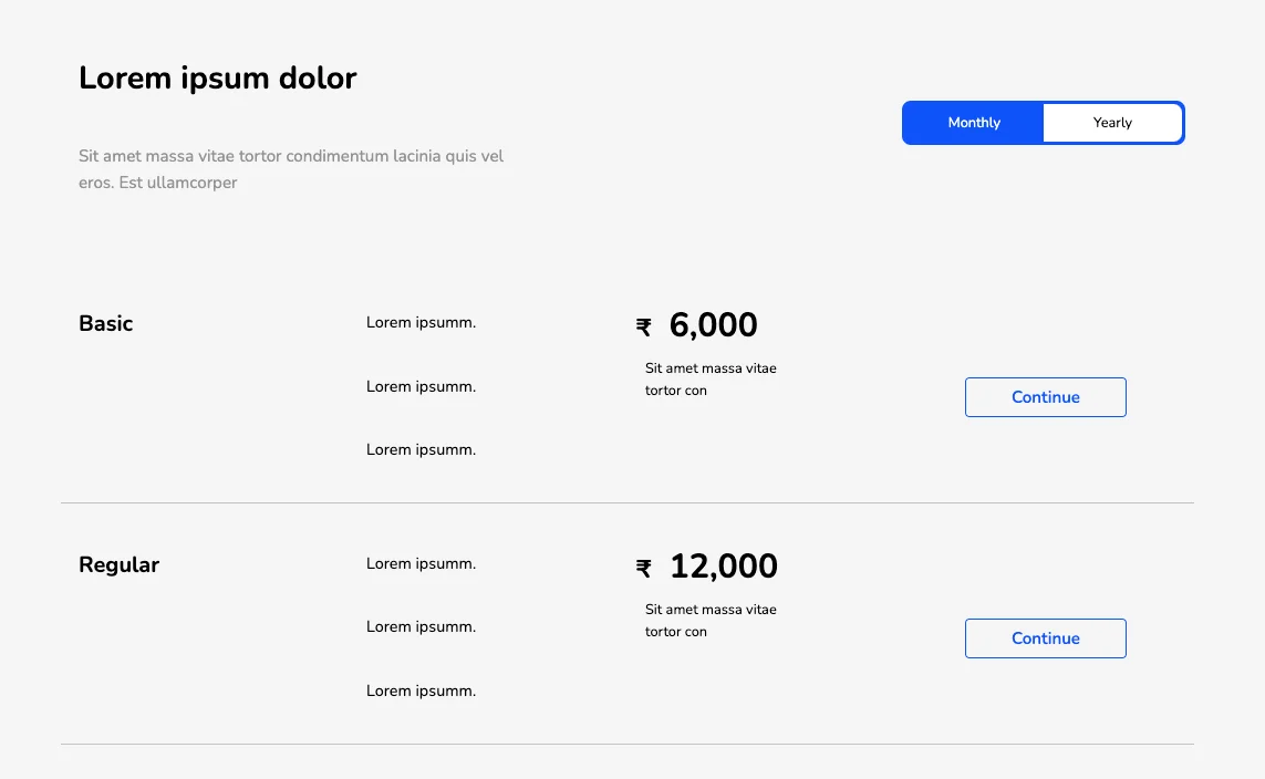
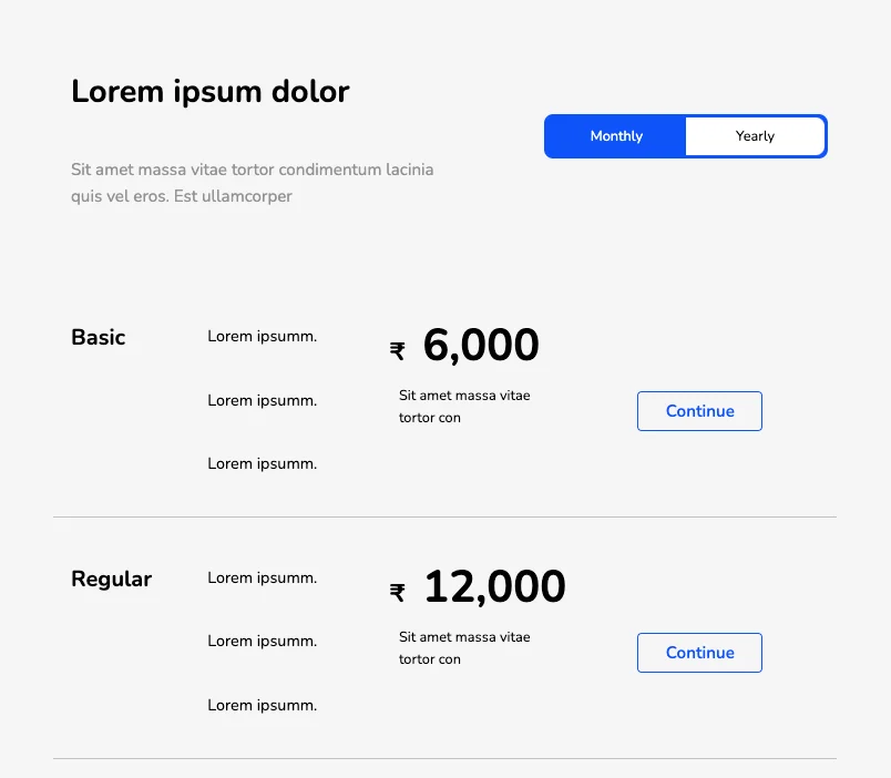
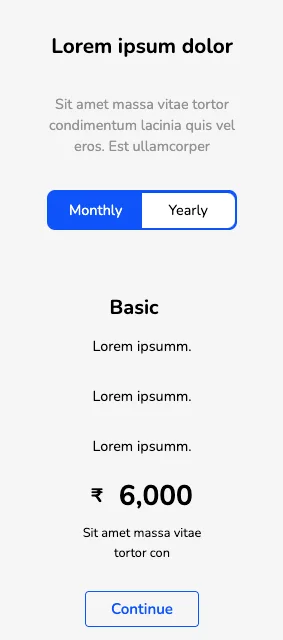
The above table has a much simpler layout and follows conventional design rules. The tabular toggle switch highlights the plan under focus with the help of a different background. Individual flex-based cards are vertically oriented and on reducing the screen width, fall into stack formation for easy browsing.
View Code
HTML
CSS
JS
Responsive CSS
Output
Lorem ipsum dolor
Sit amet massa vitae tortor condimentum lacinia quis vel eros. Est ullamcorper
Basic
Lorem ipsumm.
Lorem ipsumm.
Lorem ipsumm.
Dolor amit.
Dolor amit.
Dolor amit.
₹
6,000
Sit amet massa vitae tortor con
₹
12,000
Sit amet massa lorem ipsum dolor.
Regular
Lorem ipsumm.
Lorem ipsumm.
Lorem ipsumm.
Dolor amit.
Dolor amit.
Dolor amit.
₹
12,000
Sit amet massa vitae tortor con
₹
24,000
Sit amet massa lorem ipsum dolor.
Premium
Lorem ipsumm.
Lorem ipsumm.
Lorem ipsumm.
Dolor amit.
Dolor amit.
Dolor amit.
₹
24,000
Sit amet massa vitae tortor con
₹
48,000
Sit amet massa lorem ipsum dolor.
          .blue_pricing * {
    font-family: Nunito, sans-serif;
}

.blue_pricing .text-blk {
    margin-top: 0px;
    margin-right: 0px;
    margin-bottom: 0px;
    margin-left: 0px;
    line-height: 25px;
}

.blue_pricing .responsive-container-block {
    min-height: 75px;
    height: fit-content;
    width: 100%;
    display: flex;
    flex-wrap: wrap;
    margin-top: 0px;
    margin-right: auto;
    margin-bottom: 0px;
    margin-left: auto;
    justify-content: flex-start;
}

.blue_pricing a {
    text-decoration-line: none;
    text-decoration-thickness: initial;
    text-decoration-style: initial;
    text-decoration-color: initial;
    color: inherit;
}

.blue_pricing .d-none {
    display: none;
}

.blue_pricing .responsive-cell-block {
    min-height: 75px;
}

.blue_pricing .responsive-container-block.container {
    margin-top: 50px;
    margin-right: auto;
    margin-bottom: 50px;
    margin-left: auto;
    max-width: 1320px;
}

.blue_pricing .text-blk.section-head-text {
    font-size: 36px;
    line-height: 65px;
    font-weight: 700;
    margin-top: 0px;
    margin-right: 0px;
    margin-bottom: 20px;
    margin-left: 0px;
}

.blue_pricing .text-blk.section-subhead-text {
    font-size: 19px;
    line-height: 30px;
    color: #939393;
    max-width: 520px;
}

.blue_pricing .btn-box {
    max-width: 320px;
    height: 50px;
    width: 100%;
    border-top-left-radius: 10px;
    border-top-right-radius: 10px;
    border-bottom-right-radius: 10px;
    border-bottom-left-radius: 10px;
    border-top-width: 3.5px;
    border-right-width: 3.5px;
    border-bottom-width: 3.5px;
    border-left-width: 3.5px;
    border-top-style: solid;
    border-right-style: solid;
    border-bottom-style: solid;
    border-left-style: solid;
    border-top-color: #0f53f9;
    border-right-color: #0f53f9;
    border-bottom-color: #0f53f9;
    border-left-color: #0f53f9;
    border-image-source: initial;
    border-image-slice: initial;
    border-image-width: initial;
    border-image-outset: initial;
    border-image-repeat: initial;
    background-color: #0f53f9;
}

.blue_pricing .button {
    height: 100%;
    width: 50%;
    font-size: 16px;
    border-top-width: 2px;
    border-right-width: 2px;
    border-bottom-width: 2px;
    border-left-width: 2px;
    border-top-style: none;
    border-right-style: none;
    border-bottom-style: none;
    border-left-style: none;
    border-top-color: #767676;
    border-right-color: #767676;
    border-bottom-color: #767676;
    border-left-color: #767676;
    border-image-source: initial;
    border-image-slice: initial;
    border-image-width: initial;
    border-image-outset: initial;
    border-image-repeat: initial;
    background-color: white;
}

.blue_pricing .button.button-selected {
    background-color: #0f53f9;
    color: white;
}

.blue_pricing .responsive-cell-block.wk-desk-6.wk-ipadp-6.wk-tab-12.wk-mobile-12.btn-one {
    display: flex;
    justify-content: flex-end;
    align-items: center;
}

.blue_pricing #btn1 {
    border-top-left-radius: 10px;
    border-top-right-radius: 0px;
    border-bottom-right-radius: 0px;
    border-bottom-left-radius: 10px;
}

.blue_pricing #btn2 {
    border-top-left-radius: 0px;
    border-top-right-radius: 10px;
    border-bottom-right-radius: 10px;
    border-bottom-left-radius: 0px;
}

.blue_pricing .responsive-container-block.big-container {
    padding-top: 0px;
    padding-right: 50px;
    padding-bottom: 0px;
    padding-left: 50px;
    background-color: #f6f6f6;
}

.blue_pricing .responsive-container-block.first-container {
    margin-top: 0px;
    margin-right: 0px;
    margin-bottom: 90px;
    margin-left: 0px;
}

.blue_pricing .text-blk.pricing-head {
    font-size: 25px;
    font-weight: 700;
    line-height: 30px;
}

.blue_pricing .text-blk.pricing-content {
    text-align: left;
    font-size: 18px;
    line-height: 27px;
    margin-top: 0px;
    margin-right: 0px;
    margin-bottom: 25px;
    margin-left: 0px;
}

.blue_pricing .price {
    font-size: 38px;
    font-weight: 700;
}

.blue_pricing .Currency {
    font-size: 28px;
    margin-top: 0px;
    margin-right: 20px;
    margin-bottom: 0px;
    margin-left: 0px;
}

.blue_pricing .responsive-cell-block.wk-desk-3.wk-ipadp-3.wk-tab-6.wk-mobile-12 {
    text-align: left;
}

.blue_pricing .responsive-cell-block.wk-desk-3.wk-ipadp-3.wk-tab-6.wk-mobile-12.price-one {
    text-align: left;
    display: flex;
    flex-direction: column;
    align-items: flex-start;
    justify-content: center;
}

.blue_pricing .text-blk.price-text {
    max-width: 200px;
}

.blue_pricing .responsive-cell-block.wk-desk-3.wk-ipadp-3.wk-tab-6.wk-mobile-12.btn-one {
    display: flex;
    justify-content: center;
    align-items: center;
}

.blue_pricing .con-button {
    min-width: auto;
    height: 45px;
    display: flex;
    justify-content: center;
    align-items: center;
    border-top-width: 2px;
    border-right-width: 2px;
    border-bottom-width: 2px;
    border-left-width: 2px;
    border-top-style: solid;
    border-right-style: solid;
    border-bottom-style: solid;
    border-left-style: solid;
    border-top-color: #0f53f9;
    border-right-color: #0f53f9;
    border-bottom-color: #0f53f9;
    border-left-color: #0f53f9;
    border-image-source: initial;
    border-image-slice: initial;
    border-image-width: initial;
    border-image-outset: initial;
    border-image-repeat: initial;
    border-top-left-radius: 5px;
    border-top-right-radius: 5px;
    border-bottom-right-radius: 5px;
    border-bottom-left-radius: 5px;
    font-size: 19px;
    font-weight: 600;
    color: #0f53f9;
    padding-top: 0px;
    padding-right: 50px;
    padding-bottom: 0px;
    padding-left: 50px;
}

.blue_pricing .responsive-container-block.second-container {
    justify-content: center;
    border-bottom-width: 0.8px;
    border-bottom-style: solid;
    border-bottom-color: #c4c4c4;
    margin-top: 0px;
    margin-right: 0px;
    margin-bottom: 35px;
    margin-left: 0px;
}

.blue_pricing .responsive-cell-block.wk-desk-3.wk-ipadp-3.wk-mobile-12.btn-one.wk-tab-10 {
    display: flex;
    justify-content: center;
    align-items: center;
}

.blue_pricing .responsive-cell-block.wk-desk-3.wk-mobile-12.btn-one.wk-tab-10.wk-ipadp-4 {
    display: flex;
    justify-content: center;
    align-items: center;
    padding-top: 0px;
    padding-right: 15px;
    padding-bottom: 0px;
    padding-left: 15px;
}

.blue_pricing .responsive-cell-block.wk-mobile-12.first.wk-desk-3.wk-tab-10.wk-ipadp-2 {
    padding-top: 0px;
    padding-right: 20px;
    padding-bottom: 0px;
    padding-left: 0px;
}

.blue_pricing .responsive-cell-block.wk-ipadp-3.wk-mobile-12.wk-desk-3.wk-tab-10 {
    padding-top: 0px;
    padding-right: 10px;
    padding-bottom: 0px;
    padding-left: 10px;
}

@media (max-width: 1024px) {
    .blue_pricing .con-button {
        padding-top: 0px;
        padding-right: 30px;
        padding-bottom: 0px;
        padding-left: 30px;
    }

    .blue_pricing .responsive-cell-block.wk-desk-3.wk-ipadp-3.wk-mobile-12.btn-one.wk-tab-10 {
        justify-content: flex-end;
    }

    .blue_pricing .responsive-cell-block.wk-desk-3.wk-mobile-12.btn-one.wk-tab-10.wk-ipadp-4 {
        display: flex;
        justify-content: center;
        align-items: center;
    }

    .blue_pricing .price {
        font-size: 50px;
    }
}

@media (max-width: 768px) {
    .blue_pricing .responsive-cell-block.wk-ipadp-3.wk-mobile-12.wk-desk-3.wk-tab-10 {
        display: flex;
        flex-direction: column;
        align-items: center;
    }

    .blue_pricing .responsive-cell-block.wk-desk-6.wk-ipadp-6.wk-tab-12.wk-mobile-12.btn-one {
        justify-content: center;
        margin-top: 30px;
        margin-right: 0px;
        margin-bottom: 0px;
        margin-left: 0px;
    }

    .blue_pricing .responsive-cell-block.wk-desk-6.wk-ipadp-6.wk-tab-12.wk-mobile-12 {
        text-align: center;
        display: flex;
        flex-direction: column;
        align-items: center;
    }

    .blue_pricing .text-blk.price-text {
        text-align: center;
    }

    .blue_pricing .responsive-cell-block.wk-desk-3.wk-ipadp-3.wk-mobile-12.btn-one.wk-tab-10 {
        margin-top: 0px;
        margin-right: 0px;
        margin-bottom: 40px;
        margin-left: 0px;
    }

    .blue_pricing .responsive-container-block.second-container {
        margin-top: 0px;
        margin-right: 0px;
        margin-bottom: 60px;
        margin-left: 0px;
    }

    .blue_pricing .text-blk.pricing-content {
        margin-top: 0px;
        margin-right: 0px;
        margin-bottom: 15px;
        margin-left: 0px;
    }

    .blue_pricing .responsive-cell-block.wk-ipadp-3.wk-mobile-12.price-one.wk-desk-3.wk-tab-10 {
        margin-top: 0px;
        margin-right: 0px;
        margin-bottom: 10px;
        margin-left: 0px;
    }

    .blue_pricing .responsive-cell-block.wk-desk-3.wk-mobile-12.btn-one.wk-tab-10.wk-ipadp-4 {
        margin-top: 0px;
        margin-right: 0px;
        margin-bottom: 40px;
        margin-left: 0px;
    }

    .blue_pricing .responsive-container-block.second-container {
        flex-direction: row-reverse;
    }

    .blue_pricing .responsive-cell-block.wk-mobile-12.first.wk-desk-3.wk-tab-10.wk-ipadp-2 {
        display: flex;
        justify-content: center;
        min-height: 50px;
    }

    .blue_pricing .responsive-container-block.first-container {
        margin-top: 0px;
        margin-right: 0px;
        margin-bottom: 70px;
        margin-left: 0px;
    }

    .blue_pricing .text-blk.section-head-text {
        font-size: 32px;
        line-height: 40px;
    }

    .blue_pricing .text-blk.section-subhead-text {
        font-size: 18px;
    }

    .blue_pricing .btn-box {
        height: 50px;
    }

    .blue_pricing .price {
        font-size: 35px;
    }

    .blue_pricing .Currency {
        font-size: 24px;
    }
}

@media (max-width: 500px) {
    .blue_pricing .responsive-container-block.big-container {
        padding-top: 0px;
        padding-right: 20px;
        padding-bottom: 0px;
        padding-left: 20px;
    }

    .blue_pricing .text-blk.section-head-text {
        font-size: 26px;
        line-height: 40px;
    }

    .blue_pricing .text-blk.section-subhead-text {
        font-size: 18px;
        line-height: 26px;
    }

    .blue_pricing .yearly-price.d-none {
        text-align: left;
    }

    .blue_pricing .text-blk.price-text {
        text-align: center;
    }

    .blue_pricing .responsive-container-block.second-container {
        margin-top: 0px;
        margin-right: 0px;
        margin-bottom: 50px;
        margin-left: 0px;
    }

    .blue_pricing .responsive-cell-block.wk-ipadp-3.wk-mobile-12.first.wk-desk-3.wk-tab-10 {
        min-height: 60px;
    }

    .blue_pricing .button {
        font-size: 18px;
    }

    .blue_pricing .btn-box {
        width: 90%;
        height: 50px;
    }

    .blue_pricing .responsive-container-block.first-container {
        margin-top: 0px;
        margin-right: 0px;
        margin-bottom: 40px;
        margin-left: 0px;
    }

    .blue_pricing .responsive-cell-block.wk-desk-6.wk-ipadp-6.wk-tab-12.wk-mobile-12.btn-one {
        margin-top: 20px;
        margin-right: 0px;
        margin-bottom: 0px;
        margin-left: 0px;
    }

    .blue_pricing .price {
        display: flex;
        align-items: center;
        justify-content: center;
    }
}
          $(document).ready(function() {
    $(` #btn1`).click(function() {
    $(` .yearly-price`).addClass("d-none");
    $(` .monthly-price`).removeClass("d-none");
    $(` .yearly-plan`).addClass("d-none");
    $(` .monthly-plan`).removeClass("d-none");
    $(` #btn2`).removeClass("button-selected");
    $(` #btn1`).addClass("button-selected");
    });
    $(` #btn2 `).click(function() {
    $(` .monthly-price`).addClass("d-none");
    $(` .yearly-price`).removeClass("d-none");
    $(` .monthly-plan`).addClass("d-none");
    $(` .yearly-plan`).removeClass("d-none");
    $(` #btn1`).removeClass("button-selected");
    $(` #btn2`).addClass("button-selected");
    });
    });
          @import url('https://fonts.googleapis.com/css2?family=Nunito:wght@200;300;400;600;700;800&display=swap');
        *, *:before, *:after {
        -moz-box-sizing: border-box;
        -webkit-box-sizing: border-box;
        box-sizing: border-box;
        }
        body {
        margin: 0;
        }
        .wk-desk-1{
        width: 8.333333%;
        }
        .wk-desk-2{
        width: 16.666667%;
        }
        .wk-desk-3{
        width: 25%;
        }
        .wk-desk-4{
        width: 33.333333%;
        }
        .wk-desk-5{
        width: 41.666667%;
        }
        .wk-desk-6{
        width: 50%;
        }
        .wk-desk-7{
        width: 58.333333%;
        }
        .wk-desk-8{
        width: 66.666667%;
        }
        .wk-desk-9{
        width: 75%;
        }
        .wk-desk-10{
        width: 83.333333%;
        }
        .wk-desk-11{
        width: 91.666667%;
        }
        .wk-desk-12{
        width: 100%;
        }
        @media (max-width: 1024px) {
        .wk-ipadp-1{
        width: 8.333333%;
        }
        .wk-ipadp-2{
        width: 16.666667%;
        }
        .wk-ipadp-3{
        width: 25%;
        }
        .wk-ipadp-4{
        width: 33.333333%;
        }
        .wk-ipadp-5{
        width: 41.666667%;
        }
        .wk-ipadp-6{
        width: 50%;
        }
        .wk-ipadp-7{
        width: 58.333333%;
        }
        .wk-ipadp-8{
        width: 66.666667%;
        }
        .wk-ipadp-9{
        width: 75%;
        }
        .wk-ipadp-10{
        width: 83.333333%;
        }
        .wk-ipadp-11{
        width: 91.666667%;
        }
        .wk-ipadp-12{
        width: 100%;
        }
        }
        @media (max-width: 768px) {
        .wk-tab-1{
        width: 8.333333%;
        }
        .wk-tab-2{
        width: 16.666667%;
        }
        .wk-tab-3{
        width: 25%;
        }
        .wk-tab-4{
        width: 33.333333%;
        }
        .wk-tab-5{
        width: 41.666667%;
        }
        .wk-tab-6{
        width: 50%;
        }
        .wk-tab-7{
        width: 58.333333%;
        }
        .wk-tab-8{
        width: 66.666667%;
        }
        .wk-tab-9{
        width: 75%;
        }
        .wk-tab-10{
        width: 83.333333%;
        }
        .wk-tab-11{
        width: 91.666667%;
        }
        .wk-tab-12{
        width: 100%;
        }
        }
        @media (max-width: 500px) {
        .wk-mobile-1{
        width: 8.333333%;
        }
        .wk-mobile-2{
        width: 16.666667%;
        }
        .wk-mobile-3{
        width: 25%;
        }
        .wk-mobile-4{
        width: 33.333333%;
        }
        .wk-mobile-5{
        width: 41.666667%;
        }
        .wk-mobile-6{
        width: 50%;
        }
        .wk-mobile-7{
        width: 58.333333%;
        }
        .wk-mobile-8{
        width: 66.666667%;
        }
        .wk-mobile-9{
        width: 75%;
        }
        .wk-mobile-10{
        width: 83.333333%;
        }
        .wk-mobile-11{
        width: 91.666667%;
        }
        .wk-mobile-12{
        width: 100%;
        }
        }
Reset
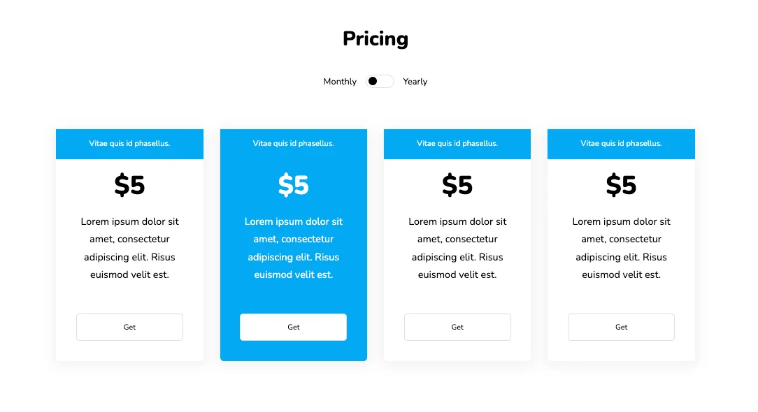
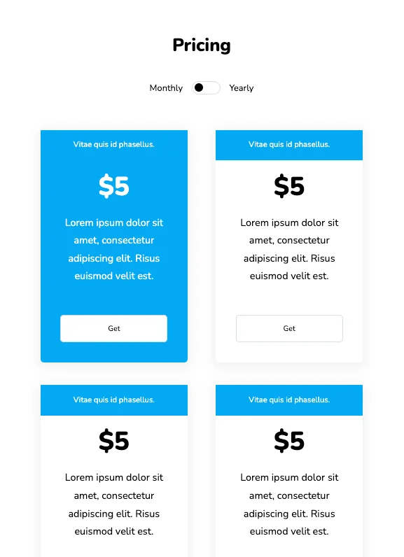
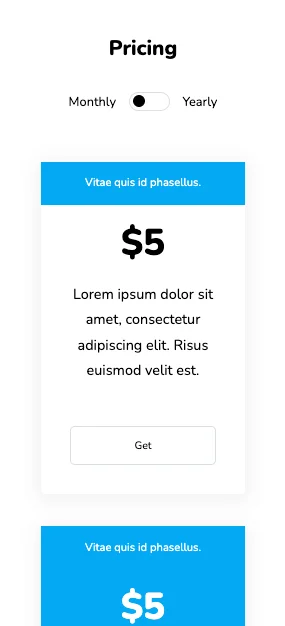
Each table has a thin header that displays the type of service provided. The hover effect on the table is light and efficient, which makes it perfect for a professional website. JavaScript controls are also included which change the description and price of services with the toggle switch.
View Code
HTML
CSS
JS
Responsive CSS
Output
Pricing
Monthly
Yearly
Vitae quis id phasellus.
$5
$450
Lorem ipsum dolor sit amet, consectetur adipiscing elit. Risus euismod velit est.
Lorem ipsum dolor sit amet, consectetur adipiscing elit. Lorem orci tempor donec vel.
Vitae quis id phasellus.
$5
$450
Lorem ipsum dolor sit amet, consectetur adipiscing elit. Risus euismod velit est.
Lorem ipsum dolor sit amet, consectetur adipiscing elit. Lorem orci tempor donec vel.
Vitae quis id phasellus.
$5
$450
Lorem ipsum dolor sit amet, consectetur adipiscing elit. Risus euismod velit est.
Lorem ipsum dolor sit amet, consectetur adipiscing elit. Lorem orci tempor donec vel.
Vitae quis id phasellus.
$5
$450
Lorem ipsum dolor sit amet, consectetur adipiscing elit. Risus euismod velit est.
Lorem ipsum dolor sit amet, consectetur adipiscing elit. Lorem orci tempor donec vel..
          .pricing_3 * {
    font-family: Nunito, sans-serif;
}

.pricing_3 .responsive-container-block {
    min-height: 75px;
    height: fit-content;
    width: 100%;
    padding-top: 10px;
    padding-right: 10px;
    padding-bottom: 10px;
    padding-left: 10px;
    display: flex;
    flex-wrap: wrap;
    margin-top: 0px;
    margin-right: auto;
    margin-bottom: 0px;
    margin-left: auto;
    justify-content: flex-start;
}

.pricing_3 .responsive-cell-block {
    min-height: 75px;
}

.pricing_3 .responsive-container-block.big-container {
    padding-top: 10px;
    padding-right: 30px;
    padding-bottom: 10px;
    padding-left: 30px;
}

.pricing_3 .responsive-container-block.container {
    max-width: 1320px;
    padding-top: 0px;
    padding-right: 0px;
    padding-bottom: 0px;
    padding-left: 0px;
    margin-top: 50px;
    margin-right: auto;
    margin-bottom: 50px;
    margin-left: auto;
}

.pricing_3 .text-blk.head {
    width: 100%;
    text-align: center;
    font-size: 36px;
    font-weight: 900;
    line-height: 52px;
    margin-top: 0px;
    margin-right: 0px;
    margin-bottom: 0px;
    margin-left: 0px;
}

.pricing_3 input {
    z-index: 5;
    height: 1.8rem;
    opacity: 0;
    width: 6rem;
    position: absolute;
    cursor: pointer;
    margin-left: -1.5rem;
}

.pricing_3 .switch {
    position: relative;
    display: inline-flex;
    width: 51px;
    height: 24px;
    text-align: center;
    margin-left: 1rem;
    margin-right: 1rem;
}

.pricing_3 .switch-text {
    display: flex;
    align-items: center;
}

.pricing_3 .slider {
    z-index: 0;
    position: absolute;
    cursor: pointer;
    top: 0px;
    left: 0px;
    right: 0px;
    bottom: 0px;
    background-color: white;
    border-top-width: 0.5px;
    border-right-width: 0.5px;
    border-bottom-width: 0.5px;
    border-left-width: 0.5px;
    border-top-style: solid;
    border-right-style: solid;
    border-bottom-style: solid;
    border-left-style: solid;
    border-top-color: #dbdee7;
    border-right-color: #dbdee7;
    border-bottom-color: #dbdee7;
    border-left-color: #dbdee7;
    border-image-source: initial;
    border-image-slice: initial;
    border-image-width: initial;
    border-image-outset: initial;
    border-image-repeat: initial;
    transition-duration: 0.4s;
    transition-timing-function: ease;
    transition-delay: 0s;
    transition-property: all;
}

.pricing_3 .slider::before {
    position: absolute;
    content: "";
    height: 15px;
    width: 15px;
    left: 4px;
    bottom: 4px;
    background-color: black;
    transition-duration: 0.4s;
    transition-timing-function: ease;
    transition-delay: 0s;
    transition-property: all;
}

.pricing_3 input:checked+.slider {
    background-color: white;
}

.pricing_3 input:checked+.slider::before {
    transform: translateX(26px);
}

.pricing_3 .slider.round {
    border-top-left-radius: 34px;
    border-top-right-radius: 34px;
    border-bottom-right-radius: 34px;
    border-bottom-left-radius: 34px;
}

.pricing_3 .slider.round::before {
    border-top-left-radius: 50%;
    border-top-right-radius: 50%;
    border-bottom-right-radius: 50%;
    border-bottom-left-radius: 50%;
}

.pricing_3 .text-center.witch.switch-text.mt-4 {
    width: 100%;
    justify-content: center;
}

.pricing_3 .responsive-container-block.swiping-box {
    padding-top: 0px;
    padding-right: 0px;
    padding-bottom: 0px;
    padding-left: 0px;
    min-height: 50px;
    justify-content: center;
    margin-top: 15px;
    margin-right: 0px;
    margin-bottom: 0px;
    margin-left: 0px;
}

.pricing_3 .card {
    background-color: white;
    box-shadow: rgba(0, 0, 0, 0.05) 0px 4px 20px 7px;
    min-height: 416px;
    max-width: 263px;
    border-top-left-radius: 6px;
    border-top-right-radius: 6px;
    border-bottom-right-radius: 6px;
    border-bottom-left-radius: 6px;
    border-top-style: none;
    border-right-style: none;
    border-bottom-style: none;
    border-left-style: none;
    position: relative;
    text-align: center;
    margin-top: 0px;
    margin-right: 0px;
    margin-bottom: 0px;
    margin-left: 0px;
    min-width: auto;
}

.pricing_3 .card-selected {
    background-color: #03a9f4;
    color: white;
}

.pricing_3 .card-details {
    font-size: 18px;
    line-height: 32px;
    padding-top: 16px;
    padding-right: 10px;
    padding-bottom: 16px;
    padding-left: 10px;
    margin-top: 0px;
    margin-right: 0px;
    margin-bottom: 98px;
    margin-left: 0px;
}

.pricing_3 .card-header {
    height: 54px;
    font-size: 14px;
    line-height: 32px;
    background-color: #03a9f4;
    color: white;
    display: flex;
    justify-content: center;
    align-items: center;
}

.pricing_3 .card-text .price {
    font-size: 46px;
    font-weight: 900;
    line-height: 64px;
}

.pricing_3 .price {
    margin-top: 0px;
    margin-right: 0px;
    margin-bottom: 0px;
    margin-left: 0px;
}

.pricing_3 .buy-button {
    bottom: 37px;
    left: 0px;
    position: absolute;
    width: 100%;
    padding-left: 36px;
    padding-right: 36px;
}

.pricing_3 .btn {
    background-color: white;
    border-top-width: 1px;
    border-right-width: 1px;
    border-bottom-width: 1px;
    border-left-width: 1px;
    border-top-style: solid;
    border-right-style: solid;
    border-bottom-style: solid;
    border-left-style: solid;
    border-top-color: #dbdee7;
    border-right-color: #dbdee7;
    border-bottom-color: #dbdee7;
    border-left-color: #dbdee7;
    border-image-source: initial;
    border-image-slice: initial;
    border-image-width: initial;
    border-image-outset: initial;
    border-image-repeat: initial;
    transition-duration: 0.2s;
    transition-timing-function: ease;
    transition-delay: 0s;
    transition-property: transform;
    border-top-left-radius: 6px;
    border-top-right-radius: 6px;
    border-bottom-right-radius: 6px;
    border-bottom-left-radius: 6px;
    width: 100%;
    height: 48px;
    cursor: pointer;
}

.pricing_3 .btn:hover {
    text-decoration-line: none;
    text-decoration-thickness: initial;
    text-decoration-style: initial;
    text-decoration-color: initial;
    background-color: white;
    border-top-left-radius: 6px;
    border-top-right-radius: 6px;
    border-bottom-right-radius: 6px;
    border-bottom-left-radius: 6px;
    transform: scale(1.05);
}

.pricing_3 .d-none {
    display: none;
}

.pricing_3 .monthly-plan {
    padding-top: 0px;
    padding-right: 0px;
    padding-bottom: 0px;
    padding-left: 0px;
}

.pricing_3 .card-text {
    padding-top: 0px;
    padding-right: 0px;
    padding-bottom: 0px;
    padding-left: 0px;
    margin-top: 0px;
    margin-right: 0px;
    margin-bottom: 0px;
    margin-left: 0px;
}

.pricing_3 .card-body {
    margin-top: 16px;
    margin-right: 16px;
    margin-bottom: 16px;
    margin-left: 16px;
}

.pricing_3 .responsive-cell-block.wk-desk-3.wk-ipadp-3.wk-tab-6.wk-mobile-12 {
    max-width: 263px;
    margin-top: 0px;
    margin-right: 12px;
    margin-bottom: 20px;
    margin-left: 12px;
}

.pricing_3 .responsive-container-block.card-container {
    justify-content: center;
    margin-top: 50px;
    margin-right: 0px;
    margin-bottom: 0px;
    margin-left: 0px;
}

.pricing_3 .responsive-cell-block.wk-desk-3.wk-tab-6.wk-mobile-12.wk-ipadp-6 {
    max-width: 263px;
    margin-top: 0px;
    margin-right: 15px;
    margin-bottom: 40px;
    margin-left: 15px;
}

@media (max-width: 1024px) {
    .pricing_3 .responsive-cell-block.wk-desk-3.wk-ipadp-3.wk-tab-6.wk-mobile-12 {
        margin-top: 0px;
        margin-right: 12px;
        margin-bottom: 30px;
        margin-left: 12px;
    }

    .pricing_3 .responsive-container-block.card-container {
        padding-top: 0px;
        padding-right: 0px;
        padding-bottom: 10px;
        padding-left: 0px;
    }

    .pricing_3 .responsive-cell-block.wk-desk-3.wk-ipadp-3.wk-tab-6.wk-mobile-12 {
        margin-top: 0px;
        margin-right: 12px;
        margin-bottom: 30px;
        margin-left: 12px;
    }

    .pricing_3 .responsive-cell-block.wk-desk-3.wk-tab-6.wk-mobile-12.wk-ipadp-6 {
        max-width: 263px;
        margin-top: 0px;
        margin-right: 20px;
        margin-bottom: 40px;
        margin-left: 20px;
    }
}

@media (max-width: 768px) {
    .pricing_3 .responsive-cell-block.wk-desk-3.wk-tab-6.wk-mobile-12.wk-ipadp-6 {
        margin-top: 0px;
        margin-right: 25px;
        margin-bottom: 40px;
        margin-left: 25px;
    }

    .pricing_3 .text-blk.head {
        font-size: 32px;
    }
}

@media (max-width: 500px) {
    .pricing_3 .responsive-container-block.card-container {
        padding-top: 0px;
        padding-right: 0px;
        padding-bottom: 0px;
        padding-left: 0px;
    }

    .pricing_3 .responsive-cell-block.wk-desk-3.wk-ipadp-3.wk-tab-6.wk-mobile-12 {
        margin-top: 0px;
        margin-right: 10px;
        margin-bottom: 30px;
        margin-left: 10px;
    }

    .pricing_3 .text-blk.head {
        font-size: 26px;
        line-height: 32px;
    }
}
          $('input[type="checkbox"]').click(function() {
    if ($(`input[type="checkbox"]`).is(":checked")) {
    $(`.monthly-plan`).addClass("d-none");
    $(`.yearly-plan`).removeClass("d-none");
    } else {
    $(`.monthly-plan`).removeClass("d-none");
    $(`.yearly-plan`).addClass("d-none");
    }
    });
    $(`.card`).mouseenter(function(item) {
    $(`.card`).removeClass("card-selected");
    item.currentTarget.classList.add("card-selected")
    });
          @import url('https://fonts.googleapis.com/css2?family=Nunito:wght@200;300;400;600;700;800&display=swap');
        *, *:before, *:after {
        -moz-box-sizing: border-box;
        -webkit-box-sizing: border-box;
        box-sizing: border-box;
        }
        body {
        margin: 0;
        }
        .wk-desk-1{
        width: 8.333333%;
        }
        .wk-desk-2{
        width: 16.666667%;
        }
        .wk-desk-3{
        width: 25%;
        }
        .wk-desk-4{
        width: 33.333333%;
        }
        .wk-desk-5{
        width: 41.666667%;
        }
        .wk-desk-6{
        width: 50%;
        }
        .wk-desk-7{
        width: 58.333333%;
        }
        .wk-desk-8{
        width: 66.666667%;
        }
        .wk-desk-9{
        width: 75%;
        }
        .wk-desk-10{
        width: 83.333333%;
        }
        .wk-desk-11{
        width: 91.666667%;
        }
        .wk-desk-12{
        width: 100%;
        }
        @media (max-width: 1024px) {
        .wk-ipadp-1{
        width: 8.333333%;
        }
        .wk-ipadp-2{
        width: 16.666667%;
        }
        .wk-ipadp-3{
        width: 25%;
        }
        .wk-ipadp-4{
        width: 33.333333%;
        }
        .wk-ipadp-5{
        width: 41.666667%;
        }
        .wk-ipadp-6{
        width: 50%;
        }
        .wk-ipadp-7{
        width: 58.333333%;
        }
        .wk-ipadp-8{
        width: 66.666667%;
        }
        .wk-ipadp-9{
        width: 75%;
        }
        .wk-ipadp-10{
        width: 83.333333%;
        }
        .wk-ipadp-11{
        width: 91.666667%;
        }
        .wk-ipadp-12{
        width: 100%;
        }
        }
        @media (max-width: 768px) {
        .wk-tab-1{
        width: 8.333333%;
        }
        .wk-tab-2{
        width: 16.666667%;
        }
        .wk-tab-3{
        width: 25%;
        }
        .wk-tab-4{
        width: 33.333333%;
        }
        .wk-tab-5{
        width: 41.666667%;
        }
        .wk-tab-6{
        width: 50%;
        }
        .wk-tab-7{
        width: 58.333333%;
        }
        .wk-tab-8{
        width: 66.666667%;
        }
        .wk-tab-9{
        width: 75%;
        }
        .wk-tab-10{
        width: 83.333333%;
        }
        .wk-tab-11{
        width: 91.666667%;
        }
        .wk-tab-12{
        width: 100%;
        }
        }
        @media (max-width: 500px) {
        .wk-mobile-1{
        width: 8.333333%;
        }
        .wk-mobile-2{
        width: 16.666667%;
        }
        .wk-mobile-3{
        width: 25%;
        }
        .wk-mobile-4{
        width: 33.333333%;
        }
        .wk-mobile-5{
        width: 41.666667%;
        }
        .wk-mobile-6{
        width: 50%;
        }
        .wk-mobile-7{
        width: 58.333333%;
        }
        .wk-mobile-8{
        width: 66.666667%;
        }
        .wk-mobile-9{
        width: 75%;
        }
        .wk-mobile-10{
        width: 83.333333%;
        }
        .wk-mobile-11{
        width: 91.666667%;
        }
        .wk-mobile-12{
        width: 100%;
        }
        }
Reset