Contact us
Lorem ipsum dolor sit amet, consectetur adipiscing elit, sed do eiusmod tempor incididunt ut labore et dolore magna al iqua. Ut enim
.webp)
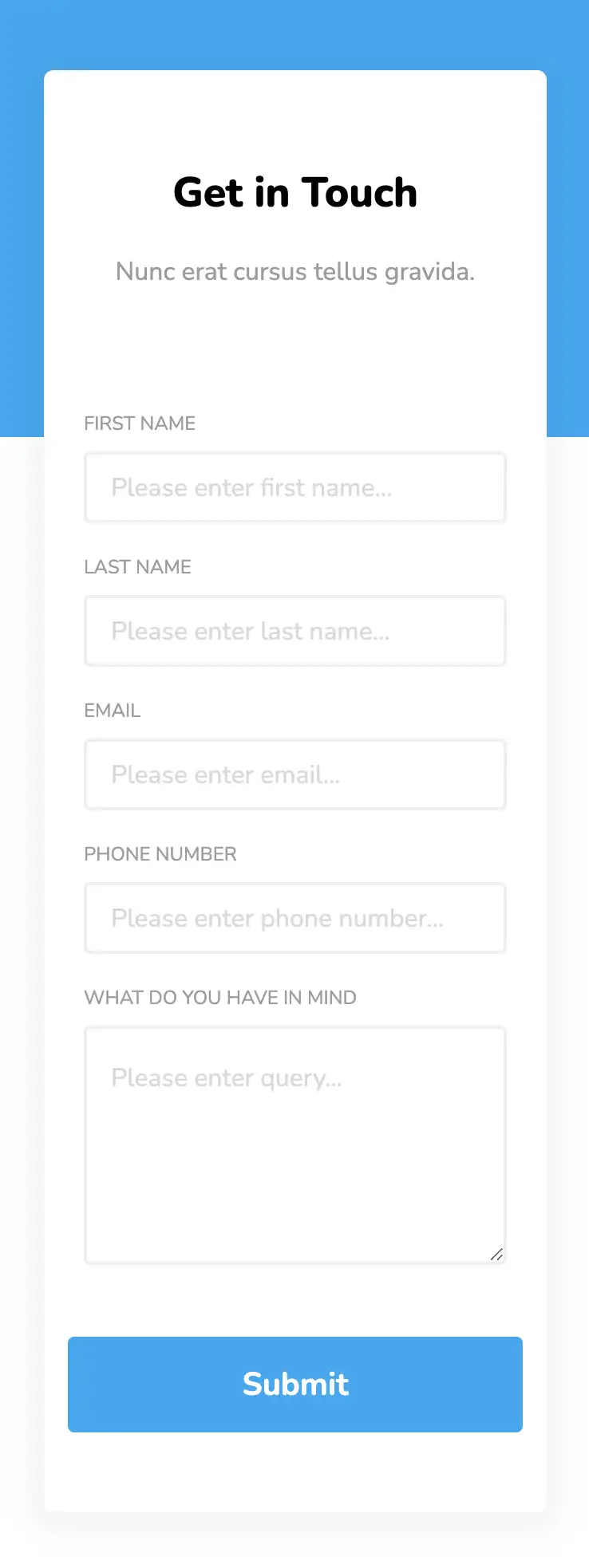
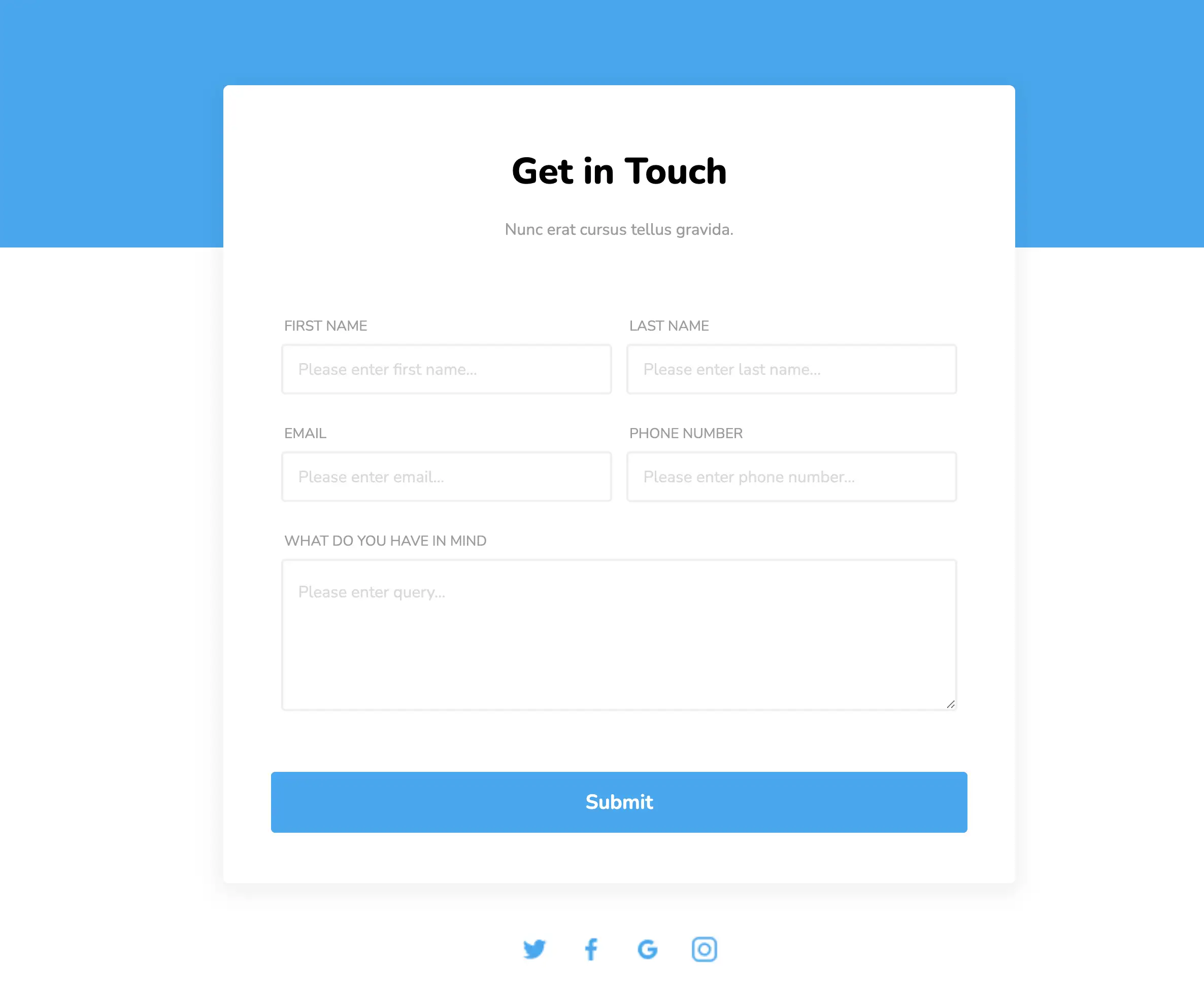
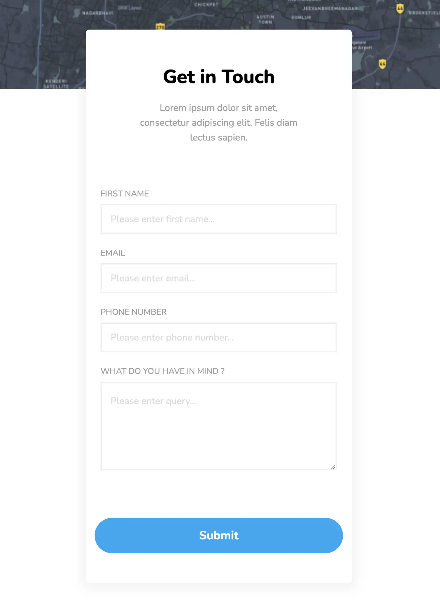
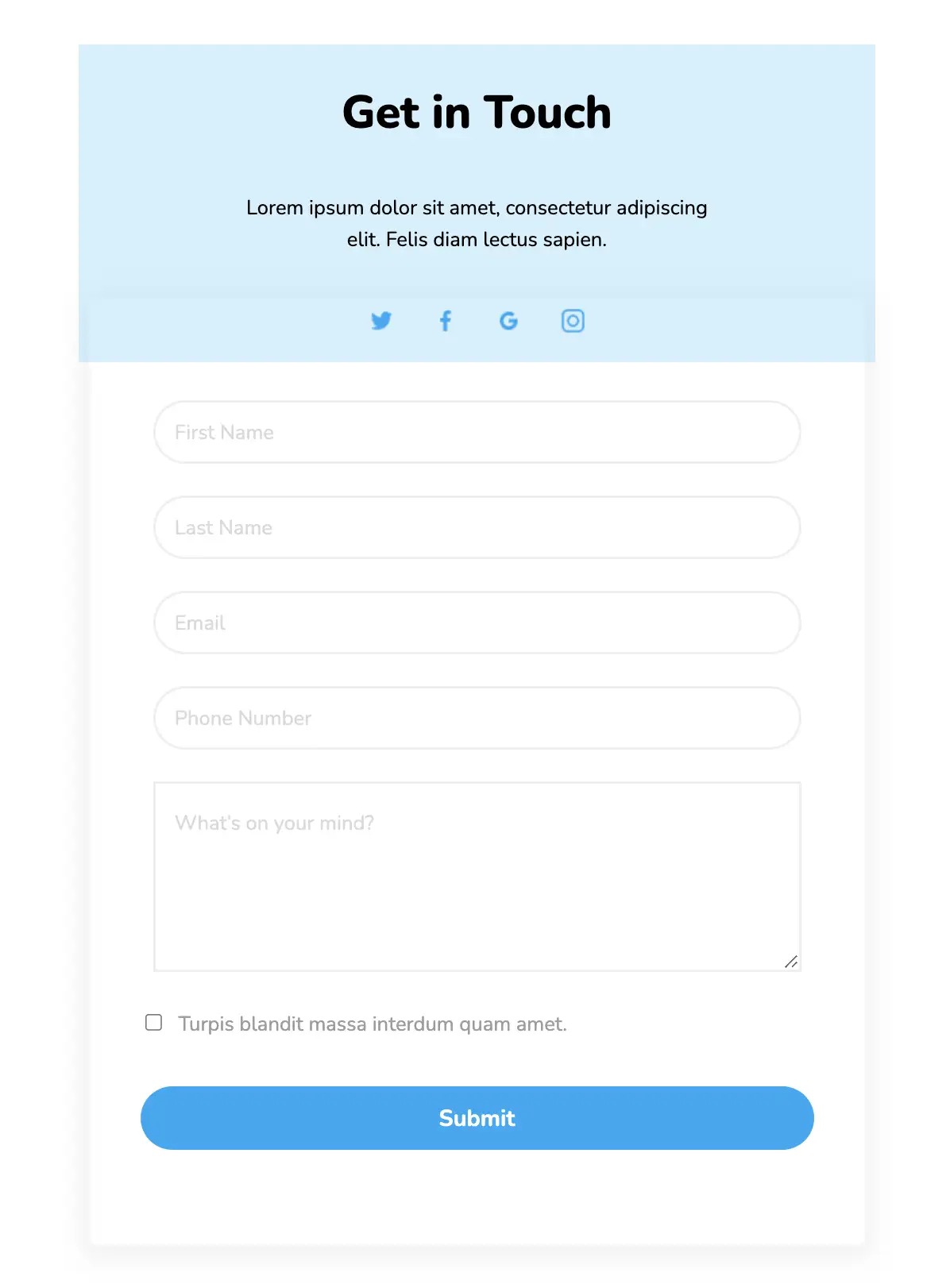
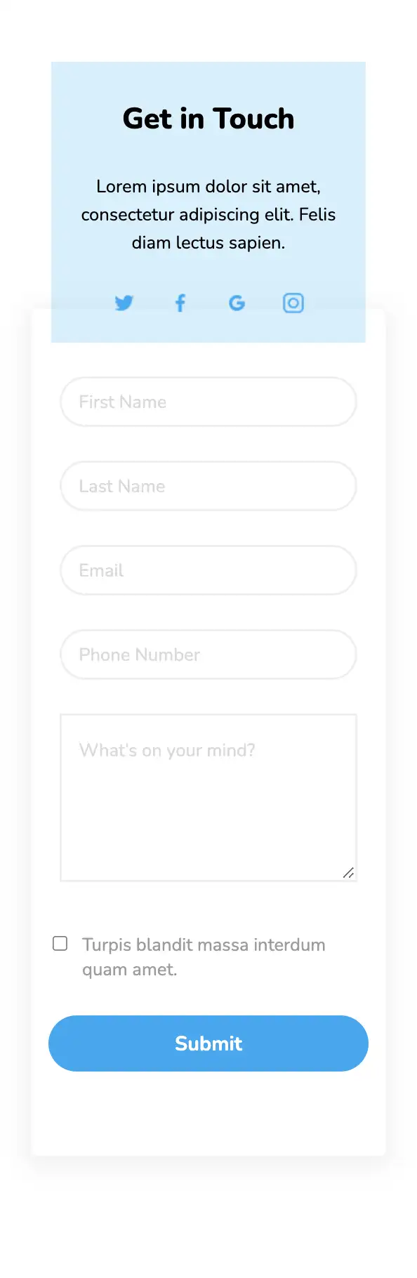
This simple widget consists of a solid form with an absolute blue background. Its minimalist design enables it to be incorporated into any website with ease. This form is completely responsive and also contains links to social media pages. The submit button has a background hover effect.
View Code
HTML
CSS
JS
Responsive CSS
Output
.contact_us_2 * {
font-family: Nunito, sans-serif;
}
.contact_us_2 .text-blk {
margin-top: 0px;
margin-right: 0px;
margin-bottom: 0px;
margin-left: 0px;
line-height: 25px;
}
.contact_us_2 .responsive-cell-block {
min-height: 75px;
}
.contact_us_2 input:focus {
outline-color: initial;
outline-style: none;
outline-width: initial;
}
.contact_us_2 .container-block {
min-height: 75px;
width: 100%;
padding-top: 10px;
padding-right: 10px;
padding-bottom: 10px;
padding-left: 10px;
display: block;
}
.contact_us_2 .submit-btn:hover {
background-image: initial;
background-position-x: initial;
background-position-y: initial;
background-size: initial;
background-repeat-x: initial;
background-repeat-y: initial;
background-attachment: initial;
background-origin: initial;
background-clip: initial;
background-color: #0381fe;
}
.contact_us_2 .responsive-container-block {
min-height: 75px;
height: fit-content;
width: 100%;
display: flex;
flex-wrap: wrap;
justify-content: flex-start;
margin-top: 0px;
margin-right: auto;
margin-bottom: 50px;
margin-left: auto;
padding-top: 0px;
padding-right: 0px;
padding-bottom: 0px;
padding-left: 0px;
}
.contact_us_2 .responsive-container-block.big-container {
padding-top: 10px;
padding-right: 30px;
padding-bottom: 10px;
padding-left: 30px;
position: relative;
height: auto;
}
.contact_us_2 .responsive-container-block.container {
position: static;
min-height: 75px;
flex-direction: column;
z-index: 2;
max-width: 800px;
margin-top: 120px;
margin-right: auto;
margin-bottom: 50px;
margin-left: auto;
}
.contact_us_2 .container-block.form-wrapper {
background-color: white;
max-width: 799px;
text-align: center;
padding-top: 50px;
padding-right: 40px;
padding-bottom: 50px;
padding-left: 40px;
box-shadow: rgba(0, 0, 0, 0.05) 0px 4px 20px 7px;
border-top-left-radius: 6px;
border-top-right-radius: 6px;
border-bottom-right-radius: 6px;
border-bottom-left-radius: 6px;
margin-top: 0px;
margin-right: auto;
margin-bottom: 0px;
margin-left: auto;
}
.contact_us_2 .text-blk.contactus-head {
font-size: 36px;
line-height: 50px;
font-weight: 900;
}
.contact_us_2 .text-blk.contactus-subhead {
color: #9c9c9c;
margin-top: 0px;
margin-right: 0px;
margin-bottom: 50px;
margin-left: 0px;
}
.contact_us_2 .responsive-cell-block.wk-desk-6.wk-ipadp-6.wk-tab-12.wk-mobile-12 {
margin-top: 0px;
margin-right: 0px;
margin-bottom: 26px;
margin-left: 0px;
min-height: 50px;
}
.contact_us_2 .input {
width: 96%;
height: 50px;
padding-top: 1px;
padding-right: 15px;
padding-bottom: 1px;
padding-left: 15px;
border-top-width: 2px;
border-right-width: 2px;
border-bottom-width: 2px;
border-left-width: 2px;
border-top-style: solid;
border-right-style: solid;
border-bottom-style: solid;
border-left-style: solid;
border-top-color: #eeeeee;
border-right-color: #eeeeee;
border-bottom-color: #eeeeee;
border-left-color: #eeeeee;
border-image-source: initial;
border-image-slice: initial;
border-image-width: initial;
border-image-outset: initial;
border-image-repeat: initial;
font-size: 16px;
color: black;
border-top-left-radius: 4px;
border-top-right-radius: 4px;
border-bottom-right-radius: 4px;
border-bottom-left-radius: 4px;
}
.contact_us_2 .textinput {
width: 98%;
min-height: 150px;
padding-top: 20px;
padding-right: 15px;
padding-bottom: 20px;
padding-left: 15px;
border-top-width: 2px;
border-right-width: 2px;
border-bottom-width: 2px;
border-left-width: 2px;
border-top-style: solid;
border-right-style: solid;
border-bottom-style: solid;
border-left-style: solid;
border-top-color: #eeeeee;
border-right-color: #eeeeee;
border-bottom-color: #eeeeee;
border-left-color: #eeeeee;
border-image-source: initial;
border-image-slice: initial;
border-image-width: initial;
border-image-outset: initial;
border-image-repeat: initial;
font-size: 16px;
border-top-left-radius: 4px;
border-top-right-radius: 4px;
border-bottom-right-radius: 4px;
border-bottom-left-radius: 4px;
}
.contact_us_2 .submit-btn {
width: 98%;
background-color: #03a9f4;
height: 60px;
font-size: 20px;
font-weight: 700;
color: white;
border-top-width: 0px;
border-right-width: 0px;
border-bottom-width: 0px;
border-left-width: 0px;
border-top-style: outset;
border-right-style: outset;
border-bottom-style: outset;
border-left-style: outset;
border-top-color: #767676;
border-right-color: #767676;
border-bottom-color: #767676;
border-left-color: #767676;
border-image-source: initial;
border-image-slice: initial;
border-image-width: initial;
border-image-outset: initial;
border-image-repeat: initial;
border-top-left-radius: 4px;
border-top-right-radius: 4px;
border-bottom-right-radius: 4px;
border-bottom-left-radius: 4px;
cursor: pointer;
}
.contact_us_2 .form-box {
margin-top: 0px;
margin-right: auto;
margin-bottom: 0px;
margin-left: auto;
}
.contact_us_2 .social-media-links {
width: 250px;
display: flex;
justify-content: space-evenly;
margin-top: 50px;
margin-right: auto;
margin-bottom: 0px;
margin-left: auto;
}
.contact_us_2 .link-img {
width: 30px;
height: 30px;
}
.contact_us_2 .text-blk.input-title {
text-align: left;
padding-top: 0px;
padding-right: 0px;
padding-bottom: 0px;
padding-left: 10px;
font-size: 14px;
margin-top: 0px;
margin-right: 0px;
margin-bottom: 5px;
margin-left: 0px;
color: #9c9c9c;
}
.contact_us_2 ::placeholder {
color: #dadada;
}
.contact_us_2 .blueBG {
position: absolute;
width: 100%;
left: 0px;
top: 0px;
height: 300px;
background-color: #03a9f4;
}
@media (max-width: 768px) {
.contact_us_2 .submit-btn {
width: 100%;
}
.contact_us_2 .input {
width: 100%;
}
.contact_us_2 .textinput {
width: 100%;
}
.contact_us_2 .container-block.form-wrapper {
margin-top: 80px;
margin-right: 0px;
margin-bottom: 0px;
margin-left: 0px;
}
.contact_us_2 .text-blk.input-title {
padding-top: 0px;
padding-right: 0px;
padding-bottom: 0px;
padding-left: 0px;
}
.contact_us_2 .responsive-container-block.container {
margin-top: 80px;
margin-right: 0px;
margin-bottom: 50px;
margin-left: 0px;
}
.contact_us_2 .container-block.form-wrapper {
margin-top: 0px;
margin-right: 0px;
margin-bottom: 0px;
margin-left: 0px;
}
.contact_us_2 .text-blk.contactus-head {
font-size: 30px;
line-height: 40px;
}
}
@media (max-width: 500px) {
.contact_us_2 .container-block.form-wrapper {
padding-top: 50px;
padding-right: 15px;
padding-bottom: 50px;
padding-left: 15px;
}
.contact_us_2 .container-block.form-wrapper {
margin-top: 60px;
margin-right: 0px;
margin-bottom: 0px;
margin-left: 0px;
}
.contact_us_2 .responsive-cell-block.wk-ipadp-6.wk-tab-12.wk-mobile-12.wk-desk-6 {
margin-top: 0px;
margin-right: 0px;
margin-bottom: 15px;
margin-left: 0px;
}
.contact_us_2 .responsive-container-block {
margin-top: 0px;
margin-right: 0px;
margin-bottom: 35px;
margin-left: 0px;
}
.contact_us_2 .text-blk.input-title {
font-size: 12px;
}
.contact_us_2 .responsive-container-block.container {
margin-top: 50px;
margin-right: 0px;
margin-bottom: 50px;
margin-left: 0px;
}
.contact_us_2 .container-block.form-wrapper {
margin-top: 0px;
margin-right: 0px;
margin-bottom: 0px;
margin-left: 0px;
}
.contact_us_2 .responsive-container-block.big-container {
padding-top: 10px;
padding-right: 20px;
padding-bottom: 10px;
padding-left: 20px;
}
.contact_us_2 .text-blk.contactus-head {
font-size: 26px;
line-height: 34px;
}
.contact_us_2 .input {
height: 45px;
}
}
         @import url('https://fonts.googleapis.com/css2?family=Nunito:wght@200;300;400;600;700;800&display=swap');
                            *, *:before, *:after {
                            -moz-box-sizing: border-box;
                            -webkit-box-sizing: border-box;
                            box-sizing: border-box;
                            }
                            body {
                            margin: 0;
                            }
                            .wk-desk-1{
                            width: 8.333333%;
                            }
                            .wk-desk-2{
                            width: 16.666667%;
                            }
                            .wk-desk-3{
                            width: 25%;
                            }
                            .wk-desk-4{
                            width: 33.333333%;
                            }
                            .wk-desk-5{
                            width: 41.666667%;
                            }
                            .wk-desk-6{
                            width: 50%;
                            }
                            .wk-desk-7{
                            width: 58.333333%;
                            }
                            .wk-desk-8{
                            width: 66.666667%;
                            }
                            .wk-desk-9{
                            width: 75%;
                            }
                            .wk-desk-10{
                            width: 83.333333%;
                            }
                            .wk-desk-11{
                            width: 91.666667%;
                            }
                            .wk-desk-12{
                            width: 100%;
                            }
                            @media (max-width: 1024px) {
                            .wk-ipadp-1{
                            width: 8.333333%;
                            }
                            .wk-ipadp-2{
                            width: 16.666667%;
                            }
                            .wk-ipadp-3{
                            width: 25%;
                            }
                            .wk-ipadp-4{
                            width: 33.333333%;
                            }
                            .wk-ipadp-5{
                            width: 41.666667%;
                            }
                            .wk-ipadp-6{
                            width: 50%;
                            }
                            .wk-ipadp-7{
                            width: 58.333333%;
                            }
                            .wk-ipadp-8{
                            width: 66.666667%;
                            }
                            .wk-ipadp-9{
                            width: 75%;
                            }
                            .wk-ipadp-10{
                            width: 83.333333%;
                            }
                            .wk-ipadp-11{
                            width: 91.666667%;
                            }
                            .wk-ipadp-12{
                            width: 100%;
                            }
                            }
                            @media (max-width: 768px) {
                            .wk-tab-1{
                            width: 8.333333%;
                            }
                            .wk-tab-2{
                            width: 16.666667%;
                            }
                            .wk-tab-3{
                            width: 25%;
                            }
                            .wk-tab-4{
                            width: 33.333333%;
                            }
                            .wk-tab-5{
                            width: 41.666667%;
                            }
                            .wk-tab-6{
                            width: 50%;
                            }
                            .wk-tab-7{
                            width: 58.333333%;
                            }
                            .wk-tab-8{
                            width: 66.666667%;
                            }
                            .wk-tab-9{
                            width: 75%;
                            }
                            .wk-tab-10{
                            width: 83.333333%;
                            }
                            .wk-tab-11{
                            width: 91.666667%;
                            }
                            .wk-tab-12{
                            width: 100%;
                            }
                            }
                            @media (max-width: 500px) {
                            .wk-mobile-1{
                            width: 8.333333%;
                            }
                            .wk-mobile-2{
                            width: 16.666667%;
                            }
                            .wk-mobile-3{
                            width: 25%;
                            }
                            .wk-mobile-4{
                            width: 33.333333%;
                            }
                            .wk-mobile-5{
                            width: 41.666667%;
                            }
                            .wk-mobile-6{
                            width: 50%;
                            }
                            .wk-mobile-7{
                            width: 58.333333%;
                            }
                            .wk-mobile-8{
                            width: 66.666667%;
                            }
                            .wk-mobile-9{
                            width: 75%;
                            }
                            .wk-mobile-10{
                            width: 83.333333%;
                            }
                            .wk-mobile-11{
                            width: 91.666667%;
                            }
                            .wk-mobile-12{
                            width: 100%;
                            }
                            }
Reset
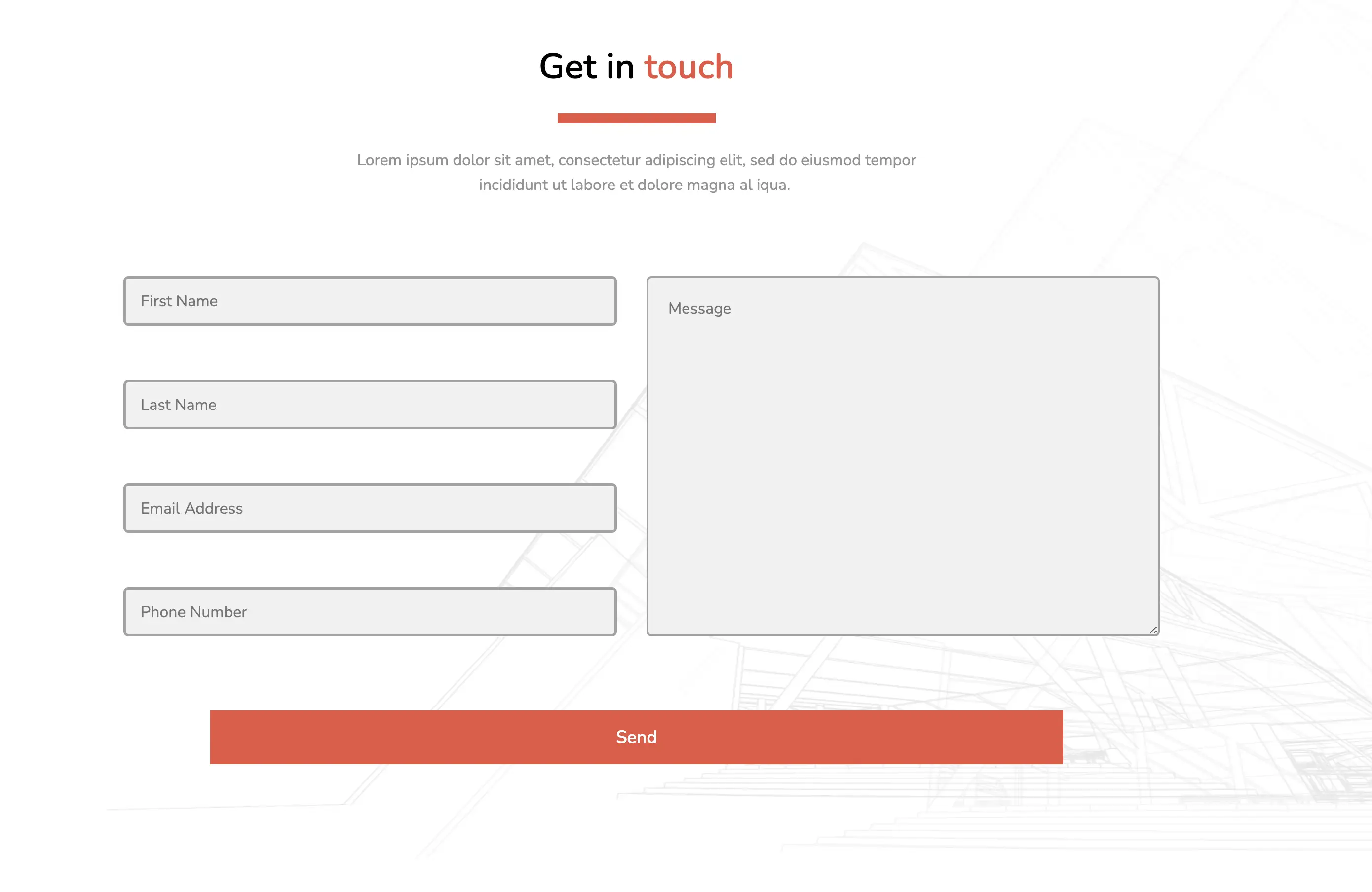
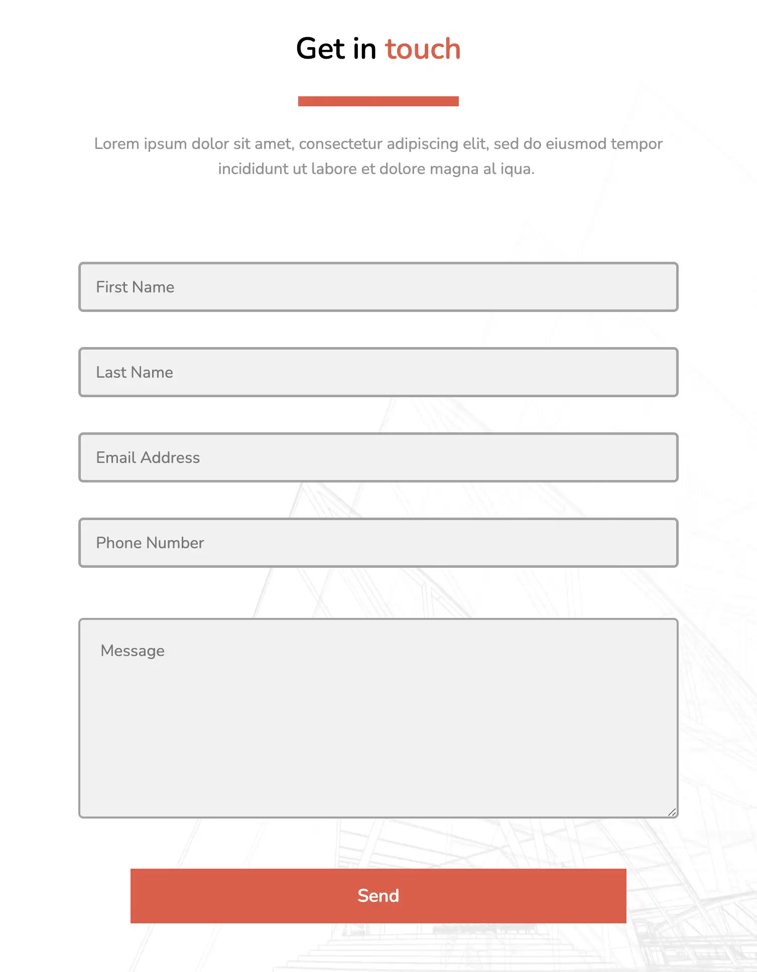
The above contact form is a clean and visually appealing form based entirely on the HTML5 and CSS3 framework. All input fields have a flex display and wrap around each other as the screen size is reduced. The design also includes span elements for a dual-tone title and background hover effects.
View Code
HTML
CSS
JS
Responsive CSS
Output
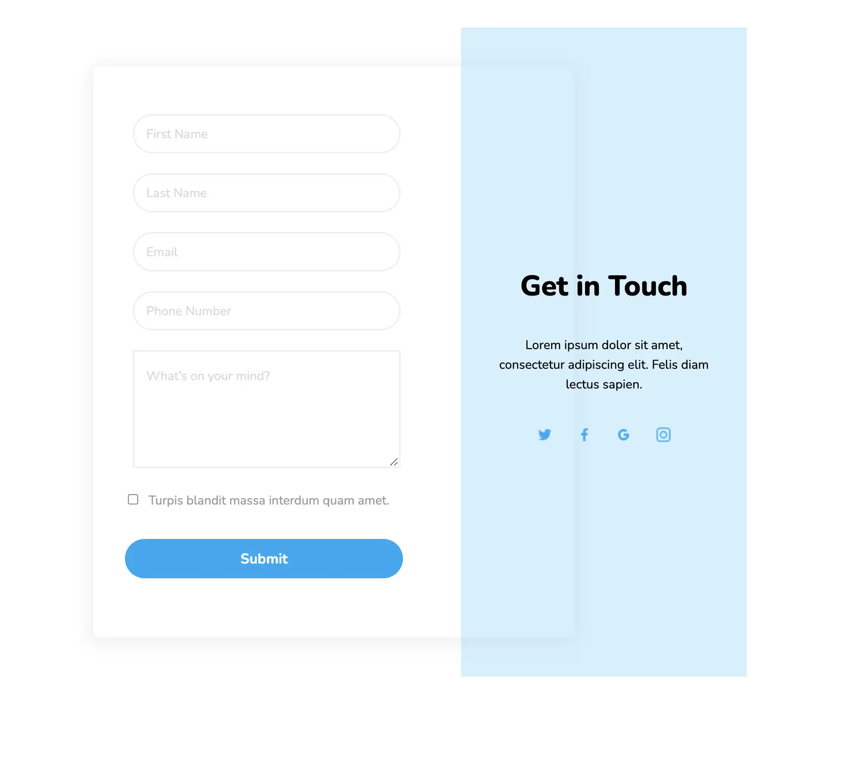
Get in
touch
Lorem ipsum dolor sit amet, consectetur adipiscing elit, sed do eiusmod tempor incididunt ut labore et dolore magna al iqua.
.new_home_web .text-blk.subHeading {
text-align: center;
color: #939393;
max-width: 630px;
}
.new_home_web .text-blk.heading {
font-size: 36px;
line-height: 55px;
font-weight: 600;
margin-top: 0px;
margin-right: 0px;
margin-bottom: 20px;
margin-left: 0px;
}
.new_home_web .responsive-container-block.textContainer {
flex-direction: column;
align-items: center;
margin-top: 50px;
margin-right: 0px;
margin-bottom: 40px;
margin-left: 0px;
max-width: 1320px;
z-index: 50;
}
.new_home_web .responsive-cell-block.wk-tab-12.wk-mobile-12.wk-desk-12.wk-ipadp-12 {
width: 50%;
padding-top: 0px;
padding-right: 0px;
padding-bottom: 25px;
padding-left: 10px;
}
.new_home_web .send:hover {
background-image: initial;
background-position-x: initial;
background-position-y: initial;
background-size: initial;
background-repeat-x: initial;
background-repeat-y: initial;
background-attachment: initial;
background-origin: initial;
background-clip: initial;
}
.new_home_web .send {
font-size: 18px;
color: white;
font-weight: 600;
background-color: #ea5541;
width: 80%;
text-align: center;
padding-top: 15px;
padding-right: 0px;
padding-bottom: 15px;
padding-left: 0px;
margin-top: 0px;
margin-right: 0px;
margin-bottom: 0px;
margin-left: 0px;
border-top-left-radius: 0px;
border-top-right-radius: 0px;
border-bottom-right-radius: 0px;
border-bottom-left-radius: 0px;
}
.new_home_web .container-block.form-wrapper {
display: flex;
flex-direction: row;
align-items: flex-start;
justify-content: space-evenly;
flex-wrap: wrap;
z-index: 50;
}
.new_home_web .responsive-cell-block.wk-tab-12.wk-mobile-12.wk-desk-7.wk-ipadp-10.line {
width: 100%;
padding-top: 0px;
padding-right: 0px;
padding-bottom: 0px;
padding-left: 0px;
max-width: 1100px;
}
.new_home_web .responsive-cell-block.wk-tab-12.wk-mobile-12.wk-desk-5.wk-ipadp-10 {
display: flex;
flex-direction: column;
align-items: center;
width: 30%;
max-width: 310px;
padding-top: 0px;
padding-right: 40px;
padding-bottom: 0px;
padding-left: 0px;
}
.new_home_web .responsive-cell-block.wk-ipadp-6.wk-tab-12.wk-mobile-12.wk-desk-6 {
margin-top: 0px;
margin-right: 0px;
margin-bottom: 30px;
margin-left: 0px;
padding-top: 0px;
padding-right: 10px;
padding-bottom: 0px;
padding-left: 10px;
width: 100%;
}
.new_home_web .textinput {
height: 100%;
width: 100%;
border-top-width: 2px;
border-right-width: 2px;
border-bottom-width: 2px;
border-left-width: 2px;
border-top-style: solid;
border-right-style: solid;
border-bottom-style: solid;
border-left-style: solid;
border-top-color: #a2a2a2;
border-right-color: #a2a2a2;
border-bottom-color: #a2a2a2;
border-left-color: #a2a2a2;
border-image-source: initial;
border-image-slice: initial;
border-image-width: initial;
border-image-outset: initial;
border-image-repeat: initial;
border-top-left-radius: 5px;
border-top-right-radius: 5px;
border-bottom-right-radius: 5px;
border-bottom-left-radius: 5px;
font-size: 16px;
padding-top: 20px;
padding-right: 30px;
padding-bottom: 20px;
padding-left: 20px;
background-color: #f1f1f1;
}
.new_home_web .input {
height: 50px;
width: 100%;
border-top-width: 2.5px;
border-right-width: 2.5px;
border-bottom-width: 2.5px;
border-left-width: 2.5px;
border-top-style: solid;
border-right-style: solid;
border-bottom-style: solid;
border-left-style: solid;
border-top-color: #a2a2a2;
border-right-color: #a2a2a2;
border-bottom-color: #a2a2a2;
border-left-color: #a2a2a2;
border-image-source: initial;
border-image-slice: initial;
border-image-width: initial;
border-image-outset: initial;
border-image-repeat: initial;
border-top-left-radius: 5px;
border-top-right-radius: 5px;
border-bottom-right-radius: 5px;
border-bottom-left-radius: 5px;
font-size: 16px;
padding-top: 5px;
padding-right: 15px;
padding-bottom: 5px;
padding-left: 15px;
background-color: #f1f1f1;
}
.new_home_web .responsive-container-block.big-container {
padding-top: 0px;
padding-right: 50px;
padding-bottom: 0px;
padding-left: 50px;
flex-direction: column;
align-items: center;
justify-content: center;
position: relative;
}
.new_home_web .responsive-container-block.container {
max-width: 1320px;
flex-direction: row-reverse;
justify-content: center;
align-items: center;
margin-top: 0px;
margin-right: auto;
margin-bottom: 60px;
margin-left: auto;
z-index: 50;
}
.new_home_web .responsive-cell-block {
min-height: 75px;
}
.new_home_web textarea:focus {
outline-color: initial;
outline-style: none;
outline-width: initial;
}
.new_home_web input:focus {
outline-color: initial;
outline-style: none;
outline-width: initial;
}
.new_home_web a {
text-decoration-line: none;
text-decoration-thickness: initial;
text-decoration-style: initial;
text-decoration-color: initial;
}
.new_home_web .responsive-container-block {
min-height: 75px;
height: fit-content;
width: 100%;
display: flex;
flex-wrap: wrap;
justify-content: flex-start;
margin-top: 0px;
margin-right: auto;
margin-bottom: 40px;
margin-left: auto;
}
.new_home_web * {
font-family: Nunito, sans-serif;
}
.new_home_web .text-blk {
margin-top: 0px;
margin-right: 0px;
margin-bottom: 0px;
margin-left: 0px;
line-height: 25px;
padding-top: 0px;
padding-right: 0px;
padding-bottom: 0px;
padding-left: 0px;
}
.new_home_web .left4 {
width: 50%;
padding-top: 0px;
padding-right: 10px;
padding-bottom: 0px;
padding-left: 0px;
}
.new_home_web .responsive-cell-block.wk-desk-6.wk-ipadp-6.wk-tab-12.wk-mobile-12.lastPhone {
margin-top: 0px;
margin-right: 0px;
margin-bottom: 0px;
margin-left: 0px;
}
.new_home_web .orangeText {
color: #ea5541;
}
.new_home_web .orangeLine {
height: 10px;
width: 160px;
background-color: #eb604d;
}
.new_home_web .topHead {
display: flex;
flex-direction: column;
justify-content: center;
align-items: center;
margin-top: 0px;
margin-right: 0px;
margin-bottom: 40px;
margin-left: 0px;
margin: 0 0 25px 0;
}
.new_home_web .imgBG {
position: absolute;
width: 80%;
height: 100%;
left: auto;
right: 0px;
top: auto;
bottom: 0px;
}
@media (max-width: 1024px) {
.new_home_web .responsive-cell-block.wk-tab-12.wk-mobile-12.wk-desk-5.wk-ipadp-10 {
margin-top: 60px;
margin-right: 0px;
margin-bottom: 0px;
margin-left: 0px;
}
.new_home_web .responsive-cell-block.wk-tab-12.wk-mobile-12.wk-desk-7.wk-ipadp-10.line {
padding-top: 0px;
padding-right: 20px;
padding-bottom: 60px;
padding-left: 0px;
}
.new_home_web .responsive-container-block.container {
justify-content: center;
}
}
@media (max-width: 768px) {
.new_home_web .responsive-cell-block.wk-tab-12.wk-mobile-12.wk-desk-12.wk-ipadp-12 {
padding-top: 0px;
padding-right: 0px;
padding-bottom: 0px;
padding-left: 0px;
}
.new_home_web .responsive-cell-block.wk-ipadp-6.wk-tab-12.wk-mobile-12.wk-desk-6 {
padding-top: 0px;
padding-right: 0px;
padding-bottom: 0px;
padding-left: 0px;
margin: 0 0 10px 0;
}
.new_home_web .container-block.form-wrapper {
align-items: center;
}
.new_home_web .responsive-cell-block.wk-tab-12.wk-mobile-12.wk-desk-5.wk-ipadp-10 {
width: 100%;
margin-top: 30px;
margin-right: 0px;
margin-bottom: 0px;
margin-left: 0px;
}
.new_home_web .responsive-cell-block.wk-tab-12.wk-mobile-12.wk-desk-7.wk-ipadp-10.line {
width: 100%;
padding-top: 0px;
padding-right: 0px;
padding-bottom: 20px;
padding-left: 0px;
}
.new_home_web .responsive-container-block.container {
flex-direction: column;
}
.new_home_web .textinput {
width: 100%;
}
.new_home_web .input {
width: 100%;
}
.new_home_web .left4 {
padding-top: 0px;
padding-right: 0px;
padding-bottom: 0px;
padding-left: 0px;
width: 100%;
margin-top: 0px;
margin-right: 0px;
margin-bottom: 25px;
margin-left: 0px;
}
.new_home_web .responsive-container-block {
flex-direction: column;
align-items: center;
}
.new_home_web .textinput {
height: 200px;
}
.new_home_web .responsive-cell-block.wk-tab-12.wk-mobile-12.wk-desk-12.wk-ipadp-12 {
width: 100%;
}
.new_home_web .imgBG {
width: 100%;
height: 90%;
top: auto;
left: auto;
}
.new_home_web .text-blk.heading {
font-size: 30px;
}
}
@media (max-width: 500px) {
.new_home_web .responsive-cell-block.wk-tab-12.wk-mobile-12.wk-desk-5.wk-ipadp-10 {
flex-wrap: wrap;
}
.new_home_web .send {
padding-top: 15px;
padding-right: 0px;
padding-bottom: 15px;
padding-left: 0px;
text-align: center;
width: 70%;
}
.new_home_web .responsive-container-block.big-container {
padding-top: 0px;
padding-right: 20px;
padding-bottom: 0px;
padding-left: 20px;
}
.new_home_web .text-blk.heading {
font-size: 30px;
text-align: center;
line-height: 35px;
}
.new_home_web .send {
width: 100%;
max-width: 250px;
}
.new_home_web .imgBG {
height: 60%;
}
.new_home_web .text-blk.subHeading {
font-size: 16px;
line-height: 24px;
}
.new_home_web .responsive-container-block.textContainer {
margin: 50px 0 30px 0;
}
.new_home_web .input {
height: 45px;
}
.new_home_web .responsive-cell-block.wk-ipadp-6.wk-tab-12.wk-mobile-12.wk-desk-6 {
margin: 0 0 10px 0;
}
}
         @import url('https://fonts.googleapis.com/css2?family=Nunito:wght@200;300;400;600;700;800&display=swap');
                            *, *:before, *:after {
                            -moz-box-sizing: border-box;
                            -webkit-box-sizing: border-box;
                            box-sizing: border-box;
                            }
                            body {
                            margin: 0;
                            }
                            .wk-desk-1{
                            width: 8.333333%;
                            }
                            .wk-desk-2{
                            width: 16.666667%;
                            }
                            .wk-desk-3{
                            width: 25%;
                            }
                            .wk-desk-4{
                            width: 33.333333%;
                            }
                            .wk-desk-5{
                            width: 41.666667%;
                            }
                            .wk-desk-6{
                            width: 50%;
                            }
                            .wk-desk-7{
                            width: 58.333333%;
                            }
                            .wk-desk-8{
                            width: 66.666667%;
                            }
                            .wk-desk-9{
                            width: 75%;
                            }
                            .wk-desk-10{
                            width: 83.333333%;
                            }
                            .wk-desk-11{
                            width: 91.666667%;
                            }
                            .wk-desk-12{
                            width: 100%;
                            }
                            @media (max-width: 1024px) {
                            .wk-ipadp-1{
                            width: 8.333333%;
                            }
                            .wk-ipadp-2{
                            width: 16.666667%;
                            }
                            .wk-ipadp-3{
                            width: 25%;
                            }
                            .wk-ipadp-4{
                            width: 33.333333%;
                            }
                            .wk-ipadp-5{
                            width: 41.666667%;
                            }
                            .wk-ipadp-6{
                            width: 50%;
                            }
                            .wk-ipadp-7{
                            width: 58.333333%;
                            }
                            .wk-ipadp-8{
                            width: 66.666667%;
                            }
                            .wk-ipadp-9{
                            width: 75%;
                            }
                            .wk-ipadp-10{
                            width: 83.333333%;
                            }
                            .wk-ipadp-11{
                            width: 91.666667%;
                            }
                            .wk-ipadp-12{
                            width: 100%;
                            }
                            }
                            @media (max-width: 768px) {
                            .wk-tab-1{
                            width: 8.333333%;
                            }
                            .wk-tab-2{
                            width: 16.666667%;
                            }
                            .wk-tab-3{
                            width: 25%;
                            }
                            .wk-tab-4{
                            width: 33.333333%;
                            }
                            .wk-tab-5{
                            width: 41.666667%;
                            }
                            .wk-tab-6{
                            width: 50%;
                            }
                            .wk-tab-7{
                            width: 58.333333%;
                            }
                            .wk-tab-8{
                            width: 66.666667%;
                            }
                            .wk-tab-9{
                            width: 75%;
                            }
                            .wk-tab-10{
                            width: 83.333333%;
                            }
                            .wk-tab-11{
                            width: 91.666667%;
                            }
                            .wk-tab-12{
                            width: 100%;
                            }
                            }
                            @media (max-width: 500px) {
                            .wk-mobile-1{
                            width: 8.333333%;
                            }
                            .wk-mobile-2{
                            width: 16.666667%;
                            }
                            .wk-mobile-3{
                            width: 25%;
                            }
                            .wk-mobile-4{
                            width: 33.333333%;
                            }
                            .wk-mobile-5{
                            width: 41.666667%;
                            }
                            .wk-mobile-6{
                            width: 50%;
                            }
                            .wk-mobile-7{
                            width: 58.333333%;
                            }
                            .wk-mobile-8{
                            width: 66.666667%;
                            }
                            .wk-mobile-9{
                            width: 75%;
                            }
                            .wk-mobile-10{
                            width: 83.333333%;
                            }
                            .wk-mobile-11{
                            width: 91.666667%;
                            }
                            .wk-mobile-12{
                            width: 100%;
                            }
                            }
Reset
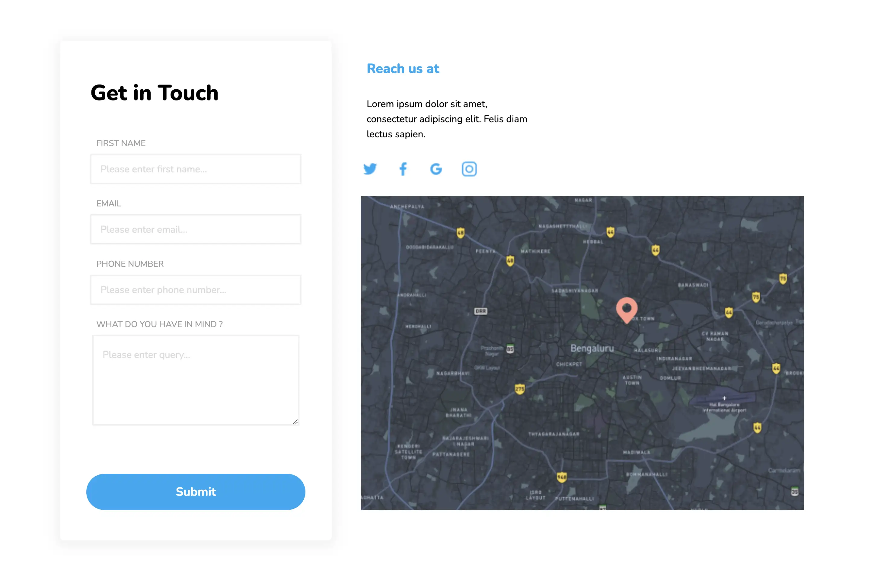
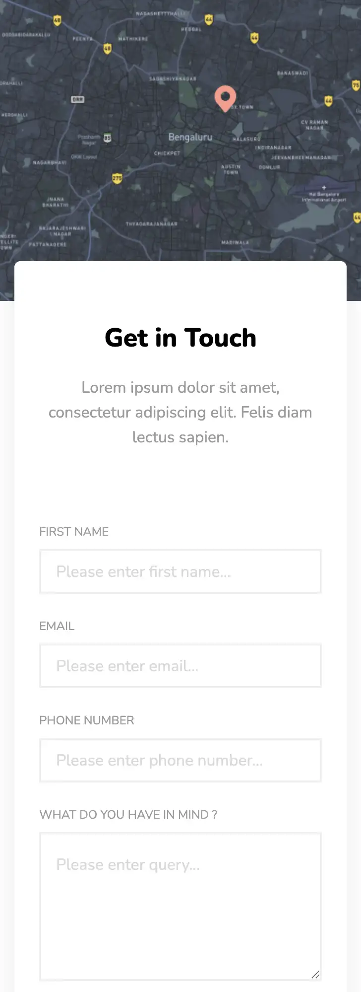
This widget has two parts: the contact form and additional company information. The layout is completely responsive and provides the best experience across different devices and screen sizes. This widget also allows you to showcase your exact location on a map and contains social media links.
View Code
HTML
CSS
JS
Responsive CSS
Output
Reach us at
Lorem ipsum dolor sit amet, consectetur adipiscing elit. Felis diam lectus sapien.


.contact_us_6 * {
font-family: Nunito, sans-serif;
}
.contact_us_6 .text-blk {
margin-top: 0px;
margin-right: 0px;
margin-bottom: 0px;
margin-left: 0px;
line-height: 25px;
}
.contact_us_6 .responsive-cell-block {
min-height: 75px;
}
.contact_us_6 input:focus,
.contact_us_6 textarea:focus {
outline-color: initial;
outline-style: none;
outline-width: initial;
}
.contact_us_6 .container-block {
min-height: 75px;
width: 100%;
padding-top: 10px;
padding-right: 10px;
padding-bottom: 10px;
padding-left: 10px;
display: block;
}
.contact_us_6 .responsive-container-block {
min-height: 75px;
display: flex;
flex-wrap: wrap;
justify-content: flex-start;
margin-top: 0px;
margin-right: auto;
margin-bottom: 50px;
margin-left: auto;
padding-top: 0px;
padding-right: 0px;
padding-bottom: 0px;
padding-left: 0px;
}
.contact_us_6 .responsive-container-block.big-container {
padding-top: 10px;
padding-right: 30px;
width: 35%;
padding-bottom: 10px;
padding-left: 30px;
background-color: #03a9f4;
position: absolute;
height: 950px;
right: 0px;
}
.contact_us_6 .responsive-container-block.container {
position: relative;
min-height: 75px;
flex-direction: row;
z-index: 2;
flex-wrap: nowrap;
align-items: center;
justify-content: center;
padding-top: 0px;
padding-right: 30px;
padding-bottom: 0px;
padding-left: 30px;
max-width: 1320px;
margin-top: 0px;
margin-right: auto;
margin-bottom: 0px;
margin-left: auto;
}
.contact_us_6 .container-block.form-wrapper {
background-color: white;
max-width: 450px;
text-align: center;
padding-top: 50px;
padding-right: 40px;
padding-bottom: 50px;
padding-left: 40px;
box-shadow: rgba(0, 0, 0, 0.05) 0px 4px 20px 7px;
border-top-left-radius: 6px;
border-top-right-radius: 6px;
border-bottom-right-radius: 6px;
border-bottom-left-radius: 6px;
margin-top: 90px;
margin-right: 0px;
margin-bottom: 60px;
margin-left: 0px;
}
.contact_us_6 .text-blk.contactus-head {
font-size: 36px;
line-height: 52px;
font-weight: 900;
}
.contact_us_6 .text-blk.contactus-subhead {
color: #9c9c9c;
width: 300px;
margin-top: 0px;
margin-right: auto;
margin-bottom: 50px;
margin-left: auto;
display: none;
}
.contact_us_6 .responsive-cell-block.wk-desk-6.wk-ipadp-6.wk-tab-12.wk-mobile-12 {
margin-top: 0px;
margin-right: 0px;
margin-bottom: 26px;
margin-left: 0px;
min-height: 50px;
}
.contact_us_6 .input {
width: 100%;
height: 50px;
padding-top: 1px;
padding-right: 15px;
padding-bottom: 1px;
padding-left: 15px;
border-top-width: 2px;
border-right-width: 2px;
border-bottom-width: 2px;
border-left-width: 2px;
border-top-style: solid;
border-right-style: solid;
border-bottom-style: solid;
border-left-style: solid;
border-top-color: #eeeeee;
border-right-color: #eeeeee;
border-bottom-color: #eeeeee;
border-left-color: #eeeeee;
border-image-source: initial;
border-image-slice: initial;
border-image-width: initial;
border-image-outset: initial;
border-image-repeat: initial;
font-size: 16px;
color: black;
}
.contact_us_6 .textinput {
width: 98%;
min-height: 150px;
padding-top: 20px;
padding-right: 15px;
padding-bottom: 20px;
padding-left: 15px;
border-top-width: 2px;
border-right-width: 2px;
border-bottom-width: 2px;
border-left-width: 2px;
border-top-style: solid;
border-right-style: solid;
border-bottom-style: solid;
border-left-style: solid;
border-top-color: #eeeeee;
border-right-color: #eeeeee;
border-bottom-color: #eeeeee;
border-left-color: #eeeeee;
border-image-source: initial;
border-image-slice: initial;
border-image-width: initial;
border-image-outset: initial;
border-image-repeat: initial;
font-size: 16px;
}
.contact_us_6 .submit-btn {
width: 98%;
background-color: #03a9f4;
height: 60px;
font-size: 20px;
font-weight: 700;
color: white;
border-top-width: 0px;
border-right-width: 0px;
border-bottom-width: 0px;
border-left-width: 0px;
border-top-style: outset;
border-right-style: outset;
border-bottom-style: outset;
border-left-style: outset;
border-top-color: #767676;
border-right-color: #767676;
border-bottom-color: #767676;
border-left-color: #767676;
border-image-source: initial;
border-image-slice: initial;
border-image-width: initial;
border-image-outset: initial;
border-image-repeat: initial;
border-top-left-radius: 40px;
border-top-right-radius: 40px;
border-bottom-right-radius: 40px;
border-bottom-left-radius: 40px;
}
.contact_us_6 .form-box {
z-index: 2;
margin-top: 0px;
margin-right: 48px;
margin-bottom: 0px;
margin-left: 0px;
}
.contact_us_6 .text-blk.input-title {
text-align: left;
padding-top: 0px;
padding-right: 0px;
padding-bottom: 0px;
padding-left: 10px;
font-size: 14px;
margin-top: 0px;
margin-right: 0px;
margin-bottom: 5px;
margin-left: 0px;
color: #9c9c9c;
}
.contact_us_6 ::placeholder {
color: #dadada;
}
.contact_us_6 .mob-text {
display: block;
text-align: left;
margin-top: 0px;
margin-right: 0px;
margin-bottom: 25px;
margin-left: 0px;
}
.contact_us_6 .responsive-cell-block.wk-tab-12.wk-mobile-12.wk-desk-12.wk-ipadp-12 {
margin-top: 0px;
margin-right: 0px;
margin-bottom: 20px;
margin-left: 0px;
}
.contact_us_6 .text-blk.contactus-subhead.color {
color: white;
}
.contact_us_6 .map-box {
max-width: 800px;
max-height: 520px;
width: 100%;
height: 520px;
background-color: #d9d9d9;
background-image: url("https://workik-widget-assets.s3.amazonaws.com/widget-assets/images/sc23.png");
background-size: cover;
background-position-x: 50%;
background-position-y: 50%;
}
.contact_us_6 .map-part {
width: 100%;
height: 100%;
}
.contact_us_6 .text-blk.map-contactus-head {
font-weight: 900;
font-size: 22px;
line-height: 32px;
margin-top: 0px;
margin-right: 0px;
margin-bottom: 10px;
margin-left: 0px;
color: #03a9f4;
}
.contact_us_6 .text-blk.map-contactus-subhead {
max-width: 300px;
margin-top: 0px;
margin-right: 0px;
margin-bottom: 20px;
margin-left: 0px;
}
.contact_us_6 .social-media-links.mob {
margin-top: 0px;
margin-right: 0px;
margin-bottom: 30px;
margin-left: 0px;
width: 230px;
display: flex;
justify-content: flex-start;
}
.contact_us_6 .link-img {
width: 30px;
height: 30px;
margin-top: 0px;
margin-right: 25px;
margin-bottom: 0px;
margin-left: 0px;
}
.contact_us_6 .link-img.image-block {
margin-top: 0px;
margin-right: 0px;
margin-bottom: 0px;
margin-left: 0px;
}
.contact_us_6 .social-icon-link {
margin: 0 25px 0 0;
padding: 0 0 0 0;
}
@media (max-width: 1024px) {
.contact_us_6 .responsive-container-block.container {
justify-content: center;
}
.contact_us_6 .map-box {
position: absolute;
top: 0px;
max-height: 320px;
}
.contact_us_6 .map-box {
max-width: 100%;
width: 100%;
}
.contact_us_6 .responsive-container-block.container {
padding-top: 0px;
padding-right: 0px;
padding-bottom: 0px;
padding-left: 0px;
}
.contact_us_6 .map-part {
width: 100%;
display: flex;
flex-direction: column;
align-items: center;
}
.contact_us_6 .container-block.form-wrapper {
margin-top: 0px;
margin-right: 0px;
margin-bottom: 0px;
margin-left: 0px;
}
.contact_us_6 .mob-text {
display: block;
}
.contact_us_6 .form-box {
margin-top: 200px;
margin-right: 60px;
margin-bottom: 40px;
margin-left: 0px;
}
.contact_us_6 .link-img {
margin-top: 0px;
margin-right: 0px;
margin-bottom: 0px;
margin-left: 0px;
display: flex;
justify-content: space-evenly;
}
.contact_us_6 .social-media-links.mob {
justify-content: space-evenly;
}
.contact_us_6 .responsive-cell-block.wk-desk-7.wk-ipadp-12.wk-tab-12.wk-mobile-12 {
text-align: center;
display: flex;
justify-content: flex-end;
align-items: center;
flex-direction: row;
}
.contact_us_6 .text-blk.contactus-subhead {
display: block;
}
.contact_us_6 .mob-text {
text-align: center;
margin-top: 0px;
margin-right: 0px;
margin-bottom: 0px;
margin-left: 0px;
}
.contact_us_6 .responsive-container-block.container {
flex-wrap: wrap;
}
.contact_us_6 .form-box {
margin-top: 200px;
margin-right: 0px;
margin-bottom: 40px;
margin-left: 0px;
}
}
@media (max-width: 768px) {
.contact_us_6 .submit-btn {
width: 100%;
}
.contact_us_6 .input {
width: 100%;
}
.contact_us_6 .textinput {
width: 100%;
}
.contact_us_6 .container-block.form-wrapper {
margin-top: 80px;
margin-right: 0px;
margin-bottom: 0px;
margin-left: 0px;
}
.contact_us_6 .text-blk.input-title {
padding-top: 0px;
padding-right: 0px;
padding-bottom: 0px;
padding-left: 0px;
}
.contact_us_6 .form-box {
padding-top: 0px;
padding-right: 20px;
padding-bottom: 0px;
padding-left: 20px;
}
.contact_us_6 .container-block.form-wrapper {
padding-top: 50px;
padding-right: 15px;
padding-bottom: 50px;
padding-left: 15px;
}
.contact_us_6 .mob-text {
display: block;
}
.contact_us_6 .responsive-container-block.container {
padding-top: 0px;
padding-right: 0px;
padding-bottom: 0px;
padding-left: 0px;
}
.contact_us_6 .form-box {
margin-top: 200px;
margin-right: 0px;
margin-bottom: 0px;
margin-left: 0px;
}
.contact_us_6 .container-block.form-wrapper {
margin-top: 0px;
margin-right: 0px;
margin-bottom: 0px;
margin-left: 0px;
}
.contact_us_6 .form-box {
margin-top: 220px;
margin-right: 0px;
margin-bottom: 0px;
margin-left: 0px;
}
.contact_us_6 .form-box {
margin-top: 220px;
margin-right: 0px;
margin-bottom: 50px;
margin-left: 0px;
}
.contact_us_6 .text-blk.contactus-head {
font-size: 32px;
line-height: 40px;
}
}
@media (max-width: 500px) {
.contact_us_6 .container-block.form-wrapper {
padding-top: 50px;
padding-right: 15px;
padding-bottom: 50px;
padding-left: 15px;
}
.contact_us_6 .container-block.form-wrapper {
margin-top: 60px;
margin-right: 0px;
margin-bottom: 0px;
margin-left: 0px;
}
.contact_us_6 .responsive-cell-block.wk-ipadp-6.wk-tab-12.wk-mobile-12.wk-desk-6 {
margin-top: 0px;
margin-right: 0px;
margin-bottom: 15px;
margin-left: 0px;
}
.contact_us_6 .responsive-container-block {
margin-top: 0px;
margin-right: 0px;
margin-bottom: 35px;
margin-left: 0px;
}
.contact_us_6 .text-blk.input-title {
font-size: 12px;
}
.contact_us_6 .text-blk.contactus-head {
font-size: 26px;
line-height: 35px;
}
.contact_us_6 .input {
height: 45px;
}
}
         @import url('https://fonts.googleapis.com/css2?family=Nunito:wght@200;300;400;600;700;800&display=swap');
                            *, *:before, *:after {
                            -moz-box-sizing: border-box;
                            -webkit-box-sizing: border-box;
                            box-sizing: border-box;
                            }
                            body {
                            margin: 0;
                            }
                            .wk-desk-1{
                            width: 8.333333%;
                            }
                            .wk-desk-2{
                            width: 16.666667%;
                            }
                            .wk-desk-3{
                            width: 25%;
                            }
                            .wk-desk-4{
                            width: 33.333333%;
                            }
                            .wk-desk-5{
                            width: 41.666667%;
                            }
                            .wk-desk-6{
                            width: 50%;
                            }
                            .wk-desk-7{
                            width: 58.333333%;
                            }
                            .wk-desk-8{
                            width: 66.666667%;
                            }
                            .wk-desk-9{
                            width: 75%;
                            }
                            .wk-desk-10{
                            width: 83.333333%;
                            }
                            .wk-desk-11{
                            width: 91.666667%;
                            }
                            .wk-desk-12{
                            width: 100%;
                            }
                            @media (max-width: 1024px) {
                            .wk-ipadp-1{
                            width: 8.333333%;
                            }
                            .wk-ipadp-2{
                            width: 16.666667%;
                            }
                            .wk-ipadp-3{
                            width: 25%;
                            }
                            .wk-ipadp-4{
                            width: 33.333333%;
                            }
                            .wk-ipadp-5{
                            width: 41.666667%;
                            }
                            .wk-ipadp-6{
                            width: 50%;
                            }
                            .wk-ipadp-7{
                            width: 58.333333%;
                            }
                            .wk-ipadp-8{
                            width: 66.666667%;
                            }
                            .wk-ipadp-9{
                            width: 75%;
                            }
                            .wk-ipadp-10{
                            width: 83.333333%;
                            }
                            .wk-ipadp-11{
                            width: 91.666667%;
                            }
                            .wk-ipadp-12{
                            width: 100%;
                            }
                            }
                            @media (max-width: 768px) {
                            .wk-tab-1{
                            width: 8.333333%;
                            }
                            .wk-tab-2{
                            width: 16.666667%;
                            }
                            .wk-tab-3{
                            width: 25%;
                            }
                            .wk-tab-4{
                            width: 33.333333%;
                            }
                            .wk-tab-5{
                            width: 41.666667%;
                            }
                            .wk-tab-6{
                            width: 50%;
                            }
                            .wk-tab-7{
                            width: 58.333333%;
                            }
                            .wk-tab-8{
                            width: 66.666667%;
                            }
                            .wk-tab-9{
                            width: 75%;
                            }
                            .wk-tab-10{
                            width: 83.333333%;
                            }
                            .wk-tab-11{
                            width: 91.666667%;
                            }
                            .wk-tab-12{
                            width: 100%;
                            }
                            }
                            @media (max-width: 500px) {
                            .wk-mobile-1{
                            width: 8.333333%;
                            }
                            .wk-mobile-2{
                            width: 16.666667%;
                            }
                            .wk-mobile-3{
                            width: 25%;
                            }
                            .wk-mobile-4{
                            width: 33.333333%;
                            }
                            .wk-mobile-5{
                            width: 41.666667%;
                            }
                            .wk-mobile-6{
                            width: 50%;
                            }
                            .wk-mobile-7{
                            width: 58.333333%;
                            }
                            .wk-mobile-8{
                            width: 66.666667%;
                            }
                            .wk-mobile-9{
                            width: 75%;
                            }
                            .wk-mobile-10{
                            width: 83.333333%;
                            }
                            .wk-mobile-11{
                            width: 91.666667%;
                            }
                            .wk-mobile-12{
                            width: 100%;
                            }
                            }
Reset
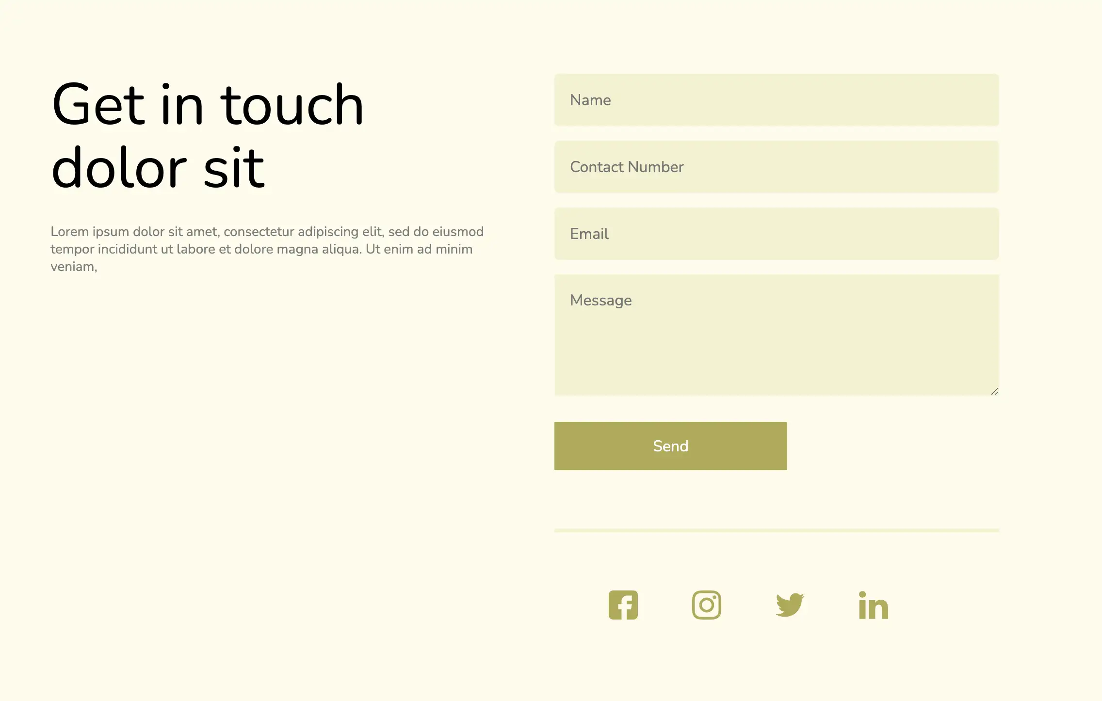
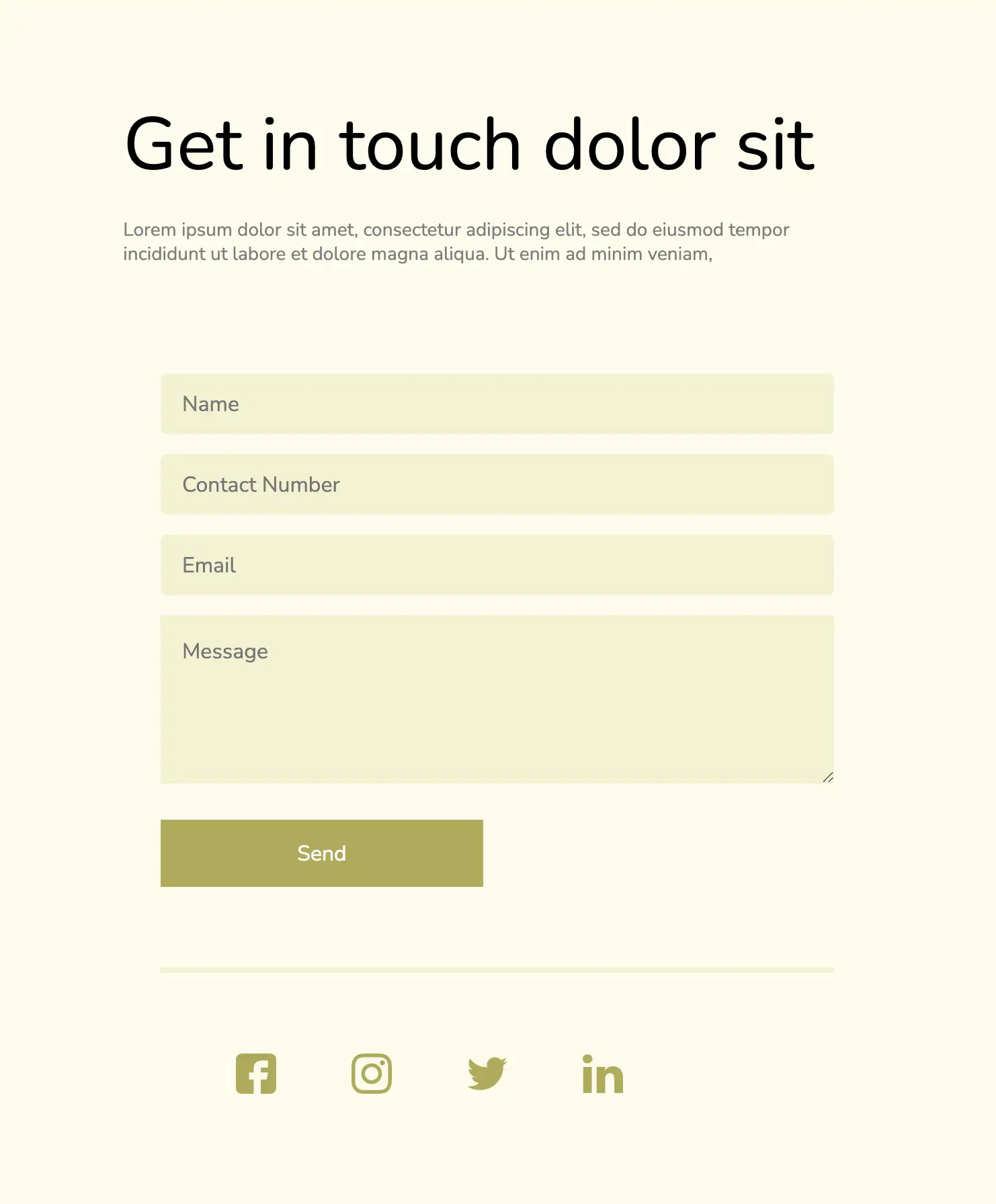
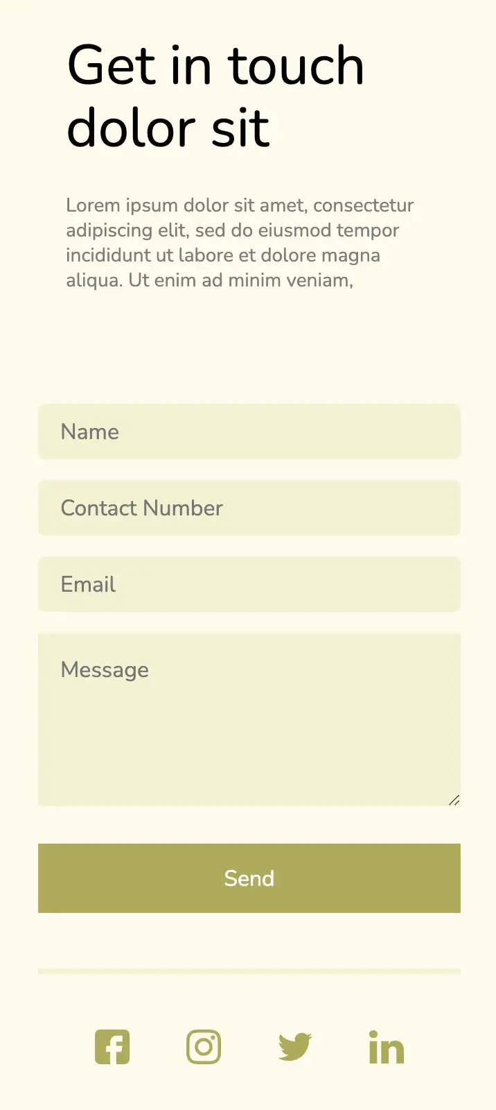
This design incorporates a split-screen layout, providing ample space for the contact form. The form includes conventional input fields and a submit button along with social media links. The other section of the split-screen can be utilized to provide a short bio of the company.
View Code
HTML
CSS
JS
Responsive CSS
Output
Get in touch dolor sit
Lorem ipsum dolor sit amet, consectetur adipiscing elit, sed do eiusmod tempor incididunt ut labore et dolore magna aliqua. Ut enim ad minim veniam,
.arch_contact_us_duplicate * {
font-family: Nunito, sans-serif;
}
.arch_contact_us_duplicate .icon-block svg {
width: 100%;
height: 100%;
}
.arch_contact_us_duplicate .icon-block {
width: 30px;
height: 30px;
}
.arch_contact_us_duplicate .text-blk {
margin-top: 0px;
margin-right: 0px;
margin-bottom: 0px;
margin-left: 0px;
padding-top: 0px;
padding-right: 0px;
padding-bottom: 0px;
padding-left: 0px;
line-height: 25px;
}
.arch_contact_us_duplicate .responsive-container-block {
min-height: 75px;
height: fit-content;
width: 100%;
padding-top: 0px;
padding-right: 0px;
padding-bottom: 0px;
padding-left: 0px;
display: flex;
flex-wrap: wrap;
margin-top: 0px;
margin-right: auto;
margin-bottom: 0px;
margin-left: auto;
justify-content: flex-start;
}
.arch_contact_us_duplicate .responsive-cell-block {
min-height: 75px;
}
.arch_contact_us_duplicate .responsive-container-block.big-container {
justify-content: center;
align-items: center;
min-height: 100vh;
padding-top: 0px;
padding-right: 50px;
padding-bottom: 0px;
padding-left: 50px;
background-color: #fdfcea;
}
.arch_contact_us_duplicate .responsive-container-block.container {
max-width: 1100px;
justify-content: space-evenly;
}
.arch_contact_us_duplicate .text-blk.section-head {
font-size: 60px;
line-height: 65px;
margin-top: 0px;
margin-right: 0px;
margin-bottom: 24px;
margin-left: 0px;
}
.arch_contact_us_duplicate .text-blk.section-subhead {
font-size: 14px;
line-height: 18px;
color: #7e7e7e;
}
.arch_contact_us_duplicate .input {
width: 100%;
margin-top: 0px;
margin-right: 0px;
margin-bottom: 15px;
margin-left: 0px;
height: 54px;
border-top-left-radius: 5px;
border-top-right-radius: 5px;
border-bottom-right-radius: 5px;
border-bottom-left-radius: 5px;
border-top-width: 2px;
border-right-width: 2px;
border-bottom-width: 2px;
border-left-width: 2px;
border-top-style: none;
border-right-style: none;
border-bottom-style: none;
border-left-style: none;
border-top-color: #767676;
border-right-color: #767676;
border-bottom-color: #767676;
border-left-color: #767676;
border-image-source: initial;
border-image-slice: initial;
border-image-width: initial;
border-image-outset: initial;
border-image-repeat: initial;
padding-top: 1px;
padding-right: 16px;
padding-bottom: 1px;
padding-left: 16px;
font-size: 16px;
}
.arch_contact_us_duplicate .textinput {
width: 100%;
height: 125px;
margin-top: 0px;
margin-right: 0px;
margin-bottom: 27px;
margin-left: 0px;
border-top-width: 1px;
border-right-width: 1px;
border-bottom-width: 1px;
border-left-width: 1px;
border-top-style: none;
border-right-style: none;
border-bottom-style: none;
border-left-style: none;
border-top-color: #767676;
border-right-color: #767676;
border-bottom-color: #767676;
border-left-color: #767676;
border-image-source: initial;
border-image-slice: initial;
border-image-width: initial;
border-image-outset: initial;
border-image-repeat: initial;
font-size: 16px;
padding-top: 16px;
padding-right: 16px;
padding-bottom: 16px;
padding-left: 16px;
}
.arch_contact_us_duplicate .button {
height: 50px;
min-width: 240px;
font-size: 16px;
color: white;
border-top-width: 2px;
border-right-width: 2px;
border-bottom-width: 2px;
border-left-width: 2px;
border-top-style: none;
border-right-style: none;
border-bottom-style: none;
border-left-style: none;
border-top-color: #767676;
border-right-color: #767676;
border-bottom-color: #767676;
border-left-color: #767676;
border-image-source: initial;
border-image-slice: initial;
border-image-width: initial;
border-image-outset: initial;
border-image-repeat: initial;
margin-top: 0px;
margin-right: 0px;
margin-bottom: 60px;
margin-left: 0px;
background-color: #b0ab4d;
}
.arch_contact_us_duplicate .form-wrapper {
border-bottom-width: 4px;
border-bottom-style: solid;
border-bottom-color: #f3f2cf;
margin-top: 0px;
margin-right: 0px;
margin-bottom: 60px;
margin-left: 0px;
}
.arch_contact_us_duplicate .social-media-icon-container {
display: flex;
max-width: 400px;
justify-content: space-evenly;
}
.arch_contact_us_duplicate .input-element {
background-color: #f3f2cf;
}
.arch_contact_us_duplicate .icon-block.social-icon {
fill: #b0ab4d;
}
@media (max-width: 1024px) {
.arch_contact_us_duplicate .text-blk.section-head {
font-size: 55px;
line-height: 60px;
}
.arch_contact_us_duplicate .responsive-container-block.container {
justify-content: space-between;
}
}
@media (max-width: 768px) {
.arch_contact_us_duplicate .responsive-cell-block.wk-tab-12.wk-mobile-12.wk-ipadp-6.wk-desk-5 {
margin-top: 0px;
margin-right: 0px;
margin-bottom: 80px;
margin-left: 0px;
}
.arch_contact_us_duplicate .responsive-cell-block.wk-mobile-12.wk-ipadp-6.wk-desk-5.wk-tab-10 {
margin-top: 0px;
margin-right: 0px;
margin-bottom: 80px;
margin-left: 0px;
text-align: center;
}
.arch_contact_us_duplicate .input {
height: 45px;
}
.arch_contact_us_duplicate .responsive-container-block.container {
justify-content: space-evenly;
margin-top: 80px;
margin-right: 0px;
margin-bottom: 80px;
margin-left: 0px;
}
.arch_contact_us_duplicate .responsive-cell-block.wk-mobile-12.wk-desk-5.wk-tab-10.wk-ipadp-5 {
margin-top: 0px;
margin-right: 0px;
margin-bottom: 80px;
margin-left: 0px;
}
}
@media (max-width: 500px) {
.arch_contact_us_duplicate .text-blk.section-head {
font-size: 40px;
line-height: 45px;
}
.arch_contact_us_duplicate .responsive-container-block.big-container {
padding-top: 0px;
padding-right: 20px;
padding-bottom: 0px;
padding-left: 20px;
}
.arch_contact_us_duplicate .input {
height: 40px;
}
.arch_contact_us_duplicate .responsive-cell-block.wk-tab-12.wk-mobile-12.wk-ipadp-6.wk-desk-5 {
margin-top: 0px;
margin-right: 0px;
margin-bottom: 80px;
margin-left: 0px;
}
.arch_contact_us_duplicate .responsive-cell-block.wk-mobile-12.wk-ipadp-6.wk-desk-5.wk-tab-10 {
text-align: left;
padding-top: 0px;
padding-right: 20px;
padding-bottom: 0px;
padding-left: 20px;
}
.arch_contact_us_duplicate .responsive-container-block.big-container {
padding-top: 0px;
padding-right: 30px;
padding-bottom: 0px;
padding-left: 30px;
}
.arch_contact_us_duplicate .responsive-cell-block.wk-mobile-12.wk-desk-5.wk-tab-10.wk-ipadp-5 {
padding-top: 0px;
padding-right: 20px;
padding-bottom: 0px;
padding-left: 20px;
}
.arch_contact_us_duplicate .button {
width: 100%;
}
.arch_contact_us_duplicate .button {
margin-top: 0px;
margin-right: 0px;
margin-bottom: 40px;
margin-left: 0px;
height: 50px;
}
.arch_contact_us_duplicate .form-wrapper {
margin-top: 0px;
margin-right: 0px;
margin-bottom: 40px;
margin-left: 0px;
}
.arch_contact_us_duplicate .icon-block {
width: 25px;
height: 25px;
}
}
         @import url('https://fonts.googleapis.com/css2?family=Nunito:wght@200;300;400;600;700;800&display=swap');
                            *, *:before, *:after {
                            -moz-box-sizing: border-box;
                            -webkit-box-sizing: border-box;
                            box-sizing: border-box;
                            }
                            body {
                            margin: 0;
                            }
                            .wk-desk-1{
                            width: 8.333333%;
                            }
                            .wk-desk-2{
                            width: 16.666667%;
                            }
                            .wk-desk-3{
                            width: 25%;
                            }
                            .wk-desk-4{
                            width: 33.333333%;
                            }
                            .wk-desk-5{
                            width: 41.666667%;
                            }
                            .wk-desk-6{
                            width: 50%;
                            }
                            .wk-desk-7{
                            width: 58.333333%;
                            }
                            .wk-desk-8{
                            width: 66.666667%;
                            }
                            .wk-desk-9{
                            width: 75%;
                            }
                            .wk-desk-10{
                            width: 83.333333%;
                            }
                            .wk-desk-11{
                            width: 91.666667%;
                            }
                            .wk-desk-12{
                            width: 100%;
                            }
                            @media (max-width: 1024px) {
                            .wk-ipadp-1{
                            width: 8.333333%;
                            }
                            .wk-ipadp-2{
                            width: 16.666667%;
                            }
                            .wk-ipadp-3{
                            width: 25%;
                            }
                            .wk-ipadp-4{
                            width: 33.333333%;
                            }
                            .wk-ipadp-5{
                            width: 41.666667%;
                            }
                            .wk-ipadp-6{
                            width: 50%;
                            }
                            .wk-ipadp-7{
                            width: 58.333333%;
                            }
                            .wk-ipadp-8{
                            width: 66.666667%;
                            }
                            .wk-ipadp-9{
                            width: 75%;
                            }
                            .wk-ipadp-10{
                            width: 83.333333%;
                            }
                            .wk-ipadp-11{
                            width: 91.666667%;
                            }
                            .wk-ipadp-12{
                            width: 100%;
                            }
                            }
                            @media (max-width: 768px) {
                            .wk-tab-1{
                            width: 8.333333%;
                            }
                            .wk-tab-2{
                            width: 16.666667%;
                            }
                            .wk-tab-3{
                            width: 25%;
                            }
                            .wk-tab-4{
                            width: 33.333333%;
                            }
                            .wk-tab-5{
                            width: 41.666667%;
                            }
                            .wk-tab-6{
                            width: 50%;
                            }
                            .wk-tab-7{
                            width: 58.333333%;
                            }
                            .wk-tab-8{
                            width: 66.666667%;
                            }
                            .wk-tab-9{
                            width: 75%;
                            }
                            .wk-tab-10{
                            width: 83.333333%;
                            }
                            .wk-tab-11{
                            width: 91.666667%;
                            }
                            .wk-tab-12{
                            width: 100%;
                            }
                            }
                            @media (max-width: 500px) {
                            .wk-mobile-1{
                            width: 8.333333%;
                            }
                            .wk-mobile-2{
                            width: 16.666667%;
                            }
                            .wk-mobile-3{
                            width: 25%;
                            }
                            .wk-mobile-4{
                            width: 33.333333%;
                            }
                            .wk-mobile-5{
                            width: 41.666667%;
                            }
                            .wk-mobile-6{
                            width: 50%;
                            }
                            .wk-mobile-7{
                            width: 58.333333%;
                            }
                            .wk-mobile-8{
                            width: 66.666667%;
                            }
                            .wk-mobile-9{
                            width: 75%;
                            }
                            .wk-mobile-10{
                            width: 83.333333%;
                            }
                            .wk-mobile-11{
                            width: 91.666667%;
                            }
                            .wk-mobile-12{
                            width: 100%;
                            }
                            }
Reset
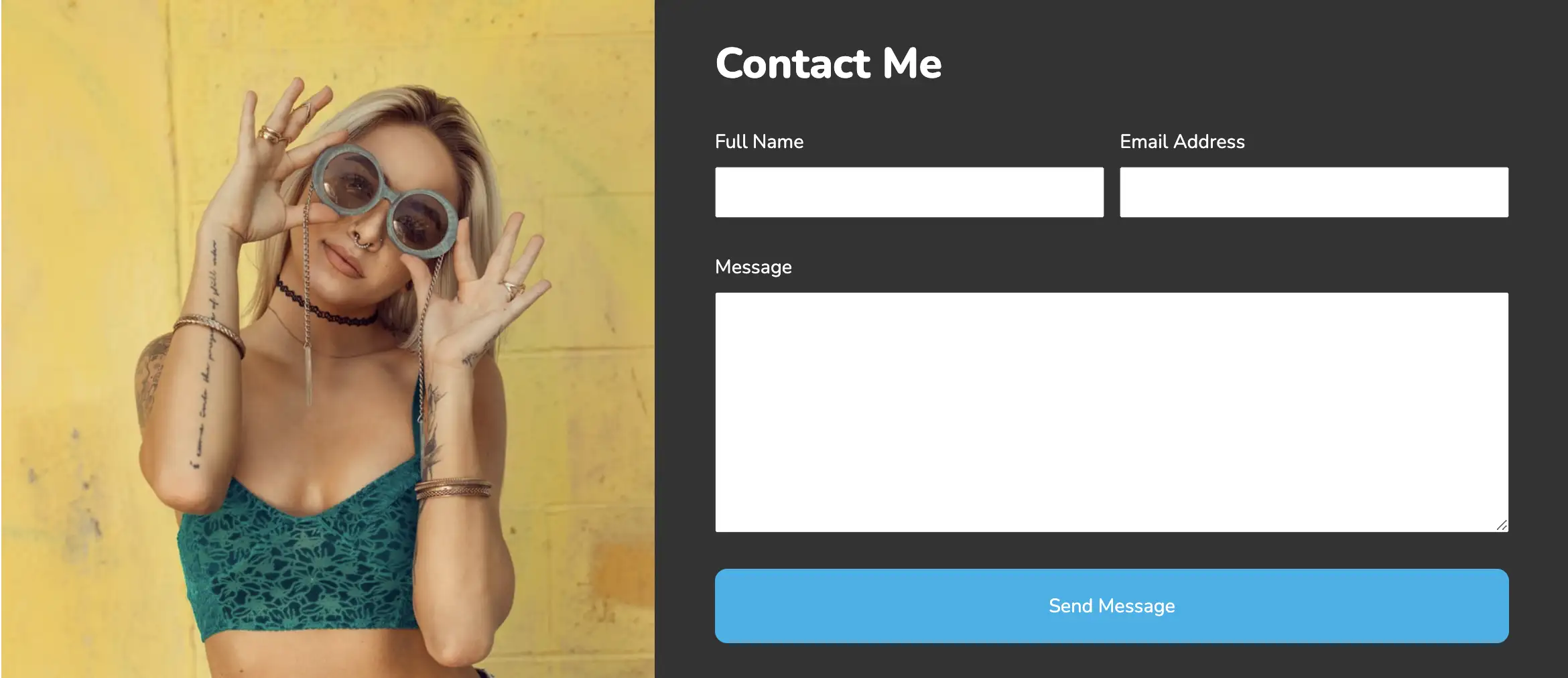
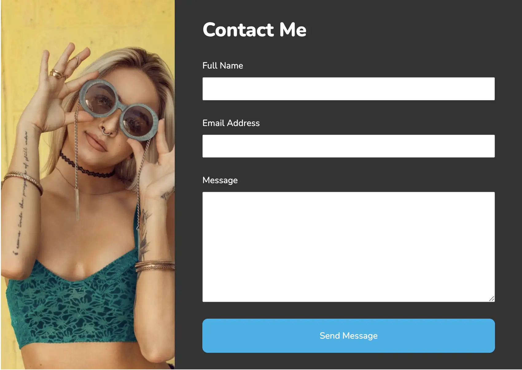
If you are on the lookout for split-screen contact forms, this design is sure to impress you. Each form field is given enough space, enabling the user to interact easily with the form. The remaining space is set aside to add brand or service-related images and can be easily modified as per user requirements.
View Code
HTML
CSS
JS
Responsive CSS
Output

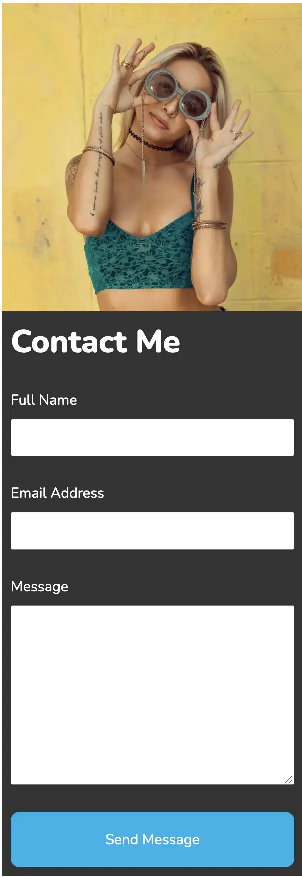
Contact Me
.contact_us * {
font-family: Nunito, sans-serif;
}
.contact_us a {
text-decoration-line: none;
text-decoration-thickness: initial;
text-decoration-style: initial;
text-decoration-color: initial;
}
.contact_us .text-blk {
margin-top: 0px;
margin-right: 0px;
margin-bottom: 0px;
margin-left: 0px;
line-height: 25px;
padding-top: 0px;
padding-right: 0px;
padding-bottom: 0px;
padding-left: 0px;
}
.contact_us input:focus {
outline-color: initial;
outline-style: none;
outline-width: initial;
}
.contact_us textarea:focus {
outline-color: initial;
outline-style: none;
outline-width: initial;
}
.contact_us .responsive-cell-block {
min-height: 75px;
}
.contact_us .responsive-container-block {
min-height: 75px;
height: fit-content;
width: 100%;
padding-top: 10px;
padding-right: 10px;
padding-bottom: 10px;
padding-left: 10px;
display: flex;
flex-wrap: wrap;
margin-top: 0px;
margin-right: auto;
margin-bottom: 0px;
margin-left: auto;
justify-content: flex-start;
}
.contact_us .responsive-container-block.bigContainer {
padding-top: 10px;
padding-right: 30px;
padding-bottom: 10px;
padding-left: 30px;
}
.contact_us .responsive-container-block.Container {
max-width: 1320px;
margin-top: 50px;
margin-right: auto;
margin-bottom: 50px;
margin-left: auto;
}
.contact_us .mainImg {
width: 100%;
object-fit: cover;
height: 100%;
}
.contact_us .responsive-cell-block.wk-desk-7.wk-ipadp-8.wk-tab-12.wk-mobile-12 {
background-color: #333333;
padding-top: 30px;
padding-right: 50px;
padding-bottom: 30px;
padding-left: 50px;
}
.contact_us .text-blk.heading {
color: white;
font-size: 35px;
line-height: 48px;
font-weight: 800;
margin-top: 0px;
margin-right: 0px;
margin-bottom: 30px;
margin-left: 0px;
}
.contact_us #message {
width: 100%;
margin-top: 0px;
margin-right: 0px;
margin-bottom: 0px;
margin-left: 0px;
padding-top: 10px;
padding-right: 10px;
padding-bottom: 10px;
padding-left: 10px;
}
.contact_us .emailArea {
width: 49%;
}
.contact_us .firstRow {
display: flex;
flex-direction: row;
align-items: flex-start;
justify-content: space-between;
margin-top: 0px;
margin-right: 0px;
margin-bottom: 30px;
margin-left: 0px;
width: 100%;
}
.contact_us .fullNameArea {
width: 49%;
}
.contact_us .cardHead {
margin-top: 0px;
margin-right: 0px;
margin-bottom: 10px;
margin-left: 0px;
color: white;
}
.contact_us .submit {
color: white;
padding-top: 20px;
padding-bottom: 20px;
width: 100%;
text-align: center;
background-image: initial;
background-position-x: initial;
background-position-y: initial;
background-size: initial;
background-repeat-x: initial;
background-repeat-y: initial;
background-attachment: initial;
background-origin: initial;
background-clip: initial;
background-color: #00b2eb;
border-top-left-radius: 10px;
border-top-right-radius: 10px;
border-bottom-right-radius: 10px;
border-bottom-left-radius: 10px;
}
.contact_us .formTable {
margin-top: 0px;
margin-right: 0px;
margin-bottom: 0px;
margin-left: 0px;
display: flex;
flex-direction: column;
align-items: flex-start;
}
.contact_us .messageArea {
width: 100%;
margin-top: 0px;
margin-right: 0px;
margin-bottom: 30px;
margin-left: 0px;
}
.contact_us .fullName {
width: 100%;
padding-top: 10px;
padding-right: 10px;
padding-bottom: 10px;
padding-left: 10px;
}
.contact_us .email {
width: 100%;
padding-top: 10px;
padding-right: 10px;
padding-bottom: 10px;
padding-left: 10px;
}
@media (max-width: 1024px) {
.contact_us .firstRow {
flex-direction: column;
}
.contact_us .fullNameArea {
width: 100%;
margin-top: 0px;
margin-right: 0px;
margin-bottom: 30px;
margin-left: 0px;
}
.contact_us .emailArea {
width: 100%;
}
}
@media (max-width: 500px) {
.contact_us .responsive-container-block.bigContainer {
padding-top: 10px;
padding-right: 20px;
padding-bottom: 10px;
padding-left: 20px;
}
.contact_us .responsive-container-block.Container {
padding-top: 0px;
padding-right: 0px;
padding-bottom: 0px;
padding-left: 0px;
}
.contact_us .responsive-cell-block.wk-desk-7.wk-ipadp-8.wk-tab-12.wk-mobile-12 {
padding-top: 10px;
padding-right: 10px;
padding-bottom: 10px;
padding-left: 10px;
}
}
         @import url('https://fonts.googleapis.com/css2?family=Nunito:wght@200;300;400;600;700;800&display=swap');
                            *, *:before, *:after {
                            -moz-box-sizing: border-box;
                            -webkit-box-sizing: border-box;
                            box-sizing: border-box;
                            }
                            body {
                            margin: 0;
                            }
                            .wk-desk-1{
                            width: 8.333333%;
                            }
                            .wk-desk-2{
                            width: 16.666667%;
                            }
                            .wk-desk-3{
                            width: 25%;
                            }
                            .wk-desk-4{
                            width: 33.333333%;
                            }
                            .wk-desk-5{
                            width: 41.666667%;
                            }
                            .wk-desk-6{
                            width: 50%;
                            }
                            .wk-desk-7{
                            width: 58.333333%;
                            }
                            .wk-desk-8{
                            width: 66.666667%;
                            }
                            .wk-desk-9{
                            width: 75%;
                            }
                            .wk-desk-10{
                            width: 83.333333%;
                            }
                            .wk-desk-11{
                            width: 91.666667%;
                            }
                            .wk-desk-12{
                            width: 100%;
                            }
                            @media (max-width: 1024px) {
                            .wk-ipadp-1{
                            width: 8.333333%;
                            }
                            .wk-ipadp-2{
                            width: 16.666667%;
                            }
                            .wk-ipadp-3{
                            width: 25%;
                            }
                            .wk-ipadp-4{
                            width: 33.333333%;
                            }
                            .wk-ipadp-5{
                            width: 41.666667%;
                            }
                            .wk-ipadp-6{
                            width: 50%;
                            }
                            .wk-ipadp-7{
                            width: 58.333333%;
                            }
                            .wk-ipadp-8{
                            width: 66.666667%;
                            }
                            .wk-ipadp-9{
                            width: 75%;
                            }
                            .wk-ipadp-10{
                            width: 83.333333%;
                            }
                            .wk-ipadp-11{
                            width: 91.666667%;
                            }
                            .wk-ipadp-12{
                            width: 100%;
                            }
                            }
                            @media (max-width: 768px) {
                            .wk-tab-1{
                            width: 8.333333%;
                            }
                            .wk-tab-2{
                            width: 16.666667%;
                            }
                            .wk-tab-3{
                            width: 25%;
                            }
                            .wk-tab-4{
                            width: 33.333333%;
                            }
                            .wk-tab-5{
                            width: 41.666667%;
                            }
                            .wk-tab-6{
                            width: 50%;
                            }
                            .wk-tab-7{
                            width: 58.333333%;
                            }
                            .wk-tab-8{
                            width: 66.666667%;
                            }
                            .wk-tab-9{
                            width: 75%;
                            }
                            .wk-tab-10{
                            width: 83.333333%;
                            }
                            .wk-tab-11{
                            width: 91.666667%;
                            }
                            .wk-tab-12{
                            width: 100%;
                            }
                            }
                            @media (max-width: 500px) {
                            .wk-mobile-1{
                            width: 8.333333%;
                            }
                            .wk-mobile-2{
                            width: 16.666667%;
                            }
                            .wk-mobile-3{
                            width: 25%;
                            }
                            .wk-mobile-4{
                            width: 33.333333%;
                            }
                            .wk-mobile-5{
                            width: 41.666667%;
                            }
                            .wk-mobile-6{
                            width: 50%;
                            }
                            .wk-mobile-7{
                            width: 58.333333%;
                            }
                            .wk-mobile-8{
                            width: 66.666667%;
                            }
                            .wk-mobile-9{
                            width: 75%;
                            }
                            .wk-mobile-10{
                            width: 83.333333%;
                            }
                            .wk-mobile-11{
                            width: 91.666667%;
                            }
                            .wk-mobile-12{
                            width: 100%;
                            }
                            }
Reset
The design is completely responsive, stacking the sections one above the other on smaller screens. It would work well to maintain the theme of the website. The call-to-action is highlighted with proper styles.
View Code
HTML
CSS
JS
Responsive CSS
Output

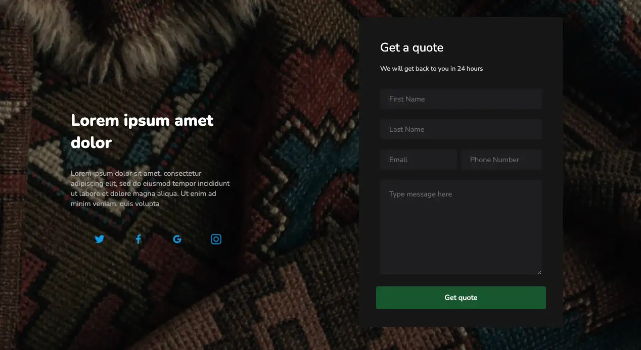
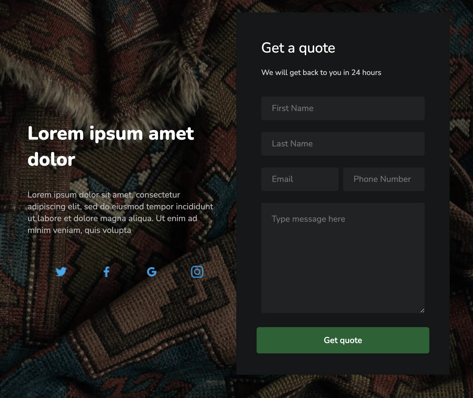
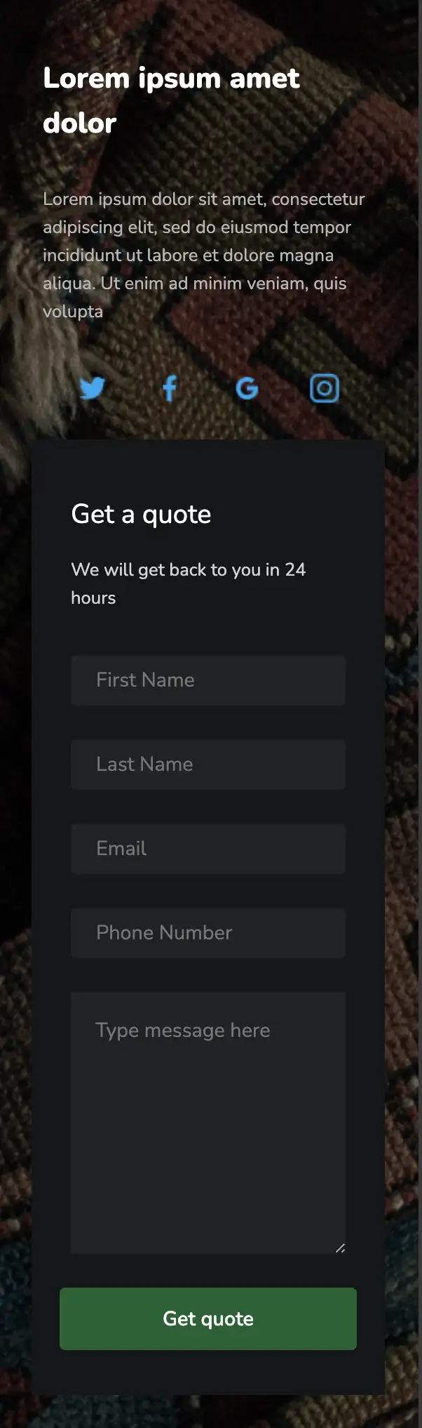
Lorem ipsum amet dolor
Lorem ipsum dolor sit amet, consectetur adipiscing elit, sed do eiusmod tempor incididunt ut labore et dolore magna aliqua. Ut enim ad minim veniam, quis volupta
.landing_page * {
font-family: Nunito, sans-serif;
}
.landing_page .responsive-container-block {
min-height: 75px;
height: fit-content;
width: 100%;
display: flex;
flex-wrap: wrap;
margin-top: 0px;
margin-right: auto;
margin-bottom: 0px;
margin-left: auto;
justify-content: flex-start;
}
.landing_page .text-blk {
margin-top: 0px;
margin-right: 0px;
margin-bottom: 0px;
margin-left: 0px;
line-height: 25px;
}
.landing_page .responsive-cell-block {
min-height: 75px;
}
.landing_page .responsive-container-block.container {
max-width: 1320px;
margin-top: 60px;
margin-right: auto;
margin-bottom: 60px;
margin-left: auto;
position: relative;
}
.landing_page .form-box {
background-color: #151617;
color: white;
padding-top: 35px;
padding-right: 33px;
padding-bottom: 35px;
padding-left: 33px;
max-width: 506px;
}
.landing_page .text-blk.contactus-head {
font-size: 30px;
line-height: 40px;
}
.landing_page .text-blk.contactus-subhead {
color: #d4d4d4;
margin-top: 0px;
margin-right: 0px;
margin-bottom: 18px;
margin-left: 0px;
}
.landing_page .input {
width: 100%;
height: 50px;
border-top-left-radius: 5px;
border-top-right-radius: 5px;
border-bottom-right-radius: 5px;
border-bottom-left-radius: 5px;
font-size: 18px;
padding-top: 1px;
padding-right: 125px;
padding-bottom: 1px;
padding-left: 22.5px;
border-top-width: 2px;
border-right-width: 2px;
border-bottom-width: 2px;
border-left-width: 2px;
border-top-style: none;
border-right-style: none;
border-bottom-style: none;
border-left-style: none;
border-top-color: #767676;
border-right-color: #767676;
border-bottom-color: #767676;
border-left-color: #767676;
border-image-source: initial;
border-image-slice: initial;
border-image-width: initial;
border-image-outset: initial;
border-image-repeat: initial;
background-color: #212223;
padding: 1px 12.5px 1px 22.5px;
}
.landing_page .textinput {
width: 100%;
height: 233px;
margin-top: 0px;
margin-right: 0px;
margin-bottom: 20px;
margin-left: 0px;
font-size: 18px;
padding-top: 22px;
padding-right: 22px;
padding-bottom: 22px;
padding-left: 22px;
background-color: #212223;
border-top-width: 1px;
border-right-width: 1px;
border-bottom-width: 1px;
border-left-width: 1px;
border-top-style: none;
border-right-style: none;
border-bottom-style: none;
border-left-style: none;
border-top-color: #767676;
border-right-color: #767676;
border-bottom-color: #767676;
border-left-color: #767676;
border-image-source: initial;
border-image-slice: initial;
border-image-width: initial;
border-image-outset: initial;
border-image-repeat: initial;
}
.landing_page .submit-btn {
width: 100%;
height: 56px;
border-top-left-radius: 5px;
border-top-right-radius: 5px;
border-bottom-right-radius: 5px;
border-bottom-left-radius: 5px;
background-color: #146132;
font-size: 18px;
font-weight: 600;
color: white;
border-top-width: 2px;
border-right-width: 2px;
border-bottom-width: 2px;
border-left-width: 2px;
border-top-style: none;
border-right-style: none;
border-bottom-style: none;
border-left-style: none;
border-top-color: #146132;
border-right-color: #146132;
border-bottom-color: #146132;
border-left-color: #146132;
border-image-source: initial;
border-image-slice: initial;
border-image-width: initial;
border-image-outset: initial;
border-image-repeat: initial;
}
.landing_page .responsive-cell-block.wk-tab-12.wk-mobile-12.wk-desk-6.wk-ipadp-6.emial {
padding-top: 0px;
padding-right: 10px;
padding-bottom: 0px;
padding-left: 0px;
}
.landing_page .responsive-cell-block.wk-ipadp-6.wk-tab-12.wk-mobile-12.wk-desk-6.right-one {
display: flex;
justify-content: center;
}
.landing_page .responsive-cell-block.wk-desk-6.wk-ipadp-6.wk-tab-12.wk-mobile-12.left-one {
display: flex;
justify-content: flex-start;
align-items: center;
color: white;
}
.landing_page .text-blk.section-subhead {
margin-top: 0px;
margin-right: 0px;
margin-bottom: 50px;
margin-left: 0px;
max-width: 420px;
font-size: 18px;
color: #b6b6b6;
}
.landing_page .text-blk.section-head {
font-size: 40px;
line-height: 55px;
font-weight: 800;
margin-top: 0px;
margin-right: 0px;
margin-bottom: 15px;
margin-left: 0px;
max-width: 450px;
}
.landing_page .icons-container {
max-width: 450px;
display: flex;
justify-content: space-evenly;
}
.landing_page .img {
width: 31px;
height: 31px;
}
.landing_page .responsive-container-block.big-container {
background-color: black;
padding-top: 0px;
padding-right: 50px;
padding-bottom: 0px;
padding-left: 50px;
position: relative;
}
.landing_page .bg-img {
width: 100%;
position: absolute;
left: 0px;
right: 0px;
bottom: 0px;
top: 0px;
height: 100%;
opacity: 0.5;
object-fit: cover;
}
@media (max-width: 768px) {
.landing_page .responsive-cell-block.wk-desk-6.wk-ipadp-6.wk-tab-12.wk-mobile-12.left-one {
justify-content: center;
margin-top: 0px;
margin-right: 0px;
margin-bottom: 30px;
margin-left: 0px;
}
.landing_page .responsive-cell-block.wk-tab-12.wk-mobile-12.wk-desk-6.wk-ipadp-6.emial {
padding-top: 0px;
padding-right: 0px;
padding-bottom: 0px;
padding-left: 0px;
}
.landing_page .responsive-cell-block.wk-desk-6.wk-ipadp-6.wk-tab-12.wk-mobile-12.left-one {
margin: 0 0 40px 0;
}
}
@media (max-width: 500px) {
.landing_page .text-blk.section-head {
font-size: 26px;
line-height: 40px;
}
.landing_page .responsive-container-block.big-container {
padding-top: 0px;
padding-right: 20px;
padding-bottom: 0px;
padding-left: 20px;
}
.landing_page .text-blk.section-subhead {
margin-top: 0px;
margin-right: 0px;
margin-bottom: 30px;
margin-left: 0px;
font-size: 16px;
}
.landing_page .form-box {
padding-top: 30px;
padding-right: 15px;
padding-bottom: 30px;
padding-left: 15px;
}
.landing_page .responsive-cell-block.wk-desk-6.wk-ipadp-6.wk-tab-12.wk-mobile-12.left-one {
margin: 0 0 30px 0;
}
.landing_page .input {
height: 45px;
}
.landing_page .text-blk.contactus-head {
font-size: 24px;
line-height: 34px;
}
}
         @import url('https://fonts.googleapis.com/css2?family=Nunito:wght@200;300;400;600;700;800&display=swap');
                            *, *:before, *:after {
                            -moz-box-sizing: border-box;
                            -webkit-box-sizing: border-box;
                            box-sizing: border-box;
                            }
                            body {
                            margin: 0;
                            }
                            .wk-desk-1{
                            width: 8.333333%;
                            }
                            .wk-desk-2{
                            width: 16.666667%;
                            }
                            .wk-desk-3{
                            width: 25%;
                            }
                            .wk-desk-4{
                            width: 33.333333%;
                            }
                            .wk-desk-5{
                            width: 41.666667%;
                            }
                            .wk-desk-6{
                            width: 50%;
                            }
                            .wk-desk-7{
                            width: 58.333333%;
                            }
                            .wk-desk-8{
                            width: 66.666667%;
                            }
                            .wk-desk-9{
                            width: 75%;
                            }
                            .wk-desk-10{
                            width: 83.333333%;
                            }
                            .wk-desk-11{
                            width: 91.666667%;
                            }
                            .wk-desk-12{
                            width: 100%;
                            }
                            @media (max-width: 1024px) {
                            .wk-ipadp-1{
                            width: 8.333333%;
                            }
                            .wk-ipadp-2{
                            width: 16.666667%;
                            }
                            .wk-ipadp-3{
                            width: 25%;
                            }
                            .wk-ipadp-4{
                            width: 33.333333%;
                            }
                            .wk-ipadp-5{
                            width: 41.666667%;
                            }
                            .wk-ipadp-6{
                            width: 50%;
                            }
                            .wk-ipadp-7{
                            width: 58.333333%;
                            }
                            .wk-ipadp-8{
                            width: 66.666667%;
                            }
                            .wk-ipadp-9{
                            width: 75%;
                            }
                            .wk-ipadp-10{
                            width: 83.333333%;
                            }
                            .wk-ipadp-11{
                            width: 91.666667%;
                            }
                            .wk-ipadp-12{
                            width: 100%;
                            }
                            }
                            @media (max-width: 768px) {
                            .wk-tab-1{
                            width: 8.333333%;
                            }
                            .wk-tab-2{
                            width: 16.666667%;
                            }
                            .wk-tab-3{
                            width: 25%;
                            }
                            .wk-tab-4{
                            width: 33.333333%;
                            }
                            .wk-tab-5{
                            width: 41.666667%;
                            }
                            .wk-tab-6{
                            width: 50%;
                            }
                            .wk-tab-7{
                            width: 58.333333%;
                            }
                            .wk-tab-8{
                            width: 66.666667%;
                            }
                            .wk-tab-9{
                            width: 75%;
                            }
                            .wk-tab-10{
                            width: 83.333333%;
                            }
                            .wk-tab-11{
                            width: 91.666667%;
                            }
                            .wk-tab-12{
                            width: 100%;
                            }
                            }
                            @media (max-width: 500px) {
                            .wk-mobile-1{
                            width: 8.333333%;
                            }
                            .wk-mobile-2{
                            width: 16.666667%;
                            }
                            .wk-mobile-3{
                            width: 25%;
                            }
                            .wk-mobile-4{
                            width: 33.333333%;
                            }
                            .wk-mobile-5{
                            width: 41.666667%;
                            }
                            .wk-mobile-6{
                            width: 50%;
                            }
                            .wk-mobile-7{
                            width: 58.333333%;
                            }
                            .wk-mobile-8{
                            width: 66.666667%;
                            }
                            .wk-mobile-9{
                            width: 75%;
                            }
                            .wk-mobile-10{
                            width: 83.333333%;
                            }
                            .wk-mobile-11{
                            width: 91.666667%;
                            }
                            .wk-mobile-12{
                            width: 100%;
                            }
                            }
Reset
This design is ideal for a mix of simple yet creative style. Company information is displayed in a separate section with a translucent blue background that overlaps with the contact form. The form element contains rounded fields and a checkbox to agree to the company’s terms and conditions.
View Code
HTML
CSS
JS
Responsive CSS
Output
.contact_us_8 * {
font-family: Nunito, sans-serif;
}
.contact_us_8 .text-blk {
margin-top: 0px;
margin-right: 0px;
margin-bottom: 0px;
margin-left: 0px;
line-height: 25px;
}
.contact_us_8 .responsive-cell-block {
min-height: 75px;
}
.contact_us_8 .container-block {
min-height: 75px;
height: fit-content;
width: 100%;
padding-top: 10px;
padding-right: 10px;
padding-bottom: 10px;
padding-left: 10px;
display: block;
}
.contact_us_8 input:focus {
outline-color: initial;
outline-style: none;
outline-width: initial;
}
.contact_us_8 .responsive-container-block {
min-height: 75px;
height: fit-content;
width: 100%;
display: flex;
flex-wrap: wrap;
justify-content: flex-start;
margin-top: 0px;
margin-right: auto;
margin-bottom: 20px;
margin-left: auto;
}
.contact_us_8 .responsive-container-block.big-container {
padding-top: 10px;
padding-right: 30px;
padding-bottom: 10px;
padding-left: 30px;
background-color: #03a9f4;
position: absolute;
height: 300px;
}
.contact_us_8 .responsive-container-block.container {
position: static;
min-height: 75px;
flex-direction: column;
margin-top: 0px;
margin-right: 0px;
margin-bottom: 0px;
margin-left: 0px;
}
.contact_us_8 .container-block.form-wrapper {
background-color: white;
max-width: 610px;
text-align: center;
padding-top: 50px;
padding-right: 40px;
padding-bottom: 50px;
padding-left: 40px;
box-shadow: rgba(0, 0, 0, 0.05) 0px 4px 20px 7px;
border-top-left-radius: 6px;
border-top-right-radius: 6px;
border-bottom-right-radius: 6px;
border-bottom-left-radius: 6px;
position: static;
margin-top: 50px;
margin-right: auto;
margin-bottom: 50px;
margin-left: auto;
margin: 50px 0 50px 0;
}
.contact_us_8 .text-blk.contactus-head {
font-size: 36px;
line-height: 45px;
font-weight: 900;
margin-top: 0px;
margin-right: 0px;
margin-bottom: 20px;
margin-left: 0px;
}
.contact_us_8 .text-blk.contactus-subhead {
color: black;
margin-top: 0px;
margin-right: 0px;
margin-bottom: 30px;
margin-left: 0px;
max-width: 300px;
}
.contact_us_8 .responsive-cell-block.wk-desk-6.wk-ipadp-6.wk-tab-12.wk-mobile-12 {
margin-top: 0px;
margin-right: 0px;
margin-bottom: 26px;
margin-left: 0px;
min-height: 50px;
}
.contact_us_8 .input {
width: 100%;
height: 50px;
padding-top: 1px;
padding-right: 15px;
padding-bottom: 1px;
padding-left: 15px;
border-top-width: 2px;
border-right-width: 2px;
border-bottom-width: 2px;
border-left-width: 2px;
border-top-style: solid;
border-right-style: solid;
border-bottom-style: solid;
border-left-style: solid;
border-top-color: #eeeeee;
border-right-color: #eeeeee;
border-bottom-color: #eeeeee;
border-left-color: #eeeeee;
border-image-source: initial;
border-image-slice: initial;
border-image-width: initial;
border-image-outset: initial;
border-image-repeat: initial;
font-size: 16px;
border-top-left-radius: 64px;
border-top-right-radius: 64px;
border-bottom-right-radius: 64px;
border-bottom-left-radius: 64px;
}
.contact_us_8 .textinput {
width: 100%;
min-height: 150px;
padding-top: 20px;
padding-right: 15px;
padding-bottom: 20px;
padding-left: 15px;
border-top-width: 2px;
border-right-width: 2px;
border-bottom-width: 2px;
border-left-width: 2px;
border-top-style: solid;
border-right-style: solid;
border-bottom-style: solid;
border-left-style: solid;
border-top-color: #eeeeee;
border-right-color: #eeeeee;
border-bottom-color: #eeeeee;
border-left-color: #eeeeee;
border-image-source: initial;
border-image-slice: initial;
border-image-width: initial;
border-image-outset: initial;
border-image-repeat: initial;
font-size: 16px;
}
.contact_us_8 .submit-btn {
width: 100%;
background-color: #03a9f4;
height: 50px;
font-size: 18px;
font-weight: 700;
color: white;
border-top-width: 0px;
border-right-width: 0px;
border-bottom-width: 0px;
border-left-width: 0px;
border-top-style: outset;
border-right-style: outset;
border-bottom-style: outset;
border-left-style: outset;
border-top-color: #767676;
border-right-color: #767676;
border-bottom-color: #767676;
border-left-color: #767676;
border-image-source: initial;
border-image-slice: initial;
border-image-width: initial;
border-image-outset: initial;
border-image-repeat: initial;
border-top-left-radius: 64px;
border-top-right-radius: 64px;
border-bottom-right-radius: 64px;
border-bottom-left-radius: 64px;
}
.contact_us_8 .form-box {
position: relative;
margin-top: 60px;
margin-right: auto;
margin-bottom: 60px;
margin-left: auto;
max-width: 830px;
width: 100%;
}
.contact_us_8 ::placeholder {
color: #dadada;
}
.contact_us_8 .right-side-text {
position: absolute;
top: 0px;
height: 100%;
right: 0;
background-color: rgba(151, 220, 250, 0.44);
max-width: 363px;
width: 100%;
display: flex;
flex-direction: column;
align-items: center;
justify-content: center;
}
.contact_us_8 .social-media-links {
width: 230px;
display: flex;
justify-content: space-evenly;
}
.contact_us_8 .checkboc-container {
display: flex;
align-items: flex-start;
}
.contact_us_8 .checkbox-text {
color: #9c9c9c;
margin-top: 16px;
margin-right: 0px;
margin-bottom: 16px;
margin-left: 10px;
margin: 0 0 0 10px;
text-align: left;
}
.contact_us_8 .responsive-cell-block.wk-tab-12.wk-mobile-12.wk-desk-8.wk-ipadp-12.checkbox-container {
min-height: 30px;
margin: 0 0 30px 0;
}
@media (max-width: 1024px) {
.contact_us_8 .right-side-text {
right: 0px;
top: 0px;
height: 250px;
width: 100%;
max-width: 100%;
}
.contact_us_8 .container-block.form-wrapper {
margin-top: 200px;
margin-right: 0px;
margin-bottom: 50px;
margin-left: 0px;
padding-top: 70px;
padding-right: 40px;
padding-bottom: 50px;
padding-left: 40px;
}
.contact_us_8 .form-box {
margin-top: 60px;
margin-right: auto;
margin-bottom: 60px;
margin-left: auto;
}
.contact_us_8 .text-blk.contactus-subhead {
max-width: 400px;
}
.contact_us_8 .right-side-text {
width: 85%;
left: 0px;
margin-top: 0px;
margin-right: auto;
margin-bottom: 0px;
margin-left: auto;
}
.contact_us_8 .form-box {
display: flex;
justify-content: center;
}
}
@media (max-width: 768px) {
.contact_us_8 .submit-btn {
width: 100%;
}
.contact_us_8 .input {
width: 100%;
}
.contact_us_8 .textinput {
width: 100%;
}
.contact_us_8 .container-block.form-wrapper {
margin-top: 80px;
margin-right: 0px;
margin-bottom: 0px;
margin-left: 0px;
}
.contact_us_8 .container-block.form-wrapper {
margin-top: 200px;
margin-right: 0px;
margin-bottom: 50px;
margin-left: 0px;
}
.contact_us_8 .text-blk.contactus-head {
font-size: 32px;
}
}
@media (max-width: 500px) {
.contact_us_8 .container-block.form-wrapper {
padding-top: 50px;
padding-right: 15px;
padding-bottom: 50px;
padding-left: 15px;
}
.contact_us_8 .container-block.form-wrapper {
margin-top: 60px;
margin-right: 0px;
margin-bottom: 0px;
margin-left: 0px;
}
.contact_us_8 .responsive-cell-block.wk-ipadp-6.wk-tab-12.wk-mobile-12.wk-desk-6 {
margin-top: 0px;
margin-right: 0px;
margin-bottom: 15px;
margin-left: 0px;
}
.contact_us_8 .responsive-container-block {
margin-top: 0px;
margin-right: 0px;
margin-bottom: 35px;
margin-left: 0px;
}
.contact_us_8 .container-block.form-wrapper {
margin-top: 220px;
margin-right: 0px;
margin-bottom: 50px;
margin-left: 0px;
}
.contact_us_8 .right-side-text {
width: 100%;
margin-top: 0px;
margin-right: auto;
margin-bottom: 0px;
margin-left: auto;
left: 0px;
max-width: 310px;
}
.contact_us_8 .right-side-text {
max-width: 280px;
}
.contact_us_8 .text-blk.contactus-head {
font-size: 26px;
line-height: 34px;
margin-top: 0px;
margin-right: 0px;
margin-bottom: 10px;
margin-left: 0px;
}
.contact_us_8 .text-blk.contactus-subhead {
max-width: 250px;
margin-top: 0px;
margin-right: 0px;
margin-bottom: 20px;
margin-left: 0px;
}
.contact_us_8 .form-box {
padding-top: 0px;
padding-right: 20px;
padding-bottom: 0px;
padding-left: 20px;
}
.contact_us_8 .checkboc-container {
align-items: flex-start;
}
.contact_us_8 .input {
height: 45px;
}
}
         @import url('https://fonts.googleapis.com/css2?family=Nunito:wght@200;300;400;600;700;800&display=swap');
                            *, *:before, *:after {
                            -moz-box-sizing: border-box;
                            -webkit-box-sizing: border-box;
                            box-sizing: border-box;
                            }
                            body {
                            margin: 0;
                            }
                            .wk-desk-1{
                            width: 8.333333%;
                            }
                            .wk-desk-2{
                            width: 16.666667%;
                            }
                            .wk-desk-3{
                            width: 25%;
                            }
                            .wk-desk-4{
                            width: 33.333333%;
                            }
                            .wk-desk-5{
                            width: 41.666667%;
                            }
                            .wk-desk-6{
                            width: 50%;
                            }
                            .wk-desk-7{
                            width: 58.333333%;
                            }
                            .wk-desk-8{
                            width: 66.666667%;
                            }
                            .wk-desk-9{
                            width: 75%;
                            }
                            .wk-desk-10{
                            width: 83.333333%;
                            }
                            .wk-desk-11{
                            width: 91.666667%;
                            }
                            .wk-desk-12{
                            width: 100%;
                            }
                            @media (max-width: 1024px) {
                            .wk-ipadp-1{
                            width: 8.333333%;
                            }
                            .wk-ipadp-2{
                            width: 16.666667%;
                            }
                            .wk-ipadp-3{
                            width: 25%;
                            }
                            .wk-ipadp-4{
                            width: 33.333333%;
                            }
                            .wk-ipadp-5{
                            width: 41.666667%;
                            }
                            .wk-ipadp-6{
                            width: 50%;
                            }
                            .wk-ipadp-7{
                            width: 58.333333%;
                            }
                            .wk-ipadp-8{
                            width: 66.666667%;
                            }
                            .wk-ipadp-9{
                            width: 75%;
                            }
                            .wk-ipadp-10{
                            width: 83.333333%;
                            }
                            .wk-ipadp-11{
                            width: 91.666667%;
                            }
                            .wk-ipadp-12{
                            width: 100%;
                            }
                            }
                            @media (max-width: 768px) {
                            .wk-tab-1{
                            width: 8.333333%;
                            }
                            .wk-tab-2{
                            width: 16.666667%;
                            }
                            .wk-tab-3{
                            width: 25%;
                            }
                            .wk-tab-4{
                            width: 33.333333%;
                            }
                            .wk-tab-5{
                            width: 41.666667%;
                            }
                            .wk-tab-6{
                            width: 50%;
                            }
                            .wk-tab-7{
                            width: 58.333333%;
                            }
                            .wk-tab-8{
                            width: 66.666667%;
                            }
                            .wk-tab-9{
                            width: 75%;
                            }
                            .wk-tab-10{
                            width: 83.333333%;
                            }
                            .wk-tab-11{
                            width: 91.666667%;
                            }
                            .wk-tab-12{
                            width: 100%;
                            }
                            }
                            @media (max-width: 500px) {
                            .wk-mobile-1{
                            width: 8.333333%;
                            }
                            .wk-mobile-2{
                            width: 16.666667%;
                            }
                            .wk-mobile-3{
                            width: 25%;
                            }
                            .wk-mobile-4{
                            width: 33.333333%;
                            }
                            .wk-mobile-5{
                            width: 41.666667%;
                            }
                            .wk-mobile-6{
                            width: 50%;
                            }
                            .wk-mobile-7{
                            width: 58.333333%;
                            }
                            .wk-mobile-8{
                            width: 66.666667%;
                            }
                            .wk-mobile-9{
                            width: 75%;
                            }
                            .wk-mobile-10{
                            width: 83.333333%;
                            }
                            .wk-mobile-11{
                            width: 91.666667%;
                            }
                            .wk-mobile-12{
                            width: 100%;
                            }
                            }
Reset
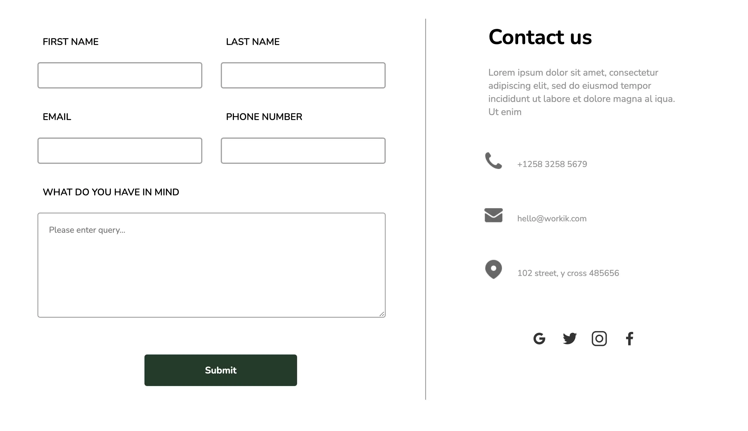
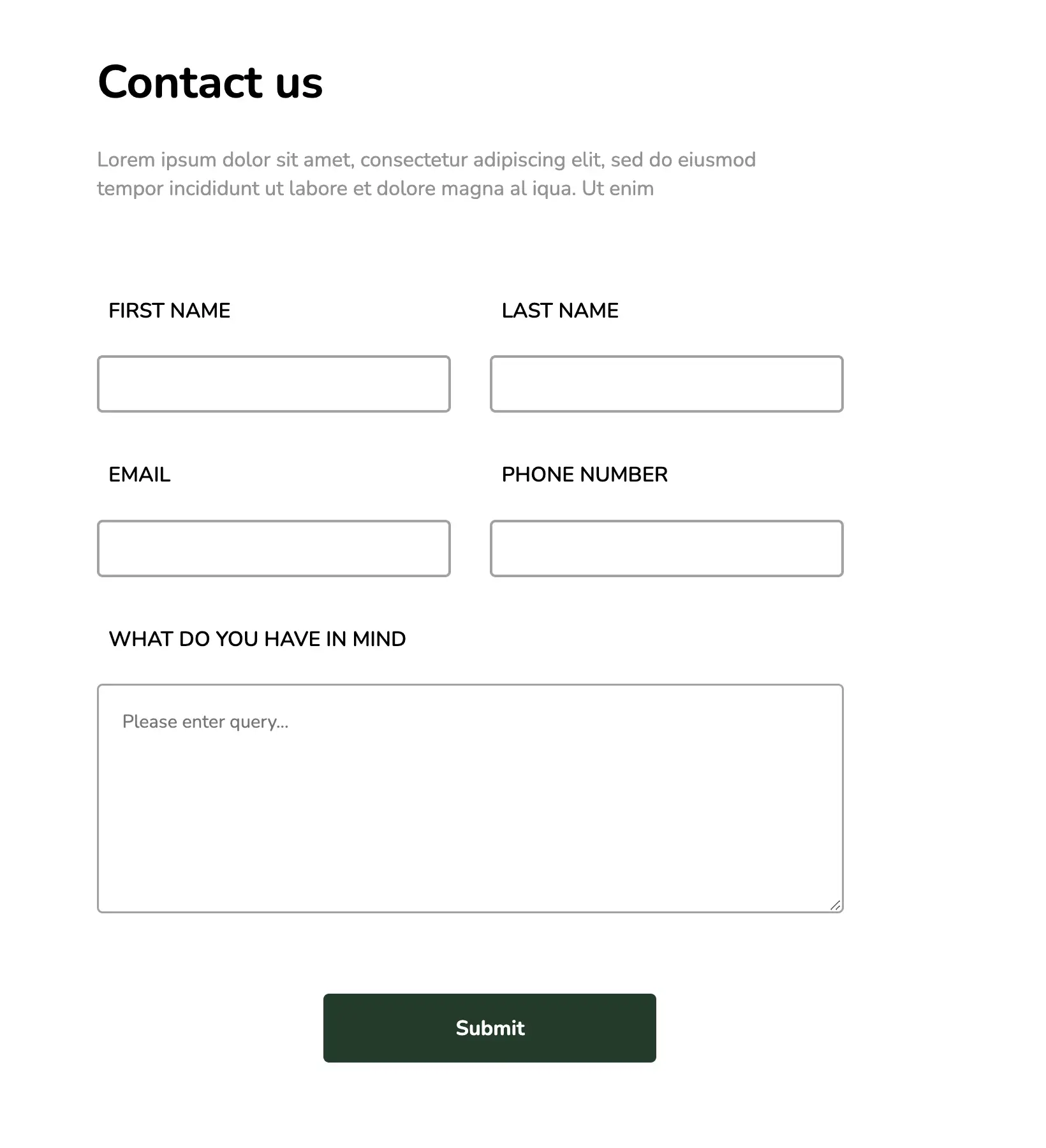
The above contact form is simple and visually appealing. The design provides ample space to showcase company contact information in addition to the input form. The rounded web elements, combined with the neat layout, make this design unique and minimalistic.
View Code
HTML
CSS
JS
Responsive CSS
Output
Contact us
Lorem ipsum dolor sit amet, consectetur adipiscing elit, sed do eiusmod tempor incididunt ut labore et dolore magna al iqua. Ut enim

+1258 3258 5679

hello@workik.com

102 street, y cross 485656


.contact_us_green * {
font-family: Nunito, sans-serif;
}
.contact_us_green .responsive-container-block {
min-height: 75px;
height: fit-content;
width: 100%;
display: flex;
flex-wrap: wrap;
justify-content: flex-start;
margin-top: 0px;
margin-right: auto;
margin-bottom: 60px;
margin-left: auto;
}
.contact_us_green input:focus {
outline-color: initial;
outline-style: none;
outline-width: initial;
}
.contact_us_green textarea:focus {
outline-color: initial;
outline-style: none;
outline-width: initial;
}
.contact_us_green .text-blk {
margin-top: 0px;
margin-right: 0px;
margin-bottom: 0px;
margin-left: 0px;
line-height: 25px;
}
.contact_us_green .responsive-cell-block {
min-height: 75px;
}
.contact_us_green .responsive-container-block.container {
max-width: 1320px;
margin-top: 60px;
margin-right: auto;
margin-bottom: 60px;
margin-left: auto;
}
.contact_us_green .responsive-container-block.big-container {
padding-top: 0px;
padding-right: 50px;
padding-bottom: 0px;
padding-left: 50px;
}
.contact_us_green .text-blk.contactus-head {
font-size: 40px;
line-height: 50px;
font-weight: 700;
margin-top: 0px;
margin-right: 0px;
margin-bottom: 10px;
margin-left: 0px;
}
.contact_us_green .text-blk.contactus-subhead {
max-width: 385px;
color: #939393;
font-size: 18px;
margin-top: 0px;
margin-right: 0px;
margin-bottom: 50px;
margin-left: 0px;
}
.contact_us_green .contact-svg {
padding-top: 0px;
padding-right: 25px;
padding-bottom: 0px;
padding-left: 0px;
width: 65px;
height: 40px;
}
.contact_us_green .social-media-links {
margin-top: 80px;
margin-right: auto;
margin-bottom: 0px;
margin-left: auto;
width: 250px;
display: flex;
justify-content: space-evenly;
}
.contact_us_green .social-svg {
width: 35px;
height: 35px;
}
.contact_us_green .text-box {
display: flex;
margin-top: 0px;
margin-right: 0px;
margin-bottom: 50px;
margin-left: 0px;
}
.contact_us_green .contact-text {
color: #939393;
}
.contact_us_green .input {
height: 50px;
width: 90%;
border-top-width: 2.5px;
border-right-width: 2.5px;
border-bottom-width: 2.5px;
border-left-width: 2.5px;
border-top-style: solid;
border-right-style: solid;
border-bottom-style: solid;
border-left-style: solid;
border-top-color: #a2a2a2;
border-right-color: #a2a2a2;
border-bottom-color: #a2a2a2;
border-left-color: #a2a2a2;
border-image-source: initial;
border-image-slice: initial;
border-image-width: initial;
border-image-outset: initial;
border-image-repeat: initial;
border-top-left-radius: 5px;
border-top-right-radius: 5px;
border-bottom-right-radius: 5px;
border-bottom-left-radius: 5px;
font-size: 16px;
padding-top: 5px;
padding-right: 15px;
padding-bottom: 5px;
padding-left: 15px;
}
.contact_us_green .textinput {
height: 200px;
width: 95%;
border-top-width: 2px;
border-right-width: 2px;
border-bottom-width: 2px;
border-left-width: 2px;
border-top-style: solid;
border-right-style: solid;
border-bottom-style: solid;
border-left-style: solid;
border-top-color: #a2a2a2;
border-right-color: #a2a2a2;
border-bottom-color: #a2a2a2;
border-left-color: #a2a2a2;
border-image-source: initial;
border-image-slice: initial;
border-image-width: initial;
border-image-outset: initial;
border-image-repeat: initial;
border-top-left-radius: 5px;
border-top-right-radius: 5px;
border-bottom-right-radius: 5px;
border-bottom-left-radius: 5px;
font-size: 16px;
padding-top: 20px;
padding-right: 30px;
padding-bottom: 20px;
padding-left: 20px;
}
.contact_us_green .submit-btn {
min-width: 290px;
height: 60px;
background-color: #1c3b28;
font-size: 18px;
font-weight: 700;
color: white;
border-top-width: 2px;
border-right-width: 2px;
border-bottom-width: 2px;
border-left-width: 2px;
border-top-style: none;
border-right-style: none;
border-bottom-style: none;
border-left-style: none;
border-top-color: #767676;
border-right-color: #767676;
border-bottom-color: #767676;
border-left-color: #767676;
border-image-source: initial;
border-image-slice: initial;
border-image-width: initial;
border-image-outset: initial;
border-image-repeat: initial;
border-top-left-radius: 5px;
border-top-right-radius: 5px;
border-bottom-right-radius: 5px;
border-bottom-left-radius: 5px;
margin-top: 0px;
margin-right: auto;
margin-bottom: 0px;
margin-left: auto;
cursor: pointer;
}
.contact_us_green .btn-wrapper {
display: flex;
justify-content: center;
}
.contact_us_green .text-blk.input-title {
font-size: 18px;
font-weight: 600;
line-height: 28px;
margin-top: 0px;
margin-right: 0px;
margin-bottom: 15px;
margin-left: 0px;
}
.contact_us_green .responsive-cell-block.wk-ipadp-6.wk-tab-12.wk-mobile-12.wk-desk-6 {
margin-top: 0px;
margin-right: 0px;
margin-bottom: 30px;
margin-left: 0px;
}
.contact_us_green .responsive-cell-block.wk-tab-12.wk-mobile-12.wk-desk-5.wk-ipadp-10 {
padding-top: 0px;
padding-right: 0px;
padding-bottom: 0px;
padding-left: 60px;
display: flex;
flex-direction: column;
align-items: center;
}
.contact_us_green .head-text-box {
display: none;
}
.contact_us_green .line {
border-right-width: 1.8px;
border-right-style: solid;
border-right-color: #a2a2a2;
}
.contact_us_green .responsive-cell-block.wk-tab-12.wk-mobile-12.wk-desk-7.wk-ipadp-10.line {
padding-top: 0px;
padding-right: 20px;
padding-bottom: 0px;
padding-left: 0px;
}
@media (max-width: 1024px) {
.contact_us_green .responsive-container-block.container {
justify-content: center;
}
.contact_us_green .text-blk.contactus-subhead {
max-width: 90%;
}
.contact_us_green .head-text-box {
display: block;
}
.contact_us_green .responsive-cell-block.wk-tab-12.wk-mobile-12.wk-desk-7.wk-ipadp-10.line {
padding-top: 0px;
padding-right: 20px;
padding-bottom: 60px;
padding-left: 0px;
}
.contact_us_green .line {
border-right-width: initial;
border-right-style: none;
border-right-color: initial;
border-bottom-width: 1.8px;
border-bottom-style: solid;
border-bottom-color: #a2a2a2;
}
.contact_us_green .responsive-cell-block.wk-tab-12.wk-mobile-12.wk-desk-5.wk-ipadp-10 {
margin-top: 60px;
margin-right: 0px;
margin-bottom: 0px;
margin-left: 0px;
}
.contact_us_green .workik-contact-bigbox {
display: flex;
}
.contact_us_green .responsive-cell-block.wk-tab-12.wk-mobile-12.wk-desk-5.wk-ipadp-10 {
padding-top: 0px;
padding-right: 0px;
padding-bottom: 0px;
padding-left: 0px;
}
}
@media (max-width: 768px) {
.contact_us_green .text-content {
display: none;
}
.contact_us_green .input {
width: 100%;
}
.contact_us_green .textinput {
width: 100%;
}
.contact_us_green .text-blk.contactus-head {
font-size: 30px;
}
}
@media (max-width: 500px) {
.contact_us_green .responsive-container-block.big-container {
padding-top: 0px;
padding-right: 20px;
padding-bottom: 0px;
padding-left: 20px;
}
.contact_us_green .workik-contact-bigbox {
display: block;
}
.contact_us_green .text-blk.input-title {
font-size: 16px;
}
.contact_us_green .text-blk.contactus-head {
font-size: 26px;
}
.contact_us_green .text-blk.contactus-subhead {
font-size: 16px;
line-height: 23px;
}
.contact_us_green .input {
height: 45px;
}
.contact_us_green .responsive-cell-block.wk-ipadp-6.wk-tab-12.wk-mobile-12.wk-desk-6 {
margin: 0 0 25px 0;
}
}
         @import url('https://fonts.googleapis.com/css2?family=Nunito:wght@200;300;400;600;700;800&display=swap');
                            *, *:before, *:after {
                            -moz-box-sizing: border-box;
                            -webkit-box-sizing: border-box;
                            box-sizing: border-box;
                            }
                            body {
                            margin: 0;
                            }
                            .wk-desk-1{
                            width: 8.333333%;
                            }
                            .wk-desk-2{
                            width: 16.666667%;
                            }
                            .wk-desk-3{
                            width: 25%;
                            }
                            .wk-desk-4{
                            width: 33.333333%;
                            }
                            .wk-desk-5{
                            width: 41.666667%;
                            }
                            .wk-desk-6{
                            width: 50%;
                            }
                            .wk-desk-7{
                            width: 58.333333%;
                            }
                            .wk-desk-8{
                            width: 66.666667%;
                            }
                            .wk-desk-9{
                            width: 75%;
                            }
                            .wk-desk-10{
                            width: 83.333333%;
                            }
                            .wk-desk-11{
                            width: 91.666667%;
                            }
                            .wk-desk-12{
                            width: 100%;
                            }
                            @media (max-width: 1024px) {
                            .wk-ipadp-1{
                            width: 8.333333%;
                            }
                            .wk-ipadp-2{
                            width: 16.666667%;
                            }
                            .wk-ipadp-3{
                            width: 25%;
                            }
                            .wk-ipadp-4{
                            width: 33.333333%;
                            }
                            .wk-ipadp-5{
                            width: 41.666667%;
                            }
                            .wk-ipadp-6{
                            width: 50%;
                            }
                            .wk-ipadp-7{
                            width: 58.333333%;
                            }
                            .wk-ipadp-8{
                            width: 66.666667%;
                            }
                            .wk-ipadp-9{
                            width: 75%;
                            }
                            .wk-ipadp-10{
                            width: 83.333333%;
                            }
                            .wk-ipadp-11{
                            width: 91.666667%;
                            }
                            .wk-ipadp-12{
                            width: 100%;
                            }
                            }
                            @media (max-width: 768px) {
                            .wk-tab-1{
                            width: 8.333333%;
                            }
                            .wk-tab-2{
                            width: 16.666667%;
                            }
                            .wk-tab-3{
                            width: 25%;
                            }
                            .wk-tab-4{
                            width: 33.333333%;
                            }
                            .wk-tab-5{
                            width: 41.666667%;
                            }
                            .wk-tab-6{
                            width: 50%;
                            }
                            .wk-tab-7{
                            width: 58.333333%;
                            }
                            .wk-tab-8{
                            width: 66.666667%;
                            }
                            .wk-tab-9{
                            width: 75%;
                            }
                            .wk-tab-10{
                            width: 83.333333%;
                            }
                            .wk-tab-11{
                            width: 91.666667%;
                            }
                            .wk-tab-12{
                            width: 100%;
                            }
                            }
                            @media (max-width: 500px) {
                            .wk-mobile-1{
                            width: 8.333333%;
                            }
                            .wk-mobile-2{
                            width: 16.666667%;
                            }
                            .wk-mobile-3{
                            width: 25%;
                            }
                            .wk-mobile-4{
                            width: 33.333333%;
                            }
                            .wk-mobile-5{
                            width: 41.666667%;
                            }
                            .wk-mobile-6{
                            width: 50%;
                            }
                            .wk-mobile-7{
                            width: 58.333333%;
                            }
                            .wk-mobile-8{
                            width: 66.666667%;
                            }
                            .wk-mobile-9{
                            width: 75%;
                            }
                            .wk-mobile-10{
                            width: 83.333333%;
                            }
                            .wk-mobile-11{
                            width: 91.666667%;
                            }
                            .wk-mobile-12{
                            width: 100%;
                            }
                            }
Reset
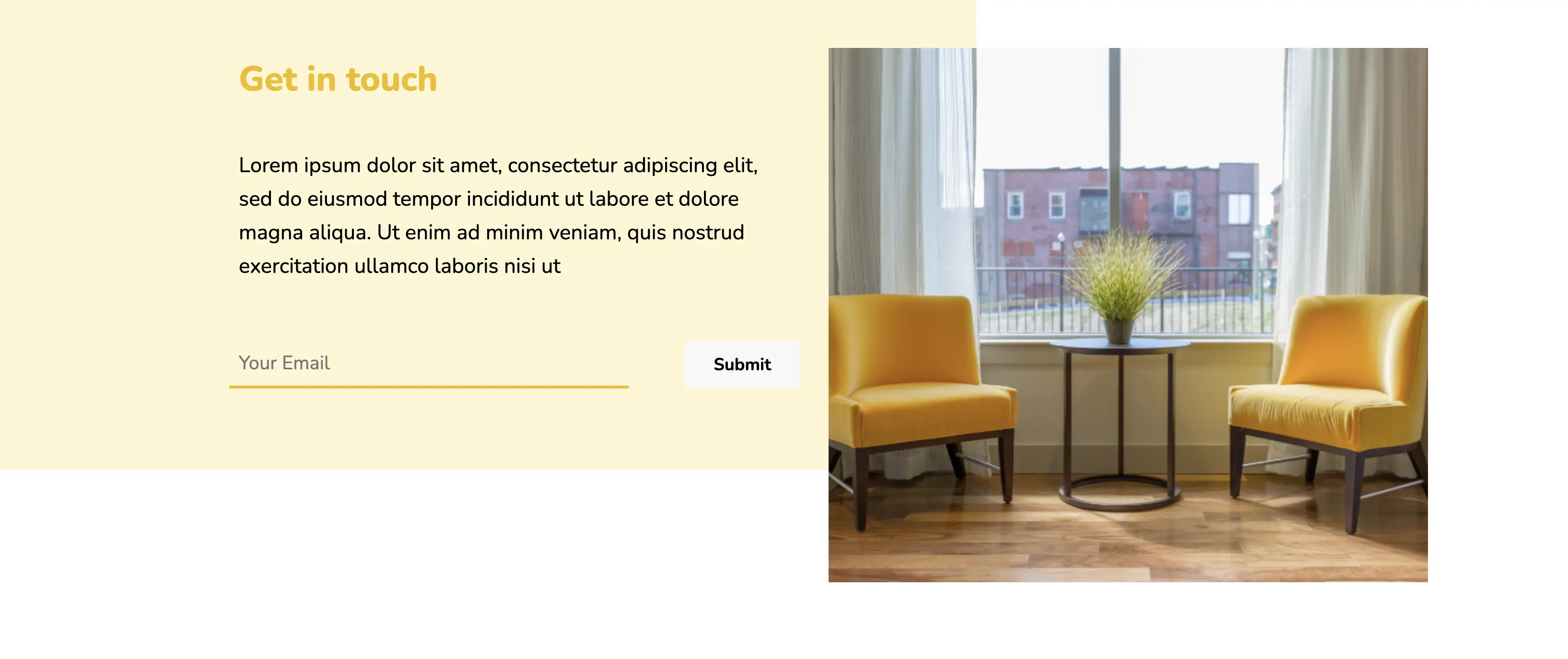
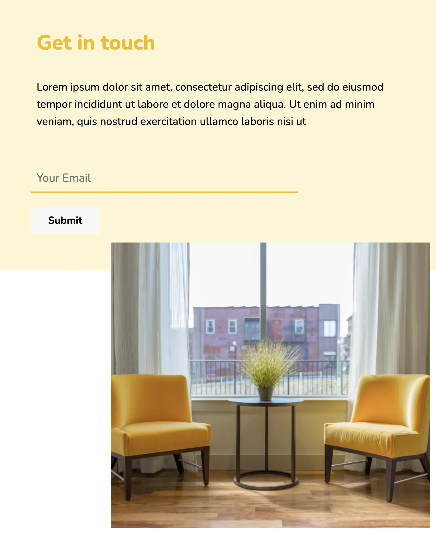
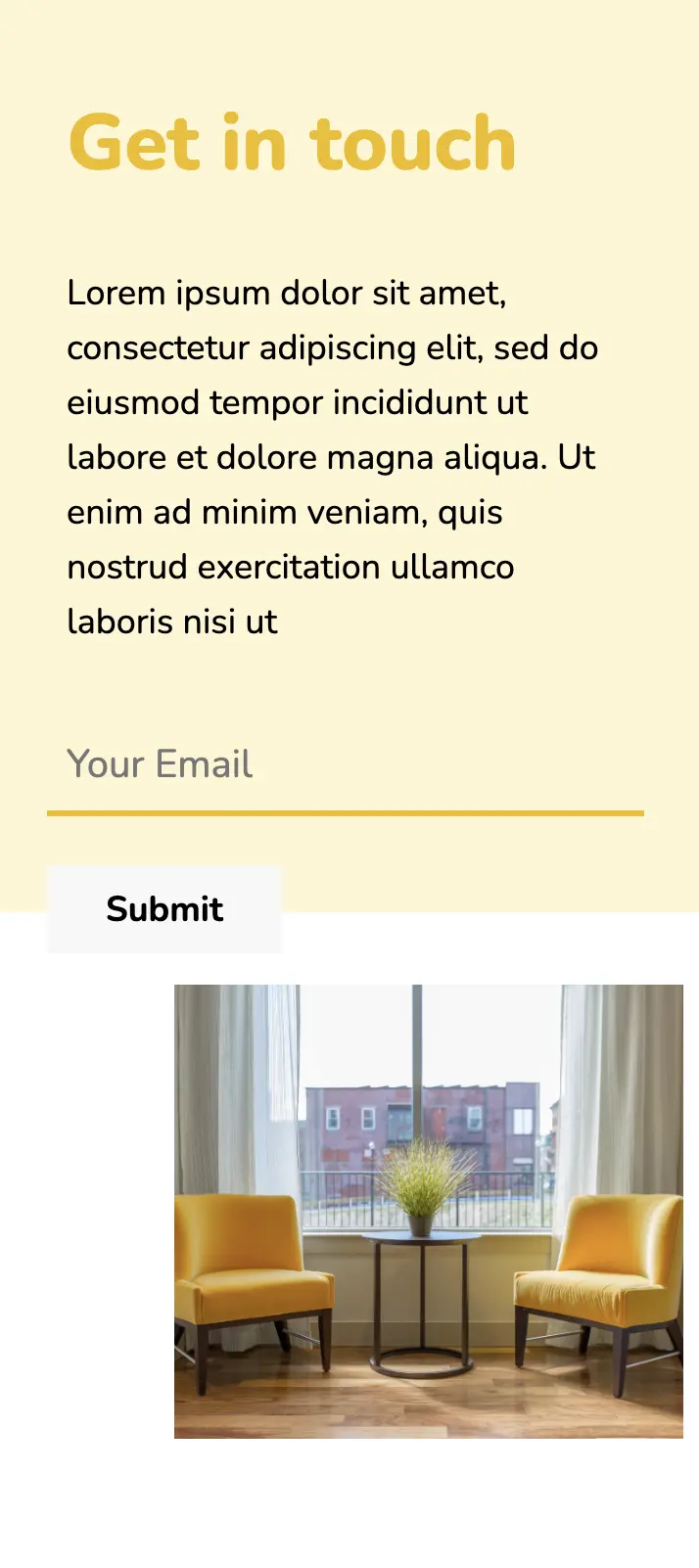
This contact form catches everyone’s attention with the image section that it sports on the right edge. The image can be changed based on preference and is a great detail that appeals to users. The form features just a field to type for email address keeping it very easy and short for users.
View Code
HTML
CSS
JS
Responsive CSS
Output
Get in touch
Lorem ipsum dolor sit amet, consectetur adipiscing elit, sed do eiusmod tempor incididunt ut labore et dolore magna aliqua. Ut enim ad minim veniam, quis nostrud exercitation ullamco laboris nisi ut
.interior_13 * {
font-family: Nunito, sans-serif;
}
.interior_13 .text-blk.section-head {
line-height: 45px;
font-size: 36px;
font-weight: 900;
color: #efbe00;
margin-top: 0px;
margin-right: 0px;
margin-bottom: 30px;
margin-left: 0px;
}
.interior_13 .text-blk {
margin-top: 0px;
margin-right: 0px;
margin-bottom: 0px;
margin-left: 0px;
line-height: 25px;
font-size: 16px;
}
.interior_13 a {
text-decoration-line: none;
text-decoration-thickness: initial;
text-decoration-style: initial;
text-decoration-color: initial;
color: inherit;
}
.interior_13 .responsive-cell-block {
min-height: 75px;
}
.interior_13 .responsive-container-block {
min-height: 75px;
height: fit-content;
width: 100%;
display: flex;
flex-wrap: wrap;
margin-top: 0px;
margin-right: auto;
margin-bottom: 0px;
margin-left: auto;
justify-content: flex-start;
}
.interior_13 .responsive-container-block.container {
max-width: 1320px;
padding-top: 10px;
padding-right: 10px;
padding-bottom: 10px;
padding-left: 50px;
padding: 0 0 0 50px;
}
.interior_13 .img-sofa3 {
width: 100%;
}
.interior_13 .responsive-cell-block.wk-tab-12.wk-mobile-12.wk-ipadp-12.wk-desk-6 {
margin-top: 50px;
margin-right: 0px;
margin-bottom: 50px;
margin-left: 0px;
}
.interior_13 .card-content {
padding-top: 0px;
padding-right: 30px;
padding-bottom: 0px;
padding-left: 0px;
}
.interior_13 .text-blk.sub-head {
font-size: 22px;
line-height: 35px;
margin-top: 0px;
margin-right: 0px;
margin-bottom: 50px;
margin-left: 0px;
}
.interior_13 .input {
width: 70%;
border-top-width: 2px;
border-right-width: 2px;
border-left-width: 2px;
border-top-style: none;
border-right-style: none;
border-left-style: none;
border-top-color: #767676;
border-right-color: #767676;
border-left-color: #767676;
border-image-source: initial;
border-image-slice: initial;
border-image-width: initial;
border-image-outset: initial;
border-image-repeat: initial;
border-bottom-width: 3px;
border-bottom-style: solid;
border-bottom-color: #efbe00;
height: 50px;
font-size: 20px;
padding-top: 1px;
padding-right: 2px;
padding-bottom: 1px;
padding-left: 10px;
background-color: transparent;
}
.interior_13 .form-box {
display: flex;
justify-content: space-between;
}
.interior_13 .submit-btn {
width: auto;
background-color: #f8f8f8;
padding-top: 1px;
padding-right: 30px;
padding-bottom: 1px;
padding-left: 30px;
border-top-width: 2px;
border-right-width: 2px;
border-bottom-width: 2px;
border-left-width: 2px;
border-top-style: none;
border-right-style: none;
border-bottom-style: none;
border-left-style: none;
border-top-color: #767676;
border-right-color: #767676;
border-bottom-color: #767676;
border-left-color: #767676;
border-image-source: initial;
border-image-slice: initial;
border-image-width: initial;
border-image-outset: initial;
border-image-repeat: initial;
font-size: 18px;
font-weight: 700;
height: 50px;
}
.interior_13 .orange-card {
background-color: #fff6d2;
width: 60%;
height: 500px;
position: absolute;
top: 0px;
left: 0px;
z-index: -1;
}
.interior_13 .responsive-container-block.big-container {
position: relative;
padding: 0 0 0 0;
}
@media (max-width: 1024px) {
.interior_13 .submit-btn {
height: 45px;
}
.interior_13 .form-box {
flex-direction: column;
justify-content: flex-start;
align-items: flex-start;
}
.interior_13 .input {
margin-top: 0px;
margin-right: 0px;
margin-bottom: 25px;
margin-left: 0px;
}
.interior_13 .responsive-cell-block.wk-tab-12.wk-mobile-12.wk-ipadp-12.wk-desk-6 {
margin: 0 0 0 0;
}
.interior_13 .img-sofa3 {
width: 80%;
}
.interior_13 .responsive-container-block.container {
margin: 50px auto 50px auto;
}
.interior_13 .orange-card {
width: 100%;
}
.interior_13 .responsive-cell-block.wk-tab-12.wk-mobile-12.wk-ipadp-12.wk-desk-6.img-one {
display: flex;
align-items: flex-start;
justify-content: flex-end;
}
}
@media (max-width: 768px) {
.interior_13 .responsive-container-block.container {
padding: 10px 0 10px 50px;
}
.interior_13 .text-blk.section-head {
margin: 0 0 20px 0;
}
.interior_13 .text-blk.sub-head {
font-size: 19px;
line-height: 30px;
}
}
@media (max-width: 500px) {
.interior_13 .input {
width: 100%;
}
.interior_13 .card-content {
padding-top: 0px;
padding-right: 0px;
padding-bottom: 0px;
padding-left: 0px;
}
.interior_13 .responsive-container-block.container {
padding-top: 10px;
padding-right: 20px;
padding-bottom: 10px;
padding-left: 20px;
}
.interior_13 .text-blk.section-head {
font-size: 40px;
line-height: 55px;
margin-top: 0px;
margin-right: 0px;
margin-bottom: 20px;
margin-left: 0px;
margin: 0 0 15px 0;
}
.interior_13 .text-blk.sub-head {
font-size: 18px;
line-height: 28px;
margin-top: 0px;
margin-right: 0px;
margin-bottom: 30px;
margin-left: 0px;
margin: 0 0 25px 0;
}
.interior_13 .responsive-container-block.container {
padding: 10px 0 10px 20px;
}
.interior_13 .card-content {
padding: 0 20px 0 0;
}
}
         @import url('https://fonts.googleapis.com/css2?family=Nunito:wght@200;300;400;600;700;800&display=swap');
                            *, *:before, *:after {
                            -moz-box-sizing: border-box;
                            -webkit-box-sizing: border-box;
                            box-sizing: border-box;
                            }
                            body {
                            margin: 0;
                            }
                            .wk-desk-1{
                            width: 8.333333%;
                            }
                            .wk-desk-2{
                            width: 16.666667%;
                            }
                            .wk-desk-3{
                            width: 25%;
                            }
                            .wk-desk-4{
                            width: 33.333333%;
                            }
                            .wk-desk-5{
                            width: 41.666667%;
                            }
                            .wk-desk-6{
                            width: 50%;
                            }
                            .wk-desk-7{
                            width: 58.333333%;
                            }
                            .wk-desk-8{
                            width: 66.666667%;
                            }
                            .wk-desk-9{
                            width: 75%;
                            }
                            .wk-desk-10{
                            width: 83.333333%;
                            }
                            .wk-desk-11{
                            width: 91.666667%;
                            }
                            .wk-desk-12{
                            width: 100%;
                            }
                            @media (max-width: 1024px) {
                            .wk-ipadp-1{
                            width: 8.333333%;
                            }
                            .wk-ipadp-2{
                            width: 16.666667%;
                            }
                            .wk-ipadp-3{
                            width: 25%;
                            }
                            .wk-ipadp-4{
                            width: 33.333333%;
                            }
                            .wk-ipadp-5{
                            width: 41.666667%;
                            }
                            .wk-ipadp-6{
                            width: 50%;
                            }
                            .wk-ipadp-7{
                            width: 58.333333%;
                            }
                            .wk-ipadp-8{
                            width: 66.666667%;
                            }
                            .wk-ipadp-9{
                            width: 75%;
                            }
                            .wk-ipadp-10{
                            width: 83.333333%;
                            }
                            .wk-ipadp-11{
                            width: 91.666667%;
                            }
                            .wk-ipadp-12{
                            width: 100%;
                            }
                            }
                            @media (max-width: 768px) {
                            .wk-tab-1{
                            width: 8.333333%;
                            }
                            .wk-tab-2{
                            width: 16.666667%;
                            }
                            .wk-tab-3{
                            width: 25%;
                            }
                            .wk-tab-4{
                            width: 33.333333%;
                            }
                            .wk-tab-5{
                            width: 41.666667%;
                            }
                            .wk-tab-6{
                            width: 50%;
                            }
                            .wk-tab-7{
                            width: 58.333333%;
                            }
                            .wk-tab-8{
                            width: 66.666667%;
                            }
                            .wk-tab-9{
                            width: 75%;
                            }
                            .wk-tab-10{
                            width: 83.333333%;
                            }
                            .wk-tab-11{
                            width: 91.666667%;
                            }
                            .wk-tab-12{
                            width: 100%;
                            }
                            }
                            @media (max-width: 500px) {
                            .wk-mobile-1{
                            width: 8.333333%;
                            }
                            .wk-mobile-2{
                            width: 16.666667%;
                            }
                            .wk-mobile-3{
                            width: 25%;
                            }
                            .wk-mobile-4{
                            width: 33.333333%;
                            }
                            .wk-mobile-5{
                            width: 41.666667%;
                            }
                            .wk-mobile-6{
                            width: 50%;
                            }
                            .wk-mobile-7{
                            width: 58.333333%;
                            }
                            .wk-mobile-8{
                            width: 66.666667%;
                            }
                            .wk-mobile-9{
                            width: 75%;
                            }
                            .wk-mobile-10{
                            width: 83.333333%;
                            }
                            .wk-mobile-11{
                            width: 91.666667%;
                            }
                            .wk-mobile-12{
                            width: 100%;
                            }
                            }
Reset
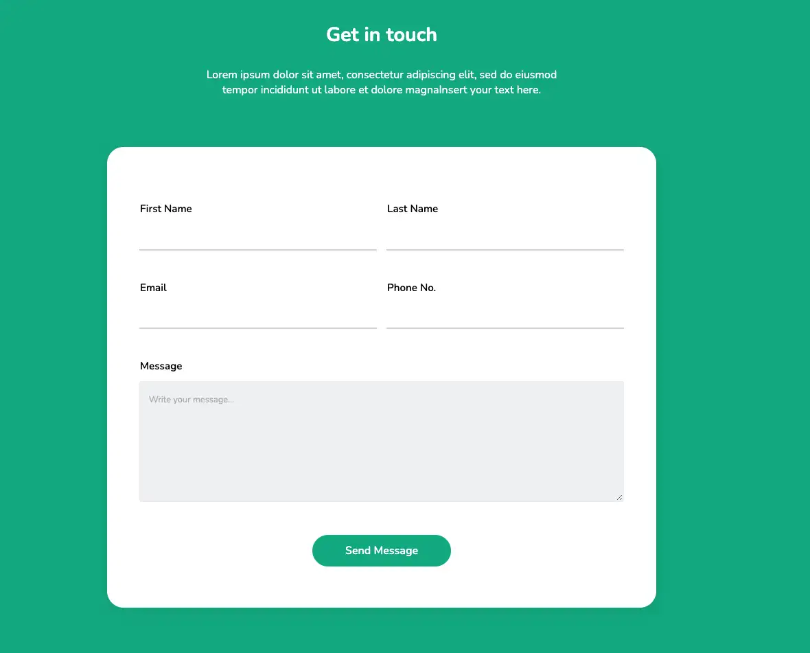
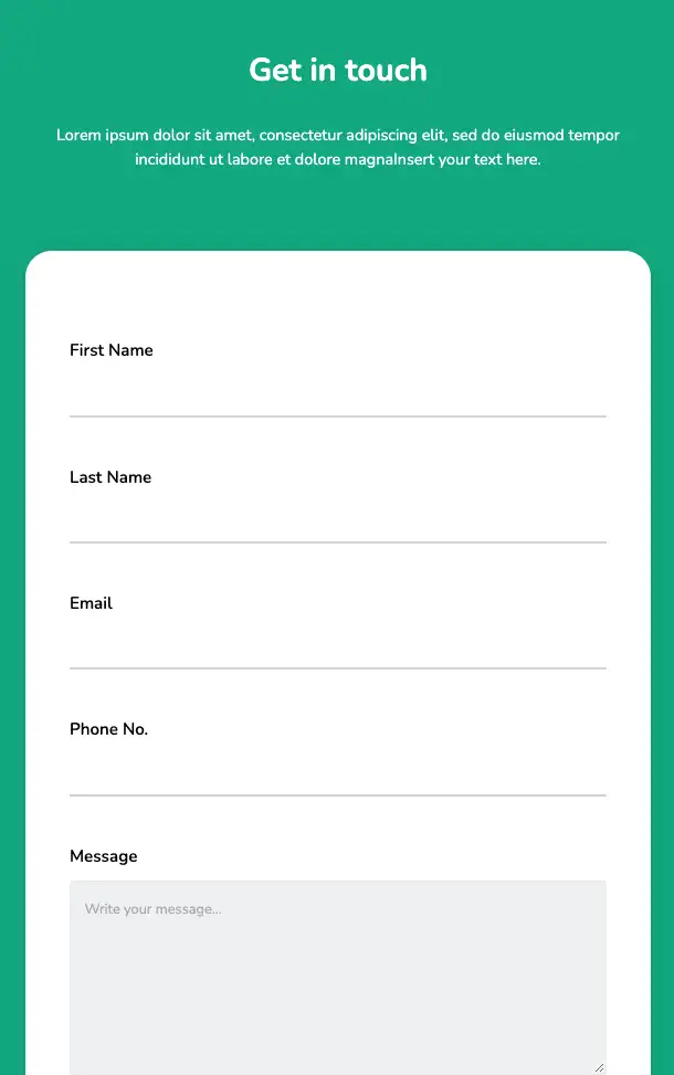
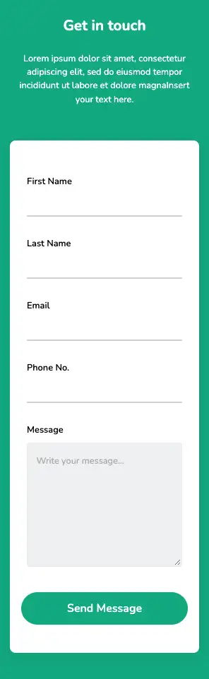
This design includes a simple-looking, modern contact form. Individual form fields are not marked by a definite boundary; instead, bottom borders alone are employed. The layout is based entirely on the HTML5 and CSS3 framework and is flexible and easy to customize.
View Code
HTML
CSS
JS
Responsive CSS
Output
.contact_us * {
font-family: Nunito, sans-serif;
}
.contact_us .text-blk {
margin-top: 0px;
margin-right: 0px;
margin-bottom: 0px;
margin-left: 0px;
line-height: 25px;
}
.contact_us .responsive-cell-block {
min-height: 75px;
}
.contact_us input:focus {
outline-color: initial;
outline-style: none;
outline-width: initial;
}
.contact_us .container-block {
min-height: 75px;
height: fit-content;
width: 100%;
padding-top: 10px;
padding-right: 10px;
padding-bottom: 10px;
padding-left: 10px;
display: block;
}
.contact_us .responsive-container-block {
min-height: 75px;
height: fit-content;
width: 100%;
display: flex;
flex-wrap: wrap;
justify-content: flex-start;
margin-top: 0px;
margin-right: auto;
margin-bottom: 50px;
margin-left: auto;
padding-top: 0px;
padding-right: 0px;
padding-bottom: 0px;
padding-left: 0px;
}
.contact_us .responsive-container-block.big-container {
background-color: #03a9f4;
position: static;
height: auto;
margin-top: 0px;
margin-right: 0px;
margin-bottom: 0px;
margin-left: 0px;
padding-top: 0px;
padding-right: 30px;
padding-bottom: 0px;
padding-left: 30px;
}
.contact_us .responsive-container-block.container {
position: static;
min-height: 75px;
flex-direction: column;
margin-top: 0px;
margin-right: 0px;
margin-bottom: 0px;
margin-left: 0px;
background-color: #00b289;
}
.contact_us .container-block.form-wrapper {
background-color: white;
max-width: 1000px;
text-align: center;
box-shadow: rgba(0, 0, 0, 0.05) 0px 4px 20px 7px;
border-top-left-radius: 30px;
border-top-right-radius: 30px;
border-bottom-right-radius: 30px;
border-bottom-left-radius: 30px;
padding-top: 90px;
padding-right: 40px;
padding-bottom: 75px;
padding-left: 40px;
margin-top: 80px;
margin-right: auto;
margin-bottom: 100px;
margin-left: auto;
}
.contact_us .text-blk.contactus-head {
font-size: 38px;
line-height: 52px;
font-weight: 900;
}
.contact_us .text-blk.contactus-subhead {
color: #9c9c9c;
margin-top: 0px;
margin-right: 0px;
margin-bottom: 50px;
margin-left: 0px;
}
.contact_us .responsive-cell-block.wk-desk-6.wk-ipadp-6.wk-tab-12.wk-mobile-12 {
min-height: 50px;
margin-top: 0px;
margin-right: 0px;
margin-bottom: 55px;
margin-left: 0px;
}
.contact_us .input {
width: 96%;
height: 48px;
padding-top: 1px;
padding-right: 15px;
padding-bottom: 1px;
padding-left: 15px;
font-size: 16px;
color: black;
border-top-width: initial;
border-right-width: initial;
border-bottom-width: 3px;
border-left-width: initial;
border-top-style: none;
border-right-style: none;
border-bottom-style: solid;
border-left-style: none;
border-top-color: initial;
border-right-color: initial;
border-bottom-color: #d8d7d7;
border-left-color: initial;
border-image-source: initial;
border-image-slice: initial;
border-image-width: initial;
border-image-outset: initial;
border-image-repeat: initial;
}
.contact_us .textinput {
width: 98%;
min-height: 220px;
padding-top: 20px;
padding-right: 15px;
padding-bottom: 20px;
padding-left: 15px;
border-top-width: 2px;
border-right-width: 2px;
border-bottom-width: 2px;
border-left-width: 2px;
border-top-style: solid;
border-right-style: solid;
border-bottom-style: solid;
border-left-style: solid;
border-top-color: #eeeeee;
border-right-color: #eeeeee;
border-bottom-color: #eeeeee;
border-left-color: #eeeeee;
border-image-source: initial;
border-image-slice: initial;
border-image-width: initial;
border-image-outset: initial;
border-image-repeat: initial;
font-size: 16px;
border-top-left-radius: 4px;
border-top-right-radius: 4px;
border-bottom-right-radius: 4px;
border-bottom-left-radius: 4px;
background-color: #f1f2f3;
}
.contact_us .submit-btn {
width: auto;
background-color: #00b289;
height: 58px;
font-size: 20px;
font-weight: 600;
color: white;
border-top-width: 0px;
border-right-width: 0px;
border-bottom-width: 0px;
border-left-width: 0px;
border-top-style: outset;
border-right-style: outset;
border-bottom-style: outset;
border-left-style: outset;
border-top-color: #767676;
border-right-color: #767676;
border-bottom-color: #767676;
border-left-color: #767676;
border-image-source: initial;
border-image-slice: initial;
border-image-width: initial;
border-image-outset: initial;
border-image-repeat: initial;
padding-top: 1px;
padding-right: 60px;
padding-bottom: 1px;
padding-left: 60px;
border-top-left-radius: 35px;
border-top-right-radius: 35px;
border-bottom-right-radius: 35px;
border-bottom-left-radius: 35px;
cursor: pointer;
}
.contact_us .form-box {
margin-top: 0px;
margin-right: auto;
margin-bottom: 0px;
margin-left: auto;
padding-top: 80px;
padding-right: 0px;
padding-bottom: 0px;
padding-left: 0px;
display: flex;
flex-direction: column;
justify-content: flex-start;
align-items: center;
text-align: center;
}
.contact_us .text-blk.input-title {
text-align: left;
padding-top: 0px;
padding-right: 0px;
padding-bottom: 0px;
padding-left: 10px;
font-size: 19px;
color: black;
font-weight: 600;
margin-top: 0px;
margin-right: 0px;
margin-bottom: 15px;
margin-left: 0px;
}
.contact_us ::placeholder {
color: #b4b4b4;
}
.contact_us .text-blk.contact-head {
font-size: 36px;
line-height: 50px;
font-weight: 700;
color: white;
margin-top: 0px;
margin-right: 0px;
margin-bottom: 15px;
margin-left: 0px;
}
.contact_us .text-blk.contact-subhead {
max-width: 670px;
font-size: 20px;
line-height: 27px;
color: white;
}
@media (max-width: 1024px) {
.contact_us .responsive-container-block.container {
padding-top: 0px;
padding-right: 30px;
padding-bottom: 0px;
padding-left: 30px;
}
.contact_us .container-block.form-wrapper {
margin-top: 60px;
margin-right: 0px;
margin-bottom: 80px;
margin-left: 0px;
}
}
@media (max-width: 768px) {
.contact_us .submit-btn {
width: 100%;
}
.contact_us .input {
width: 100%;
}
.contact_us .textinput {
width: 100%;
}
.contact_us .container-block.form-wrapper {
margin-top: 80px;
margin-right: 0px;
margin-bottom: 0px;
margin-left: 0px;
}
.contact_us .text-blk.input-title {
padding-top: 0px;
padding-right: 0px;
padding-bottom: 0px;
padding-left: 0px;
}
.contact_us .container-block.form-wrapper {
margin-top: 80px;
margin-right: 0px;
margin-bottom: 80px;
margin-left: 0px;
}
.contact_us .text-blk.contact-subhead {
font-size: 18px;
}
}
@media (max-width: 500px) {
.contact_us .container-block.form-wrapper {
padding-top: 50px;
padding-right: 15px;
padding-bottom: 50px;
padding-left: 15px;
}
.contact_us .container-block.form-wrapper {
margin-top: 60px;
margin-right: 0px;
margin-bottom: 0px;
margin-left: 0px;
}
.contact_us .responsive-cell-block.wk-ipadp-6.wk-tab-12.wk-mobile-12.wk-desk-6 {
margin-top: 0px;
margin-right: 0px;
margin-bottom: 15px;
margin-left: 0px;
}
.contact_us .responsive-container-block {
margin-top: 0px;
margin-right: 0px;
margin-bottom: 35px;
margin-left: 0px;
}
.contact_us .text-blk.input-title {
font-size: 12px;
}
.contact_us .responsive-container-block.container {
padding-top: 0px;
padding-right: 20px;
padding-bottom: 0px;
padding-left: 20px;
}
.contact_us .container-block.form-wrapper {
border-top-left-radius: 10px;
border-top-right-radius: 10px;
border-bottom-right-radius: 10px;
border-bottom-left-radius: 10px;
padding-top: 50px;
padding-right: 20px;
padding-bottom: 50px;
padding-left: 20px;
margin-top: 50px;
margin-right: 0px;
margin-bottom: 80px;
margin-left: 0px;
}
.contact_us .form-box {
padding-top: 50px;
padding-right: 0px;
padding-bottom: 0px;
padding-left: 0px;
}
.contact_us .text-blk.contact-head {
font-size: 35px;
line-height: 40px;
}
.contact_us .text-blk.contact-subhead {
font-size: 16px;
line-height: 24px;
}
.contact_us .text-blk.input-title {
font-size: 16px;
margin-top: 0px;
margin-right: 0px;
margin-bottom: 10px;
margin-left: 0px;
}
.contact_us .responsive-cell-block.wk-ipadp-6.wk-tab-12.wk-mobile-12.wk-desk-6 {
margin-top: 0px;
margin-right: 0px;
margin-bottom: 35px;
margin-left: 0px;
}
.contact_us .input {
height: 40px;
}
.contact_us .text-blk.contact-head {
font-size: 26px;
line-height: 35px;
margin-top: 0px;
margin-right: 0px;
margin-bottom: 10px;
margin-left: 0px;
}
}
         @import url('https://fonts.googleapis.com/css2?family=Nunito:wght@200;300;400;600;700;800&display=swap');
                            *, *:before, *:after {
                            -moz-box-sizing: border-box;
                            -webkit-box-sizing: border-box;
                            box-sizing: border-box;
                            }
                            body {
                            margin: 0;
                            }
                            .wk-desk-1{
                            width: 8.333333%;
                            }
                            .wk-desk-2{
                            width: 16.666667%;
                            }
                            .wk-desk-3{
                            width: 25%;
                            }
                            .wk-desk-4{
                            width: 33.333333%;
                            }
                            .wk-desk-5{
                            width: 41.666667%;
                            }
                            .wk-desk-6{
                            width: 50%;
                            }
                            .wk-desk-7{
                            width: 58.333333%;
                            }
                            .wk-desk-8{
                            width: 66.666667%;
                            }
                            .wk-desk-9{
                            width: 75%;
                            }
                            .wk-desk-10{
                            width: 83.333333%;
                            }
                            .wk-desk-11{
                            width: 91.666667%;
                            }
                            .wk-desk-12{
                            width: 100%;
                            }
                            @media (max-width: 1024px) {
                            .wk-ipadp-1{
                            width: 8.333333%;
                            }
                            .wk-ipadp-2{
                            width: 16.666667%;
                            }
                            .wk-ipadp-3{
                            width: 25%;
                            }
                            .wk-ipadp-4{
                            width: 33.333333%;
                            }
                            .wk-ipadp-5{
                            width: 41.666667%;
                            }
                            .wk-ipadp-6{
                            width: 50%;
                            }
                            .wk-ipadp-7{
                            width: 58.333333%;
                            }
                            .wk-ipadp-8{
                            width: 66.666667%;
                            }
                            .wk-ipadp-9{
                            width: 75%;
                            }
                            .wk-ipadp-10{
                            width: 83.333333%;
                            }
                            .wk-ipadp-11{
                            width: 91.666667%;
                            }
                            .wk-ipadp-12{
                            width: 100%;
                            }
                            }
                            @media (max-width: 768px) {
                            .wk-tab-1{
                            width: 8.333333%;
                            }
                            .wk-tab-2{
                            width: 16.666667%;
                            }
                            .wk-tab-3{
                            width: 25%;
                            }
                            .wk-tab-4{
                            width: 33.333333%;
                            }
                            .wk-tab-5{
                            width: 41.666667%;
                            }
                            .wk-tab-6{
                            width: 50%;
                            }
                            .wk-tab-7{
                            width: 58.333333%;
                            }
                            .wk-tab-8{
                            width: 66.666667%;
                            }
                            .wk-tab-9{
                            width: 75%;
                            }
                            .wk-tab-10{
                            width: 83.333333%;
                            }
                            .wk-tab-11{
                            width: 91.666667%;
                            }
                            .wk-tab-12{
                            width: 100%;
                            }
                            }
                            @media (max-width: 500px) {
                            .wk-mobile-1{
                            width: 8.333333%;
                            }
                            .wk-mobile-2{
                            width: 16.666667%;
                            }
                            .wk-mobile-3{
                            width: 25%;
                            }
                            .wk-mobile-4{
                            width: 33.333333%;
                            }
                            .wk-mobile-5{
                            width: 41.666667%;
                            }
                            .wk-mobile-6{
                            width: 50%;
                            }
                            .wk-mobile-7{
                            width: 58.333333%;
                            }
                            .wk-mobile-8{
                            width: 66.666667%;
                            }
                            .wk-mobile-9{
                            width: 75%;
                            }
                            .wk-mobile-10{
                            width: 83.333333%;
                            }
                            .wk-mobile-11{
                            width: 91.666667%;
                            }
                            .wk-mobile-12{
                            width: 100%;
                            }
                            }
Reset
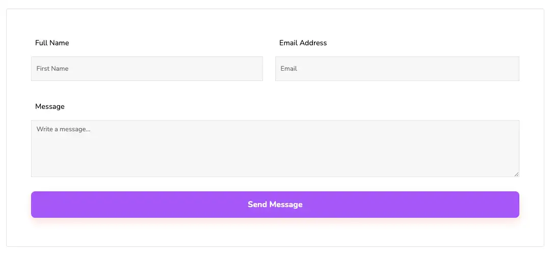
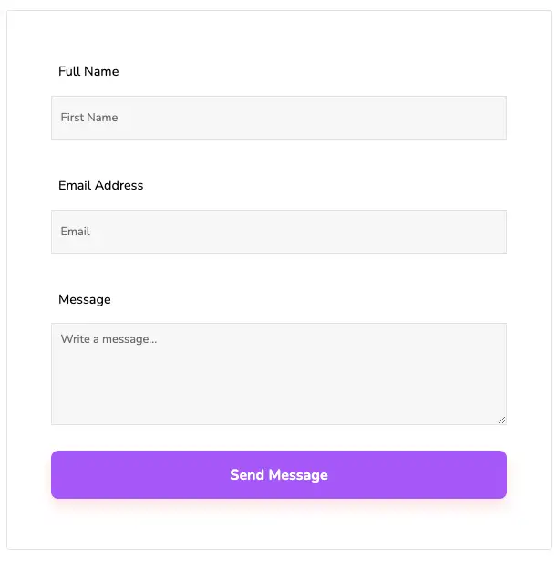
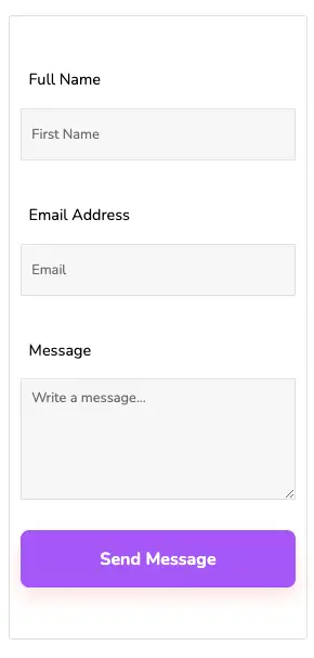
The above contact form is simple and practically applicable on any webpage. Fonts are of normal, readable size by default and can be changed based on design requirements. This design has been created using the latest HTML5 and CSS3 script and supports all modern fonts and styles.
View Code
HTML
CSS
JS
Responsive CSS
Output
.section_10 * {
font-family: Nunito, sans-serif;
}
.section_10 .responsive-container-block {
min-height: 75px;
height: fit-content;
width: 100%;
display: flex;
flex-wrap: wrap;
margin-top: 0px;
margin-right: auto;
margin-bottom: 0px;
margin-left: auto;
justify-content: flex-start;
}
.section_10 .text-blk {
margin-top: 0px;
margin-right: 0px;
margin-bottom: 0px;
margin-left: 0px;
line-height: 25px;
}
.section_10 .responsive-container-block.container {
max-width: auto;
flex-direction: column;
margin-top: 20px;
margin-right: auto;
margin-bottom: 80px;
margin-left: auto;
width: 100%;
}
.section_10 .responsive-container-block.form-container {
width: auto;
padding-top: 60px;
padding-right: 60px;
padding-bottom: 60px;
padding-left: 60px;
margin-top: 0px;
margin-right: auto;
margin-bottom: 0px;
margin-left: auto;
border-top-left-radius: 4px;
border-top-right-radius: 4px;
border-bottom-right-radius: 4px;
border-bottom-left-radius: 4px;
border-top-color: #e5e5e5;
border-top-style: solid;
border-top-width: 1px;
border-right-color: #e5e5e5;
border-right-style: solid;
border-right-width: 1px;
border-bottom-color: #e5e5e5;
border-bottom-style: solid;
border-bottom-width: 1px;
border-left-color: #e5e5e5;
border-left-style: solid;
border-left-width: 1px;
border-image-outset: 0;
border-image-repeat: stretch;
border-image-slice: 100%;
border-image-source: none;
border-image-width: 1;
max-width: 1320px;
}
.section_10 .input {
width: 100%;
background-color: #f8f8f8;
height: 60px;
border-top-width: 1px;
border-right-width: 1px;
border-bottom-width: 1px;
border-left-width: 1px;
border-top-style: solid;
border-right-style: solid;
border-bottom-style: solid;
border-left-style: solid;
border-top-color: #e5e5e5;
border-right-color: #e5e5e5;
border-bottom-color: #e5e5e5;
border-left-color: #e5e5e5;
border-image-source: initial;
border-image-slice: initial;
border-image-width: initial;
border-image-outset: initial;
border-image-repeat: initial;
padding-top: 5px;
padding-right: 12px;
padding-bottom: 5px;
padding-left: 12px;
font-size: 16px;
}
.section_10 .responsive-cell-block.wk-desk-6.wk-ipadp-6.wk-tab-12.wk-mobile-12 {
margin-top: 0px;
margin-right: 0px;
margin-bottom: 40px;
margin-left: 0px;
padding-top: 0px;
padding-right: 0px;
padding-bottom: 0px;
padding-left: 0px;
}
.section_10 .textinput {
width: 100%;
margin-top: 0px;
margin-right: 0px;
margin-bottom: 35px;
margin-left: 0px;
height: 140px;
border-top-width: 1px;
border-right-width: 1px;
border-bottom-width: 1px;
border-left-width: 1px;
border-top-style: solid;
border-right-style: solid;
border-bottom-style: solid;
border-left-style: solid;
border-top-color: #e5e5e5;
border-right-color: #e5e5e5;
border-bottom-color: #e5e5e5;
border-left-color: #e5e5e5;
border-image-source: initial;
border-image-slice: initial;
border-image-width: initial;
border-image-outset: initial;
border-image-repeat: initial;
background-color: #f8f8f8;
padding-top: 10px;
padding-right: 12px;
padding-bottom: 10px;
padding-left: 12px;
font-size: 16px;
}
.section_10 .submit-btn {
width: 100%;
height: 66px;
background-color: #b062ff;
box-shadow: rgba(244, 152, 146, 0.25) 0px 10px 20px;
border-top-left-radius: 10px;
border-top-right-radius: 10px;
border-bottom-right-radius: 10px;
border-bottom-left-radius: 10px;
border-top-width: 2px;
border-right-width: 2px;
border-bottom-width: 2px;
border-left-width: 2px;
border-top-style: none;
border-right-style: none;
border-bottom-style: none;
border-left-style: none;
border-top-color: #767676;
border-right-color: #767676;
border-bottom-color: #767676;
border-left-color: #767676;
border-image-source: initial;
border-image-slice: initial;
border-image-width: initial;
border-image-outset: initial;
border-image-repeat: initial;
font-size: 20px;
font-weight: 700;
color: white;
}
.section_10 .responsive-cell-block.wk-tab-12.wk-mobile-12.wk-desk-12.wk-ipadp-12 {
margin-top: 0px;
margin-right: 0px;
margin-bottom: 0px;
margin-left: 0px;
padding-top: 0px;
padding-right: 0px;
padding-bottom: 0px;
padding-left: 0px;
}
.section_10 .text-blk.input-title {
font-size: 18px;
line-height: 26px;
margin-top: 0px;
margin-right: 0px;
margin-bottom: 10px;
margin-left: 0px;
}
.section_10 #iox4 {
margin-top: 0px;
margin-right: 0px;
margin-bottom: 0px;
margin-left: 0px;
}
.section_10 .responsive-cell-block.wk-desk-6.wk-ipadp-6.wk-tab-12.wk-mobile-12.first-name {
padding-top: 0px;
padding-right: 30px;
padding-bottom: 0px;
padding-left: 0px;
}
@media (max-width: 768px) {
.section_10 .responsive-cell-block.wk-desk-6.wk-ipadp-6.wk-tab-12.wk-mobile-12 {
padding-top: 0px;
padding-right: 0px;
padding-bottom: 0px;
padding-left: 0px;
}
.section_10 .responsive-cell-block.wk-tab-12.wk-mobile-12.wk-desk-12.wk-ipadp-12 {
padding-top: 0px;
padding-right: 0px;
padding-bottom: 0px;
padding-left: 0px;
}
.section_10 .responsive-cell-block.wk-desk-6.wk-ipadp-6.wk-tab-12.wk-mobile-12.first-name {
padding-top: 0px;
padding-right: 0px;
padding-bottom: 0px;
padding-left: 0px;
}
}
@media (max-width: 500px) {
.section_10 .responsive-container-block.form-container {
padding-top: 50px;
padding-right: 10px;
padding-bottom: 50px;
padding-left: 10px;
margin-top: 0px;
margin-right: auto;
margin-bottom: 0px;
margin-left: auto;
}
.section_10 .responsive-container-block.form-container {
padding-top: 50px;
padding-right: 12px;
padding-bottom: 50px;
padding-left: 12px;
}
}
         @import url('https://fonts.googleapis.com/css2?family=Nunito:wght@200;300;400;600;700;800&display=swap');
                            *, *:before, *:after {
                            -moz-box-sizing: border-box;
                            -webkit-box-sizing: border-box;
                            box-sizing: border-box;
                            }
                            body {
                            margin: 0;
                            }
                            .wk-desk-1{
                            width: 8.333333%;
                            }
                            .wk-desk-2{
                            width: 16.666667%;
                            }
                            .wk-desk-3{
                            width: 25%;
                            }
                            .wk-desk-4{
                            width: 33.333333%;
                            }
                            .wk-desk-5{
                            width: 41.666667%;
                            }
                            .wk-desk-6{
                            width: 50%;
                            }
                            .wk-desk-7{
                            width: 58.333333%;
                            }
                            .wk-desk-8{
                            width: 66.666667%;
                            }
                            .wk-desk-9{
                            width: 75%;
                            }
                            .wk-desk-10{
                            width: 83.333333%;
                            }
                            .wk-desk-11{
                            width: 91.666667%;
                            }
                            .wk-desk-12{
                            width: 100%;
                            }
                            @media (max-width: 1024px) {
                            .wk-ipadp-1{
                            width: 8.333333%;
                            }
                            .wk-ipadp-2{
                            width: 16.666667%;
                            }
                            .wk-ipadp-3{
                            width: 25%;
                            }
                            .wk-ipadp-4{
                            width: 33.333333%;
                            }
                            .wk-ipadp-5{
                            width: 41.666667%;
                            }
                            .wk-ipadp-6{
                            width: 50%;
                            }
                            .wk-ipadp-7{
                            width: 58.333333%;
                            }
                            .wk-ipadp-8{
                            width: 66.666667%;
                            }
                            .wk-ipadp-9{
                            width: 75%;
                            }
                            .wk-ipadp-10{
                            width: 83.333333%;
                            }
                            .wk-ipadp-11{
                            width: 91.666667%;
                            }
                            .wk-ipadp-12{
                            width: 100%;
                            }
                            }
                            @media (max-width: 768px) {
                            .wk-tab-1{
                            width: 8.333333%;
                            }
                            .wk-tab-2{
                            width: 16.666667%;
                            }
                            .wk-tab-3{
                            width: 25%;
                            }
                            .wk-tab-4{
                            width: 33.333333%;
                            }
                            .wk-tab-5{
                            width: 41.666667%;
                            }
                            .wk-tab-6{
                            width: 50%;
                            }
                            .wk-tab-7{
                            width: 58.333333%;
                            }
                            .wk-tab-8{
                            width: 66.666667%;
                            }
                            .wk-tab-9{
                            width: 75%;
                            }
                            .wk-tab-10{
                            width: 83.333333%;
                            }
                            .wk-tab-11{
                            width: 91.666667%;
                            }
                            .wk-tab-12{
                            width: 100%;
                            }
                            }
                            @media (max-width: 500px) {
                            .wk-mobile-1{
                            width: 8.333333%;
                            }
                            .wk-mobile-2{
                            width: 16.666667%;
                            }
                            .wk-mobile-3{
                            width: 25%;
                            }
                            .wk-mobile-4{
                            width: 33.333333%;
                            }
                            .wk-mobile-5{
                            width: 41.666667%;
                            }
                            .wk-mobile-6{
                            width: 50%;
                            }
                            .wk-mobile-7{
                            width: 58.333333%;
                            }
                            .wk-mobile-8{
                            width: 66.666667%;
                            }
                            .wk-mobile-9{
                            width: 75%;
                            }
                            .wk-mobile-10{
                            width: 83.333333%;
                            }
                            .wk-mobile-11{
                            width: 91.666667%;
                            }
                            .wk-mobile-12{
                            width: 100%;
                            }
                            }
Reset