
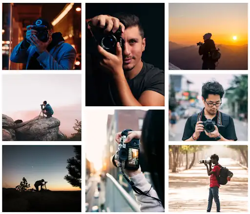
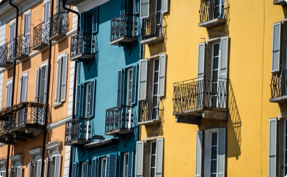
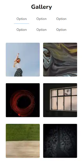
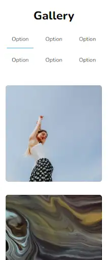
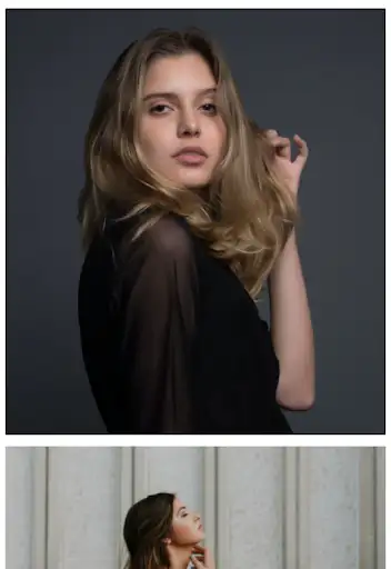
This grid provides a professional-looking gallery design. Image holders are provided for both landscape and portrait orientations. Visual effects play a vital role in this design all the while ensuring it doesn’t get overexploited.
View Code
HTML
CSS
JS
Responsive CSS
Output


          .album .responsive-container-block {
    min-height: 75px;
    height: fit-content;
    width: 100%;
    padding-top: 10px;
    padding-right: 10px;
    padding-bottom: 10px;
    padding-left: 10px;
    display: flex;
    flex-wrap: wrap;
    margin-top: 0px;
    margin-right: auto;
    margin-bottom: 0px;
    margin-left: auto;
    justify-content: flex-start;
}

.album .responsive-container-block.bg {
    max-width: 1320px;
    margin: 0 0 0 0;
    justify-content: space-between;
}

.album .img {
    width: 100%;
    margin: 0 0 20px 0;
}

.album #i9rb {
    color: black;
}

.album #ir6i {
    color: black;
}

.album #ikz3b {
    color: black;
}

.album .responsive-container-block.img-cont {
    flex-direction: column;
    max-width: 33.3%;
    min-height: auto;
    margin: 0 0 0 0;
    height: 100%;
}

.album #ipix {
    color: black;
}

.album #ipzoh {
    color: black;
}

.album #ig5q8 {
    color: black;
}

.album #imtzl {
    color: black;
}

.album #i53es {
    color: black;
}

.album .img.img-big {
    height: 50%;
    margin: 0 0 16px 0;
}

@media (max-width: 1024px) {
    .album .img {
        margin: 0 0 18px 0;
    }
}

@media (max-width: 768px) {
    .album .img {
        max-width: 32.5%;
        margin: 0 0 0 0;
    }

    .album .responsive-container-block.bg {
        flex-direction: column;
    }

    .album .responsive-container-block.img-cont {
        max-width: 100%;
        flex-direction: row;
        justify-content: space-between;
    }

    .album .img.img-big {
        max-width: 49%;
        margin: 0 0 0 0;
    }
}

@media (max-width: 500px) {
    .album .img {
        max-width: 94%;
        margin: 0 0 25px 0;
    }

    .album .responsive-container-block.img-cont {
        flex-direction: column;
        align-items: center;
        padding: 10px 10px 10px 10px;
    }

    .album .img.img-big {
        max-width: 94%;
        margin: 0 0 25px 0;
    }

    .album .img.img-last {
        margin: 0 0 5px 0;
    }
}
          @import url('https://fonts.googleapis.com/css2?family=Nunito:wght@200;300;400;600;700;800&display=swap');
        *, *:before, *:after {
        -moz-box-sizing: border-box;
        -webkit-box-sizing: border-box;
        box-sizing: border-box;
        }
        body {
        margin: 0;
        }
        .wk-desk-1{
        width: 8.333333%;
        }
        .wk-desk-2{
        width: 16.666667%;
        }
        .wk-desk-3{
        width: 25%;
        }
        .wk-desk-4{
        width: 33.333333%;
        }
        .wk-desk-5{
        width: 41.666667%;
        }
        .wk-desk-6{
        width: 50%;
        }
        .wk-desk-7{
        width: 58.333333%;
        }
        .wk-desk-8{
        width: 66.666667%;
        }
        .wk-desk-9{
        width: 75%;
        }
        .wk-desk-10{
        width: 83.333333%;
        }
        .wk-desk-11{
        width: 91.666667%;
        }
        .wk-desk-12{
        width: 100%;
        }
        @media (max-width: 1024px) {
        .wk-ipadp-1{
        width: 8.333333%;
        }
        .wk-ipadp-2{
        width: 16.666667%;
        }
        .wk-ipadp-3{
        width: 25%;
        }
        .wk-ipadp-4{
        width: 33.333333%;
        }
        .wk-ipadp-5{
        width: 41.666667%;
        }
        .wk-ipadp-6{
        width: 50%;
        }
        .wk-ipadp-7{
        width: 58.333333%;
        }
        .wk-ipadp-8{
        width: 66.666667%;
        }
        .wk-ipadp-9{
        width: 75%;
        }
        .wk-ipadp-10{
        width: 83.333333%;
        }
        .wk-ipadp-11{
        width: 91.666667%;
        }
        .wk-ipadp-12{
        width: 100%;
        }
        }
        @media (max-width: 768px) {
        .wk-tab-1{
        width: 8.333333%;
        }
        .wk-tab-2{
        width: 16.666667%;
        }
        .wk-tab-3{
        width: 25%;
        }
        .wk-tab-4{
        width: 33.333333%;
        }
        .wk-tab-5{
        width: 41.666667%;
        }
        .wk-tab-6{
        width: 50%;
        }
        .wk-tab-7{
        width: 58.333333%;
        }
        .wk-tab-8{
        width: 66.666667%;
        }
        .wk-tab-9{
        width: 75%;
        }
        .wk-tab-10{
        width: 83.333333%;
        }
        .wk-tab-11{
        width: 91.666667%;
        }
        .wk-tab-12{
        width: 100%;
        }
        }
        @media (max-width: 500px) {
        .wk-mobile-1{
        width: 8.333333%;
        }
        .wk-mobile-2{
        width: 16.666667%;
        }
        .wk-mobile-3{
        width: 25%;
        }
        .wk-mobile-4{
        width: 33.333333%;
        }
        .wk-mobile-5{
        width: 41.666667%;
        }
        .wk-mobile-6{
        width: 50%;
        }
        .wk-mobile-7{
        width: 58.333333%;
        }
        .wk-mobile-8{
        width: 66.666667%;
        }
        .wk-mobile-9{
        width: 75%;
        }
        .wk-mobile-10{
        width: 83.333333%;
        }
        .wk-mobile-11{
        width: 91.666667%;
        }
        .wk-mobile-12{
        width: 100%;
        }
        }
Reset
Join our community to see how developers are using Workik AI everyday.
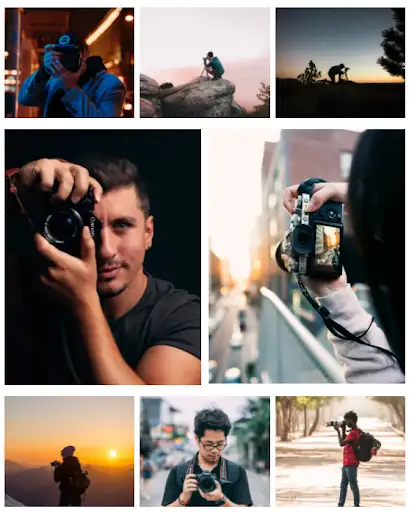
The above design is ideal for those who want a website layout that is easy to maintain and yet does not want to skip any feature. To keep your photographs undisturbed, all the category options are put on the sidebar. Smooth scroll effects and filters are used to present the content engaging for the users.
View Code
HTML
CSS
JS
Responsive CSS
Output


All
One
Two
Three
          .desktop_4 * {
    font-family: Nunito, sans-serif;
    }
    .desktop_4 .responsive-container-block {
    min-height: 75px;
    height: auto;
    width: auto;
    padding-top: 0px;
    padding-right: 0px;
    padding-bottom: 0px;
    padding-left: 0px;
    display: flex;
    flex-wrap: wrap;
    margin-top: 0px;
    margin-right: auto;
    margin-bottom: 0px;
    margin-left: auto;
    justify-content: flex-start;
    }
    .desktop_4 .btn-box {
    position: absolute;
    top: 50%;
    left: 50%;
    transform: translate(-50%, -50%);
    display: none;
    }
    .desktop_4 .project:hover .btn-box {
    display: block;
    }
    .desktop_4 .text-blk {
    margin-top: 0px;
    margin-right: 0px;
    margin-bottom: 0px;
    margin-left: 0px;
    padding-top: 10px;
    padding-right: 10px;
    padding-bottom: 10px;
    padding-left: 10px;
    line-height: 25px;
    }
    .desktop_4 .responsive-container-block.bigContainer {
    padding-top: 10px;
    padding-right: 30px;
    padding-bottom: 10px;
    padding-left: 30px;
    }
    .desktop_4 .responsive-container-block.Container {
    max-width: 940px;
    flex-direction: row;
    margin-top: 80px;
    margin-right: auto;
    margin-bottom: 50px;
    margin-left: auto;
    }
    .desktop_4 .portfolio {
    display: inline-block;
    flex-direction: column;
    flex-wrap: nowrap;
    height: 700px;
    overflow-y: auto;
    margin-top: 0px;
    margin-right: auto;
    margin-bottom: 0px;
    margin-left: auto;
    width: 630px;
    }
    .desktop_4 button {
    cursor: pointer;
    }
    .desktop_4 img {
    cursor: pointer;
    }
    .desktop_4 img:hover {
    transform: scale(1.02);
    transition-duration: 0.3s;
    transition-timing-function: ease-in-out;
    transition-delay: 0s;
    transition-property: all;
    }
    .desktop_4 .project {
    position: relative;
    background-image: initial;
    background-position-x: initial;
    background-position-y: initial;
    background-size: initial;
    background-repeat-x: initial;
    background-repeat-y: initial;
    background-attachment: initial;
    background-origin: initial;
    background-clip: initial;
    display: inline-block;
    }
    .desktop_4 .overlay {
    position: fixed;
    background-image: initial;
    background-position-x: initial;
    background-position-y: initial;
    background-size: initial;
    background-repeat-x: initial;
    background-repeat-y: initial;
    background-attachment: initial;
    background-origin: initial;
    background-clip: initial;
    background-color: rgba(71, 69, 69, 0.7);
    height: 100%;
    width: 100%;
    max-height: 100%;
    top: 0px;
    left: 0px;
    z-index: 100;
    display: none;
    }
    .desktop_4 .overlay-inner {
    top: 50%;
    right: 0px;
    bottom: 0px;
    left: 50%;
    transform: translate(-50%, -50%);
    background-image: initial;
    background-position-x: initial;
    background-position-y: initial;
    background-size: initial;
    background-repeat-x: initial;
    background-repeat-y: initial;
    background-attachment: initial;
    background-origin: initial;
    background-clip: initial;
    background-color: white;
    padding-top: 25px;
    padding-right: 20px;
    padding-bottom: 20px;
    padding-left: 20px;
    position: relative;
    opacity: 1;
    width: fit-content;
    max-width: 50%;
    max-height: 85;
    }
    .desktop_4 .close {
    position: absolute;
    top: 3px;
    right: 10px;
    background-image: none;
    background-position-x: initial;
    background-position-y: initial;
    background-size: initial;
    background-repeat-x: initial;
    background-repeat-y: initial;
    background-attachment: initial;
    background-origin: initial;
    background-clip: initial;
    background-color: initial;
    outline-color: initial;
    outline-style: initial;
    outline-width: 0px;
    color: #474545;
    border-top-width: 0px;
    border-right-width: 0px;
    border-bottom-width: 0px;
    border-left-width: 0px;
    border-top-style: initial;
    border-right-style: initial;
    border-bottom-style: initial;
    border-left-style: initial;
    border-top-color: initial;
    border-right-color: initial;
    border-bottom-color: initial;
    border-left-color: initial;
    border-image-source: initial;
    border-image-slice: initial;
    border-image-width: initial;
    border-image-outset: initial;
    border-image-repeat: initial;
    text-transform: uppercase;
    letter-spacing: 2px;
    }
    .desktop_4 .overlay-inner .hdImgs {
    width: fit-content;
    height: calc(85% - 55px);
    display: flex;
    }
    .desktop_4 .overlay-inner img {
    max-height: 100%;
    max-width: 100%;
    transform: none;
    }
    .desktop_4 .project-image {
    height: 200px;
    width: 300px;
    margin-top: 0px;
    margin-right: 10px;
    margin-bottom: 10px;
    margin-left: 0px;
    }
    .desktop_4 .project.first-project {
    display: inline-block;
    }
    .desktop_4 .responsive-container-block.textContainer {
    flex-direction: column;
    width: 200px;
    margin-top: 0px;
    margin-right: 0px;
    margin-bottom: 0px;
    margin-left: 30px;
    }
    .desktop_4 .text-blk.optionsText {
    font-size: 20px;
    font-weight: 800;
    line-height: 34px;
    margin-top: 0px;
    margin-right: 0px;
    margin-bottom: 10px;
    margin-left: 0px;
    }
    .desktop_4 .text-blk.active {
    font-size: 20px;
    line-height: 34px;
    font-weight: 700;
    color: #03a9f4;
    }
    .desktop_4 .text-blk.list {
    font-size: 20px;
    line-height: 34px;
    cursor: pointer;
    }
    .desktop_4 .text-blk.all {
    margin-right: 10px;
    margin-left: 0px;
    }
    .desktop_4 .text-blk.list {
    margin-left: 0px;
    margin-right: 20px;
    }
    .desktop_4 .project-image.one {
    border-radius: 6px;
    }
    .desktop_4 .project-image.two {
    border-radius: 6px;
    }
    .desktop_4 .project-image.three {
    border-radius: 6px;
    }
    @media (max-width: 1024px) {
    .desktop_4 .responsive-container-block.bigContainer {
    padding-top: 10px;
    padding-right: 20px;
    padding-bottom: 10px;
    padding-left: 20px;
    }
    .desktop_4 .responsive-container-block.Container {
    flex-direction: column-reverse;
    }
    .desktop_4 .responsive-container-block.textContainer {
    flex-direction: row;
    width: 100%;
    margin-top: 0px;
    margin-right: 0px;
    margin-bottom: 0px;
    margin-left: 0px;
    }
    .desktop_4 .responsive-container-block.textContainer {
    padding-top: 0px;
    padding-right: 10px;
    padding-bottom: 0px;
    padding-left: 0px;
    min-height: auto;
    margin-top: 0px;
    margin-right: 0px;
    margin-bottom: 40px;
    margin-left: 0px;
    }
    .desktop_4 .text-blk.optionsText {
    padding-top: 0px;
    padding-right: 10px;
    padding-bottom: 0px;
    padding-left: 10px;
    margin-top: 0px;
    margin-right: 0px;
    margin-bottom: 5px;
    margin-left: 0px;
    max-width: 100%;
    }
    .desktop_4 .responsive-container-block.Container {
    max-width: 640px;
    }
    .desktop_4 .overlay-inner {
    margin-top: 20px;
    margin-right: 20px;
    margin-bottom: 20px;
    margin-left: 20px;
    padding-top: 25px;
    padding-right: 20px;
    padding-bottom: 20px;
    padding-left: 20px;
    width: 100%;
    }
    .desktop_4 .overlay {
    padding-top: 20px;
    padding-right: 40px;
    padding-bottom: 20px;
    padding-left: 40px;
    }
    .desktop_4 .responsive-container-block.textContainer {
    display: inline;
    }
    .desktop_4 .text-blk.optionsText {
    display: block;
    font-size: 30px;
    line-height: 40px;
    }
    .desktop_4 .text-blk.list.all.active {
    display: inline-block;
    }
    .desktop_4 .text-blk.list {
    display: inline-block;
    }
    }
    @media (max-width: 768px) {
    .desktop_4 .responsive-container-block.Container {
    max-width: 440px;
    }
    .desktop_4 .project-image.two {
    width: 400px;
    }
    .desktop_4 .project {
    margin-top: 5px;
    margin-right: 0px;
    margin-bottom: 0px;
    margin-left: 0px;
    }
    .desktop_4 .portfolio {
    max-width: 420px;
    }
    .desktop_4 .project-image.one {
    width: 400px;
    margin-top: 0px;
    margin-right: 10px;
    margin-bottom: 10px;
    margin-left: 0px;
    }
    .desktop_4 .project-image.three {
    width: 400px;
    }
    .desktop_4 .overlay-inner {
    margin-top: 20px;
    margin-right: 20px;
    margin-bottom: 20px;
    margin-left: 20px;
    padding-top: 20px;
    padding-right: 20px;
    padding-bottom: 20px;
    padding-left: 20px;
    width: 100%;
    }
    .desktop_4 .close {
    font-size: 14px;
    top: 2px;
    right: 5px;
    }
    .desktop_4 .overlay-inner {
    padding-top: 24px;
    padding-right: 5px;
    padding-bottom: 5px;
    padding-left: 5px;
    }
    .desktop_4 .overlay {
    padding-top: 10px;
    padding-right: 30px;
    padding-bottom: 10px;
    padding-left: 30px;
    }
    }
    @media (max-width: 500px) {
    .desktop_4 .portfolio {
    padding-top: 0px;
    padding-right: 10px;
    padding-bottom: 0px;
    padding-left: 10px;
    width: auto;
    max-width: 100%;
    }
    .desktop_4 .project-image.one {
    padding-top: 0px;
    padding-right: 0px;
    padding-bottom: 0px;
    padding-left: 0px;
    width: 100%;
    height: auto;
    }
    .desktop_4 .project {
    padding-top: 0px;
    padding-right: 10px;
    padding-bottom: 0px;
    padding-left: 10px;
    width: 100%;
    margin-top: 5px;
    margin-right: 0px;
    margin-bottom: 0px;
    margin-left: 0px;
    }
    .desktop_4 .responsive-container-block.textContainer {
    width: auto;
    flex-direction: column;
    align-items: flex-start;
    }
    .desktop_4 .text-blk.optionsText {
    width: 200px;
    }
    .desktop_4 .responsive-container-block.Container {
    max-width: 100%;
    }
    .desktop_4 .project-image.two {
    width: 100%;
    height: auto;
    }
    .desktop_4 .project-image.three {
    width: 100%;
    height: auto;
    }
    .desktop_4 .text-blk.list {
    margin-right: 0px;
    margin-left: 0px;
    margin-bottom: 10px;
    }
    .desktop_4 .overlay-inner {
    margin-top: 20px;
    margin-right: 20px;
    margin-bottom: 20px;
    margin-left: 20px;
    padding-top: 20px;
    padding-right: 20px;
    padding-bottom: 20px;
    padding-left: 20px;
    width: 100%;
    }
    .desktop_4 .close {
    font-size: 10px;
    top: 0px;
    right: 5px;
    }
    .desktop_4 .text-blk.list {
    font-size: 16px;
    }
    .desktop_4 .text-blk.optionsText {
    font-size: 30px;
    }
    .desktop_4 .text-blk.list {
    padding-top: 0px;
    padding-right: 10px;
    padding-bottom: 0px;
    padding-left: 10px;
    }
    .desktop_4 .text-blk.optionsText {
    margin-top: 0px;
    margin-right: 0px;
    margin-bottom: 10px;
    margin-left: 0px;
    }
    .desktop_4 .overlay-inner {
    margin-top: 20px;
    margin-right: 20px;
    margin-bottom: 20px;
    margin-left: 20px;
    padding-top: 20px;
    padding-right: 20px;
    padding-bottom: 20px;
    padding-left: 20px;
    width: 100%;
    }
    .desktop_4 .close {
    font-size: 10px;
    top: 0px;
    right: 5px;
    }
    .desktop_4 .overlay-inner {
    padding-top: 15px;
    padding-right: 5px;
    padding-bottom: 5px;
    padding-left: 5px;
    }
    .desktop_4 .overlay {
    padding-top: 10px;
    padding-right: 10px;
    padding-bottom: 10px;
    padding-left: 10px;
    }
    .desktop_4 .responsive-container-block.textContainer {
    flex-direction: row;
    }
    .desktop_4 .text-blk.list.active {
    background-color: rgba(3, 169, 244, 0.09);
    border-top-left-radius: 110px;
    border-top-right-radius: 110px;
    border-bottom-right-radius: 110px;
    border-bottom-left-radius: 110px;
    }
    .desktop_4 .text-blk.list {
    margin-right: 10px;
    margin-left: 0px;
    }
    .desktop_4 .responsive-container-block.textContainer {
    margin-top: 0px;
    margin-right: 0px;
    margin-bottom: 20px;
    margin-left: 0px;
    padding-top: 0px;
    padding-right: 10px;
    padding-bottom: 0px;
    padding-left: 10px;
    }
    .desktop_4 .text-blk.optionsText {
    margin-top: 0px;
    margin-right: 0px;
    margin-bottom: 20px;
    margin-left: 0px;
    }
    .desktop_4 .overlay-inner .hdImgs {
    width: 90%;
    }
    }
          $(document).ready(function() {

  $("[unique-script-id='w-w-dm-id'] .btn-box").click(function() {
    $(this).parent().children(".overlay").show();

  });


  $("[unique-script-id='w-w-dm-id'] .close").click(function() {
    $("[unique-script-id='w-w-dm-id'] .overlay").hide();
  });

  $("[unique-script-id='w-w-dm-id'] .list").click(function() {
    const value = $(this).attr('data-filter');
    if (value == 'all') {
      $("[unique-script-id='w-w-dm-id'] .project-image").show('1000');
    } else {
      $("[unique-script-id='w-w-dm-id'] .project-image").not('.' + value).hide('1000');
      $("[unique-script-id='w-w-dm-id'] .project-image").filter('.' + value).show('1000');
    }
  })
  $("[unique-script-id='w-w-dm-id'] .list").click(function() {
    $(this).addClass('active').siblings().removeClass('active');
  })
});
          @import url('https://fonts.googleapis.com/css2?family=Nunito:wght@200;300;400;600;700;800&display=swap');
        *, *:before, *:after {
        -moz-box-sizing: border-box;
        -webkit-box-sizing: border-box;
        box-sizing: border-box;
        }
        body {
        margin: 0;
        }
        .wk-desk-1{
        width: 8.333333%;
        }
        .wk-desk-2{
        width: 16.666667%;
        }
        .wk-desk-3{
        width: 25%;
        }
        .wk-desk-4{
        width: 33.333333%;
        }
        .wk-desk-5{
        width: 41.666667%;
        }
        .wk-desk-6{
        width: 50%;
        }
        .wk-desk-7{
        width: 58.333333%;
        }
        .wk-desk-8{
        width: 66.666667%;
        }
        .wk-desk-9{
        width: 75%;
        }
        .wk-desk-10{
        width: 83.333333%;
        }
        .wk-desk-11{
        width: 91.666667%;
        }
        .wk-desk-12{
        width: 100%;
        }
        @media (max-width: 1024px) {
        .wk-ipadp-1{
        width: 8.333333%;
        }
        .wk-ipadp-2{
        width: 16.666667%;
        }
        .wk-ipadp-3{
        width: 25%;
        }
        .wk-ipadp-4{
        width: 33.333333%;
        }
        .wk-ipadp-5{
        width: 41.666667%;
        }
        .wk-ipadp-6{
        width: 50%;
        }
        .wk-ipadp-7{
        width: 58.333333%;
        }
        .wk-ipadp-8{
        width: 66.666667%;
        }
        .wk-ipadp-9{
        width: 75%;
        }
        .wk-ipadp-10{
        width: 83.333333%;
        }
        .wk-ipadp-11{
        width: 91.666667%;
        }
        .wk-ipadp-12{
        width: 100%;
        }
        }
        @media (max-width: 768px) {
        .wk-tab-1{
        width: 8.333333%;
        }
        .wk-tab-2{
        width: 16.666667%;
        }
        .wk-tab-3{
        width: 25%;
        }
        .wk-tab-4{
        width: 33.333333%;
        }
        .wk-tab-5{
        width: 41.666667%;
        }
        .wk-tab-6{
        width: 50%;
        }
        .wk-tab-7{
        width: 58.333333%;
        }
        .wk-tab-8{
        width: 66.666667%;
        }
        .wk-tab-9{
        width: 75%;
        }
        .wk-tab-10{
        width: 83.333333%;
        }
        .wk-tab-11{
        width: 91.666667%;
        }
        .wk-tab-12{
        width: 100%;
        }
        }
        @media (max-width: 500px) {
        .wk-mobile-1{
        width: 8.333333%;
        }
        .wk-mobile-2{
        width: 16.666667%;
        }
        .wk-mobile-3{
        width: 25%;
        }
        .wk-mobile-4{
        width: 33.333333%;
        }
        .wk-mobile-5{
        width: 41.666667%;
        }
        .wk-mobile-6{
        width: 50%;
        }
        .wk-mobile-7{
        width: 58.333333%;
        }
        .wk-mobile-8{
        width: 66.666667%;
        }
        .wk-mobile-9{
        width: 75%;
        }
        .wk-mobile-10{
        width: 83.333333%;
        }
        .wk-mobile-11{
        width: 91.666667%;
        }
        .wk-mobile-12{
        width: 100%;
        }
        }
Reset
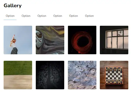
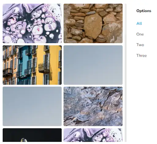
This design helps you build an evenly spaced grid. White spaces are handled elegantly in this design to add richness to the website and to make the images look crisp. This design also incorporates a full-page photo gallery viewer to enjoy the photo in full view.
View Code
HTML
CSS
JS
Responsive CSS
Output
Gallery
          .desktop_7 * {
    font-family: Nunito, sans-serif;
    }
    .desktop_7 .text-blk {
    margin-top: 0px;
    margin-right: 0px;
    margin-bottom: 0px;
    margin-left: 0px;
    padding-top: 10px;
    padding-right: 10px;
    padding-bottom: 10px;
    padding-left: 10px;
    line-height: 25px;
    }
    .desktop_7 .responsive-container-block {
    min-height: 75px;
    height: fit-content;
    width: 100%;
    padding-top: 10px;
    padding-right: 10px;
    padding-bottom: 10px;
    padding-left: 10px;
    display: flex;
    flex-wrap: wrap;
    margin-top: 0px;
    margin-right: auto;
    margin-bottom: 0px;
    margin-left: auto;
    justify-content: flex-start;
    }
    .desktop_7 .responsive-container-block.bigContainer {
    padding-top: 10px;
    padding-right: 30px;
    padding-bottom: 10px;
    padding-left: 30px;
    }
    .desktop_7 .responsive-container-block.Container {
    max-width: 980px;
    flex-direction: column;
    padding-top: 10px;
    padding-right: 0px;
    padding-bottom: 10px;
    padding-left: 0px;
    margin-top: 80px;
    margin-right: auto;
    margin-bottom: 50px;
    margin-left: auto;
    }
    .desktop_7 .text-blk.headingText {
    font-size: 36px;
    line-height: 50px;
    font-weight: 900;
    }
    .desktop_7 .text-blk.active {
    font-size: 20px;
    line-height: 34px;
    font-weight: 400;
    border-bottom-width: 2px;
    border-bottom-style: solid;
    border-bottom-color: #03a9f4;
    }
    .desktop_7 .text-blk.list {
    font-size: 20px;
    line-height: 34px;
    cursor: pointer;
    }
    .desktop_7 .text-blk.all {
    margin-right: 20px;
    margin-left: 0px;
    }
    .desktop_7 .text-blk.list {
    margin-left: 0px;
    margin-right: 20px;
    padding-top: 10px;
    padding-right: 15px;
    padding-bottom: 10px;
    padding-left: 15px;
    }
    .desktop_7 .text-blk.list.active {
    padding-top: 10px;
    padding-right: 15px;
    padding-bottom: 10px;
    padding-left: 15px;
    }
    .desktop_7 .squareImg {
    border-top-left-radius: 6px;
    border-top-right-radius: 6px;
    border-bottom-right-radius: 6px;
    border-bottom-left-radius: 6px;
    width: 225px;
    height: 225px;
    margin-top: 0px;
    margin-right: auto;
    margin-bottom: 20px;
    margin-left: auto;
    }
    .desktop_7 .responsive-container-block.imageContainer {
    flex-direction: row;
    align-items: flex-start;
    justify-content: flex-start;
    flex-wrap: wrap;
    padding-top: 10px;
    padding-right: 0px;
    padding-bottom: 10px;
    padding-left: 0px;
    }
    .desktop_7 .responsive-container-block.optionsContainer {
    margin-top: 0px;
    margin-right: 0px;
    margin-bottom: 10px;
    margin-left: 0px;
    min-height: auto;
    }
    .desktop_7 .project {
    display: inline-block;
    margin-top: 0px;
    margin-right: 0px;
    margin-bottom: 20px;
    margin-left: 0px;
    padding-top: 0px;
    padding-right: 0px;
    padding-bottom: 0px;
    padding-left: 0px;
    }
    .desktop_7 button {
    cursor: pointer;
    }
    .desktop_7 img {
    cursor: pointer;
    }
    .desktop_7 img:hover {
    transform: scale(1.02);
    transition-duration: 0.3s;
    transition-timing-function: ease-in-out;
    transition-delay: 0s;
    transition-property: all;
    }
    .desktop_7 .hdImg {
    display: none;
    }
    .desktop_7 .btn-box {
    position: absolute;
    top: 50%;
    left: 50%;
    transform: translate(-50%, -50%);
    display: none;
    }
    .desktop_7 .project:hover .btn-box {
    display: block;
    }
    .desktop_7 .imageContainer {
    background-image: initial;
    background-position-x: initial;
    background-position-y: initial;
    background-size: initial;
    background-repeat-x: initial;
    background-repeat-y: initial;
    background-attachment: initial;
    background-origin: initial;
    background-clip: initial;
    background-color: white;
    position: relative;
    display: flex;
    flex-wrap: wrap;
    flex-direction: column;
    }
    .desktop_7 .project {
    position: relative;
    background-image: initial;
    background-position-x: initial;
    background-position-y: initial;
    background-size: initial;
    background-repeat-x: initial;
    background-repeat-y: initial;
    background-attachment: initial;
    background-origin: initial;
    background-clip: initial;
    }
    .desktop_7 .overlay {
    position: fixed;
    background-image: initial;
    background-position-x: initial;
    background-position-y: initial;
    background-size: initial;
    background-repeat-x: initial;
    background-repeat-y: initial;
    background-attachment: initial;
    background-origin: initial;
    background-clip: initial;
    background-color: rgba(71, 69, 69, 0.7);
    height: 100%;
    width: 100%;
    max-height: 100%;
    top: 0px;
    left: 0px;
    z-index: 100;
    display: none;
    }
    .desktop_7 .overlay-inner {
    top: 50%;
    right: 0px;
    bottom: 0px;
    left: 50%;
    transform: translate(-50%, -50%);
    background-image: initial;
    background-position-x: initial;
    background-position-y: initial;
    background-size: initial;
    background-repeat-x: initial;
    background-repeat-y: initial;
    background-attachment: initial;
    background-origin: initial;
    background-clip: initial;
    background-color: white;
    padding-top: 25px;
    padding-right: 20px;
    padding-bottom: 20px;
    padding-left: 20px;
    position: relative;
    opacity: 1;
    width: fit-content;
    max-width: 50%;
    max-height: 85%;
    }
    .desktop_7 .close {
    position: absolute;
    top: 3px;
    right: 10px;
    background-image: none;
    background-position-x: initial;
    background-position-y: initial;
    background-size: initial;
    background-repeat-x: initial;
    background-repeat-y: initial;
    background-attachment: initial;
    background-origin: initial;
    background-clip: initial;
    background-color: initial;
    outline-color: initial;
    outline-style: initial;
    outline-width: 0px;
    color: #474545;
    border-top-width: 0px;
    border-right-width: 0px;
    border-bottom-width: 0px;
    border-left-width: 0px;
    border-top-style: initial;
    border-right-style: initial;
    border-bottom-style: initial;
    border-left-style: initial;
    border-top-color: initial;
    border-right-color: initial;
    border-bottom-color: initial;
    border-left-color: initial;
    border-image-source: initial;
    border-image-slice: initial;
    border-image-width: initial;
    border-image-outset: initial;
    border-image-repeat: initial;
    text-transform: uppercase;
    letter-spacing: 2px;
    }
    .desktop_7 .overlay-inner .hdImgs {
    width: fit-content;
    height: calc(85% - 55px);
    display: flex;
    }
    .desktop_7 .overlay-inner img {
    max-height: 100%;
    max-width: 100%;
    transform: none;
    }
    .desktop_7 .squareImg.one {
    padding-top: 10px;
    padding-right: 15px;
    padding-bottom: 15px;
    padding-left: 10px;
    margin-top: 0px;
    margin-right: 0px;
    margin-bottom: 0px;
    margin-left: 0px;
    }
    .desktop_7 .squareImg.two {
    padding-top: 10px;
    padding-right: 15px;
    padding-bottom: 15px;
    padding-left: 10px;
    margin-top: 0px;
    margin-right: 0px;
    margin-bottom: 0px;
    margin-left: 0px;
    }
    .desktop_7 .squareImg.three {
    padding-top: 10px;
    padding-right: 15px;
    padding-bottom: 15px;
    padding-left: 10px;
    margin-top: 0px;
    margin-right: 0px;
    margin-bottom: 0px;
    margin-left: 0px;
    }
    .desktop_7 .squareImg.four {
    padding-top: 10px;
    padding-right: 15px;
    padding-bottom: 15px;
    padding-left: 10px;
    margin-top: 0px;
    margin-right: 0px;
    margin-bottom: 0px;
    margin-left: 0px;
    }
    .desktop_7 .squareImg.five {
    padding-top: 10px;
    padding-right: 15px;
    padding-bottom: 15px;
    padding-left: 10px;
    margin-top: 0px;
    margin-right: 0px;
    margin-bottom: 0px;
    margin-left: 0px;
    }
    @media (max-width: 1024px) {
    .desktop_7 .Container {
    width: 690px;
    }
    .desktop_7 .squareImg {
    width: 170px;
    height: 170px;
    }
    .desktop_7 .squareImg.one {
    padding-top: 10px;
    padding-right: 10px;
    padding-bottom: 10px;
    padding-left: 10px;
    }
    .desktop_7 .squareImg.two {
    padding-top: 10px;
    padding-right: 10px;
    padding-bottom: 10px;
    padding-left: 10px;
    }
    .desktop_7 .squareImg.three {
    padding-top: 10px;
    padding-right: 10px;
    padding-bottom: 10px;
    padding-left: 10px;
    }
    .desktop_7 .squareImg.four {
    padding-top: 10px;
    padding-right: 10px;
    padding-bottom: 10px;
    padding-left: 10px;
    }
    .desktop_7 .squareImg.five {
    padding-top: 10px;
    padding-right: 10px;
    padding-bottom: 10px;
    padding-left: 10px;
    }
    .desktop_7 .overlay-inner {
    margin-top: 20px;
    margin-right: 20px;
    margin-bottom: 20px;
    margin-left: 20px;
    padding-top: 25px;
    padding-right: 20px;
    padding-bottom: 20px;
    padding-left: 20px;
    width: 80%;
    }
    .desktop_7 .close {
    font-size: 14px;
    top: 2px;
    right: 5px;
    }
    .desktop_7 .overlay {
    padding-top: 10px;
    padding-right: 30px;
    padding-bottom: 10px;
    padding-left: 30px;
    }
    }
    @media (max-width: 768px) {
    .desktop_7 .squareImg {
    width: 225px;
    height: 225px;
    }
    .desktop_7 .responsive-container-block.Container {
    max-width: 450px;
    }
    .desktop_7 .responsive-container-block.optionsContainer {
    max-width: 380px;
    margin-top: 0px;
    margin-right: auto;
    margin-bottom: 10px;
    margin-left: auto;
    }
    .desktop_7 .text-blk.list {
    margin-top: 0px;
    margin-right: auto;
    margin-bottom: 0px;
    margin-left: auto;
    }
    .desktop_7 .text-blk.list.all.active {
    margin-top: 0px;
    margin-right: auto;
    margin-bottom: 0px;
    margin-left: auto;
    }
    .desktop_7 .text-blk.headingText {
    text-align: center;
    }
    .desktop_7 .text-blk.list {
    margin-top: 0px;
    margin-right: auto;
    margin-bottom: 10px;
    margin-left: auto;
    }
    .desktop_7 .text-blk.list.all.active {
    margin-top: 0px;
    margin-right: 14.4219px;
    margin-bottom: 10px;
    margin-left: 14.4219px;
    }
    .desktop_7 .responsive-container-block.bigContainer {
    padding-top: 10px;
    padding-right: 10px;
    padding-bottom: 10px;
    padding-left: 10px;
    }
    }
    @media (max-width: 500px) {
    .desktop_7 .text-blk.list.all.active {
    font-size: 14px;
    padding-top: 10px;
    padding-right: 15px;
    padding-bottom: 0px;
    padding-left: 15px;
    line-height: 34px;
    }
    .desktop_7 .text-blk.list {
    font-size: 14px;
    }
    .desktop_7 .responsive-container-block.optionsContainer {
    min-height: auto;
    }
    .desktop_7 .responsive-container-block.imageContainer {
    padding-top: 10px;
    padding-right: 5px;
    padding-bottom: 10px;
    padding-left: 5px;
    }
    .desktop_7 .responsive-container-block.optionsContainer {
    max-width: 330px;
    margin-top: 0px;
    margin-right: auto;
    margin-bottom: 10px;
    margin-left: auto;
    }
    .desktop_7 .text-blk.list.all.active {
    font-size: 17px;
    margin-top: 0px;
    margin-right: auto;
    margin-bottom: 10px;
    margin-left: auto;
    }
    .desktop_7 .text-blk.list {
    font-size: 17px;
    margin-top: 0px;
    margin-right: auto;
    margin-bottom: 10px;
    margin-left: auto;
    }
    .desktop_7 .squareImg {
    width: 100%;
    height: 25%;
    }
    .desktop_7 .project {
    padding-top: 0px;
    padding-right: 10px;
    padding-bottom: 0px;
    padding-left: 10px;
    width: 100%;
    height: 25%;
    }
    .desktop_7 .overlay-inner {
    margin-top: 20px;
    margin-right: auto;
    margin-bottom: 20px;
    margin-left: auto;
    padding-top: 25px;
    padding-right: 10px;
    padding-bottom: 10px;
    padding-left: 10px;
    width: 100%;
    }
    .desktop_7 .overlay {
    padding-top: 10px;
    padding-right: 10px;
    padding-bottom: 10px;
    padding-left: 10px;
    }
    .desktop_7 .responsive-container-block.bigContainer {
    padding-top: 10px;
    padding-right: 10px;
    padding-bottom: 10px;
    padding-left: 10px;
    }
    .desktop_7 .overlay-inner hdImgs {
    width: 90%;
    }
    }
          $(document).ready(function() {

  $("[unique-script-id='w-w-dm-id'] .btn-box").click(function() {
    $(this).parent().children(".overlay").show();

  });


  $("[unique-script-id='w-w-dm-id'] .close").click(function() {
    $(".overlay").hide();
  });

  $("[unique-script-id='w-w-dm-id'] .list").click(function() {
    const value = $(this).attr('data-filter');
    if (value == 'all') {
      $("[unique-script-id='w-w-dm-id'] .squareImg").show('1000');
    } else {
      $("[unique-script-id='w-w-dm-id'] .squareImg").not('.' + value).hide('1000');
      $("[unique-script-id='w-w-dm-id'] .squareImg").filter('.' + value).show('1000');
    }
  })
  $("[unique-script-id='w-w-dm-id'] .list").click(function() {
    $(this).addClass('active').siblings().removeClass('active');
  })
})
          @import url('https://fonts.googleapis.com/css2?family=Nunito:wght@200;300;400;600;700;800&display=swap');
        *, *:before, *:after {
        -moz-box-sizing: border-box;
        -webkit-box-sizing: border-box;
        box-sizing: border-box;
        }
        body {
        margin: 0;
        }
        .wk-desk-1{
        width: 8.333333%;
        }
        .wk-desk-2{
        width: 16.666667%;
        }
        .wk-desk-3{
        width: 25%;
        }
        .wk-desk-4{
        width: 33.333333%;
        }
        .wk-desk-5{
        width: 41.666667%;
        }
        .wk-desk-6{
        width: 50%;
        }
        .wk-desk-7{
        width: 58.333333%;
        }
        .wk-desk-8{
        width: 66.666667%;
        }
        .wk-desk-9{
        width: 75%;
        }
        .wk-desk-10{
        width: 83.333333%;
        }
        .wk-desk-11{
        width: 91.666667%;
        }
        .wk-desk-12{
        width: 100%;
        }
        @media (max-width: 1024px) {
        .wk-ipadp-1{
        width: 8.333333%;
        }
        .wk-ipadp-2{
        width: 16.666667%;
        }
        .wk-ipadp-3{
        width: 25%;
        }
        .wk-ipadp-4{
        width: 33.333333%;
        }
        .wk-ipadp-5{
        width: 41.666667%;
        }
        .wk-ipadp-6{
        width: 50%;
        }
        .wk-ipadp-7{
        width: 58.333333%;
        }
        .wk-ipadp-8{
        width: 66.666667%;
        }
        .wk-ipadp-9{
        width: 75%;
        }
        .wk-ipadp-10{
        width: 83.333333%;
        }
        .wk-ipadp-11{
        width: 91.666667%;
        }
        .wk-ipadp-12{
        width: 100%;
        }
        }
        @media (max-width: 768px) {
        .wk-tab-1{
        width: 8.333333%;
        }
        .wk-tab-2{
        width: 16.666667%;
        }
        .wk-tab-3{
        width: 25%;
        }
        .wk-tab-4{
        width: 33.333333%;
        }
        .wk-tab-5{
        width: 41.666667%;
        }
        .wk-tab-6{
        width: 50%;
        }
        .wk-tab-7{
        width: 58.333333%;
        }
        .wk-tab-8{
        width: 66.666667%;
        }
        .wk-tab-9{
        width: 75%;
        }
        .wk-tab-10{
        width: 83.333333%;
        }
        .wk-tab-11{
        width: 91.666667%;
        }
        .wk-tab-12{
        width: 100%;
        }
        }
        @media (max-width: 500px) {
        .wk-mobile-1{
        width: 8.333333%;
        }
        .wk-mobile-2{
        width: 16.666667%;
        }
        .wk-mobile-3{
        width: 25%;
        }
        .wk-mobile-4{
        width: 33.333333%;
        }
        .wk-mobile-5{
        width: 41.666667%;
        }
        .wk-mobile-6{
        width: 50%;
        }
        .wk-mobile-7{
        width: 58.333333%;
        }
        .wk-mobile-8{
        width: 66.666667%;
        }
        .wk-mobile-9{
        width: 75%;
        }
        .wk-mobile-10{
        width: 83.333333%;
        }
        .wk-mobile-11{
        width: 91.666667%;
        }
        .wk-mobile-12{
        width: 100%;
        }
        }
Reset
.webp)
.webp)
.webp)
This photo gallery offers a pure personal feel to clients. It helps one to create a focused picture in the center with other related photos adding more depth to it. The widget allows visitors to interact with the gallery as it opens a pop-up on click. This design enables you to share your photos on full screen and keep users thoroughly engaged.
View Code
HTML
CSS
JS
Responsive CSS
Output
          .desktop_2 * {
    font-family: Nunito, sans-serif;
    margin-top: 0px;
    margin-right: 0px;
    margin-bottom: 0px;
    margin-left: 0px;
    }
    .desktop_2 button {
    cursor: pointer;
    }
    .desktop_2 img {
    cursor: pointer;
    }
    .desktop_2 img:hover {
    transform: scale(1.02);
    transition-duration: 0.3s;
    transition-timing-function: ease-in-out;
    transition-delay: 0s;
    transition-property: all;
    }
    .desktop_2 .hdImg {
    display: none;
    }
    .desktop_2 .btn-box {
    position: absolute;
    top: 50%;
    left: 50%;
    transform: translate(-50%, -50%);
    display: none;
    }
    .desktop_2 .project:hover .btn-box {
    display: block;
    }
    .desktop_2 .Container {
    width: 890px;
    margin-top: 100px;
    margin-right: auto;
    margin-bottom: 50px;
    margin-left: auto;
    }
    .desktop_2 .portfolio {
    background-image: initial;
    background-position-x: initial;
    background-position-y: initial;
    background-size: initial;
    background-repeat-x: initial;
    background-repeat-y: initial;
    background-attachment: initial;
    background-origin: initial;
    background-clip: initial;
    background-color: white;
    position: relative;
    display: flex;
    flex-wrap: wrap;
    flex-direction: column;
    }
    .desktop_2 .project {
    position: relative;
    background-image: initial;
    background-position-x: initial;
    background-position-y: initial;
    background-size: initial;
    background-repeat-x: initial;
    background-repeat-y: initial;
    background-attachment: initial;
    background-origin: initial;
    background-clip: initial;
    }
    .desktop_2 .overlay {
    position: fixed;
    background-image: initial;
    background-position-x: initial;
    background-position-y: initial;
    background-size: initial;
    background-repeat-x: initial;
    background-repeat-y: initial;
    background-attachment: initial;
    background-origin: initial;
    background-clip: initial;
    background-color: rgba(71, 69, 69, 0.7);
    height: 100%;
    width: 100%;
    max-height: 100%;
    top: 0px;
    left: 0px;
    z-index: 100;
    display: none;
    padding-top: 20px;
    padding-right: 20px;
    padding-bottom: 20px;
    padding-left: 20px;
    }
    .desktop_2 .overlay-inner {
    top: 50%;
    right: 0px;
    bottom: 0px;
    left: 50%;
    transform: translate(-50%, -50%);
    background-image: initial;
    background-position-x: initial;
    background-position-y: initial;
    background-size: initial;
    background-repeat-x: initial;
    background-repeat-y: initial;
    background-attachment: initial;
    background-origin: initial;
    background-clip: initial;
    background-color: white;
    max-width: 700px;
    width: fit-content;
    padding-top: 35px;
    padding-right: 20px;
    padding-bottom: 20px;
    padding-left: 20px;
    position: relative;
    border-top-left-radius: 10px;
    border-top-right-radius: 10px;
    border-bottom-right-radius: 10px;
    border-bottom-left-radius: 10px;
    opacity: 1;
    max-width: 50%;
    max-height: 85%;
    }
    .desktop_2 .close {
    position: absolute;
    top: 9px;
    right: 15px;
    background-image: none;
    background-position-x: initial;
    background-position-y: initial;
    background-size: initial;
    background-repeat-x: initial;
    background-repeat-y: initial;
    background-attachment: initial;
    background-origin: initial;
    background-clip: initial;
    background-color: initial;
    outline-color: initial;
    outline-style: initial;
    outline-width: 0px;
    color: #474545;
    border-top-width: 0px;
    border-right-width: 0px;
    border-bottom-width: 0px;
    border-left-width: 0px;
    border-top-style: initial;
    border-right-style: initial;
    border-bottom-style: initial;
    border-left-style: initial;
    border-top-color: initial;
    border-right-color: initial;
    border-bottom-color: initial;
    border-left-color: initial;
    border-image-source: initial;
    border-image-slice: initial;
    border-image-width: initial;
    border-image-outset: initial;
    border-image-repeat: initial;
    text-transform: uppercase;
    letter-spacing: 2px;
    }
    .desktop_2 .overlay-inner .hdImgs {
    width: fit-content;
    height: calc(80% - 55px);
    display: flex;
    }
    .desktop_2 .overlay-inner img {
    max-height: 100%;
    max-width: 100%;
    transform: none;
    }
    .desktop_2 .bigImg {
    width: 665px;
    height: 440px;
    margin-top: 0px;
    margin-right: 10px;
    margin-bottom: 10px;
    margin-left: 0px;
    border-top-left-radius: 6px;
    border-top-right-radius: 6px;
    border-bottom-right-radius: 6px;
    border-bottom-left-radius: 6px;
    }
    .desktop_2 .project-image {
    height: 215px;
    width: 215px;
    margin-top: 0px;
    margin-right: 10px;
    margin-bottom: 10px;
    margin-left: 0px;
    border-top-left-radius: 6px;
    border-top-right-radius: 6px;
    border-bottom-right-radius: 6px;
    border-bottom-left-radius: 6px;
    }
    .desktop_2 .above {
    display: flex;
    }
    .desktop_2 .bottom {
    display: flex;
    justify-content: space-around;
    }
    @media (max-width: 1024px) {
    .desktop_2 .project-image {
    width: 165px;
    height: 165px;
    }
    .desktop_2 .Container {
    width: 690px;
    margin-top: 80px;
    margin-right: auto;
    margin-bottom: 50px;
    margin-left: auto;
    }
    .desktop_2 .bigImg {
    width: 515px;
    height: 340px;
    }
    }
    @media (max-width: 768px) {
    .desktop_2 .project {
    width: 220px;
    display: inline-block;
    margin-top: 0px;
    margin-right: 0px;
    margin-bottom: 0px;
    margin-left: 0px;
    }
    .desktop_2 .project-first {
    width: 450px;
    }
    .desktop_2 .above {
    flex-direction: column;
    }
    .desktop_2 .portfolio {
    justify-content: flex-start;
    }
    .desktop_2 .Container {
    width: 450px;
    }
    .desktop_2 .bigImg {
    width: 450px;
    }
    .desktop_2 .project-image {
    width: 220px;
    height: 200px;
    margin-top: 0px;
    margin-right: 0px;
    margin-bottom: 10px;
    margin-left: 0px;
    display: inline-block;
    padding-top: 0px;
    padding-right: 0px;
    padding-bottom: 0px;
    padding-left: 0px;
    }
    .desktop_2 .side {
    display: flex;
    width: 450px;
    justify-content: space-between;
    }
    .desktop_2 .bottom {
    display: flex;
    flex-wrap: wrap;
    justify-content: space-between;
    align-items: stretch;
    }
    .desktop_2 .project-image.last {
    margin-top: 0px;
    margin-right: 0px;
    margin-bottom: 10px;
    margin-left: 5px;
    }
    .desktop_2 .project-image.last {
    margin-top: 0px;
    margin-right: 0px;
    margin-bottom: 10px;
    margin-left: 0px;
    }
    }
    @media (max-width: 500px) {
    .desktop_2 .bigImg {
    width: 250px;
    height: 200px;
    }
    .desktop_2 .project {
    width: 110px;
    margin-top: 0px;
    margin-right: 0px;
    margin-bottom: 20px;
    margin-left: 0px;
    }
    .desktop_2 .Container {
    width: 250px;
    margin-top: 80px;
    margin-right: auto;
    margin-bottom: 50px;
    margin-left: auto;
    }
    .desktop_2 .project-image {
    width: 110px;
    height: 110px;
    }
    .desktop_2 .side {
    flex-direction: row;
    width: 250px;
    }
    .desktop_2 .project-image.last {
    margin-top: 0px;
    margin-right: 0px;
    margin-bottom: 10px;
    margin-left: 0px;
    }
    .desktop_2 .project.last-project {
    margin-top: 0px;
    margin-right: 0px;
    margin-bottom: 0px;
    margin-left: 30px;
    }
    .desktop_2 .project-first {
    width: 250px;
    }

  .desktop_2 .overlay-inner {
    max-width: 90%;
  }
    }
          $(document).ready(function() {

    $(`[unique-script-id="w-w-dm-id"] .btn-box`).click(function() {
        $(this).parent().children(".overlay").show();

    });


    $(`[unique-script-id="w-w-dm-id"] .close`).click(function() {
        $(`[unique-script-id="w-w-dm-id"] .overlay`).hide();
    });
});
          @import url('https://fonts.googleapis.com/css2?family=Nunito:wght@200;300;400;600;700;800&display=swap');
        *, *:before, *:after {
        -moz-box-sizing: border-box;
        -webkit-box-sizing: border-box;
        box-sizing: border-box;
        }
        body {
        margin: 0;
        }
        .wk-desk-1{
        width: 8.333333%;
        }
        .wk-desk-2{
        width: 16.666667%;
        }
        .wk-desk-3{
        width: 25%;
        }
        .wk-desk-4{
        width: 33.333333%;
        }
        .wk-desk-5{
        width: 41.666667%;
        }
        .wk-desk-6{
        width: 50%;
        }
        .wk-desk-7{
        width: 58.333333%;
        }
        .wk-desk-8{
        width: 66.666667%;
        }
        .wk-desk-9{
        width: 75%;
        }
        .wk-desk-10{
        width: 83.333333%;
        }
        .wk-desk-11{
        width: 91.666667%;
        }
        .wk-desk-12{
        width: 100%;
        }
        @media (max-width: 1024px) {
        .wk-ipadp-1{
        width: 8.333333%;
        }
        .wk-ipadp-2{
        width: 16.666667%;
        }
        .wk-ipadp-3{
        width: 25%;
        }
        .wk-ipadp-4{
        width: 33.333333%;
        }
        .wk-ipadp-5{
        width: 41.666667%;
        }
        .wk-ipadp-6{
        width: 50%;
        }
        .wk-ipadp-7{
        width: 58.333333%;
        }
        .wk-ipadp-8{
        width: 66.666667%;
        }
        .wk-ipadp-9{
        width: 75%;
        }
        .wk-ipadp-10{
        width: 83.333333%;
        }
        .wk-ipadp-11{
        width: 91.666667%;
        }
        .wk-ipadp-12{
        width: 100%;
        }
        }
        @media (max-width: 768px) {
        .wk-tab-1{
        width: 8.333333%;
        }
        .wk-tab-2{
        width: 16.666667%;
        }
        .wk-tab-3{
        width: 25%;
        }
        .wk-tab-4{
        width: 33.333333%;
        }
        .wk-tab-5{
        width: 41.666667%;
        }
        .wk-tab-6{
        width: 50%;
        }
        .wk-tab-7{
        width: 58.333333%;
        }
        .wk-tab-8{
        width: 66.666667%;
        }
        .wk-tab-9{
        width: 75%;
        }
        .wk-tab-10{
        width: 83.333333%;
        }
        .wk-tab-11{
        width: 91.666667%;
        }
        .wk-tab-12{
        width: 100%;
        }
        }
        @media (max-width: 500px) {
        .wk-mobile-1{
        width: 8.333333%;
        }
        .wk-mobile-2{
        width: 16.666667%;
        }
        .wk-mobile-3{
        width: 25%;
        }
        .wk-mobile-4{
        width: 33.333333%;
        }
        .wk-mobile-5{
        width: 41.666667%;
        }
        .wk-mobile-6{
        width: 50%;
        }
        .wk-mobile-7{
        width: 58.333333%;
        }
        .wk-mobile-8{
        width: 66.666667%;
        }
        .wk-mobile-9{
        width: 75%;
        }
        .wk-mobile-10{
        width: 83.333333%;
        }
        .wk-mobile-11{
        width: 91.666667%;
        }
        .wk-mobile-12{
        width: 100%;
        }
        }
Reset
.webp)
.webp)
.webp)
The above design is a horizontal gallery with a scrollable function that makes it easy for user interaction. It has a regular grid-like design with optimal image size. Its carousel design helps you showcase your works effectively. The image under focus is also highlighted with a higher opacity, thereby providing an engaging user experience.
View Code
HTML
CSS
JS
Responsive CSS
Output

          .desktop_3 .responsive-container-block {
    min-height: 75px;
    height: fit-content;
    width: 100%;
    padding-top: 10px;
    padding-right: 10px;
    padding-bottom: 10px;
    padding-left: 10px;
    display: flex;
    flex-wrap: wrap;
    margin-top: 0px;
    margin-right: auto;
    margin-bottom: 0px;
    margin-left: auto;
    justify-content: flex-start;
    }
    .desktop_3 .swiper-slide.swiper-slide-active {
    opacity: 1;
    }
    .desktop_3 .btn {
    z-index: 1000;
    right: 0px;
    left: 0px;
    margin-top: 14%;
    margin-right: 0px;
    margin-bottom: 0px;
    margin-left: 0px;
    }
    .desktop_3 .responsive-container-block.bigContainer {
    padding-top: 10px;
    padding-right: 30px;
    padding-bottom: 10px;
    padding-left: 30px;
    overflow: hidden;
    }
    .desktop_3 .responsive-container-block.Container {
    max-width: 1320px;
    padding-top: 10px;
    padding-right: 10px;
    padding-bottom: 10px;
    padding-left: 10px;
    margin-top: 80px;
    margin-right: auto;
    margin-bottom: 50px;
    margin-left: auto;
    }
    .desktop_3 .swiper-wrapper {
    display: flex;
    padding-top: 0px;
    padding-right: 0px;
    padding-bottom: 30px;
    padding-left: 0px;
    }
    .desktop_3 .swiper-pagination.container-block {
    position: relative;
    margin-top: 0px;
    margin-right: 0px;
    margin-bottom: 0px;
    margin-left: 0px;
    padding-top: 10px;
    padding-right: 10px;
    padding-bottom: 10px;
    padding-left: 10px;
    }
    .desktop_3 .swiper-pagination {
    position: static;
    margin-top: 0px;
    margin-right: 0px;
    margin-bottom: 0px;
    margin-left: 0px;
    }
    .desktop_3 .swiper-container.mySwiper {
    padding-top: 0px;
    padding-right: 0px;
    padding-bottom: 50px;
    padding-left: 0px;
    max-width: 100%;
    }
    .desktop_3 .swiper-button-nexts {
    background-color: rgba(255, 255, 255, 0.4);
    cursor: pointer;
    border-top-left-radius: 50px;
    border-top-right-radius: 50px;
    border-bottom-right-radius: 50px;
    border-bottom-left-radius: 50px;
    margin-top: 0px;
    margin-right: 80px;
    margin-bottom: 0px;
    margin-left: 0px;
    padding-top: 16px;
    padding-right: 20px;
    padding-bottom: 16px;
    padding-left: 20px;
    }
    .desktop_3 .btn {
    display: flex;
    justify-content: space-between;
    align-items: stretch;
    width: 100%;
    flex-direction: row-reverse;
    position: absolute;
    }
    .desktop_3 .swiper-button-prevs {
    cursor: pointer;
    padding-top: 16px;
    padding-right: 20px;
    padding-bottom: 16px;
    padding-left: 20px;
    background-color: rgba(255, 255, 255, 0.4);
    border-top-left-radius: 50px;
    border-top-right-radius: 50px;
    border-bottom-right-radius: 50px;
    border-bottom-left-radius: 50px;
    margin-top: 0px;
    margin-right: 0px;
    margin-bottom: 0px;
    margin-left: 80px;
    }
    .desktop_3 .prevArrow {
    transform: rotateX(0deg) rotateY(180deg) rotateZ(0deg) scaleX(1) scaleY(1) scaleZ(1);
    }
    .desktop_3 .mainImage {
    margin-top: 0px;
    margin-right: 0px;
    margin-bottom: 0px;
    margin-left: 0px;
    width: auto;
    border-top-left-radius: 6px;
    border-top-right-radius: 6px;
    border-bottom-right-radius: 6px;
    border-bottom-left-radius: 6px;
    }
    .desktop_3 .swiper-slide {
    text-align: center;
    font-size: 18px;
    background-image: initial;
    background-position-x: initial;
    background-position-y: initial;
    background-size: initial;
    background-repeat-x: initial;
    background-repeat-y: initial;
    background-attachment: initial;
    background-origin: initial;
    background-clip: initial;
    background-color: white;
    display: flex;
    -webkit-box-pack: center;
    justify-content: center;
    -webkit-box-align: center;
    align-items: center;
    opacity: 0.3;
    }
    .desktop_3 .swiper-slide img {
    display: block;
    width: 100%;
    height: 100%;
    object-fit: cover;
    }
    .desktop_3 .nextArrow {
    width: 10px;
    }
    .desktop_3 .swiper-container-horizontal>.swiper-pagination-bullets .swiper-pagination-bullet {
    margin-top: 0px;
    margin-right: 4px;
    margin-bottom: 0px;
    margin-left: 4px;
    background-image: initial;
    background-position-x: initial;
    background-position-y: initial;
    background-size: initial;
    background-repeat-x: initial;
    background-repeat-y: initial;
    background-attachment: initial;
    background-origin: initial;
    background-clip: initial;
    background-color: #1479f6;
    }
    @media (max-width: 1024px) {
    .desktop_3 .swiper-button-prevs {
    padding-top: 13px;
    padding-right: 17px;
    padding-bottom: 13px;
    padding-left: 17px;
    }
    .desktop_3 .swiper-button-nexts {
    padding-top: 13px;
    padding-right: 17px;
    padding-bottom: 13px;
    padding-left: 17px;
    }
    }
    @media (max-width: 768px) {
    .desktop_3 .swiper-button-prevs {
    padding-top: 10px;
    padding-right: 14px;
    padding-bottom: 10px;
    padding-left: 14px;
    }
    .desktop_3 .swiper-button-nexts {
    padding-top: 10px;
    padding-right: 14px;
    padding-bottom: 10px;
    padding-left: 14px;
    }
    }
    @media (max-width: 500px) {
    .desktop_3 .swiper-button-nexts {
    margin-top: 0px;
    margin-right: 20px;
    margin-bottom: 0px;
    margin-left: 0px;
    padding-top: 7px;
    padding-right: 11px;
    padding-bottom: 7px;
    padding-left: 11px;
    }
    .desktop_3 .swiper-button-prevs {
    margin-top: 0px;
    margin-right: 0px;
    margin-bottom: 0px;
    margin-left: 20px;
    padding-top: 7px;
    padding-right: 11px;
    padding-bottom: 7px;
    padding-left: 11px;
    }
    .desktop_3 .responsive-container-block.Container {
    padding-top: 10px;
    padding-right: 0px;
    padding-bottom: 10px;
    padding-left: 0px;
    }
    .desktop_3 .responsive-container-block.bigContainer {
    padding-top: 10px;
    padding-right: 10px;
    padding-bottom: 10px;
    padding-left: 10px;
    }
    }
          var swiper = new Swiper(`[unique-script-id="w-w-dm-id"] .mySwiper`, {
    slidesPerView: 1.5,
    centeredSlides: true,
    spaceBetween: 5,
    pagination: {
        el: `[unique-script-id="w-w-dm-id"] .swiper-pagination`,
        clickable: true,
    },
    loop: true,
    navigation: {
        nextEl: `[unique-script-id="w-w-dm-id"] .swiper-button-nexts`,
        prevEl: `[unique-script-id="w-w-dm-id"] .swiper-button-prevs`,
    },
});
          @import url('https://fonts.googleapis.com/css2?family=Nunito:wght@200;300;400;600;700;800&display=swap');
        *, *:before, *:after {
        -moz-box-sizing: border-box;
        -webkit-box-sizing: border-box;
        box-sizing: border-box;
        }
        body {
        margin: 0;
        }
        .wk-desk-1{
        width: 8.333333%;
        }
        .wk-desk-2{
        width: 16.666667%;
        }
        .wk-desk-3{
        width: 25%;
        }
        .wk-desk-4{
        width: 33.333333%;
        }
        .wk-desk-5{
        width: 41.666667%;
        }
        .wk-desk-6{
        width: 50%;
        }
        .wk-desk-7{
        width: 58.333333%;
        }
        .wk-desk-8{
        width: 66.666667%;
        }
        .wk-desk-9{
        width: 75%;
        }
        .wk-desk-10{
        width: 83.333333%;
        }
        .wk-desk-11{
        width: 91.666667%;
        }
        .wk-desk-12{
        width: 100%;
        }
        @media (max-width: 1024px) {
        .wk-ipadp-1{
        width: 8.333333%;
        }
        .wk-ipadp-2{
        width: 16.666667%;
        }
        .wk-ipadp-3{
        width: 25%;
        }
        .wk-ipadp-4{
        width: 33.333333%;
        }
        .wk-ipadp-5{
        width: 41.666667%;
        }
        .wk-ipadp-6{
        width: 50%;
        }
        .wk-ipadp-7{
        width: 58.333333%;
        }
        .wk-ipadp-8{
        width: 66.666667%;
        }
        .wk-ipadp-9{
        width: 75%;
        }
        .wk-ipadp-10{
        width: 83.333333%;
        }
        .wk-ipadp-11{
        width: 91.666667%;
        }
        .wk-ipadp-12{
        width: 100%;
        }
        }
        @media (max-width: 768px) {
        .wk-tab-1{
        width: 8.333333%;
        }
        .wk-tab-2{
        width: 16.666667%;
        }
        .wk-tab-3{
        width: 25%;
        }
        .wk-tab-4{
        width: 33.333333%;
        }
        .wk-tab-5{
        width: 41.666667%;
        }
        .wk-tab-6{
        width: 50%;
        }
        .wk-tab-7{
        width: 58.333333%;
        }
        .wk-tab-8{
        width: 66.666667%;
        }
        .wk-tab-9{
        width: 75%;
        }
        .wk-tab-10{
        width: 83.333333%;
        }
        .wk-tab-11{
        width: 91.666667%;
        }
        .wk-tab-12{
        width: 100%;
        }
        }
        @media (max-width: 500px) {
        .wk-mobile-1{
        width: 8.333333%;
        }
        .wk-mobile-2{
        width: 16.666667%;
        }
        .wk-mobile-3{
        width: 25%;
        }
        .wk-mobile-4{
        width: 33.333333%;
        }
        .wk-mobile-5{
        width: 41.666667%;
        }
        .wk-mobile-6{
        width: 50%;
        }
        .wk-mobile-7{
        width: 58.333333%;
        }
        .wk-mobile-8{
        width: 66.666667%;
        }
        .wk-mobile-9{
        width: 75%;
        }
        .wk-mobile-10{
        width: 83.333333%;
        }
        .wk-mobile-11{
        width: 91.666667%;
        }
        .wk-mobile-12{
        width: 100%;
        }
        }
Reset
This gallery design provides enough room to explain your services as well as showcase your creative photos. No distractive elements are present in the template and the visual effects are kept mild. This 3*2 grid allows creating a minimalist layout that looks clean.
View Code
HTML
CSS
JS
Responsive CSS
Output
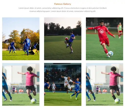
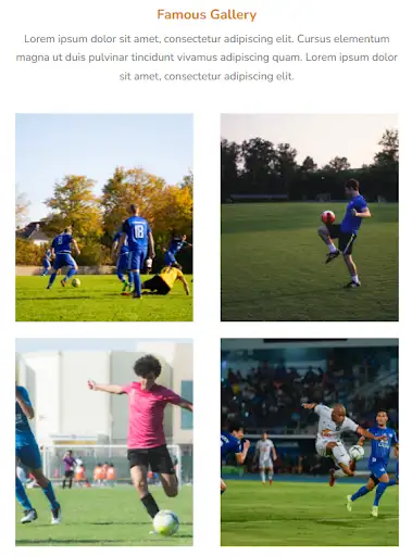
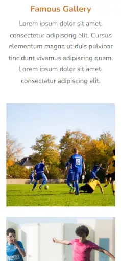
              Famous Gallery


              Lorem ipsum dolor sit amet, consectetur adipiscing elit. Cursus elementum magna ut duis pulvinar tincidunt vivamus adipiscing quam. Lorem ipsum dolor sit amet, consectetur adipiscing elit.


          .gallery * {
    font-family: Nunito, sans-serif;
}

.gallery .swiper-container {
    width: 100%;
    height: 100%;
}

.gallery img {
    object-fit: cover;
}

.gallery .text-blk {
    line-height: 28px;
    font-size: 20px;
    font-weight: 400;
    padding-top: 0px;
    padding-right: 0px;
    padding-bottom: 0px;
    padding-left: 0px;
    text-align: center;
    color: #666666;
    max-width: 1030px;
    margin-top: 0px;
    margin-right: 0px;
    margin-bottom: 30px;
    margin-left: 0px;
}

.gallery .responsive-container-block {
    min-height: 75px;
    height: fit-content;
    width: 100%;
    display: flex;
    flex-wrap: wrap;
    margin-top: 0px;
    margin-right: auto;
    margin-bottom: 0px;
    margin-left: auto;
    justify-content: flex-start;
}

.gallery .responsive-container-block.bigContainer {
    padding-top: 10px;
    padding-right: 30px;
    padding-bottom: 10px;
    padding-left: 30px;
}

.gallery .responsive-container-block.Container {
    max-width: 1320px;
    flex-direction: column;
    align-items: center;
    justify-content: center;
    margin-top: 50px;
    margin-right: auto;
    margin-bottom: 50px;
    margin-left: auto;
}

.gallery .responsive-container-block.cardContainer {
    overflow-x: visible;
    overflow-y: visible;
}

.gallery .text-blk.headingText {
    font-size: 25px;
    line-height: 34px;
    font-weight: 700;
    color: #d97a0b;
    padding-top: 0px;
    padding-right: 0px;
    padding-bottom: 0px;
    padding-left: 0px;
    margin-top: 0px;
    margin-right: 0px;
    margin-bottom: 10px;
    margin-left: 0px;
}

.gallery .text-blk.name {
    font-size: 18px;
    line-height: 24px;
    font-weight: 800;
    padding-top: 0px;
    padding-right: 0px;
    padding-bottom: 0px;
    padding-left: 0px;
    margin-top: 0px;
    margin-right: 0px;
    margin-bottom: 0px;
    margin-left: 0px;
}

.gallery .text-blk.position {
    padding-top: 0px;
    padding-right: 0px;
    padding-bottom: 0px;
    padding-left: 0px;
    margin-top: 0px;
    margin-right: 0px;
    margin-bottom: 0px;
    margin-left: 0px;
}

.gallery .swiper-slide {
    justify-content: flex-start;
    display: flex;
}

.gallery #ipou8 {
    transform: rotateX(0deg) rotateY(0deg) rotateZ(0deg) scaleX(1) scaleY(1) scaleZ(1);
    margin-top: 0px;
    margin-right: 0px;
    margin-bottom: 0px;
    margin-left: 20px;
    cursor: pointer;
    height: 14px;
}

.gallery #ipou8-2 {
    height: 14px;
    transform: rotateX(0deg) rotateY(180deg) rotateZ(0deg) scaleX(1) scaleY(1) scaleZ(1);
    cursor: pointer;
}

.gallery .btn {
    display: none;
    margin-top: 0px;
    margin-right: 0px;
    margin-bottom: 30px;
    margin-left: 0px;
    flex-direction: row-reverse;
}

.gallery .swiper-pagination {
    position: static;
    text-align: left;
    margin-top: 30px;
    margin-right: 0px;
    margin-bottom: 0px;
    margin-left: 0px;
    display: flex;
    justify-content: center;
    align-items: center;
}

.gallery .swiper-container-horizontal>.swiper-pagination-bullets .swiper-pagination-bullet {
    margin-top: 0px;
    margin-right: 4px;
    margin-bottom: 0px;
    margin-left: 4px;
    background-image: initial;
    background-position-x: initial;
    background-position-y: initial;
    background-size: initial;
    background-repeat-x: initial;
    background-repeat-y: initial;
    background-attachment: initial;
    background-origin: initial;
    background-clip: initial;
    background-color: #eaa947;
}

.gallery .mainImg {
    width: 100%;
    margin-top: 0px;
    margin-right: 0px;
    margin-bottom: 30px;
    margin-left: 0px;
    height: 470px;
}

.gallery .mainImg:hover {
    transform: translateY(-10px);
}

.gallery .blockImg {
    margin-top: 0px;
    margin-right: 0px;
    margin-bottom: 0px;
    margin-left: 0px;
    width: 100%;
}

.gallery .swiper-container.mySwiper {
    overflow-y: hidden;
    padding-top: 20px;
    padding-right: 0px;
    padding-bottom: 0px;
    padding-left: 0px;
}

@media (max-width: 1024px) {
    .gallery .mainImg {
        height: 380px;
    }
}

@media (max-width: 768px) {
    .gallery .responsive-container-block.Container {
        margin-top: 80px;
        margin-right: 0px;
        margin-bottom: 0px;
        margin-left: 0px;
    }

    .gallery .responsive-container-block.cardContainer {
        margin-top: 0px;
        margin-right: auto;
        margin-bottom: 0px;
        margin-left: auto;
    }

    .gallery .responsive-container-block.Container {
        margin-top: 80px;
        margin-right: 0px;
        margin-bottom: 0px;
        margin-left: 0px;
        justify-content: center;
    }

    .gallery .swiper-slide {
        justify-content: center;
    }

    .gallery .text-blk.headingText {
        text-align: center;
    }

    .gallery .swiper-pagination {
        text-align: center;
    }

    .gallery #ipou8-2 {
        margin-top: 0px;
        margin-right: 0px;
        margin-bottom: 0px;
        margin-left: 20px;
    }

    .gallery #ipou8 {
        height: 14px;
    }

    .gallery .swiper-slide.empty {
        display: none;
    }

    .gallery .responsive-container-block.Container {
        margin-top: 80px;
        margin-right: 0px;
        margin-bottom: 50px;
        margin-left: 0px;
    }
}

@media (max-width: 500px) {
    .gallery .responsive-container-block.Container {
        margin-top: 80px;
        margin-right: 0px;
        margin-bottom: 0px;
        margin-left: 0px;
    }

    .gallery .responsive-container-block.cardContainer {
        margin-top: 0px;
        margin-right: auto;
        margin-bottom: 0px;
        margin-left: auto;
    }

    .gallery .responsive-container-block.Container {
        align-items: center;
        margin-top: 80px;
        margin-right: auto;
        margin-bottom: 0px;
        margin-left: auto;
    }

    .gallery .text-blk.headingText {
        text-align: center;
    }

    .gallery .responsive-container-block.cardContainer {
        align-items: flex-start;
    }

    .gallery .btn {
        justify-content: flex-start;
        margin-top: 0px;
        margin-right: 0px;
        margin-bottom: 30px;
        margin-left: 0px;
        text-align: left;
    }

    .gallery #ipou8-2 {
        margin-top: 0px;
        margin-right: 0px;
        margin-bottom: 0px;
        margin-left: 0px;
    }

    .gallery .responsive-container-block.bigContainer {
        padding-top: 10px;
        padding-right: 10px;
        padding-bottom: 10px;
        padding-left: 10px;
    }

    .gallery .btn {
        margin-top: 0px;
        margin-right: 0px;
        margin-bottom: 30px;
        margin-left: 10px;
    }

    .gallery .responsive-container-block.Container {
        align-items: flex-start;
    }

    .gallery .responsive-container-block.bigContainer {
        padding-top: 10px;
        padding-right: 0px;
        padding-bottom: 10px;
        padding-left: 20px;
    }

    .gallery .responsive-container-block.bigContainer {
        padding-top: 10px;
        padding-right: 20px;
        padding-bottom: 10px;
        padding-left: 20px;
    }

    .gallery .responsive-container-block.Container {
        align-items: center;
    }

    .gallery .responsive-container-block.Container {
        margin-top: 50px;
        margin-right: 0px;
        margin-bottom: 50px;
        margin-left: 0px;
    }

    .gallery .mainImg {
        height: 310px;
    }

    .gallery .text-blk {
        line-height: 24px;
        font-size: 17px;
    }
}
          var swiper = new Swiper(`[unique-script-id="w-w-dm-id"] .mySwiper`, {
    pagination: {
        el: `[unique-script-id="w-w-dm-id"] .swiper-pagination`,
        clickable: true,
    },
    breakpoints: {
        100: {
            slidesPerView: 1,
            spaceBetween: 50,
        },
        400: {
            slidesPerView: 1.5,
            spaceBetween: 50,
        },
        640: {
            slidesPerView: 2,
            spaceBetween: 50,
        },
        890: {
            slidesPerView: 3,
            spaceBetween: 50,
        },
    }
});
          @import url('https://fonts.googleapis.com/css2?family=Nunito:wght@200;300;400;600;700;800&display=swap');
        *, *:before, *:after {
        -moz-box-sizing: border-box;
        -webkit-box-sizing: border-box;
        box-sizing: border-box;
        }
        body {
        margin: 0;
        }
        .wk-desk-1{
        width: 8.333333%;
        }
        .wk-desk-2{
        width: 16.666667%;
        }
        .wk-desk-3{
        width: 25%;
        }
        .wk-desk-4{
        width: 33.333333%;
        }
        .wk-desk-5{
        width: 41.666667%;
        }
        .wk-desk-6{
        width: 50%;
        }
        .wk-desk-7{
        width: 58.333333%;
        }
        .wk-desk-8{
        width: 66.666667%;
        }
        .wk-desk-9{
        width: 75%;
        }
        .wk-desk-10{
        width: 83.333333%;
        }
        .wk-desk-11{
        width: 91.666667%;
        }
        .wk-desk-12{
        width: 100%;
        }
        @media (max-width: 1024px) {
        .wk-ipadp-1{
        width: 8.333333%;
        }
        .wk-ipadp-2{
        width: 16.666667%;
        }
        .wk-ipadp-3{
        width: 25%;
        }
        .wk-ipadp-4{
        width: 33.333333%;
        }
        .wk-ipadp-5{
        width: 41.666667%;
        }
        .wk-ipadp-6{
        width: 50%;
        }
        .wk-ipadp-7{
        width: 58.333333%;
        }
        .wk-ipadp-8{
        width: 66.666667%;
        }
        .wk-ipadp-9{
        width: 75%;
        }
        .wk-ipadp-10{
        width: 83.333333%;
        }
        .wk-ipadp-11{
        width: 91.666667%;
        }
        .wk-ipadp-12{
        width: 100%;
        }
        }
        @media (max-width: 768px) {
        .wk-tab-1{
        width: 8.333333%;
        }
        .wk-tab-2{
        width: 16.666667%;
        }
        .wk-tab-3{
        width: 25%;
        }
        .wk-tab-4{
        width: 33.333333%;
        }
        .wk-tab-5{
        width: 41.666667%;
        }
        .wk-tab-6{
        width: 50%;
        }
        .wk-tab-7{
        width: 58.333333%;
        }
        .wk-tab-8{
        width: 66.666667%;
        }
        .wk-tab-9{
        width: 75%;
        }
        .wk-tab-10{
        width: 83.333333%;
        }
        .wk-tab-11{
        width: 91.666667%;
        }
        .wk-tab-12{
        width: 100%;
        }
        }
        @media (max-width: 500px) {
        .wk-mobile-1{
        width: 8.333333%;
        }
        .wk-mobile-2{
        width: 16.666667%;
        }
        .wk-mobile-3{
        width: 25%;
        }
        .wk-mobile-4{
        width: 33.333333%;
        }
        .wk-mobile-5{
        width: 41.666667%;
        }
        .wk-mobile-6{
        width: 50%;
        }
        .wk-mobile-7{
        width: 58.333333%;
        }
        .wk-mobile-8{
        width: 66.666667%;
        }
        .wk-mobile-9{
        width: 75%;
        }
        .wk-mobile-10{
        width: 83.333333%;
        }
        .wk-mobile-11{
        width: 91.666667%;
        }
        .wk-mobile-12{
        width: 100%;
        }
        }
Reset


This design gives you a professional-looking gallery. Image holders of various sizes and orientations are provided, thus allowing one to add different types of images without any hassle. If you want a gallery-centric website design for your website, this will surely be a good choice.
View Code
HTML
CSS
JS
Responsive CSS
Output


          .top .responsive-cell-block {
    min-height: 75px;
}

.top .responsive-container-block {
    min-height: 75px;
    height: fit-content;
    width: 100%;
    padding-top: 10px;
    padding-right: 10px;
    padding-bottom: 10px;
    padding-left: 10px;
    display: flex;
    flex-wrap: wrap;
    margin-top: 0px;
    margin-right: auto;
    margin-bottom: 0px;
    margin-left: auto;
    justify-content: flex-start;
}

.top .responsive-container-block.bigContainer {
    padding-top: 10px;
    padding-right: 30px;
    padding-bottom: 10px;
    padding-left: 30px;
}

.top .responsive-container-block.Container {
    max-width: 1320px;
    padding-top: 0px;
    padding-right: 0px;
    padding-bottom: 0px;
    padding-left: 0px;
    margin-top: 50px;
    margin-right: auto;
    margin-bottom: 50px;
    margin-left: auto;
}

.top .responsive-cell-block.wk-desk-6.wk-ipadp-6.wk-tab-12.wk-mobile-12 {
    padding-top: 10px;
    padding-right: 10px;
    padding-bottom: 10px;
    padding-left: 10px;
}

.top .bigImg {
    width: 100%;
    object-fit: cover;
    height: 100%;
}

.top .responsive-container-block.sideImgContainer {
    width: 50%;
    height: auto;
    min-height: 100%;
    flex-direction: column;
    align-items: center;
    justify-content: flex-start;
    padding-top: 0px;
    padding-right: 0px;
    padding-bottom: 0px;
    padding-left: 0px;
}

.top .responsive-cell-block.wk-desk-12.wk-ipadp-12.wk-tab-12.wk-mobile-12.side {
    height: 50%;
    min-height: auto;
    padding-top: 10px;
    padding-right: 10px;
    padding-bottom: 10px;
    padding-left: 10px;
}

.top .sideImg {
    color: black;
    width: 100%;
    height: 100%;
    padding-top: 0px;
    padding-right: 0px;
    padding-bottom: 0px;
    padding-left: 0px;
    object-fit: cover;
}

@media (max-width: 768px) {
    .top .responsive-cell-block.wk-desk-12.wk-ipadp-12.wk-tab-12.wk-mobile-12.side {
        margin-top: 0px;
        margin-right: 0px;
        margin-bottom: 10px;
        margin-left: 0px;
    }

    .top .responsive-container-block.sideImgContainer {
        width: 100%;
        flex-direction: column;
        flex-wrap: nowrap;
    }
}

@media (max-width: 500px) {
    .top .responsive-container-block.bigContainer {
        padding-top: 10px;
        padding-right: 20px;
        padding-bottom: 10px;
        padding-left: 20px;
    }

    .top .responsive-cell-block.wk-desk-6.wk-ipadp-6.wk-tab-12.wk-mobile-12 {
        padding-top: 10px;
        padding-right: 0px;
        padding-bottom: 10px;
        padding-left: 0px;
    }

    .top .responsive-cell-block.wk-desk-12.wk-ipadp-12.wk-tab-12.wk-mobile-12.side {
        padding-top: 0px;
        padding-right: 0px;
        padding-bottom: 0px;
        padding-left: 0px;
    }
}
          @import url('https://fonts.googleapis.com/css2?family=Nunito:wght@200;300;400;600;700;800&display=swap');
        *, *:before, *:after {
        -moz-box-sizing: border-box;
        -webkit-box-sizing: border-box;
        box-sizing: border-box;
        }
        body {
        margin: 0;
        }
        .wk-desk-1{
        width: 8.333333%;
        }
        .wk-desk-2{
        width: 16.666667%;
        }
        .wk-desk-3{
        width: 25%;
        }
        .wk-desk-4{
        width: 33.333333%;
        }
        .wk-desk-5{
        width: 41.666667%;
        }
        .wk-desk-6{
        width: 50%;
        }
        .wk-desk-7{
        width: 58.333333%;
        }
        .wk-desk-8{
        width: 66.666667%;
        }
        .wk-desk-9{
        width: 75%;
        }
        .wk-desk-10{
        width: 83.333333%;
        }
        .wk-desk-11{
        width: 91.666667%;
        }
        .wk-desk-12{
        width: 100%;
        }
        @media (max-width: 1024px) {
        .wk-ipadp-1{
        width: 8.333333%;
        }
        .wk-ipadp-2{
        width: 16.666667%;
        }
        .wk-ipadp-3{
        width: 25%;
        }
        .wk-ipadp-4{
        width: 33.333333%;
        }
        .wk-ipadp-5{
        width: 41.666667%;
        }
        .wk-ipadp-6{
        width: 50%;
        }
        .wk-ipadp-7{
        width: 58.333333%;
        }
        .wk-ipadp-8{
        width: 66.666667%;
        }
        .wk-ipadp-9{
        width: 75%;
        }
        .wk-ipadp-10{
        width: 83.333333%;
        }
        .wk-ipadp-11{
        width: 91.666667%;
        }
        .wk-ipadp-12{
        width: 100%;
        }
        }
        @media (max-width: 768px) {
        .wk-tab-1{
        width: 8.333333%;
        }
        .wk-tab-2{
        width: 16.666667%;
        }
        .wk-tab-3{
        width: 25%;
        }
        .wk-tab-4{
        width: 33.333333%;
        }
        .wk-tab-5{
        width: 41.666667%;
        }
        .wk-tab-6{
        width: 50%;
        }
        .wk-tab-7{
        width: 58.333333%;
        }
        .wk-tab-8{
        width: 66.666667%;
        }
        .wk-tab-9{
        width: 75%;
        }
        .wk-tab-10{
        width: 83.333333%;
        }
        .wk-tab-11{
        width: 91.666667%;
        }
        .wk-tab-12{
        width: 100%;
        }
        }
        @media (max-width: 500px) {
        .wk-mobile-1{
        width: 8.333333%;
        }
        .wk-mobile-2{
        width: 16.666667%;
        }
        .wk-mobile-3{
        width: 25%;
        }
        .wk-mobile-4{
        width: 33.333333%;
        }
        .wk-mobile-5{
        width: 41.666667%;
        }
        .wk-mobile-6{
        width: 50%;
        }
        .wk-mobile-7{
        width: 58.333333%;
        }
        .wk-mobile-8{
        width: 66.666667%;
        }
        .wk-mobile-9{
        width: 75%;
        }
        .wk-mobile-10{
        width: 83.333333%;
        }
        .wk-mobile-11{
        width: 91.666667%;
        }
        .wk-mobile-12{
        width: 100%;
        }
        }
Reset
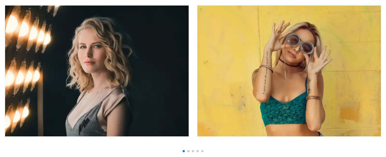
.webp)
.webp)
The above design uses a minimal creative layout that improves your branding. This unique design has an image slider with a landscape orientation that offers an interactive experience for clients. If you wish to create a website that stands out, then this is the one for you.
View Code
HTML
CSS
JS
Responsive CSS
Output


          .carousel .responsive-container-block {
    min-height: 75px;
    height: fit-content;
    width: 100%;
    padding-top: 10px;
    padding-right: 10px;
    padding-bottom: 10px;
    padding-left: 10px;
    display: flex;
    flex-wrap: wrap;
    margin-top: 0px;
    margin-right: auto;
    margin-bottom: 0px;
    margin-left: auto;
    justify-content: flex-start;
}

.carousel * {
    font-family: Nunito, sans-serif;
}

.carousel .responsive-container-block.bigContainer {
    padding-top: 10px;
    padding-right: 30px;
    padding-bottom: 10px;
    padding-left: 30px;
}

.carousel .responsive-container-block.Container {
    max-width: 1320px;
    margin-top: 0px;
    margin-right: auto;
    margin-bottom: 0px;
    margin-left: auto;
    position: relative;
    padding-top: 10px;
    padding-right: 10px;
    padding-bottom: 70px;
    padding-left: 10px;
}

.carousel .cardImg {
    width: 100%;
}

.carousel .container-block {
    min-height: 75px;
    height: fit-content;
    width: 100%;
    padding-top: 10px;
    padding-right: 10px;
    padding-bottom: 10px;
    padding-left: 10px;
    display: block;
}

.carousel .swiper.mySwiper {
    width: 100%;
}

.carousel .swiper-slide {
    width: 100%;
}

.carousel .swiper-wrapper {
    width: 100%;
}

.carousel .swiper-pagination.container-block {
    top: auto;
    bottom: 5px;
    min-height: 20px;
}
          var swiper = new Swiper(`[unique-script-id="w-w-dm-id"] .mySwiper`, {
    loop: true,

    pagination: {
        el: `[unique-script-id="w-w-dm-id"] .swiper-pagination`,
        clickable: true,
    },
    breakpoints: {
        100: {
            slidesPerView: 1,
            spaceBetween: 30,
        },
        500: {
            slidesPerView: 1,
            spaceBetween: 30,
        },
        769: {
            slidesPerView: 1.5,
            spaceBetween: 30,
        },
        1024: {
            slidesPerView: 2,
            spaceBetween: 30,
        },


    }
});
          @import url('https://fonts.googleapis.com/css2?family=Nunito:wght@200;300;400;600;700;800&display=swap');
        *, *:before, *:after {
        -moz-box-sizing: border-box;
        -webkit-box-sizing: border-box;
        box-sizing: border-box;
        }
        body {
        margin: 0;
        }
        .wk-desk-1{
        width: 8.333333%;
        }
        .wk-desk-2{
        width: 16.666667%;
        }
        .wk-desk-3{
        width: 25%;
        }
        .wk-desk-4{
        width: 33.333333%;
        }
        .wk-desk-5{
        width: 41.666667%;
        }
        .wk-desk-6{
        width: 50%;
        }
        .wk-desk-7{
        width: 58.333333%;
        }
        .wk-desk-8{
        width: 66.666667%;
        }
        .wk-desk-9{
        width: 75%;
        }
        .wk-desk-10{
        width: 83.333333%;
        }
        .wk-desk-11{
        width: 91.666667%;
        }
        .wk-desk-12{
        width: 100%;
        }
        @media (max-width: 1024px) {
        .wk-ipadp-1{
        width: 8.333333%;
        }
        .wk-ipadp-2{
        width: 16.666667%;
        }
        .wk-ipadp-3{
        width: 25%;
        }
        .wk-ipadp-4{
        width: 33.333333%;
        }
        .wk-ipadp-5{
        width: 41.666667%;
        }
        .wk-ipadp-6{
        width: 50%;
        }
        .wk-ipadp-7{
        width: 58.333333%;
        }
        .wk-ipadp-8{
        width: 66.666667%;
        }
        .wk-ipadp-9{
        width: 75%;
        }
        .wk-ipadp-10{
        width: 83.333333%;
        }
        .wk-ipadp-11{
        width: 91.666667%;
        }
        .wk-ipadp-12{
        width: 100%;
        }
        }
        @media (max-width: 768px) {
        .wk-tab-1{
        width: 8.333333%;
        }
        .wk-tab-2{
        width: 16.666667%;
        }
        .wk-tab-3{
        width: 25%;
        }
        .wk-tab-4{
        width: 33.333333%;
        }
        .wk-tab-5{
        width: 41.666667%;
        }
        .wk-tab-6{
        width: 50%;
        }
        .wk-tab-7{
        width: 58.333333%;
        }
        .wk-tab-8{
        width: 66.666667%;
        }
        .wk-tab-9{
        width: 75%;
        }
        .wk-tab-10{
        width: 83.333333%;
        }
        .wk-tab-11{
        width: 91.666667%;
        }
        .wk-tab-12{
        width: 100%;
        }
        }
        @media (max-width: 500px) {
        .wk-mobile-1{
        width: 8.333333%;
        }
        .wk-mobile-2{
        width: 16.666667%;
        }
        .wk-mobile-3{
        width: 25%;
        }
        .wk-mobile-4{
        width: 33.333333%;
        }
        .wk-mobile-5{
        width: 41.666667%;
        }
        .wk-mobile-6{
        width: 50%;
        }
        .wk-mobile-7{
        width: 58.333333%;
        }
        .wk-mobile-8{
        width: 66.666667%;
        }
        .wk-mobile-9{
        width: 75%;
        }
        .wk-mobile-10{
        width: 83.333333%;
        }
        .wk-mobile-11{
        width: 91.666667%;
        }
        .wk-mobile-12{
        width: 100%;
        }
        }
Reset

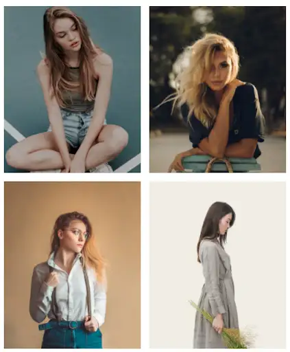
This gallery grid allows the pictures to be uniformly arranged in a 3*2 grid. This gallery helps to enhance the user appeal by providing a feel of polaroid pictures. This grid helps the pictures look minimal and effortless.
View Code
HTML
CSS
JS
Responsive CSS
Output


          .gallery .responsive-container-block {
    min-height: 75px;
    height: fit-content;
    width: 100%;
    padding-top: 10px;
    padding-right: 10px;
    padding-bottom: 10px;
    padding-left: 10px;
    display: flex;
    flex-wrap: wrap;
    margin-top: 0px;
    margin-right: auto;
    margin-bottom: 0px;
    margin-left: auto;
    justify-content: flex-start;
    }
    .gallery .responsive-container-block.bigContainer {
    padding-top: 10px;
    padding-right: 30px;
    padding-bottom: 10px;
    padding-left: 30px;
    }
    .gallery .responsive-container-block.Container {
    max-width: 1320px;
    padding-top: 0px;
    padding-right: 0px;
    padding-bottom: 0px;
    padding-left: 0px;
    margin-top: 50px;
    margin-right: auto;
    margin-bottom: 50px;
    margin-left: auto;
    align-items: center;
    justify-content: space-evenly;
    }
    .gallery .overlay {
    position: fixed;
    background-image: initial;
    background-position-x: initial;
    background-position-y: initial;
    background-size: initial;
    background-repeat-x: initial;
    background-repeat-y: initial;
    background-attachment: initial;
    background-origin: initial;
    background-clip: initial;
    background-color: rgba(71, 69, 69, 0.7);
    height: 100%;
    width: 100%;
    max-height: 100%;
    top: 0px;
    left: 0px;
    z-index: 100;
    display: none;
    padding-top: 20px;
    padding-right: 20px;
    padding-bottom: 20px;
    padding-left: 20px;
    }
    .gallery .overlay-inner {
    top: 50%;
    right: 0px;
    bottom: 0px;
    left: 50%;
    transform: translate(-50%, -50%);
    background-image: initial;
    background-position-x: initial;
    background-position-y: initial;
    background-size: initial;
    background-repeat-x: initial;
    background-repeat-y: initial;
    background-attachment: initial;
    background-origin: initial;
    background-clip: initial;
    background-color: white;
    width: fit-content;
    padding-top: 35px;
    padding-right: 20px;
    padding-bottom: 20px;
    padding-left: 20px;
    position: relative;
    border-top-left-radius: 10px;
    border-top-right-radius: 10px;
    border-bottom-right-radius: 10px;
    border-bottom-left-radius: 10px;
    opacity: 1;
    max-width: 50%;
    max-height: 85%;
    }
    .gallery .close {
    position: absolute;
    top: 9px;
    right: 15px;
    background-image: none;
    background-position-x: initial;
    background-position-y: initial;
    background-size: initial;
    background-repeat-x: initial;
    background-repeat-y: initial;
    background-attachment: initial;
    background-origin: initial;
    background-clip: initial;
    background-color: initial;
    outline-color: initial;
    outline-style: initial;
    outline-width: 0px;
    color: #474545;
    border-top-width: 0px;
    border-right-width: 0px;
    border-bottom-width: 0px;
    border-left-width: 0px;
    border-top-style: initial;
    border-right-style: initial;
    border-bottom-style: initial;
    border-left-style: initial;
    border-top-color: initial;
    border-right-color: initial;
    border-bottom-color: initial;
    border-left-color: initial;
    border-image-source: initial;
    border-image-slice: initial;
    border-image-width: initial;
    border-image-outset: initial;
    border-image-repeat: initial;
    text-transform: uppercase;
    letter-spacing: 2px;
    }
    .gallery .overlay-inner .hdImgs {
    width: fit-content;
    height: calc(80% - 55px);
    display: flex;
    }
    .gallery .overlay-inner img {
    max-height: 100%;
    max-width: 100%;
    transform: none;
    }
    .gallery .close:hover {
    cursor: pointer;
    }
    .gallery .project {
    position: relative;
    width: 33%;
    padding-top: 10px;
    padding-right: 10px;
    padding-bottom: 10px;
    padding-left: 10px;
    }
    .gallery .btn-box {
    position: absolute;
    top: 40%;
    left: 50%;
    transform: translate(-50%, -50%);
    display: none;
    }
    .gallery .project:hover .btn-box {
    display: block;
    }
    .gallery .btn {
    cursor: pointer;
    }
    .gallery .smallImage {
    width: 100%;
    height: 100%;
    object-fit: cover;
    }
    @media (max-width: 768px) {
    .gallery .project {
    width: 50%;
    }
    .gallery .overlay-inner {
    width: 90%;
    }
    }
    @media (max-width: 500px) {
    .gallery .project {
    width: 100%;
    padding-top: 10px;
    padding-right: 0px;
    padding-bottom: 10px;
    padding-left: 0px;
    }
    .gallery .responsive-container-block.bigContainer {
    padding-top: 10px;
    padding-right: 20px;
    padding-bottom: 10px;
    padding-left: 20px;
    }
    .gallery .overlay-inner {
    max-width: 90%;
    }
    }
          $(document).ready(function() {

    $(`[unique-script-id="w-w-dm-id"] .btn-box`).click(function() {
        $(this).parent().children(".overlay").show();

    });


    $(`[unique-script-id="w-w-dm-id"] .close`).click(function() {
        $(`[unique-script-id="w-w-dm-id"] .overlay`).hide();
    });
});
          @import url('https://fonts.googleapis.com/css2?family=Nunito:wght@200;300;400;600;700;800&display=swap');
        *, *:before, *:after {
        -moz-box-sizing: border-box;
        -webkit-box-sizing: border-box;
        box-sizing: border-box;
        }
        body {
        margin: 0;
        }
        .wk-desk-1{
        width: 8.333333%;
        }
        .wk-desk-2{
        width: 16.666667%;
        }
        .wk-desk-3{
        width: 25%;
        }
        .wk-desk-4{
        width: 33.333333%;
        }
        .wk-desk-5{
        width: 41.666667%;
        }
        .wk-desk-6{
        width: 50%;
        }
        .wk-desk-7{
        width: 58.333333%;
        }
        .wk-desk-8{
        width: 66.666667%;
        }
        .wk-desk-9{
        width: 75%;
        }
        .wk-desk-10{
        width: 83.333333%;
        }
        .wk-desk-11{
        width: 91.666667%;
        }
        .wk-desk-12{
        width: 100%;
        }
        @media (max-width: 1024px) {
        .wk-ipadp-1{
        width: 8.333333%;
        }
        .wk-ipadp-2{
        width: 16.666667%;
        }
        .wk-ipadp-3{
        width: 25%;
        }
        .wk-ipadp-4{
        width: 33.333333%;
        }
        .wk-ipadp-5{
        width: 41.666667%;
        }
        .wk-ipadp-6{
        width: 50%;
        }
        .wk-ipadp-7{
        width: 58.333333%;
        }
        .wk-ipadp-8{
        width: 66.666667%;
        }
        .wk-ipadp-9{
        width: 75%;
        }
        .wk-ipadp-10{
        width: 83.333333%;
        }
        .wk-ipadp-11{
        width: 91.666667%;
        }
        .wk-ipadp-12{
        width: 100%;
        }
        }
        @media (max-width: 768px) {
        .wk-tab-1{
        width: 8.333333%;
        }
        .wk-tab-2{
        width: 16.666667%;
        }
        .wk-tab-3{
        width: 25%;
        }
        .wk-tab-4{
        width: 33.333333%;
        }
        .wk-tab-5{
        width: 41.666667%;
        }
        .wk-tab-6{
        width: 50%;
        }
        .wk-tab-7{
        width: 58.333333%;
        }
        .wk-tab-8{
        width: 66.666667%;
        }
        .wk-tab-9{
        width: 75%;
        }
        .wk-tab-10{
        width: 83.333333%;
        }
        .wk-tab-11{
        width: 91.666667%;
        }
        .wk-tab-12{
        width: 100%;
        }
        }
        @media (max-width: 500px) {
        .wk-mobile-1{
        width: 8.333333%;
        }
        .wk-mobile-2{
        width: 16.666667%;
        }
        .wk-mobile-3{
        width: 25%;
        }
        .wk-mobile-4{
        width: 33.333333%;
        }
        .wk-mobile-5{
        width: 41.666667%;
        }
        .wk-mobile-6{
        width: 50%;
        }
        .wk-mobile-7{
        width: 58.333333%;
        }
        .wk-mobile-8{
        width: 66.666667%;
        }
        .wk-mobile-9{
        width: 75%;
        }
        .wk-mobile-10{
        width: 83.333333%;
        }
        .wk-mobile-11{
        width: 91.666667%;
        }
        .wk-mobile-12{
        width: 100%;
        }
        }
Reset
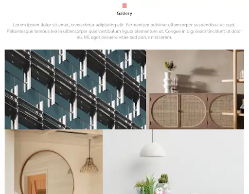
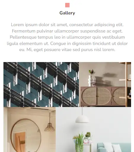
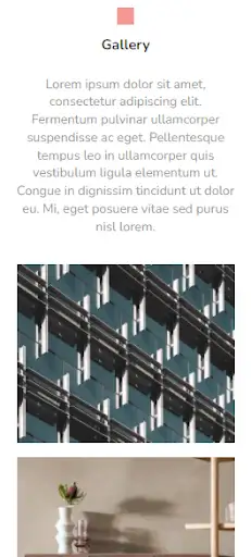
This design helps one to create a content-focused website. No distractive elements are present and even the visual effects are kept to a minimum. The user can view each image in full-screen by simply clicking on it. The design also provides an option to add a welcome text at the top to explain your services in detail to the clients.
View Code
HTML
CSS
JS
Responsive CSS
Output
Gallery
Lorem ipsum dolor sit amet, consectetur adipiscing elit. Fermentum pulvinar ullamcorper suspendisse ac eget. Pellentesque tempus leo in ullamcorper quis vestibulum ligula elementum ut. Congue in dignissim tincidunt ut dolor eu. Mi, eget posuere vitae sed purus nisl lorem.
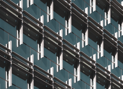

          .gallery * {
    font-family: Nunito, sans-serif;
    }
    .gallery .text-blk {
    margin-top: 0px;
    margin-right: 0px;
    margin-bottom: 0px;
    margin-left: 0px;
    line-height: 25px;
    padding-top: 0px;
    padding-right: 0px;
    padding-bottom: 0px;
    padding-left: 0px;
    }
    .gallery .responsive-container-block {
    min-height: 75px;
    height: fit-content;
    width: 100%;
    padding-top: 10px;
    padding-right: 10px;
    padding-bottom: 10px;
    padding-left: 10px;
    display: flex;
    flex-wrap: wrap;
    margin-top: 0px;
    margin-right: auto;
    margin-bottom: 0px;
    margin-left: auto;
    justify-content: flex-start;
    }
    .gallery .responsive-container-block.bigContainer {
    flex-direction: column;
    align-items: center;
    justify-content: center;
    padding-top: 50px;
    padding-right: 30px;
    padding-bottom: 50px;
    padding-left: 30px;
    }
    .gallery .responsive-container-block.headerContainer {
    max-width: 1320px;
    flex-direction: column;
    align-items: center;
    justify-content: center;
    margin-top: 0px;
    margin-right: auto;
    margin-bottom: 40px;
    margin-left: auto;
    }
    .gallery .responsive-container-block.Container {
    max-width: 1320px;
    margin-top: 0px;
    margin-right: auto;
    margin-bottom: 0px;
    margin-left: auto;
    position: relative;
    padding-top: 0px;
    padding-right: 0px;
    padding-bottom: 0px;
    padding-left: 0px;
    height: 1380px;
    }
    .gallery .row1 {
    display: flex;
    flex-direction: column;
    align-items: center;
    justify-content: center;
    margin-top: 0px;
    margin-right: 0px;
    margin-bottom: 30px;
    margin-left: 0px;
    }
    .gallery .text-blk.heading {
    font-size: 36px;
    line-height: 34px;
    font-weight: 700;
    color: #333333;
    text-align: center;
    }
    .gallery .text-blk.subHeading {
    font-size: 18px;
    line-height: 29px;
    text-align: center;
    color: #999999;
    }
    .gallery .overlay {
    position: fixed;
    background-image: initial;
    background-position-x: initial;
    background-position-y: initial;
    background-size: initial;
    background-repeat-x: initial;
    background-repeat-y: initial;
    background-attachment: initial;
    background-origin: initial;
    background-clip: initial;
    background-color: rgba(71, 69, 69, 0.7);
    height: 100%;
    width: 100%;
    max-height: 100%;
    top: 0px;
    left: 0px;
    z-index: 100;
    display: none;
    padding-top: 20px;
    padding-right: 20px;
    padding-bottom: 20px;
    padding-left: 20px;
    }
    .gallery .overlay-inner {
    top: 50%;
    right: 0px;
    bottom: 0px;
    left: 50%;
    transform: translate(-50%, -50%);
    background-image: initial;
    background-position-x: initial;
    background-position-y: initial;
    background-size: initial;
    background-repeat-x: initial;
    background-repeat-y: initial;
    background-attachment: initial;
    background-origin: initial;
    background-clip: initial;
    background-color: white;
    max-width: 700px;
    width: fit-content;
    padding-top: 35px;
    padding-right: 20px;
    padding-bottom: 20px;
    padding-left: 20px;
    position: relative;
    border-top-left-radius: 10px;
    border-top-right-radius: 10px;
    border-bottom-right-radius: 10px;
    border-bottom-left-radius: 10px;
    opacity: 1;
    max-width: 50%;
    max-height: 85%;
    }
    .gallery .close {
    position: absolute;
    top: 9px;
    right: 15px;
    background-image: none;
    background-position-x: initial;
    background-position-y: initial;
    background-size: initial;
    background-repeat-x: initial;
    background-repeat-y: initial;
    background-attachment: initial;
    background-origin: initial;
    background-clip: initial;
    background-color: initial;
    outline-color: initial;
    outline-style: initial;
    outline-width: 0px;
    color: #474545;
    border-top-width: 0px;
    border-right-width: 0px;
    border-bottom-width: 0px;
    border-left-width: 0px;
    border-top-style: initial;
    border-right-style: initial;
    border-bottom-style: initial;
    border-left-style: initial;
    border-top-color: initial;
    border-right-color: initial;
    border-bottom-color: initial;
    border-left-color: initial;
    border-image-source: initial;
    border-image-slice: initial;
    border-image-width: initial;
    border-image-outset: initial;
    border-image-repeat: initial;
    text-transform: uppercase;
    letter-spacing: 2px;
    }

    .gallery .overlay-inner hdImgs {
    	width: fit-content;
    height: calc(85% - 55px)
    display: flex
    }
    .gallery .overlay-inner img {
    max-height: 100%;
    max-width: 100%;
    transform: none;
    }
    .gallery .close:hover {
    cursor: pointer;
    }
    .gallery .project {
    position: absolute;
    width: 59%;
    height: 440px;
    padding-top: 0px;
    padding-right: 0px;
    padding-bottom: 0px;
    padding-left: 0px;
    }
    .gallery .btn-box {
    position: absolute;
    top: 40%;
    left: 50%;
    transform: translate(-50%, -50%);
    display: none;
    }
    .gallery .project:hover .btn-box {
    display: block;
    }
    .gallery .btn {
    cursor: pointer;
    }
    .gallery .smallImage {
    width: 100%;
    height: 100%;
    object-fit: cover;
    }
    .gallery .project.project2 {
    left: 59%;
    width: 41%;
    height: 440px;
    }
    .gallery .project.project3 {
    top: 440px;
    width: 41%;
    height: 940px;
    }
    .gallery .project.project4 {
    left: 41%;
    top: 440px;
    width: 59%;
    height: 440px;
    }
    .gallery .project.project5 {
    top: 880px;
    left: 41%;
    width: 29.5%;
    height: 500px;
    }
    .gallery .project.project6 {
    top: 880px;
    left: 70.5%;
    width: 29.5%;
    height: 500px;
    }
    @media (max-width: 768px) {
    .gallery .project.project2 {
    height: 245px;
    }
    .gallery .responsive-container-block.Container {
    max-width: 740px;
    height: 770px;
    }
    .gallery .project.project1 {
    height: 245px;
    }
    .gallery .project.project3 {
    height: 525px;
    top: 245px;
    }
    .gallery .project.project4 {
    top: 245px;
    height: 245px;
    }
    .gallery .project.project5 {
    top: 490px;
    height: 280px;
    }
    .gallery .project.project6 {
    top: 490px;
    height: 280px;
    }
    .gallery .overlay-inner {
    width: 90%;
    }
    .gallery .row1 {
    margin-top: 0px;
    margin-right: 0px;
    margin-bottom: 25px;
    margin-left: 0px;
    }
    .gallery .text-blk.heading {
    font-size: 30px;
    }
    }
    @media (max-width: 500px) {
    .gallery .project.project1 {
    position: relative;
    width: 100%;
    height: 250px;
    margin-top: 0px;
    margin-right: 0px;
    margin-bottom: 20px;
    margin-left: 0px;
    }
    .gallery .project.project2 {
    position: relative;
    left: 0px;
    width: 100%;
    height: 250px;
    top: 0px;
    margin-top: 0px;
    margin-right: 0px;
    margin-bottom: 20px;
    margin-left: 0px;
    }
    .gallery .project.project3 {
    position: relative;
    top: 0px;
    width: 100%;
    height: 250px;
    margin-top: 0px;
    margin-right: 0px;
    margin-bottom: 20px;
    margin-left: 0px;
    }
    .gallery .project.project4 {
    position: relative;
    top: 0px;
    left: 0px;
    width: 100%;
    height: 250px;
    margin-top: 0px;
    margin-right: 0px;
    margin-bottom: 20px;
    margin-left: 0px;
    }
    .gallery .project.project5 {
    position: relative;
    top: 0px;
    left: 0px;
    width: 100%;
    height: 250px;
    margin-top: 0px;
    margin-right: 0px;
    margin-bottom: 20px;
    margin-left: 0px;
    }
    .gallery .project.project6 {
    position: relative;
    top: 0px;
    left: 0px;
    width: 100%;
    height: 250px;
    margin-top: 0px;
    margin-right: 0px;
    margin-bottom: 20px;
    margin-left: 0px;
    }
    .gallery .responsive-container-block.Container {
    height: 100%;
    margin-top: 0px;
    margin-right: 0px;
    margin-bottom: 50px;
    margin-left: 0px;
    }
    .gallery .text-blk.subHeading {
    font-size: 16px;
    line-height: 24px;
    }
    .gallery .text-blk.heading {
    font-size: 26px;
    line-height: 27px;
    }
    .gallery .responsive-container-block.headerContainer {
    padding-top: 0px;
    padding-right: 0px;
    padding-bottom: 0px;
    padding-left: 0px;
    }
    .gallery .row1 {
    margin-top: 0px;
    margin-right: 0px;
    margin-bottom: 22px;
    margin-left: 0px;
    }
    .gallery .overlay-inner .hdImgs {
    	width: 90%;
    }
    }
          $(document).ready(function() {

    $(`[unique-script-id="w-w-dm-id"] .btn-box`).click(function() {
        $(this).parent().children(".overlay").show();

    });


    $(`[unique-script-id="w-w-dm-id"] .close`).click(function() {
        $(".overlay").hide();
    });
});
          @import url('https://fonts.googleapis.com/css2?family=Nunito:wght@200;300;400;600;700;800&display=swap');
        *, *:before, *:after {
        -moz-box-sizing: border-box;
        -webkit-box-sizing: border-box;
        box-sizing: border-box;
        }
        body {
        margin: 0;
        }
        .wk-desk-1{
        width: 8.333333%;
        }
        .wk-desk-2{
        width: 16.666667%;
        }
        .wk-desk-3{
        width: 25%;
        }
        .wk-desk-4{
        width: 33.333333%;
        }
        .wk-desk-5{
        width: 41.666667%;
        }
        .wk-desk-6{
        width: 50%;
        }
        .wk-desk-7{
        width: 58.333333%;
        }
        .wk-desk-8{
        width: 66.666667%;
        }
        .wk-desk-9{
        width: 75%;
        }
        .wk-desk-10{
        width: 83.333333%;
        }
        .wk-desk-11{
        width: 91.666667%;
        }
        .wk-desk-12{
        width: 100%;
        }
        @media (max-width: 1024px) {
        .wk-ipadp-1{
        width: 8.333333%;
        }
        .wk-ipadp-2{
        width: 16.666667%;
        }
        .wk-ipadp-3{
        width: 25%;
        }
        .wk-ipadp-4{
        width: 33.333333%;
        }
        .wk-ipadp-5{
        width: 41.666667%;
        }
        .wk-ipadp-6{
        width: 50%;
        }
        .wk-ipadp-7{
        width: 58.333333%;
        }
        .wk-ipadp-8{
        width: 66.666667%;
        }
        .wk-ipadp-9{
        width: 75%;
        }
        .wk-ipadp-10{
        width: 83.333333%;
        }
        .wk-ipadp-11{
        width: 91.666667%;
        }
        .wk-ipadp-12{
        width: 100%;
        }
        }
        @media (max-width: 768px) {
        .wk-tab-1{
        width: 8.333333%;
        }
        .wk-tab-2{
        width: 16.666667%;
        }
        .wk-tab-3{
        width: 25%;
        }
        .wk-tab-4{
        width: 33.333333%;
        }
        .wk-tab-5{
        width: 41.666667%;
        }
        .wk-tab-6{
        width: 50%;
        }
        .wk-tab-7{
        width: 58.333333%;
        }
        .wk-tab-8{
        width: 66.666667%;
        }
        .wk-tab-9{
        width: 75%;
        }
        .wk-tab-10{
        width: 83.333333%;
        }
        .wk-tab-11{
        width: 91.666667%;
        }
        .wk-tab-12{
        width: 100%;
        }
        }
        @media (max-width: 500px) {
        .wk-mobile-1{
        width: 8.333333%;
        }
        .wk-mobile-2{
        width: 16.666667%;
        }
        .wk-mobile-3{
        width: 25%;
        }
        .wk-mobile-4{
        width: 33.333333%;
        }
        .wk-mobile-5{
        width: 41.666667%;
        }
        .wk-mobile-6{
        width: 50%;
        }
        .wk-mobile-7{
        width: 58.333333%;
        }
        .wk-mobile-8{
        width: 66.666667%;
        }
        .wk-mobile-9{
        width: 75%;
        }
        .wk-mobile-10{
        width: 83.333333%;
        }
        .wk-mobile-11{
        width: 91.666667%;
        }
        .wk-mobile-12{
        width: 100%;
        }
        }
Reset
.webp)
.webp)
.webp)
This design provides a professional-looking gallery template. Its carousel design helps you showcase your works effectively. It uses a dark theme layout which not only gives a rich look but ensures the content looks clean.
View Code
HTML
CSS
JS
Responsive CSS
Output
              GALLERY


              Lorem ipsum dolor sit amet, consectetur adipiscing elit


          .gallery * {
    font-family: Nunito, sans-serif;
}

.gallery .container-block {
    min-height: 75px;
    height: fit-content;
    width: 100%;
    padding-top: 10px;
    padding-right: 10px;
    padding-bottom: 10px;
    padding-left: 10px;
    display: block;
}

.gallery .text-blk {
    margin-top: 0px;
    margin-right: 0px;
    margin-bottom: 0px;
    margin-left: 0px;
    padding-top: 10px;
    padding-right: 10px;
    padding-bottom: 10px;
    padding-left: 10px;
    line-height: 25px;
}

.gallery .mySwiper .swiper-pagination-bullet-active {
    background-image: initial;
    background-position-x: initial;
    background-position-y: initial;
    background-size: initial;
    background-repeat-x: initial;
    background-repeat-y: initial;
    background-attachment: initial;
    background-origin: initial;
    background-clip: initial;
    background-color: #f49892;
    opacity: 1 !important;
}

.gallery .mySwiper .swiper-pagination-bullet {
    width: 25px;
    height: 4px;
    display: inline-block;
    border-top-left-radius: 0%;
    border-top-right-radius: 0%;
    border-bottom-right-radius: 0%;
    border-bottom-left-radius: 0%;
    background-image: initial;
    background-position-x: initial;
    background-position-y: initial;
    background-size: initial;
    background-repeat-x: initial;
    background-repeat-y: initial;
    background-attachment: initial;
    background-origin: initial;
    background-clip: initial;
    background-color: #f49892;
}

.gallery .responsive-container-block {
    min-height: 75px;
    height: fit-content;
    width: 100%;
    padding-top: 10px;
    padding-right: 10px;
    padding-bottom: 10px;
    padding-left: 10px;
    display: flex;
    flex-wrap: wrap;
    margin-top: 0px;
    margin-right: auto;
    margin-bottom: 0px;
    margin-left: auto;
    justify-content: flex-start;
    max-width: 1490px;
    transform: rotateX(0deg) rotateY(0deg) rotateZ(0deg) scaleX(1) scaleY(1) scaleZ(2);
    flex-direction: column;
    align-items: center;
}

.gallery .responsive-container-block.bg {
    flex-direction: column;
    align-items: center;
    padding-top: 10px;
    padding-right: 10px;
    padding-bottom: 10px;
    padding-left: 10px;
    position: relative;
    margin-top: 0px;
    margin-right: 0px;
    margin-bottom: 0px;
    margin-left: 0px;
    max-width: 1320px;
}

.gallery .text-blk.title {
    font-size: 36px;
    line-height: 45px;
    font-weight: 700;
    text-align: left;
    color: #f49892;
    max-width: 1490px;
    width: auto;
    padding-top: 0px;
    padding-right: 0px;
    padding-bottom: 0px;
    padding-left: 0px;
    margin-top: 40px;
    margin-right: 0px;
    margin-bottom: 20px;
    margin-left: 0px;
}

.gallery .text-blk.heading {
    font-size: 20px;
    line-height: 30px;
    color: white;
    font-weight: 400;
    text-align: center;
    max-width: 480px;
    margin-top: 0px;
    margin-right: 0px;
    margin-bottom: 15px;
    margin-left: 0px;
    width: 480px;
    padding-top: 0px;
    padding-right: 0px;
    padding-bottom: 0px;
    padding-left: 0px;
}

.gallery .container-block.card {
    width: 32.5%;
    display: flex;
    flex-direction: column;
    align-items: center;
}

.gallery .text-blk.card-text {
    width: 100%;
    text-align: center;
    background-color: #333333;
    color: white;
    font-size: 20px;
    line-height: 34px;
    padding-top: 35px;
    padding-right: 15px;
    padding-bottom: 35px;
    padding-left: 15px;
    margin-top: 0px;
    margin-right: 10px;
    margin-bottom: 50px;
    margin-left: 10px;
}

.gallery .text-blk.name {
    color: white;
    text-align: center;
    font-size: 20px;
    line-height: 27.28px;
    font-weight: 700;
    padding-top: 10px;
    padding-right: 10px;
    padding-bottom: 0px;
    padding-left: 10px;
}

.gallery .text-blk.desig {
    color: white;
    text-align: center;
    line-height: 21.82px;
    padding-top: 5px;
    padding-right: 10px;
    padding-bottom: 10px;
    padding-left: 10px;
}

.gallery .responsive-container-block.card-cont {
    justify-content: space-evenly;
    margin-top: 0px;
    margin-right: 0px;
    margin-bottom: 80px;
    margin-left: 0px;
}

.gallery .container-block {
    min-height: 75px;
    height: fit-content;
    width: 100%;
    padding-top: 10px;
    padding-right: 10px;
    padding-bottom: 10px;
    padding-left: 10px;
    display: block;
}

.gallery .swiper-container {
    width: 100%;
    height: 100%;
}

.gallery .swiper-slide {
    text-align: center;
    font-size: 18px;
    background-image: initial;
    background-position-x: initial;
    background-position-y: initial;
    background-size: initial;
    background-repeat-x: initial;
    background-repeat-y: initial;
    background-attachment: initial;
    background-origin: initial;
    background-clip: initial;
    display: flex;
    -webkit-box-pack: center;
    justify-content: center;
    -webkit-box-align: center;
    align-items: flex-start;
    flex-direction: column;
    margin-top: 0px;
    margin-right: 10px;
    margin-bottom: 80px;
    margin-left: 0px;
    width: 32.5%;
    padding-top: 10px;
    padding-right: 0px;
    padding-bottom: 10px;
    padding-left: 0px;
}

.gallery .swiper-slide img {
    display: block;
    width: 100%;
    height: 100%;
    object-fit: cover;
}

.gallery .swiper-pagination.container-block {
    margin-top: 0px;
    margin-right: 0px;
    margin-bottom: 0px;
    margin-left: 0px;
    display: flex;
    flex-direction: row;
    justify-content: center;
    align-items: flex-end;
}

.gallery .swiper-container.mySwiper {
    padding-top: 10px;
    padding-right: 0px;
    padding-bottom: 10px;
    padding-left: 0px;
    max-width: 1490px;
    margin-top: 0px;
    margin-right: 0px;
    margin-bottom: 0px;
    margin-left: 0px;
}

.gallery .swiper-slide.card-sel {
    border-top-width: 2px;
    border-right-width: 2px;
    border-bottom-width: 2px;
    border-left-width: 2px;
    border-top-style: solid;
    border-right-style: solid;
    border-bottom-style: solid;
    border-left-style: solid;
    border-top-color: white;
    border-right-color: white;
    border-bottom-color: white;
    border-left-color: white;
    border-image-source: initial;
    border-image-slice: initial;
    border-image-width: initial;
    border-image-outset: initial;
    border-image-repeat: initial;
}

.gallery .responsive-container-block.img {
    min-height: 245px;
    background-image: url("https://workik-widget-assets.s3.amazonaws.com/widget-assets/images/PM2.4.png");
    background-size: cover;
    background-position-x: 50%;
    background-position-y: 50%;
    position: relative;
    border-top-left-radius: 10px;
    border-top-right-radius: 10px;
    border-bottom-right-radius: 10px;
    border-bottom-left-radius: 10px;
}

.gallery .text-blk.info {
    font-size: 20px;
    line-height: 27.28px;
    color: #999999;
    text-align: left;
    padding-top: 10px;
    padding-right: 10px;
    padding-bottom: 10px;
    padding-left: 0px;
    max-width: 400px;
    margin-top: 0px;
    margin-right: 0px;
    margin-bottom: 0px;
    margin-left: 0px;
}

.gallery .text-blk.date {
    position: absolute;
    bottom: 0px;
    left: 0px;
    font-size: 25px;
    line-height: 34px;
    color: white;
    font-weight: 700;
    background-color: #f43b2f;
    padding-top: 15px;
    padding-right: 15px;
    padding-bottom: 15px;
    padding-left: 15px;
}

.gallery .responsive-container-block.blue-cont {
    background-color: #f4fcff;
    transform: rotateX(0deg) rotateY(0deg) rotateZ(0deg) scaleX(1) scaleY(1) scaleZ(-1);
    width: 50%;
    position: absolute;
    float: right;
    left: 0px;
    height: 100%;
    bottom: 0px;
    top: 0px;
}

.gallery .text-blk.desc {
    margin-top: 15px;
    margin-right: 0px;
    margin-bottom: 0px;
    margin-left: 0px;
    font-size: 25px;
    line-height: 34.1px;
    color: #666666;
    font-weight: 700;
    padding-top: 10px;
    padding-right: 10px;
    padding-bottom: 0px;
    padding-left: 0px;
}

.gallery #ipmmi {
    color: black;
}

.gallery .im {
    border-top-left-radius: 10px;
    border-top-right-radius: 10px;
    border-bottom-right-radius: 10px;
    border-bottom-left-radius: 10px;
    min-height: auto;
}

.gallery #iwcuv {
    color: black;
}

.gallery #itnqd {
    color: black;
}

.gallery #igv7i {
    color: black;
}

.gallery #iswt7 {
    color: black;
}

@media (max-width: 1024px) {
    .gallery .text-blk.title {
        width: 100%;
    }

    .gallery .text-blk.heading {
        width: 100%;
    }

    .gallery .text-blk.title {
        width: auto;
    }
}

@media (max-width: 768px) {
    .gallery .text-blk.card-text {
        width: 100%;
    }

    .gallery .text-blk.heading {
        font-size: 18px;
    }

    .gallery .text-blk.title {
        font-size: 32px;
        margin-top: 40px;
        margin-right: 0px;
        margin-bottom: 15px;
        margin-left: 0px;
        line-height: 40px;
    }
}

@media (max-width: 500px) {
    .gallery .text-blk.card-text {
        width: 100%;
    }

    .gallery .text-blk.heading {
        font-size: 16px;
        line-height: 26px;
    }

    .gallery .text-blk.title {
        font-size: 26px;
        line-height: 36px;
    }
}
          var swiper = new Swiper(`[unique-script-id="w-w-dm-id"] .mySwiper`, {
    slidesPerView: 3,
    spaceBetween: 30,
    pagination: {
        el: `[unique-script-id="w-w-dm-id"] .swiper-pagination`,
        clickable: true,
    },
    breakpoints: {

        200: {
            slidesPerView: 1
        },

        501: {
            slidesPerView: 1.5
        },

        769: {
            slidesPerView: 2.5,
            spaceBetween: 10
        },
        1025: {
            slidesPerView: 3,
            spaceBetween: 20
        },
    }
});
          @import url('https://fonts.googleapis.com/css2?family=Nunito:wght@200;300;400;600;700;800&display=swap');
        *, *:before, *:after {
        -moz-box-sizing: border-box;
        -webkit-box-sizing: border-box;
        box-sizing: border-box;
        }
        body {
        margin: 0;
        }
        .wk-desk-1{
        width: 8.333333%;
        }
        .wk-desk-2{
        width: 16.666667%;
        }
        .wk-desk-3{
        width: 25%;
        }
        .wk-desk-4{
        width: 33.333333%;
        }
        .wk-desk-5{
        width: 41.666667%;
        }
        .wk-desk-6{
        width: 50%;
        }
        .wk-desk-7{
        width: 58.333333%;
        }
        .wk-desk-8{
        width: 66.666667%;
        }
        .wk-desk-9{
        width: 75%;
        }
        .wk-desk-10{
        width: 83.333333%;
        }
        .wk-desk-11{
        width: 91.666667%;
        }
        .wk-desk-12{
        width: 100%;
        }
        @media (max-width: 1024px) {
        .wk-ipadp-1{
        width: 8.333333%;
        }
        .wk-ipadp-2{
        width: 16.666667%;
        }
        .wk-ipadp-3{
        width: 25%;
        }
        .wk-ipadp-4{
        width: 33.333333%;
        }
        .wk-ipadp-5{
        width: 41.666667%;
        }
        .wk-ipadp-6{
        width: 50%;
        }
        .wk-ipadp-7{
        width: 58.333333%;
        }
        .wk-ipadp-8{
        width: 66.666667%;
        }
        .wk-ipadp-9{
        width: 75%;
        }
        .wk-ipadp-10{
        width: 83.333333%;
        }
        .wk-ipadp-11{
        width: 91.666667%;
        }
        .wk-ipadp-12{
        width: 100%;
        }
        }
        @media (max-width: 768px) {
        .wk-tab-1{
        width: 8.333333%;
        }
        .wk-tab-2{
        width: 16.666667%;
        }
        .wk-tab-3{
        width: 25%;
        }
        .wk-tab-4{
        width: 33.333333%;
        }
        .wk-tab-5{
        width: 41.666667%;
        }
        .wk-tab-6{
        width: 50%;
        }
        .wk-tab-7{
        width: 58.333333%;
        }
        .wk-tab-8{
        width: 66.666667%;
        }
        .wk-tab-9{
        width: 75%;
        }
        .wk-tab-10{
        width: 83.333333%;
        }
        .wk-tab-11{
        width: 91.666667%;
        }
        .wk-tab-12{
        width: 100%;
        }
        }
        @media (max-width: 500px) {
        .wk-mobile-1{
        width: 8.333333%;
        }
        .wk-mobile-2{
        width: 16.666667%;
        }
        .wk-mobile-3{
        width: 25%;
        }
        .wk-mobile-4{
        width: 33.333333%;
        }
        .wk-mobile-5{
        width: 41.666667%;
        }
        .wk-mobile-6{
        width: 50%;
        }
        .wk-mobile-7{
        width: 58.333333%;
        }
        .wk-mobile-8{
        width: 66.666667%;
        }
        .wk-mobile-9{
        width: 75%;
        }
        .wk-mobile-10{
        width: 83.333333%;
        }
        .wk-mobile-11{
        width: 91.666667%;
        }
        .wk-mobile-12{
        width: 100%;
        }
        }
Reset
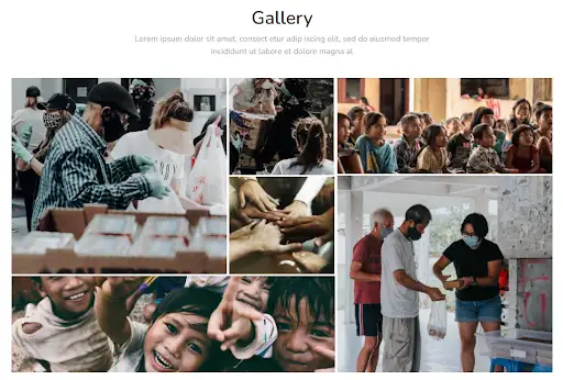
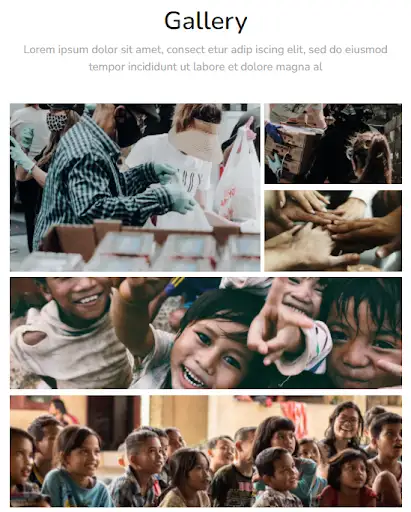
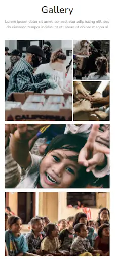
The above design is a classy website gallery template. Photo gallery designs such as these help you display the content creatively to the audience. This gallery allows uploading pictures of any dimension all the while ensuring the grid remains responsive to every viewport type.
View Code
HTML
CSS
JS
Responsive CSS
Output
Gallery
Lorem ipsum dolor sit amet, consect etur adip iscing elit, sed do eiusmod tempor incididunt ut labore et dolore magna al
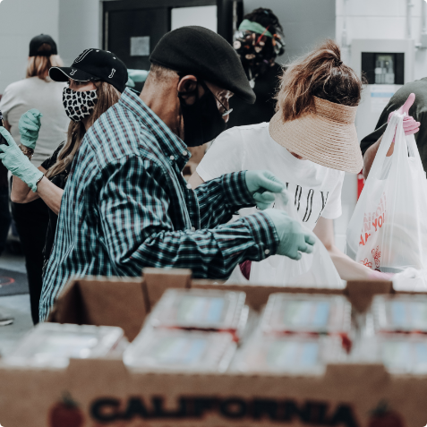

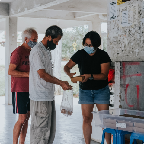
          .gallery_1 * {
    font-family: Nunito, sans-serif;
}

.gallery_1 .text-blk {
    margin-top: 0px;
    margin-right: 0px;
    margin-bottom: 0px;
    margin-left: 0px;
    line-height: 25px;
    padding-top: 0px;
    padding-right: 0px;
    padding-bottom: 0px;
    padding-left: 0px;
}

.gallery_1 img {
    object-fit: cover;
}

.gallery_1 .responsive-container-block {
    min-height: 75px;
    height: fit-content;
    width: 100%;
    padding-top: 10px;
    padding-right: 10px;
    padding-bottom: 10px;
    padding-left: 10px;
    display: flex;
    flex-wrap: wrap;
    margin-top: 0px;
    margin-right: auto;
    margin-bottom: 0px;
    margin-left: auto;
    justify-content: flex-start;
}

.gallery_1 .responsive-container-block.bigContainer {
    padding-top: 10px;
    padding-right: 30px;
    padding-bottom: 10px;
    padding-left: 30px;
}

.gallery_1 .responsive-container-block.Container {
    max-width: 1320px;
    padding-top: 0px;
    padding-right: 0px;
    padding-bottom: 0px;
    padding-left: 0px;
    margin-top: 50px;
    margin-right: auto;
    margin-bottom: 50px;
    margin-left: auto;
    flex-direction: column;
    align-items: center;
    justify-content: center;
}

.gallery_1 .text-blk.heading {
    font-size: 36px;
    line-height: 45px;
    font-weight: 600;
    color: #242424;
    text-align: center;
    margin-top: 0px;
    margin-right: 0px;
    margin-bottom: 20px;
    margin-left: 0px;
}

.gallery_1 .text-blk.subHeading {
    text-align: center;
    font-size: 20px;
    line-height: 30px;
    max-width: 750px;
    color: #a3a3a3;
    margin-top: 0px;
    margin-right: 0px;
    margin-bottom: 50px;
    margin-left: 0px;
}

.gallery_1 .responsive-container-block.imgContainer {
    padding-top: 0px;
    padding-right: 0px;
    padding-bottom: 0px;
    padding-left: 0px;
    min-height: auto;
    height: 720px;
    position: relative;
}

.gallery_1 .overlay {
    position: fixed;
    background-image: initial;
    background-position-x: initial;
    background-position-y: initial;
    background-size: initial;
    background-repeat-x: initial;
    background-repeat-y: initial;
    background-attachment: initial;
    background-origin: initial;
    background-clip: initial;
    background-color: rgba(71, 69, 69, 0.7);
    height: 100%;
    width: 100%;
    max-height: 100%;
    top: 0px;
    left: 0px;
    z-index: 100;
    display: none;
    padding-top: 20px;
    padding-right: 20px;
    padding-bottom: 20px;
    padding-left: 20px;
}

.gallery_1 .overlay-inner {
    top: 50%;
    right: 0px;
    bottom: 0px;
    left: 50%;
    transform: translate(-50%, -50%);
    background-image: initial;
    background-position-x: initial;
    background-position-y: initial;
    background-size: initial;
    background-repeat-x: initial;
    background-repeat-y: initial;
    background-attachment: initial;
    background-origin: initial;
    background-clip: initial;
    background-color: white;
    max-width: 700px;
    width: 100%;
    padding-top: 35px;
    padding-right: 20px;
    padding-bottom: 20px;
    padding-left: 20px;
    position: relative;
    border-top-left-radius: 10px;
    border-top-right-radius: 10px;
    border-bottom-right-radius: 10px;
    border-bottom-left-radius: 10px;
    opacity: 1;
}

.gallery_1 .close {
    position: absolute;
    top: 9px;
    right: 15px;
    background-image: none;
    background-position-x: initial;
    background-position-y: initial;
    background-size: initial;
    background-repeat-x: initial;
    background-repeat-y: initial;
    background-attachment: initial;
    background-origin: initial;
    background-clip: initial;
    background-color: initial;
    outline-color: initial;
    outline-style: initial;
    outline-width: 0px;
    color: #474545;
    border-top-width: 0px;
    border-right-width: 0px;
    border-bottom-width: 0px;
    border-left-width: 0px;
    border-top-style: initial;
    border-right-style: initial;
    border-bottom-style: initial;
    border-left-style: initial;
    border-top-color: initial;
    border-right-color: initial;
    border-bottom-color: initial;
    border-left-color: initial;
    border-image-source: initial;
    border-image-slice: initial;
    border-image-width: initial;
    border-image-outset: initial;
    border-image-repeat: initial;
    text-transform: uppercase;
    letter-spacing: 2px;
}

.gallery_1 .overlay-inner img {
    height: auto;
    width: 100%;
    transform: none;
}

.gallery_1 .close:hover {
    cursor: pointer;
}

.gallery_1 .project {
    position: absolute;
    width: 39.8%;
    padding-top: 10px;
    padding-right: 10px;
    padding-bottom: 10px;
    padding-left: 10px;
}

.gallery_1 .btn-box {
    position: absolute;
    top: 40%;
    left: 50%;
    transform: translate(-50%, -50%);
    display: none;
}

.gallery_1 .project:hover .btn-box {
    display: block;
}

.gallery_1 .btn {
    cursor: pointer;
}

.gallery_1 .smallImage {
    width: 100%;
    height: 100%;
    object-fit: cover;
}

.gallery_1 .project.project1 {
    width: 39.8%;
    height: 66.67%;
    padding-top: 0px;
    padding-right: 0px;
    padding-bottom: 0px;
    padding-left: 0px;
}

.gallery_1 .project.project2 {
    bottom: 0px;
    top: auto;
    right: auto;
    width: 59.75%;
    height: 32.6%;
    padding-top: 0px;
    padding-right: 0px;
    padding-bottom: 0px;
    padding-left: 0px;
}

.gallery_1 .project.project3 {
    left: 40.2%;
    right: auto;
    bottom: auto;
    width: 19.4%;
    height: 32.98%;
    padding-top: 0px;
    padding-right: 0px;
    padding-bottom: 0px;
    padding-left: 0px;
}

.gallery_1 .project.project4 {
    left: 40.2%;
    top: 33.7%;
    width: 19.5%;
    height: 32.98%;
    padding-top: 0px;
    padding-right: 0px;
    padding-bottom: 0px;
    padding-left: 0px;
}

.gallery_1 .project.project5 {
    right: 0px;
    left: auto;
    bottom: auto;
    width: 39.8%;
    height: 32.6%;
    padding-top: 0px;
    padding-right: 0px;
    padding-bottom: 0px;
    padding-left: 0px;
}

.gallery_1 .project.project6 {
    bottom: 0px;
    top: auto;
    left: auto;
    right: 0px;
    width: 39.8%;
    height: 66.67%;
    padding-top: 0px;
    padding-right: 0px;
    padding-bottom: 0px;
    padding-left: 0px;
}

@media (max-width: 1024px) {
    .gallery_1 .responsive-container-block.imgContainer {
        height: 600px;
    }

    .gallery_1 .text-blk.subHeading {
        font-size: 18px;
        line-height: 27px;
    }
}

@media (max-width: 768px) {
    .gallery_1 .project.project5 {
        top: 520px;
        width: 100%;
        left: 0px;
        right: auto;
        bottom: auto;
        height: 200px;
    }

    .gallery_1 .responsive-container-block.imgContainer {
        height: 930px;
    }

    .gallery_1 .project.project1 {
        width: 64%;
        height: 300px;
    }

    .gallery_1 .project.project3 {
        left: auto;
        width: 35%;
        height: 145px;
        right: 0px;
    }

    .gallery_1 .project.project4 {
        left: auto;
        width: 35%;
        height: 145px;
        top: 155px;
        right: 0px;
    }

    .gallery_1 .project.project6 {
        height: 200px;
        width: 100%;
    }

    .gallery_1 .project.project2 {
        width: 100%;
        top: 310px;
        height: 200px;
    }

    .gallery_1 .project {
        width: 100%;
        padding-top: 10px;
        padding-right: 0px;
        padding-bottom: 10px;
        padding-left: 0px;
    }

    .gallery_1 .overlay-inner {
        width: 90%;
    }

    .gallery_1 .text-blk.subHeading {
        line-height: 25px;
        font-size: 17px;
        max-width: 600px;
    }

    .gallery_1 .text-blk.heading {
        font-size: 30px;
        line-height: 40px;
        margin-top: 0px;
        margin-right: 0px;
        margin-bottom: 15px;
        margin-left: 0px;
    }
}

@media (max-width: 500px) {
    .gallery_1 .responsive-container-block.imgContainer {
        height: 890px;
    }

    .gallery_1 .responsive-container-block.bigContainer {
        padding-top: 10px;
        padding-right: 20px;
        padding-bottom: 10px;
        padding-left: 20px;
    }

    .gallery_1 .text-blk.heading {
        font-size: 30px;
        line-height: 35px;
    }

    .gallery_1 .text-blk.subHeading {
        font-size: 16px;
        line-height: 22px;
        margin-top: 0px;
        margin-right: 0px;
        margin-bottom: 30px;
        margin-left: 0px;
    }

    .gallery_1 .project.project1 {
        height: 250px;
    }

    .gallery_1 .project.project3 {
        height: 123px;
    }

    .gallery_1 .project.project4 {
        height: 123px;
        top: 127px;
    }

    .gallery_1 .project.project2 {
        top: 260px;
    }

    .gallery_1 .project.project5 {
        top: 470px;
    }

    .gallery_1 .project.project6 {
        top: 680px;
    }
}
          $(document).ready(function() {

    $(`[unique-script-id="w-w-dm-id"] .btn-box`).click(function() {
        $(this).parent().children(".overlay").show();

    });


    $(`[unique-script-id="w-w-dm-id"] .close`).click(function() {
        $(".overlay").hide();
    });
});
          @import url('https://fonts.googleapis.com/css2?family=Nunito:wght@200;300;400;600;700;800&display=swap');
        *, *:before, *:after {
        -moz-box-sizing: border-box;
        -webkit-box-sizing: border-box;
        box-sizing: border-box;
        }
        body {
        margin: 0;
        }
        .wk-desk-1{
        width: 8.333333%;
        }
        .wk-desk-2{
        width: 16.666667%;
        }
        .wk-desk-3{
        width: 25%;
        }
        .wk-desk-4{
        width: 33.333333%;
        }
        .wk-desk-5{
        width: 41.666667%;
        }
        .wk-desk-6{
        width: 50%;
        }
        .wk-desk-7{
        width: 58.333333%;
        }
        .wk-desk-8{
        width: 66.666667%;
        }
        .wk-desk-9{
        width: 75%;
        }
        .wk-desk-10{
        width: 83.333333%;
        }
        .wk-desk-11{
        width: 91.666667%;
        }
        .wk-desk-12{
        width: 100%;
        }
        @media (max-width: 1024px) {
        .wk-ipadp-1{
        width: 8.333333%;
        }
        .wk-ipadp-2{
        width: 16.666667%;
        }
        .wk-ipadp-3{
        width: 25%;
        }
        .wk-ipadp-4{
        width: 33.333333%;
        }
        .wk-ipadp-5{
        width: 41.666667%;
        }
        .wk-ipadp-6{
        width: 50%;
        }
        .wk-ipadp-7{
        width: 58.333333%;
        }
        .wk-ipadp-8{
        width: 66.666667%;
        }
        .wk-ipadp-9{
        width: 75%;
        }
        .wk-ipadp-10{
        width: 83.333333%;
        }
        .wk-ipadp-11{
        width: 91.666667%;
        }
        .wk-ipadp-12{
        width: 100%;
        }
        }
        @media (max-width: 768px) {
        .wk-tab-1{
        width: 8.333333%;
        }
        .wk-tab-2{
        width: 16.666667%;
        }
        .wk-tab-3{
        width: 25%;
        }
        .wk-tab-4{
        width: 33.333333%;
        }
        .wk-tab-5{
        width: 41.666667%;
        }
        .wk-tab-6{
        width: 50%;
        }
        .wk-tab-7{
        width: 58.333333%;
        }
        .wk-tab-8{
        width: 66.666667%;
        }
        .wk-tab-9{
        width: 75%;
        }
        .wk-tab-10{
        width: 83.333333%;
        }
        .wk-tab-11{
        width: 91.666667%;
        }
        .wk-tab-12{
        width: 100%;
        }
        }
        @media (max-width: 500px) {
        .wk-mobile-1{
        width: 8.333333%;
        }
        .wk-mobile-2{
        width: 16.666667%;
        }
        .wk-mobile-3{
        width: 25%;
        }
        .wk-mobile-4{
        width: 33.333333%;
        }
        .wk-mobile-5{
        width: 41.666667%;
        }
        .wk-mobile-6{
        width: 50%;
        }
        .wk-mobile-7{
        width: 58.333333%;
        }
        .wk-mobile-8{
        width: 66.666667%;
        }
        .wk-mobile-9{
        width: 75%;
        }
        .wk-mobile-10{
        width: 83.333333%;
        }
        .wk-mobile-11{
        width: 91.666667%;
        }
        .wk-mobile-12{
        width: 100%;
        }
        }
Reset
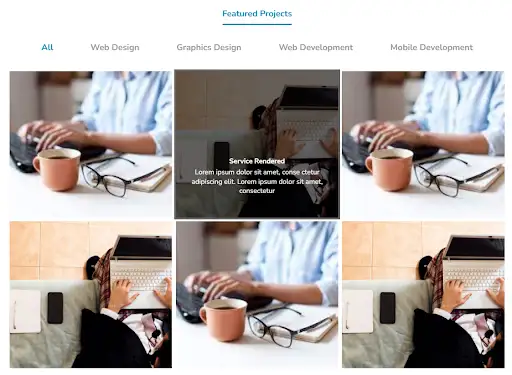
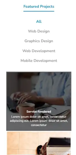

The above gallery has a bright and modish-looking photo design. There is a text overlay layer with a contrasting color that lets you share the story behind the photographs. If you are looking for user-friendly free photo gallery designs, this gallery is sure to dazzle you.
View Code
HTML
CSS
JS
Responsive CSS
Output
             Featured Projects


              All


              Web Design


              Graphics Design


              Web Development


              Mobile Development


                Service Rendered


                Lorem ipsum dolor sit amet, conse ctetur adipiscing elit. Lorem ipsum dolor sit amet, consectetur


                Service Rendered


                Lorem ipsum dolor sit amet, conse ctetur adipiscing elit. Lorem ipsum dolor sit amet, consectetur


                Service Rendered


                Lorem ipsum dolor sit amet, conse ctetur adipiscing elit. Lorem ipsum dolor sit amet, consectetur


                Service Rendered


                Lorem ipsum dolor sit amet, conse ctetur adipiscing elit. Lorem ipsum dolor sit amet, consectetur


                Service Rendered


                Lorem ipsum dolor sit amet, conse ctetur adipiscing elit. Lorem ipsum dolor sit amet, consectetur


                Service Rendered


                Lorem ipsum dolor sit amet, conse ctetur adipiscing elit. Lorem ipsum dolor sit amet, consectetur
          .featured_projects .text-blk {
    padding-top: 10px;
    padding-right: 10px;
    padding-bottom: 10px;
    padding-left: 10px;
    line-height: 25px;
    margin-top: 40px;
    margin-right: 0px;
    margin-bottom: 0px;
    margin-left: 0px;
}

.featured_projects * {
    font-family: Nunito, sans-serif;
}

.featured_projects .responsive-container-block {
    min-height: 75px;
    height: fit-content;
    width: 100%;
    padding-top: 10px;
    padding-right: 10px;
    padding-bottom: 10px;
    padding-left: 10px;
    display: flex;
    flex-wrap: wrap;
    margin-top: 0px;
    margin-right: auto;
    margin-bottom: 0px;
    margin-left: auto;
    justify-content: flex-start;
}

.featured_projects .container-block {
    min-height: 75px;
    height: fit-content;
    width: 100%;
    padding-top: 10px;
    padding-right: 10px;
    padding-bottom: 10px;
    padding-left: 10px;
    display: block;
}

.featured_projects .responsive-container-block.bg {
    max-width: 1500px;
    margin-top: 0px;
    margin-right: 0px;
    margin-bottom: 0px;
    margin-left: 0px;
    height: auto;
}

.featured_projects .container-block.bg {
    max-width: 1500px;
    display: flex;
    flex-direction: column;
    align-items: center;
}

.featured_projects .responsive-container-block.content {
    justify-content: space-evenly;
}

.featured_projects #iu99 {
    color: black;
}

.featured_projects .im {
    width: 100%;
    margin-top: 0px;
    margin-right: 0px;
    margin-bottom: 0px;
    margin-left: 0px;
    background-color: #666666;
    height: 100%;
}

.featured_projects .responsive-container-block.img {
    width: 33.33%;
    padding-top: 0px;
    padding-right: 0px;
    padding-bottom: 0px;
    padding-left: 0px;
    position: relative;
    min-height: auto;
    height: auto;
}

.featured_projects .responsive-container-block.overlay {
    position: absolute;
    height: 100%;
    flex-direction: column;
    justify-content: flex-end;
    align-items: center;
    margin-top: 0px;
    margin-right: 0px;
    margin-bottom: 0px;
    margin-left: 0px;
}

.featured_projects .responsive-container-block.desc {
    position: absolute;
    height: 100%;
    flex-direction: column;
    justify-content: flex-end;
    align-items: center;
    margin-top: 0px;
    margin-right: 0px;
    margin-bottom: 0px;
    margin-left: 0px;
}

.featured_projects .responsive-container-block.overlay.overlay-visible {
    background-color: #666666;
    mix-blend-mode: multiply;
}

.featured_projects .responsive-container-block.opt-cont {
    justify-content: space-evenly;
    align-items: center;
    margin-top: 30px;
    margin-right: 0px;
    margin-bottom: 5px;
    margin-left: 0px;
}

.featured_projects .text-blk.tab {
    font-size: 25px;
    line-height: 34.1px;
    display: flex;
    align-items: center;
    color: #999999;
    font-weight: 700;
    margin-top: 0px;
    margin-right: 0px;
    margin-bottom: 10px;
    margin-left: 0px;
    cursor: pointer;
    text-align: center;
}

.featured_projects .text-blk.tab.tab-active {
    color: #0087b1;
}

.featured_projects .responsive-container-block.img.hide.graphdes.mobdev {
    height: auto;
}

.featured_projects .text-blk.title {
    font-size: 20px;
    line-height: 27.28px;
    color: white;
    text-align: center;
    font-weight: 700;
    padding-top: 10px;
    padding-right: 10px;
    padding-bottom: 5px;
    padding-left: 10px;
}

.featured_projects .text-blk.info {
    font-size: 20px;
    line-height: 27.28px;
    color: white;
    text-align: center;
    margin-top: 0px;
    margin-right: 0px;
    margin-bottom: 50px;
    margin-left: 0px;
    padding-top: 0px;
    padding-right: 10px;
    padding-bottom: 10px;
    padding-left: 10px;
}

.featured_projects .text-blk.heading {
    font-size: 25px;
    line-height: 34.1px;
    color: #0087b1;
    font-weight: 700;
    padding-top: 10px;
    padding-right: 0px;
    padding-bottom: 10px;
    padding-left: 0px;
    border-bottom-width: 5px;
    border-bottom-style: solid;
    border-bottom-color: #0087b1;
}

.featured_projects .tab:hover {
    cursor: pointer;
}

.featured_projects .bg {
    padding: 0 0 0 0;
    margin: 0 auto 0 auto;
}

.featured_projects .content {
    padding: 0 0 0 0;
}

.featured_projects .opt-cont {
    min-height: auto;
    padding: 0 0 0 0;
}

@media (max-width: 1024px) {
    .featured_projects .text-blk.info {
        margin-top: 0px;
        margin-right: 0px;
        margin-bottom: 0px;
        margin-left: 0px;
    }
}

@media (max-width: 768px) {
    .featured_projects .im {
        width: 100%;
    }

    .featured_projects .responsive-container-block.img {
        width: 60%;
    }

    .featured_projects .responsive-container-block.img.hide {
        display: none;
    }

    .featured_projects .responsive-container-block.img.hide.hidden {
        display: none;
    }

    .featured_projects .responsive-container-block.opt-cont {
        flex-direction: column;
    }

    .featured_projects .text-blk.info {
        margin-top: 0px;
        margin-right: 0px;
        margin-bottom: 0px;
        margin-left: 0px;
        font-size: 13px;
        line-height: 15px;
        padding-top: 5px;
        padding-right: 10px;
        padding-bottom: 5px;
        padding-left: 10px;
    }

    .featured_projects .text-blk.title {
        font-size: 13px;
        line-height: 15px;
        padding-top: 0px;
        padding-right: 10px;
        padding-bottom: 0px;
        padding-left: 10px;
    }

    .featured_projects .text-blk.title {
        font-size: 20px;
        line-height: 27.28px;
    }

    .featured_projects .text-blk.info {
        font-size: 20px;
        line-height: 27.28px;
        margin-top: 0px;
        margin-right: 0px;
        margin-bottom: 10px;
        margin-left: 0px;
    }

    .featured_projects .responsive-container-block.opt-cont {
        margin-top: 30px;
        margin-right: 0px;
        margin-bottom: 15px;
        margin-left: 0px;
    }
}

@media (max-width: 500px) {
    .featured_projects .im {
        width: 100%;
    }

    .featured_projects .im {
        margin-top: 0px;
        margin-right: 0px;
        margin-bottom: 0px;
        margin-left: 0px;
    }

    .featured_projects .responsive-container-block.img {
        width: 100%;
    }

    .featured_projects .responsive-container-block.opt-cont {
        flex-direction: column;
    }

    .featured_projects .responsive-container-block.img.hidden {
        display: none;
    }

    .featured_projects .text-blk.info {
        font-size: 17px;
        line-height: 22px;
        margin-top: 0px;
        margin-right: 0px;
        margin-bottom: 10px;
        margin-left: 0px;
    }

    .featured_projects .text-blk.title {
        font-size: 17px;
        line-height: 22px;
    }

    .featured_projects .text-blk.title {
        padding-top: 0px;
        padding-right: 10px;
        padding-bottom: 5px;
        padding-left: 10px;
    }

    .featured_projects .text-blk.info {
        font-size: 20px;
        line-height: 27.28px;
    }

    .featured_projects .text-blk.title {
        font-size: 20px;
        line-height: 27.28px;
    }
}
          $(document).ready(function() {
      	$("[unique-script-id='w-w-dm-id'] .img .desc").hide();

$("[unique-script-id='w-w-dm-id'] .img").mouseenter(function(item) {
    $("[unique-script-id='w-w-dm-id'] .img .overlay").removeClass("overlay-visible");
    $("[unique-script-id='w-w-dm-id'] .img .desc").hide();
    $("#" + $(item.currentTarget).attr("id") + ' .overlay').addClass("overlay-visible");
    $("#" + $(item.currentTarget).attr("id") + ' .desc').show();
    console.log(item.currentTarget);
});
$("[unique-script-id='w-w-dm-id'] .tab").click(function() {
    const value = $(this).attr('data-filter');
    if (value == 'all') {
        $("[unique-script-id='w-w-dm-id'] .img").show('5000');
    } else {
        $("[unique-script-id='w-w-dm-id'] .img").not('.' + value).hide('5000');
        $("[unique-script-id='w-w-dm-id'] .img").filter('.' + value).show('5000');
    }
});

$("[unique-script-id='w-w-dm-id'] .tab").click(function() {
    $(this).addClass('tab-active').siblings().removeClass('tab-active');
});
      })
          @import url('https://fonts.googleapis.com/css2?family=Nunito:wght@200;300;400;600;700;800&display=swap');
      *, *:before, *:after {
      -moz-box-sizing: border-box;
      -webkit-box-sizing: border-box;
      box-sizing: border-box;
      }
      body {
      margin: 0;
      }
      .wk-desk-1{
      width: 8.333333%;
      }
      .wk-desk-2{
      width: 16.666667%;
      }
      .wk-desk-3{
      width: 25%;
      }
      .wk-desk-4{
      width: 33.333333%;
      }
      .wk-desk-5{
      width: 41.666667%;
      }
      .wk-desk-6{
      width: 50%;
      }
      .wk-desk-7{
      width: 58.333333%;
      }
      .wk-desk-8{
      width: 66.666667%;
      }
      .wk-desk-9{
      width: 75%;
      }
      .wk-desk-10{
      width: 83.333333%;
      }
      .wk-desk-11{
      width: 91.666667%;
      }
      .wk-desk-12{
      width: 100%;
      }
      @media (max-width: 1024px) {
      .wk-ipadp-1{
      width: 8.333333%;
      }
      .wk-ipadp-2{
      width: 16.666667%;
      }
      .wk-ipadp-3{
      width: 25%;
      }
      .wk-ipadp-4{
      width: 33.333333%;
      }
      .wk-ipadp-5{
      width: 41.666667%;
      }
      .wk-ipadp-6{
      width: 50%;
      }
      .wk-ipadp-7{
      width: 58.333333%;
      }
      .wk-ipadp-8{
      width: 66.666667%;
      }
      .wk-ipadp-9{
      width: 75%;
      }
      .wk-ipadp-10{
      width: 83.333333%;
      }
      .wk-ipadp-11{
      width: 91.666667%;
      }
      .wk-ipadp-12{
      width: 100%;
      }
      }
      @media (max-width: 768px) {
      .wk-tab-1{
      width: 8.333333%;
      }
      .wk-tab-2{
      width: 16.666667%;
      }
      .wk-tab-3{
      width: 25%;
      }
      .wk-tab-4{
      width: 33.333333%;
      }
      .wk-tab-5{
      width: 41.666667%;
      }
      .wk-tab-6{
      width: 50%;
      }
      .wk-tab-7{
      width: 58.333333%;
      }
      .wk-tab-8{
      width: 66.666667%;
      }
      .wk-tab-9{
      width: 75%;
      }
      .wk-tab-10{
      width: 83.333333%;
      }
      .wk-tab-11{
      width: 91.666667%;
      }
      .wk-tab-12{
      width: 100%;
      }
      }
      @media (max-width: 500px) {
      .wk-mobile-1{
      width: 8.333333%;
      }
      .wk-mobile-2{
      width: 16.666667%;
      }
      .wk-mobile-3{
      width: 25%;
      }
      .wk-mobile-4{
      width: 33.333333%;
      }
      .wk-mobile-5{
      width: 41.666667%;
      }
      .wk-mobile-6{
      width: 50%;
      }
      .wk-mobile-7{
      width: 58.333333%;
      }
      .wk-mobile-8{
      width: 66.666667%;
      }
      .wk-mobile-9{
      width: 75%;
      }
      .wk-mobile-10{
      width: 83.333333%;
      }
      .wk-mobile-11{
      width: 91.666667%;
      }
      .wk-mobile-12{
      width: 100%;
      }
      }
Reset